- Welcome
- Getting started
- Latest updates
- Foundations
-
Components
- Accordion
- Alert
- Alignment
- App Search Modal
- Aria live
- Autosuggest
- Badge
- Banner alert
- Bar chart
- Blockquote
- Bottom navigation
- Bottom sheet
- Breadcrumb
- Breakpoint
- Button
- Calendar
- Card
- Card list
- Card button
- Carousel
- Checkbox
- Chip
- Chip group
- Code
- Content cards
- Data Table
- Datepicker
- Description list
- Dialog
- Divider
- Drawer
- Field Set
- Flare
- Flat list
- Flight leg
- Floating action button
- Floating notification
- Form label
- Form validation
- Graphic promotion
- Horizontal navigation
- Icon
- Image
- Image Gallery
- Infinite scroll
- Info Banner
- Inset Banner
- Link
- List
- Map
- Mobile scroll container
- Modal
- Navigation bar
- Navigation Tab Group
- Nudger
- Overlay
- Page indicator
- Pagination
- Panel
- Phone input
- Picker
- Popover
- Price
- Progress bar
- Radio button
- Rating
- Rating Bar
- Scrollable calendar
- Search Modal
- Section header
- Section list
- Select
- Skeleton
- Skip link
- Slider
- Snackbar
- Snippet
- Spinner
- Split input
- Star rating
- Swap Button
- Switch
- Table
- Text
- Text input
- Theming
- Ticket
- Toast
- Tooltip
- Touchable native feedback
- Touchable overlay
- Search Input Summary
- Content
- Accessibility
- Contributing
- Localisation
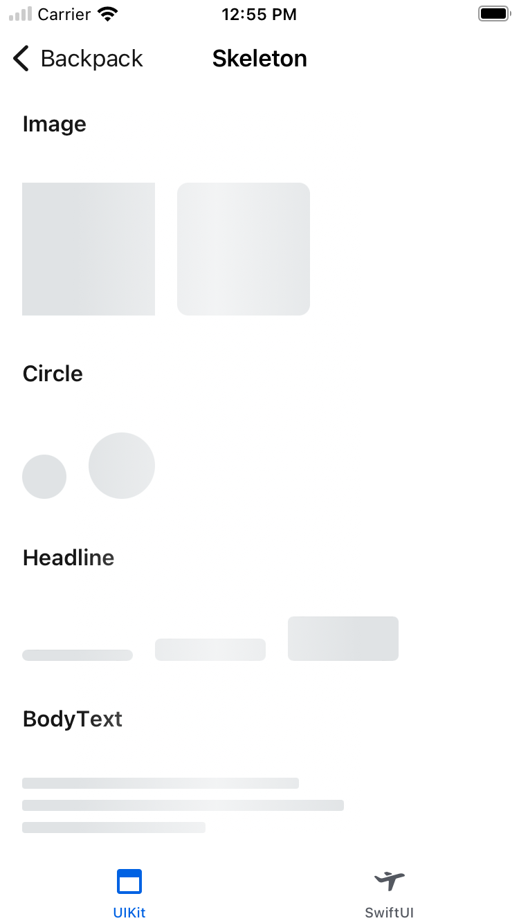
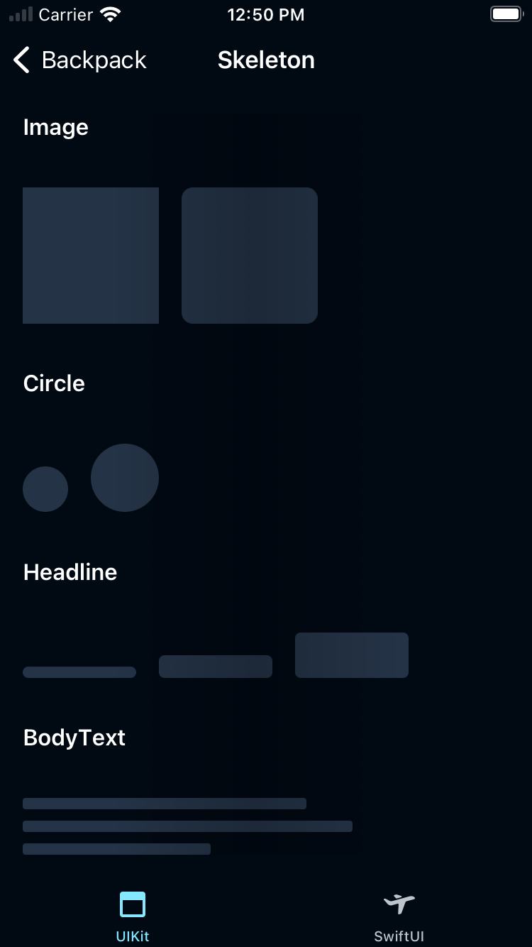
Skeleton
Skeleton components provides a standard way to build a skeleton loading view with shimmer animation.
Backpack/Skeleton

Default
| Day | Night |
|---|---|
 |
 |
Usage
Image skeleton
| Style Options | Border radius |
|---|---|
| .rounded | 8 |
| .default | 0 |
Set the custom size:
// Default size: 96 * 96
- .custom(size: CGSize(width: xxx, height: xxx))
                                                import Backpack

                                                let defaultImage = BPKSkeleton(type: .image)
                                                let roundedImage = BPKSkeleton(type: .image, style: .rounded)
                                                let customImage = BPKSkeleton(type: .image, size: .custom(size: CGSize(width: 160, height: 160)))
Circle skeleton
Set the size to:
| Size Options | Size |
|---|---|
| .small | diameter: 32 |
| .default | diameter: 48 |
| .custom(size: CGSize(width: xxx, height: xxx)) | We will choose the short side as the diameter while width != height |
                                                import Backpack

                                                let defaultCircle = BPKSkeleton(type: .circle)
                                                let small = BPKSkeleton(type: .circle, size: .small)
                                                let customImage = BPKSkeleton(type: .circle, size: .custom(size: CGSize(width: 100, height: 120)))
Headline skeleton
| Size Options | Size |
|---|---|
| .small | size: 80 * 8 |
| .default | size: 80 * 16 |
| .large | size: 80 * 32 |
| .custom(size: CGSize(width: xxx, height: xxx)) | N/A |
                                                import Backpack

                                                let default = BPKSkeleton(type: .headline)
                                                let small = BPKSkeleton(type: .headline, size: .small)
                                                let large = BPKSkeleton(type: .headline, size: .large)
                                                let custom = BPKSkeleton(type: .headline, size: .custom(size: CGSize(width: 88, height: 48)))
Body text skeleton
| Size Options | Size |
|---|---|
| .default | size: 200 * 40 |
| .custom(size: CGSize(width: xxx, height: xxx)) | N/A |
                                                import Backpack

                                                let bodytext = BPKSkeleton(type: .bodytext)
                                                let custom = BPKSkeleton(type: .bodytext, size: .custom(size: CGSize(width: 260, height: 60)))
Shimmer animation
                                                import Backpack

                                                BPKSkeleton.startShimmer(view: yourView) // Make sure call this after yourView rendered.
                                                BPKSkeleton.removeShimmer(view: yourView)
Made with ❤️ by Skyscanner © 2024
© 2024 Skyscanner Backpack. Page last updated on May 3, 2023, 10:51