- Welcome
- Getting started
- Latest updates
- Foundations
-
Components
- Accordion
- Alert
- Alignment
- App Search Modal
- Aria live
- Autosuggest
- Badge
- Banner alert
- Bar chart
- Blockquote
- Bottom navigation
- Bottom sheet
- Breadcrumb
- Breakpoint
- Button
- Calendar
- Card
- Card list
- Card button
- Carousel
- Checkbox
- Chip
- Chip group
- Code
- Content cards
- Data Table
- Datepicker
- Description list
- Dialog
- Divider
- Drawer
- Field Set
- Flare
- Flat list
- Flight leg
- Floating action button
- Floating notification
- Form label
- Form validation
- Graphic promotion
- Horizontal navigation
- Icon
- Image
- Image Gallery
- Infinite scroll
- Info Banner
- Inset Banner
- Link
- List
- Map
- Mobile scroll container
- Modal
- Navigation bar
- Navigation Tab Group
- Nudger
- Overlay
- Page indicator
- Pagination
- Panel
- Phone input
- Picker
- Popover
- Price
- Progress bar
- Radio button
- Rating
- Rating Bar
- Scrollable calendar
- Search Modal
- Section header
- Section list
- Select
- Skeleton
- Skip link
- Slider
- Snackbar
- Snippet
- Spinner
- Split input
- Star rating
- Swap Button
- Switch
- Table
- Text
- Text input
- Theming
- Ticket
- Toast
- Tooltip
- Touchable native feedback
- Touchable overlay
- Search Input Summary
- Content
- Accessibility
- Contributing
- Localisation
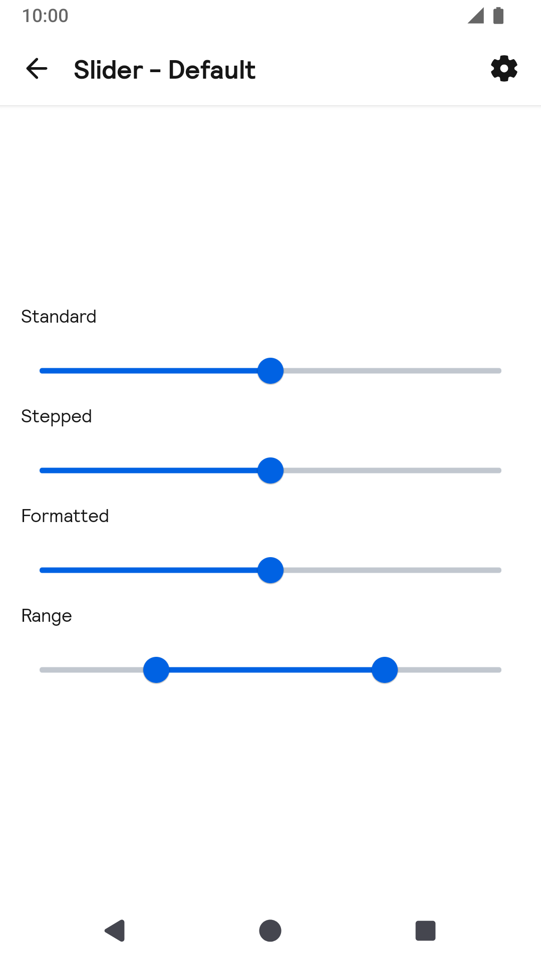
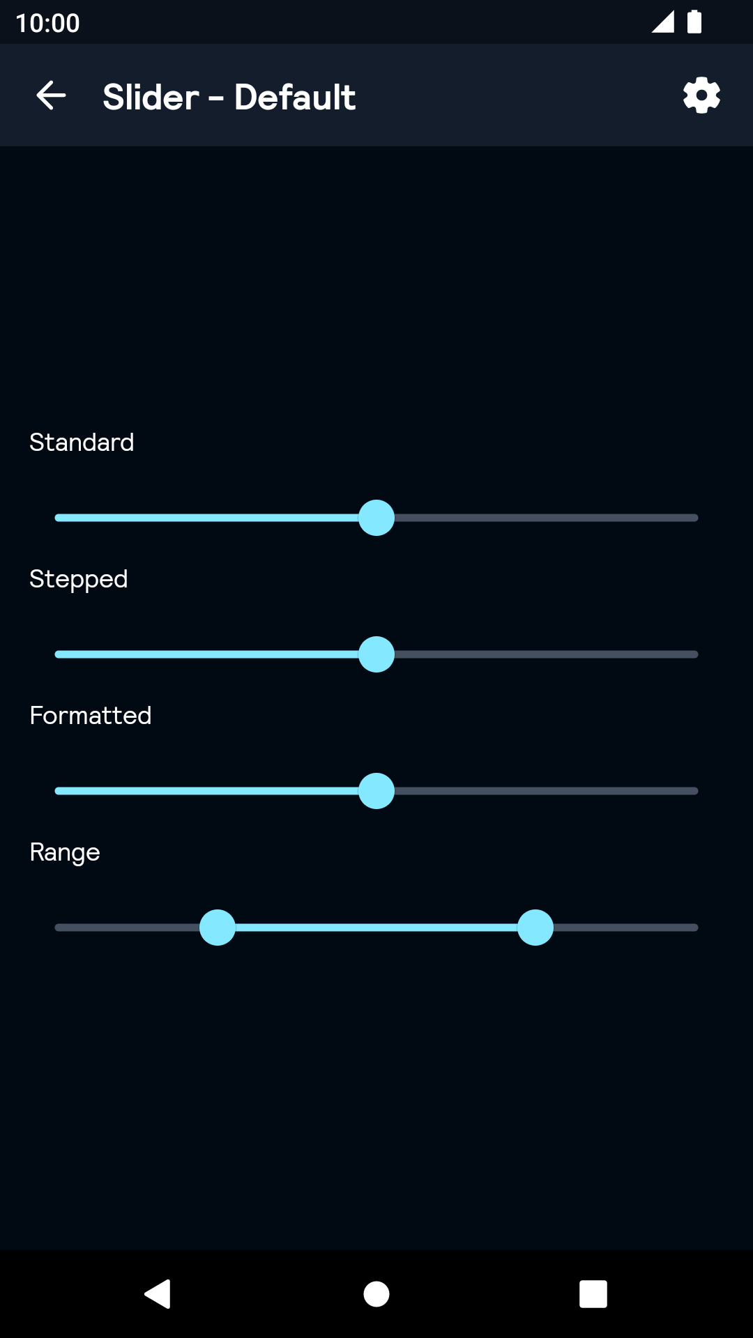
Slider
Sliders allow users to input a numeric value from a given range.
Slider

All
| Day | Night |
|---|---|
 |
 |
Installation
Backpack Android is available through Maven Central. Check the main Readme for a complete installation guide.
Usage
The Slider component can be used in both XML and Kotlin
Example of a slider in XML
                                                <net.skyscanner.backpack.slider.BpkSlider
                                                  android:layout_width="wrap_content"
                                                  android:layout_height="wrap_content"
                                                  android:valueTo="10"
                                                  android:valueFrom="0"
                                                  android:value="5"
                                                  android:stepSize="1" />
Example of a slider in Kotlin
                                                import net.skyscanner.backpack.slider.BpkSlider

                                                BpkSlider(context).apply {
                                                   valueFrom = 0f
                                                   valueTo = 10f
                                                   value = 5f
                                                   stepSize = 1f
                                                }
Example of a range slider in XML
                                                <net.skyscanner.backpack.slider.BpkSlider
                                                  android:layout_width="wrap_content"
                                                  android:layout_height="wrap_content"
                                                  android:valueTo="100"
                                                  android:valueFrom="0"
                                                  app:values="@array/initial_slider_values"
                                                  android:stepSize="5" />
                                                <resources>
                                                  <array name="initial_slider_values">
                                                    <item>25</item>
                                                    <item>75</item>
                                                  </array>
                                                </resources>
Example of a range slider in Kotlin
                                                import net.skyscanner.backpack.slider.BpkSlider

                                                BpkSlider(context).apply {
                                                   valueFrom = 0f
                                                   valueTo = 100f
                                                   setValues(25f, 75f)
                                                   stepSize = 5f
                                                }
Example of a slider with formatted label in Kotlin
                                                import net.skyscanner.backpack.slider.BpkSlider
                                                import java.text.NumberFormat
                                                import java.util.*

                                                BpkSlider(context).apply {
                                                   valueFrom = 1000f
                                                   valueTo = 5000f
                                                   value = 3000f
                                                   stepSize = 10f
                                                   setLabelFormatter { value: Float ->
                                                     val format = NumberFormat.getCurrencyInstance()
                                                     format.maximumFractionDigits = 0
                                                     format.currency = Currency.getInstance("GBP")
                                                     format.format(value.toDouble())
                                                   }
                                                }
Made with ❤️ by Skyscanner © 2024
© 2024 Skyscanner Backpack. Page last updated on Oct 31, 2022, 13:52