- Welcome
- Getting started
- Latest updates
- Foundations
-
Components
- Accordion
- Alert
- Alignment
- App Search Modal
- Aria live
- Autosuggest
- Badge
- Banner alert
- Bar chart
- Blockquote
- Bottom navigation
- Bottom sheet
- Breadcrumb
- Breakpoint
- Button
- Calendar
- Card
- Card list
- Card button
- Carousel
- Checkbox
- Chip
- Chip group
- Code
- Content cards
- Data Table
- Datepicker
- Description list
- Dialog
- Divider
- Drawer
- Field Set
- Flare
- Flat list
- Flight leg
- Floating action button
- Floating notification
- Form label
- Form validation
- Graphic promotion
- Horizontal navigation
- Icon
- Image
- Image Gallery
- Infinite scroll
- Info Banner
- Inset Banner
- Link
- List
- Map
- Mobile scroll container
- Modal
- Navigation bar
- Navigation Tab Group
- Nudger
- Overlay
- Page indicator
- Pagination
- Panel
- Phone input
- Picker
- Popover
- Price
- Progress bar
- Radio button
- Rating
- Rating Bar
- Scrollable calendar
- Search Modal
- Section header
- Section list
- Select
- Skeleton
- Skip link
- Slider
- Snackbar
- Snippet
- Spinner
- Split input
- Star rating
- Swap Button
- Switch
- Table
- Text
- Text input
- Theming
- Ticket
- Toast
- Tooltip
- Touchable native feedback
- Touchable overlay
- Search Input Summary
- Content
- Accessibility
- Contributing
- Localisation
Card list
Section Header

Rail
| Day | Night |
|---|---|
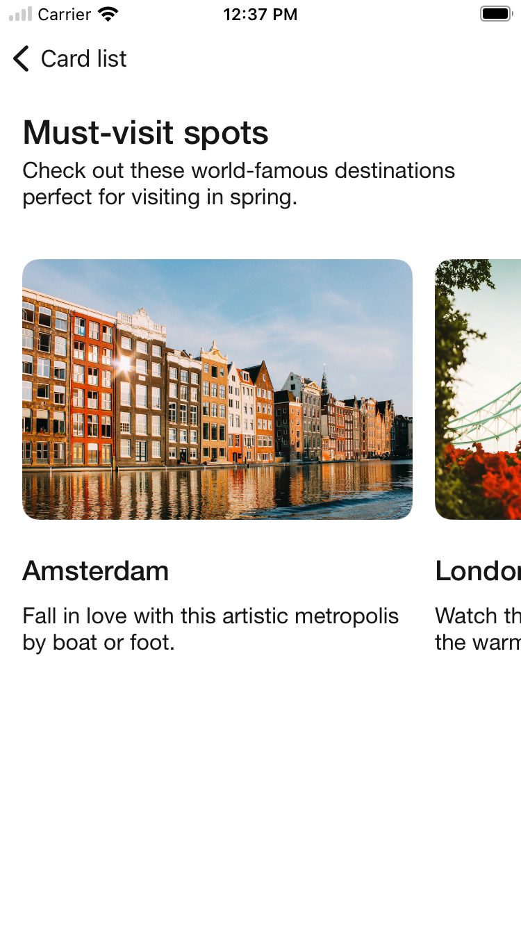 |
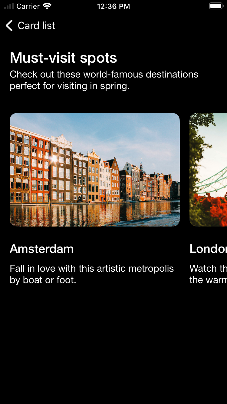 |
Rail with section header button
| Day | Night |
|---|---|
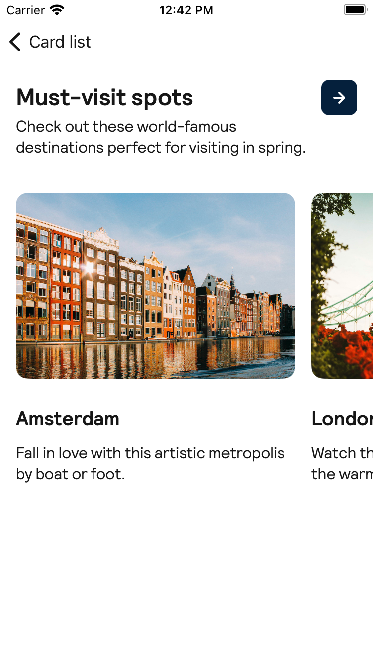 |
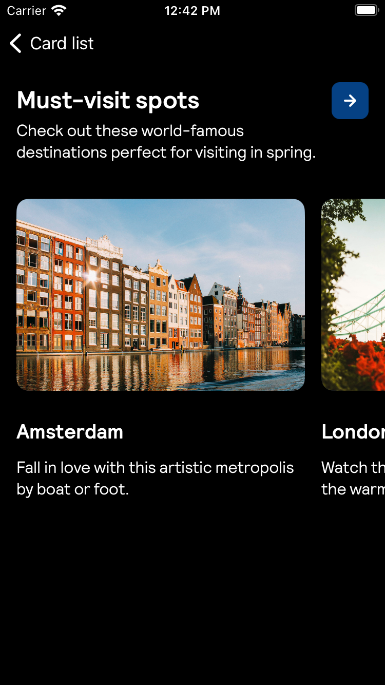 |
Stack
| Day | Night |
|---|---|
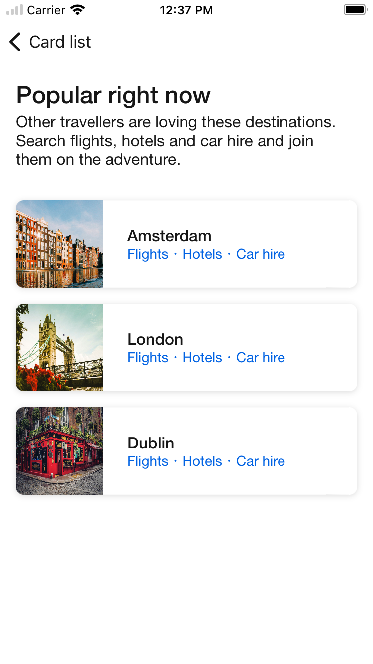 |
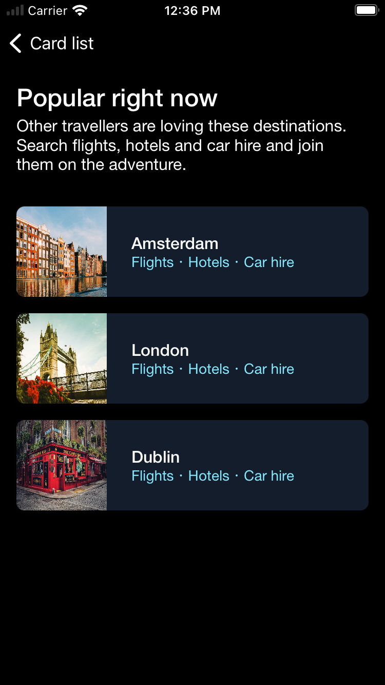 |
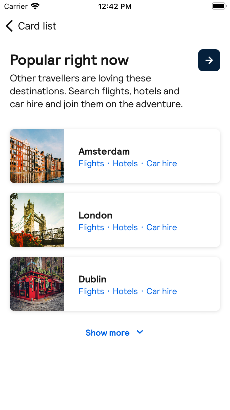
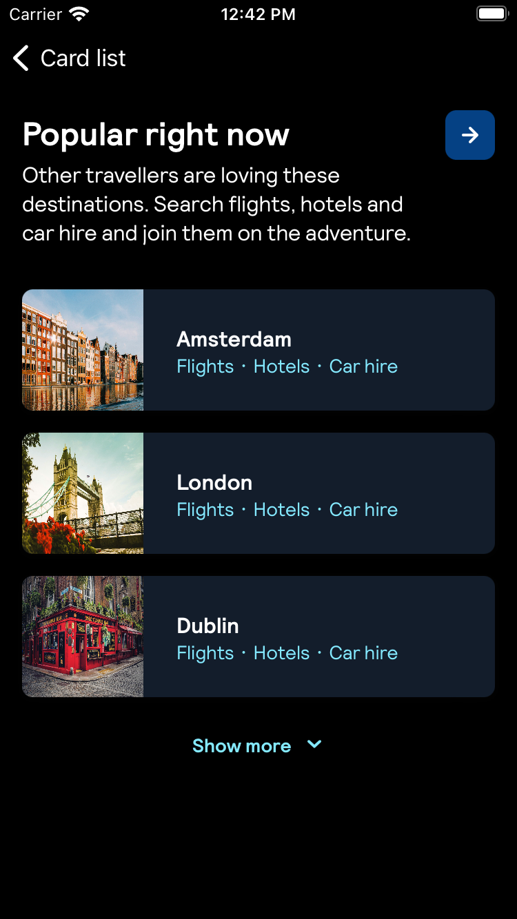
Stack with expand accessory
| Day | Night |
|---|---|
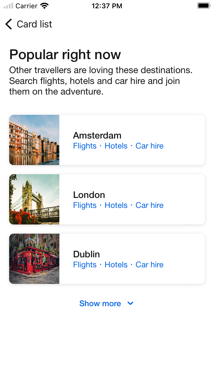 |
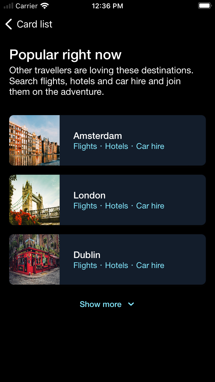 |
Stack with button accessory
| Day | Night |
|---|---|
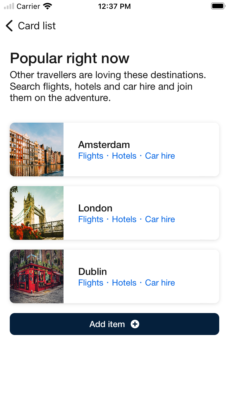 |
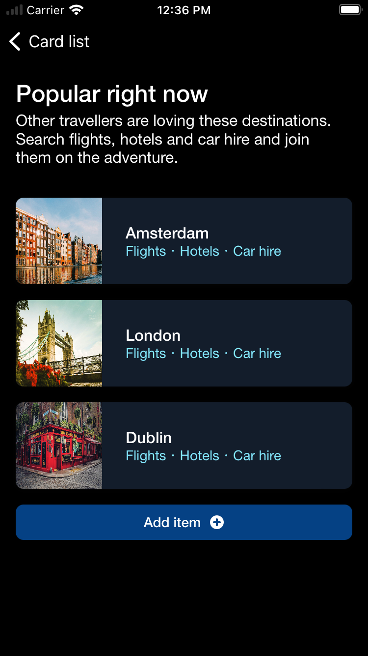 |
Stack with expand accessory and section header button
| Day | Night |
|---|---|
 |
 |
Usage
To create a Card List component, you need to choose if you want a rail (horizontal) layout or a stack (vertical) layout.
Rail layout
                                                import Backpack_SwiftUI

                                                struct TestElement: Identifiable {
                                                    let id: Int
                                                }

                                                BPKCardList(
                                                    title: "Section title",
                                                    description: "Description about this section (optional)",
                                                    layout: .rail(),
                                                    initiallyShownCards: 2,
                                                    elements: Array(repeating: TestElement(id: 1), count: 4)) {
                                                        Text("Element \(element.id)")
                                                    }
Section header
You can also specify a button with an icon for the section header.
                                                import Backpack_SwiftUI

                                                struct TestElement: Identifiable {
                                                    let id: Int
                                                }

                                                BPKCardList(
                                                    title: "Section title",
                                                    description: "Description about this section (optional)",
                                                        layout: .rail(
                                                            sectionHeaderAction: .init(
                                                                icon: .addCircle,
                                                                accessibilityLabel: "Add item") {
                                                                    print("Tap add button")
                                                                }
                                                    ),
                                                    initiallyShownCards: 2,
                                                    elements: Array(repeating: TestElement(id: 1), count: 4)) {
                                                        Text("Element \(element.id)")
                                                    }
Stack layout
                                                import Backpack_SwiftUI

                                                struct TestElement: Identifiable {
                                                    let id: Int
                                                }

                                                BPKCardList(
                                                    title: "Section title",
                                                    description: "Description about this section (optional)",
                                                    layout: .stack(),
                                                    initiallyShownCards: 2,
                                                    elements: Array(repeating: TestElement(id: 1), count: 4)) {
                                                        Text("Element \(element.id)")
                                                    }
Accessory (optional)
Using stack layout, you can optionally choose to show an accesory option. There are currently 3 options to choose from:
** Section Header Button **
Button with an icon for the section header
                                                import Backpack_SwiftUI

                                                struct TestElement: Identifiable {
                                                    let id: Int
                                                }

                                                BPKCardList(
                                                    title: "Section title",
                                                    description: "Description about this section (optional)",
                                                        layout: .stack(
                                                        accessory: .sectionHeaderButton(
                                                            .init(
                                                                icon: .addCircle,
                                                                accessibilityLabel: "Add item") {
                                                                    print("Tap add button")
                                                            }
                                                        )
                                                    ),
                                                    initiallyShownCards: 2,
                                                    elements: Array(repeating: TestElement(id: 1), count: 4)) {
                                                        Text("Element \(element.id)")
                                                    }
** Expand **
Option with a button on the bottom to toggle between showing initiallyShownCards number of elements and the total number of elements. Text for both states of the button are required, and a section header button can be provided optionally.
Without Section Header Button
                                                import Backpack_SwiftUI

                                                struct TestElement: Identifiable {
                                                    let id: Int
                                                }

                                                BPKCardList(
                                                    title: "Section title",
                                                    description: "Description about this section (optional)",
                                                    layout: .stack(
                                                        accessory: .expand(expandText: "Show more", collapseText: "Show less"),
                                                    ),
                                                    initiallyShownCards: 2,
                                                    elements: Array(repeating: TestElement(id: 1), count: 4)) {
                                                        Text("Element \(element.id)")
                                                    }
With Section Header Button
                                                import Backpack_SwiftUI

                                                struct TestElement: Identifiable {
                                                    let id: Int
                                                }

                                                BPKCardList(
                                                    title: "Section title",
                                                    description: "Description about this section (optional)",
                                                    layout: .stack(
                                                        accessory: .expand(
                                                            expandText: "Show more",
                                                            collapseText: "Show less",
                                                            sectionHeaderButton:
                                                                .init(
                                                                    icon: .addCircle,
                                                                    accessibilityLabel: "Add item") {
                                                                        print("Tap add button")
                                                                    }
                                                        )
                                                    ),
                                                    initiallyShownCards: 2,
                                                    elements: Array(repeating: TestElement(id: 1), count: 4)) {
                                                        Text("Element \(element.id)")
                                                    }
** Footer Button **
Configurable button to be shown at the bottom
                                                import Backpack_SwiftUI

                                                struct TestElement: Identifiable {
                                                    let id: Int
                                                }

                                                BPKCardList(
                                                    title: "Section title",
                                                    description: "Description about this section (optional)",
                                                    layout: .stack(
                                                        accessory: .footerButton(
                                                            .init(
                                                                title: "Add item",
                                                                icon: .init(icon: .addCircle, position: .trailing),
                                                                accessibilityLabel: "Add item") {
                                                                    print("Tap add button")
                                                            }
                                                        )
                                                    ),
                                                    initiallyShownCards: 2,
                                                    elements: Array(repeating: TestElement(id: 1), count: 4)) {
                                                        Text("Element \(element.id)")
                                                    }
Made with ❤️ by Skyscanner © 2024
© 2024 Skyscanner Backpack. Page last updated on Aug 30, 2023, 12:01