Skeleton

Default
| Day | Night |
|---|---|
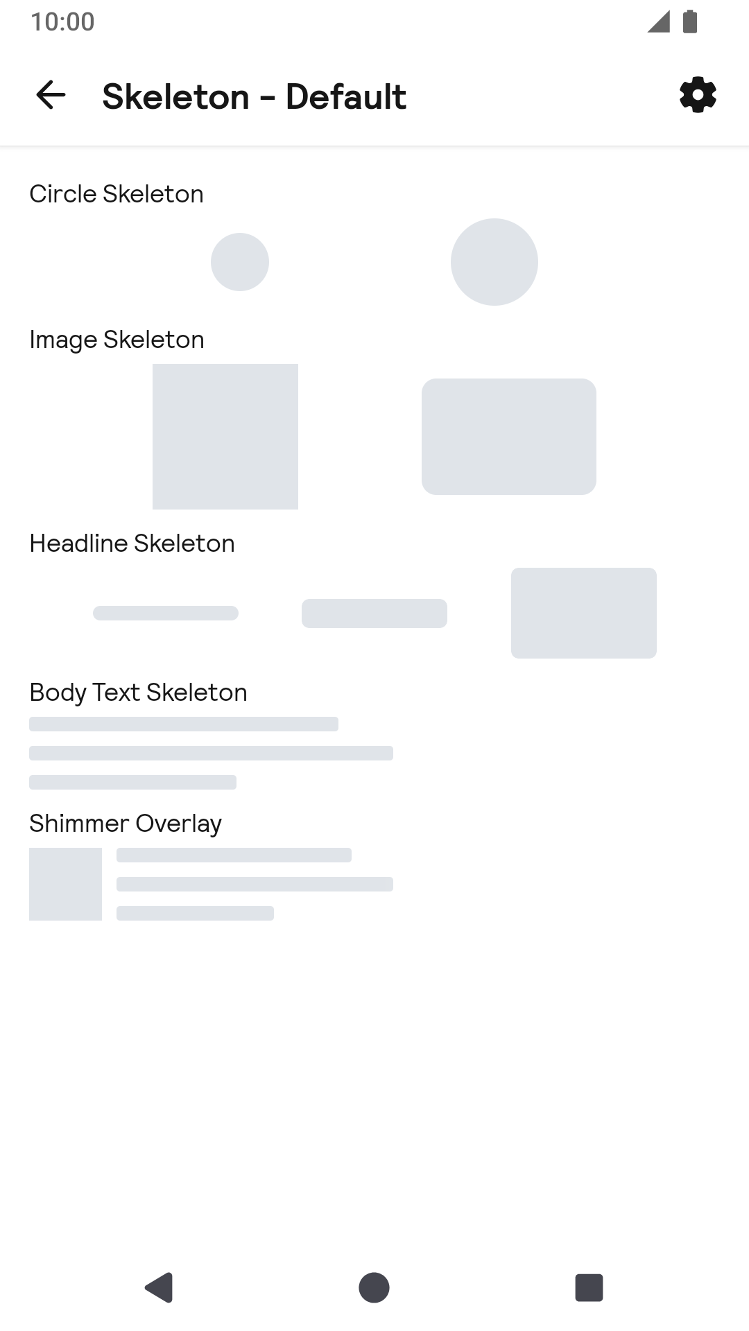 |
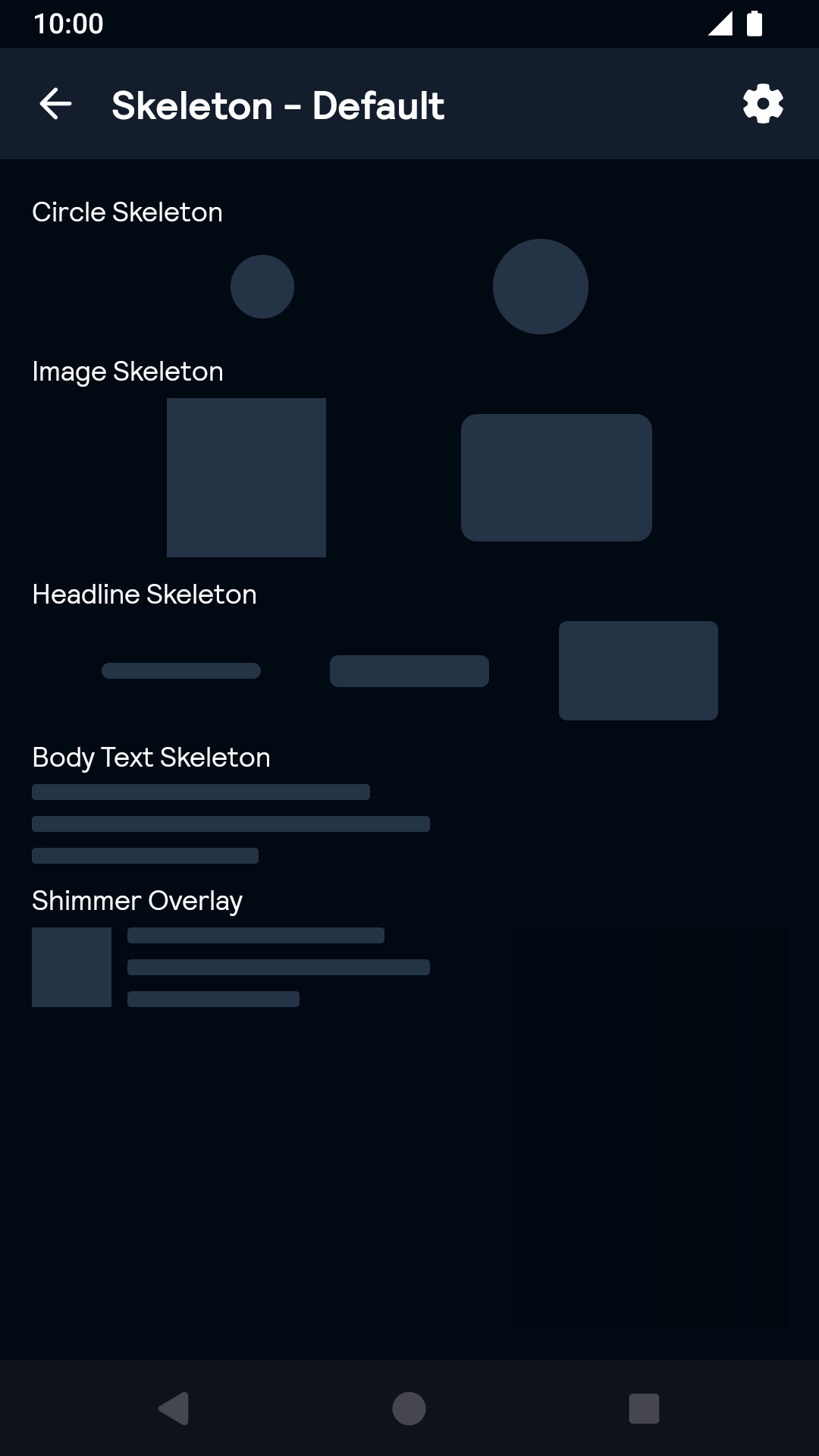 |
Installation
Backpack Android is available through Maven Central. Check the main Readme for a complete installation guide.
Usage
Skeleton components is built for an composition with shimmer animation. It is often used for a loading screen or loading cards. There is a shimmer overlay which is to wrap the whole composition. There are 4 base elements with pre-selected size or custom size support: image skeleton, circle skeleton, headline skeleton and body text skeleton, they represent the real block as their name in a composition. You should put the whole composition into a shimmer overlay to add shimmer animation.
The Skeleton components can be used in both XML and Kotlin/Java
Shimmer overlay support to add a child with component tree, or to include another layout XML file.
Example of a shimmer overlay with in XML
Circle skeleton have pre-selected size. skeletonCircleSize: small(32 dp), large(48 dp), custom. You could also specify a custom size by skeletonDiameter.
Example of a circle Skeleton with large size in XML
Example of a circle skeleton with custom size in XML
Image skeleton requires width and height dimension, you should specify them to get an expected size.
Example of a Image Skeleton with rounded corner in XML
Headline skeleton have pre-selected height. skeletonHeadlineHeightSize: small(8 dp), medium(16 dp), large(32 dp), custom. Please set height to wrap_content if you want to use pre-selected height otherwise you could specify a custom height. If you want to set the height to a custom size, please set skeletonHeadlineHeightSize to custom and then set height to a dimension value. You should specify the width to any size to keep consistent with your design.
Example of a headline skeleton with medium size in XML
Example of a headline skeleton with custom size in XML
Body text skeleton have its own height(40 dp), you should never to reset it. You should only specify width for it, and set height to wrap_content.
Example of a body text skeleton in XML
Example of a shimmer overlay in Kotlin
Example of a circle skeleton with large size in Kotlin
Example of a circle skeleton with custom size in Kotlin
Example of a image skeleton with rounded corner in Kotlin
Example of a headline skeleton with medium size in Kotlin
Example of a body text skeleton with large corner in Kotlin