- Welcome
- Getting started
- Latest updates
- Foundations
-
Components
- Accordion
- Alert
- Alignment
- App Search Modal
- Aria live
- Autosuggest
- Badge
- Banner alert
- Bar chart
- Blockquote
- Bottom navigation
- Bottom sheet
- Breadcrumb
- Breakpoint
- Button
- Calendar
- Card
- Card list
- Card button
- Carousel
- Checkbox
- Chip
- Chip group
- Code
- Content cards
- Data Table
- Datepicker
- Description list
- Dialog
- Divider
- Drawer
- Field Set
- Flare
- Flat list
- Flight leg
- Floating action button
- Floating notification
- Form label
- Form validation
- Graphic promotion
- Horizontal navigation
- Icon
- Image
- Image Gallery
- Infinite scroll
- Info Banner
- Inset Banner
- Link
- List
- Map
- Mobile scroll container
- Modal
- Navigation bar
- Navigation Tab Group
- Nudger
- Overlay
- Page indicator
- Pagination
- Panel
- Phone input
- Picker
- Popover
- Price
- Progress bar
- Radio button
- Rating
- Rating Bar
- Scrollable calendar
- Search Modal
- Section header
- Section list
- Select
- Skeleton
- Skip link
- Slider
- Snackbar
- Snippet
- Spinner
- Split input
- Star rating
- Swap Button
- Switch
- Table
- Text
- Text input
- Theming
- Ticket
- Toast
- Tooltip
- Touchable native feedback
- Touchable overlay
- Search Input Summary
- Content
- Accessibility
- Contributing
- Localisation
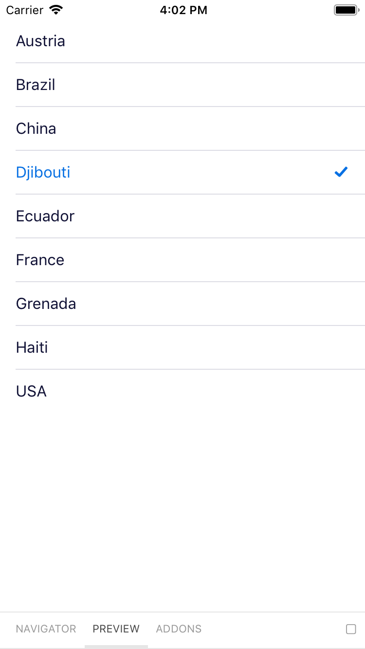
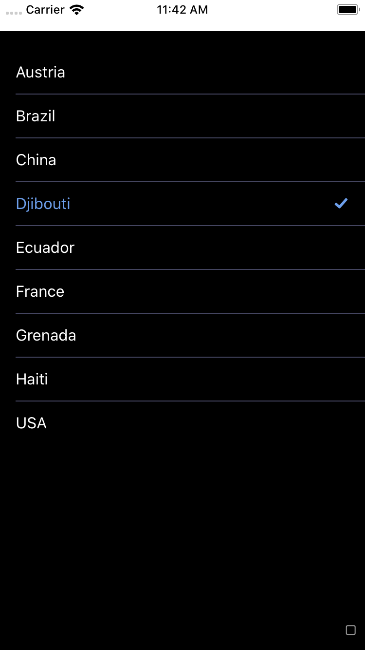
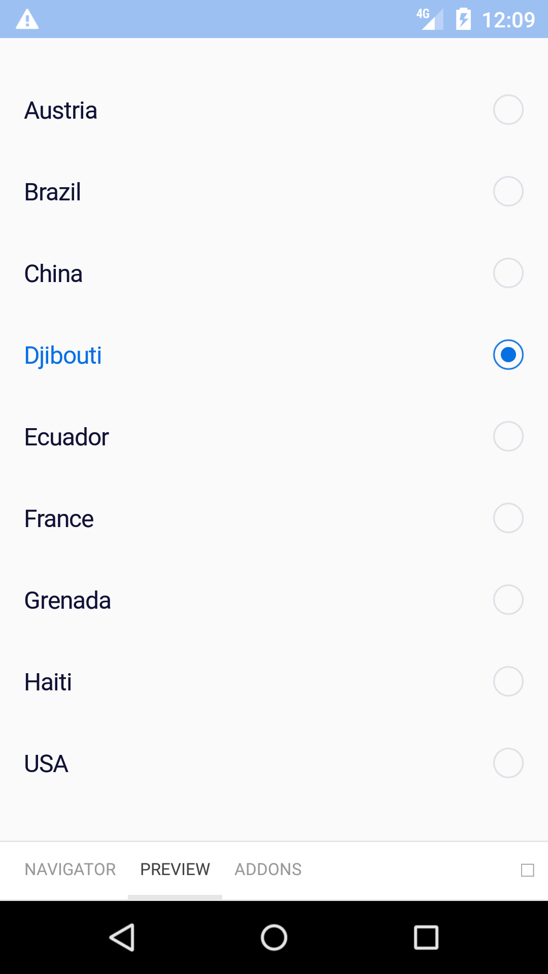
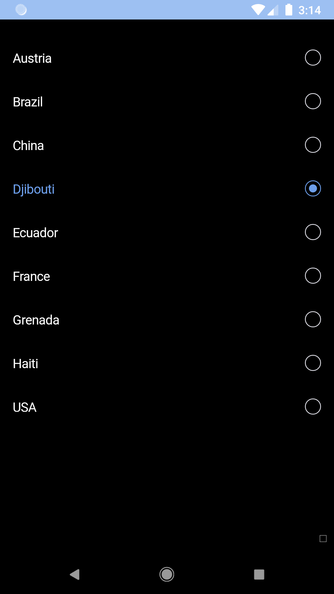
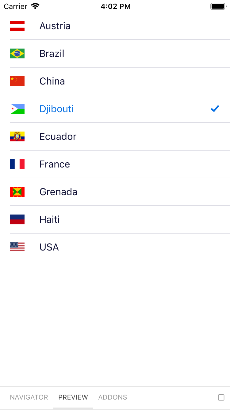
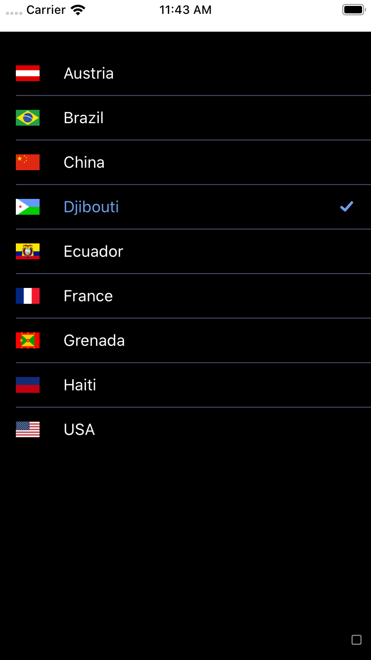
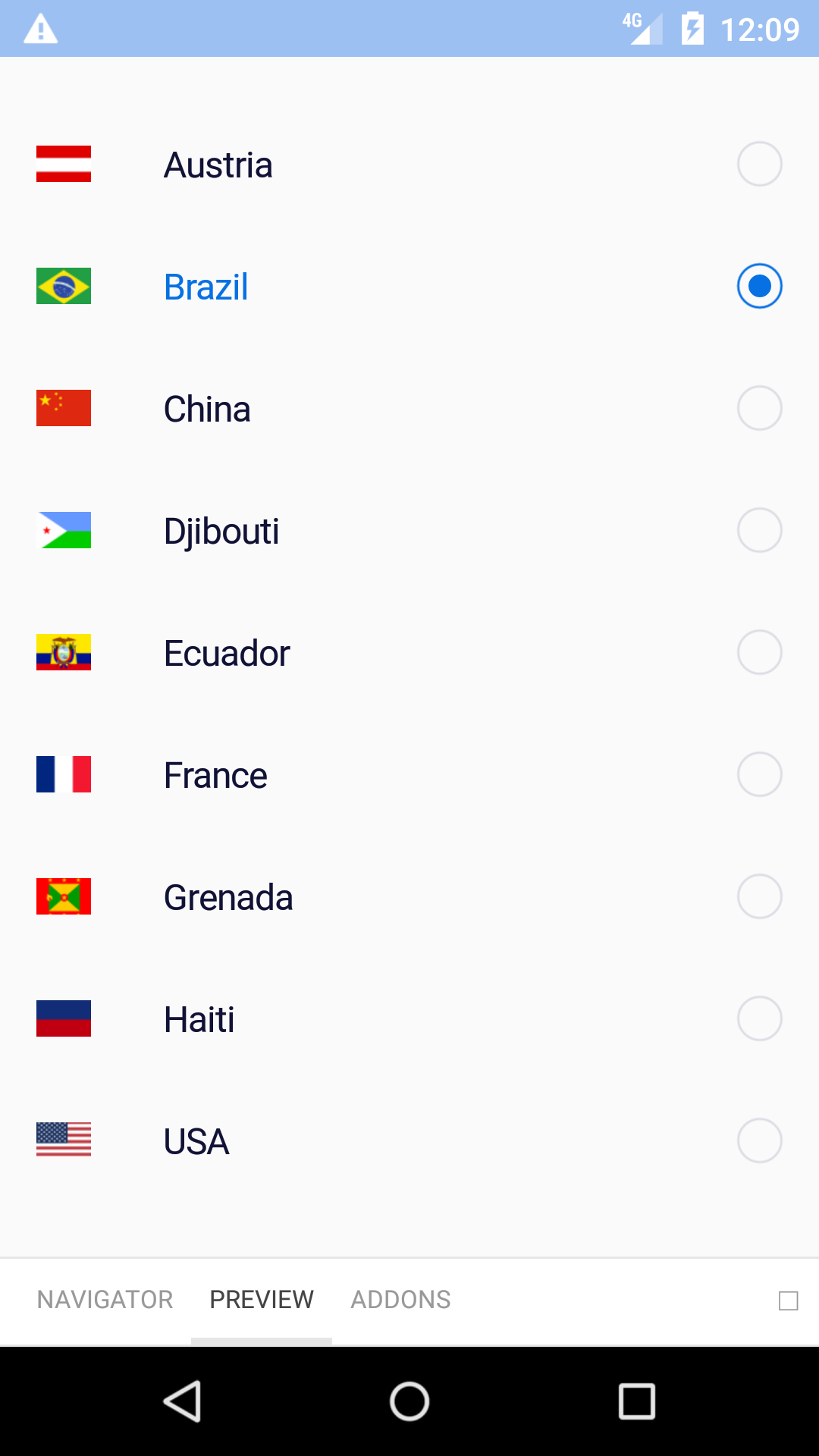
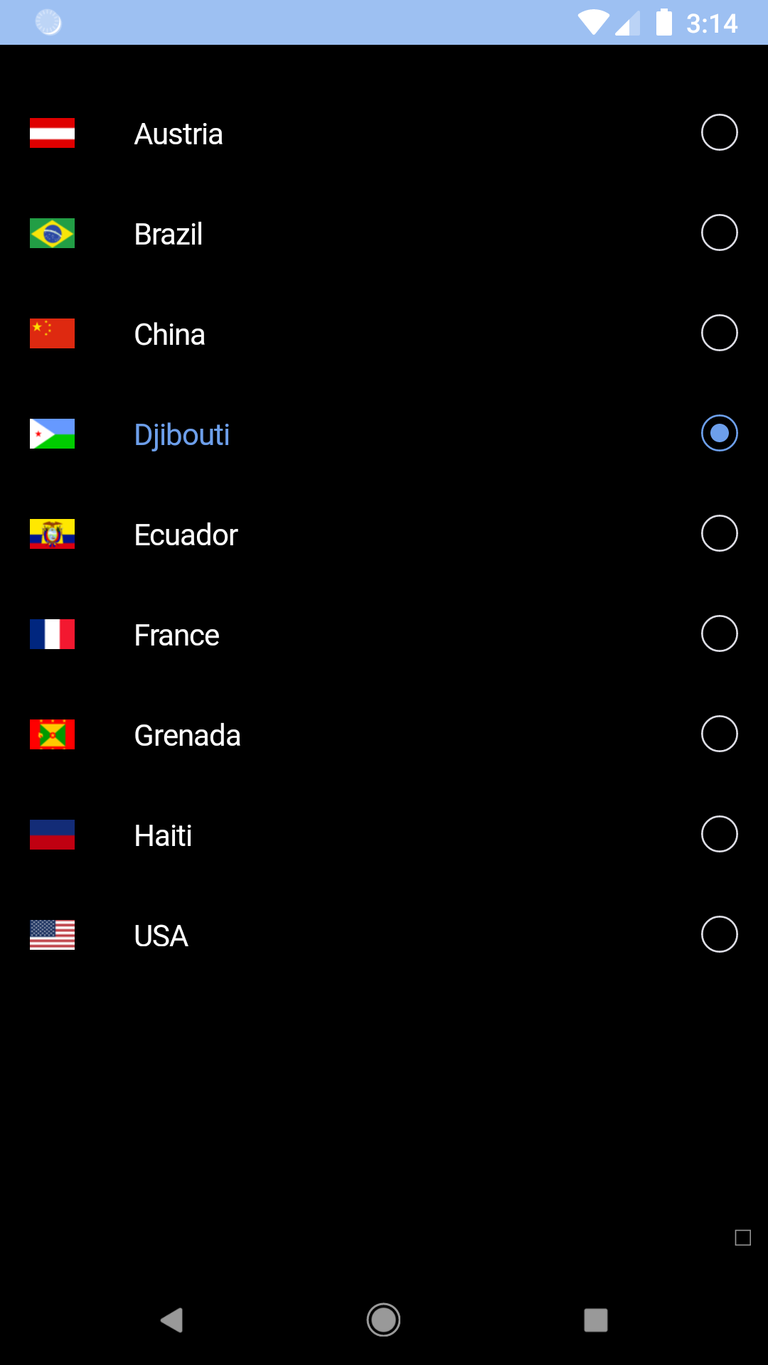
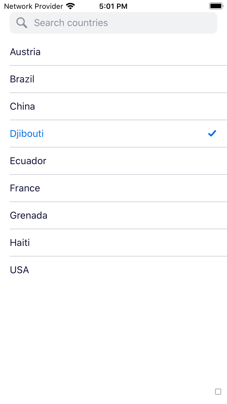
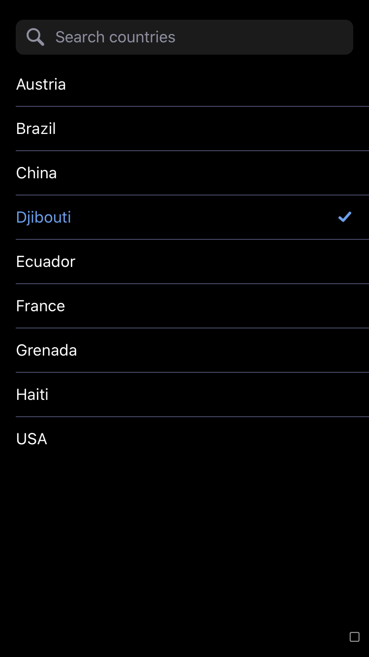
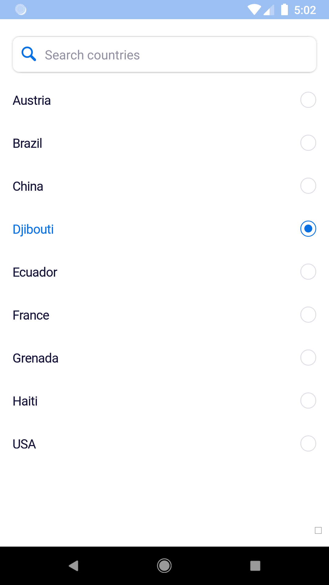
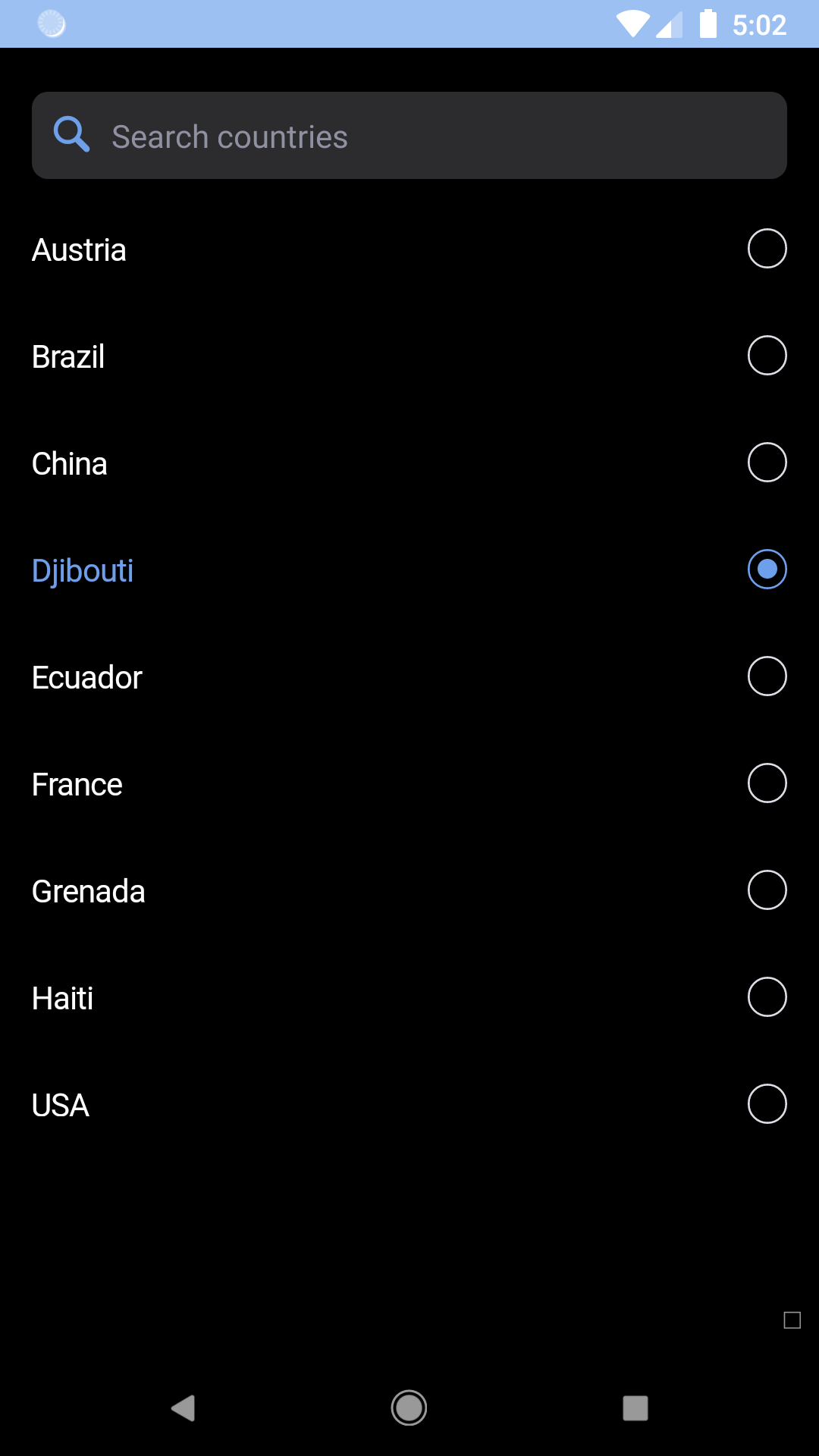
Flat list
The flat list component can be used to display content in the form of a tappable list.
bpk-component-flat-list
Backpack React Native flat list component.
Default
| Day | Night |
|---|---|
 |
 |
 |
 |
With images
| Day | Night |
|---|---|
 |
 |
 |
 |
With search
| Day | Night |
|---|---|
 |
 |
 |
 |
Installation
Check the main Readme for a complete installation guide.
Usage
                                                import React, { Component } from 'react';
                                                import { Image } from 'react-native';
                                                import BpkFlatList, {
                                                  BpkFlatListItem,
                                                  BpkFlatListItemSeparator,
                                                  BpkFlatListSearchField,
                                                  BpkFlatListNoResultsText,
                                                  } from 'backpack-react-native/bpk-component-flat-list';

                                                const COUNTRIES = [
                                                  { id: 'DZ', name: 'Algeria' },
                                                  { id: 'CA', name: 'Canada' },
                                                  { id: 'CD', name: 'Democratic Republic of the Congo' },
                                                  { id: 'IT', name: 'Italy' },
                                                  { id: 'JP', name: 'Japan' },
                                                  { id: 'SE', name: 'Sweden' },
                                                  { id: 'GB', name: 'United Kingdom' },
                                                ];

                                                const FLAG_IMAGES = {
                                                  'DZ': '/resources/algeria.png',
                                                  'CA': '/resources/canada.png',
                                                  'CD': '/resources/drcongo.png',
                                                  'IT': '/resources/italy.png',
                                                  'JP': '/resources/japan.png',
                                                  'SE': '/resources/sweden.png',
                                                  'GB': '/resources/uk.png',
                                                };

                                                export default class App extends Component {
                                                  constructor() {
                                                    super();
                                                    this.itemOnPressCallbacks = {};
                                                  }

                                                  getItemOnPressCallback = countryId => {
                                                    this.itemOnPressCallbacks[countryId] =
                                                      this.itemOnPressCallbacks[countryId] ||
                                                      (() => console.log(countryId));
                                                    return this.itemOnPressCallbacks[countryId];
                                                  };

                                                  renderItem = ({ country }) => (
                                                    <BpkFlatListItem
                                                      key={country.id}
                                                      title={country.name}
                                                      image={<Image source={require(FLAG_IMAGES[country.id])} />}
                                                      onPress={this.getItemOnPressCallback(country.id)}
                                                      titleProps={{ weight: 'regular' }}
                                                    />
                                                  );

                                                  filterItems = text => {
                                                    // Logic to filter the data based on user input.
                                                  }

                                                  render() {
                                                    return (
                                                      <BpkFlatList
                                                        data={COUNTRIES}
                                                        renderItem={this.renderItem}
                                                        ItemSeparatorComponent={BpkFlatListItemSeparator}
                                                        ListHeaderComponent={
                                                          <BpkFlatListSearchField
                                                            placeholder="Search countries"
                                                            onChangeText={this.filterItems}
                                                          />
                                                        }
                                                        ListEmptyComponent={
                                                          <BpkFlatListNoResultsText>No results</BpkFlatListNoResultsText>
                                                        }
                                                      />
                                                    );
                                                  }
                                                }
Props
BpkFlatList
Inherits all props from React Native's FlatList component.
BpkFlatListItem
| Property | PropType | Required | Default Value |
|---|---|---|---|
| onPress | func | true | - |
| title | string | true | - |
| image | element | false | null |
| selected | bool | false | false |
| titleProps | object | false | {} |
titleProps
titleProps is passed down to the BpkText used for the title. It accepts anything that React Native's Text component does.
BpkFlatListItemSeparator
Use this as the value for ItemSeparatorComponent.
No props.
BpkFlatListSearchField
This can be used as the value for ListHeaderComponent to allow users to search the list.
It's an instance of React Native's TextInput component and accepts the same props.
BpkFlatListNoResultsText
Use this as the value for ListEmptyComponent. It's generally only needed when the list can be searched.
| Property | PropType | Required | Default Value |
|---|---|---|---|
| children | Node | true | - |
Theme Props
- flatListSelectedItemColor
Made with ❤️ by Skyscanner © 2024
© 2024 Skyscanner Backpack. Page last updated on Oct 28, 2022, 16:00