- Welcome
- Getting started
- Latest updates
- Foundations
-
Components
- Accordion
- Alert
- Alignment
- App Search Modal
- Aria live
- Autosuggest
- Badge
- Banner alert
- Bar chart
- Blockquote
- Bottom navigation
- Bottom sheet
- Breadcrumb
- Breakpoint
- Button
- Calendar
- Card
- Card list
- Card button
- Carousel
- Checkbox
- Chip
- Chip group
- Code
- Content cards
- Data Table
- Datepicker
- Description list
- Dialog
- Divider
- Drawer
- Field Set
- Flare
- Flat list
- Flight leg
- Floating action button
- Floating notification
- Form label
- Form validation
- Graphic promotion
- Horizontal navigation
- Icon
- Image
- Image Gallery
- Infinite scroll
- Info Banner
- Inset Banner
- Link
- List
- Map
- Mobile scroll container
- Modal
- Navigation bar
- Navigation Tab Group
- Nudger
- Overlay
- Page indicator
- Pagination
- Panel
- Phone input
- Picker
- Popover
- Price
- Progress bar
- Radio button
- Rating
- Rating Bar
- Scrollable calendar
- Search Modal
- Section header
- Section list
- Select
- Skeleton
- Skip link
- Slider
- Snackbar
- Snippet
- Spinner
- Split input
- Star rating
- Swap Button
- Switch
- Table
- Text
- Text input
- Theming
- Ticket
- Toast
- Tooltip
- Touchable native feedback
- Touchable overlay
- Search Input Summary
- Content
- Accessibility
- Contributing
- Localisation
Star rating
Star Ratings are used for displaying a score within a given range.
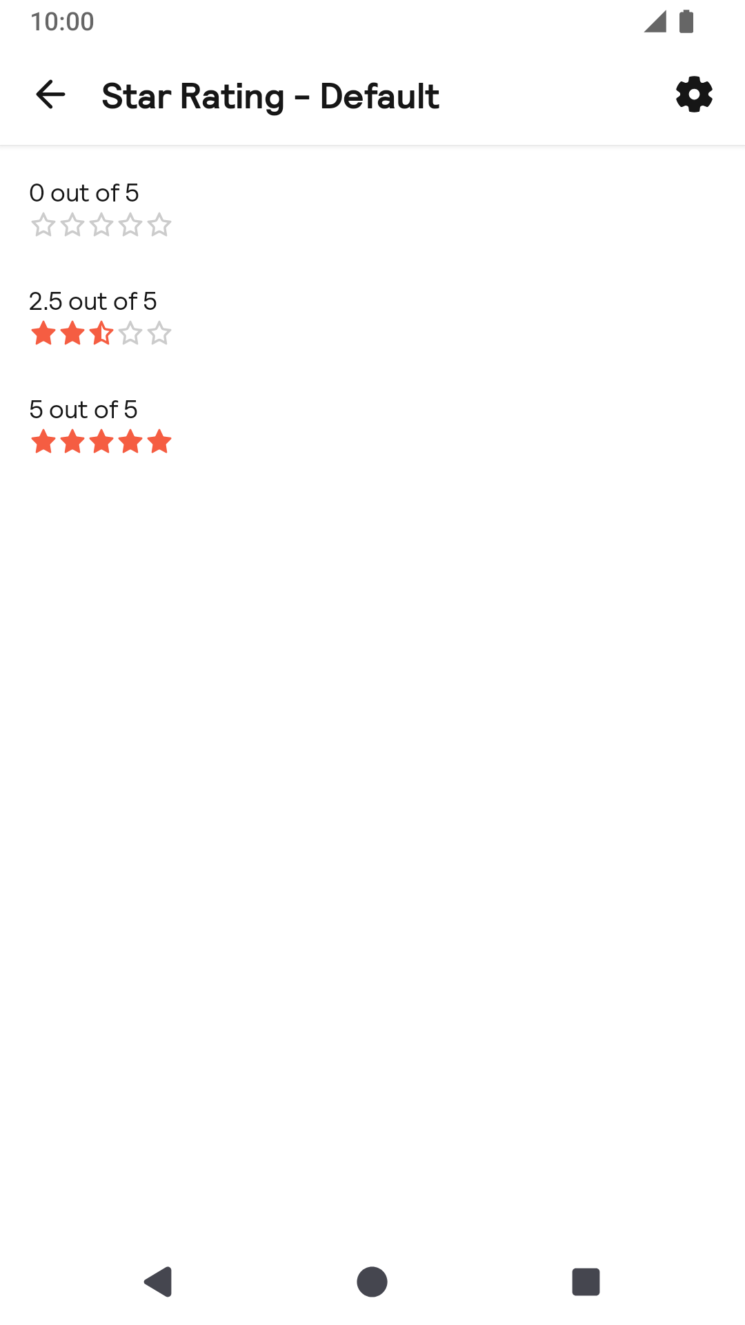
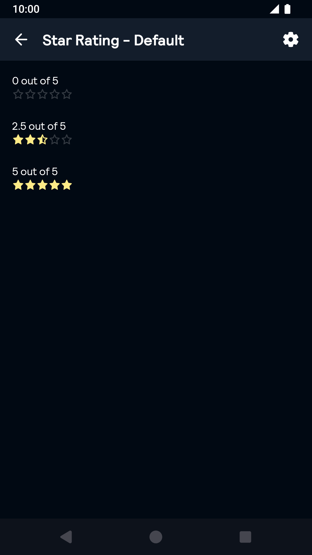
Star Rating

Default
| Day | Night |
|---|---|
 |
 |
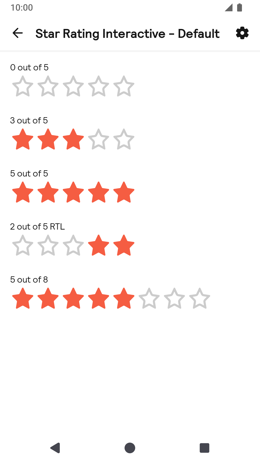
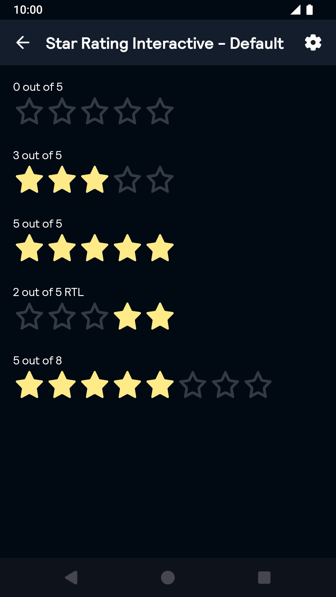
Interactive
| Day | Night |
|---|---|
 |
 |
Installation
Backpack Android is available through Maven Central. Check the main Readme for a complete installation guide.
Usage
The Star Rating component can be used in both XML and Kotlin/Java
Example of a Star Rating in XML
                                                <net.skyscanner.backpack.starrating.BpkStarRating
                                                  android:layout_width="wrap_content"
                                                  android:layout_height="wrap_content"
                                                  app:rounding="up"
                                                  app:maxRating="5"
                                                  app:rating="2.5" />
Example of an interactive Star Rating in XML
                                                <net.skyscanner.backpack.starrating.BpkInteractiveStarRating
                                                  android:layout_width="wrap_content"
                                                  android:layout_height="wrap_content"
                                                  app:rounding="up"
                                                  app:maxRating="5"
                                                  app:rating="2.5" />
Example of a Star Rating in Kotlin
                                                import net.skyscanner.backpack.starrating.BpkStarRating
                                                import net.skyscanner.backpack.starrating.RoundingType

                                                BpkStarRating(context).apply {
                                                  maxRating = 5
                                                  rating = 2.5f
                                                  rounding = RoundingType.Up
                                                }
Example of an interactive Star Rating in Kotlin
                                                import net.skyscanner.backpack.starrating.BpkInteractiveStarRating
                                                import net.skyscanner.backpack.starrating.RoundingType

                                                BpkInteractiveStarRating(context).apply {
                                                  maxRating = 5
                                                  rating = 2.5f
                                                  rounding = RoundingType.Up
                                                  onRatingChangedListener = { current, max ->
                                                  }
                                                }
Props
| Property | Type | Default Value |
|---|---|---|
| maxRating | Int | 5 |
| rating | Float | maxRating / 2 |
| rounding | RoundingType | RoundingType.DOWN |
| accessibilityStatus | String resource | - |
Theme Props
- starColor
- starFilledColor
Styles can be changed globally through bpkStarRatingStyle or bpkInterativeStarRatingStyle. Check theming for more information.
Accessibility
To ensure this component is accessible set a contentDescription for the component, unless there is a label indicating the rating available. For simpler logic you can also set accessibilityStatusRes in both XML and Kotlin/Java to announce x out of y.
The string resource needs to contain a %f and %d placeholder:
<string name="star_rating_accessibility_status">%.0f out of %d</string>If both contentDescription and accessibilityStatusRes are set the contentDescription will be appended to the accessibility status to match status description behaviour.
Made with ❤️ by Skyscanner © 2024
© 2024 Skyscanner Backpack. Page last updated on Feb 8, 2023, 09:32