- Welcome
- Getting started
- Latest updates
- Foundations
-
Components
- Accordion
- Alert
- Alignment
- App Search Modal
- Aria live
- Autosuggest
- Badge
- Banner alert
- Bar chart
- Blockquote
- Bottom navigation
- Bottom sheet
- Breadcrumb
- Breakpoint
- Button
- Calendar
- Card
- Card list
- Card button
- Carousel
- Checkbox
- Chip
- Chip group
- Code
- Content cards
- Data Table
- Datepicker
- Description list
- Dialog
- Divider
- Drawer
- Field Set
- Flare
- Flat list
- Flight leg
- Floating action button
- Floating notification
- Form label
- Form validation
- Graphic promotion
- Horizontal navigation
- Icon
- Image
- Image Gallery
- Infinite scroll
- Info Banner
- Inset Banner
- Link
- List
- Map
- Mobile scroll container
- Modal
- Navigation bar
- Navigation Tab Group
- Nudger
- Overlay
- Page indicator
- Pagination
- Panel
- Phone input
- Picker
- Popover
- Price
- Progress bar
- Radio button
- Rating
- Rating Bar
- Scrollable calendar
- Search Modal
- Section header
- Section list
- Select
- Skeleton
- Skip link
- Slider
- Snackbar
- Snippet
- Spinner
- Split input
- Star rating
- Swap Button
- Switch
- Table
- Text
- Text input
- Theming
- Ticket
- Toast
- Tooltip
- Touchable native feedback
- Touchable overlay
- Search Input Summary
- Content
- Accessibility
- Contributing
- Localisation
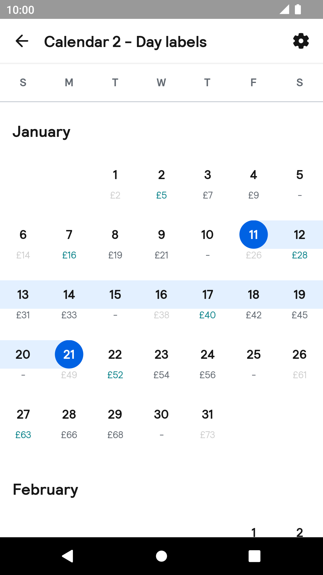
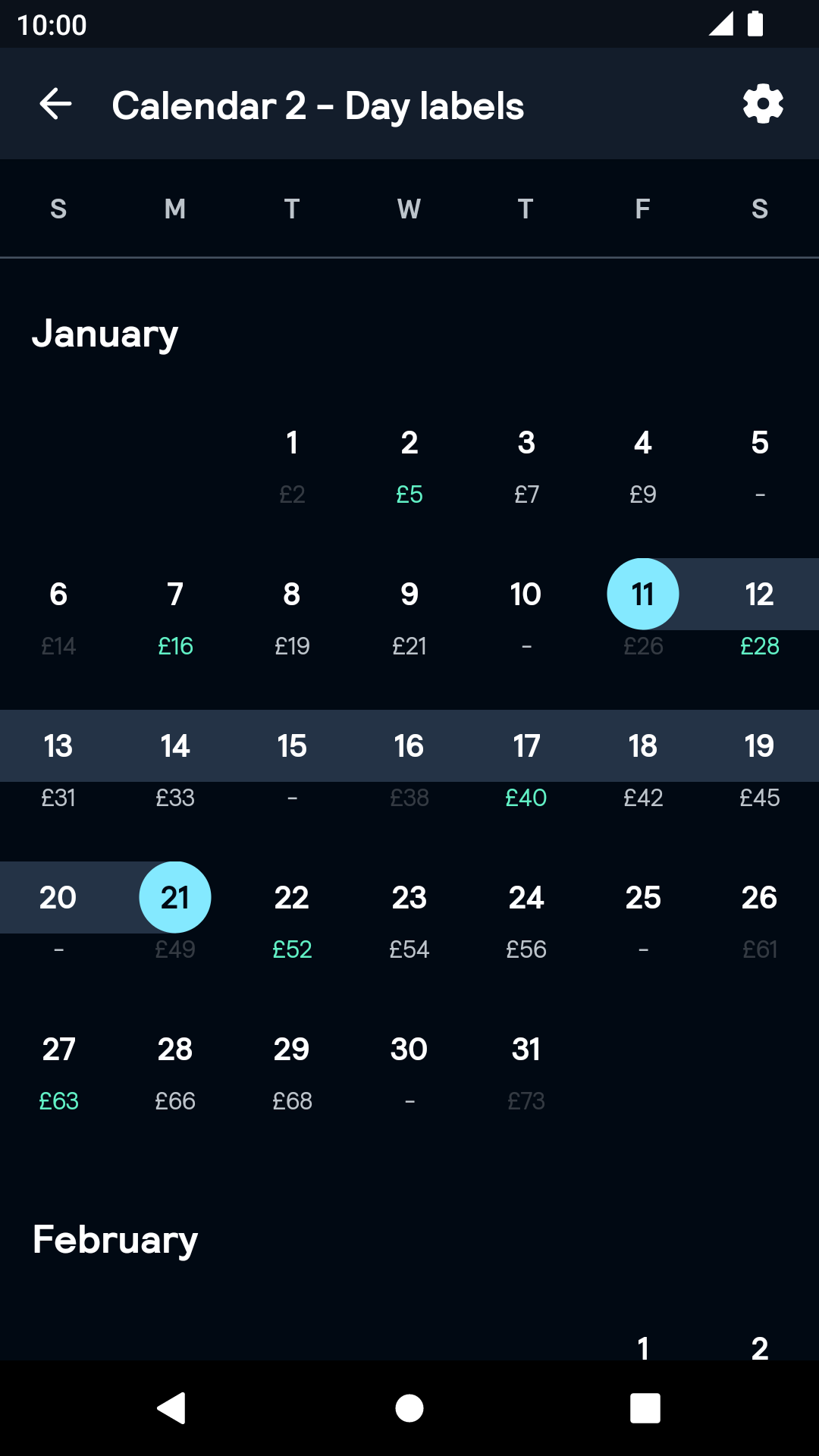
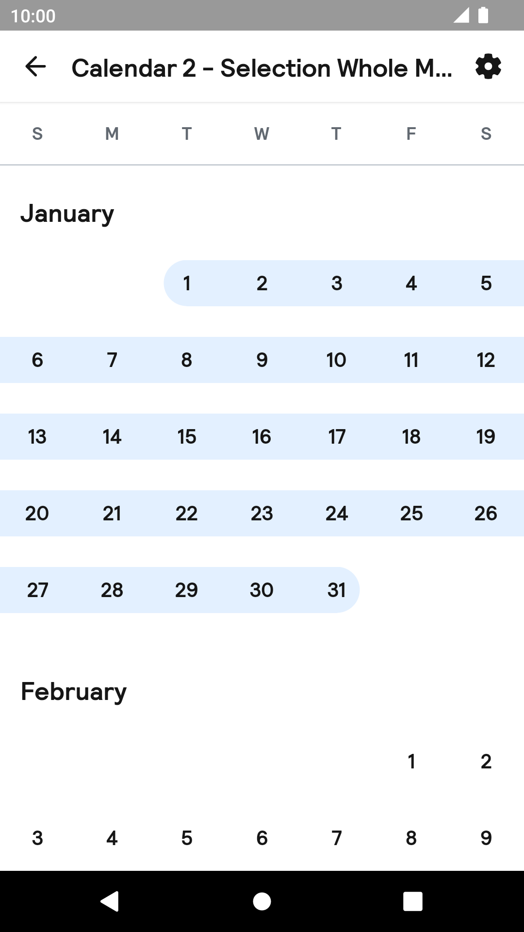
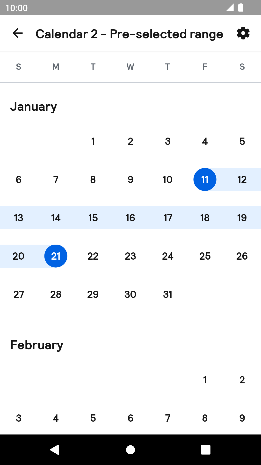
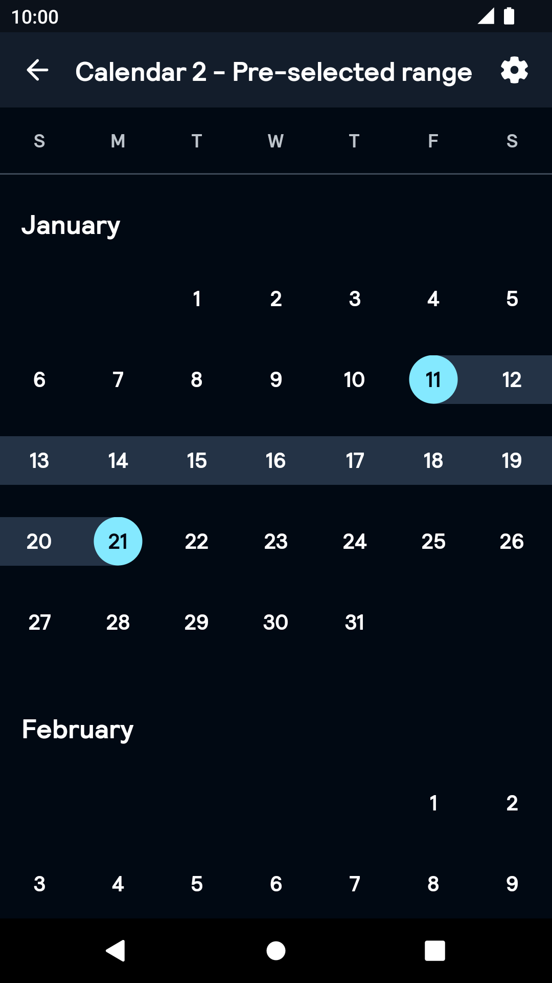
Calendar
Calendars are used for date selection within a defined time period.
Calendar

Labeled
| Day | Night |
|---|---|
 |
 |
Month
| Day | Night |
|---|---|
 |
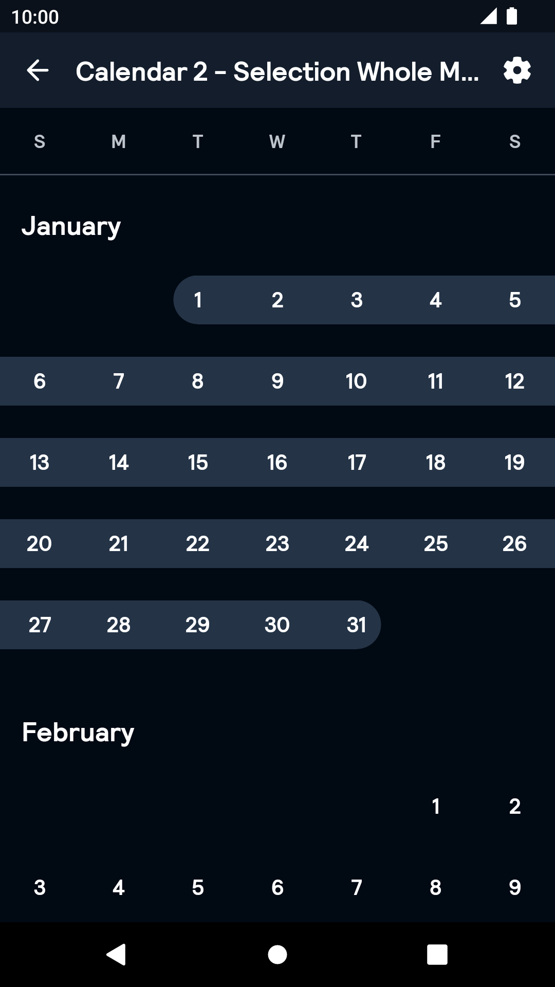 |
Range
| Day | Night |
|---|---|
 |
 |
Installation
Backpack Android is available through Maven Central. Check the main Readme for a complete installation guide.
The calendar implementation relies on the Android adaptation of the JSR-310 backport for dealing with dates: ThreeTenABP
Add the following line in your base module's Gradle script:
implementation 'com.jakewharton.threetenabp:threetenabp:$latestVersion'Usage
NOTE: The docs for the previous version of Calendar is available here.
Be sure to initialize the ThreeTenABP library according to their usage guidelines in your Application's context:
                                                override fun onCreate() {
                                                  super.onCreate()
                                                  AndroidThreeTen.init(this)
                                                }
BpkCalendar uses coroutines under the hood. Since it designed with coroutines, the API is designed primarily for Kotlin language and may not be interoperable with Java. To use the API, make sure kotlinx-coroutines is included to your project.
BpkCalendar is designed as a state machine. All the information it contains is available as a state in the StateFlow. Each method of the public API and some of the user interactions will change its state and emit it.
The Calendar component can be used in both XML and Kotlin, but requires the basic setup to be done in Kotlin. Both single and range selection are supported.
Example of a calendar declaration in XML
NOTE: Note that the package name of new Calendar has been changed to net.skyscanner.backpack.calendar2.
                                                <net.skyscanner.backpack.calendar2.BpkCalendar
                                                    android:id="@+id/bpkCalendar"
                                                    android:layout_width="match_parent"
                                                    android:layout_height="match_parent"
                                                    android:nestedScrollingEnabled="true"/>
Example of a declaration in Kotlin
                                                import net.skyscanner.backpack.calendar2.BpkCalendar

                                                BpkCalendar(context)
Once you've declared the calendar, you need to setup it like following:
                                                calendar.setParams(
                                                  CalendarParams(
                                                    range = LocalDate.of(2019, 1, 2)..LocalDate.of(2019, 12, 31), // start and end dates in the range
                                                    selectionMode = CalendarParams.SelectionMode.Single, // selection mode - can be Single, Dates, Months or Disabled
                                                  )
                                                )
Now the component is ready. You can listen for the selection change using its state:
                                                calendar
                                                  .state
                                                  .map { it.selection }
                                                  .onEach { selection ->
                                                    when (selection) {
                                                      is CalendarSelection.None -> showToast("No date is selected")
                                                      is CalendarSelection.Single -> showToast("${selection.date} is selected")
                                                      is CalendarSelection.Dates -> showToast("${selection.start} to {${selection.end} is selected")
                                                      is CalendarSelection.Month -> showToast("${selection.month} is selected")
                                                    }
                                                  }
                                                  .launchIn(myCoroutineScope)
Advanced dates customisation
You can attach some of the information to each date displayed in calendar. This information will update its appearance and behaviour.
In order to do this, specify cellInfo parameters like shown here:
                                                calendar.setParams(
                                                  CalendarParams(
                                                    range = range,
                                                    selectionMode = selectionMode,
                                                    cellsInfo = mapOf(
                                                      LocalDate.of(2019, 1, 2) to CellInfo(
                                                        disabled = true, // marks date as disabled
                                                        status = CellStatus.Positive, // adds green colour to cell, you can use Neutral, Negative, Empty and null as well
                                                        label = "£30", // adds label below the date
                                                      ),
                                                    )
                                                  )
                                                )
Theme Props
- calendarDateSelectedBackgroundColor
- calendarDateSelectedRangeBackgroundColor
- calendarDateSelectedTextColor
- calendarDateSelectedSameDayBackgroundColor
Styles can be changed globally through bpkCalendarStyle. Check theming for more information.
Made with ❤️ by Skyscanner © 2024
© 2024 Skyscanner Backpack. Page last updated on Oct 31, 2022, 13:14