- Welcome
- Getting started
- Latest updates
- Foundations
-
Components
- Accordion
- Alert
- Alignment
- App Search Modal
- Aria live
- Autosuggest
- Badge
- Banner alert
- Bar chart
- Blockquote
- Bottom navigation
- Bottom sheet
- Breadcrumb
- Breakpoint
- Button
- Calendar
- Card
- Card list
- Card button
- Carousel
- Checkbox
- Chip
- Chip group
- Code
- Content cards
- Data Table
- Datepicker
- Description list
- Dialog
- Divider
- Drawer
- Field Set
- Flare
- Flat list
- Flight leg
- Floating action button
- Floating notification
- Form label
- Form validation
- Graphic promotion
- Horizontal navigation
- Icon
- Image
- Image Gallery
- Infinite scroll
- Info Banner
- Inset Banner
- Link
- List
- Map
- Mobile scroll container
- Modal
- Navigation bar
- Navigation Tab Group
- Nudger
- Overlay
- Page indicator
- Pagination
- Panel
- Phone input
- Picker
- Popover
- Price
- Progress bar
- Radio button
- Rating
- Rating Bar
- Scrollable calendar
- Search Modal
- Section header
- Section list
- Select
- Skeleton
- Skip link
- Slider
- Snackbar
- Snippet
- Spinner
- Split input
- Star rating
- Swap Button
- Switch
- Table
- Text
- Text input
- Theming
- Ticket
- Toast
- Tooltip
- Touchable native feedback
- Touchable overlay
- Search Input Summary
- Content
- Accessibility
- Contributing
- Localisation
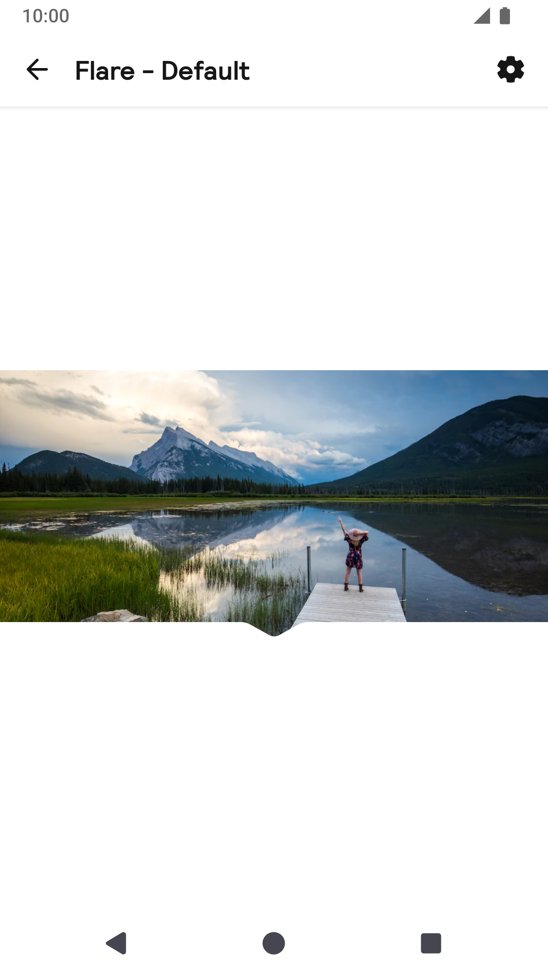
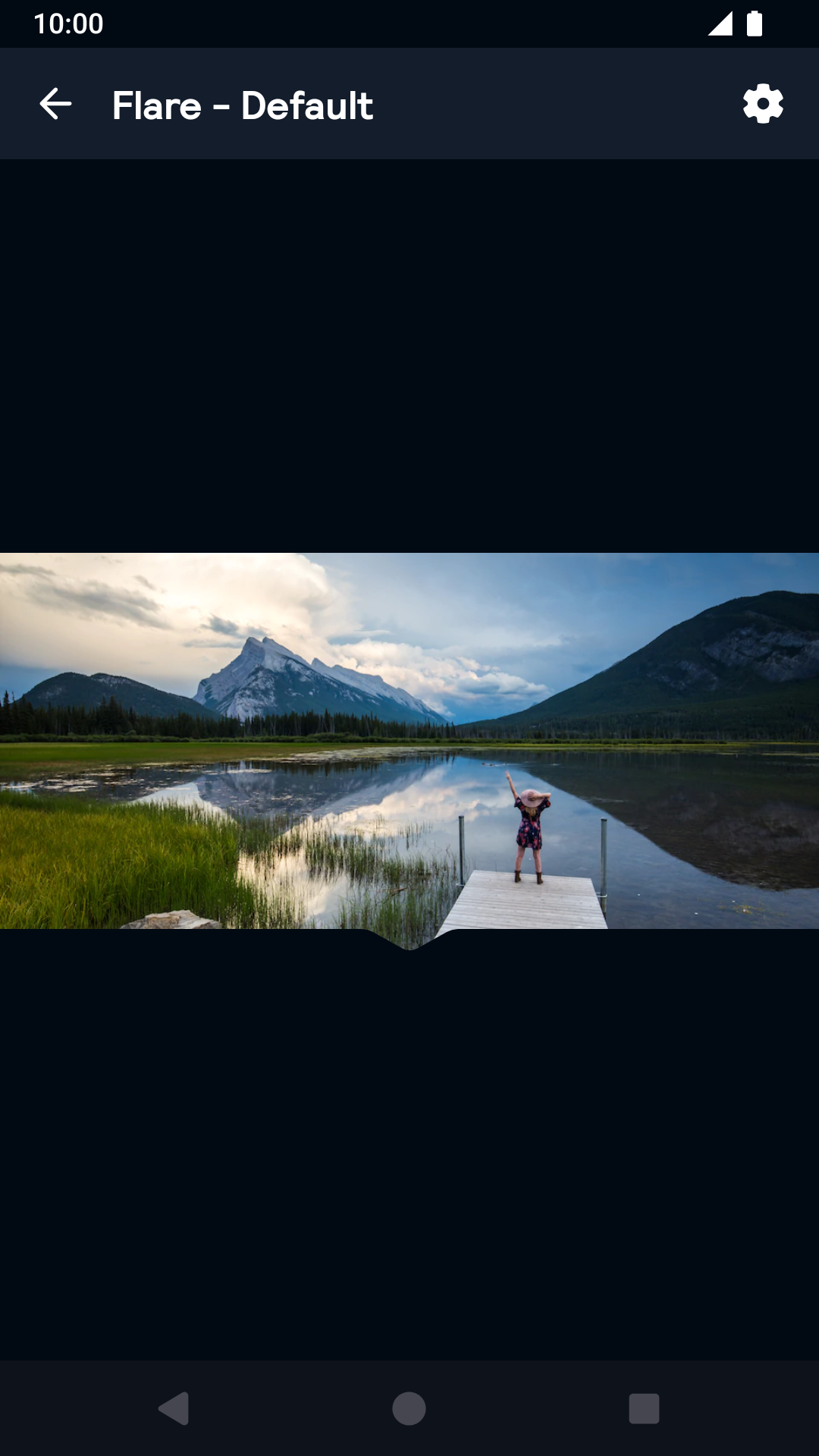
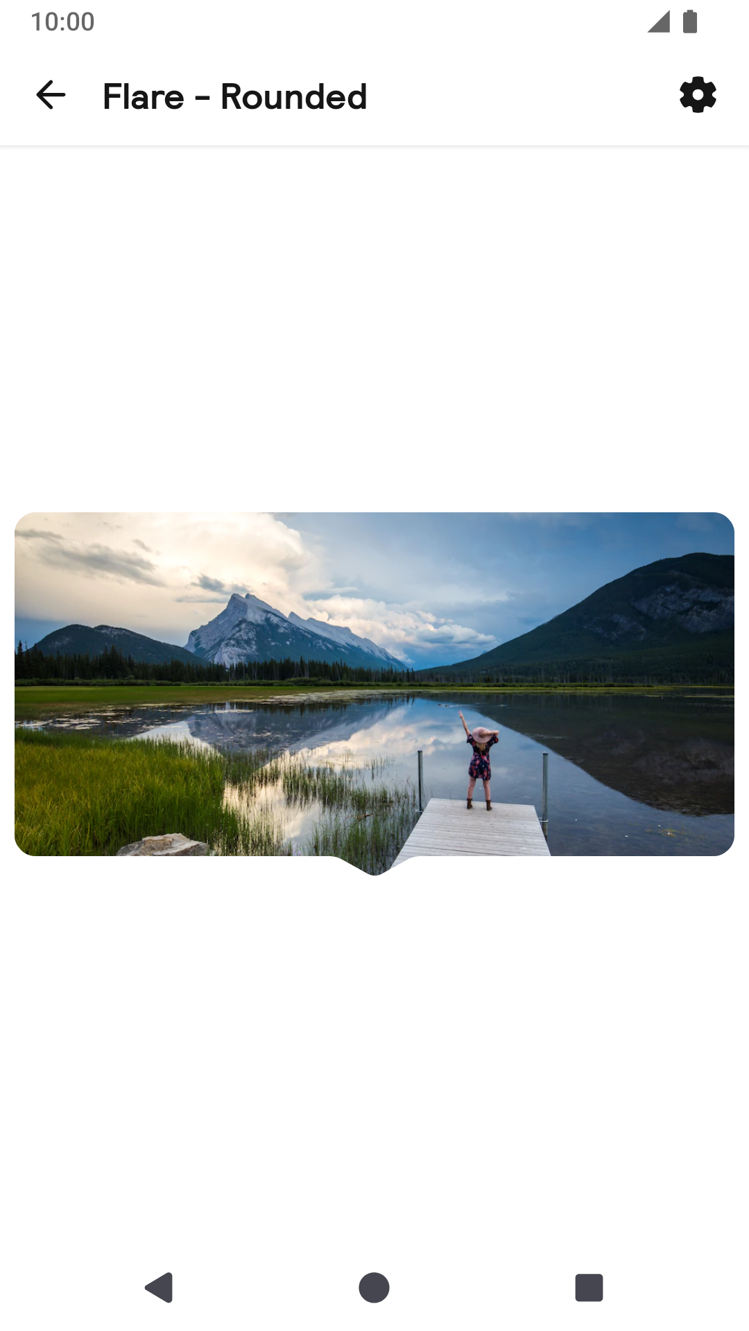
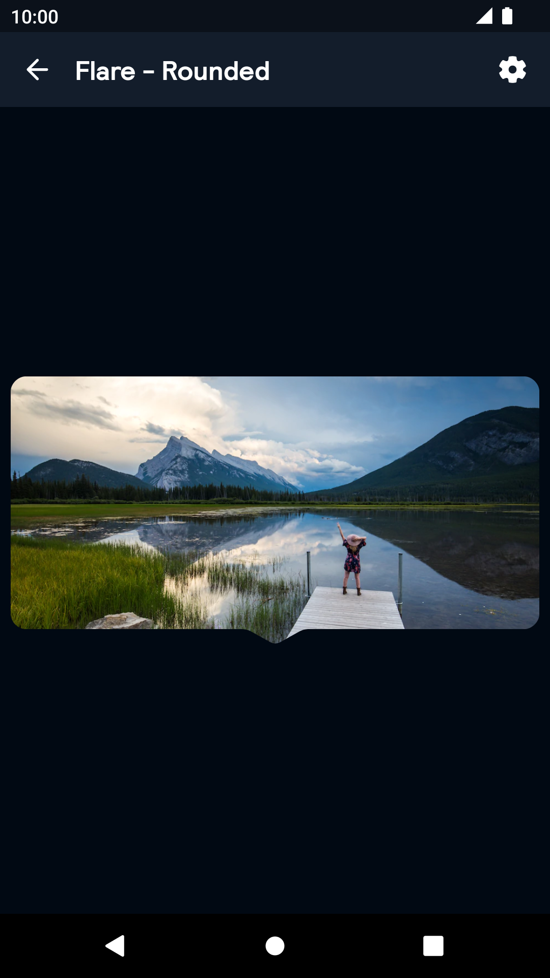
Flare
The flare enables you to display content with a pointer to directional content.
Flare

| Day | Night |
|---|---|
 |
 |
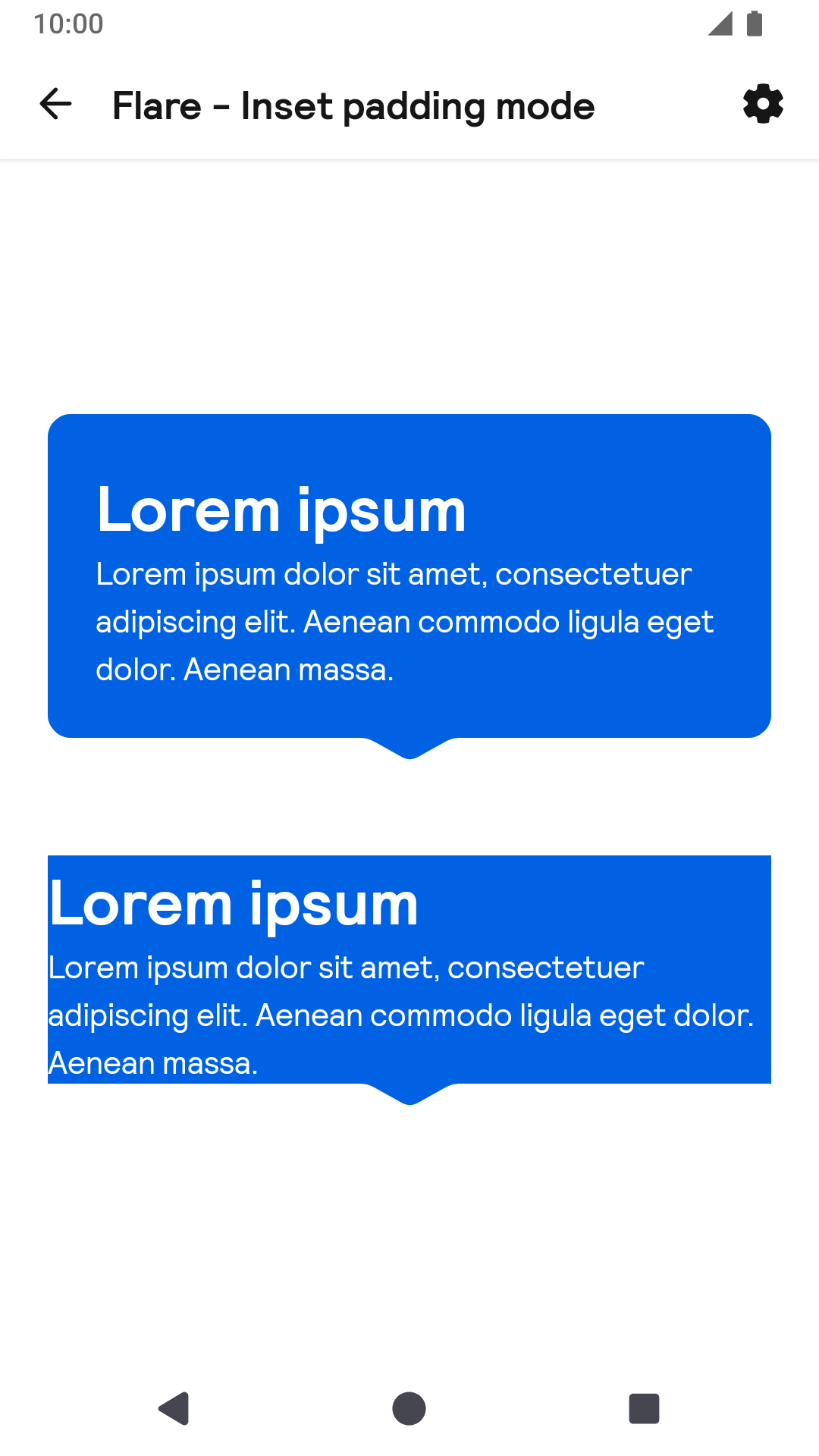
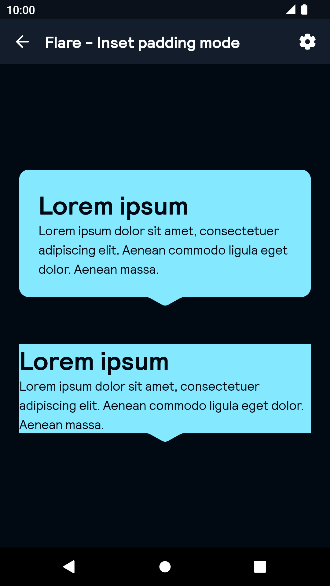
Inset padding
| Day | Night |
|---|---|
 |
 |
Pointer offset
| Day | Night |
|---|---|
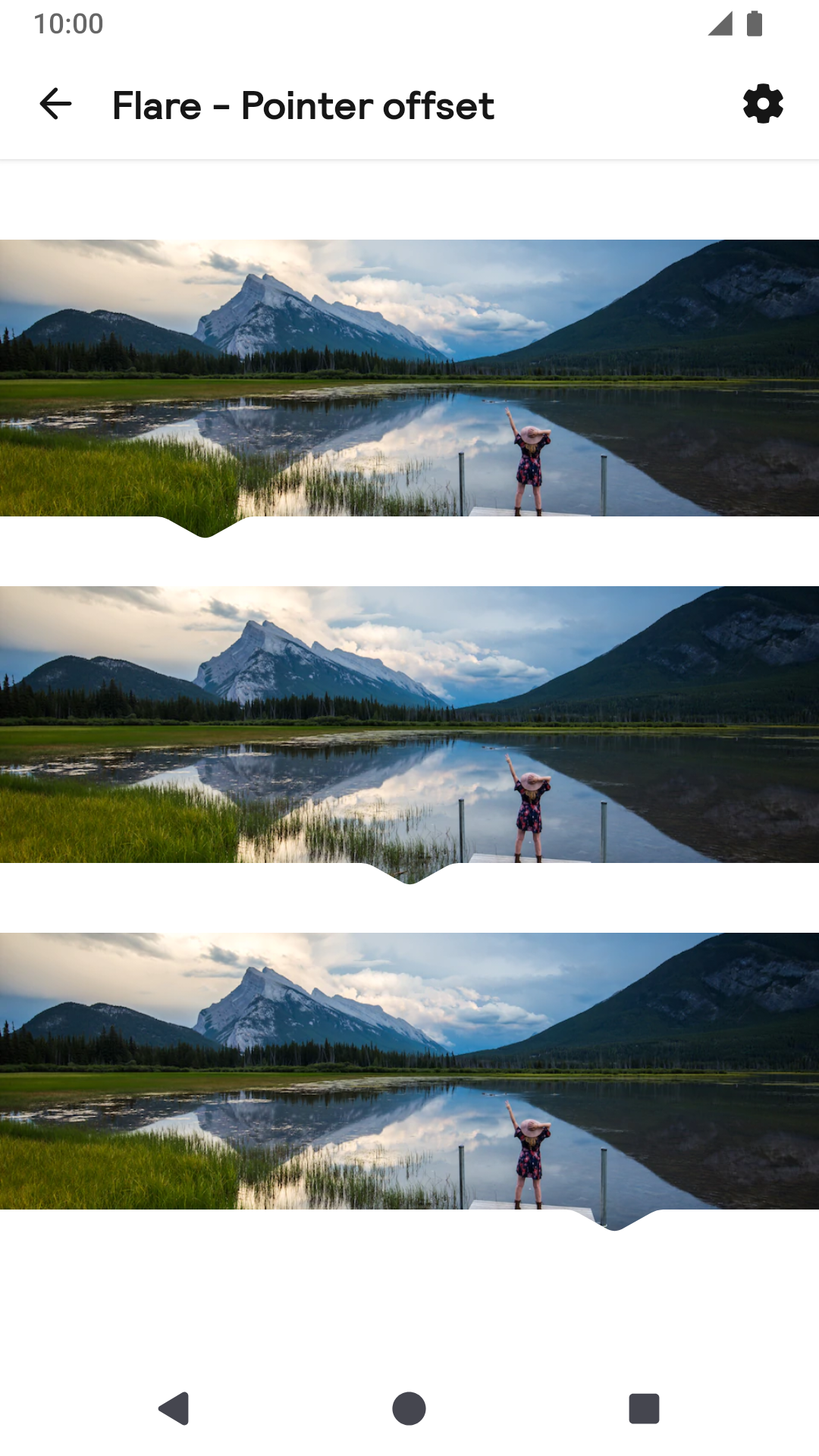 |
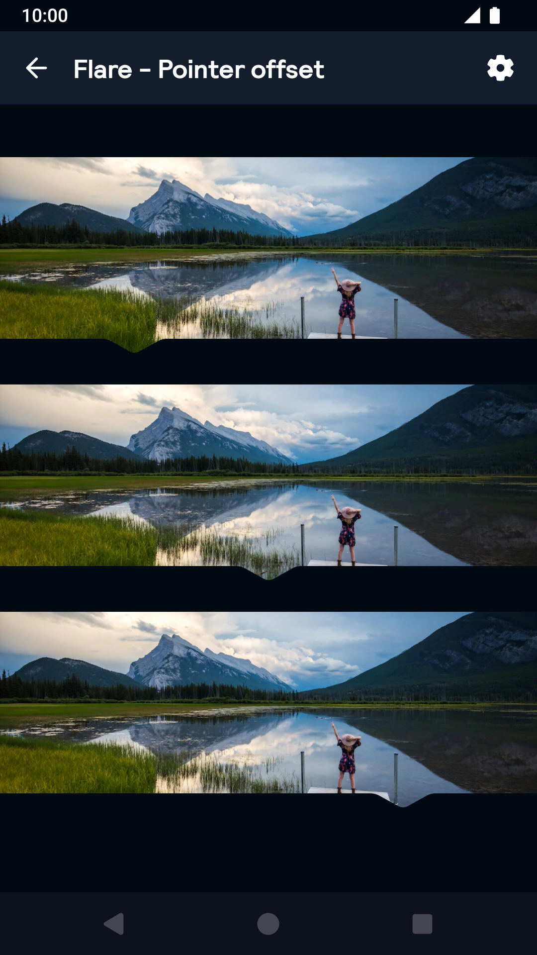 |
Pointing up
| Day | Night |
|---|---|
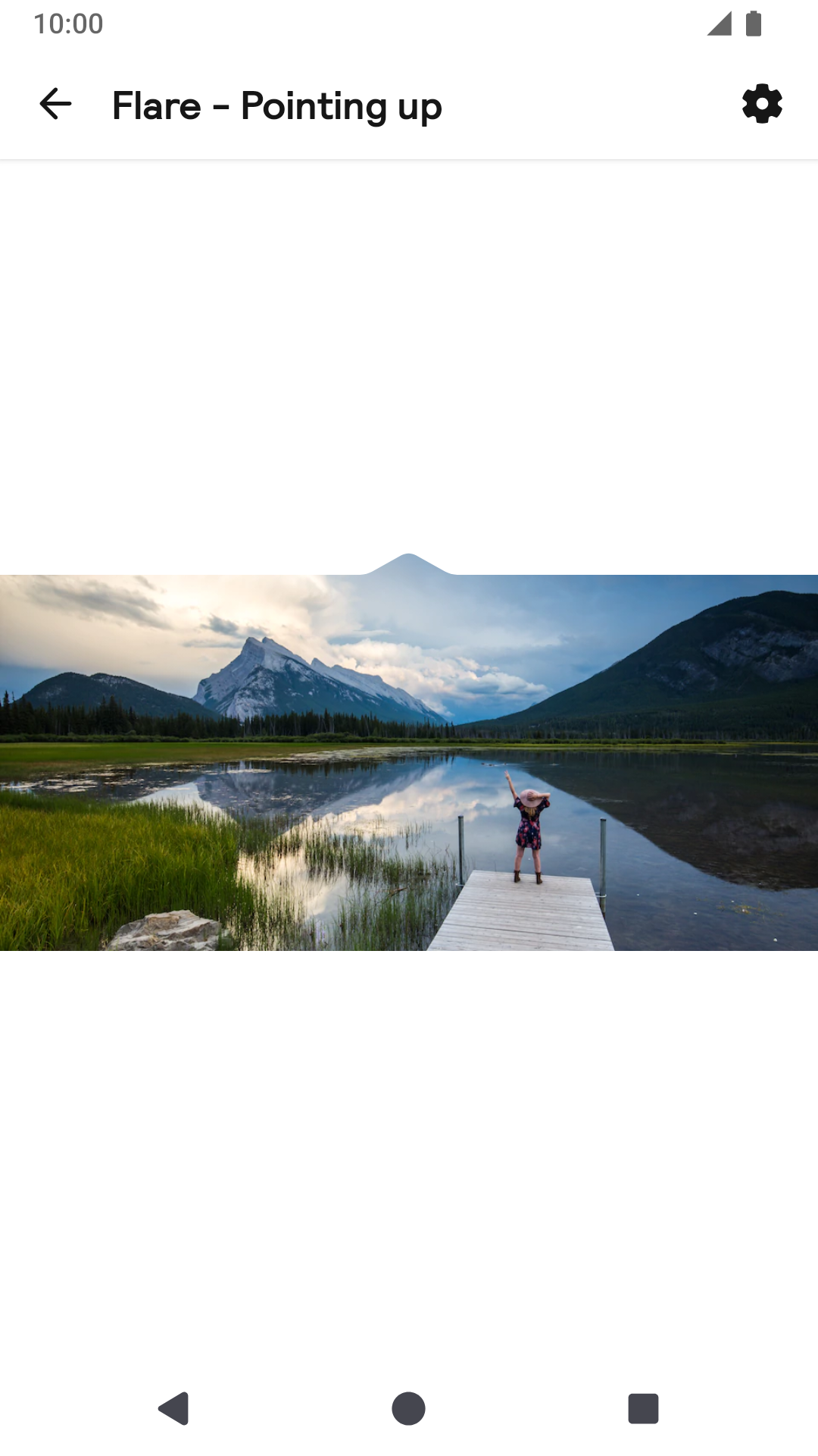 |
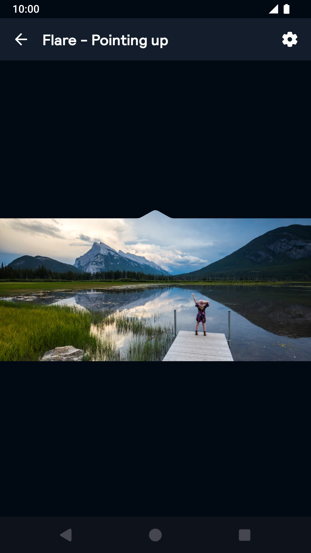 |
Rounded
| Day | Night |
|---|---|
 |
 |
Installation
Backpack Android is available through Maven Central. Check the main Readme for a complete installation guide.
Usage
The Flare component can be used in both XML and Kotlin/Java
Example of a Flare in XML
                                                <net.skyscanner.backpack.flare.BpkFlare
                                                  android:layout_width="wrap_content"
                                                  android:layout_height="200dp"
                                                  android:layout_marginBottom="@dimen/bpkSpacingMd"
                                                  app:flarePointerPosition="middle"
                                                  app:flarePointerDirection="down"
                                                  app:flareRound="false"
                                                  app:flareInsetPaddingMode="none">

                                                    <ImageView
                                                      android:layout_width="wrap_content"
                                                      android:layout_height="wrap_content"
                                                      android:scaleType="centerCrop"
                                                      app:srcCompat="@drawable/canadian_rockies_canada"/>
                                                </net.skyscanner.backpack.flare.BpkFlare>
Example of a Flare in Kotlin
                                                import android.widget.ImageView
                                                import android.view.ViewGroup
                                                import net.skyscanner.backpack.flare.BpkFlare

                                                BpkFlare(context).apply {
                                                  layoutParams = ViewGroup.LayoutParams(300, 100)
                                                  pointerPosition = BpkFlare.PointerPosition.MIDDLE
                                                  flarePointerDirection = BpkFlare.PointerDirection.DOWN
                                                  insetPaddingMode = BpkFlare.InsetPaddingMode.NONE
                                                  round = false
                                                  addView(ImageView(contenxt).apply {
                                                    setImageDrawable(AppCompatResources.getDrawable(context, R.drawable.canadian_rockies_canada))
                                                    layoutParams = ViewGroup.LayoutParams(ViewGroup.LayoutParams.WRAP_CONTENT, ViewGroup.LayoutParams.WRAP_CONTENT)
                                                    scaleType = ImageView.ScaleType.CENTER_CROP
                                                  })
                                                }
Attributes
flarePointerPosition: middle|start|end
- Determines where the flare is rendered horizontally.
flarePointerDirection: down|up
- Determines where the pointer is rendered vertically and the direction it will be pointing to.
flareInsetPaddingMode: none|bottom|top
- Determines where to add extra padding to account for the pointer size. To render the flare view we cut out part of the canvas, if you intend to add, for example, a text view to the top of the flare view with a flare pointing up, you should set this prop to top or part of the text will be cut off.
flareRound: Boolean
- When true will render the flare with rounded corners.
Made with ❤️ by Skyscanner © 2024
© 2024 Skyscanner Backpack. Page last updated on Oct 31, 2022, 13:17