Text Field

Default
| Day | Night |
|---|---|
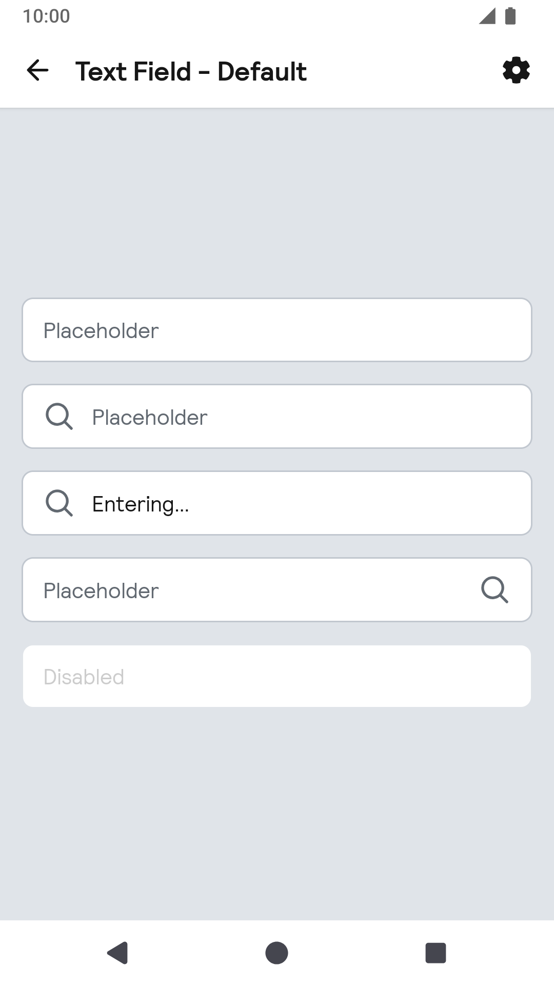 |
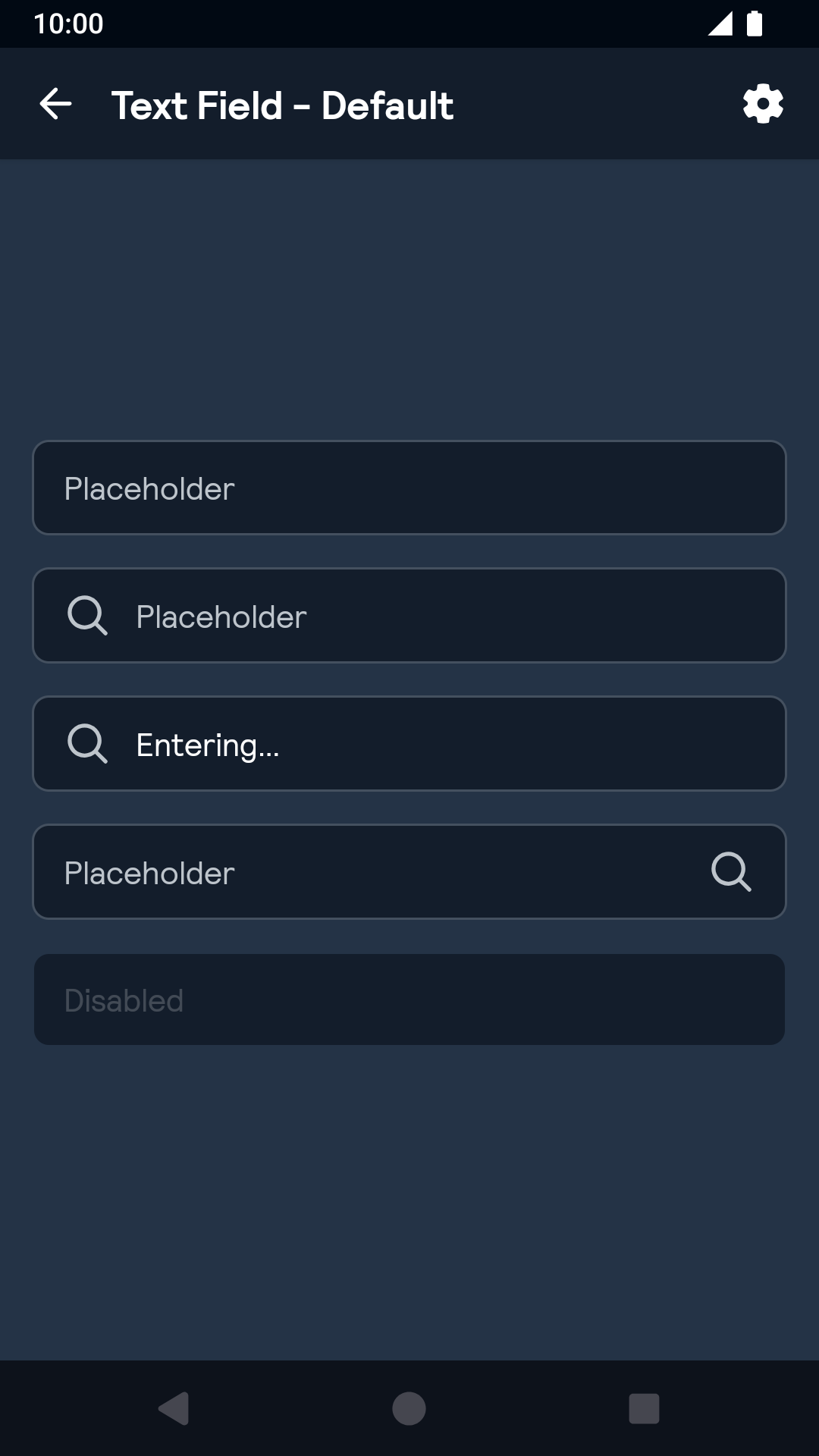 |
Labels
| Day | Night |
|---|---|
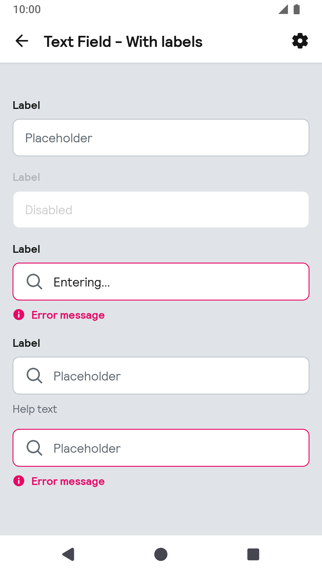 |
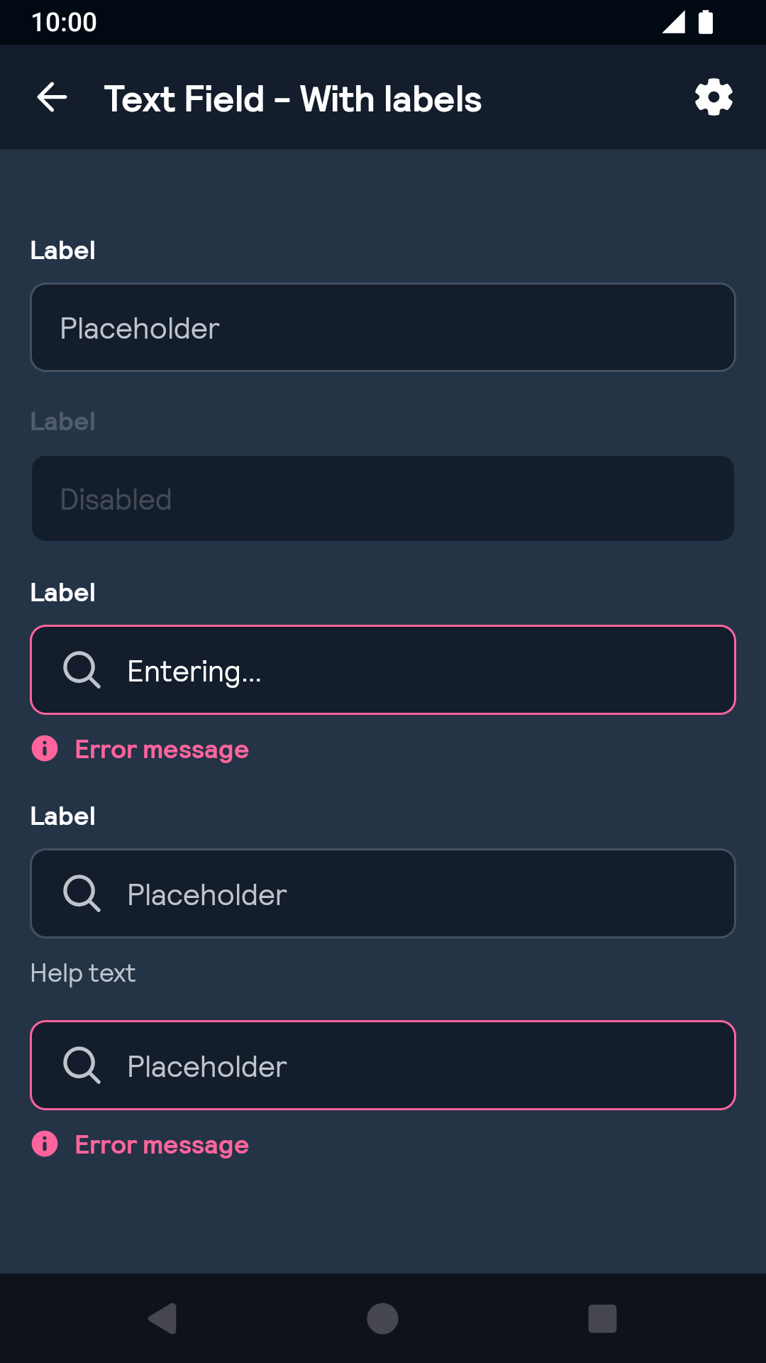 |
Installation
Backpack Android is available through Maven Central. Check the main Readme for a complete installation guide.
Usage
The Text Field component can be used in both XML and Kotlin
Example of a text field with icon on start in XML:
Example of a text field with icon on start in Kotlin:
To add a label and/or a helper or error message you can use the BpkTextInputLayout:
Example of a text layout with label, error and helper text:
Example of a text layout with label, error and helper text:
Note: If both error message and helper text are supplied the error message takes precedence.
By default the error view has a visibility of GONE until an error is set. To avoid the layout jumping set the textFieldErrorEnabled (XML) or errorEnabled (Java/Kotlin) flag to true, which will set visibility to INVISIBLE.
Theme Props
BpkTextField
- textFieldColor
- textFieldColorHintNormal
- textFieldColorHintFocused
- textFieldColorIcon
- textFieldBackground
- Font theming
BpkTextInputLayout
- textInputErrorTextColor
- textInputHelperTextColor
- textInputErrorIcon
Styles can be changed globally through bpkTextFieldStyle and bpkTextInputLayoutStyle. Check theming for more information.
Example