- Welcome
- Getting started
- Latest updates
- Foundations
-
Components
- Accordion
- Alert
- Alignment
- App Search Modal
- Aria live
- Autosuggest
- Badge
- Banner alert
- Bar chart
- Blockquote
- Bottom navigation
- Bottom sheet
- Breadcrumb
- Breakpoint
- Button
- Calendar
- Card
- Card list
- Card button
- Carousel
- Checkbox
- Chip
- Chip group
- Code
- Content cards
- Data Table
- Datepicker
- Description list
- Dialog
- Divider
- Drawer
- Field Set
- Flare
- Flat list
- Flight leg
- Floating action button
- Floating notification
- Form label
- Form validation
- Graphic promotion
- Horizontal navigation
- Icon
- Image
- Image Gallery
- Infinite scroll
- Info Banner
- Inset Banner
- Link
- List
- Map
- Mobile scroll container
- Modal
- Navigation bar
- Navigation Tab Group
- Nudger
- Overlay
- Page indicator
- Pagination
- Panel
- Phone input
- Picker
- Popover
- Price
- Progress bar
- Radio button
- Rating
- Rating Bar
- Scrollable calendar
- Search Modal
- Section header
- Section list
- Select
- Skeleton
- Skip link
- Slider
- Snackbar
- Snippet
- Spinner
- Split input
- Star rating
- Swap Button
- Switch
- Table
- Text
- Text input
- Theming
- Ticket
- Toast
- Tooltip
- Touchable native feedback
- Touchable overlay
- Search Input Summary
- Content
- Accessibility
- Contributing
- Localisation
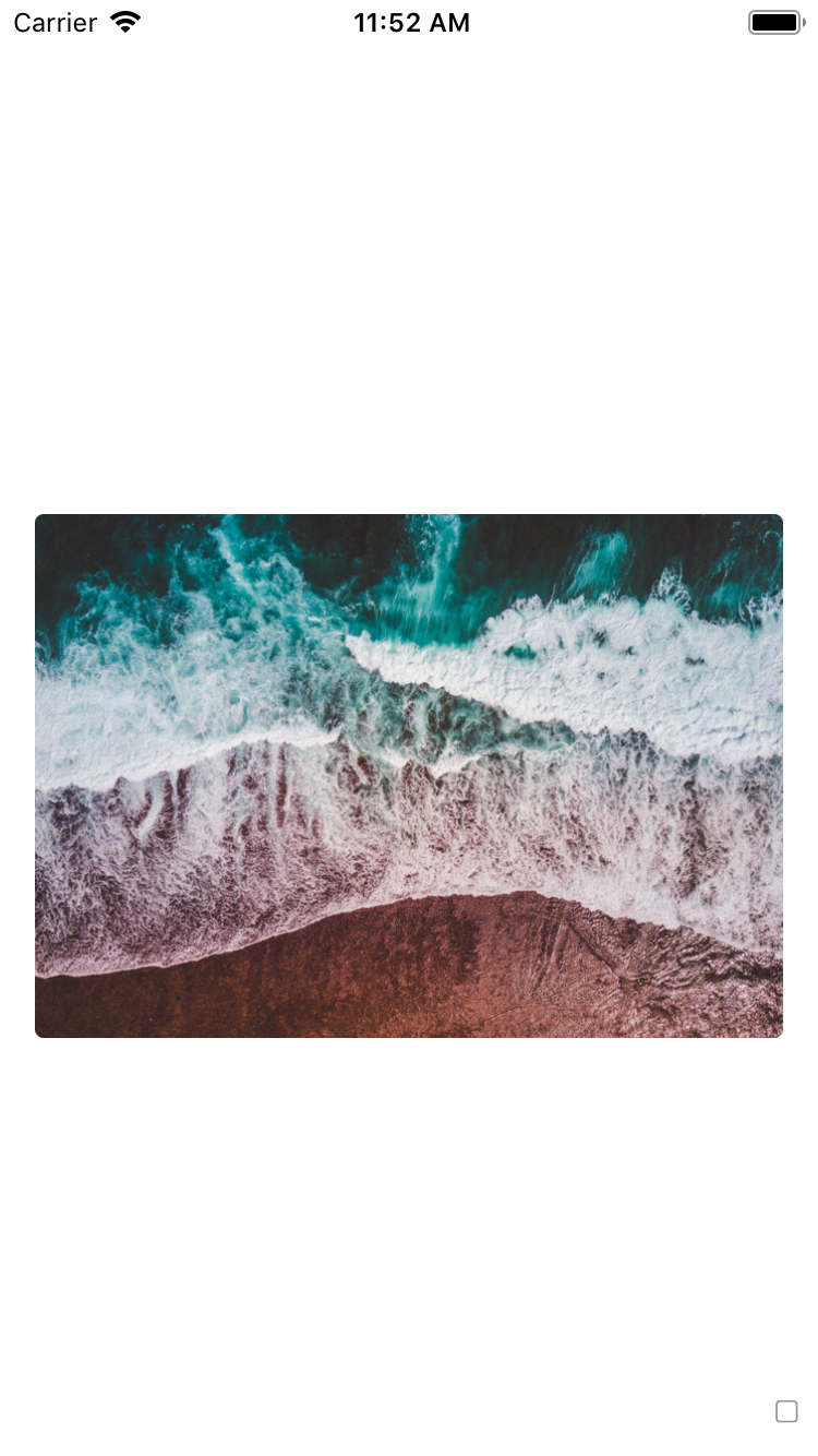
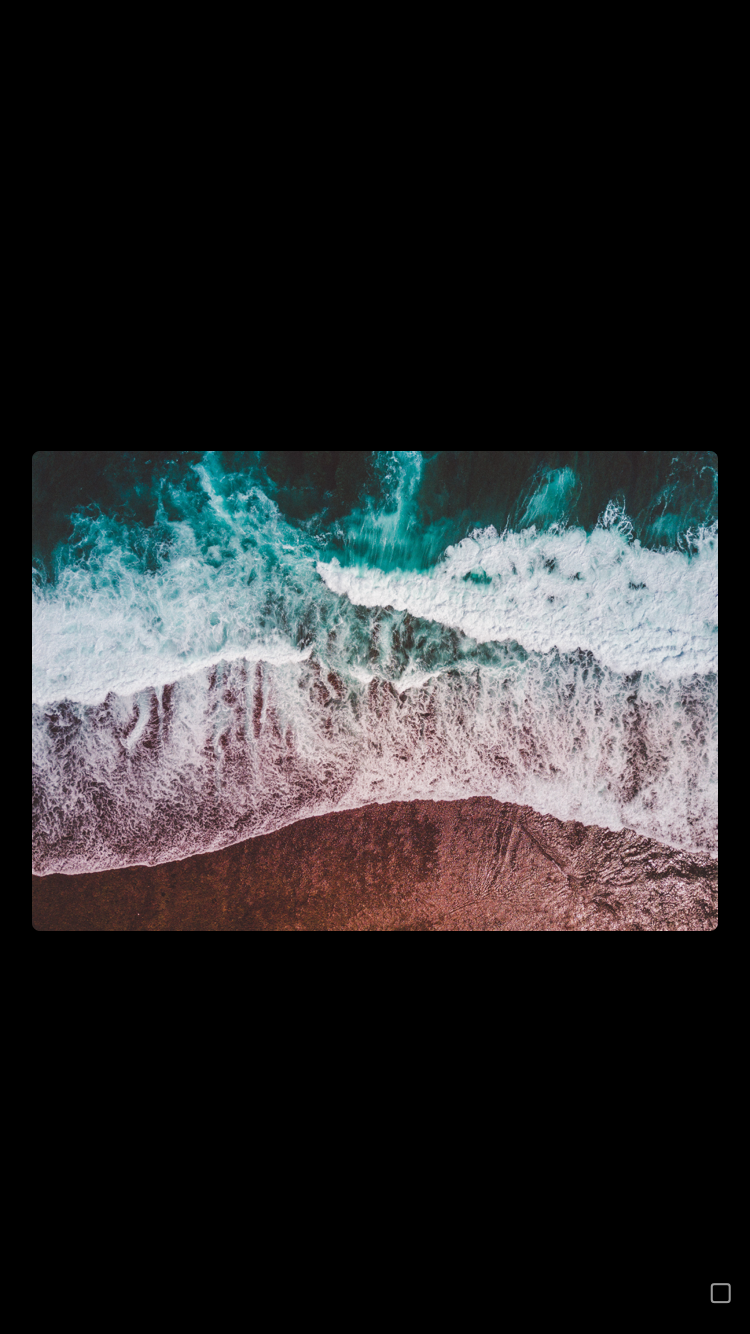
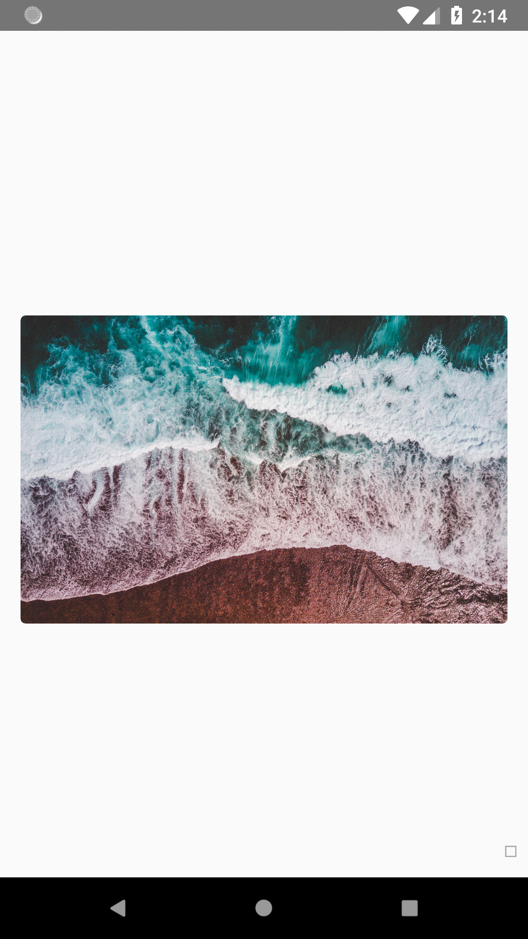
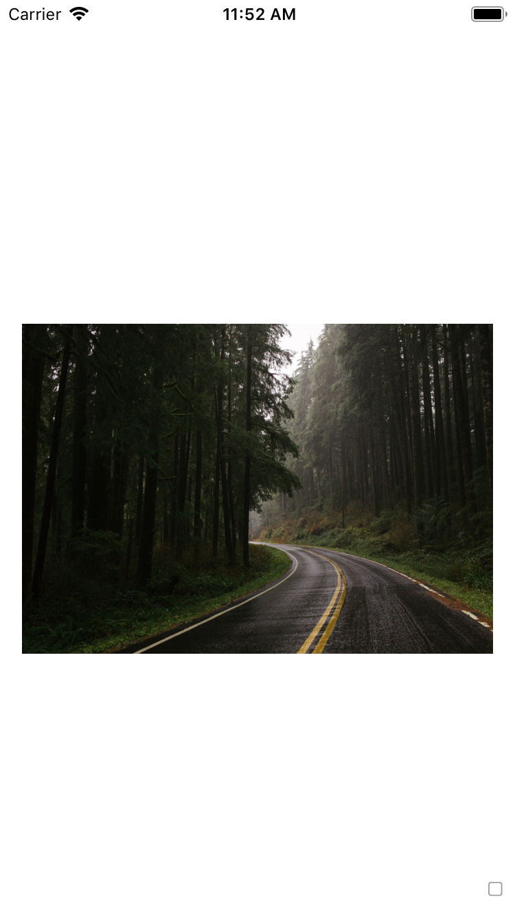
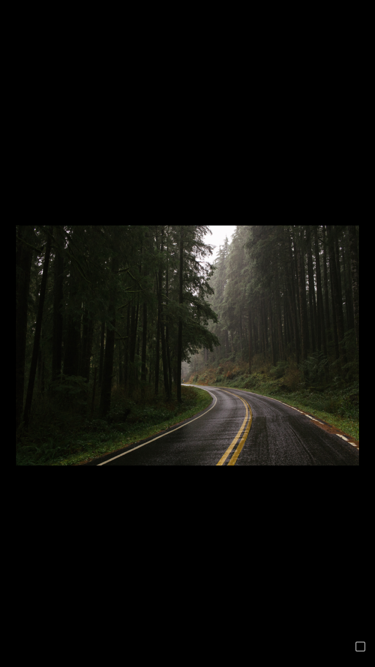
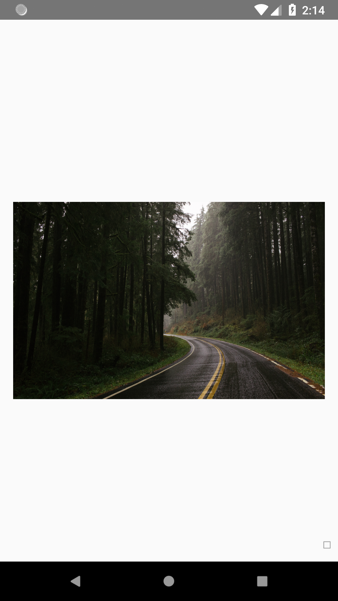
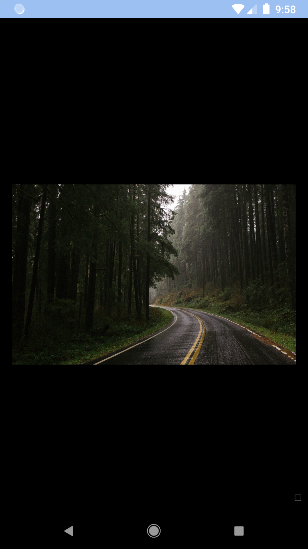
Image
A component for including images.
bpk-component-image
Backpack React Native image component.
Default
| Day | Night |
|---|---|
 |
 |
 |
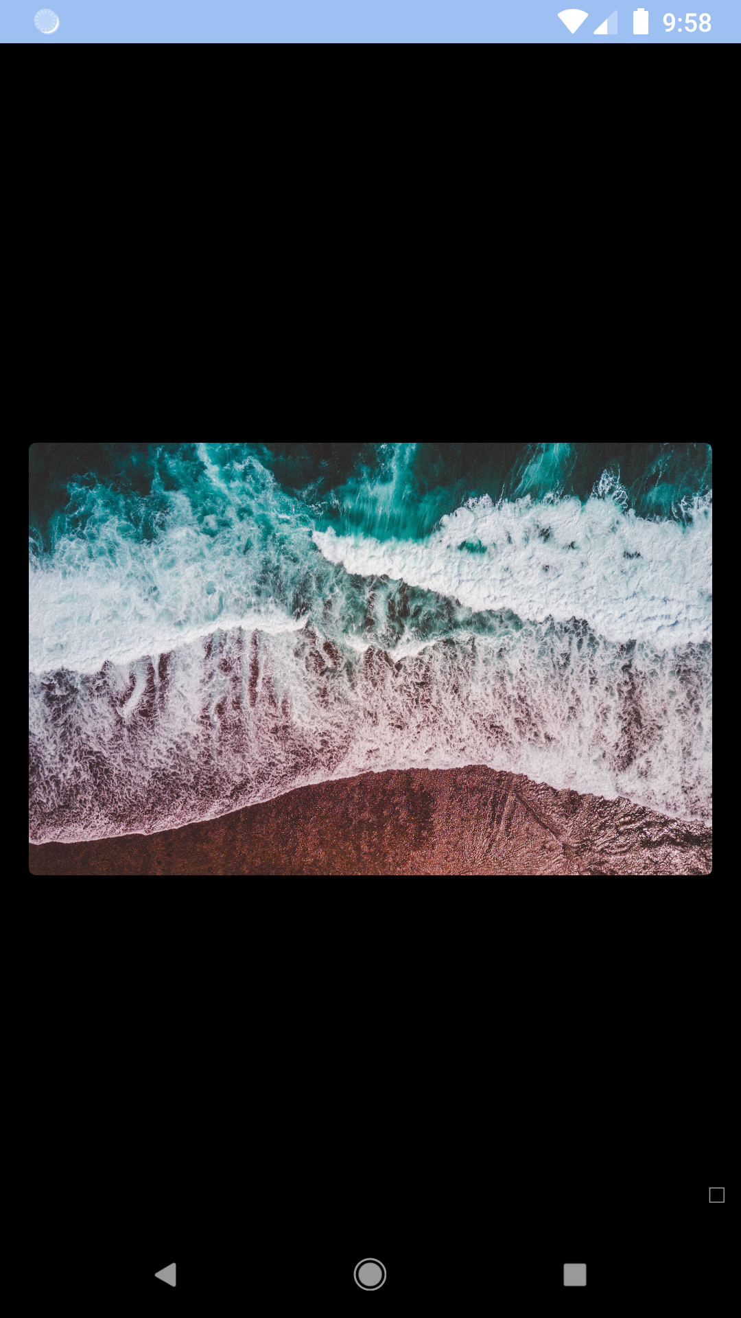 |
No border radius
| Day | Night |
|---|---|
 |
 |
 |
 |
Installation
Check the main Readme for a complete installation guide.
Usage
Default
                                                import React, { Component } from 'react';
                                                import { StyleSheet, View } from 'react-native';
                                                import { spacingBase, spacingLg } from '@skyscanner/bpk-foundations-react-native/tokens/base.react.native';
                                                import BpkImage from 'backpack-react-native/bpk-component-image';

                                                const styles = StyleSheet.create({
                                                  container: {
                                                    flex: 1,
                                                    justifyContent: 'center',
                                                    padding: spacingBase,
                                                  },
                                                  image: {
                                                    width: '100%',
                                                    height: spacingLg * 10,
                                                  },
                                                });

                                                export default () => (
                                                  <View style={styles.container}>
                                                    <BpkImage style={styles.image} alt="image title" source={{uri: "imageUri"}} />
                                                  </View>
                                                );
With Loading Behaviour
                                                import React, { Component } from 'react';
                                                import { StyleSheet, View } from 'react-native';
                                                import { spacingBase, spacingLg } from '@skyscanner/bpk-foundations-react-native/tokens/base.react.native';
                                                import BpkImage, { withLoadingBehaviour } from 'backpack-react-native/bpk-component-image';

                                                const BpkImageWithLoading = withLoadingBehaviour(BpkImage);

                                                const styles = StyleSheet.create({
                                                  container: {
                                                    flex: 1,
                                                    justifyContent: 'center',
                                                    padding: spacingBase,
                                                  },
                                                  image: {
                                                    width: '100%',
                                                    height: spacingLg * 10,
                                                  },
                                                });

                                                export default () => (
                                                  <View style={styles.container}>
                                                    <BpkImageWithLoading style={styles.image} alt="image title" source={{uri: "imageUri"}} />
                                                  </View>
                                                );
Props
BpkImage
| Property | PropType | Required | Default Value |
|---|---|---|---|
| source | oneOf(number, object, arrayOf(object)) | true | - |
| imageComponent | function | false | Animated.Image |
| inView | boolean | false | true |
| loaded | boolean | false | true |
| onLoad | function | false | null |
| rounded | boolean | false | true |
| style | style | false | null |
Made with ❤️ by Skyscanner © 2024
© 2024 Skyscanner Backpack. Page last updated on Oct 28, 2022, 16:03