- Welcome
- Getting started
- Latest updates
- Foundations
-
Components
- Accordion
- Alert
- Alignment
- App Search Modal
- Aria live
- Autosuggest
- Badge
- Banner alert
- Bar chart
- Blockquote
- Bottom navigation
- Bottom sheet
- Breadcrumb
- Breakpoint
- Button
- Calendar
- Card
- Card list
- Card button
- Carousel
- Checkbox
- Chip
- Chip group
- Code
- Content cards
- Data Table
- Datepicker
- Description list
- Dialog
- Divider
- Drawer
- Field Set
- Flare
- Flat list
- Flight leg
- Floating action button
- Floating notification
- Form label
- Form validation
- Graphic promotion
- Horizontal navigation
- Icon
- Image
- Image Gallery
- Infinite scroll
- Info Banner
- Inset Banner
- Link
- List
- Map
- Mobile scroll container
- Modal
- Navigation bar
- Navigation Tab Group
- Nudger
- Overlay
- Page indicator
- Pagination
- Panel
- Phone input
- Picker
- Popover
- Price
- Progress bar
- Radio button
- Rating
- Rating Bar
- Scrollable calendar
- Search Modal
- Section header
- Section list
- Select
- Skeleton
- Skip link
- Slider
- Snackbar
- Snippet
- Spinner
- Split input
- Star rating
- Swap Button
- Switch
- Table
- Text
- Text input
- Theming
- Ticket
- Toast
- Tooltip
- Touchable native feedback
- Touchable overlay
- Search Input Summary
- Content
- Accessibility
- Contributing
- Localisation
Rating
The rating component is used to represent a score as an exact number.
Rating

Default
| Day | Night |
|---|---|
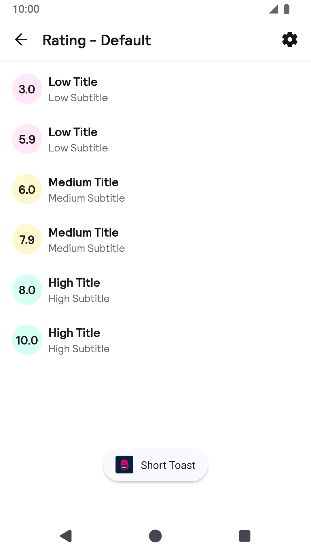 |
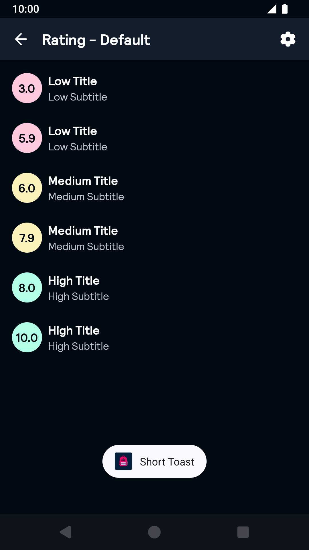 |
Pill
| Day | Night |
|---|---|
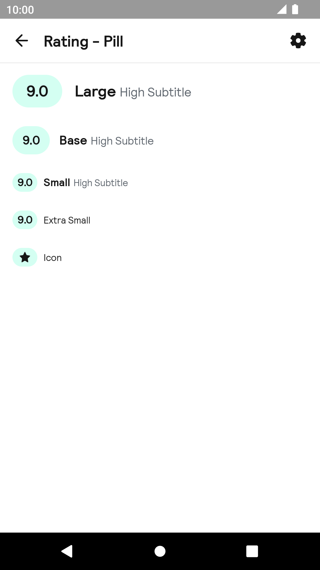 |
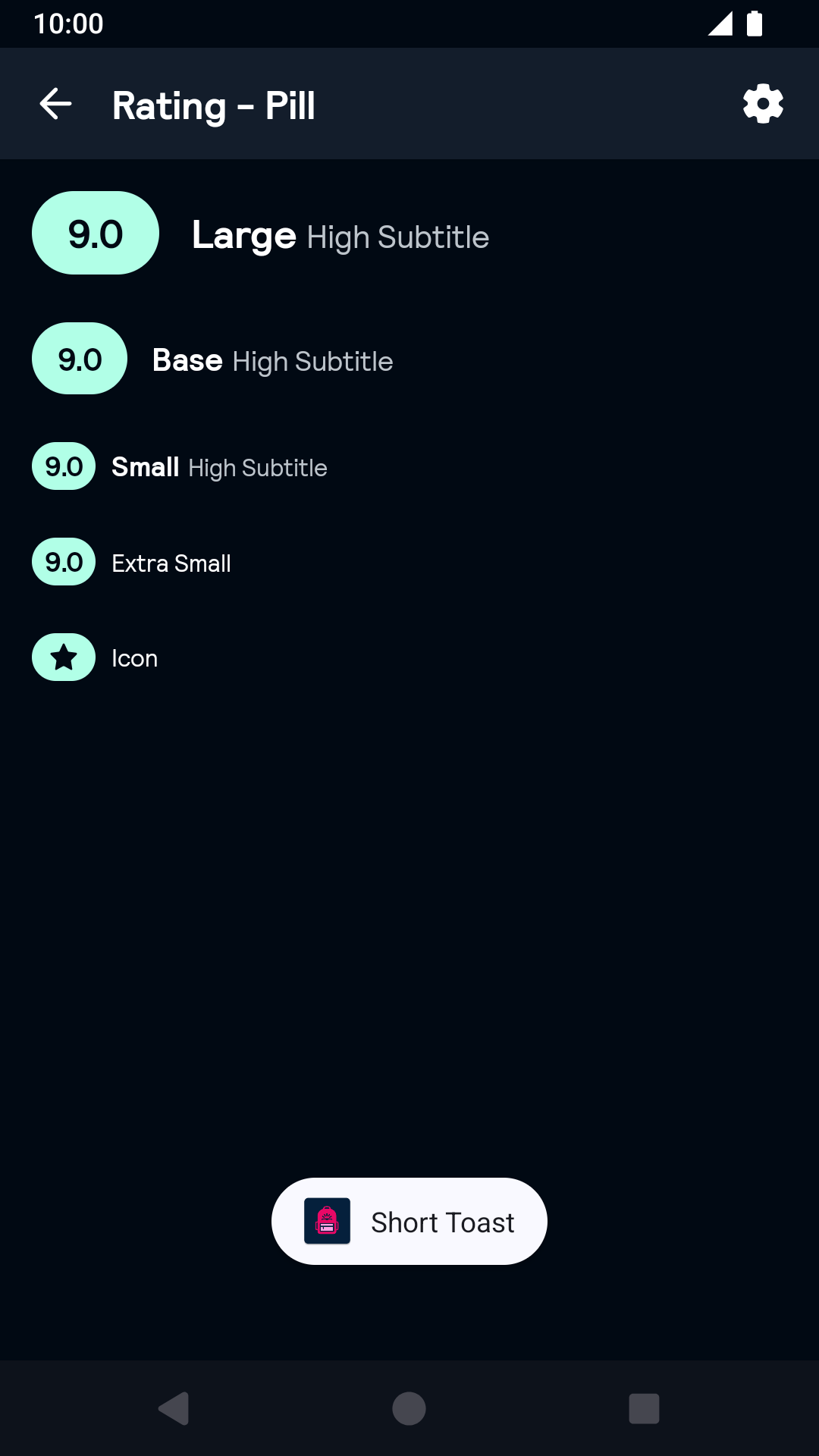 |
Horizontal
| Day | Night |
|---|---|
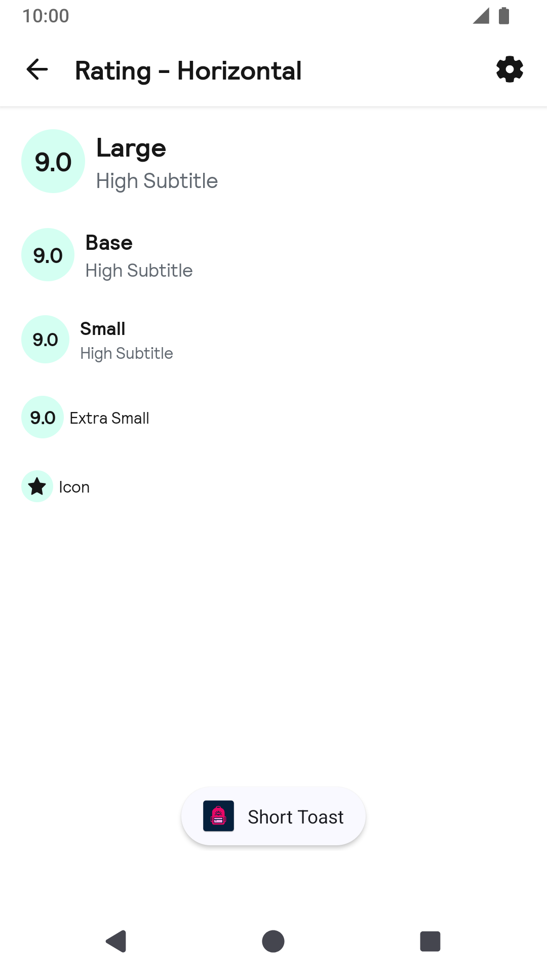 |
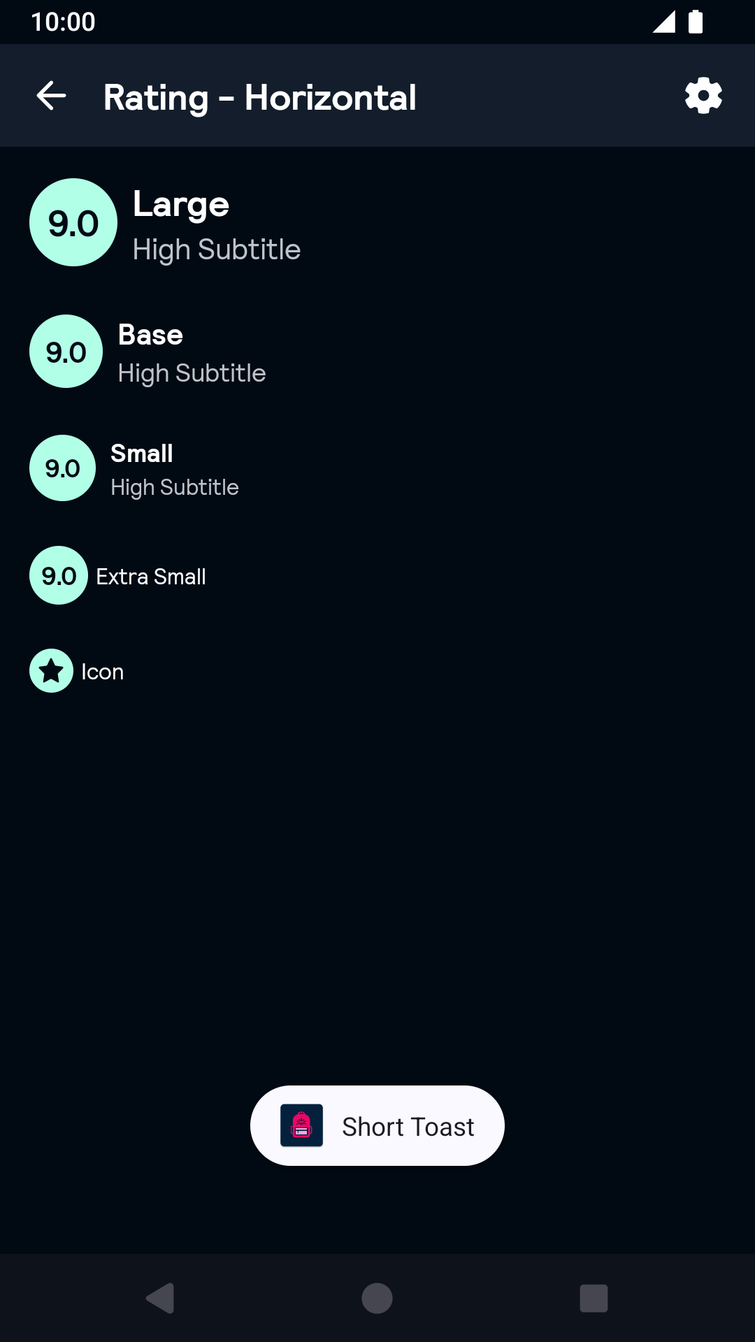 |
Vertical
| Day | Night |
|---|---|
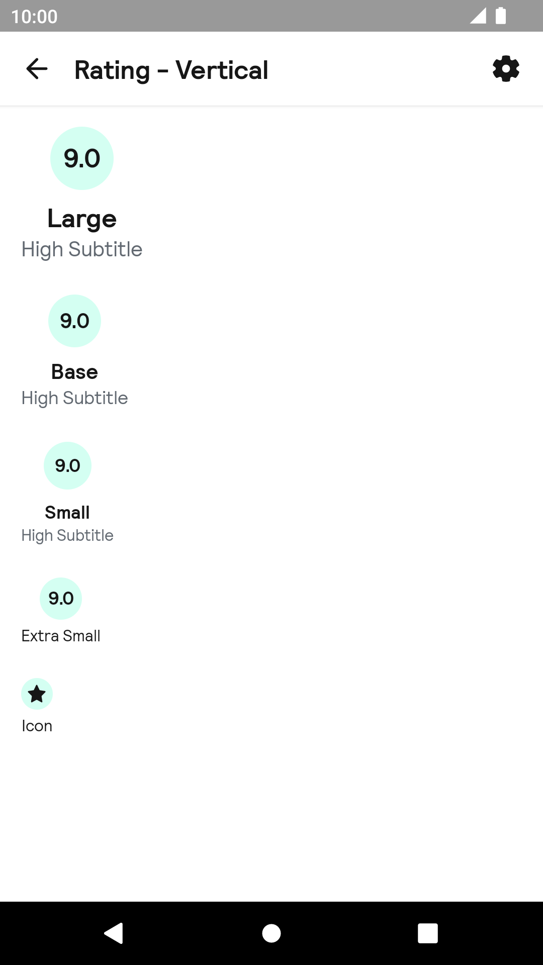 |
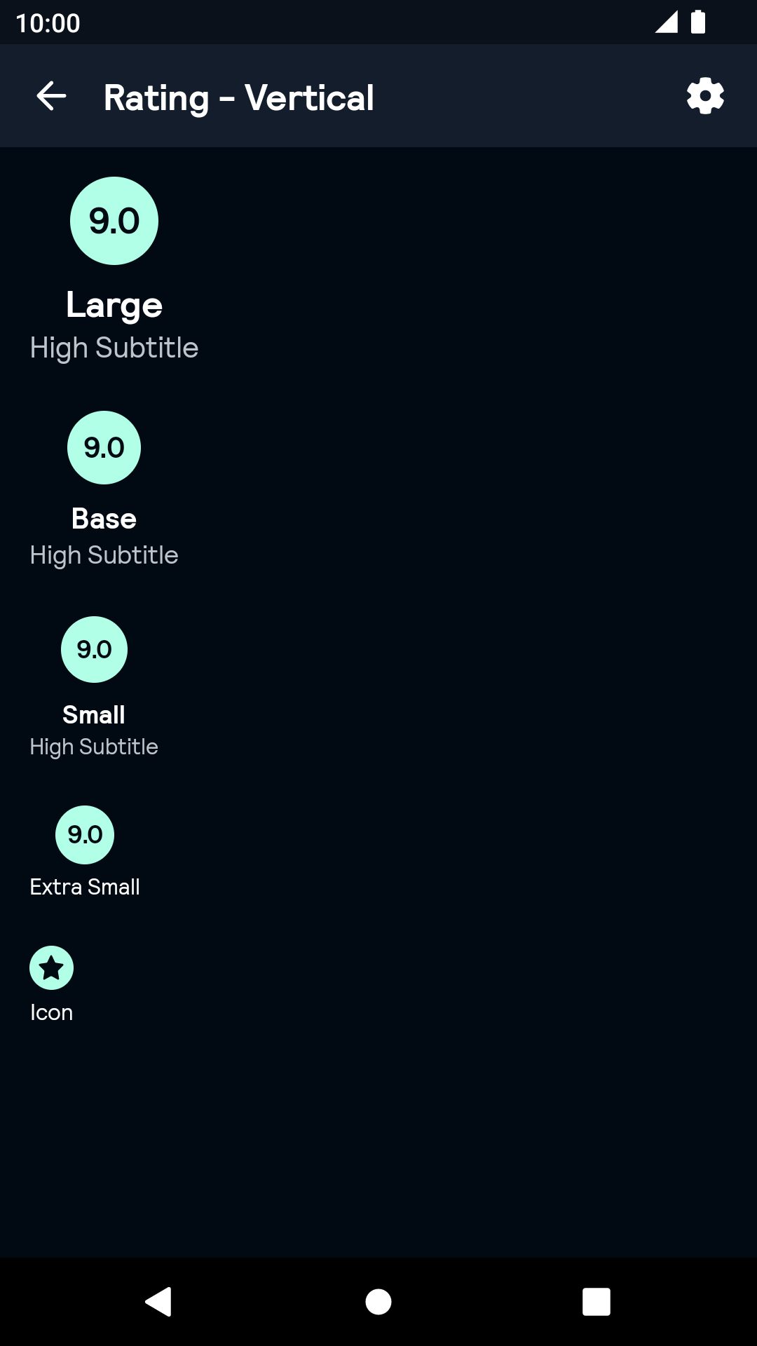 |
Installation
Backpack Android is available through Maven Central. Check the main Readme for a complete installation guide.
Usage
The Rating component can be used in both XML and Kotlin/Java
Example of a Rating in XML:
                                                <net.skyscanner.backpack.rating.BpkRating
                                                  android:layout_width="wrap_content"
                                                  android:layout_height="wrap_content"
                                                  app:ratingIcon="@drawable/rating_sample_icon"
                                                  app:ratingTitle="@array/rating_sample_titles"
                                                  app:ratingSubtitle="@array/rating_sample_subtitles"
                                                  app:ratingStyle="vertical"
                                                  app:ratingSize="large"
                                                  app:ratingValue="3.0"
                                                  app:ratingScale="zeroToTen"/>
In this example:
ratingIcon – a reference to LayerDrawable or Drawable. The layer index will be chosen based on the corresponding score value (0 - low, 1 - medium, 2 - high). If drawable is not layered, the same drawable will be used for all values. When the provided drawable is not a layered drawable, the same icon will be used for all scores. Note that the icon will be displayed only when size is equal to icon
ratingTitle – a reference to StringArray or String. The item index will be chosen based on the corresponding score value (0 - low, 1 - medium, 2 - high). If the value is a string resource, the same value will be used for all scores.
ratingSubtitle – a reference to StringArray or String. The item index will be chosen based on the corresponding score value (0 - low, 1 - medium, 2 - high). If the value is a string resource, the same value will be used for all scores. Note that when size is equal to icon or extra_small the subtitle disables.
ratingStyle - the layout configuration.
ratingSize - the dimensions of the layout
ratingValue - The actual rating expressed as a range clamped between the range defined by ratingScale.
ratingScale - The value range of the component. Either zeroToTen (0.0 to 10.0) or zeroToFive (0.0 to 5.0) with zeroToTen being the default.
Example of a Rating in Kotlin
                                                import net.skyscanner.backpack.rating.BpkRating

                                                BpkRating(context, BpkRating.Style.Horizontal, BpkRating.Size.Base, BpkRating.Scale.ZeroToTen).apply {
                                                    icon = {
                                                      when (it) {
                                                        BpkRating.Score.Low -> context.getDrawable(R.drawable.bpk_star_outline)
                                                        BpkRating.Score.Medium -> context.getDrawable(R.drawable.bpk_star_half)
                                                        BpkRating.Score.High -> context.getDrawable(R.drawable.bpk_star)
                                                      }
                                                    }
                                                    title = {
                                                      when (it) {
                                                        BpkRating.Score.Low -> "Low"
                                                        BpkRating.Score.Medium -> "Medium"
                                                        BpkRating.Score.High -> "High"
                                                      }
                                                    }
                                                    subtitle = {
                                                      when (it) {
                                                        BpkRating.Score.Low -> "Sub Low"
                                                        BpkRating.Score.Medium -> "Sub Medium"
                                                        BpkRating.Score.High -> "Sub High"
                                                      }
                                                    }
                                                    rating = 3f
}title, subtitle and icon are optional functions that return the value for the current score.
Theme Props
- ratingColorLow
- ratingColorMedium
- ratingColorHigh
Styles can be changed globally through bpkRatingStyle. Check theming for more information.
Made with ❤️ by Skyscanner © 2024
© 2024 Skyscanner Backpack. Page last updated on Oct 31, 2022, 13:22