- Welcome
- Getting started
- Latest updates
- Foundations
-
Components
- Accordion
- Alert
- Alignment
- App Search Modal
- Aria live
- Autosuggest
- Badge
- Banner alert
- Bar chart
- Blockquote
- Bottom navigation
- Bottom sheet
- Breadcrumb
- Breakpoint
- Button
- Calendar
- Card
- Card list
- Card button
- Carousel
- Checkbox
- Chip
- Chip group
- Code
- Content cards
- Data Table
- Datepicker
- Description list
- Dialog
- Divider
- Drawer
- Field Set
- Flare
- Flat list
- Flight leg
- Floating action button
- Floating notification
- Form label
- Form validation
- Graphic promotion
- Horizontal navigation
- Icon
- Image
- Image Gallery
- Infinite scroll
- Info Banner
- Inset Banner
- Link
- List
- Map
- Mobile scroll container
- Modal
- Navigation bar
- Navigation Tab Group
- Nudger
- Overlay
- Page indicator
- Pagination
- Panel
- Phone input
- Picker
- Popover
- Price
- Progress bar
- Radio button
- Rating
- Rating Bar
- Scrollable calendar
- Search Modal
- Section header
- Section list
- Select
- Skeleton
- Skip link
- Slider
- Snackbar
- Snippet
- Spinner
- Split input
- Star rating
- Swap Button
- Switch
- Table
- Text
- Text input
- Theming
- Ticket
- Toast
- Tooltip
- Touchable native feedback
- Touchable overlay
- Search Input Summary
- Content
- Accessibility
- Contributing
- Localisation
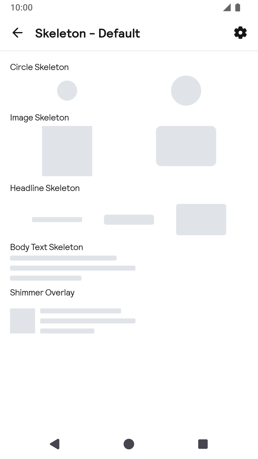
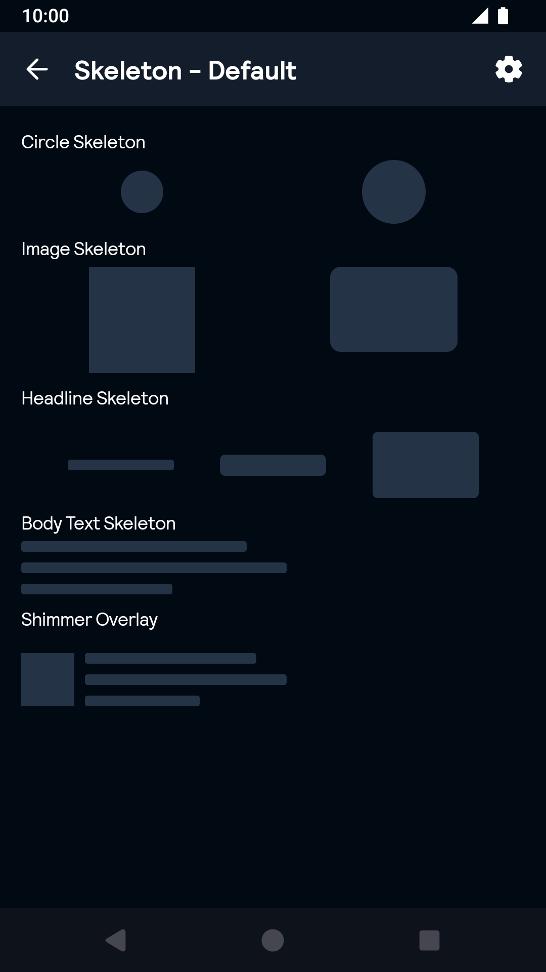
Skeleton
Skeleton components provides a standard way to build a skeleton loading view with shimmer animation.
Skeleton

Default
| Day | Night |
|---|---|
 |
 |
Installation
Backpack Compose is available through Maven Central. Check the main Readme for a complete installation guide.
Usage
Skeleton components is built for an composition with shimmer animation. It is often used for a loading screen or loading cards. There is a shimmer overlay which is to wrap the whole composition. There are 4 base elements with pre-selected size or custom size support: image skeleton, circle skeleton, headline skeleton and body text skeleton, they represent the real block as their name in a composition. You should put the whole composition into a shimmer overlay to add shimmer animation.
Example of a shimmer overlay:
                                                import net.skyscanner.backpack.compose.sleketon.BpkImageSkeleton
                                                import net.skyscanner.backpack.compose.sleketon.BpkBodyTextSkeleton
                                                import net.skyscanner.backpack.compose.sleketon.BpkShimmerOverlay

                                                BpkShimmerOverlay(modifier = Modifier.width(200.dp).wrapContentHeight()){
                                                  Row() {
                                                    BpkImageSkeleton(modifier = Modifier.size(BpkSpacing.Xxl, BpkSpacing.Xxl))
                                                    BpkBodyTextSkeleton(modifier = Modifier.padding(start=BpkSpacing.Md).width(152.dp))
                                                  }
                                                }
Image skeleton requires width and height dimension, you should specify them to get an expected size.
Example of a image skeleton:
                                                import net.skyscanner.backpack.compose.sleketon.BpkImageSkeleton

                                                BpkImageSkeleton(modifier = Modifier.size(BpkSpacing.Xxl.times(2), BpkSpacing.Xxl.times(2)),
                                                  cornerType = BpkSkeletonCornerType.Rounded)
Circle skeleton have pre-selected size. circleSize: small(32 dp), large(48 dp), custom(xx dp) You could specify a pre-selected size or a custom size.
Example of a circle skeleton:
                                                import net.skyscanner.backpack.compose.sleketon.BpkCircleSkeleton

                                                Row(
                                                    modifier = Modifier.fillMaxWidth(),
                                                    verticalAlignment = Alignment.CenterVertically,
                                                    horizontalArrangement = Arrangement.SpaceAround
                                                ) {
                                                  BpkCircleSkeleton(circleSize = BpkCircleSizeType.Custom(BpkSpacing.Xl))
                                                  BpkCircleSkeleton(circleSize = BpkCircleSizeType.Large)
                                                }
Headline skeleton have pre-selected height. skeletonHeightSize: small(8 dp), medium(16 dp), large(32 dp), custom. You could specify a pre-selected height or a custom height. You should specify the width to any size to keep consistent with your design.
Example of a headline skeleton:
                                                import net.skyscanner.backpack.compose.sleketon.BpkHeadlineSkeleton

                                                Row(
                                                  modifier = Modifier.fillMaxWidth(),
                                                  verticalAlignment = Alignment.CenterVertically,
                                                  horizontalArrangement = Arrangement.SpaceEvenly
                                                ) {
                                                  BpkHeadlineSkeleton(modifier = Modifier.width(BpkSpacing.Xxl.times(2)), BpkSkeletonSizeType.Small)
                                                  BpkHeadlineSkeleton(modifier = Modifier.width(BpkSpacing.Xxl.times(2)), BpkSkeletonSizeType.Medium)
                                                  BpkHeadlineSkeleton(modifier = Modifier.width(BpkSpacing.Xxl.times(2)).height(50.dp), BpkSkeletonSizeType.Custom)
                                                }
Body text skeleton have its own height(40 dp), you should never to reset it. You should only specify width for it.
Example of a body text skeleton:
                                                import net.skyscanner.backpack.compose.sleketon.BpkBodyTextSkeleton

                                                BpkBodyTextSkeleton(modifier = Modifier.width(BpkSpacing.Xxl.times(5)))
Made with ❤️ by Skyscanner © 2024
© 2024 Skyscanner Backpack. Page last updated on Oct 31, 2022, 13:37