- Welcome
- Getting started
- Latest updates
- Foundations
-
Components
- Accordion
- Alert
- Alignment
- App Search Modal
- Aria live
- Autosuggest
- Badge
- Banner alert
- Bar chart
- Blockquote
- Bottom navigation
- Bottom sheet
- Breadcrumb
- Breakpoint
- Button
- Calendar
- Card
- Card list
- Card button
- Carousel
- Checkbox
- Chip
- Chip group
- Code
- Content cards
- Data Table
- Datepicker
- Description list
- Dialog
- Divider
- Drawer
- Field Set
- Flare
- Flat list
- Flight leg
- Floating action button
- Floating notification
- Form label
- Form validation
- Graphic promotion
- Horizontal navigation
- Icon
- Image
- Image Gallery
- Infinite scroll
- Info Banner
- Inset Banner
- Link
- List
- Map
- Mobile scroll container
- Modal
- Navigation bar
- Navigation Tab Group
- Nudger
- Overlay
- Page indicator
- Pagination
- Panel
- Phone input
- Picker
- Popover
- Price
- Progress bar
- Radio button
- Rating
- Rating Bar
- Scrollable calendar
- Search Modal
- Section header
- Section list
- Select
- Skeleton
- Skip link
- Slider
- Snackbar
- Snippet
- Spinner
- Split input
- Star rating
- Swap Button
- Switch
- Table
- Text
- Text input
- Theming
- Ticket
- Toast
- Tooltip
- Touchable native feedback
- Touchable overlay
- Search Input Summary
- Content
- Accessibility
- Contributing
- Localisation
Card
Cards are used to group related items. They allow complex datasets to be broken down into individual, distinct areas for easy consumption.
Backpack-SwiftUI/Card

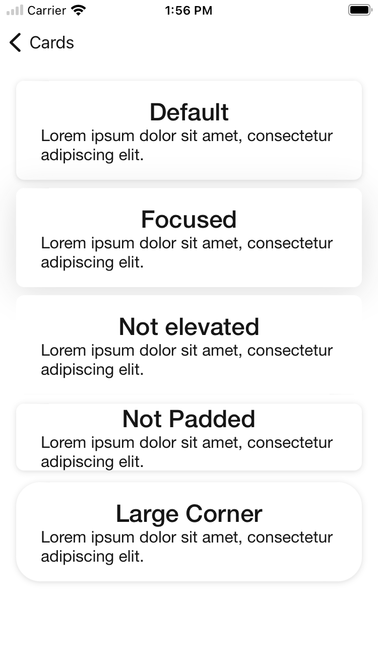
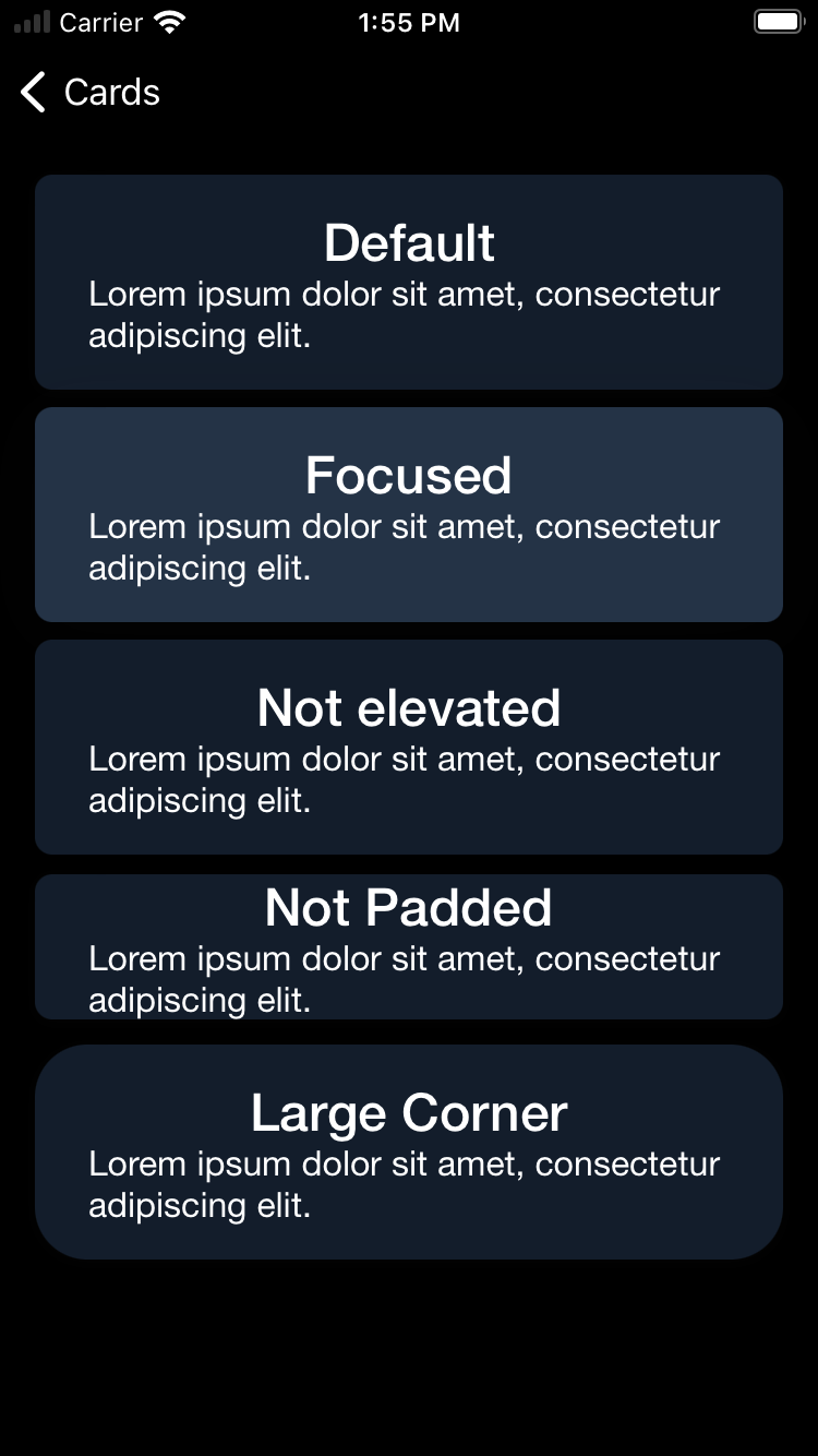
Default
BPKCard
| Day | Night |
|---|---|
 |
 |
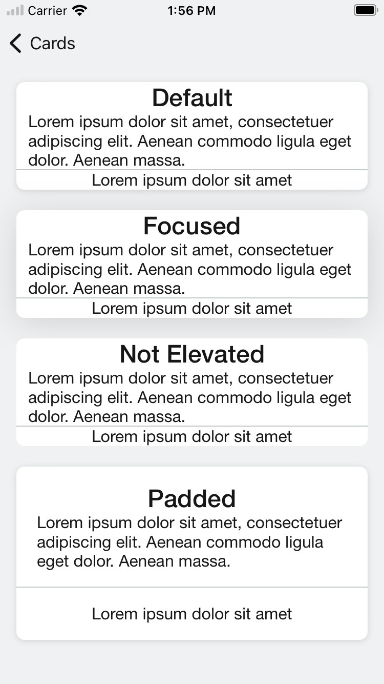
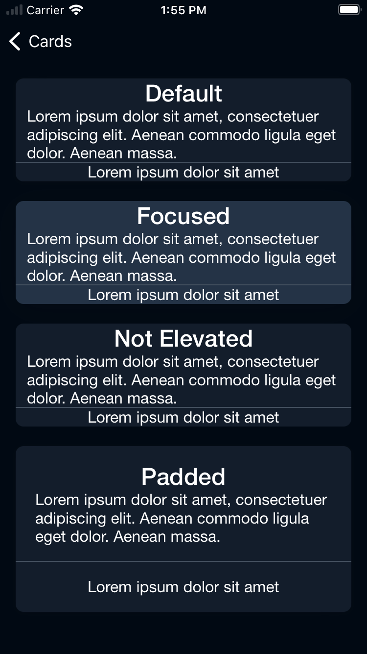
BPKDividedCard
| Day | Night |
|---|---|
 |
 |
BPKCardWrapper
| Day | Night |
|---|---|
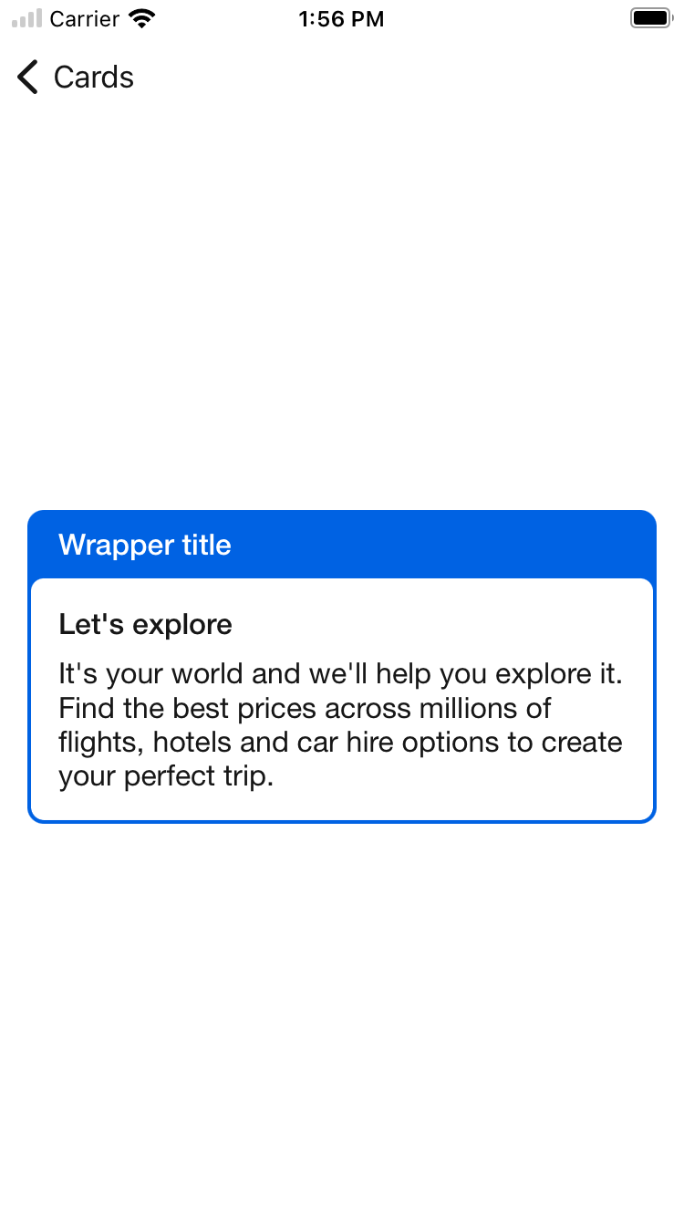 |
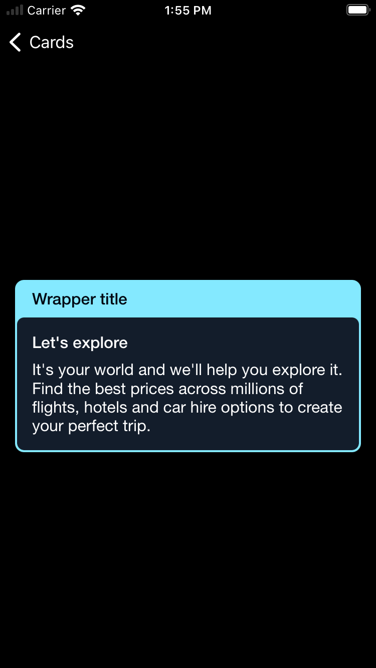 |
Usage
BPKCard
Basic card
                                                import Backpack_SwiftUI
                                                BPKCard {
                                                    BPKText("Hello World")
                                                }
Set padding
Set the padding to:
- .small
- .none
                                                BPKCard(padding: .none) {
                                                    BPKText("Hello World")
                                                }
Set elevation
Set the elevation to:
- .default
- .focus
- .none
                                                BPKCard(elevation: .focus) {
                                                    BPKText("Hello World")
                                                }
Set corner radius
Set the corner radius to:
- .small
- .large
                                                /// Set it's corner radius
                                                BPKCard(cornerStyle: .large) {
                                                    BPKText("Hello World")
                                                }
Set tap gesture
                                                BPKCard {
                                                    BPKText("You can tap me!")
                                                }.onTapGesture {
                                                    print("Card tapped!")
                                                }
BPKDividedCard
Default
                                                BPKDividedCard {
                                                    BPKText("PrimaryContent")
                                                } secondaryContent: {
                                                    BPKText("SecondaryContent")
                                                }.onTapGesture {
                                                    print("Card tapped!")
                                                }
Elevation The same as BPKCard
                                                BPKDividedCard(elevation: .focus) {
                                                    BPKText("PrimaryContent")
                                                } secondaryContent: {
                                                    BPKText("SecondaryContent")
                                                }
Padded
                                                BPKDividedCard {
                                                    BPKText("PrimaryContent")
                                                        .padding()
                                                } secondaryContent: {
                                                    BPKText("SecondaryContent")
                                                        .padding()
                                                }
BPKCardWrapper
Wrap a card
                                                BPKCardWrapper(backgroundColor: .coreAccentColor) {
                                                    BPKText("Header")
                                                } card: {
                                                    BPKCard(elevation: .none) {
                                                        Text("Card Content")
                                                    }
                                                }
Wrap a divided card
                                                BPKCardWrapper(backgroundColor: .coreAccentColor) {
                                                    BPKText("Header")
                                                } card: {
                                                    BPKDividedCard {
                                                        Text("Primary Content")
                                                    } secondaryContent: {
                                                        Text("Secondary Content")
                                                    }
}Made with ❤️ by Skyscanner © 2024
© 2024 Skyscanner Backpack. Page last updated on May 2, 2023, 13:45