- Welcome
- Getting started
- Latest updates
- Foundations
-
Components
- Accordion
- Alert
- Alignment
- App Search Modal
- Aria live
- Autosuggest
- Badge
- Banner alert
- Bar chart
- Blockquote
- Bottom navigation
- Bottom sheet
- Breadcrumb
- Breakpoint
- Button
- Calendar
- Card
- Card list
- Card button
- Carousel
- Checkbox
- Chip
- Chip group
- Code
- Content cards
- Data Table
- Datepicker
- Description list
- Dialog
- Divider
- Drawer
- Field Set
- Flare
- Flat list
- Flight leg
- Floating action button
- Floating notification
- Form label
- Form validation
- Graphic promotion
- Horizontal navigation
- Icon
- Image
- Image Gallery
- Infinite scroll
- Info Banner
- Inset Banner
- Link
- List
- Map
- Mobile scroll container
- Modal
- Navigation bar
- Navigation Tab Group
- Nudger
- Overlay
- Page indicator
- Pagination
- Panel
- Phone input
- Picker
- Popover
- Price
- Progress bar
- Radio button
- Rating
- Rating Bar
- Scrollable calendar
- Search Modal
- Section header
- Section list
- Select
- Skeleton
- Skip link
- Slider
- Snackbar
- Snippet
- Spinner
- Split input
- Star rating
- Swap Button
- Switch
- Table
- Text
- Text input
- Theming
- Ticket
- Toast
- Tooltip
- Touchable native feedback
- Touchable overlay
- Search Input Summary
- Content
- Accessibility
- Contributing
- Localisation
Card
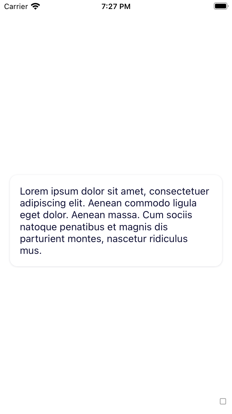
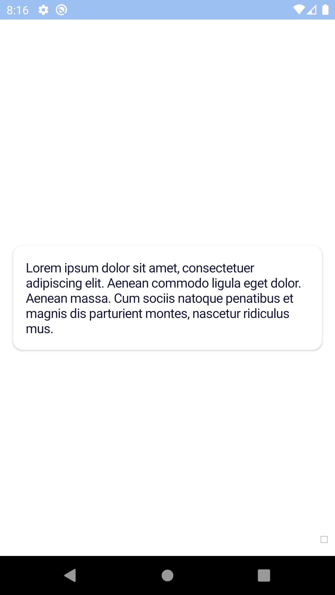
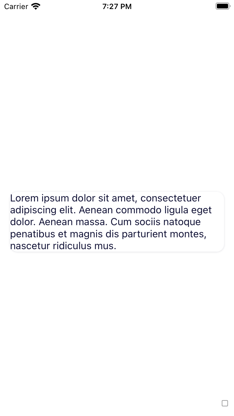
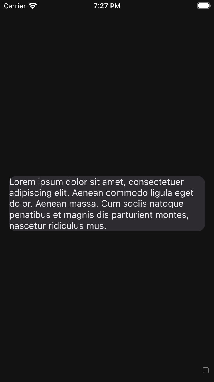
Cards are used to group related items. They allow complex datasets to be broken down into individual, distinct areas for easy consumption.
bpk-component-card
Backpack React Native card component.
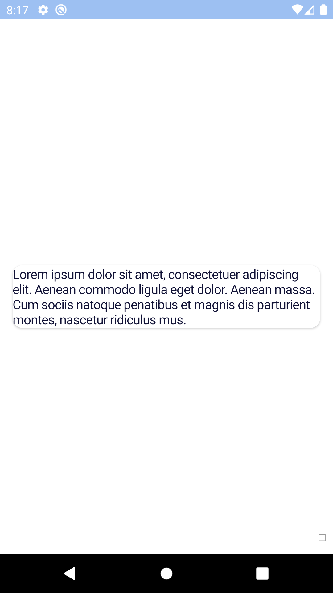
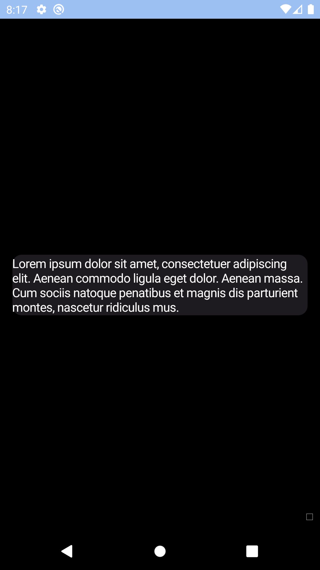
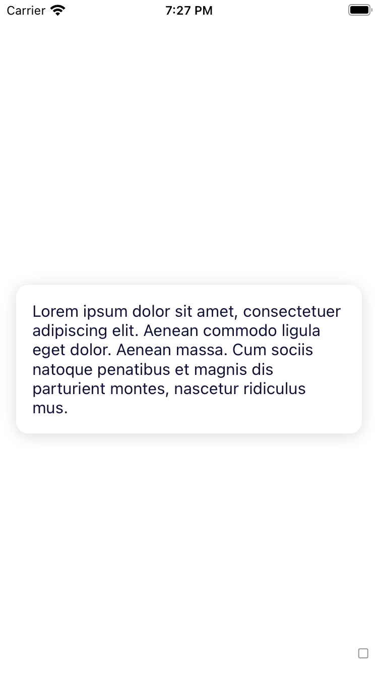
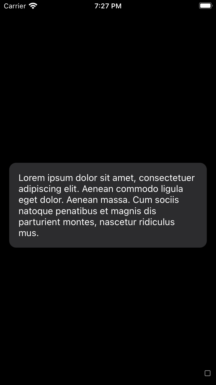
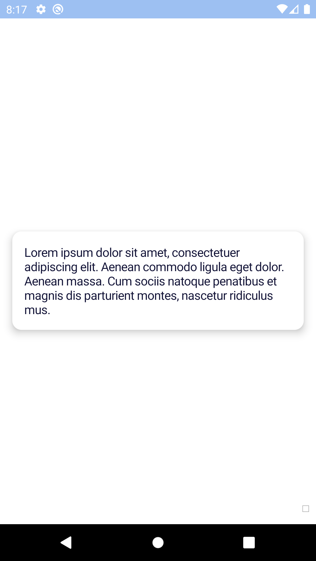
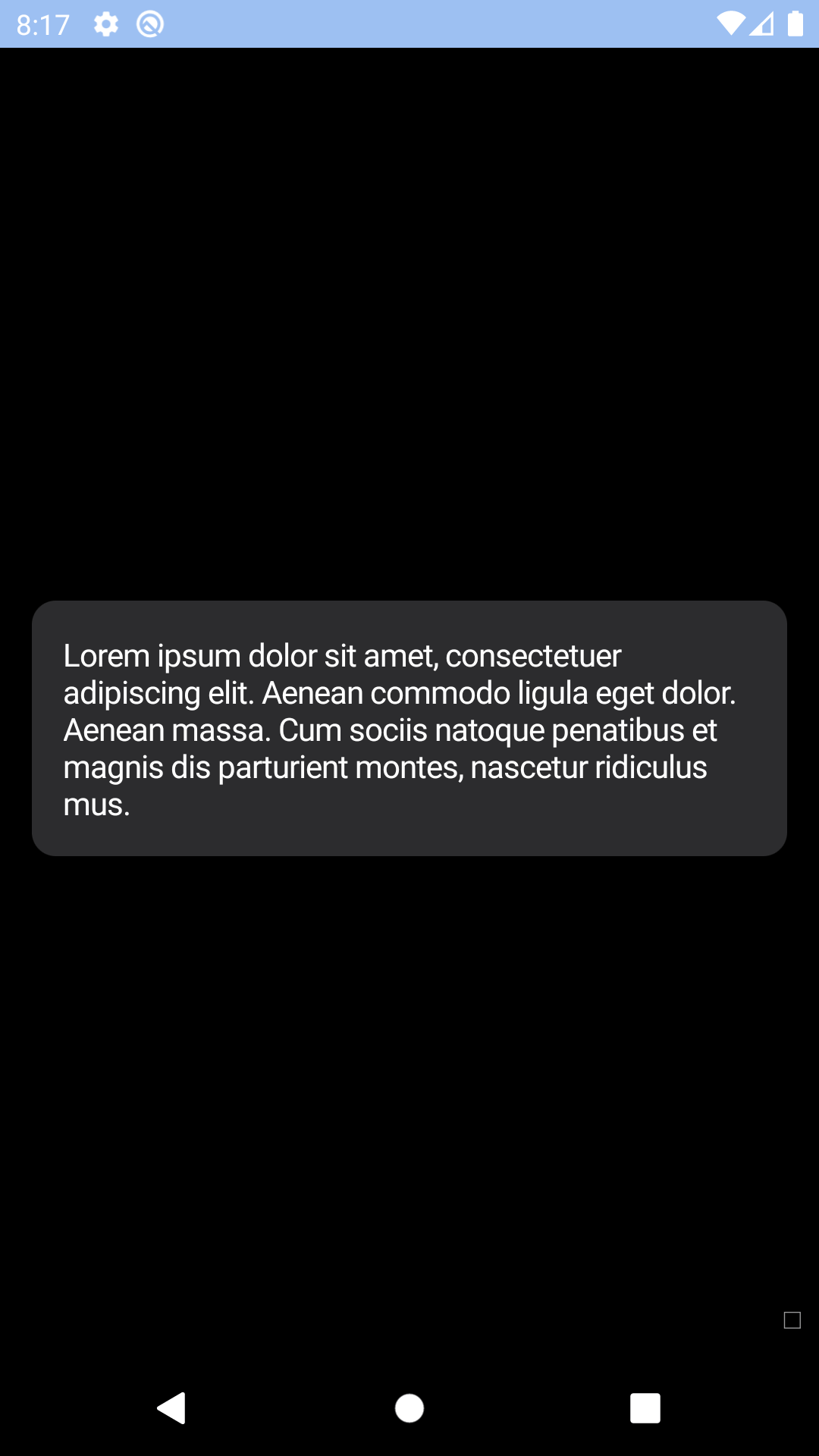
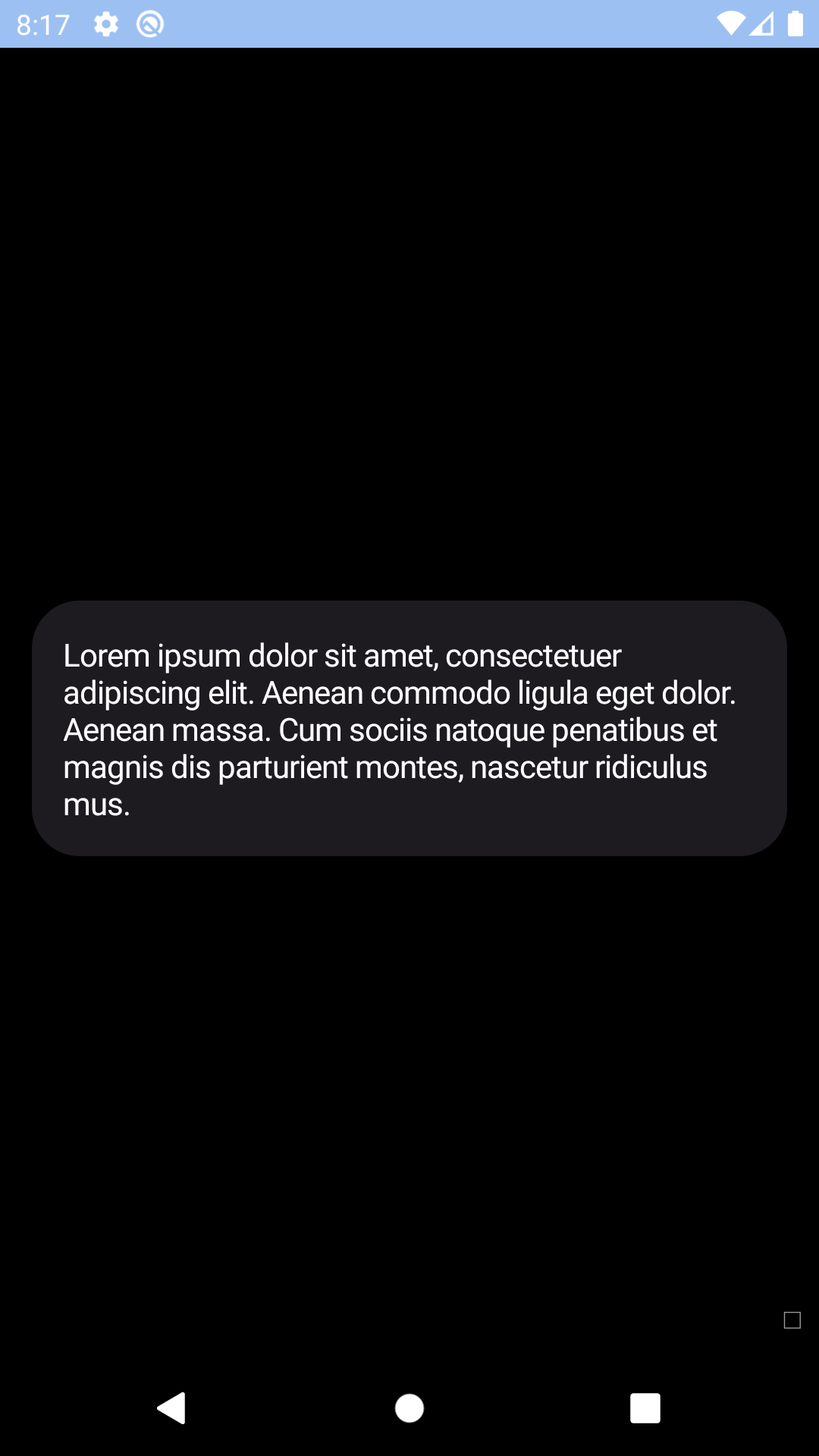
Default
| Day | Night |
|---|---|
 |
 |
 |
 |
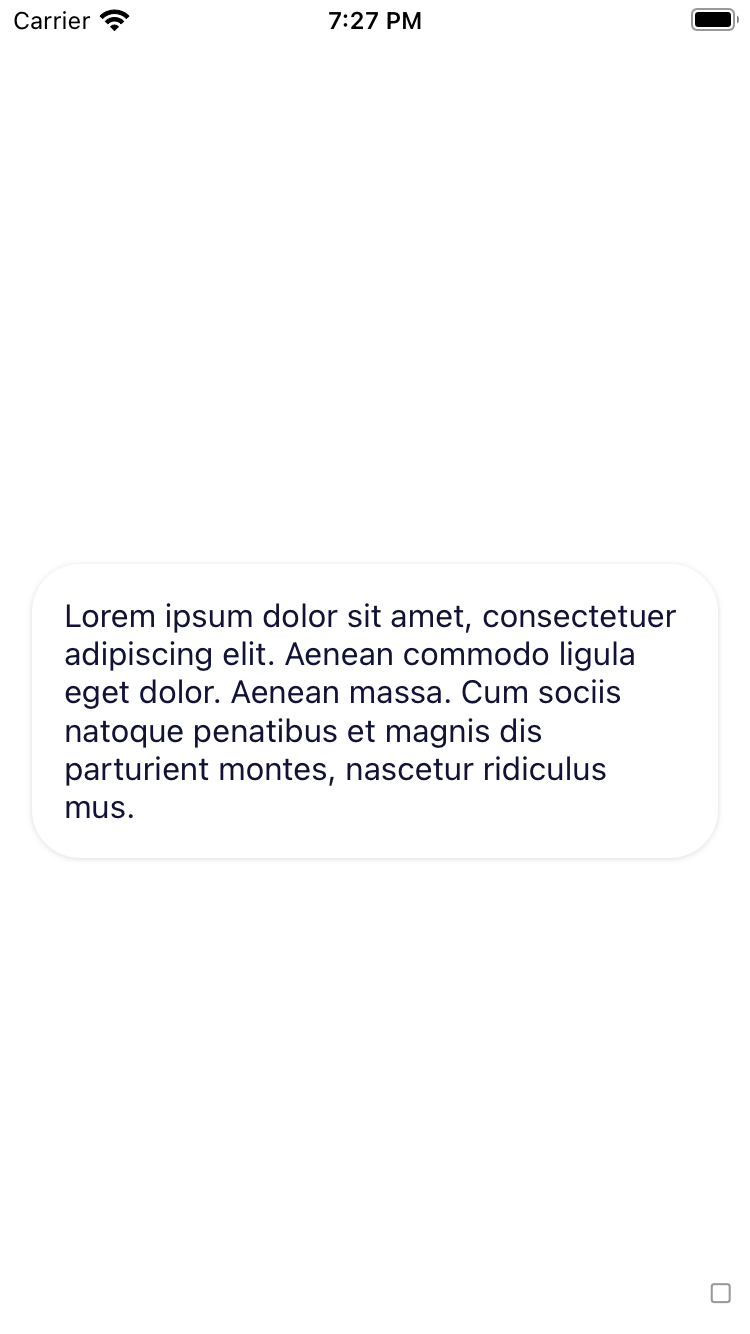
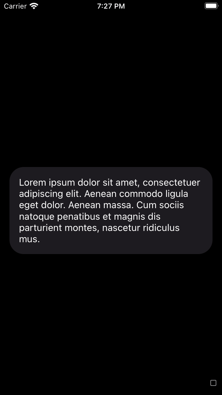
Without padding
| Day | Night |
|---|---|
 |
 |
 |
 |
Focused
| Day | Night |
|---|---|
 |
 |
 |
 |
Large corner style
| Day | Night |
|---|---|
 |
 |
 |
 |
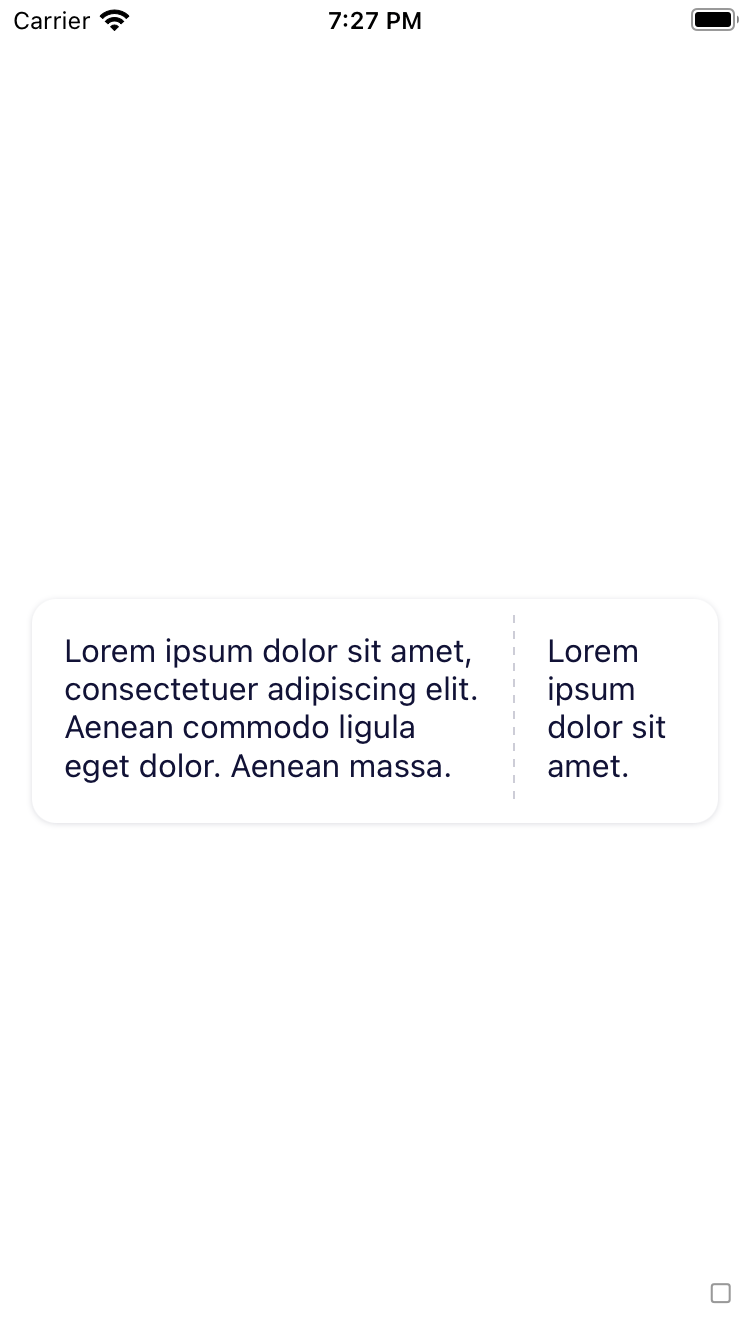
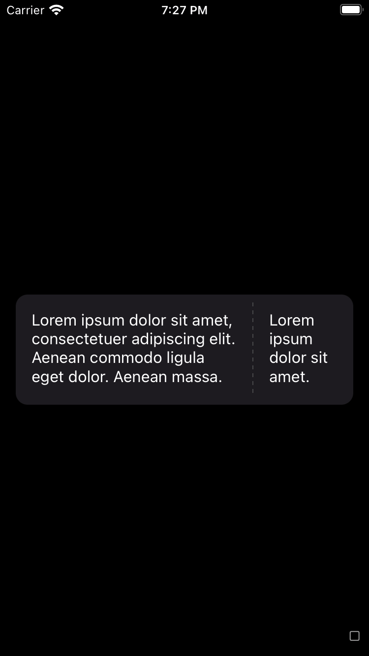
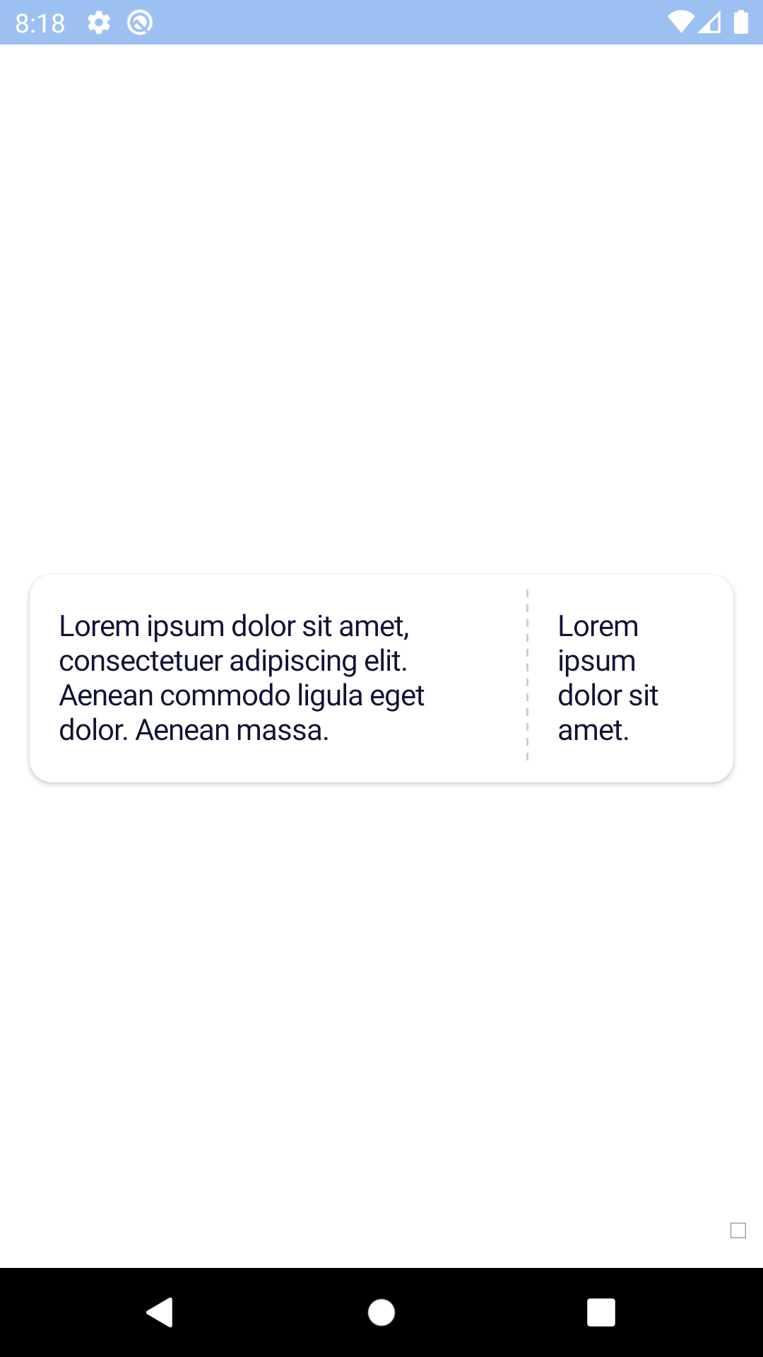
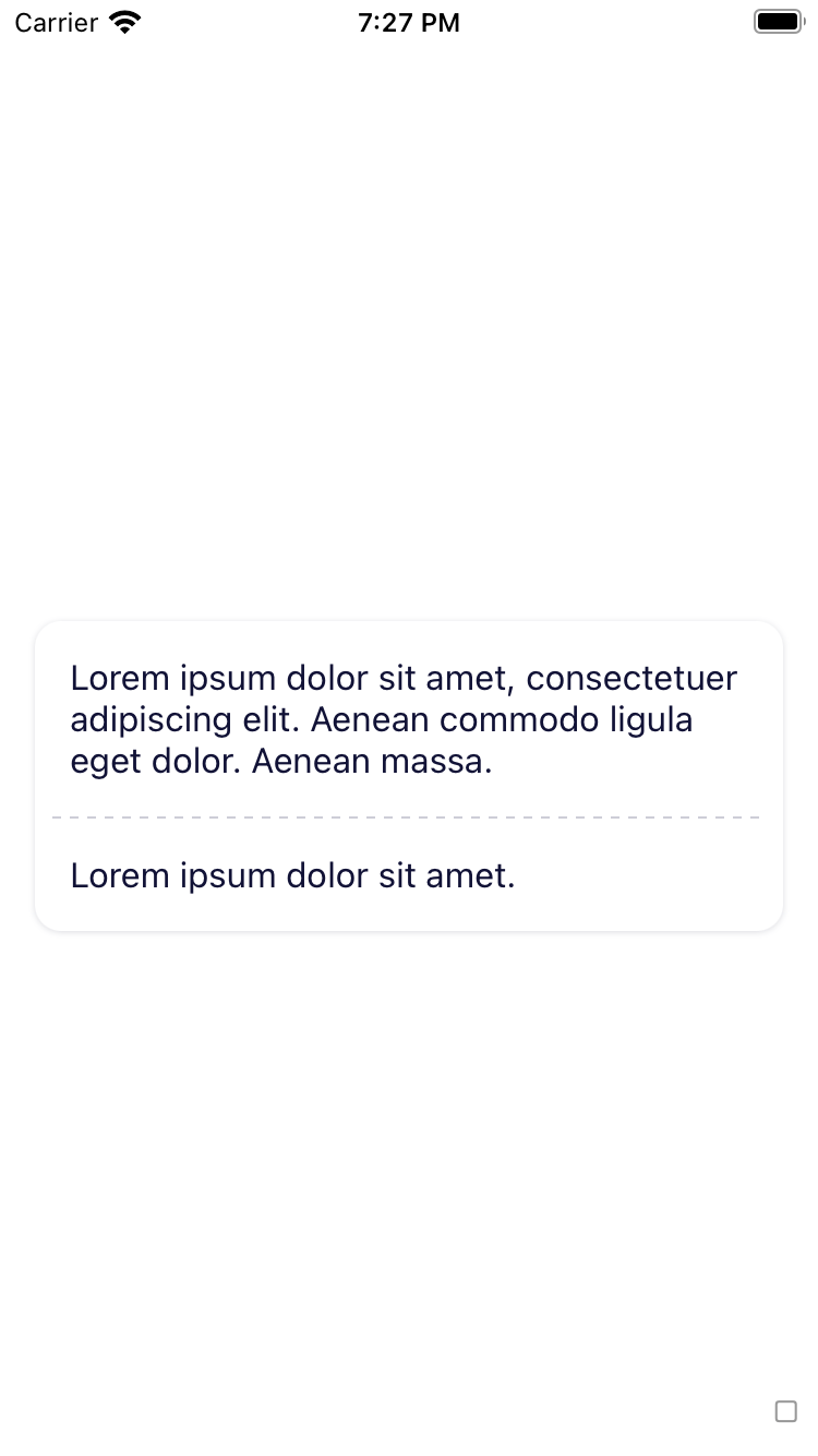
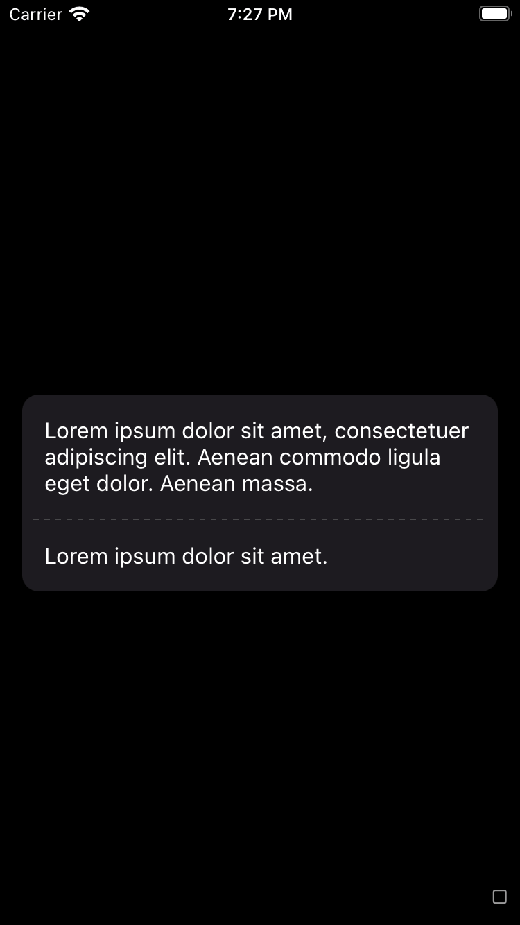
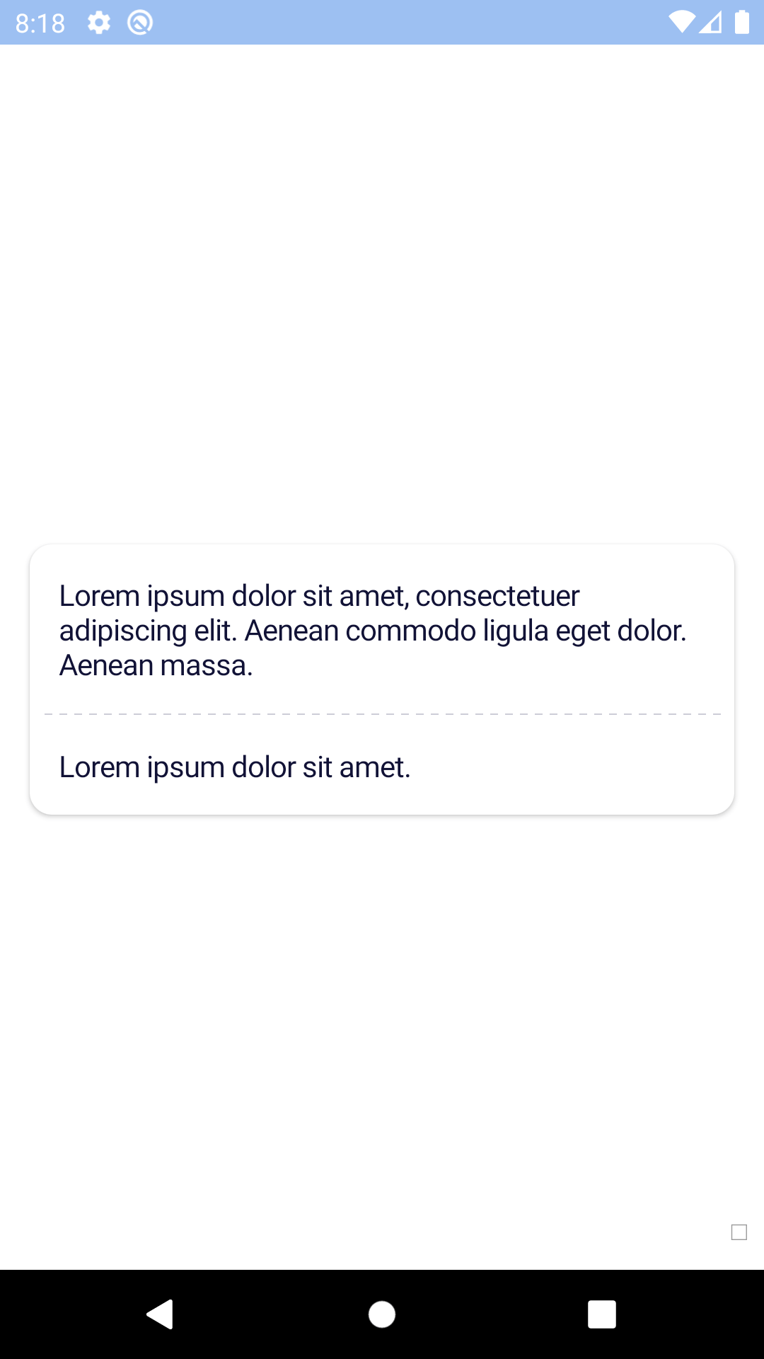
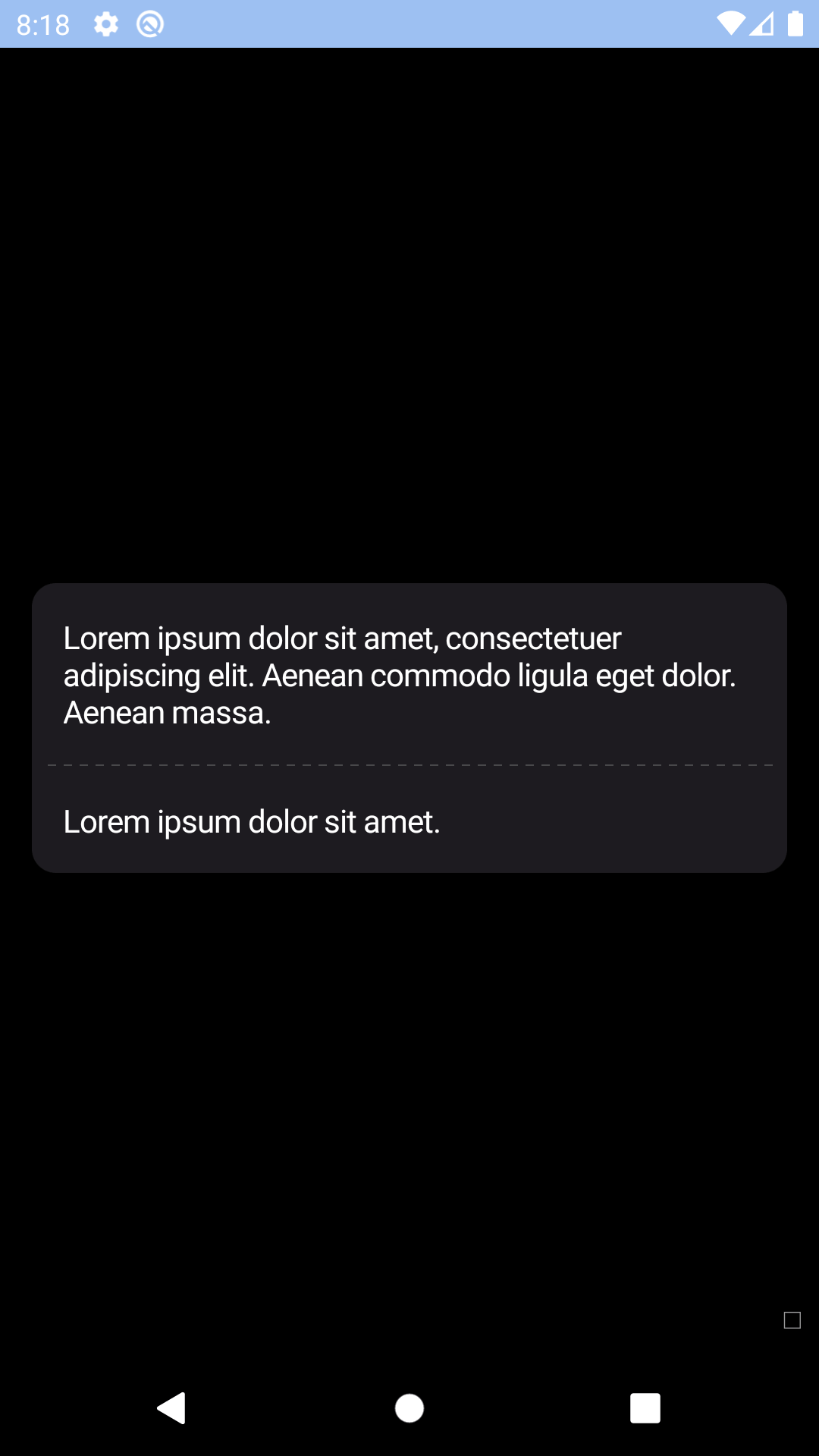
With divider
| Day | Night |
|---|---|
 |
 |
 |
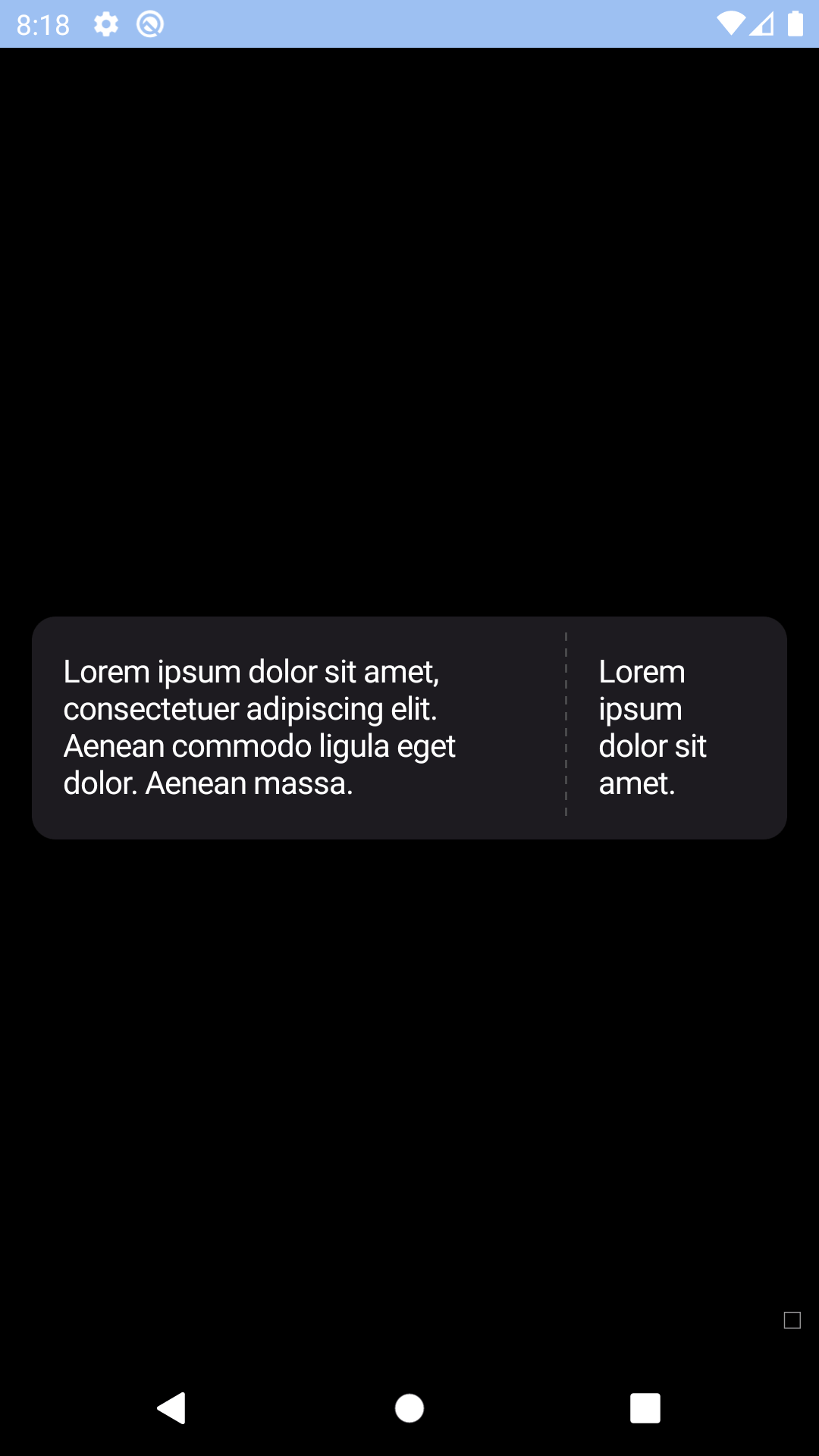 |
With divider arranged vertically
| Day | Night |
|---|---|
 |
 |
 |
 |
Installation
Check the main Readme for a complete installation guide.
Usage
                                                import React, { Component } from 'react';
                                                import { View, StyleSheet, Text } from 'react-native';
                                                import BpkCard from 'backpack-react-native/bpk-component-card';
                                                import BpkText from 'backpack-react-native/bpk-component-text';
                                                import { spacingBase } from '@skyscanner/bpk-foundations-react-native/tokens/base.react.native';

                                                const styles = StyleSheet.create({
                                                  container: {
                                                    flex: 1,
                                                    justifyContent: 'center',
                                                    padding: spacingBase,
                                                  }
                                                });

                                                export default class App extends Component {
                                                  render() {
                                                    const content = (
                                                      <BpkText>
                                                        Lorem ipsum dolor sit amet, consectetuer adipiscing elit. Aenean
                                                        commodo ligula eget dolor. Aenean massa. Cum sociis natoque penatibus
                                                        et magnis dis parturient montes, nascetur ridiculus mus.
                                                      </BpkText>
                                                    );
                                                    return (
                                                      <View style={styles.container}>
                                                        <BpkCard
                                                          onPress={() => null}
                                                          accessibilityLabel="Example Card"
                                                        >
                                                          {content}
                                                        </BpkCard>
                                                        <BpkCard
                                                          onPress={() => null}
                                                          accessibilityLabel="Example Card"
                                                          padded={false}
                                                        >
                                                          {content}
                                                        </BpkCard>
                                                        <BpkCard
                                                          onPress={() => null}
                                                          accessibilityLabel="Example Card"
                                                          focused
                                                        >
                                                          {content}
                                                        </BpkCard>
                                                      </View >
                                                    );
                                                  }
                                                }
withDivider HOC
                                                import React, { Component } from 'react';
                                                import { View, StyleSheet, Text } from 'react-native';
                                                import BpkText from 'backpack-react-native/bpk-component-text';
                                                import { spacingBase } from '@skyscanner/bpk-foundations-react-native/tokens/base.react.native';
                                                import BpkCard, { CORNER_STYLES, withDivider } from 'backpack-react-native/bpk-component-card';

                                                const BpkCardWithDivider = withDivider(BpkCard);

                                                const styles = StyleSheet.create({
                                                  container: {
                                                    flex: 1,
                                                    justifyContent: 'center',
                                                    padding: spacingBase,
                                                  }
                                                });

                                                export default class App extends Component {
                                                  render() {
                                                    const content = (
                                                      <BpkText>
                                                        Lorem ipsum dolor sit amet, consectetuer adipiscing elit. Aenean
                                                        commodo ligula eget dolor. Aenean massa. Cum sociis natoque penatibus
                                                        et magnis dis parturient montes, nascetur ridiculus mus.
                                                      </BpkText>
                                                    );
                                                    return (
                                                      <View style={styles.container}>
                                                        <BpkCardWithDivider
                                                          onPress={() => null}
                                                          stub={content}
                                                          accessibilityLabel="Example Card"
                                                        >
                                                          {content}
                                                        </BpkCardWithDivider>
                                                        <BpkCardWithDivider
                                                          onPress={() => null}
                                                          stub={content}
                                                          accessibilityLabel="Example Card"
                                                          vertical
                                                        >
                                                          {content}
                                                        </BpkCardWithDivider>
                                                        <BpkCardWithDivider
                                                          onPress={() => null}
                                                          stub={content}
                                                          accessibilityLabel="Example Card"
                                                          padded={false}
                                                        >
                                                          {content}
                                                        </BpkCardWithDivider>
                                                        <BpkCardWithDivider
                                                          onPress={() => null}
                                                          stub={content}
                                                          accessibilityLabel="Example Card"
                                                          focused
                                                          cornerStyle={CORNER_STYLES.lg}
                                                        >
                                                          {content}
                                                        </BpkCardWithDivider>
                                                      </View >
                                                    );
                                                  }
                                                }
Props
BpkCard:
| Property | PropType | Required | Default Value |
|---|---|---|---|
| children | node | true | - |
| onPress | func | true | - |
| focused | bool | false | false |
| innerStyle | object | false | null |
| cornerStyle | oneOf(CORNER_STYLES.sm, CORNER_STYLES.lg) | false | CORNER_STYLES.sm |
| padded | bool | false | true |
After withDivider:
| Property | PropType | Required | Default Value |
|---|---|---|---|
| stub | node | true | - |
| vertical | bool | false | false |
| mainStyle | object | false | null |
| stubStyle | object | false | null |
Made with ❤️ by Skyscanner © 2024
© 2024 Skyscanner Backpack. Page last updated on May 2, 2023, 13:44