Backpack/Card

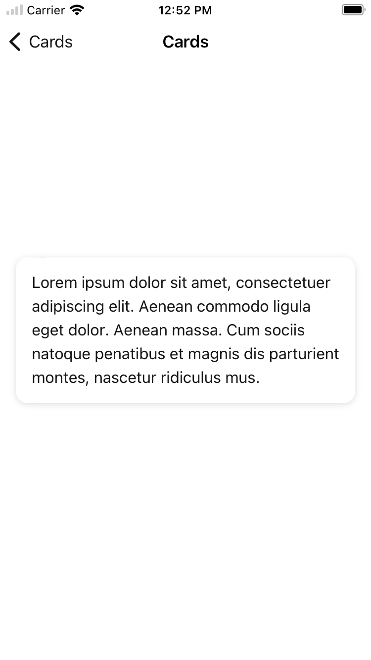
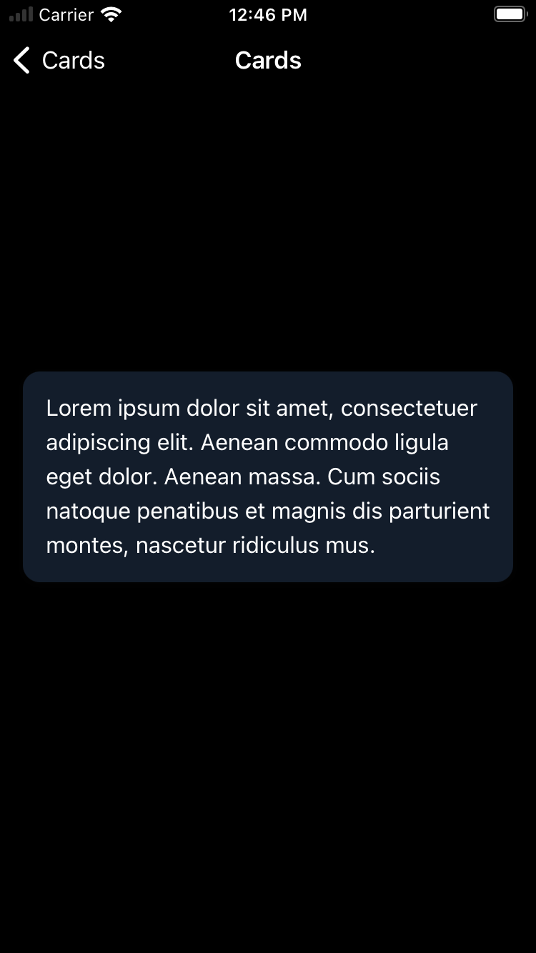
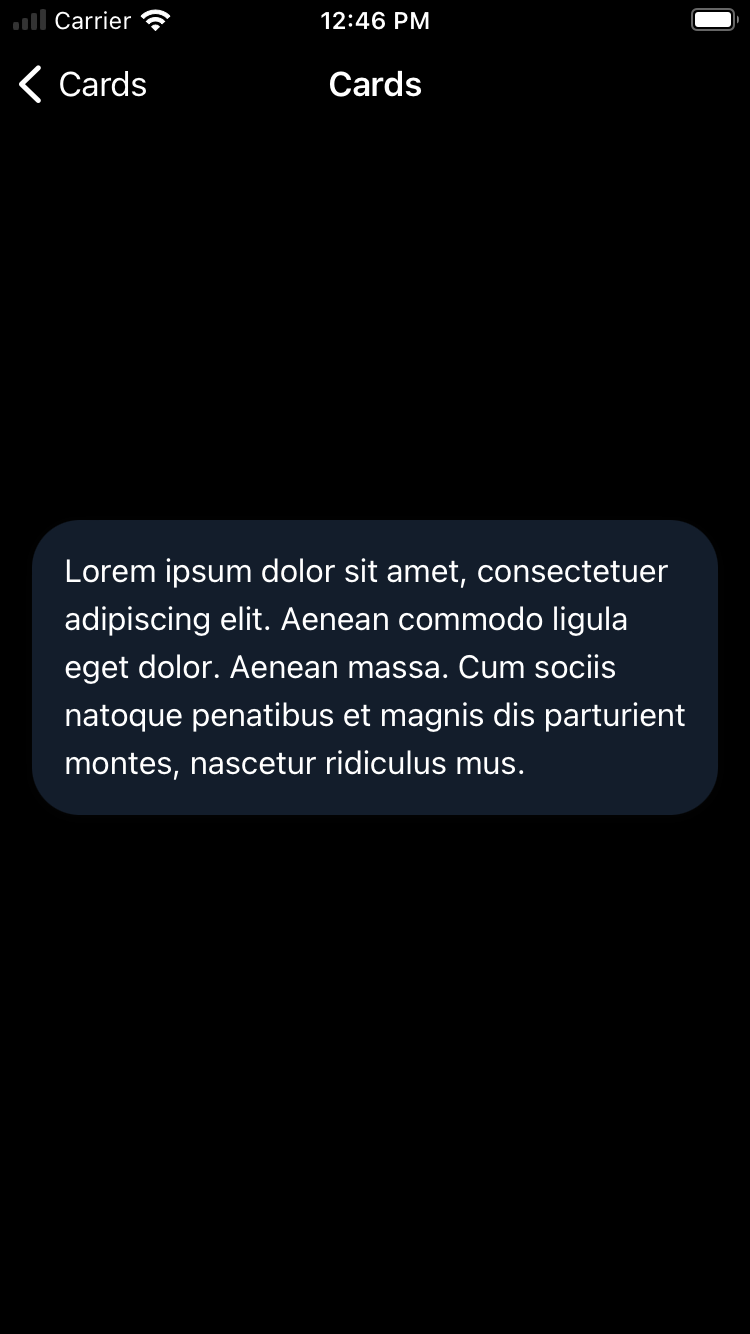
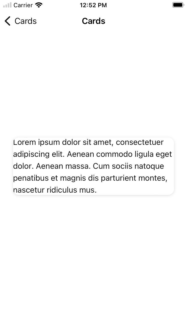
Default
| Day | Night |
|---|---|
 |
 |
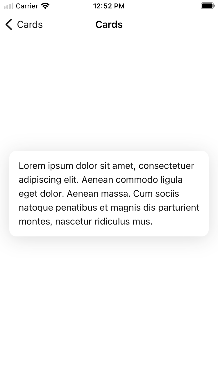
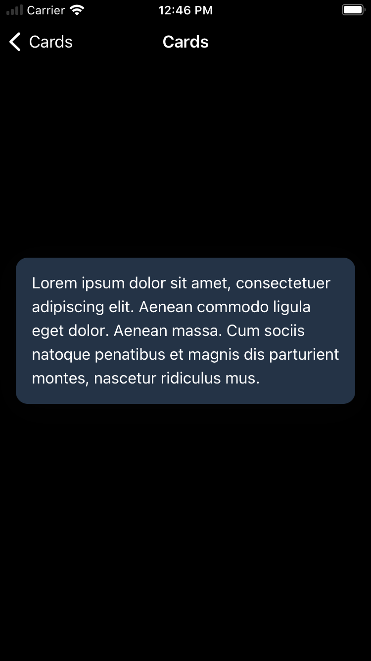
Selected
| Day | Night |
|---|---|
 |
 |
Large corner style
| Day | Night |
|---|---|
 |
 |
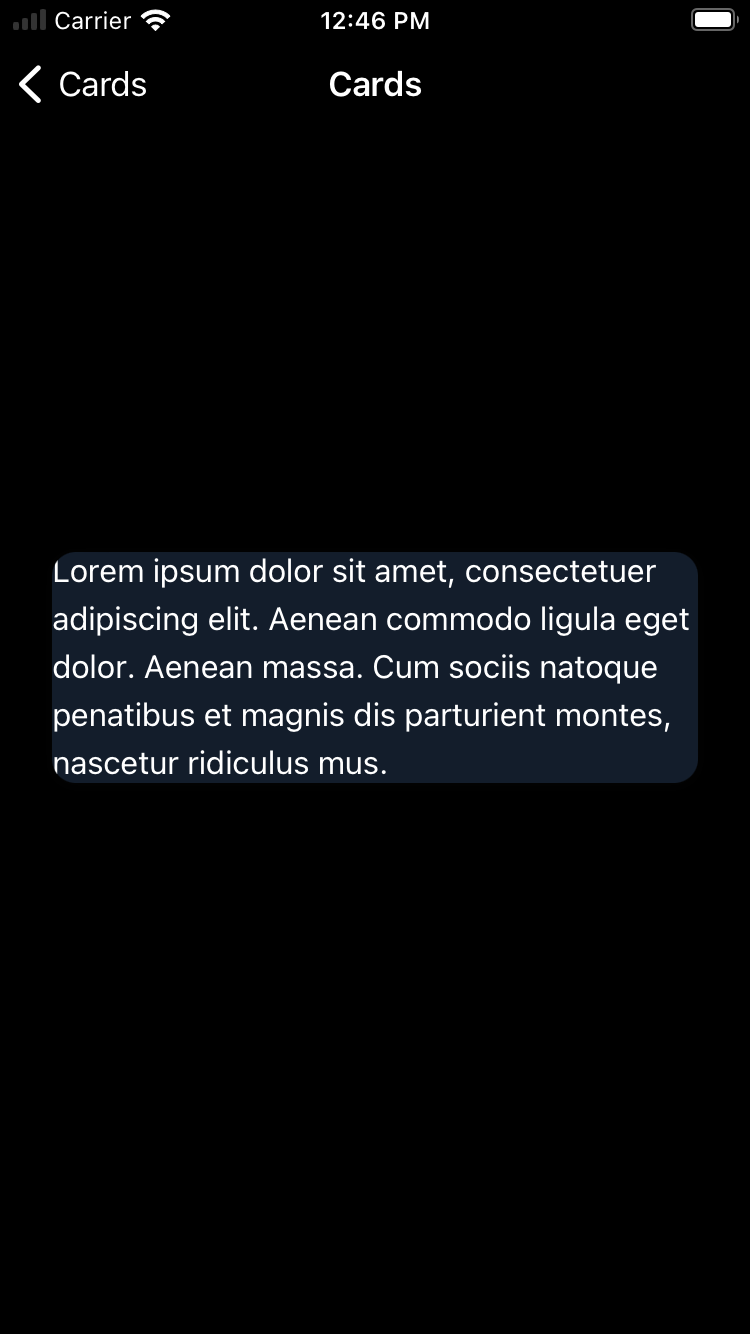
Without padding
| Day | Night |
|---|---|
 |
 |
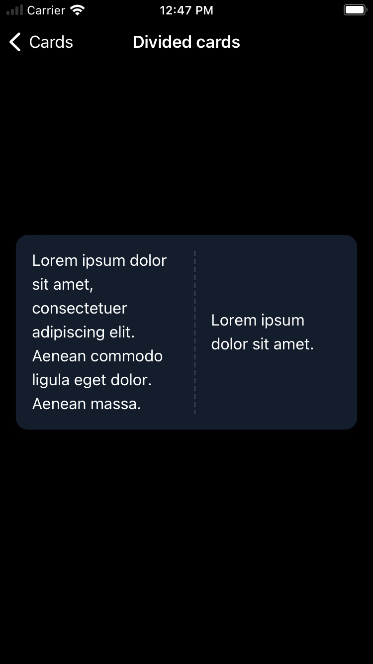
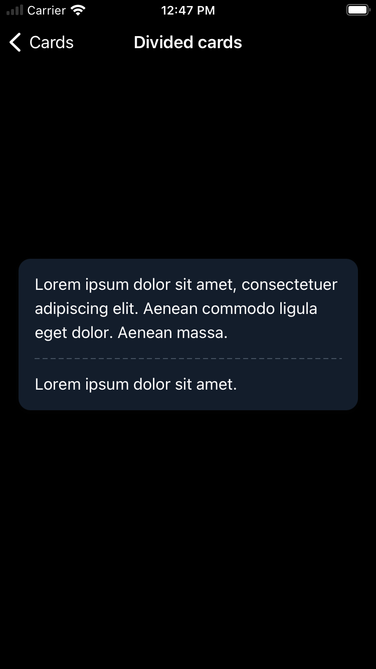
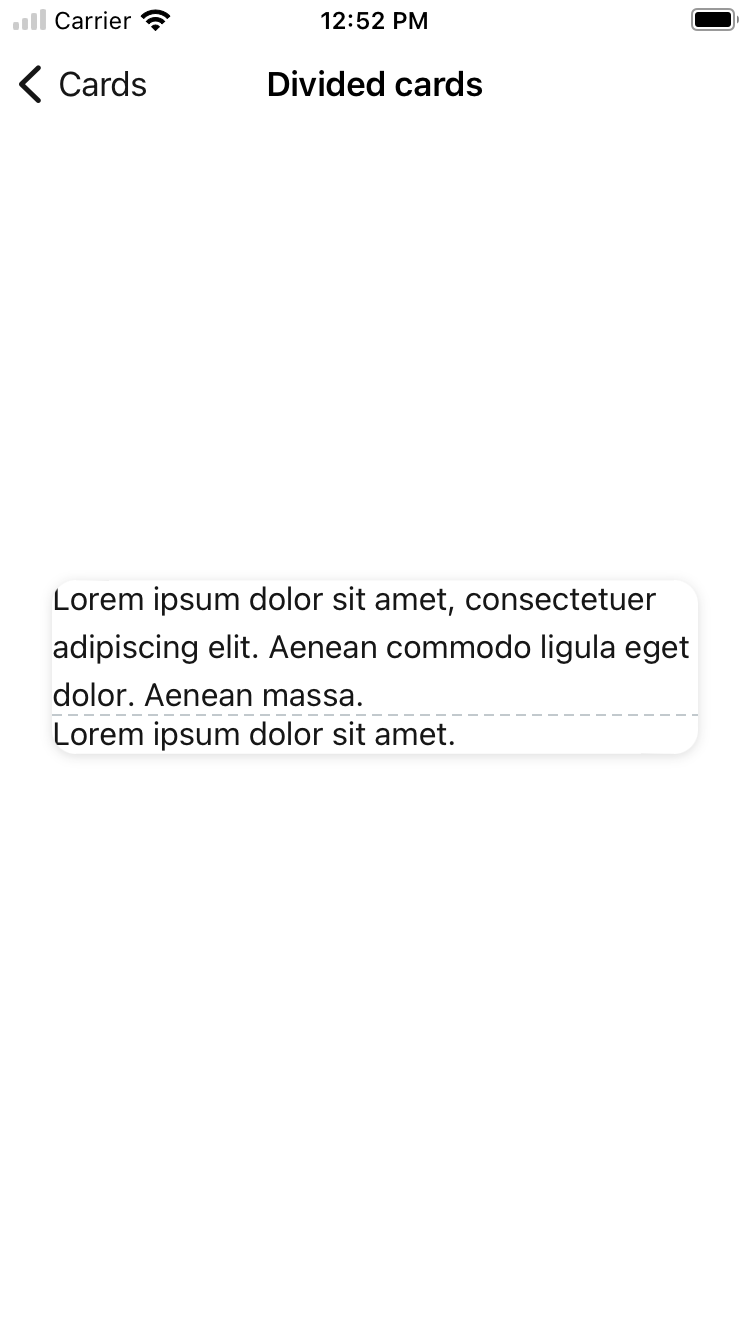
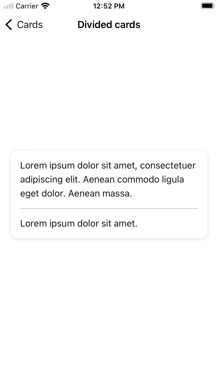
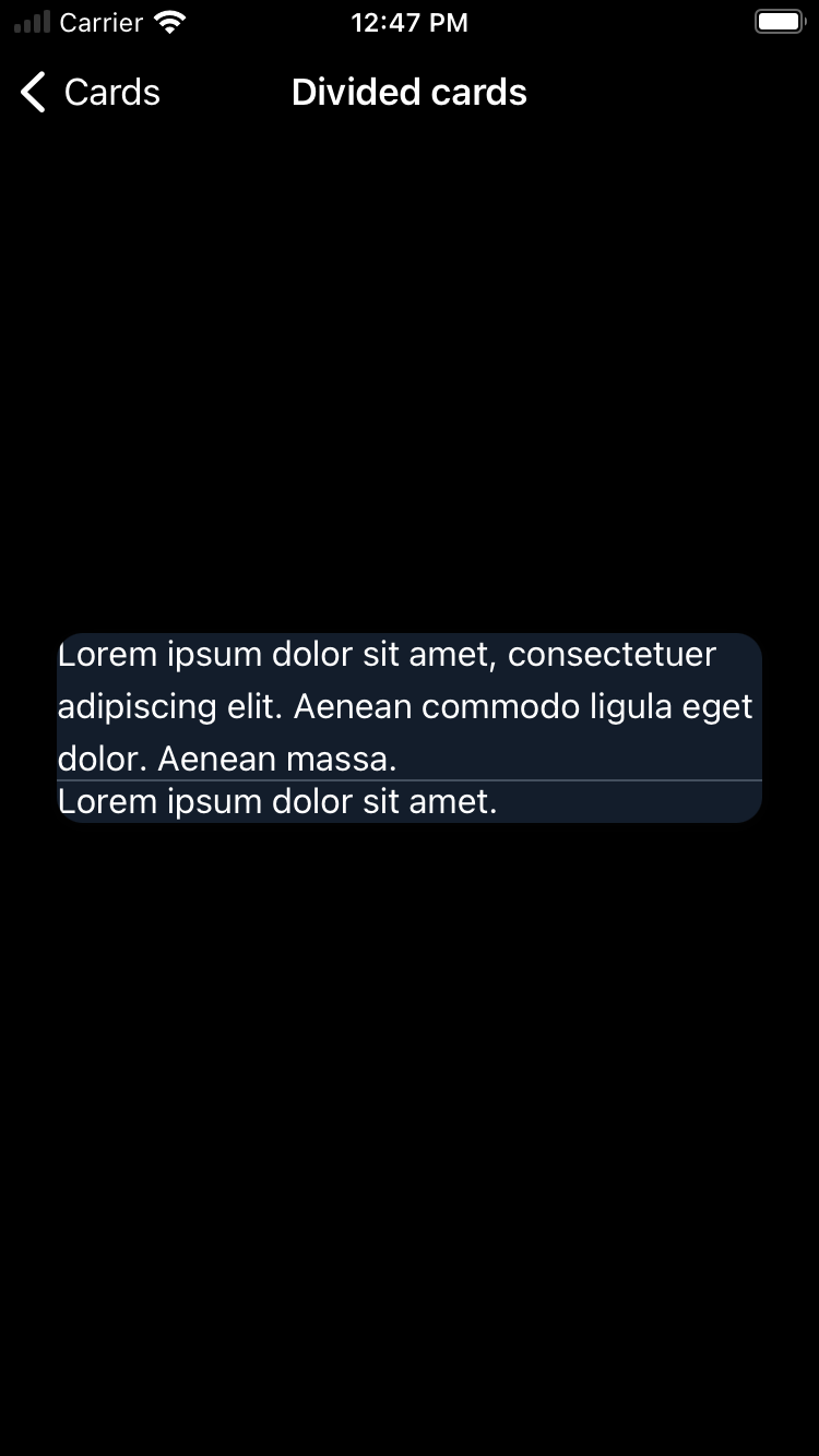
With divider
| Day | Night |
|---|---|
 |
 |
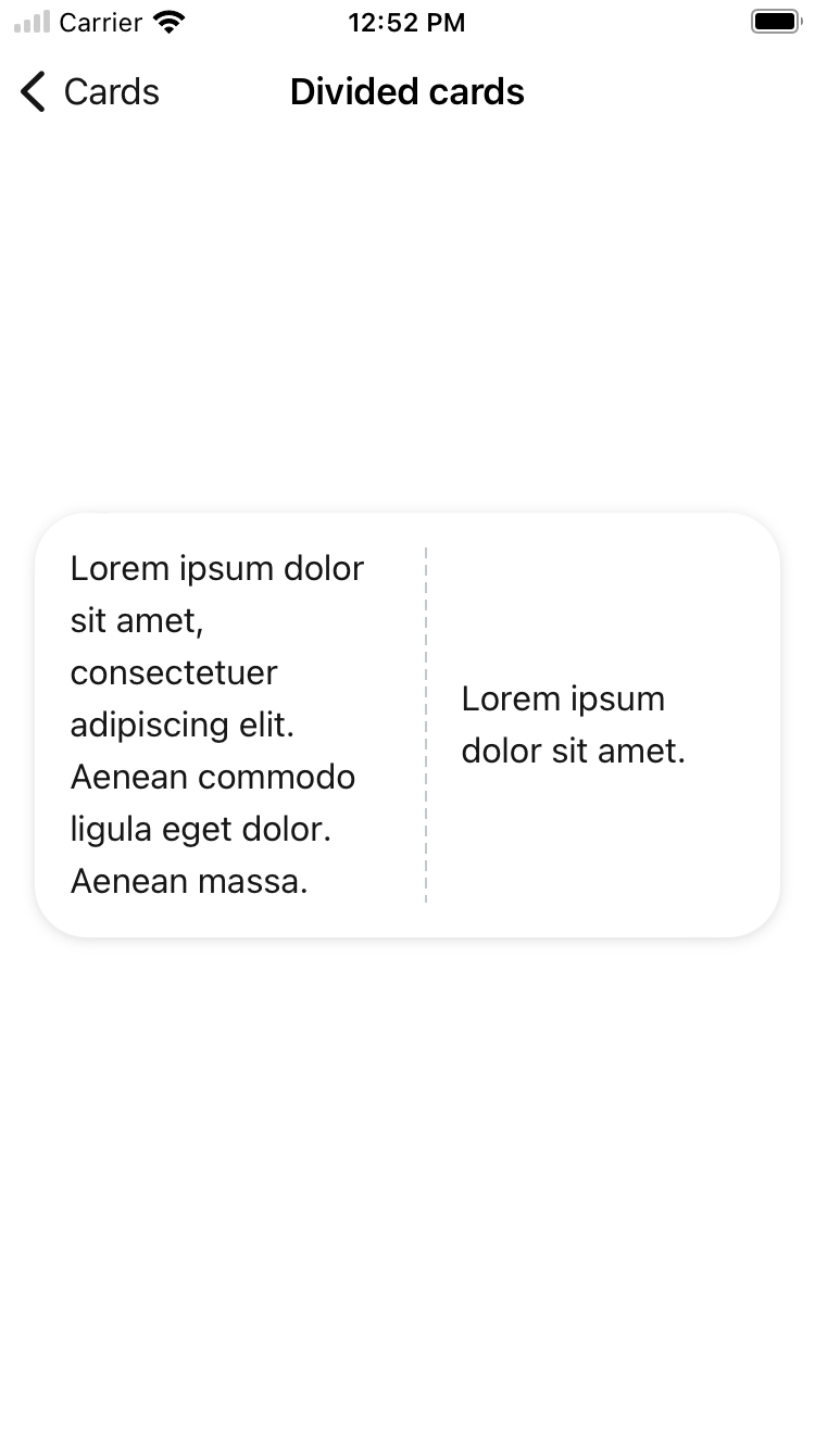
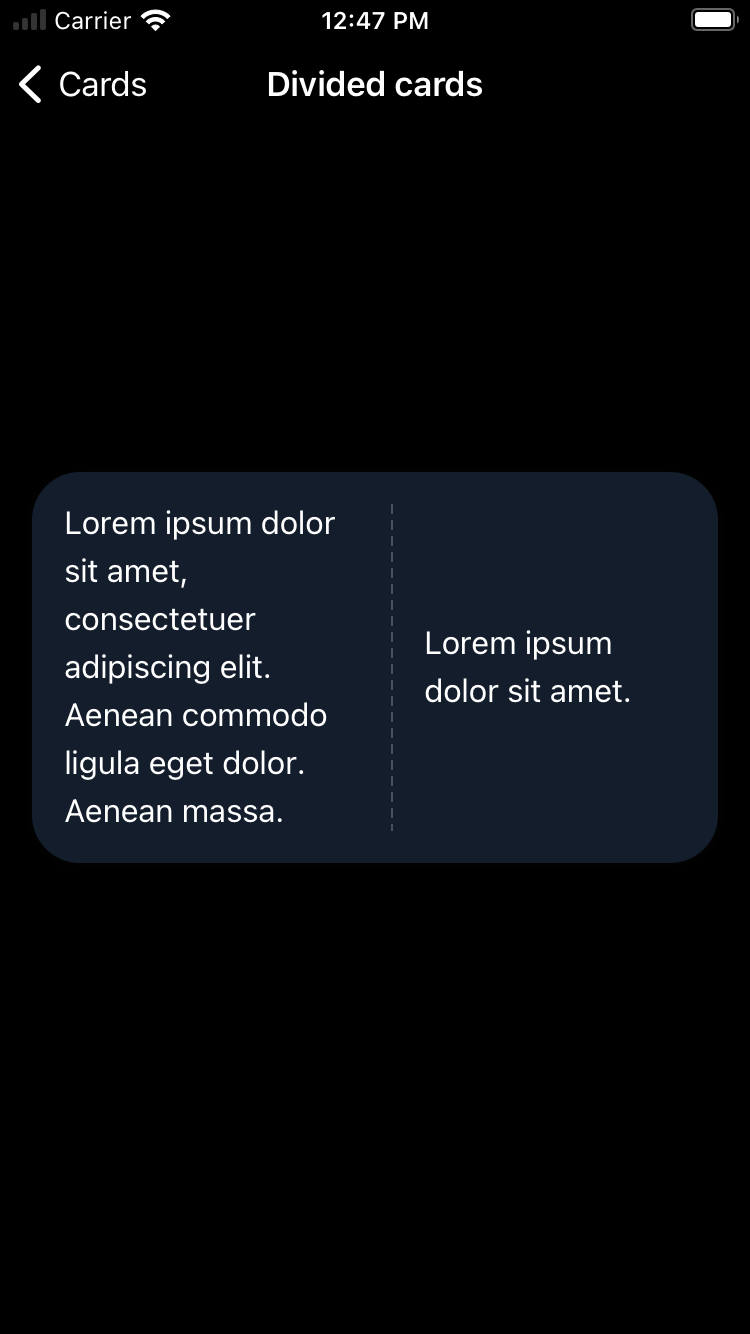
With divider arranged vertically
| Day | Night |
|---|---|
 |
 |
With divider and without padding
| Day | Night |
|---|---|
 |
 |
With divider and with large corner style
| Day | Night |
|---|---|
 |
 |
With solid divider
| Day | Night |
|---|---|
 |
 |
With solid divider and without padding
| Day | Night |
|---|---|
 |
 |
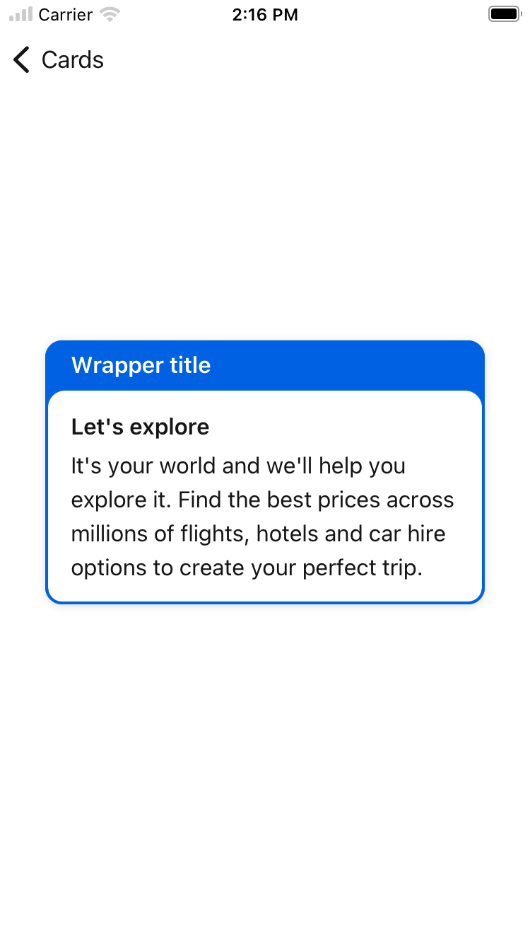
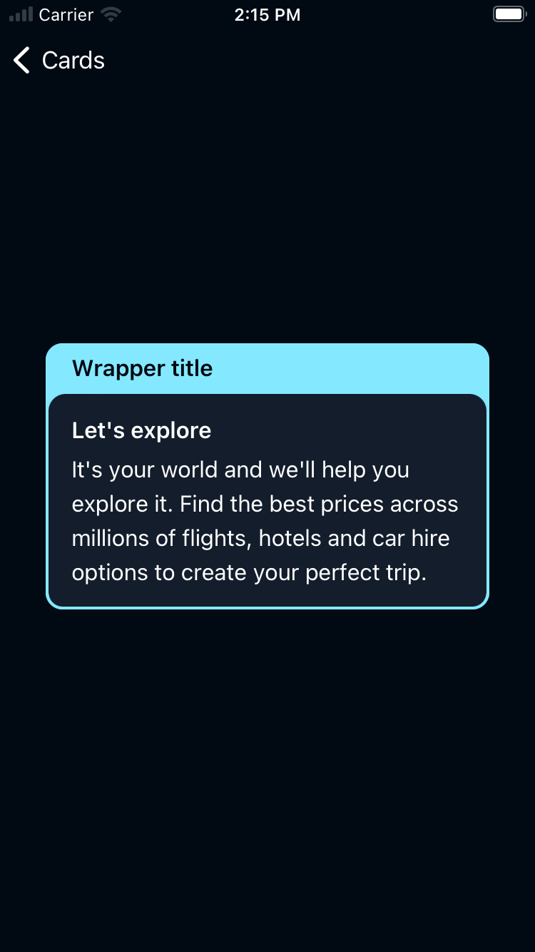
Card Wrapper
| Day | Night |
|---|---|
 |
 |
Usage
BPKCard contains the Backpack Card component. The card is a simple control view with or without a shadow, offering user interaction. It has a padded and non-padded variation. BPKCard can only have 1 direct subview and will add the appropriate constraints automatically when calling setting the subview property.
BPKDividedCard contains the Backpack Divided Card component. The divided card is a subclass of BPKCard. It can have 2 subviews and will add the appropriate constraints automatically when -initWithPrimarySubview:secondarySubview:padded/init(primarySubview: secondarySubview: padded: ) or -setPrimarySubview:secondarySubview/setSubviews(primarySubview: secondarySubview:) are called. It's axis can be vertical or horizontal.
Cards have an accessibility configuration. By default this is Container which means the card is invisible to assistive technology. In this case, ensure that the content of the card provides users of AT with the same action as tapping the card, and explain actions clearly.
Use the isElevated property to enable or disable shadows on the card.
If using a Button or Link configuration, ensure that the accessibilityLabel used describes the whole content of the card and the same action.
Do not use Button or Link configurations if the card has multiple actions or if the copy is long.
BPKCardWrapper contains the Backpack Card Wrapper component. It can have 2 subviews and will add the appropriate constraints automatically when init(header:card:backgroundColor:) is called. It's axis is vertical.
Use the elevation property to set the shadows on the wrapper. It can be .default, .focus, and .none.
Objective-C
BPKCard
BPKDividedCard
Swift
BPKCard
BPKDividedCard
BPKCardWrapper