- Welcome
- Getting started
- Latest updates
- Foundations
-
Components
- Accordion
- Alert
- Alignment
- App Search Modal
- Aria live
- Autosuggest
- Badge
- Banner alert
- Bar chart
- Blockquote
- Bottom navigation
- Bottom sheet
- Breadcrumb
- Breakpoint
- Button
- Calendar
- Card
- Card list
- Card button
- Carousel
- Checkbox
- Chip
- Chip group
- Code
- Content cards
- Data Table
- Datepicker
- Description list
- Dialog
- Divider
- Drawer
- Field Set
- Flare
- Flat list
- Flight leg
- Floating action button
- Floating notification
- Form label
- Form validation
- Graphic promotion
- Horizontal navigation
- Icon
- Image
- Image Gallery
- Infinite scroll
- Info Banner
- Inset Banner
- Link
- List
- Map
- Mobile scroll container
- Modal
- Navigation bar
- Navigation Tab Group
- Nudger
- Overlay
- Page indicator
- Pagination
- Panel
- Phone input
- Picker
- Popover
- Price
- Progress bar
- Radio button
- Rating
- Rating Bar
- Scrollable calendar
- Search Modal
- Section header
- Section list
- Select
- Skeleton
- Skip link
- Slider
- Snackbar
- Snippet
- Spinner
- Split input
- Star rating
- Swap Button
- Switch
- Table
- Text
- Text input
- Theming
- Ticket
- Toast
- Tooltip
- Touchable native feedback
- Touchable overlay
- Search Input Summary
- Content
- Accessibility
- Contributing
- Localisation
Card
Cards are used to group related items. They allow complex datasets to be broken down into individual, distinct areas for easy consumption.
Card

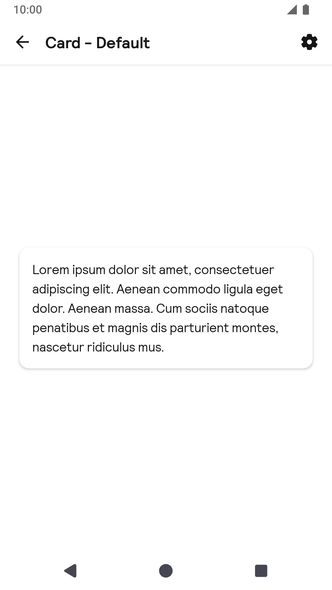
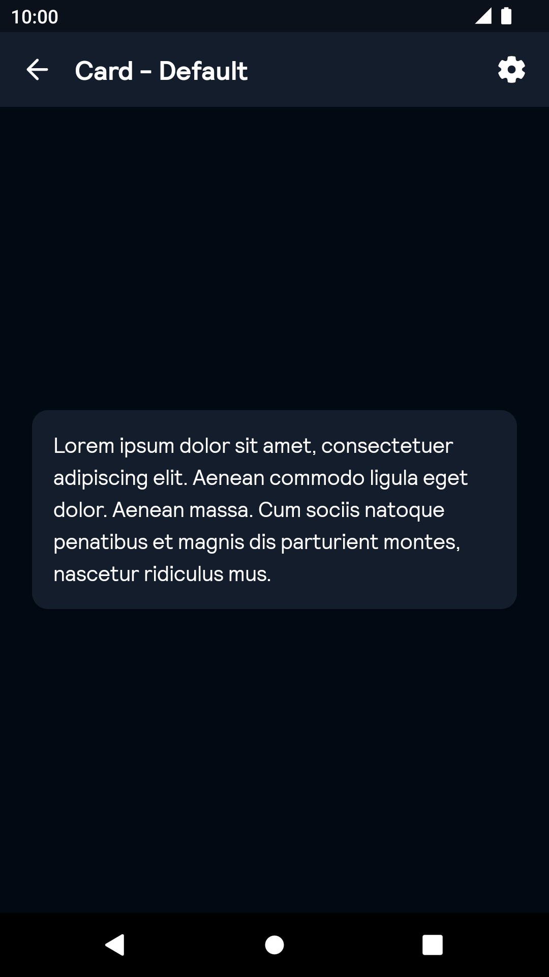
Default
| Day | Night |
|---|---|
 |
 |
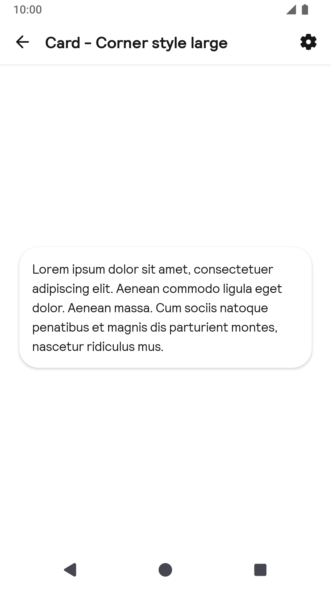
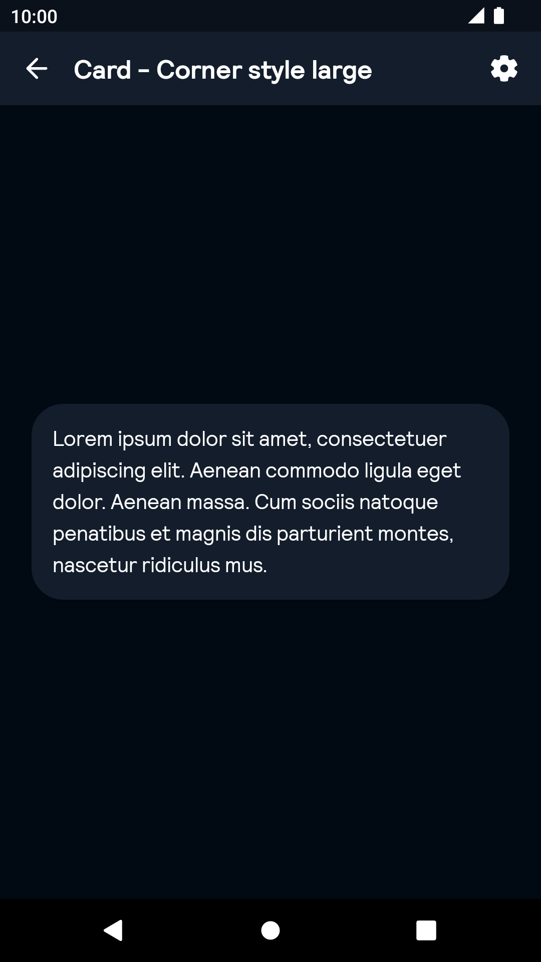
Corner style large
| Day | Night |
|---|---|
 |
 |
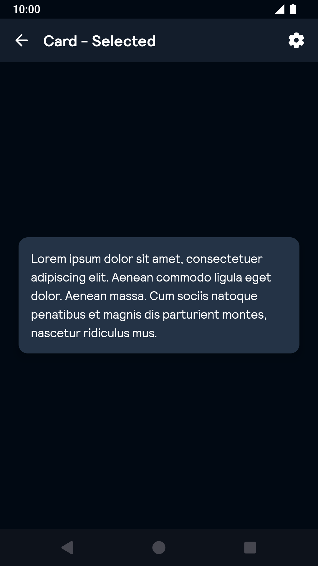
Selected
| Day | Night |
|---|---|
 |
 |
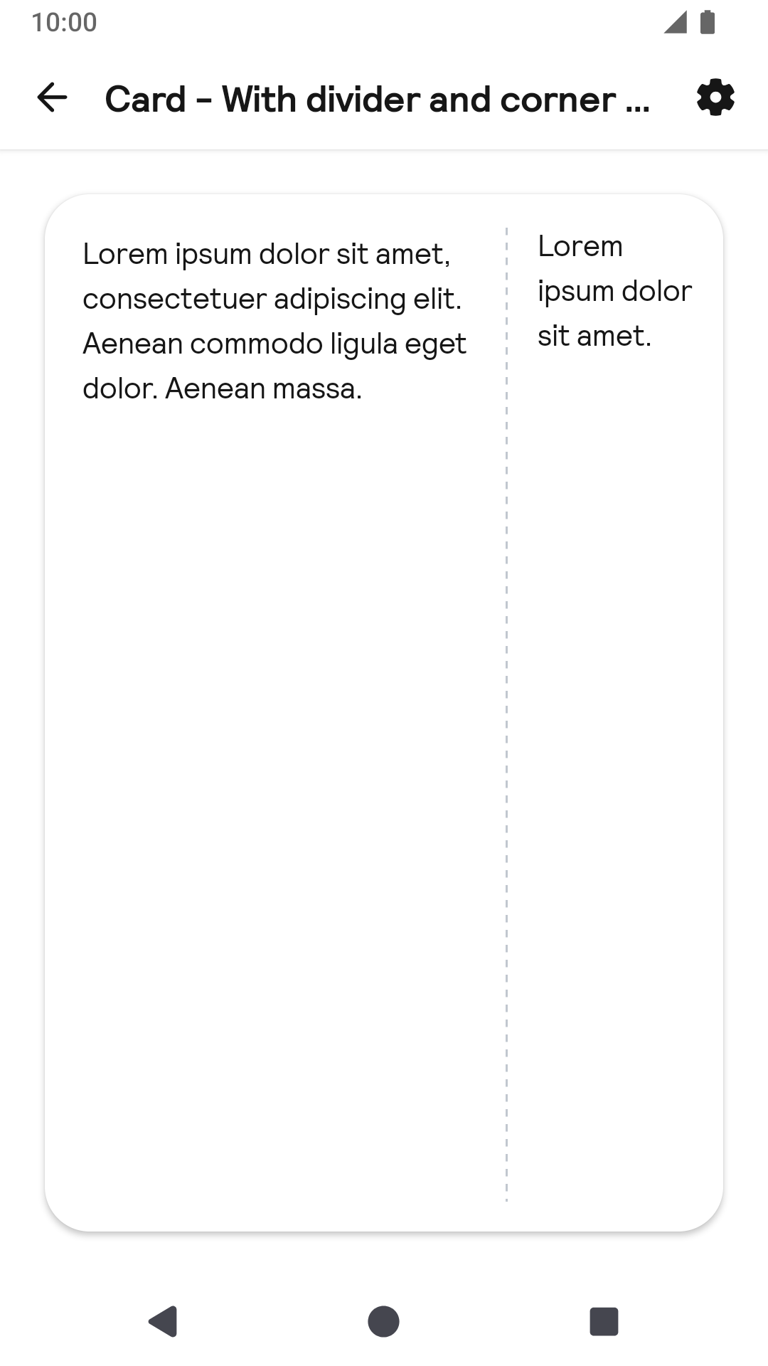
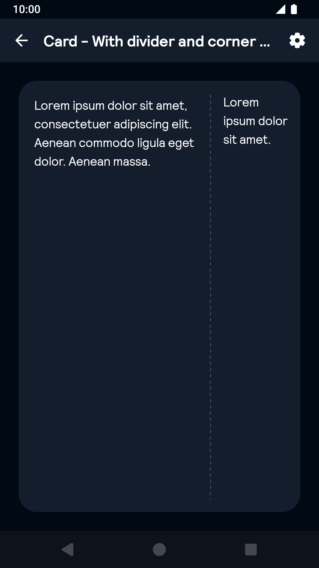
With divider and corner style large
| Day | Night |
|---|---|
 |
 |
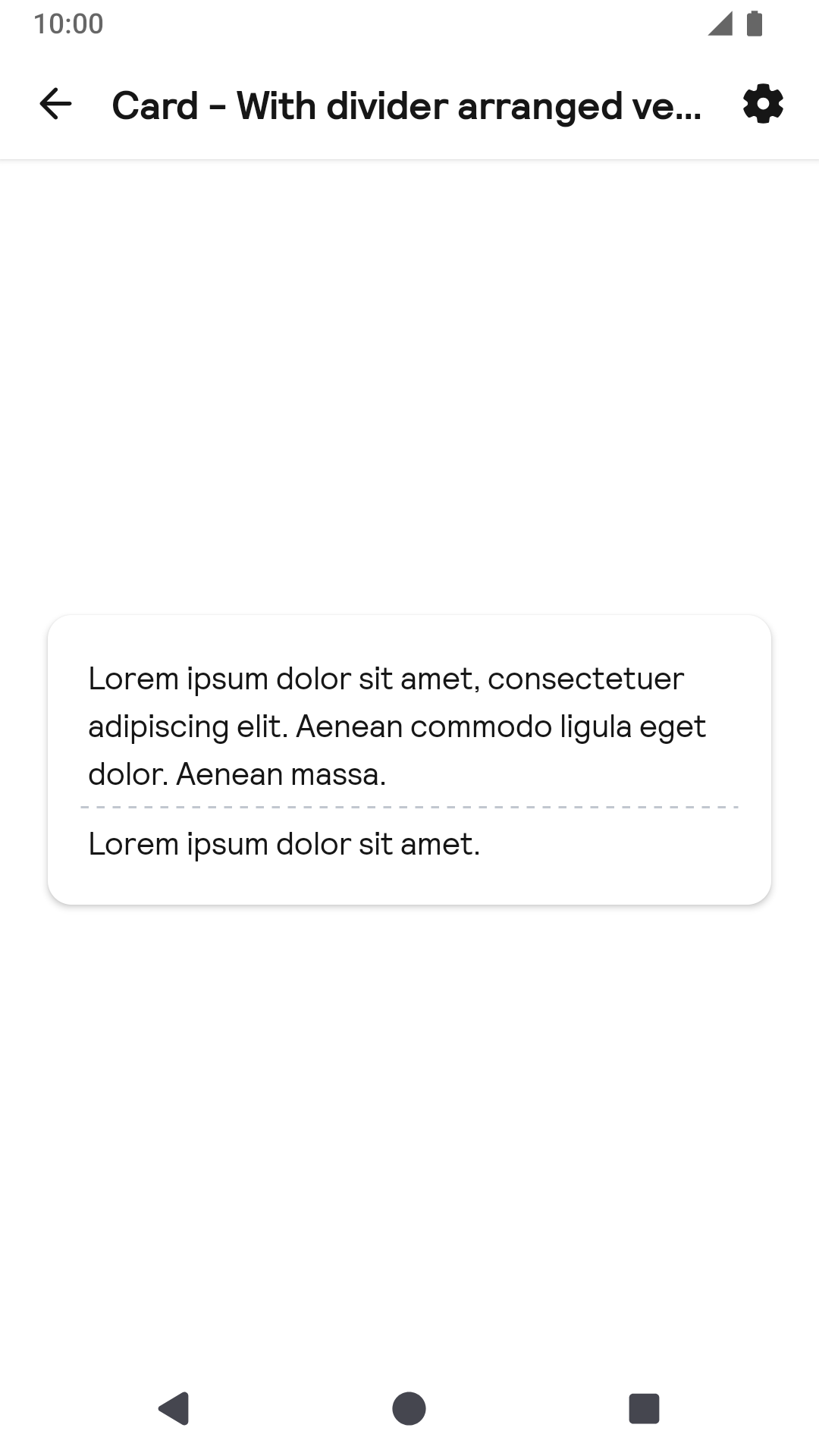
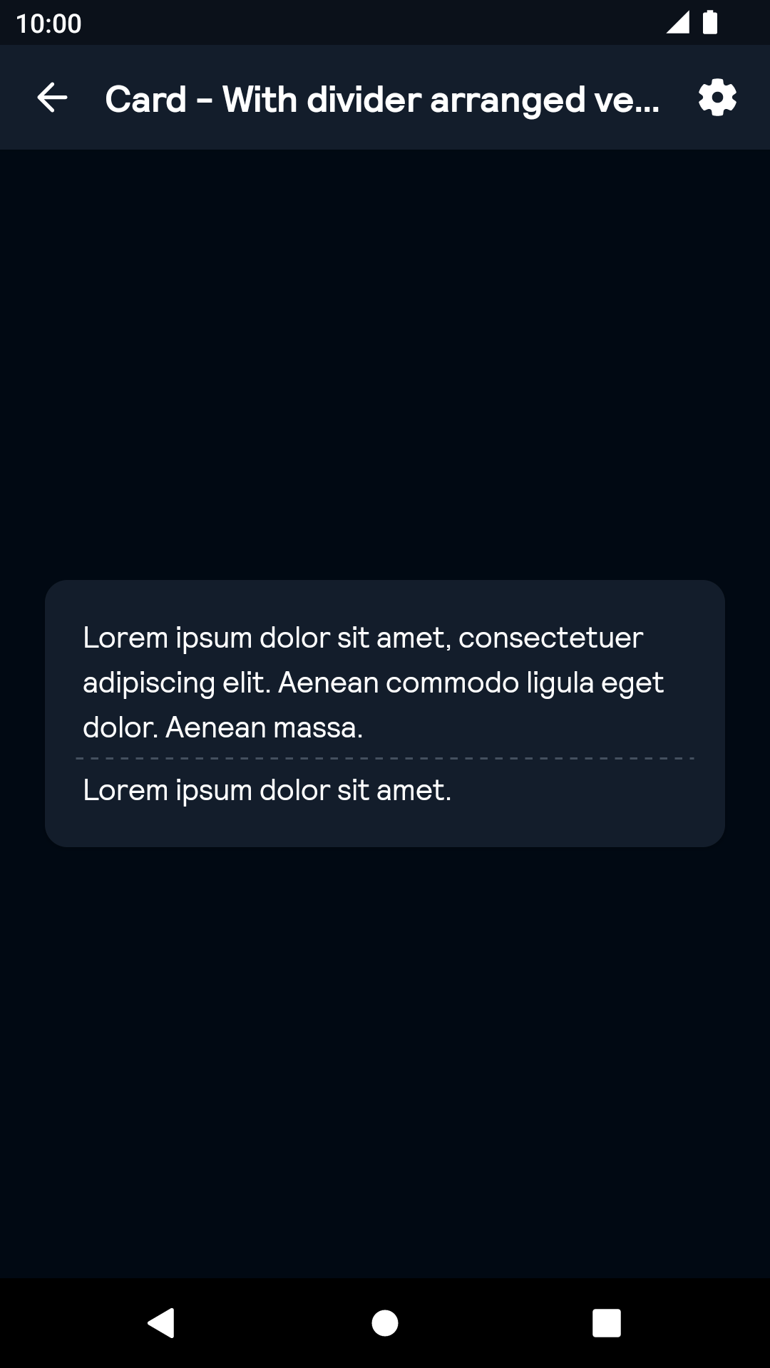
With divider arranged vertically
| Day | Night |
|---|---|
 |
 |
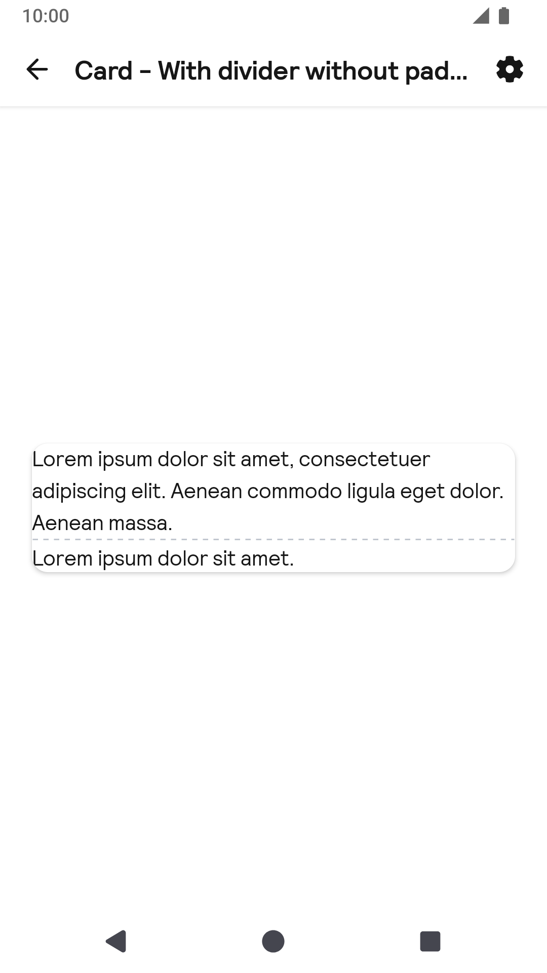
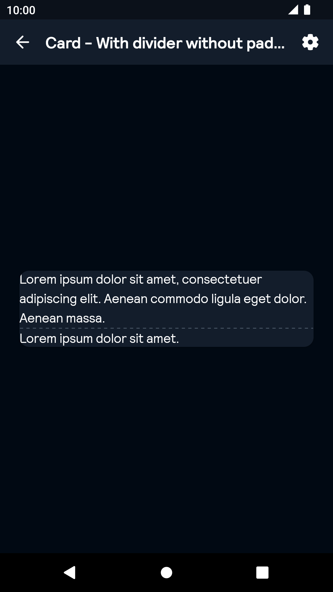
With divider without padding
| Day | Night |
|---|---|
 |
 |
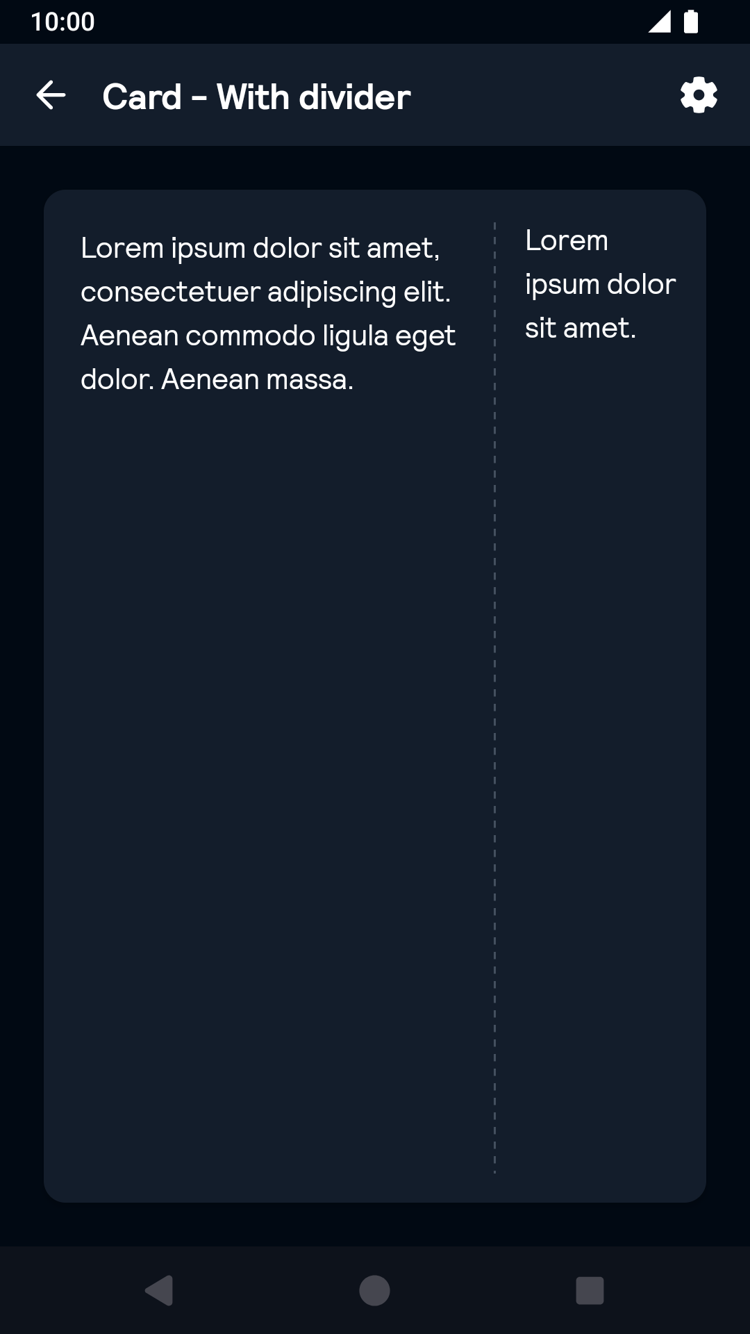
With divider
| Day | Night |
|---|---|
 |
 |
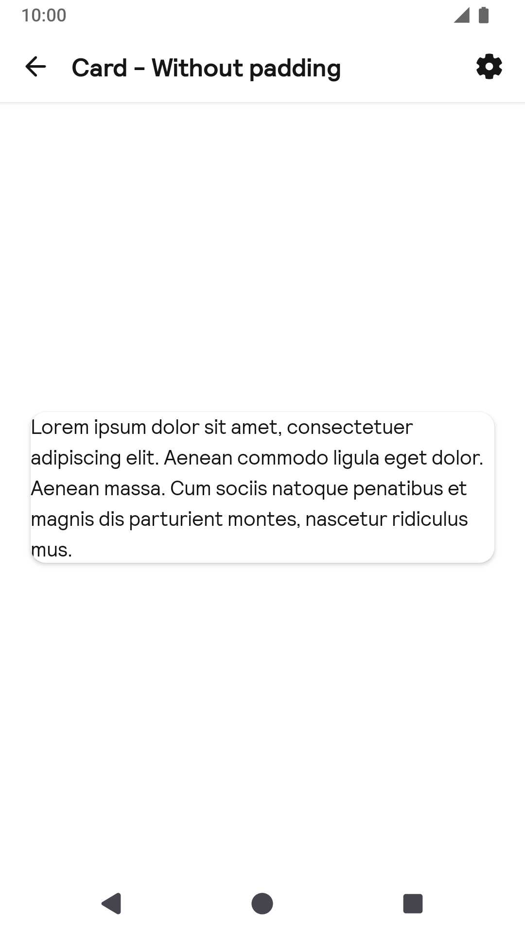
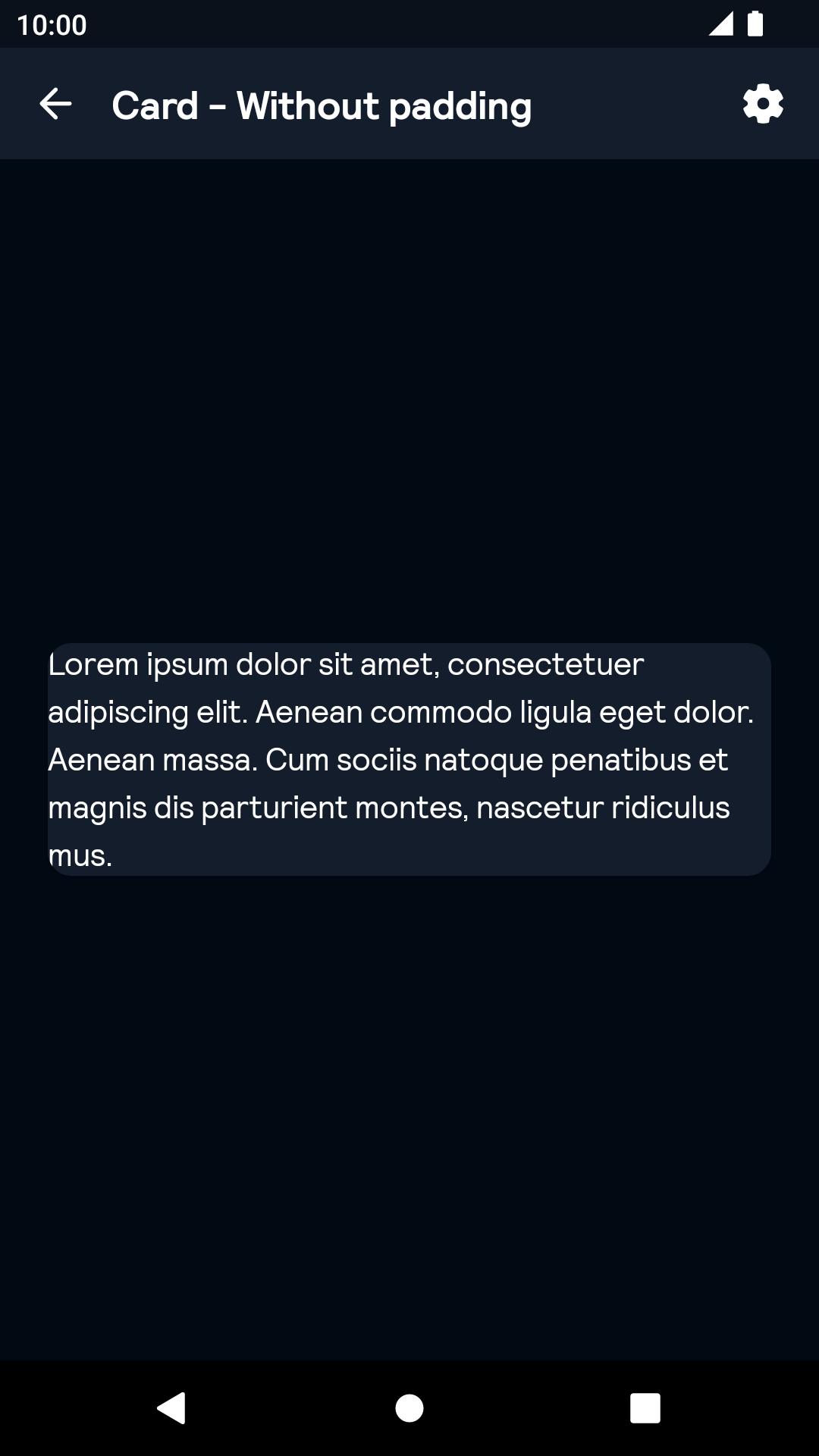
Without padding
| Day | Night |
|---|---|
 |
 |
Installation
Backpack Android is available through Maven Central. Check the main Readme for a complete installation guide.
Usage
BpkCardView is an extension of CardView in com.android.support:cardview-v7
The Card component can be used in both XML and Kotlin
Example of a padded and focused card in XML
                                                 <net.skyscanner.backpack.card.BpkCardView
                                                    android:layout_width="match_parent"
                                                    android:layout_height="wrap_content"
                                                    android:clickable="true"
                                                    android:focusable="true"
                                                    android:foreground="?android:attr/selectableItemBackground"
                                                    app:elevationLevel="focused"
                                                    app:cornerStyle="small">

                                                    <net.skyscanner.backpack.text.BpkText
                                                      android:layout_width="match_parent"
                                                      android:layout_height="match_parent"
                                                      android:text="@string/stub_md" />

                                                  </net.skyscanner.backpack.card.BpkCardView>
Example of a padded and focused card in Kotlin
                                                import net.skyscanner.backpack.card.BpkCardView

                                                BpkCardView(context).apply {
                                                   padded = true
                                                   elevationLevel = BpkCardView.ElevationLevel.Focused
                                                   cornerStyle = BpkCardView.CornerStyle.SMALL
                                                }
Properties
| Property | PropType | Required | Default Value |
|---|---|---|---|
| padded | Boolean | false | true |
| cornerStyle | CornerStyle: Small, Large | false | Small |
| elevationLevel | ElevationLevel: None, Default, Focused | false | Default |
Accessibility
Consider if your card should be atomic or non-atomic. If the copy inside your card is lengthy, consider making it non-atomic and providing a CTA inside. The entire card will still be clickable/tappable, but will be ignored by TalkBack.
A clickable & focusable card is atomic by default, whereas a non-clickable/focusable card is non-atomic. To change that set the importantForAccessibility property to yes for atomic cards and no for non-atomic cards.
Made with ❤️ by Skyscanner © 2024
© 2024 Skyscanner Backpack. Page last updated on Oct 31, 2022, 13:15