- Welcome
- Getting started
- Latest updates
- Foundations
-
Components
- Accordion
- Alert
- Alignment
- App Search Modal
- Aria live
- Autosuggest
- Badge
- Banner alert
- Bar chart
- Blockquote
- Bottom navigation
- Bottom sheet
- Breadcrumb
- Breakpoint
- Button
- Calendar
- Card
- Card list
- Card button
- Carousel
- Checkbox
- Chip
- Chip group
- Code
- Content cards
- Data Table
- Datepicker
- Description list
- Dialog
- Divider
- Drawer
- Field Set
- Flare
- Flat list
- Flight leg
- Floating action button
- Floating notification
- Form label
- Form validation
- Graphic promotion
- Horizontal navigation
- Icon
- Image
- Image Gallery
- Infinite scroll
- Info Banner
- Inset Banner
- Link
- List
- Map
- Mobile scroll container
- Modal
- Navigation bar
- Navigation Tab Group
- Nudger
- Overlay
- Page indicator
- Pagination
- Panel
- Phone input
- Picker
- Popover
- Price
- Progress bar
- Radio button
- Rating
- Rating Bar
- Scrollable calendar
- Search Modal
- Section header
- Section list
- Select
- Skeleton
- Skip link
- Slider
- Snackbar
- Snippet
- Spinner
- Split input
- Star rating
- Swap Button
- Switch
- Table
- Text
- Text input
- Theming
- Ticket
- Toast
- Tooltip
- Touchable native feedback
- Touchable overlay
- Search Input Summary
- Content
- Accessibility
- Contributing
- Localisation
Navigation bar
The navigation bar component encapsulates a title and icon/text actions for controlling views.
Backpack-SwiftUI/NavigationView

Default
| Day | Night |
|---|---|
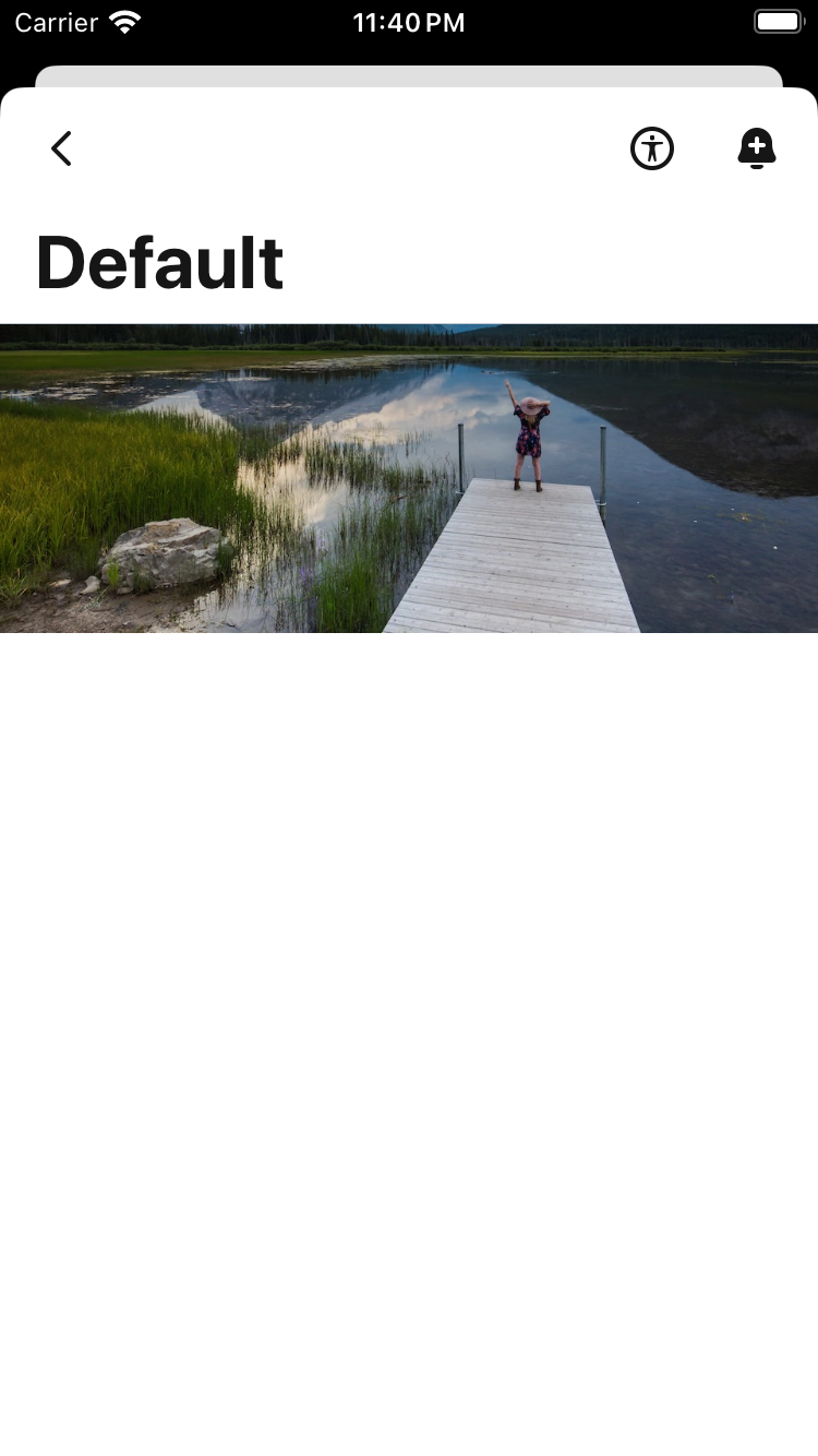 |
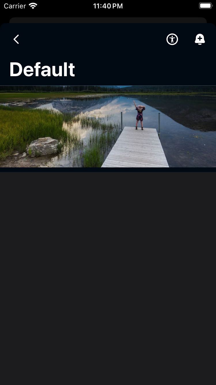 |
Transparent
| Day | Night |
|---|---|
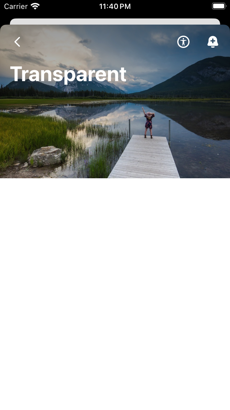 |
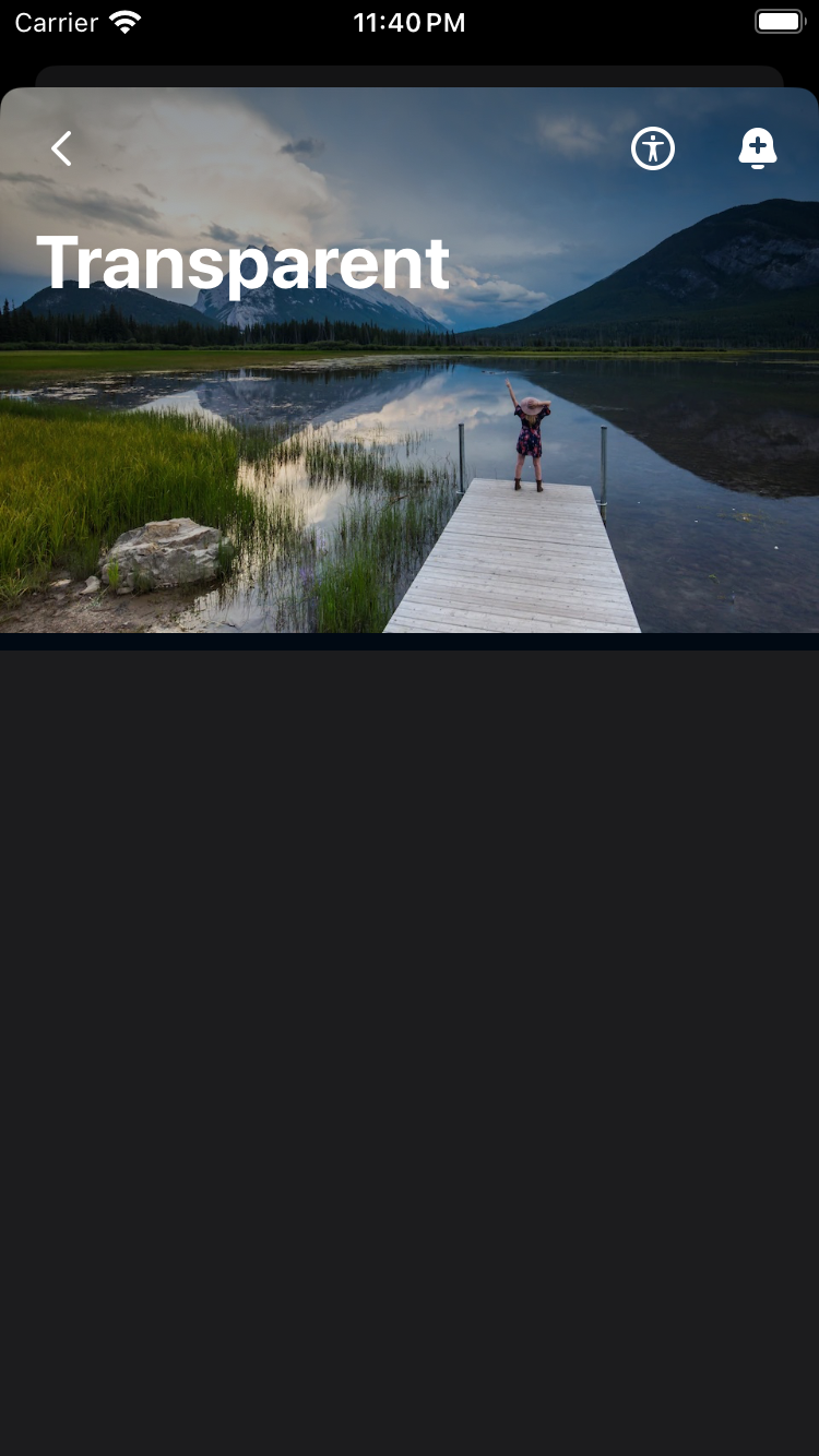 |
Surface Contrast
| Day | Night |
|---|---|
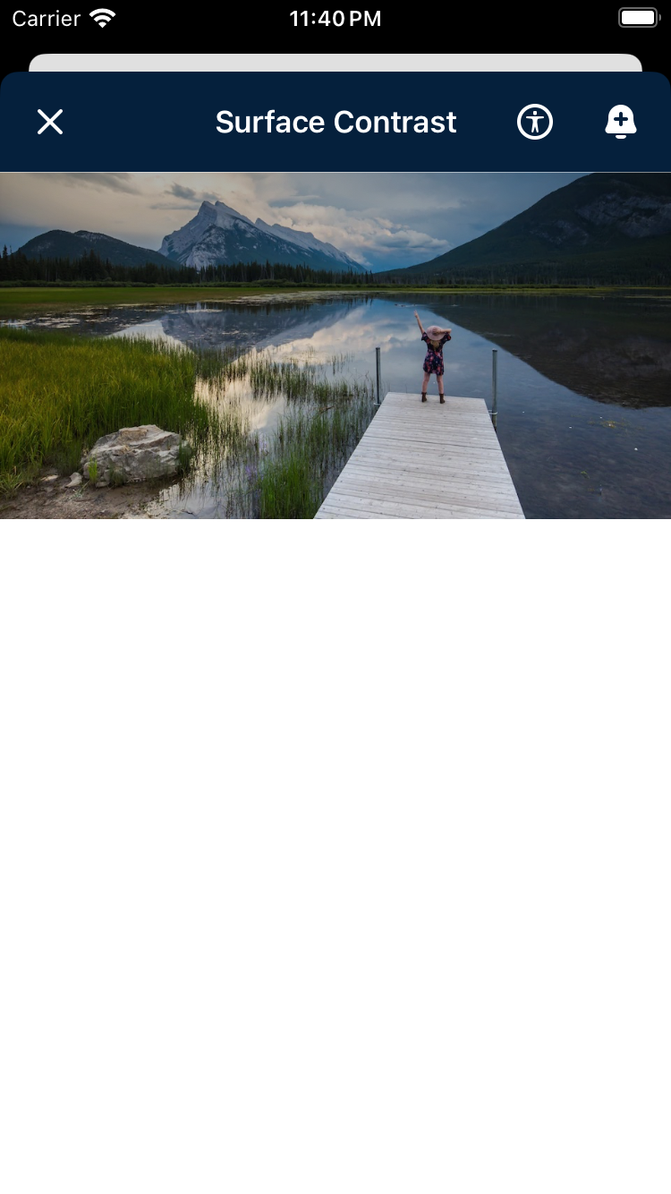 |
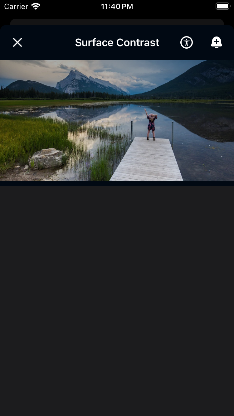 |
Usage
Similar to SwiftUI's native NavigationView, BPKNavigationView is used to manage the navigation of a view hierarchy. You can set a title and an array of leading and trailing items.
Leading and Trailing Items
An enum is defined with the different types of items that can be used as leading or trailing items. The available types are:
- icon
- title
- backButton
- closeButton
                                                BPKNavigationView(
                                                    title: "Title",
                                                    leadingItems: [.init(type: .backButton("Back"), action: {})]
                                                ) {
                                                    Text("Content")
                                                }

                                                BPKNavigationView(
                                                    title: "Title",
                                                    leadingItems: [.init(type: .closeButton("Close"), action: {})],
                                                    trailingItems: [
                                                        .init(type: .icon(.ai, "AI"), action: {},
                                                        .init(type: .icon(.calendar, "Calendar"), action: {})
                                                    ]
                                                ) {
                                                    Text("Content")
                                                }
Customising the Navigation Bar
You can customise the navigation bar by setting the style property. All except for surfaceContrast support setting a TitleDisplayMode.
- default(TitleDisplayMode)
- transparent(TitleDisplayMode)
- surfaceContrast (only supports inline style)
Default
                                                BPKNavigationView(
                                                    title: "Title",
                                                    style: .default(.large)
                                                ) {
                                                    Text("Content")
                                                }
Transparent
                                                BPKNavigationView(
                                                    title: "Title",
                                                    style: .transparent(.automatic)
                                                ) {
                                                    Text("Content")
                                                }
Surface Contrast
                                                BPKNavigationView(
                                                    title: "Title",
                                                    style: .surfaceContrast
                                                ) {
                                                    Text("Content")
}Made with ❤️ by Skyscanner © 2024
© 2024 Skyscanner Backpack. Page last updated on Apr 11, 2024, 17:08