- Welcome
- Getting started
- Latest updates
- Foundations
-
Components
- Accordion
- Alert
- Alignment
- App Search Modal
- Aria live
- Autosuggest
- Badge
- Banner alert
- Bar chart
- Blockquote
- Bottom navigation
- Bottom sheet
- Breadcrumb
- Breakpoint
- Button
- Calendar
- Card
- Card list
- Card button
- Carousel
- Checkbox
- Chip
- Chip group
- Code
- Content cards
- Data Table
- Datepicker
- Description list
- Dialog
- Divider
- Drawer
- Field Set
- Flare
- Flat list
- Flight leg
- Floating action button
- Floating notification
- Form label
- Form validation
- Graphic promotion
- Horizontal navigation
- Icon
- Image
- Image Gallery
- Infinite scroll
- Info Banner
- Inset Banner
- Link
- List
- Map
- Mobile scroll container
- Modal
- Navigation bar
- Navigation Tab Group
- Nudger
- Overlay
- Page indicator
- Pagination
- Panel
- Phone input
- Picker
- Popover
- Price
- Progress bar
- Radio button
- Rating
- Rating Bar
- Scrollable calendar
- Search Modal
- Section header
- Section list
- Select
- Skeleton
- Skip link
- Slider
- Snackbar
- Snippet
- Spinner
- Split input
- Star rating
- Swap Button
- Switch
- Table
- Text
- Text input
- Theming
- Ticket
- Toast
- Tooltip
- Touchable native feedback
- Touchable overlay
- Search Input Summary
- Content
- Accessibility
- Contributing
- Localisation
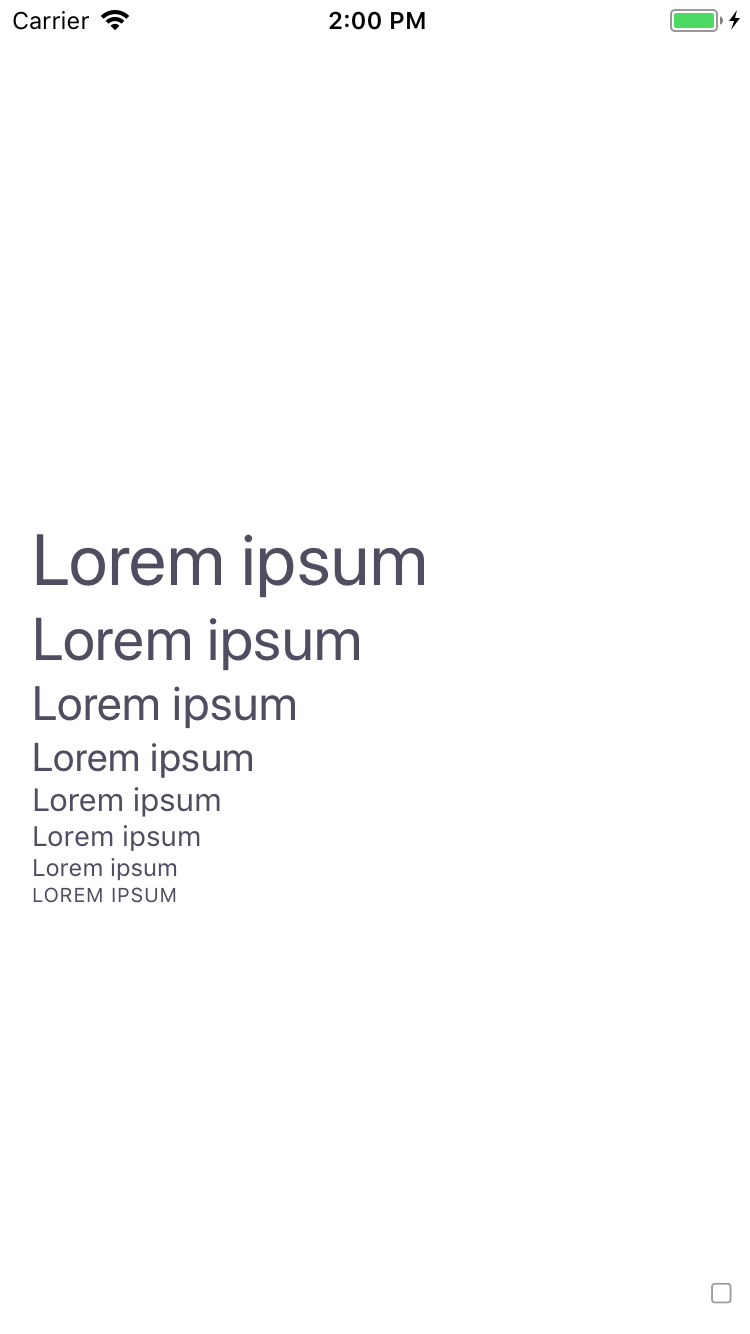
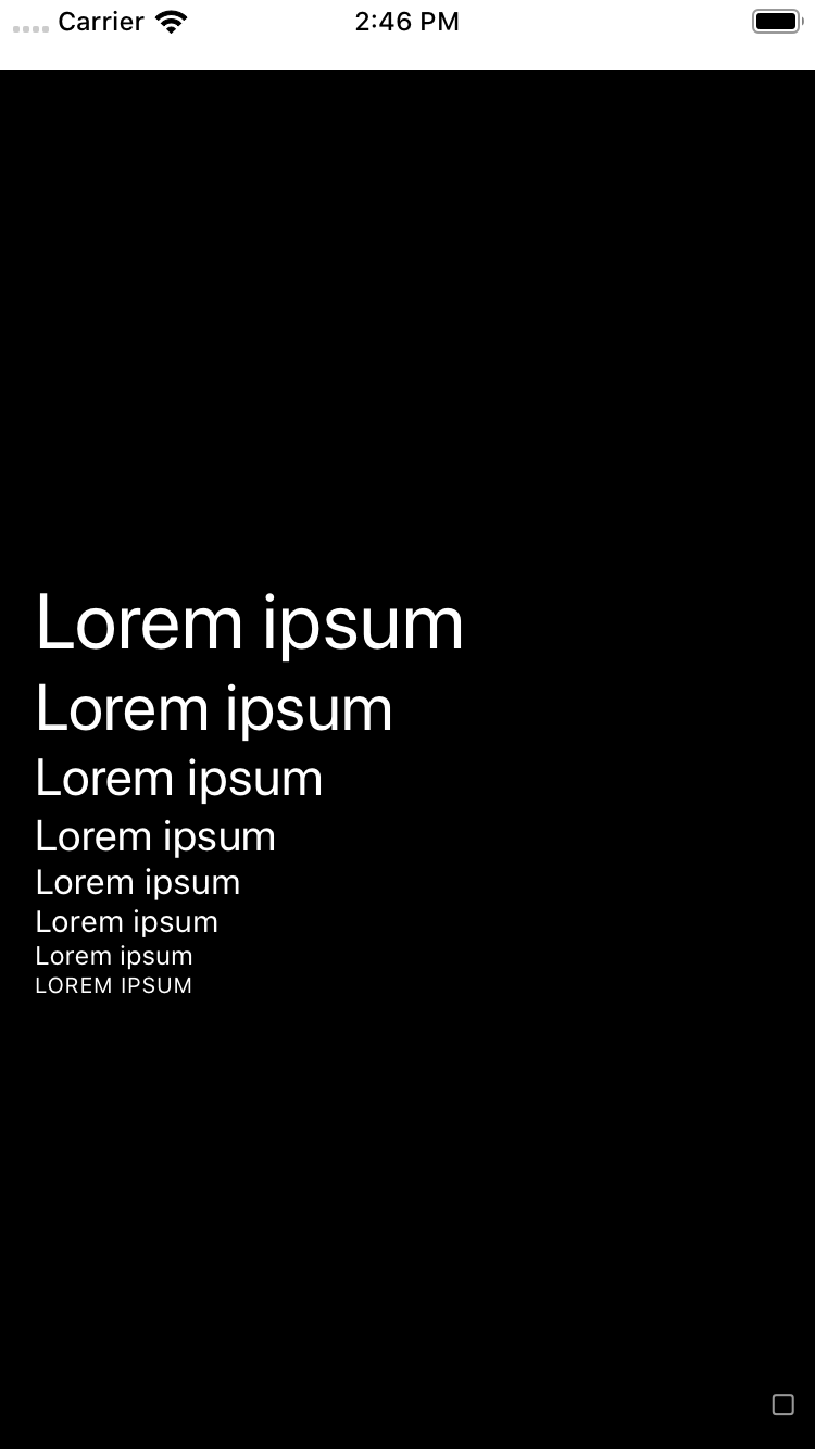
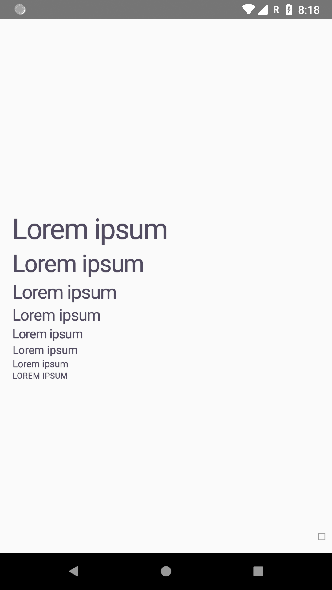
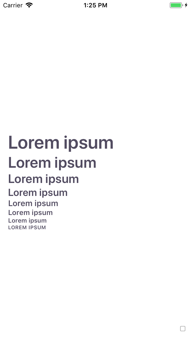
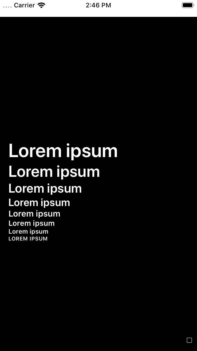
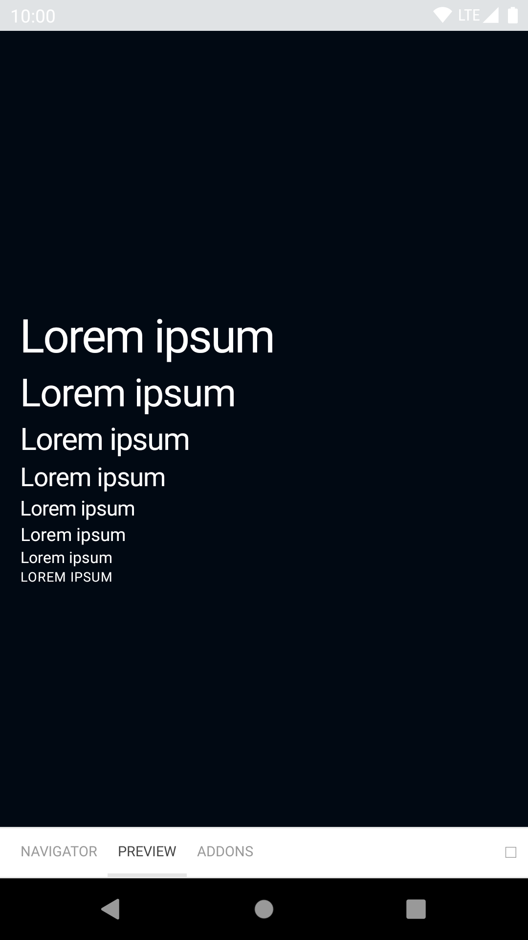
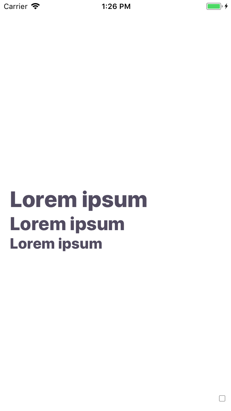
Text
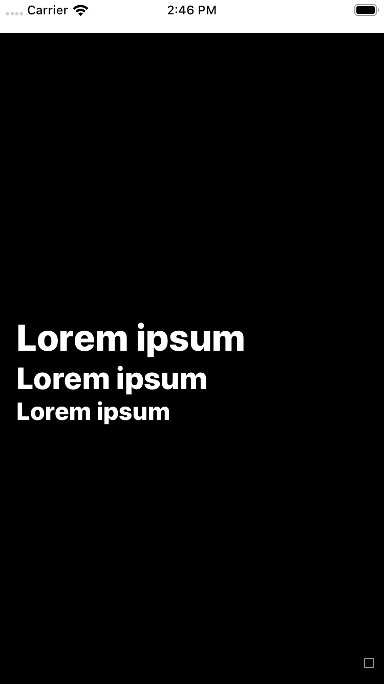
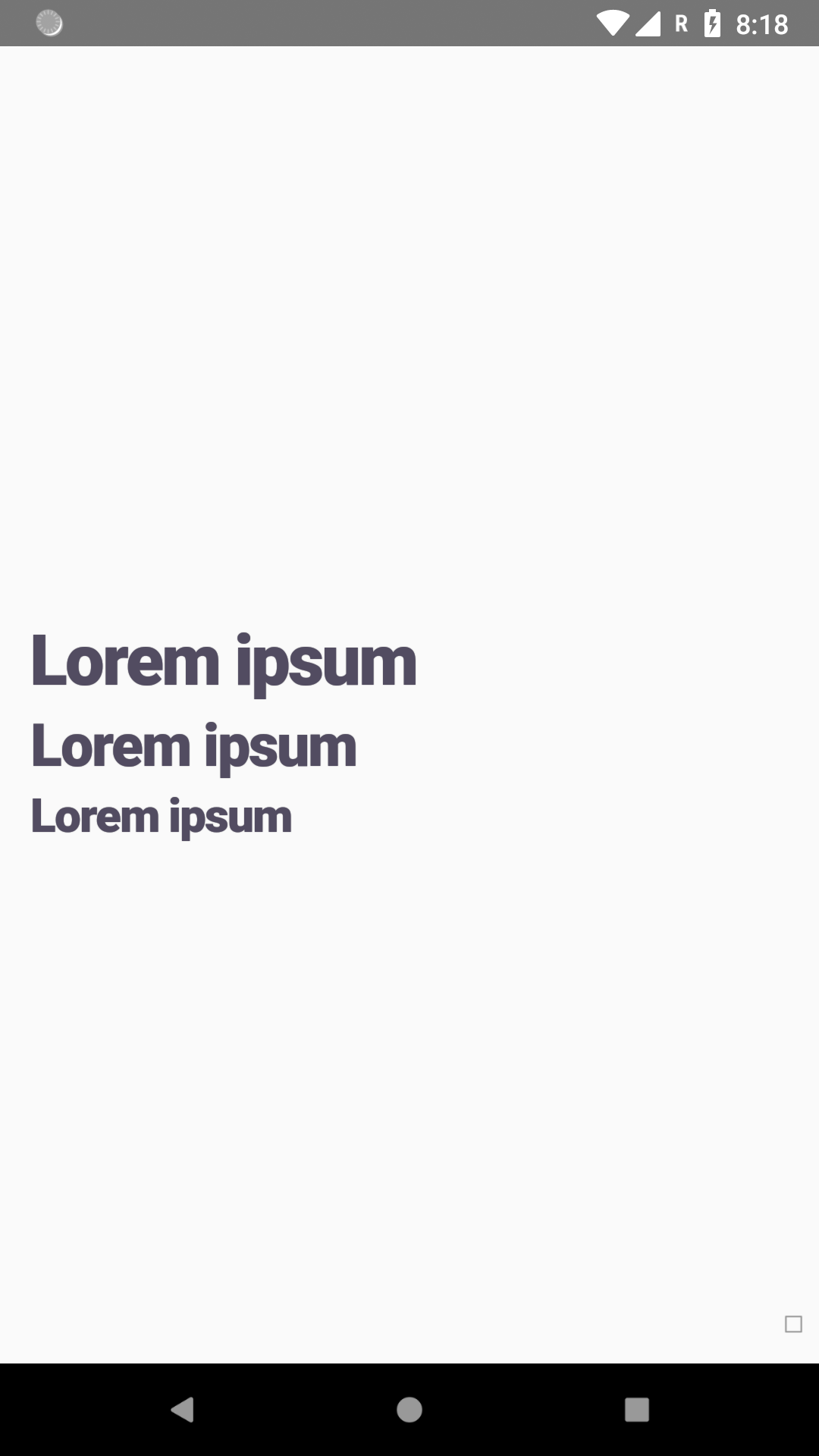
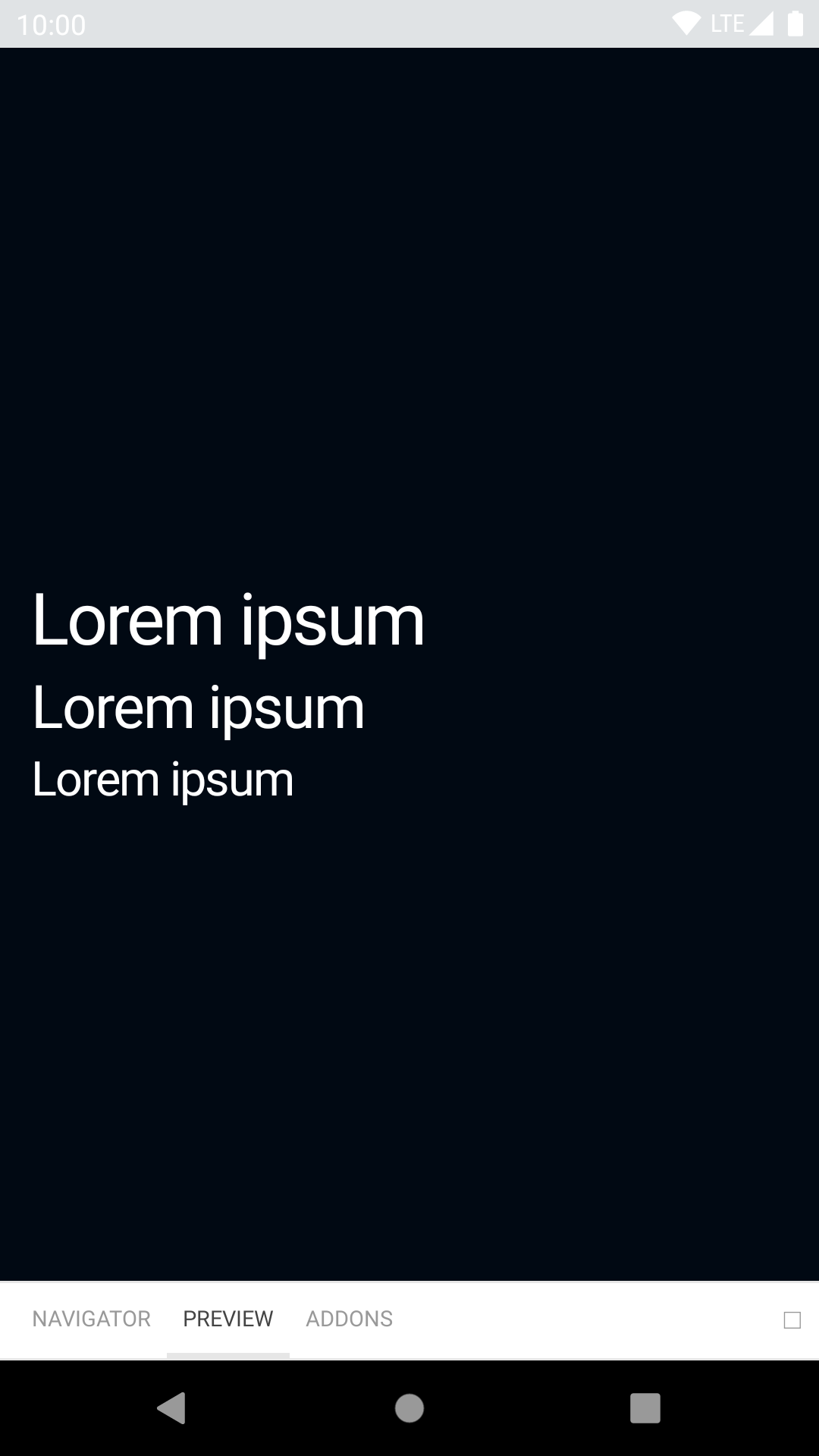
The text component enables you to use Backpack defined text styles.
bpk-component-text
Backpack React Native text component.
Default
| Day | Night |
|---|---|
 |
 |
 |
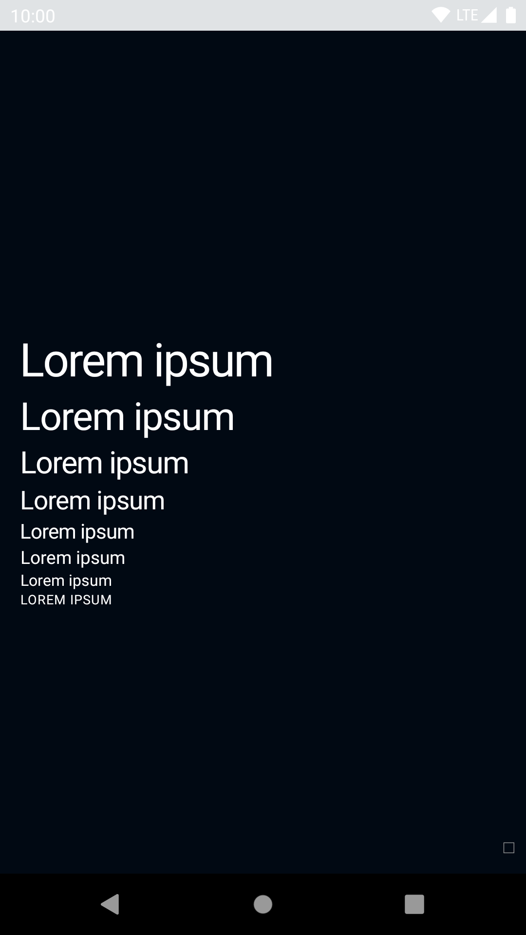 |
Emphasize
| Day | Night |
|---|---|
 |
 |
 |
 |
Heavy
| Day | Night |
|---|---|
 |
 |
 |
 |
Installation
Check the main Readme for a complete installation guide.
Usage
Note: If rendering emoji, please wrap them in BpkEmoji as this will preserve the correct line height when using a custom font.
                                                import React, { Component } from 'react';
                                                import { View, StyleSheet } from 'react-native';
                                                import BpkText, {
                                                  BpkEmoji,
                                                  WEIGHT_STYLES,
                                                } from 'backpack-react-native/bpk-component-text';
                                                import { spacingBase } from '@skyscanner/bpk-foundations-react-native/tokens/base.react.native';

                                                const styles = StyleSheet.create({
                                                  container: {
                                                    flex: 1,
                                                    justifyContent: 'center',
                                                    padding: spacingBase,
                                                  }
                                                });

                                                export default class App extends Component {
                                                  render() {
                                                    return (
                                                      <View style={styles.container}>
                                                        <BpkText textStyle='xxl'>Backpack rocks!</BpkText>
                                                        <BpkText textStyle='xl' weight={WEIGHT_STYLES.heavy}>Backpack rocks!</BpkText>
                                                        <BpkText textStyle='lg' weight={WEIGHT_STYLES.emphasized}>Backpack rocks!</BpkText>
                                                        <BpkText textStyle='base'>Backpack rocks!</BpkText>
                                                        <BpkText textStyle='sm'>Backpack rocks!</BpkText>
                                                        <BpkText textStyle='xs'>Backpack rocks!</BpkText>
                                                        <BpkText textStyle='caps'>BACKPACK ROCKS!</BpkText>
                                                        <BpkText textStyle="caps">BACKPACK ROCKS! <BpkEmoji>🎉</BpkEmoji></BpkText>
                                                        <BpkText textStyle='lg'>
                                                          <BpkText textStyle='inherit' weight='emphasized'>Backpack</BpkText> rocks!
                                                        </BpkText>
                                                      </View>
                                                    );
                                                  }
                                                }
Props
| Property | PropType | Required | Default Value |
|---|---|---|---|
| children | node | true | - |
| textStyle | oneOf('xxl', 'xl', 'lg', 'base', 'sm', 'xs', 'caps', 'inherit') | false | base |
| weight | oneOf('regular', 'emphasized', 'heavy') | false | regular |
| emphasize (deprecated, use weight) | bool | false | false |
Theme props
- textFontFamily
NOTE: For Android we expect font names to follow a specific name convention for bold and heavy variations. E.g. if you provide a font called myFont to the textFontFamilytheme attribute, we expect two more fonts to be available, those are myFont_bold and myFont_black.
Made with ❤️ by Skyscanner © 2024
© 2024 Skyscanner Backpack. Page last updated on Oct 31, 2022, 13:27