- Welcome
- Getting started
- Latest updates
- Foundations
-
Components
- Accordion
- Alert
- Alignment
- App Search Modal
- Aria live
- Autosuggest
- Badge
- Banner alert
- Bar chart
- Blockquote
- Bottom navigation
- Bottom sheet
- Breadcrumb
- Breakpoint
- Button
- Calendar
- Card
- Card list
- Card button
- Carousel
- Checkbox
- Chip
- Chip group
- Code
- Content cards
- Data Table
- Datepicker
- Description list
- Dialog
- Divider
- Drawer
- Field Set
- Flare
- Flat list
- Flight leg
- Floating action button
- Floating notification
- Form label
- Form validation
- Graphic promotion
- Horizontal navigation
- Icon
- Image
- Image Gallery
- Infinite scroll
- Info Banner
- Inset Banner
- Link
- List
- Map
- Mobile scroll container
- Modal
- Navigation bar
- Navigation Tab Group
- Nudger
- Overlay
- Page indicator
- Pagination
- Panel
- Phone input
- Picker
- Popover
- Price
- Progress bar
- Radio button
- Rating
- Rating Bar
- Scrollable calendar
- Search Modal
- Section header
- Section list
- Select
- Skeleton
- Skip link
- Slider
- Snackbar
- Snippet
- Spinner
- Split input
- Star rating
- Swap Button
- Switch
- Table
- Text
- Text input
- Theming
- Ticket
- Toast
- Tooltip
- Touchable native feedback
- Touchable overlay
- Search Input Summary
- Content
- Accessibility
- Contributing
- Localisation
Text
The text component enables you to use Backpack defined text styles.
Backpack/Label

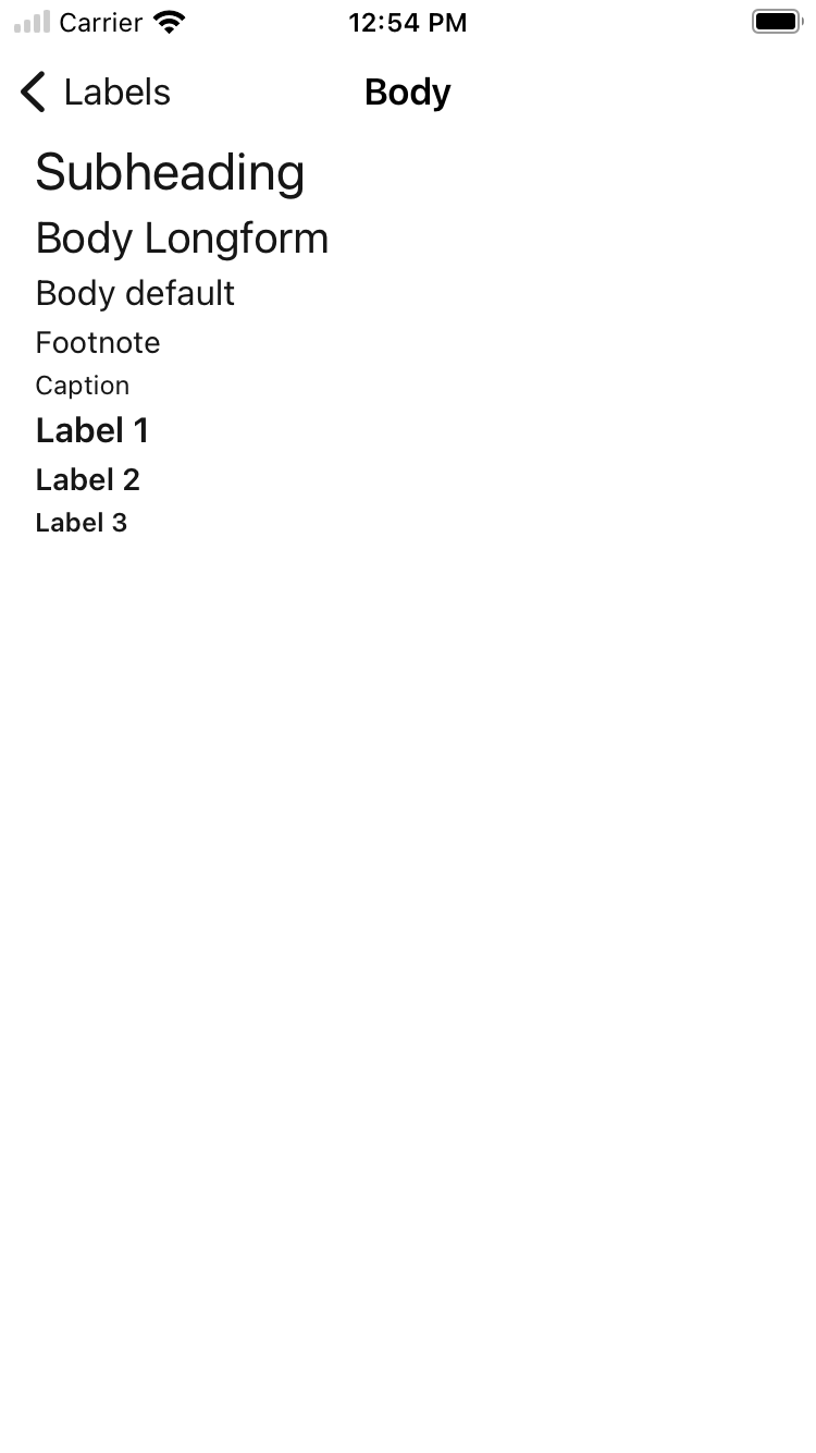
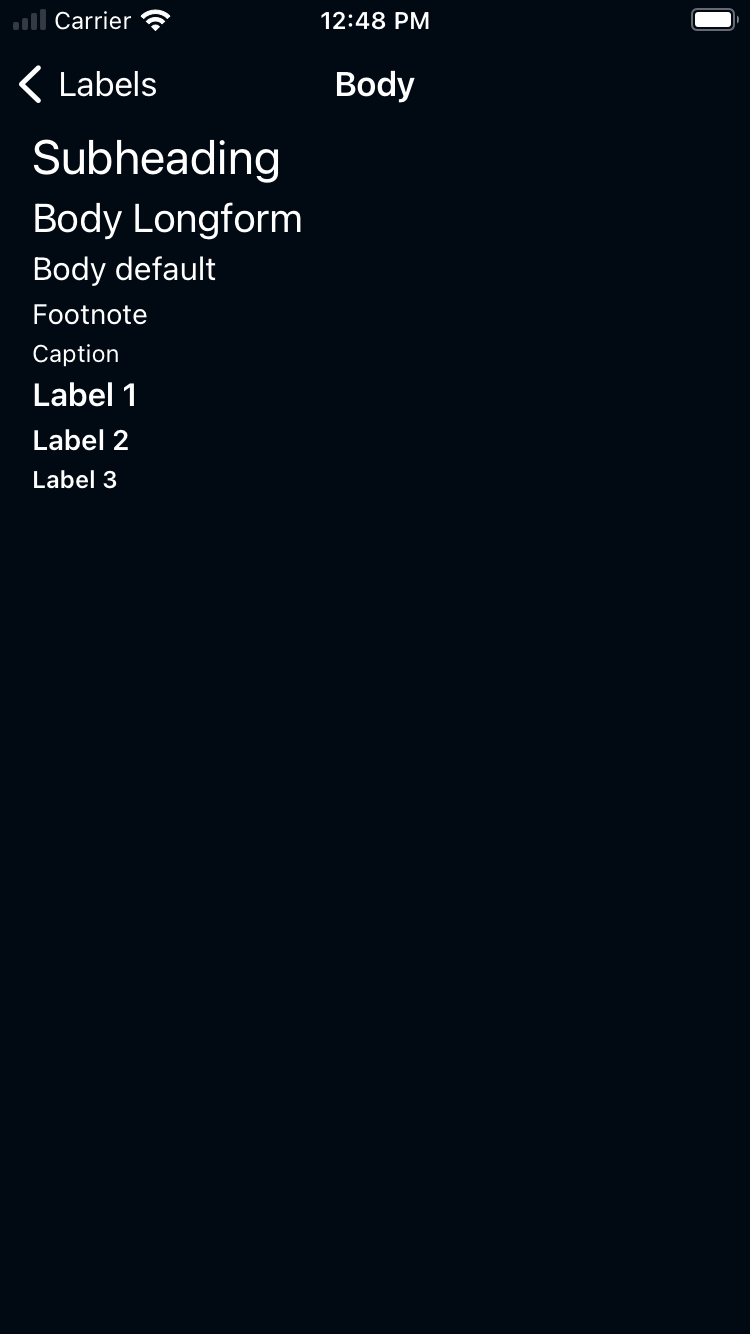
Body
| Day | Night |
|---|---|
 |
 |
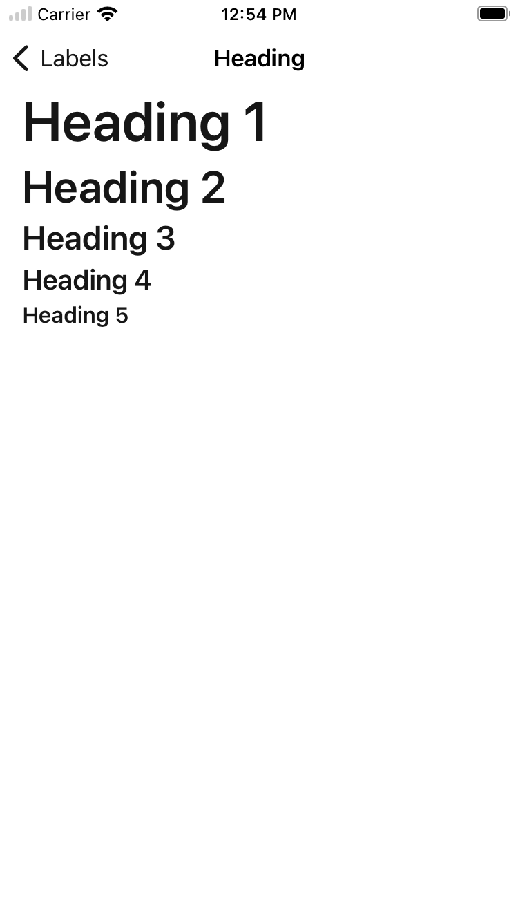
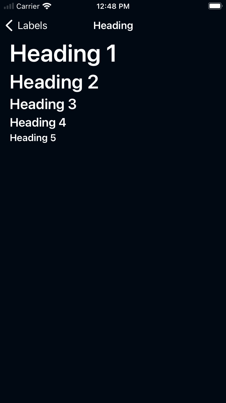
Heading
| Day | Night |
|---|---|
 |
 |
Hero
| Day | Night |
|---|---|
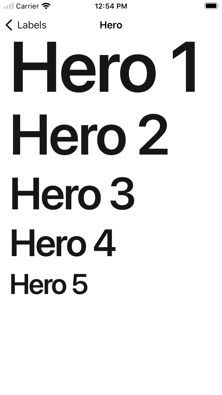 |
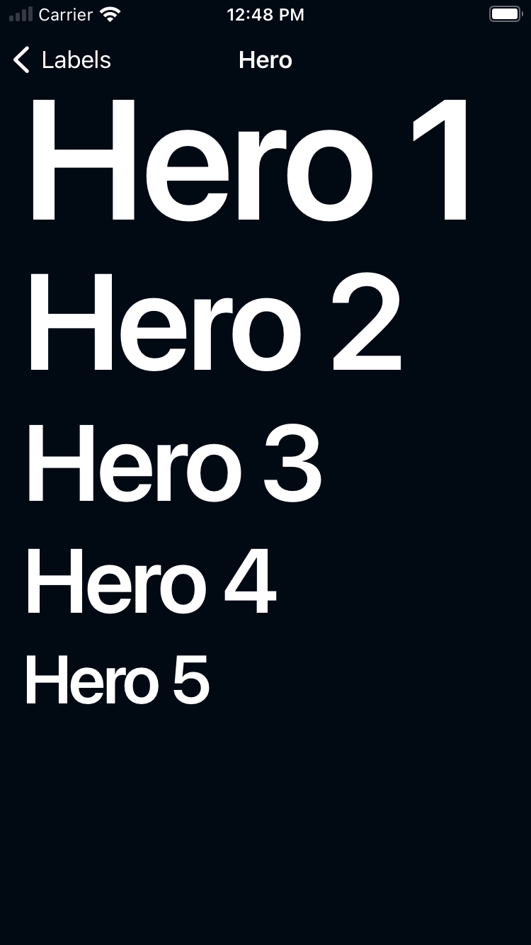 |
Usage
BPKLabel contains the Backpack Label component which is a subclass of UILabel with Skyscanner styles. It accepts a Backpack font style to set the desired size.
Swift
Example of a BPKLabel with label1 style and textSecondary color.
                                                import Backpack

                                                let label = BPKLabel(fontStyle: .textLabel1)
                                                label.textColor = BPKColor.textSecondaryColor
                                                label.text = "Label 1"
Example of a BPKLabel with multiple font styles
                                                let label = BPKLabel(fontStyle: .textLabel1)
                                                label.textColor = BPKColor.textSecondaryColor
                                                label.text = "Label 1, example multiple text styles"

                                                // Set font style for a specific range
                                                label.setFontStyle(.textLg, range: NSRange(location: 12, length: 10))
Dynamic Text
BPKLabel doesn't currently support Dynamic Text, but this is planned for a later release.
Backpack/TextView
Default
| Day | Night |
|---|---|
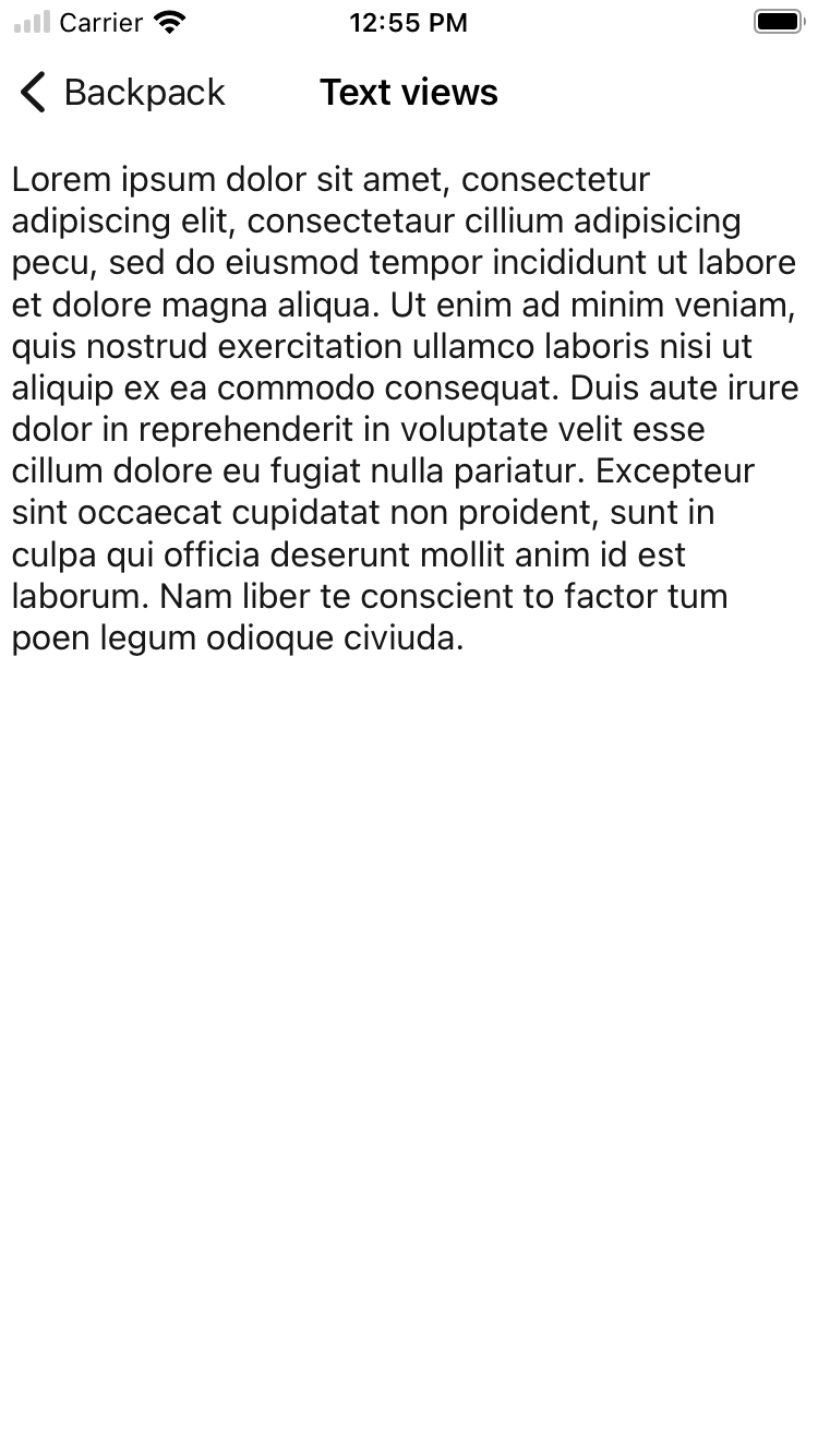 |
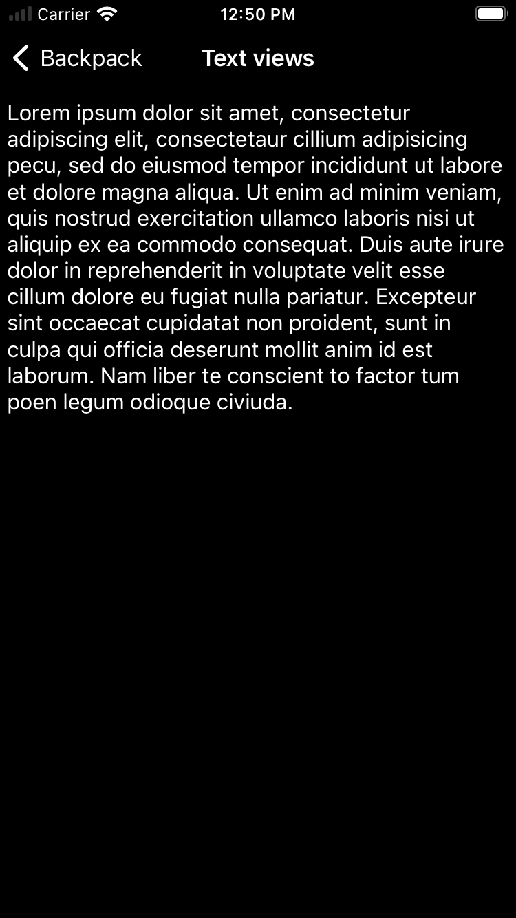 |
Usage
BPKTextView contains the Backpack TextView component which is a subclass of UITextView with Skyscanner styles. It accepts a Backpack font style to set the desired size.
Objective-C
                                                #import <Backpack/TextView.h>

                                                BPKTextView *textView = [[BPKTextView alloc] initWithFontStyle:BPKFontStyleTextBase];
                                                // Position textView with autolayout or other method
Swift
                                                import Backpack

                                                let textView = BPKTextView(fontStyle: .base)
                                                // Position TextView with autolayout or other method
Dynamic Text
BPKTextView doesn't currently support Dynamic Text, but this is planned for a later release.
Made with ❤️ by Skyscanner © 2024
© 2024 Skyscanner Backpack. Page last updated on May 2, 2023, 13:51