- Welcome
- Getting started
- Latest updates
- Foundations
-
Components
- Accordion
- Alert
- Alignment
- App Search Modal
- Aria live
- Autosuggest
- Badge
- Banner alert
- Bar chart
- Blockquote
- Bottom navigation
- Bottom sheet
- Breadcrumb
- Breakpoint
- Button
- Calendar
- Card
- Card list
- Card button
- Carousel
- Checkbox
- Chip
- Chip group
- Code
- Content cards
- Data Table
- Datepicker
- Description list
- Dialog
- Divider
- Drawer
- Field Set
- Flare
- Flat list
- Flight leg
- Floating action button
- Floating notification
- Form label
- Form validation
- Graphic promotion
- Horizontal navigation
- Icon
- Image
- Image Gallery
- Infinite scroll
- Info Banner
- Inset Banner
- Link
- List
- Map
- Mobile scroll container
- Modal
- Navigation bar
- Navigation Tab Group
- Nudger
- Overlay
- Page indicator
- Pagination
- Panel
- Phone input
- Picker
- Popover
- Price
- Progress bar
- Radio button
- Rating
- Rating Bar
- Scrollable calendar
- Search Modal
- Section header
- Section list
- Select
- Skeleton
- Skip link
- Slider
- Snackbar
- Snippet
- Spinner
- Split input
- Star rating
- Swap Button
- Switch
- Table
- Text
- Text input
- Theming
- Ticket
- Toast
- Tooltip
- Touchable native feedback
- Touchable overlay
- Search Input Summary
- Content
- Accessibility
- Contributing
- Localisation
Search Input Summary
Backpack-SwiftUI/SearchInputSummary

| Day | Night |
|---|---|
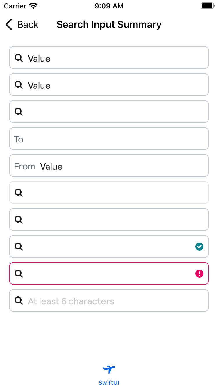 |
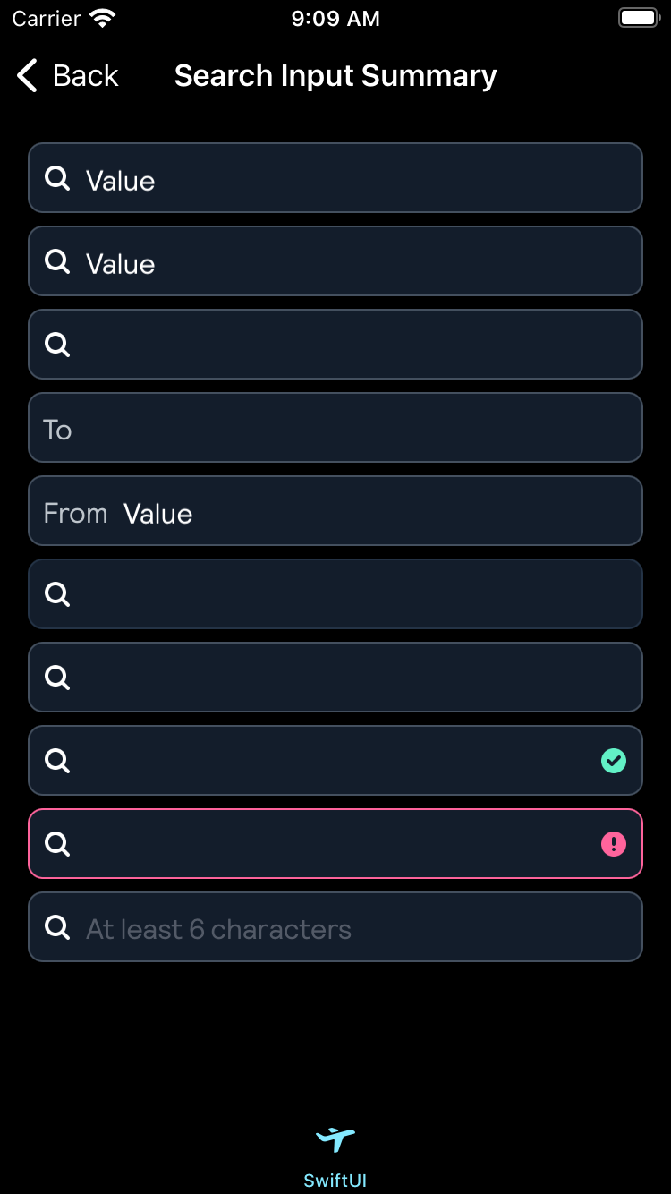 |
Usage
Create a BPKSearchInputSummary and bind the text property to a Binding<String>.
                                                @State var text: String = ""

                                                BPKSearchInputSummary(text: $text)
Setting a placeholder
BPKSearchInputSummary("Placeholder", text: $text)Setting an inputPrefix
Default value is icon.
BPKSearchInputSummary(inputPrefix: .icon, text: $text)
BPKSearchInputSummary(inputPrefix: .customText("From"), text: $text)Changing the State
                                                BPKSearchInputSummary(text: $text)
                                                    .inputState(.error)
                                                    .inputState(.valid)
Adding a clear button
                                                @State var text: String = "some text"

                                                BPKSearchInputSummary(text: $text)
                                                    .inputState(
                                                        .clear(
                                                            accessibilityLabel: "Clear",
                                                            action: { text = "" }
                                                        )
                                                    )
Passing input focused value
Default value is icon.
BPKSearchInputSummary(inputPrefix: .icon, text: $text)
BPKSearchInputSummary(inputPrefix: .customText("From"), text: $text)UI Testing
To use the component in UI or smoke tests it's possible to access this element using the accessibility identifier: search_field
Made with ❤️ by Skyscanner © 2024
© 2024 Skyscanner Backpack. Page last updated on Apr 17, 2024, 10:41