- Welcome
- Getting started
- Latest updates
- Foundations
-
Components
- Accordion
- Alert
- Alignment
- App Search Modal
- Aria live
- Autosuggest
- Badge
- Banner alert
- Bar chart
- Blockquote
- Bottom navigation
- Bottom sheet
- Breadcrumb
- Breakpoint
- Button
- Calendar
- Card
- Card list
- Card button
- Carousel
- Checkbox
- Chip
- Chip group
- Code
- Content cards
- Data Table
- Datepicker
- Description list
- Dialog
- Divider
- Drawer
- Field Set
- Flare
- Flat list
- Flight leg
- Floating action button
- Floating notification
- Form label
- Form validation
- Graphic promotion
- Horizontal navigation
- Icon
- Image
- Image Gallery
- Infinite scroll
- Info Banner
- Inset Banner
- Link
- List
- Map
- Mobile scroll container
- Modal
- Navigation bar
- Navigation Tab Group
- Nudger
- Overlay
- Page indicator
- Pagination
- Panel
- Phone input
- Picker
- Popover
- Price
- Progress bar
- Radio button
- Rating
- Rating Bar
- Scrollable calendar
- Search Modal
- Section header
- Section list
- Select
- Skeleton
- Skip link
- Slider
- Snackbar
- Snippet
- Spinner
- Split input
- Star rating
- Swap Button
- Switch
- Table
- Text
- Text input
- Theming
- Ticket
- Toast
- Tooltip
- Touchable native feedback
- Touchable overlay
- Search Input Summary
- Content
- Accessibility
- Contributing
- Localisation
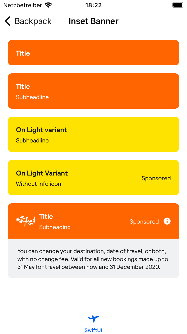
Inset Banner
Inset Banner

Default
| Day | Night |
|---|---|
 |
 |
| . |
Usage
All text fields in BPKInsetBanner are optional, though it requires having either a logo, title or subheading (or a combination). The background colour is customizable, while the text and info icon's colour rely on the variant.
```swift BPKInsetBanner( title: "Title", subheadline: "Subheading", callToAction: .init( text: "Sponsored", accessibilityLabel: "More Information"), bodyText: "This text shows when tapping the banner", variant: .onDark, backgroundColor: Color(red: 1.000, green: 0.400, blue: 0.004, opacity: 1.000) )
                                                ### Inserting logo content

                                                The `logoContent` to be inserted can be any `View` but **it is not recommended to insert anything but an image or a loading indicator**:
swift BPKInsetBanner( logoContent: Image("skyland").resizable().scaledToFit(), title: "Title", subheadline: "Subheading", callToAction: .init( text: "Sponsored", accessibilityHint: "Double tap for more information", showIcon: true), bodyText: "You can change your destination, date of travel," + " or both, with no change fee. Valid for all " + "new bookings made up to 31 May for travel between now and 31 December 2023.", variant: .onDark, backgroundColor: Color(red: 1.000, green: 0.400, blue: 0.004, opacity: 1.000) )
The info icon can be disabled passing the `showIcon` value in `callToAction`:
swift BPKInsetBanner( title: "Title", subheadline: "Subheading", callToAction: .init( text: "Sponsored", accessibilityLabel: "More Information", showIcon: false), bodyText: "This text shows when tapping the banner", variant: .onDark, backgroundColor: Color(red: 1.000, green: 0.400, blue: 0.004, opacity: 1.000) ) ```
Made with ❤️ by Skyscanner © 2024
© 2024 Skyscanner Backpack. Page last updated on Jan 16, 2024, 09:33