- Welcome
- Getting started
- Latest updates
- Foundations
-
Components
- Accordion
- Alert
- Alignment
- App Search Modal
- Aria live
- Autosuggest
- Badge
- Banner alert
- Bar chart
- Blockquote
- Bottom navigation
- Bottom sheet
- Breadcrumb
- Breakpoint
- Button
- Calendar
- Card
- Card list
- Card button
- Carousel
- Checkbox
- Chip
- Chip group
- Code
- Content cards
- Data Table
- Datepicker
- Description list
- Dialog
- Divider
- Drawer
- Field Set
- Flare
- Flat list
- Flight leg
- Floating action button
- Floating notification
- Form label
- Form validation
- Graphic promotion
- Horizontal navigation
- Icon
- Image
- Image Gallery
- Infinite scroll
- Info Banner
- Inset Banner
- Link
- List
- Map
- Mobile scroll container
- Modal
- Navigation bar
- Navigation Tab Group
- Nudger
- Overlay
- Page indicator
- Pagination
- Panel
- Phone input
- Picker
- Popover
- Price
- Progress bar
- Radio button
- Rating
- Rating Bar
- Scrollable calendar
- Search Modal
- Section header
- Section list
- Select
- Skeleton
- Skip link
- Slider
- Snackbar
- Snippet
- Spinner
- Split input
- Star rating
- Swap Button
- Switch
- Table
- Text
- Text input
- Theming
- Ticket
- Toast
- Tooltip
- Touchable native feedback
- Touchable overlay
- Search Input Summary
- Content
- Accessibility
- Contributing
- Localisation
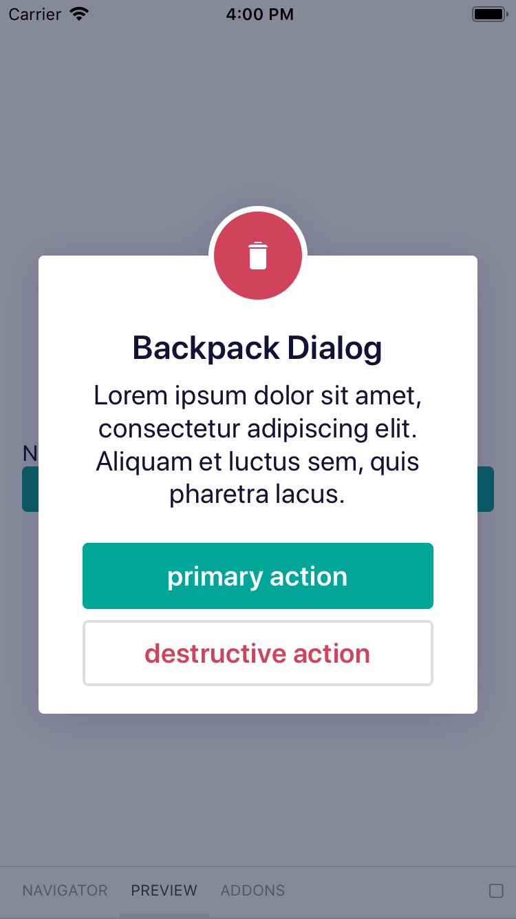
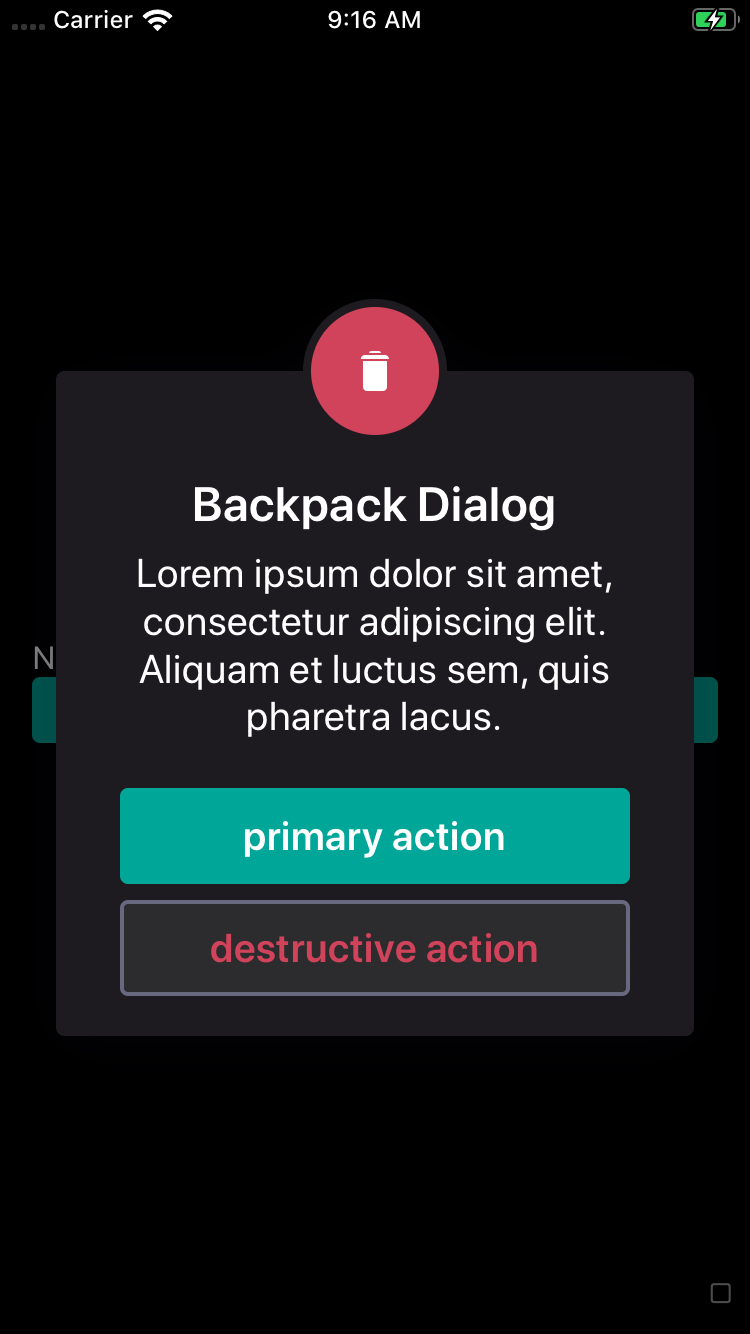
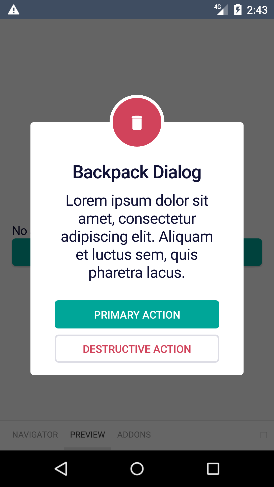
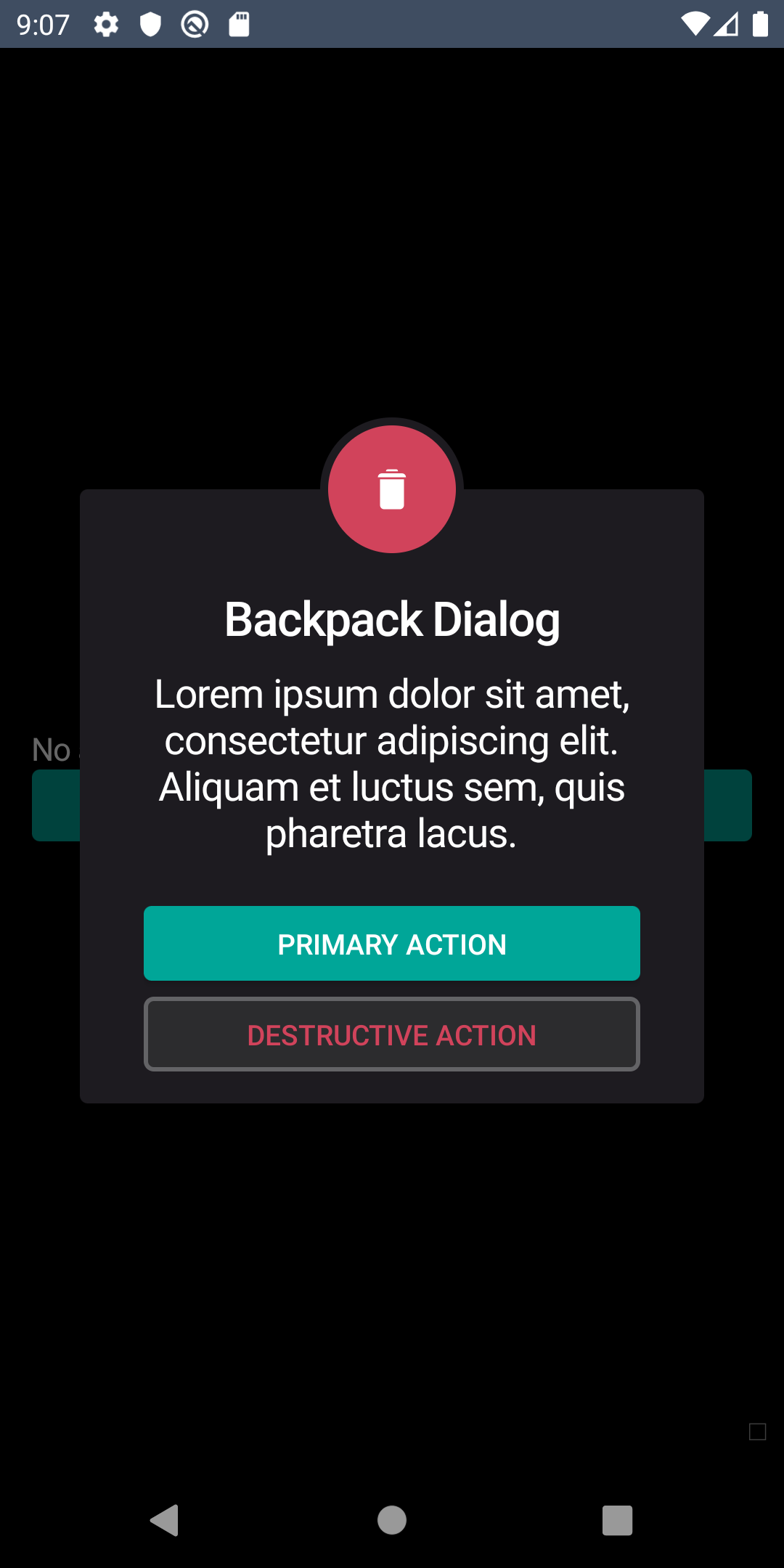
Dialog
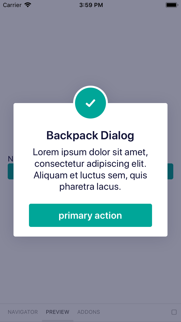
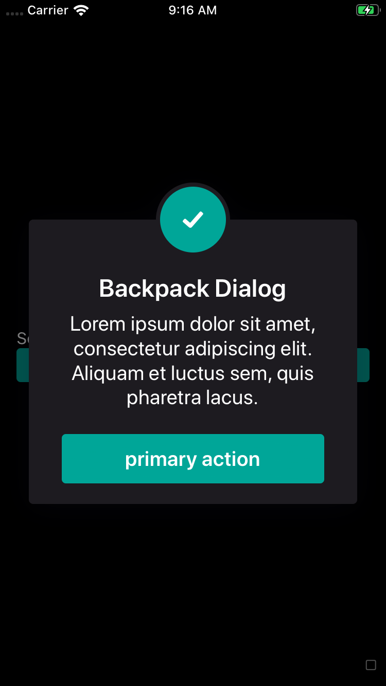
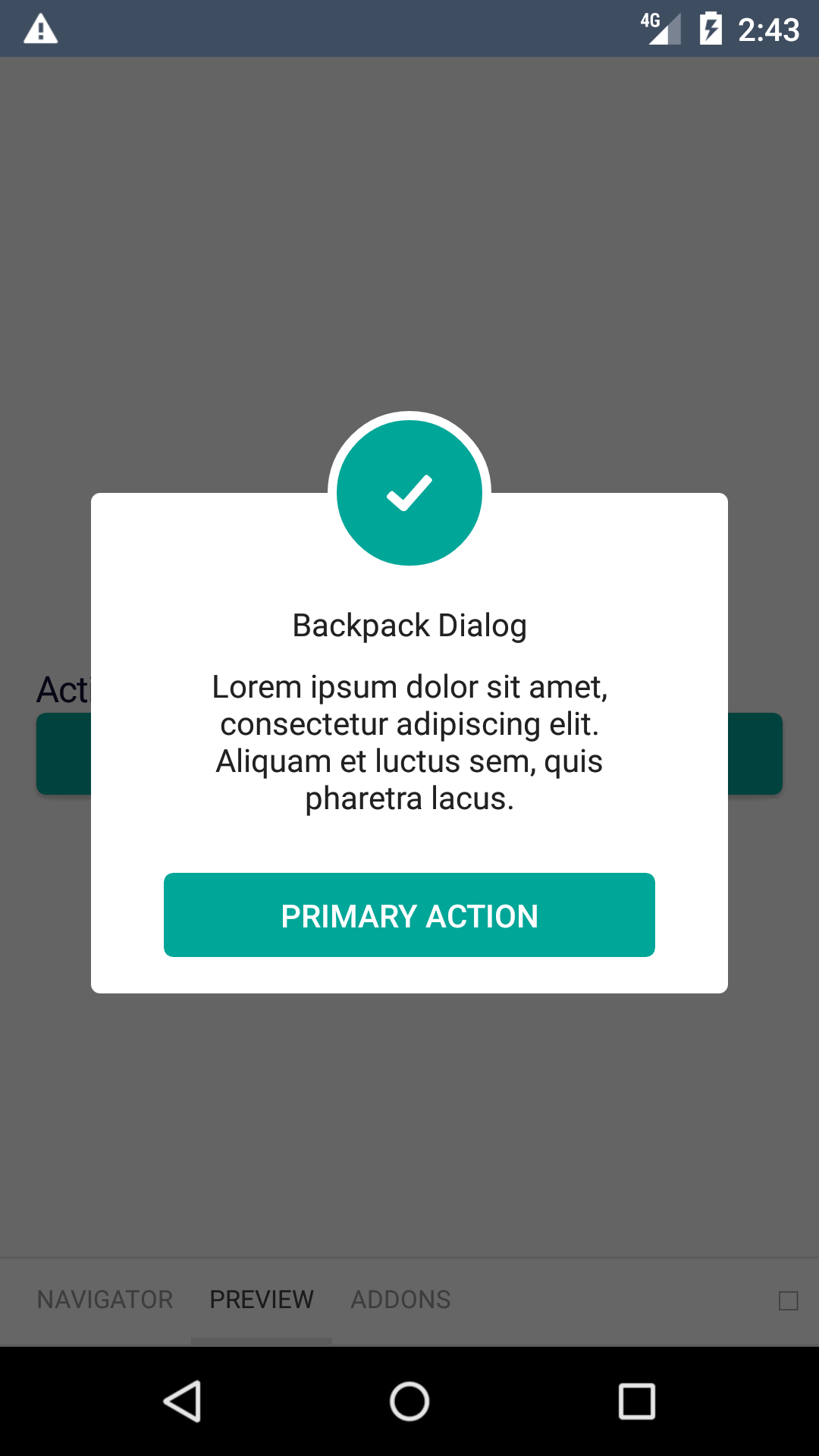
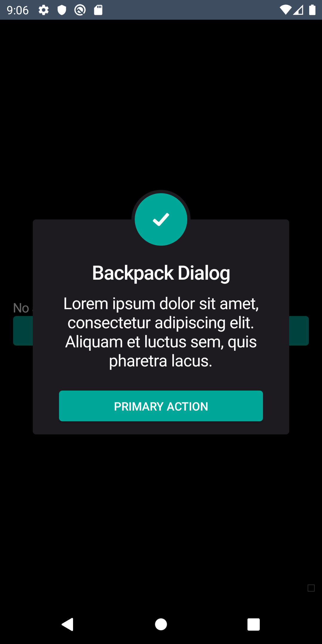
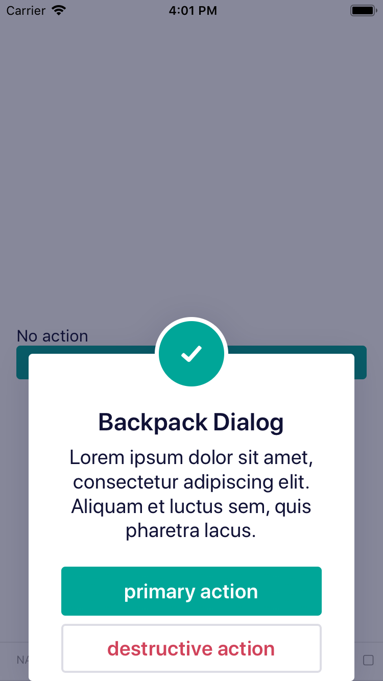
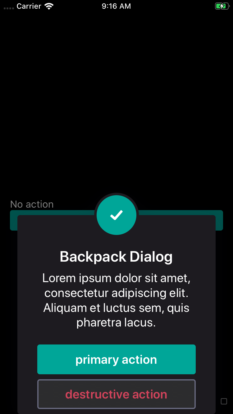
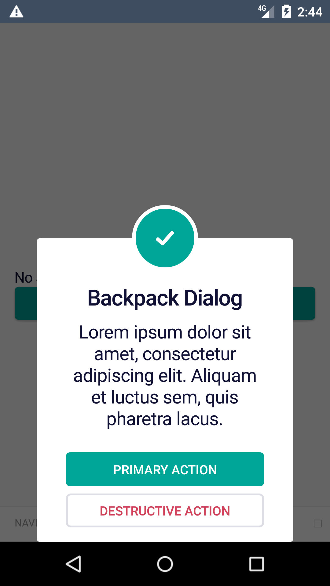
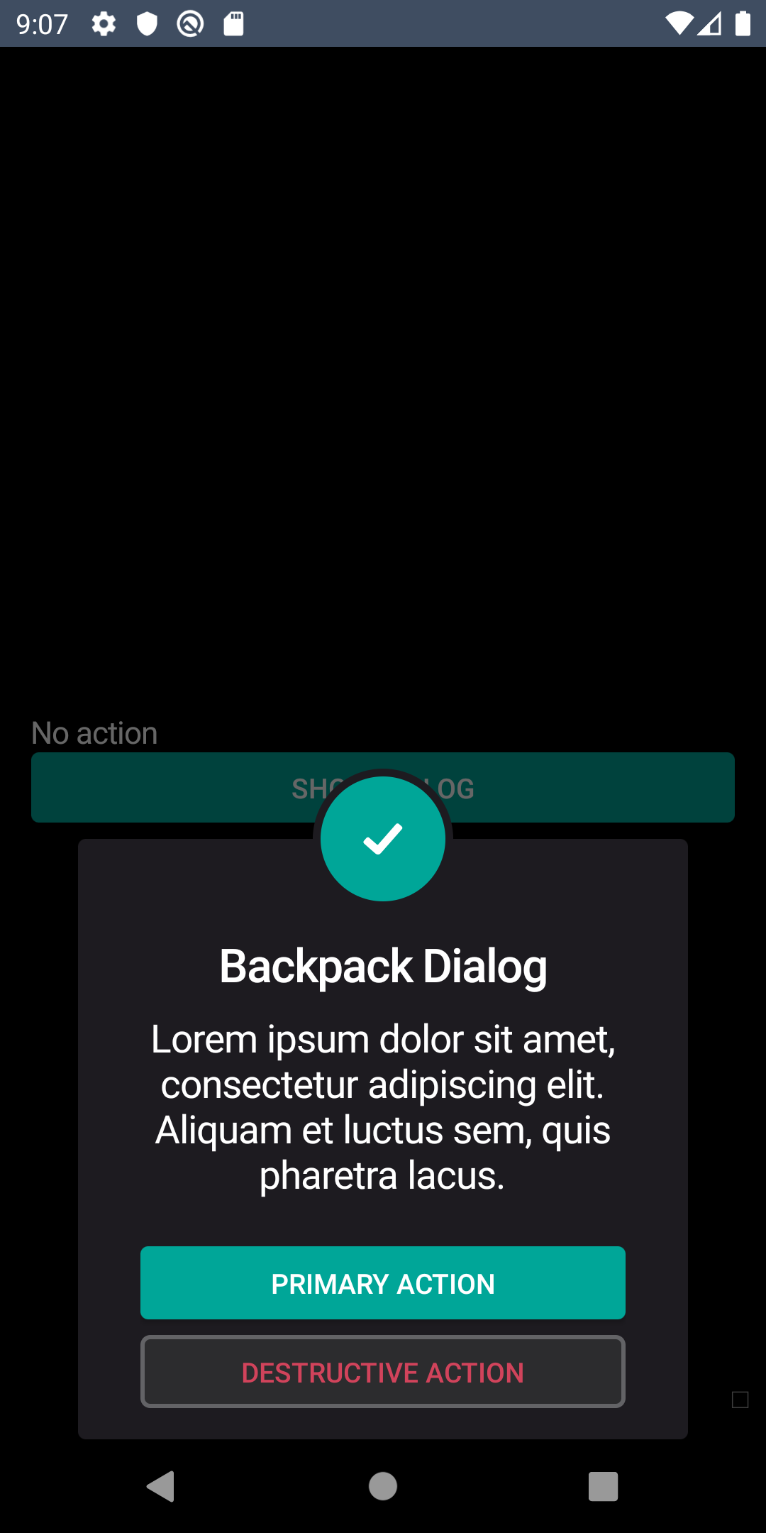
Dialogs inform users about a specific task and may contain critical information, or require decisions or acknowledgement.
bpk-component-dialog
Backpack React Native dialog dialog.
Simple
| Day | Night |
|---|---|
 |
 |
 |
 |
Multiple CTAs
| Day | Night |
|---|---|
 |
 |
 |
 |
Bottom
| Day | Night |
|---|---|
 |
 |
 |
 |
Installation
Check the main Readme for a complete installation guide.
Usage
                                                import React, { Component } from 'react';
                                                import { View } from 'react-native';
                                                import BpkButton from 'backpack-react-native/bpk-component-button';
                                                import { icons } from 'backpack-react-native/bpk-component-icon';
                                                import BpkDialog, { DIALOG_TYPE, BUTTON_TYPE } from 'backpack-react-native/bpk-component-dialog';

                                                class App extends Component {
                                                  constructor(props) {
                                                    super(props);

                                                    this.state = { isOpen: false };
                                                  }

                                                  openDialog = () => this.setState({ isOpen: true });

                                                  handlePositiveAction = () => {
                                                    // Do something
                                                    this.setState({
                                                      isOpen: false,
                                                    });
                                                  };

                                                  handleNegativeAction = () => {
                                                    // Do something else
                                                    this.setState({
                                                      isOpen: false,
                                                    });
                                                  };

                                                  handleDismissAction = () => {
                                                    // Do something else
                                                    this.setState({
                                                      isOpen: false,
                                                    });
                                                  };

                                                  render() {
                                                    return (
                                                      <View>
                                                        <BpkButton onPress={this.openDialog} title="Show dialog" />
                                                        <BpkDialog
                                                          dialogType={DIALOG_TYPE.alert}
                                                          title={'Backpack Dialog'}
                                                          description={'Lorem ipsum dolor sit amet, consectetur adipiscing elit...'}
                                                          icon={{
                                                            iconId: icons.tick,
                                                            iconColor: 'monteverde'
                                                          }}
                                                          actions={[
                                                            {
                                                              text: 'Accept',
                                                              type: BUTTON_TYPE.primary,
                                                              callback: this.handlePositiveAction
                                                            },
                                                            {
                                                              text: 'Decline',
                                                              type: BUTTON_TYPE.destructive,
                                                              callback: this.handleNegativeAction
                                                            }
                                                          ]}
                                                          scrimAction={{
                                                            enabled: true,
                                                            callback: this.handleDismissAction
                                                          }}
                                                          isOpen={this.state.isOpen}
                                                        />
                                                      </View>
                                                    );
                                                  }
                                                }
Props
BpkDialog
| Property | PropType | Required | Default Value |
|---|---|---|---|
| dialogType | DIALOG_TYPE | true | - |
| title | string | false | - |
| description | string | false | - |
| icon | struct: { iconId: string, iconColor: string} | true | - |
| action | array<action_type>* | false | - |
| scrimAction | struct: { enabled: boolean, callback: func} | false | - |
| isOpen | boolean | true | - |
* action_type has the following structure: { text: stirng, type: BUTTON_TYPE, callback: func }
Made with ❤️ by Skyscanner © 2024
© 2024 Skyscanner Backpack. Page last updated on Apr 28, 2023, 02:20