- Welcome
- Getting started
- Latest updates
- Foundations
-
Components
- Accordion
- Alert
- Alignment
- App Search Modal
- Aria live
- Autosuggest
- Badge
- Banner alert
- Bar chart
- Blockquote
- Bottom navigation
- Bottom sheet
- Breadcrumb
- Breakpoint
- Button
- Calendar
- Card
- Card list
- Card button
- Carousel
- Checkbox
- Chip
- Chip group
- Code
- Content cards
- Data Table
- Datepicker
- Description list
- Dialog
- Divider
- Drawer
- Field Set
- Flare
- Flat list
- Flight leg
- Floating action button
- Floating notification
- Form label
- Form validation
- Graphic promotion
- Horizontal navigation
- Icon
- Image
- Image Gallery
- Infinite scroll
- Info Banner
- Inset Banner
- Link
- List
- Map
- Mobile scroll container
- Modal
- Navigation bar
- Navigation Tab Group
- Nudger
- Overlay
- Page indicator
- Pagination
- Panel
- Phone input
- Picker
- Popover
- Price
- Progress bar
- Radio button
- Rating
- Rating Bar
- Scrollable calendar
- Search Modal
- Section header
- Section list
- Select
- Skeleton
- Skip link
- Slider
- Snackbar
- Snippet
- Spinner
- Split input
- Star rating
- Swap Button
- Switch
- Table
- Text
- Text input
- Theming
- Ticket
- Toast
- Tooltip
- Touchable native feedback
- Touchable overlay
- Search Input Summary
- Content
- Accessibility
- Contributing
- Localisation
Chip group
A row of chip components to allow travellers to filter options
Backpack/ChipGroup

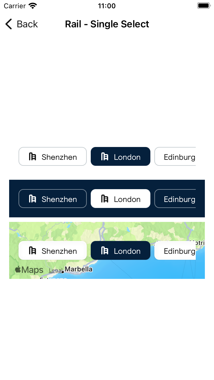
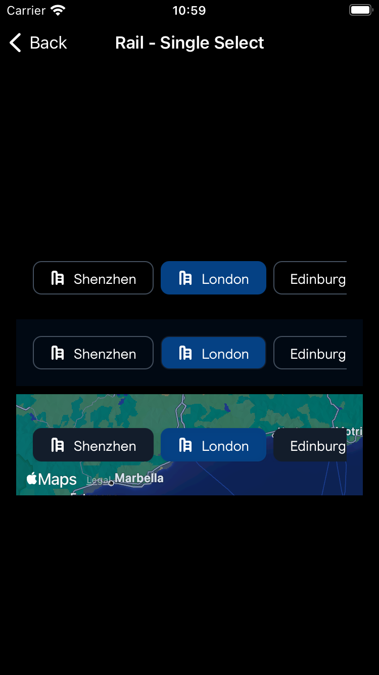
Rail - Single Select
| Day | Night |
|---|---|
 |
 |
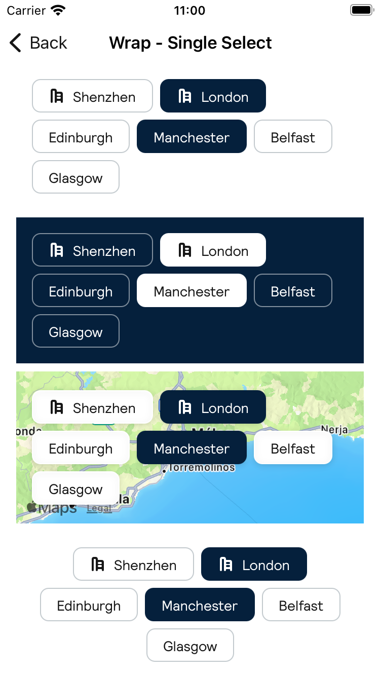
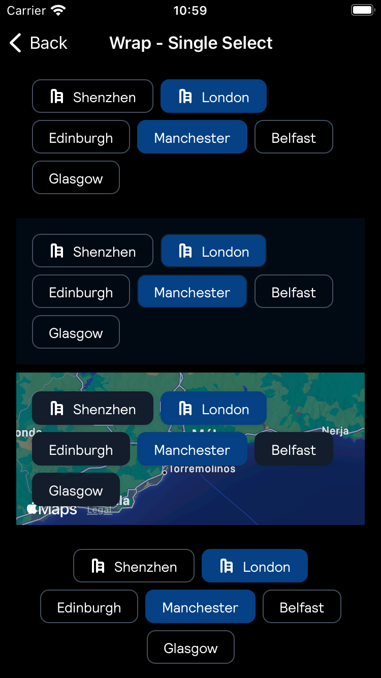
Wrap - Single Select
| Day | Night |
|---|---|
 |
 |
Rail - Multi Select
| Day | Night |
|---|---|
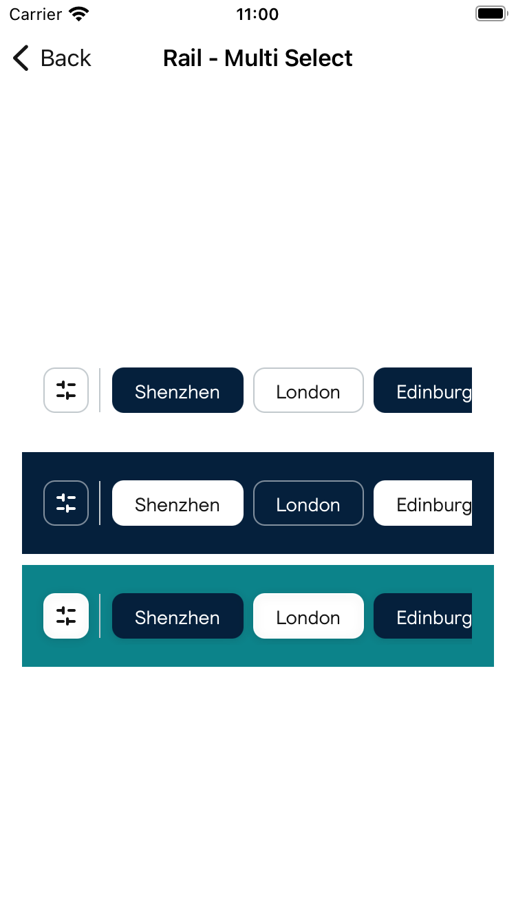 |
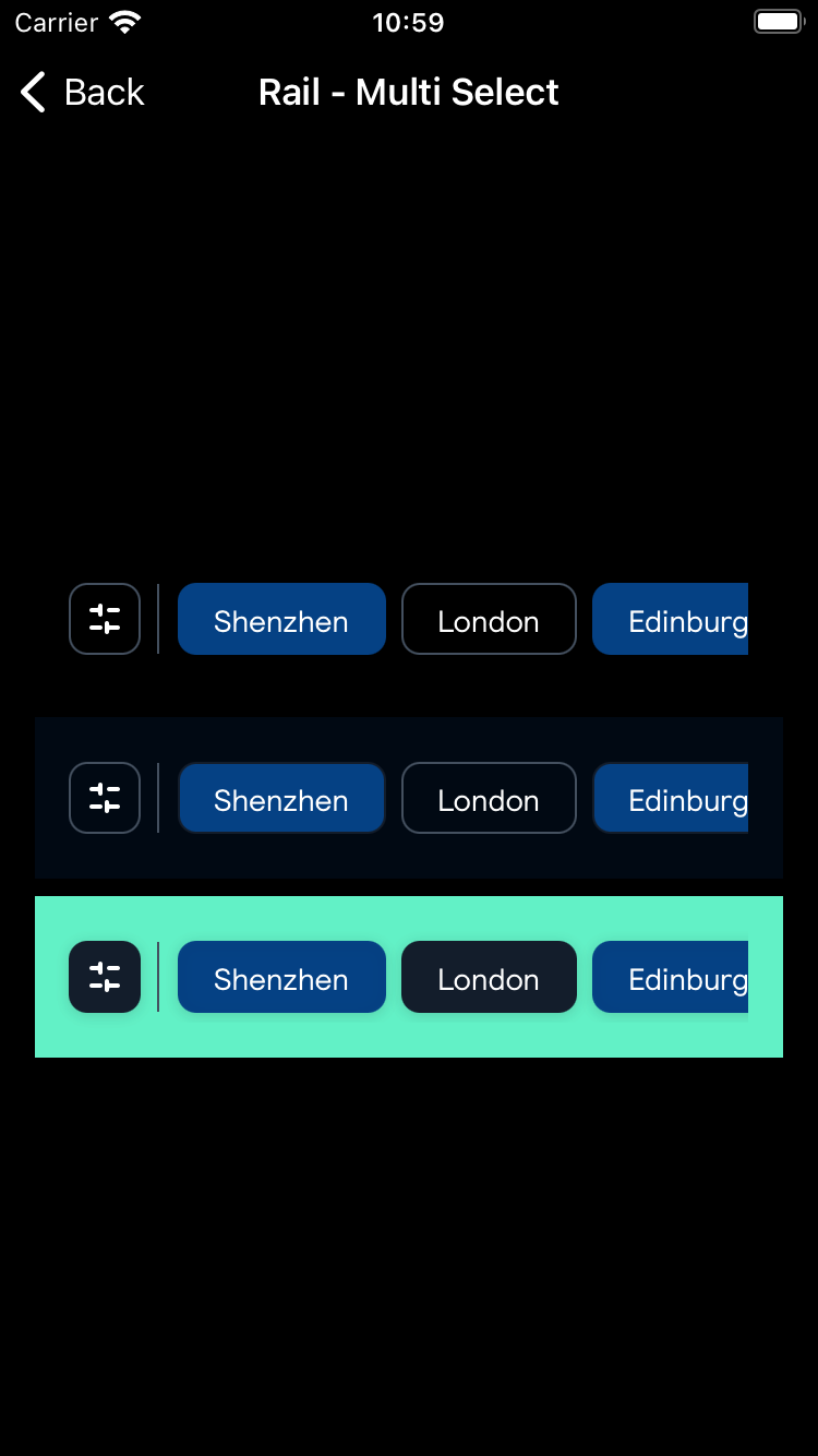 |
Wrap - Multi Select
| Day | Night |
|---|---|
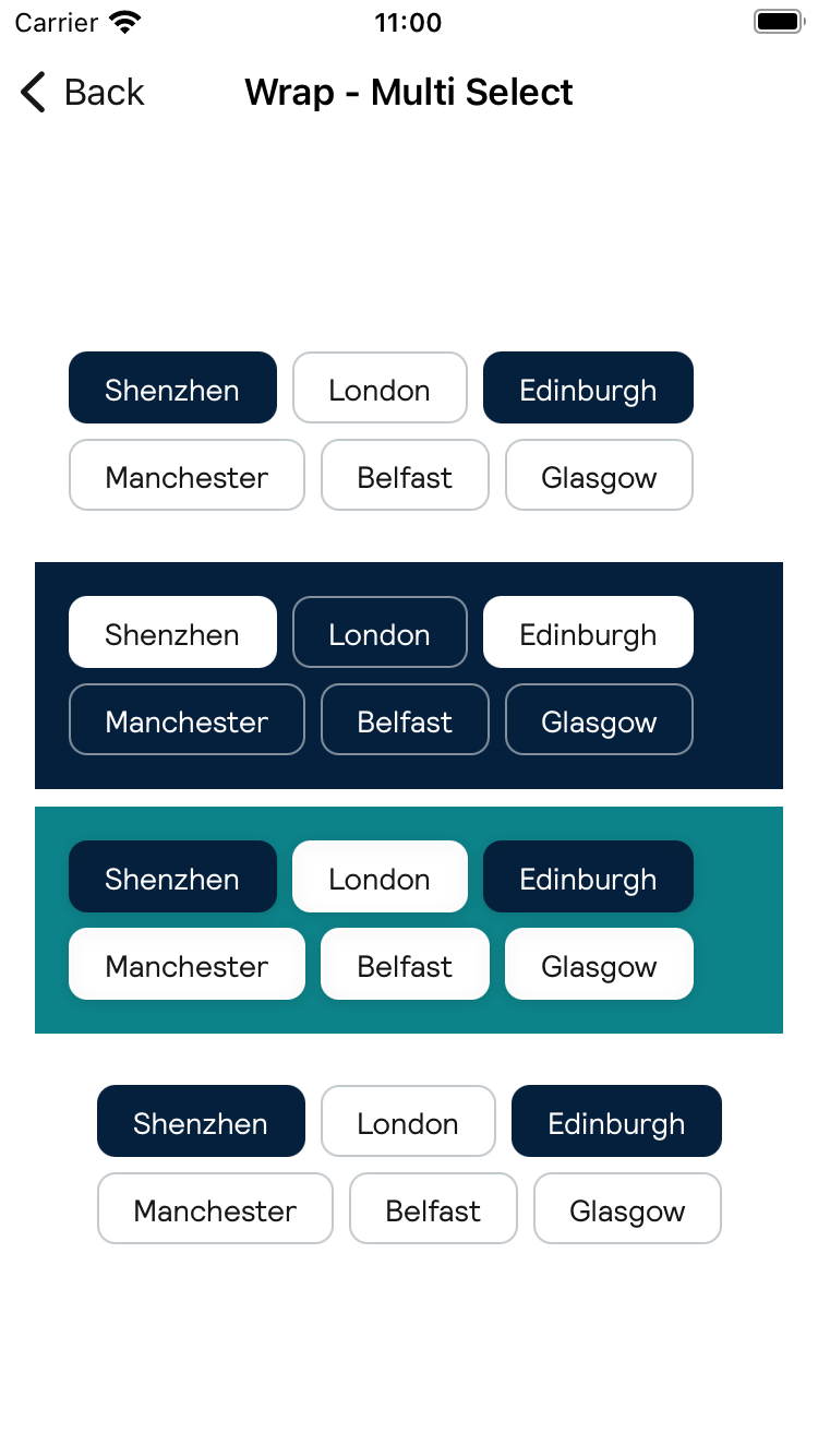 |
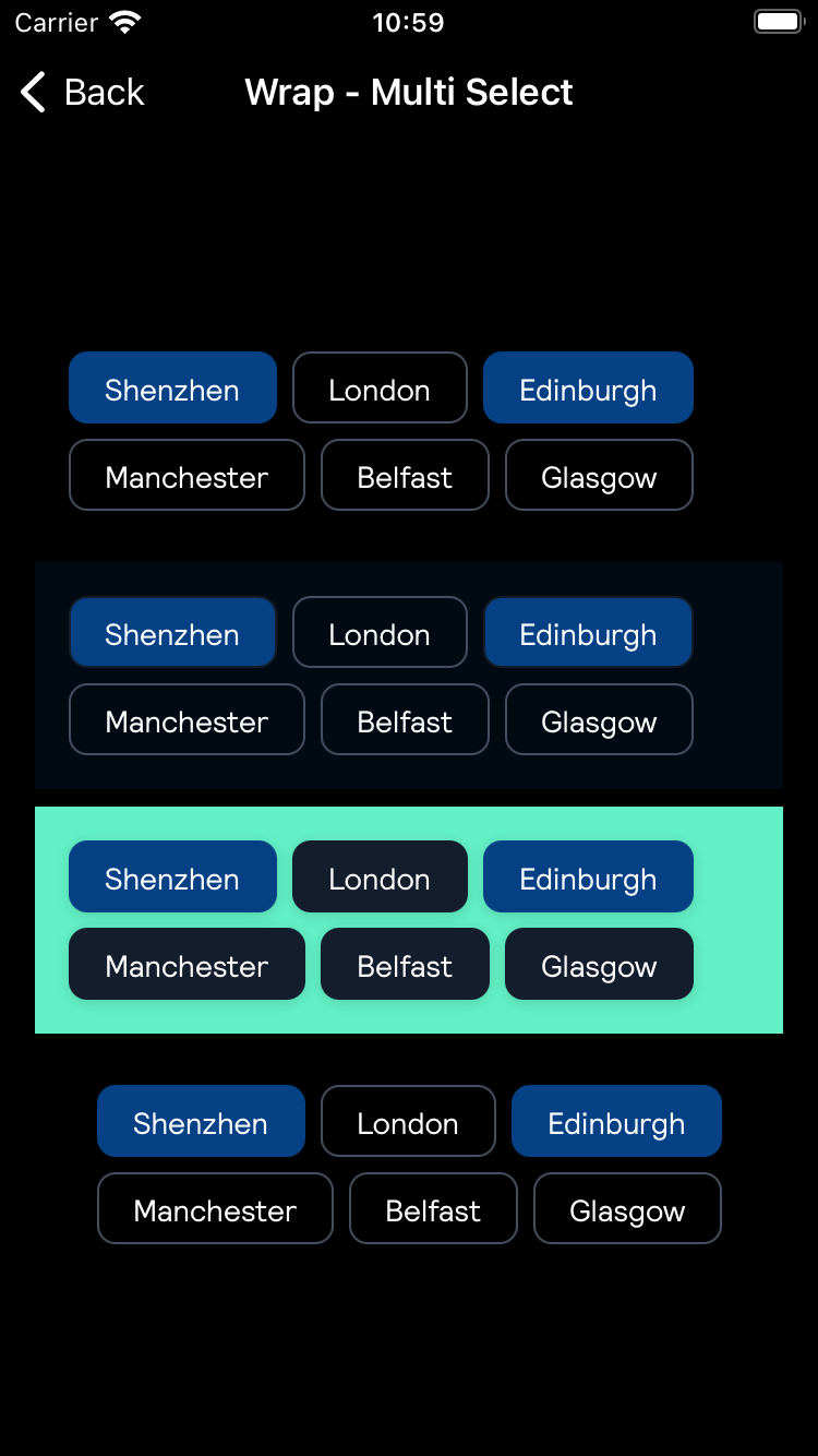 |
Usage
Single Select
Create ChipItems to be used in the group.
                                                let chips: [BPKSingleSelectChipGroup.ChipItem] = [
                                                    .init(text: "Shenzhen", icon: .city),
                                                    .init(text: "London", icon: .city),
                                                    .init(text: "Edinburgh"),
                                                    .init(text: "Manchester"),
                                                    .init(text: "Belfast"),
                                                    .init(text: "Glasgow"),
                                                    .init(text: "Gurham")
                                                ]
Single line group
                                                @State var selectedIndex: Int? = nil
                                                BPKSingleSelectChipGroup(
                                                    chips: chips,
                                                    selectedIndex: selectedIndex,
                                                    type: .rail
                                                ) {
                                                    print("Chip item tapped")
                                                }
Single line group on dark background:
                                                BPKSingleSelectChipGroup(
                                                    chips: chips,
                                                    style: .onDark,
                                                    selectedIndex: selectedIndex
                                                ) {
                                                    print("Chip item tapped")
                                                }
Single line group on an image background:
                                                BPKSingleSelectChipGroup(
                                                    chips: chips,
                                                    style: .onImage,
                                                    selectedIndex: selectedIndex
                                                ) {
                                                    print("Chip item tapped")
                                                }
Multiple lines of chips group
                                                BPKSingleSelectChipGroup(
                                                    chips: chips,
                                                    selectedIndex: selectedIndex,
                                                    type: .wrap(alignment: .leading)
                                                ) {
                                                    print("Chip item tapped")
                                                }
Multiple lines of chips group with center alignment
                                                BPKSingleSelectChipGroup(
                                                    chips: chips,
                                                    selectedIndex: selectedIndex,
                                                    type: .wrap(alignment: .center)
                                                ) {
                                                    print("Chip item tapped")
                                                }
Multiple Select
Create ChipItems to be used in the group.
                                                @State var chips: [BPKMultiSelectChipGroup.ChipItem] = [
                                                    .init(text: "Shenzhen", icon: .city, selected: true),
                                                    .init(text: "London", icon: .city, selected: true),
                                                    .init(text: "Edinburgh", selected: false),
                                                    .init(text: "Manchester", selected: false),
                                                    .init(text: "Belfast", selected: false),
                                                ]
Single line group
                                                BPKMultiSelectChipGroup(
                                                    chips: chips,
                                                    type: .rail(stickyChip: nil)
                                                )
Single line group on dark background:
                                                BPKMultiSelectChipGroup(
                                                    chips: chips,
                                                    style: .onDark
                                                )
Single line group on an image background:
                                                BPKMultiSelectChipGroup(
                                                    chips: chips,
                                                    style: .onImage
                                                )
Single line group with a sticky chip:
                                                BPKMultiSelectChipGroup(
                                                    chips: chips,
                                                    type: .rail(stickyChip: .init(accessibilityLabel: "Filters", icon: .filter, selected: false))
                                                )
Multiple lines of chips group
                                                BPKMultiSelectChipGroup(
                                                    chips: chips,
                                                    type: .wrap(alignment: .leading)
                                                )
Multiple lines of chips group with center alignment
                                                BPKMultiSelectChipGroup(
                                                    chips: chips,
                                                    type: .wrap(alignment: .center)
)Made with ❤️ by Skyscanner © 2024
© 2024 Skyscanner Backpack. Page last updated on Aug 8, 2023, 08:38