- Welcome
- Getting started
- Latest updates
- Foundations
-
Components
- Accordion
- Alert
- Alignment
- App Search Modal
- Aria live
- Autosuggest
- Badge
- Banner alert
- Bar chart
- Blockquote
- Bottom navigation
- Bottom sheet
- Breadcrumb
- Breakpoint
- Button
- Calendar
- Card
- Card list
- Card button
- Carousel
- Checkbox
- Chip
- Chip group
- Code
- Content cards
- Data Table
- Datepicker
- Description list
- Dialog
- Divider
- Drawer
- Field Set
- Flare
- Flat list
- Flight leg
- Floating action button
- Floating notification
- Form label
- Form validation
- Graphic promotion
- Horizontal navigation
- Icon
- Image
- Image Gallery
- Infinite scroll
- Info Banner
- Inset Banner
- Link
- List
- Map
- Mobile scroll container
- Modal
- Navigation bar
- Navigation Tab Group
- Nudger
- Overlay
- Page indicator
- Pagination
- Panel
- Phone input
- Picker
- Popover
- Price
- Progress bar
- Radio button
- Rating
- Rating Bar
- Scrollable calendar
- Search Modal
- Section header
- Section list
- Select
- Skeleton
- Skip link
- Slider
- Snackbar
- Snippet
- Spinner
- Split input
- Star rating
- Swap Button
- Switch
- Table
- Text
- Text input
- Theming
- Ticket
- Toast
- Tooltip
- Touchable native feedback
- Touchable overlay
- Search Input Summary
- Content
- Accessibility
- Contributing
- Localisation
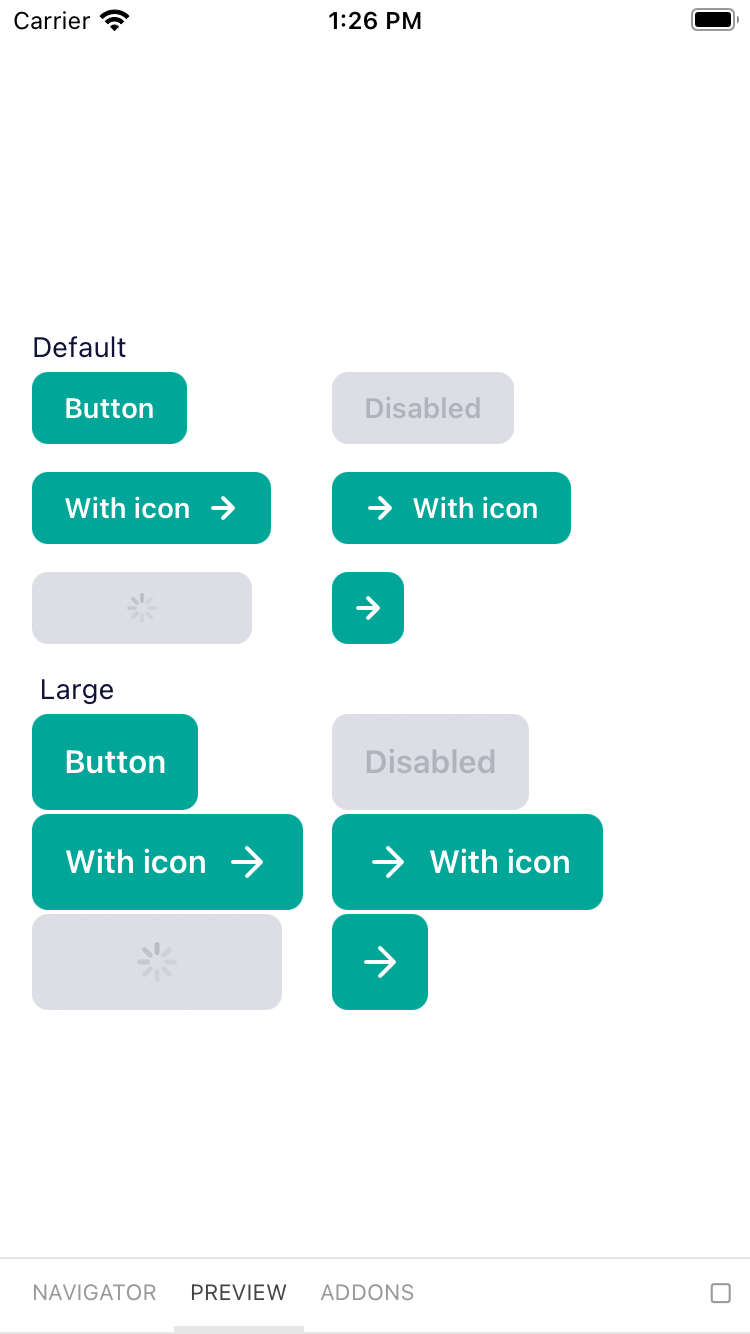
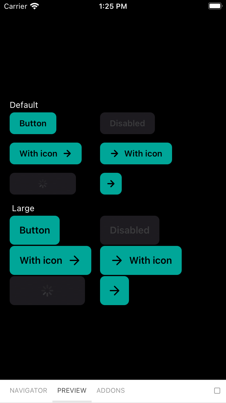
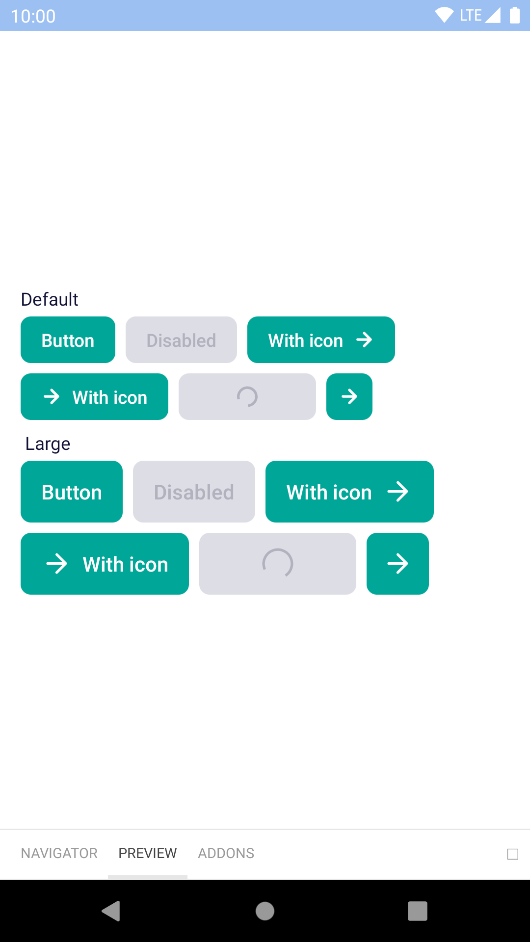
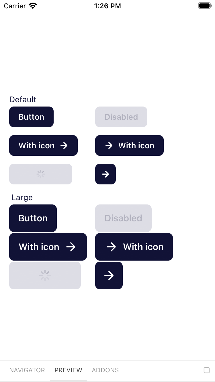
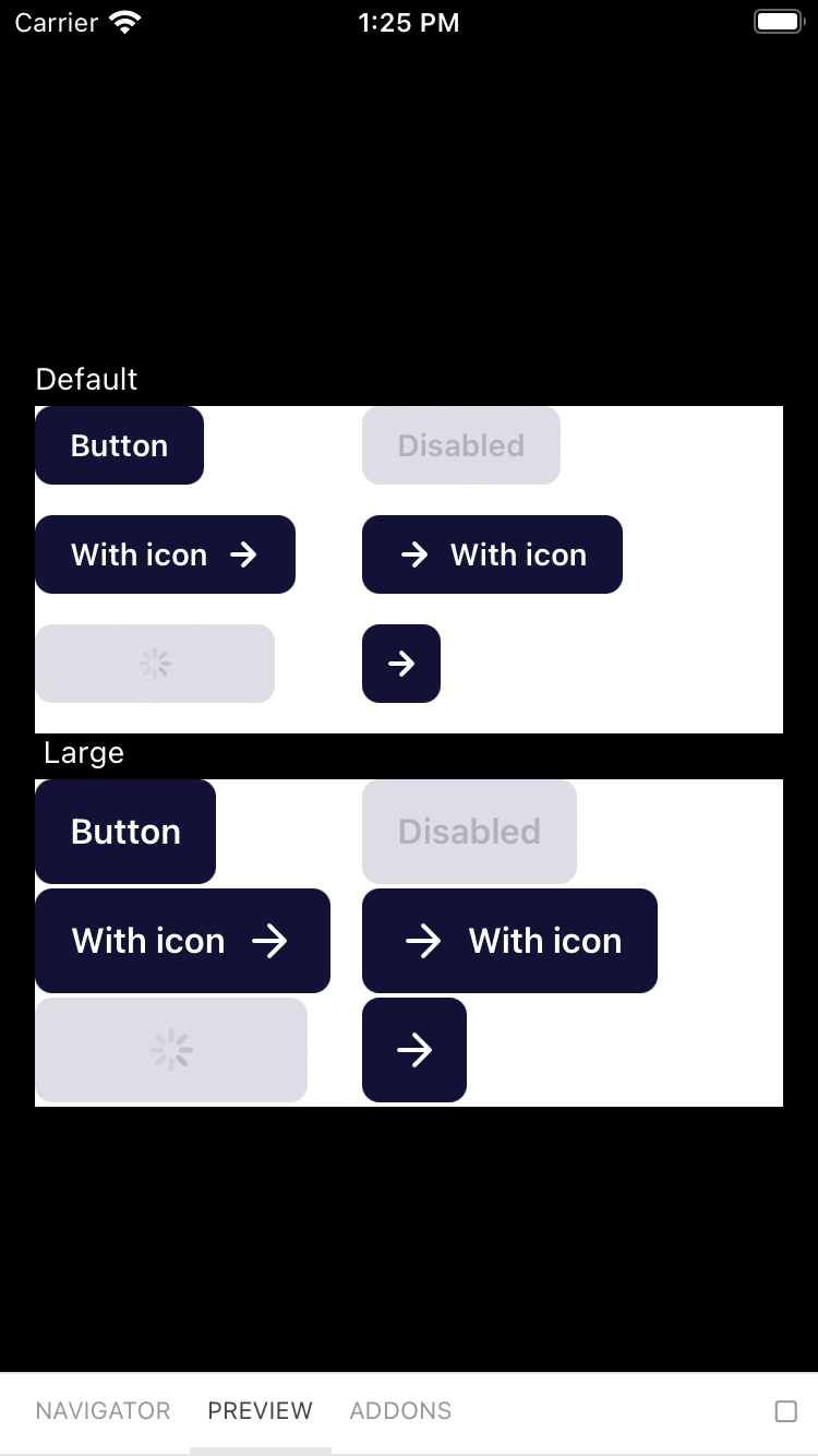
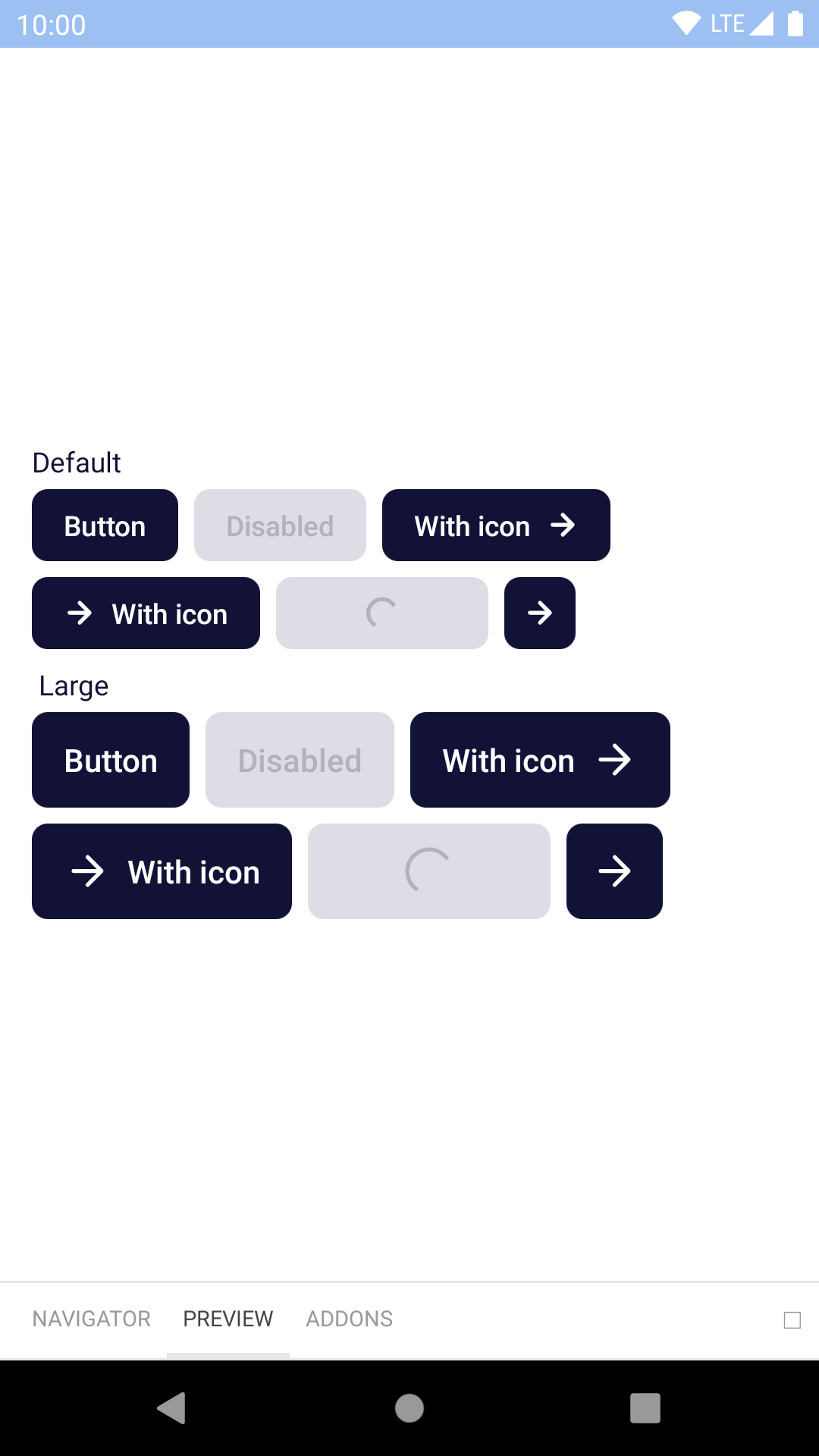
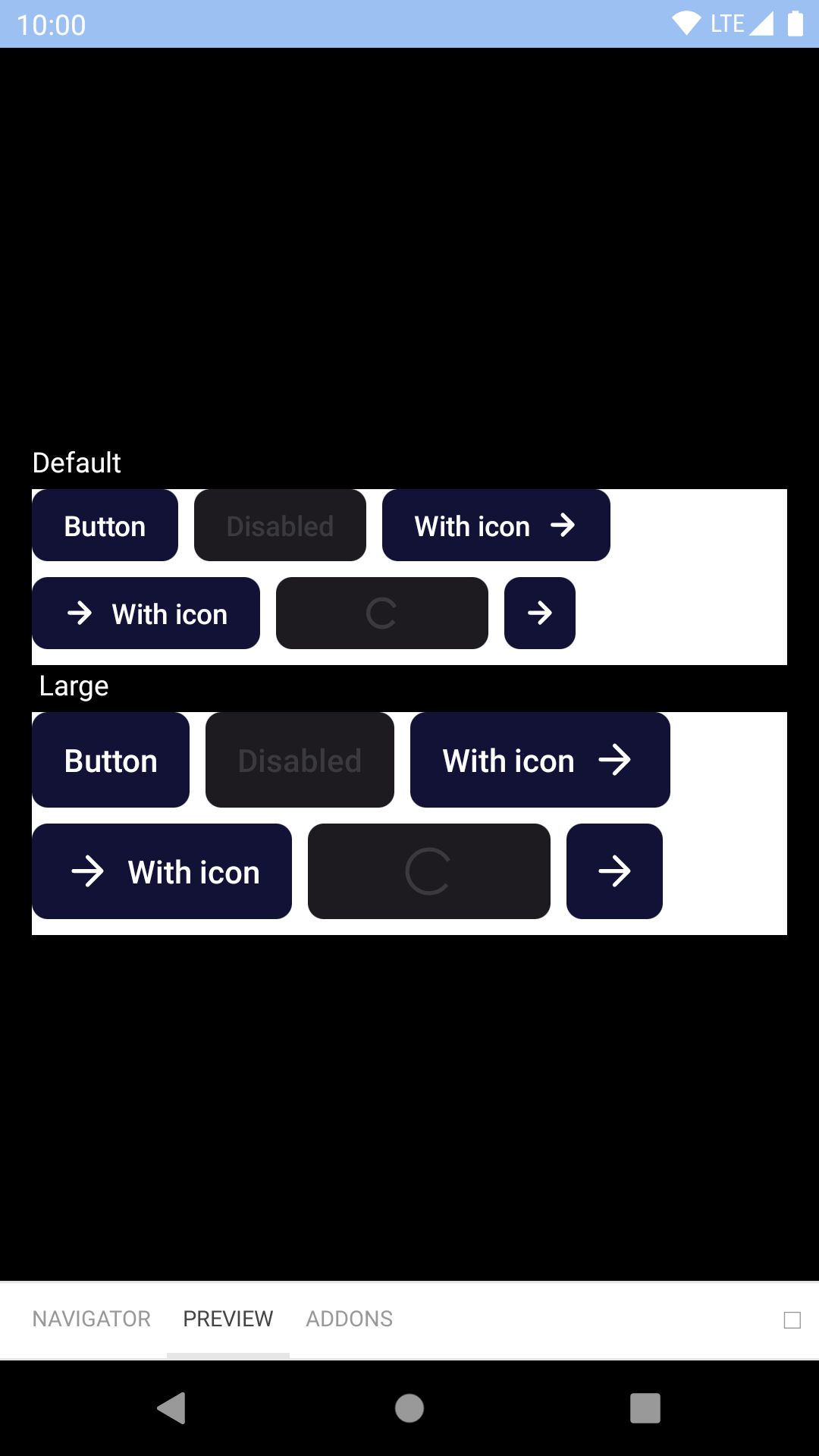
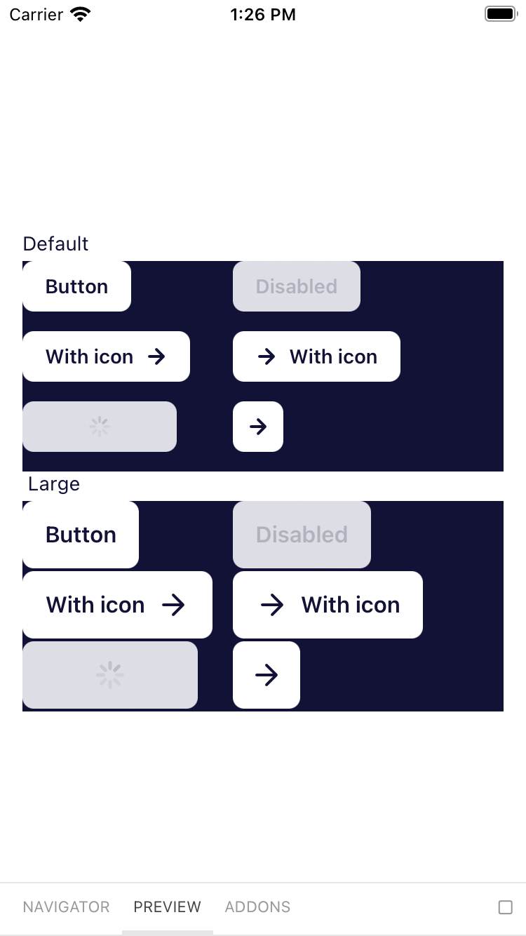
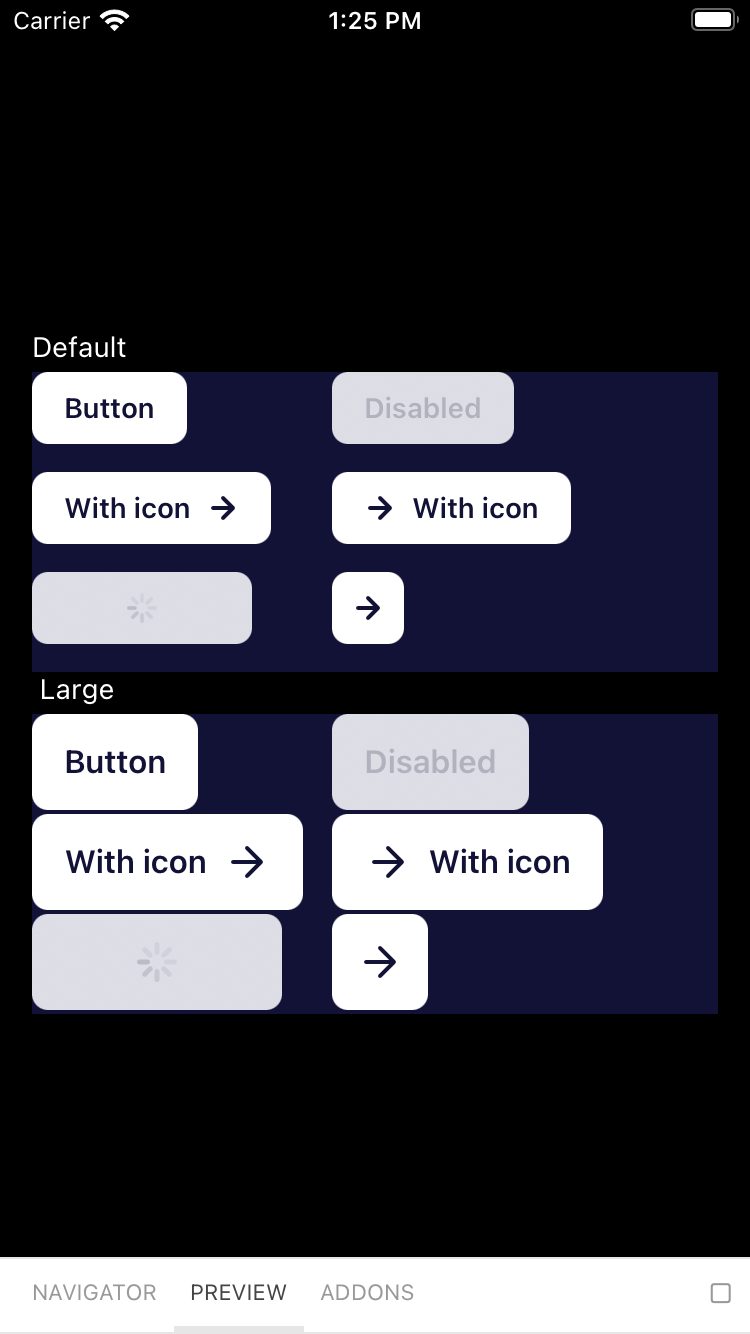
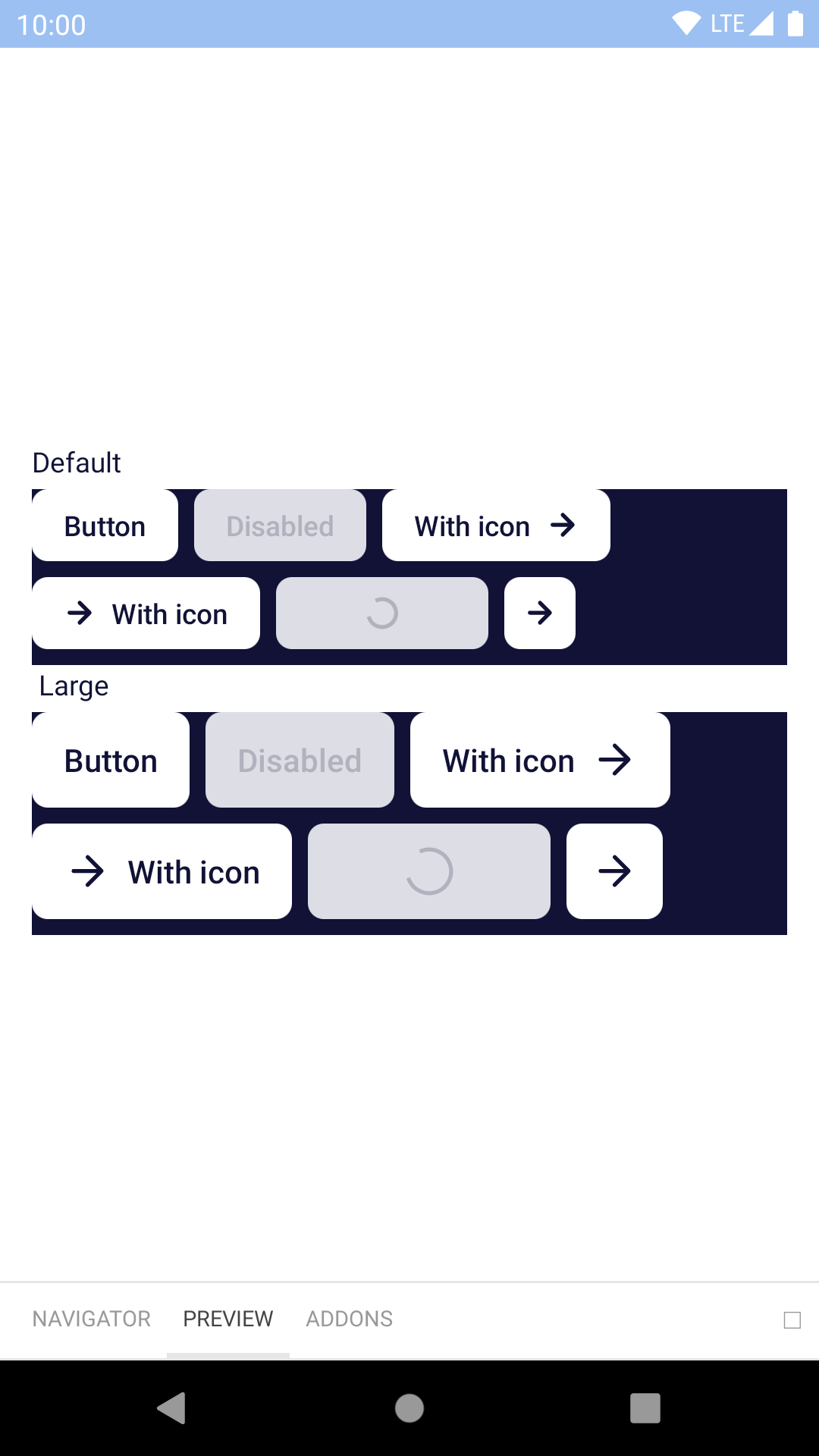
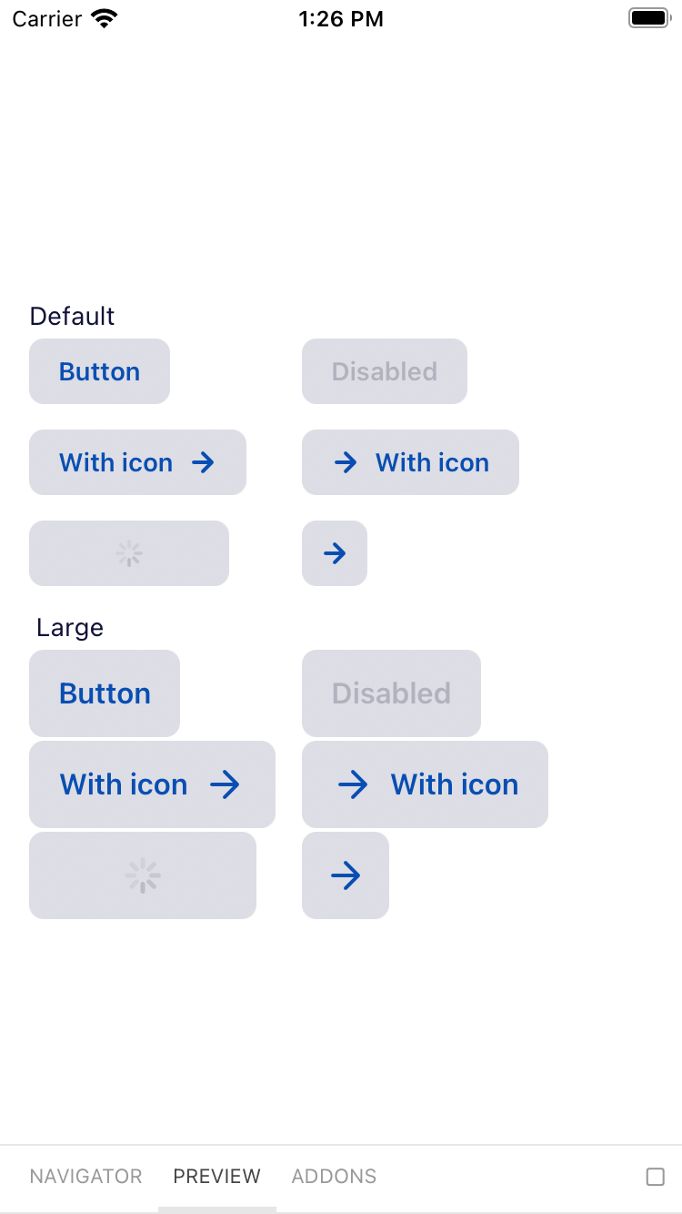
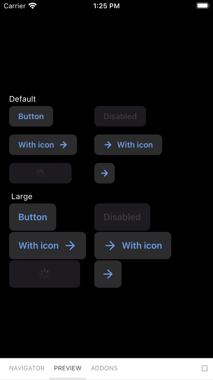
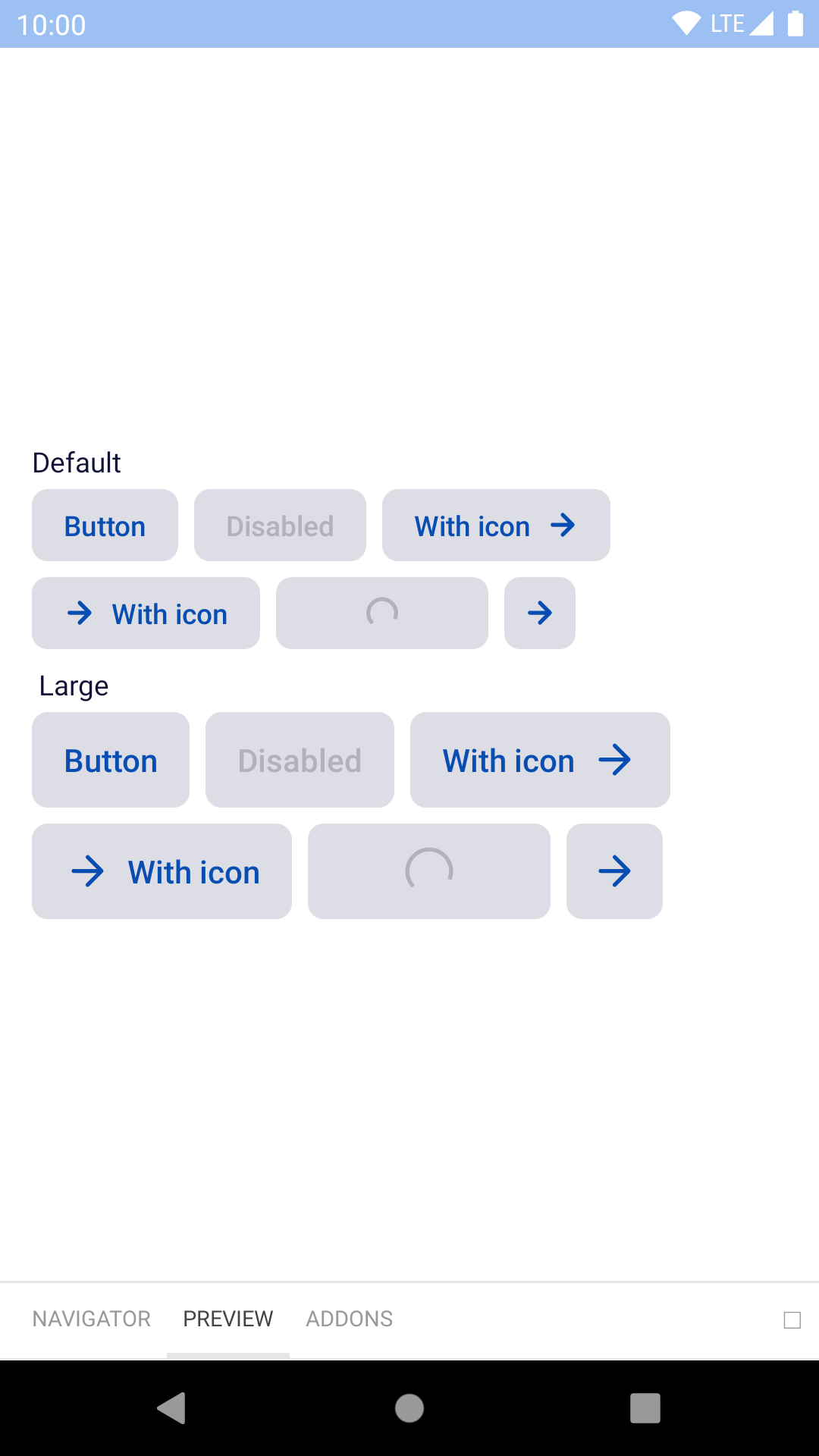
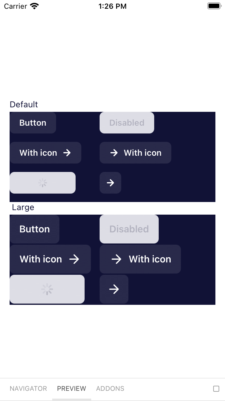
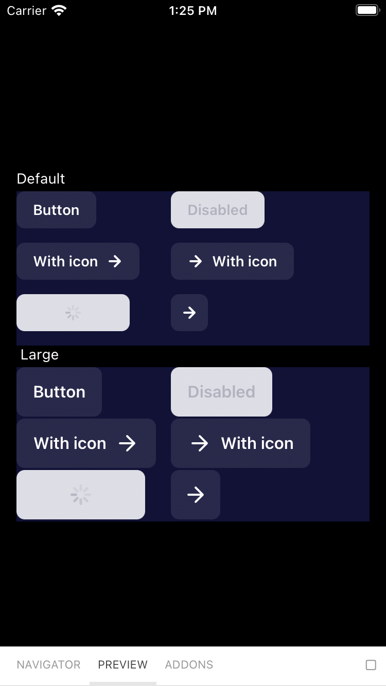
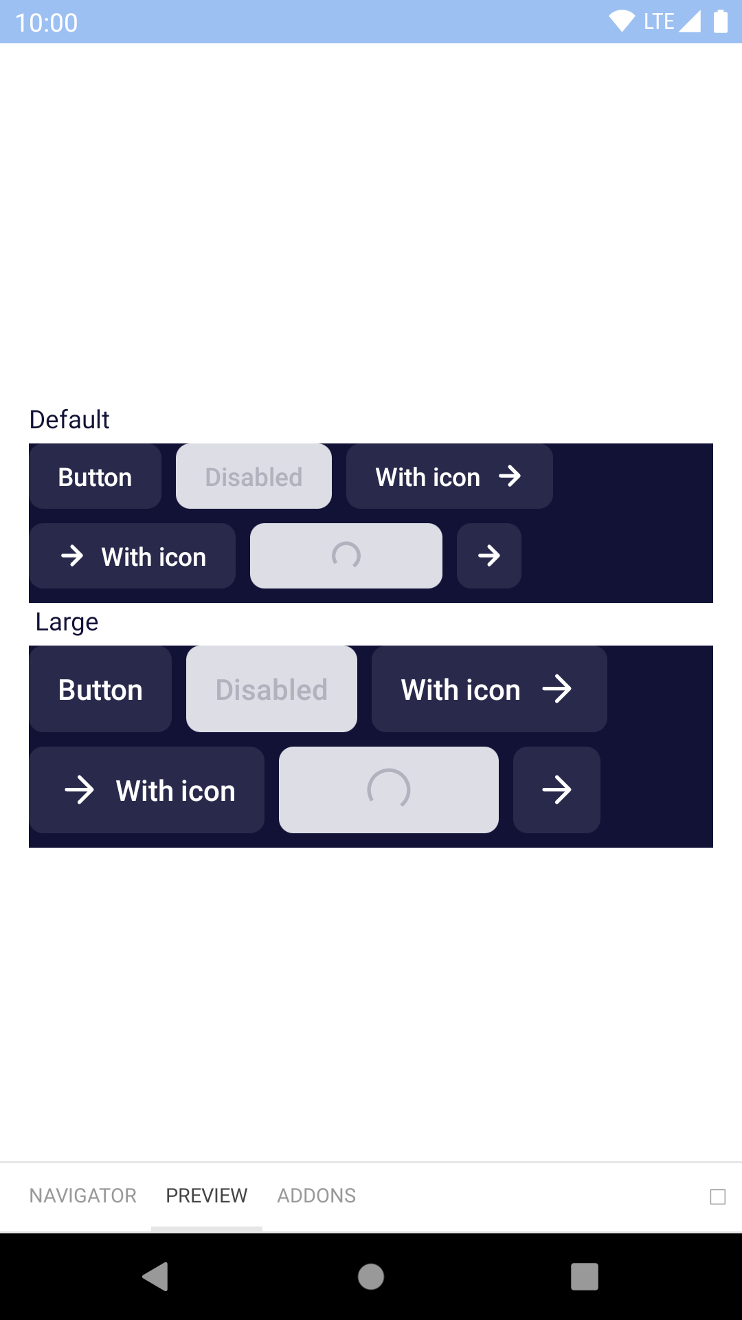
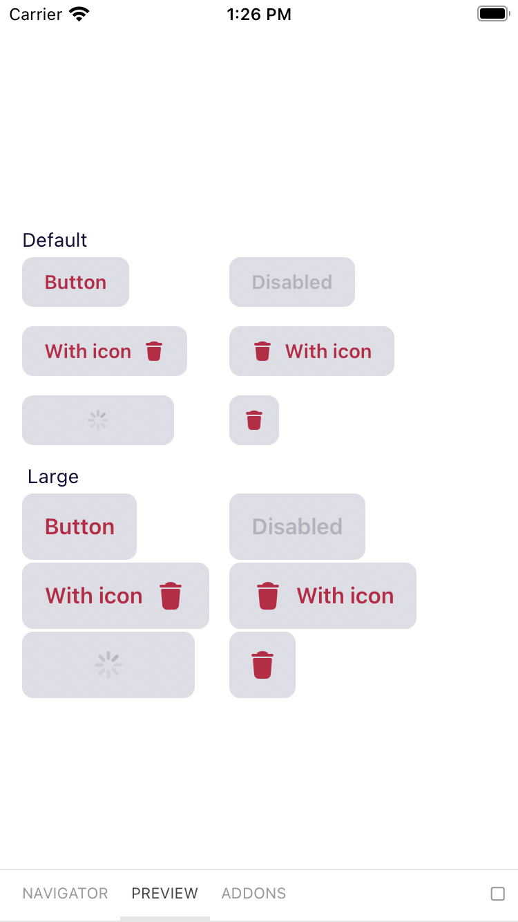
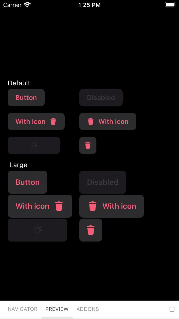
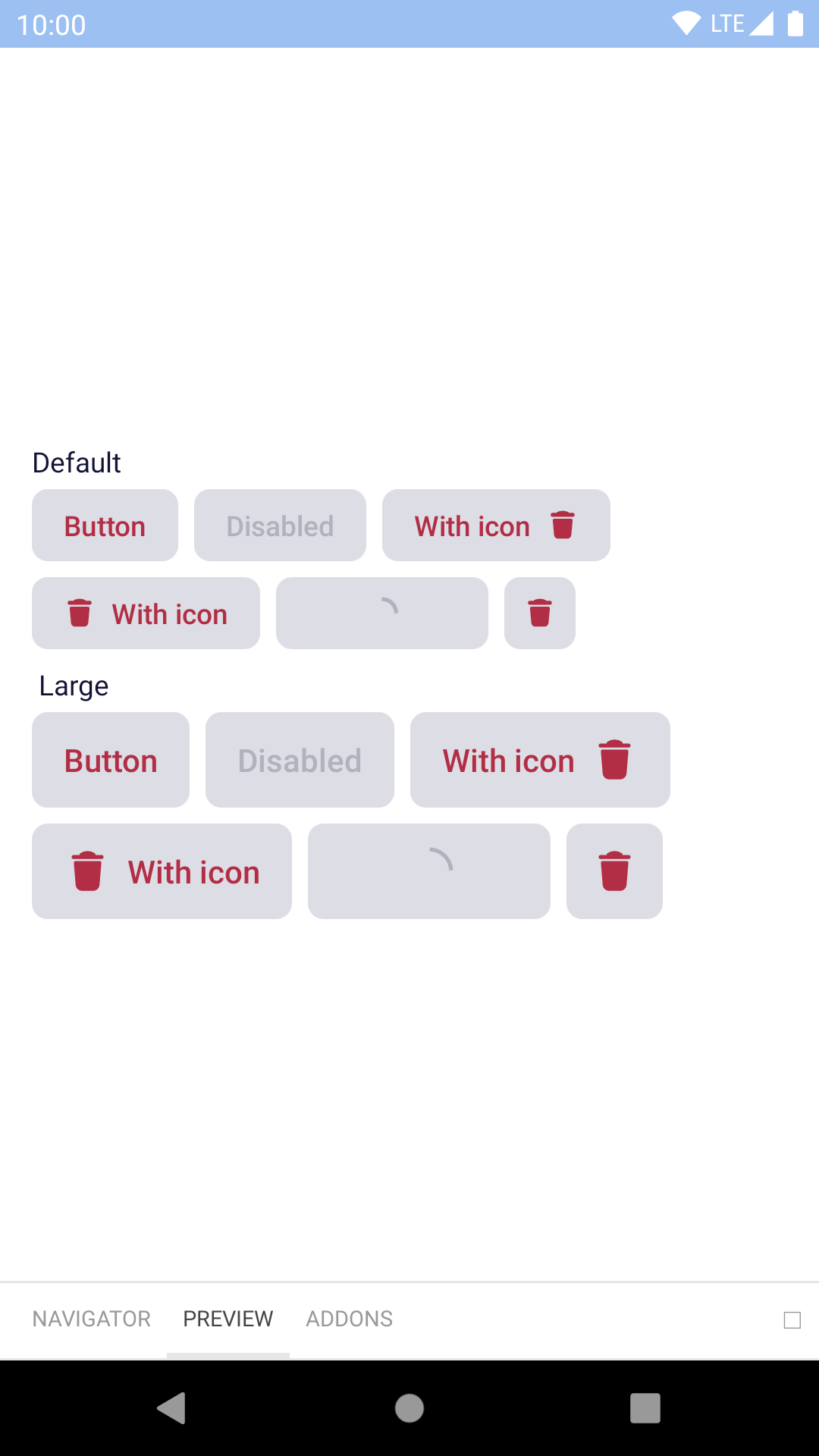
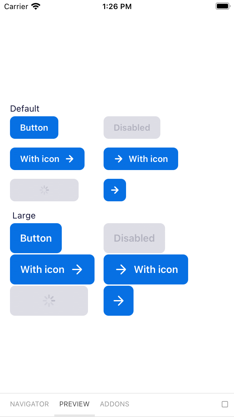
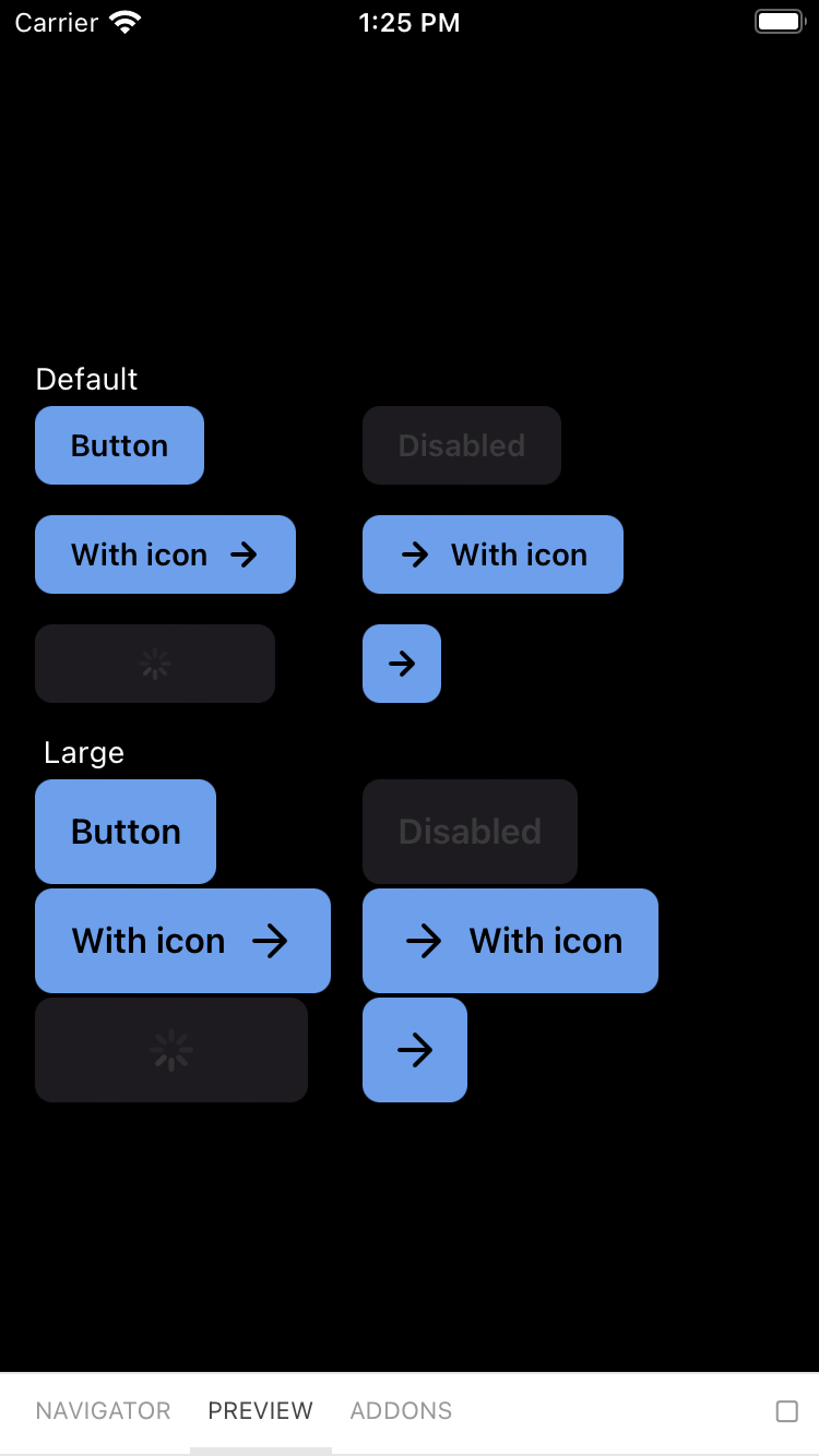
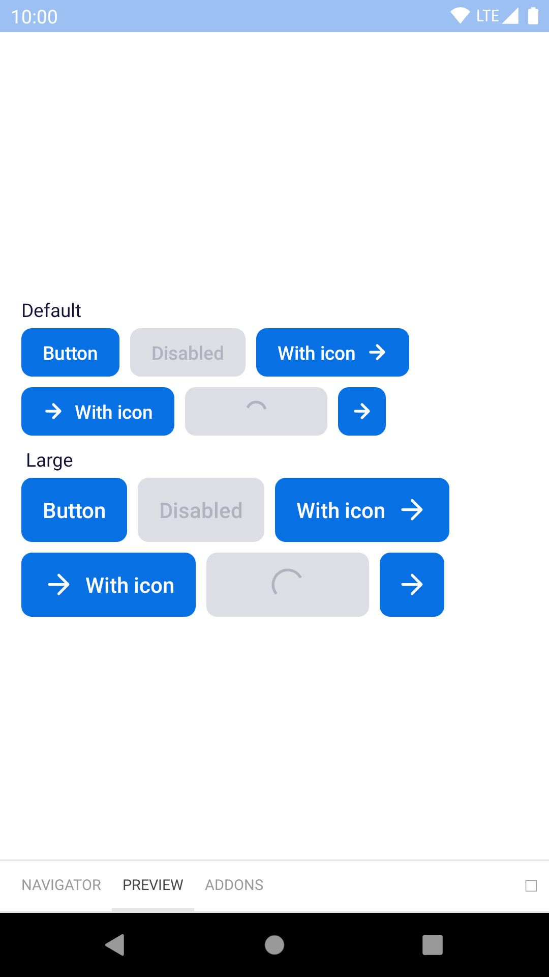
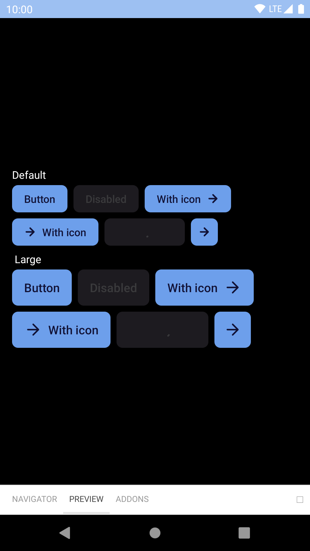
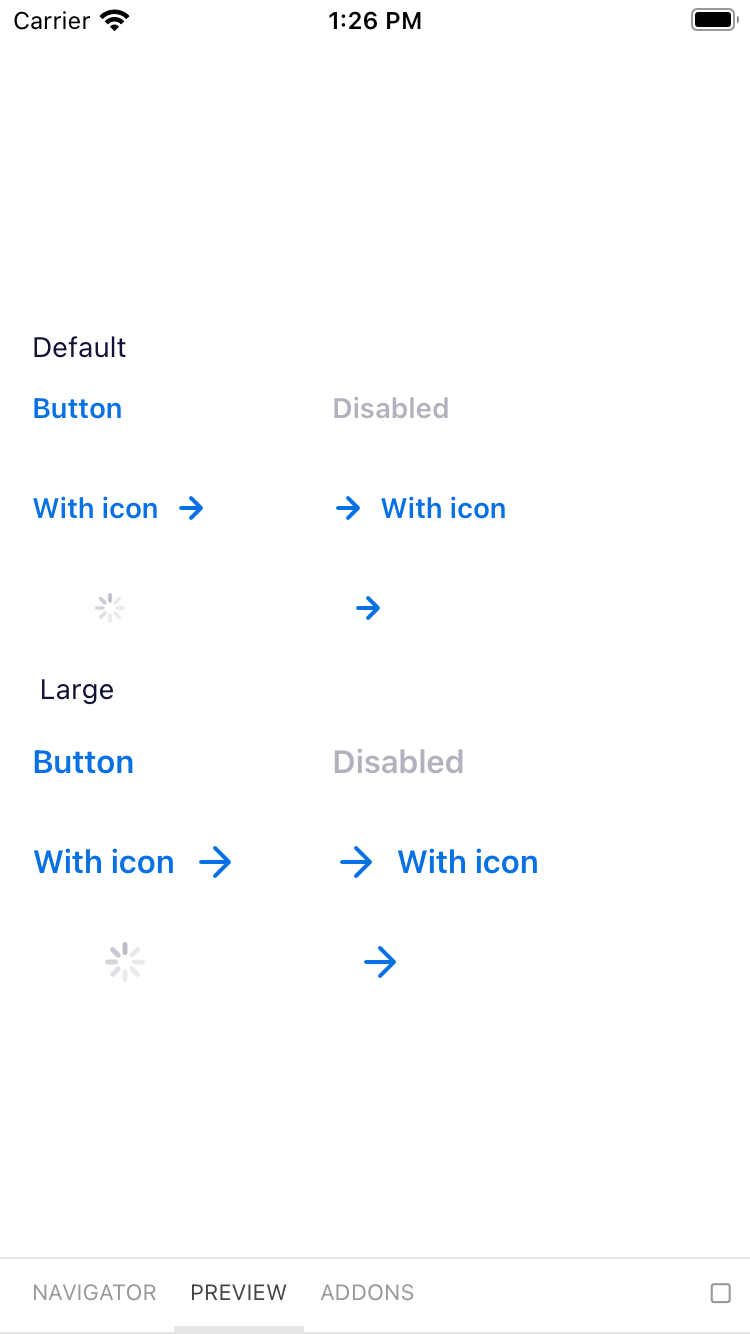
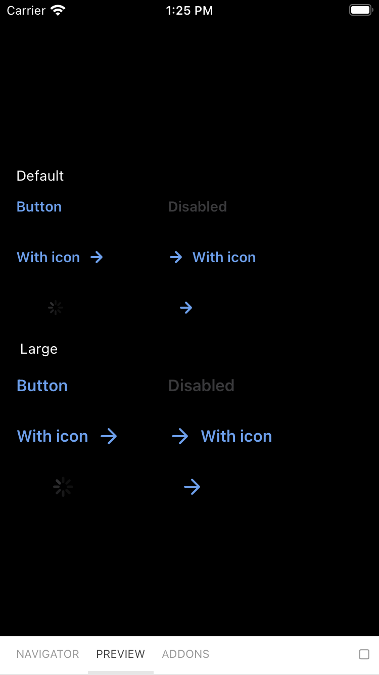
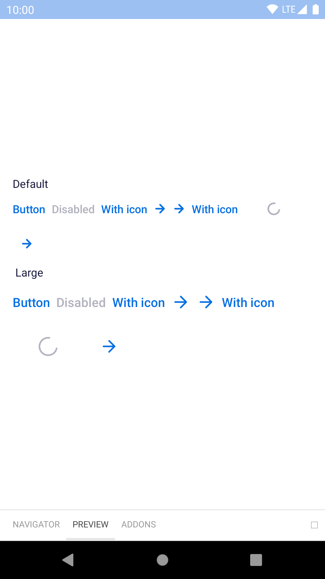
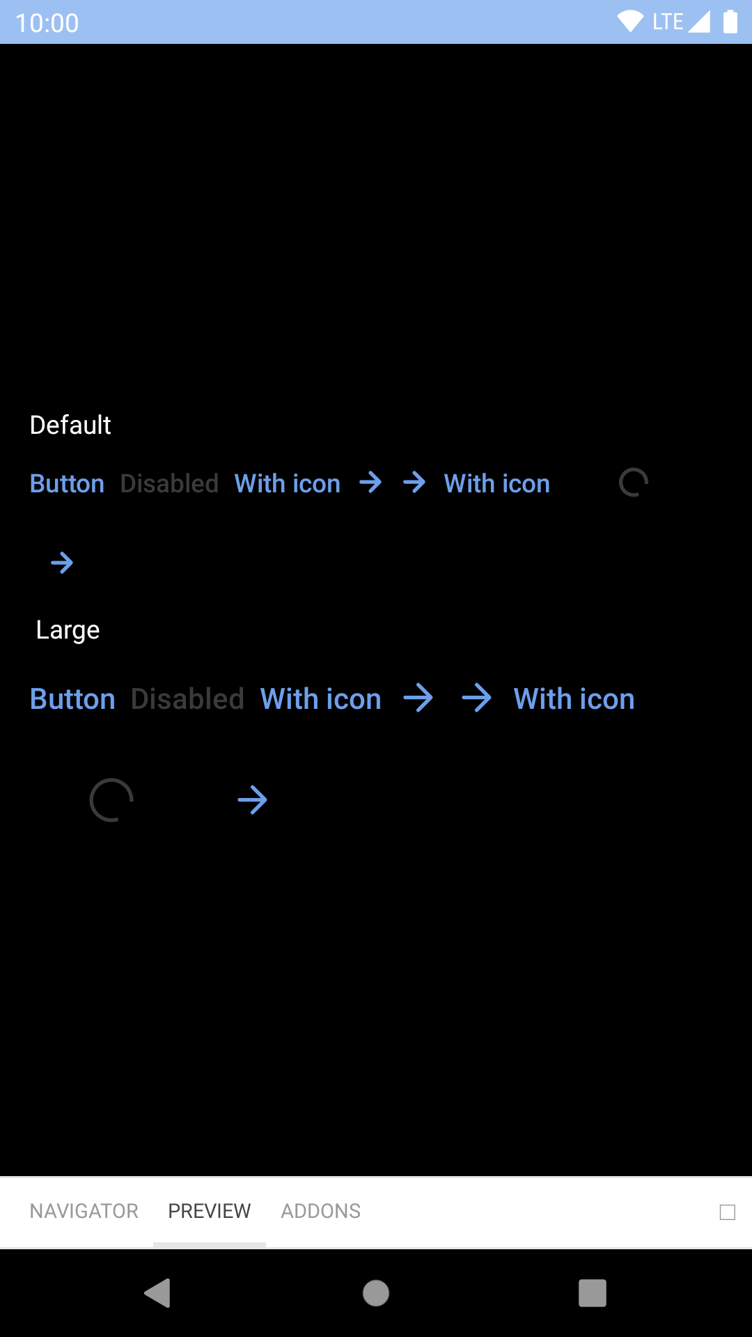
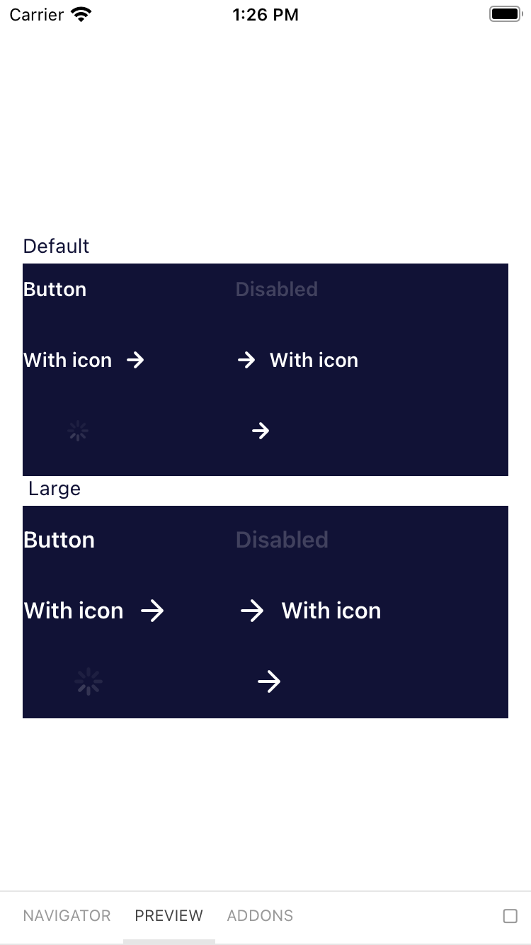
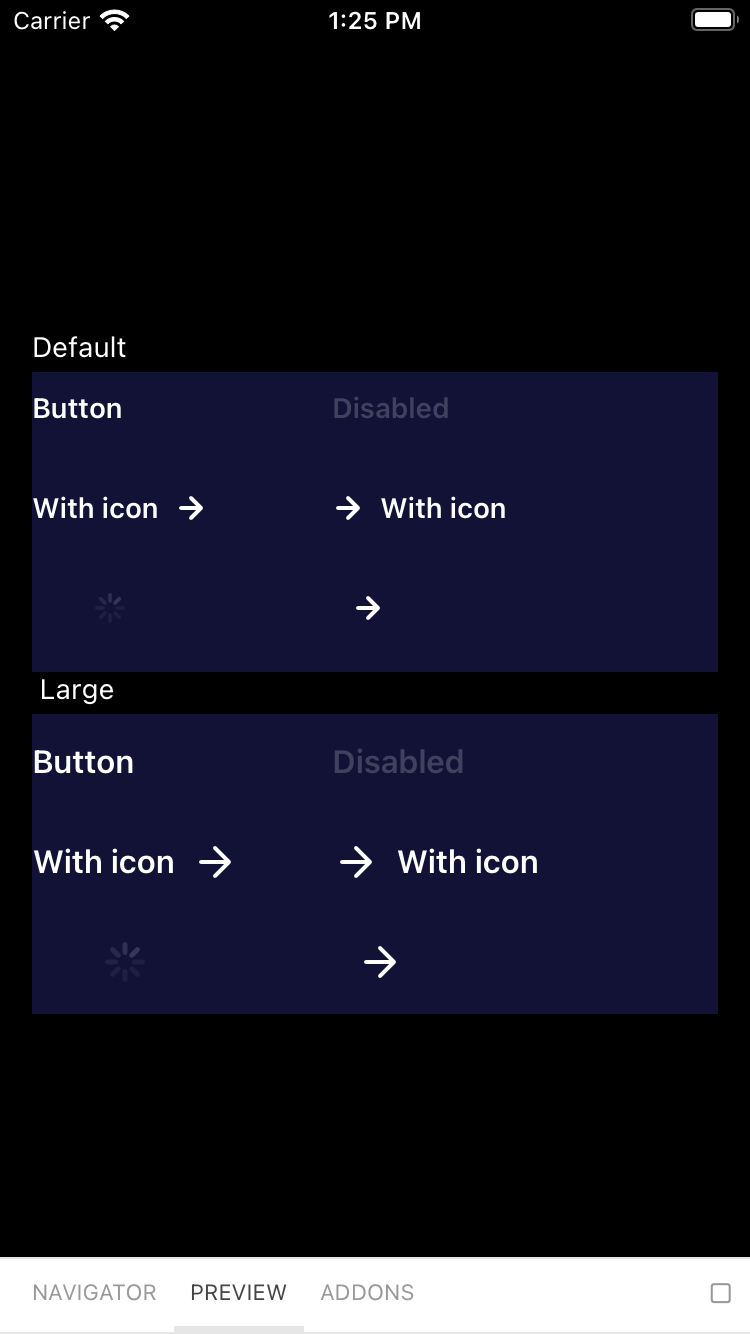
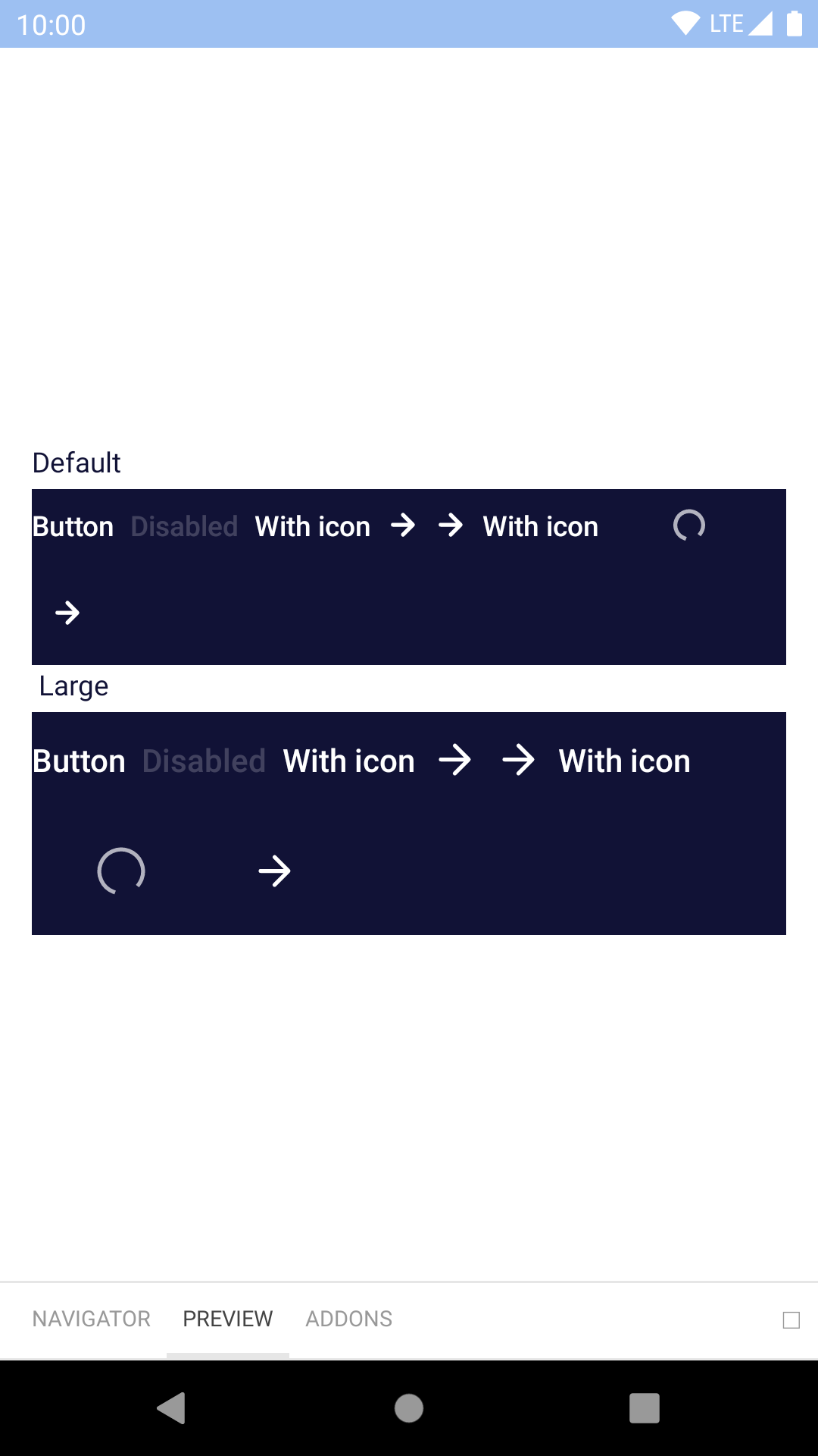
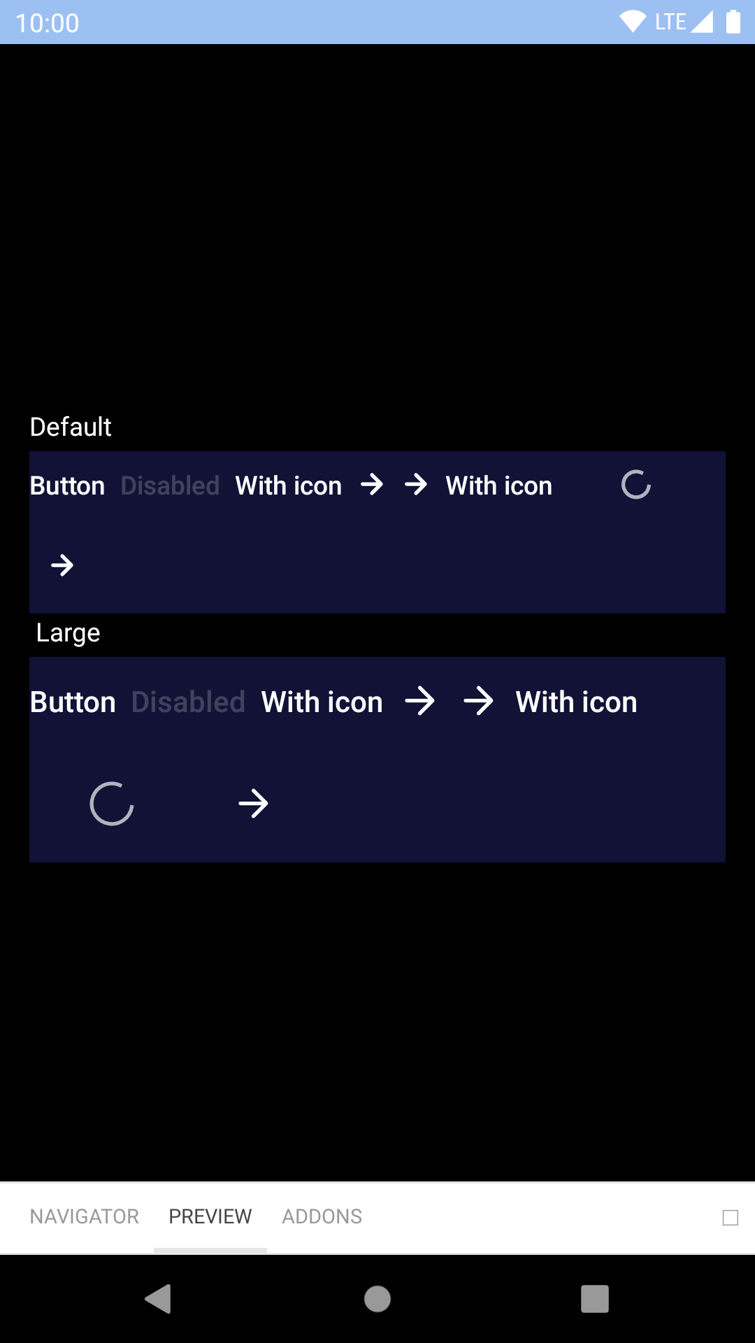
Button
Buttons help our travellers make all kinds of action, from logging in to booking that dream trip.
bpk-component-button
Backpack React Native button component.
Primary
| Day | Night |
|---|---|
 |
 |
 |
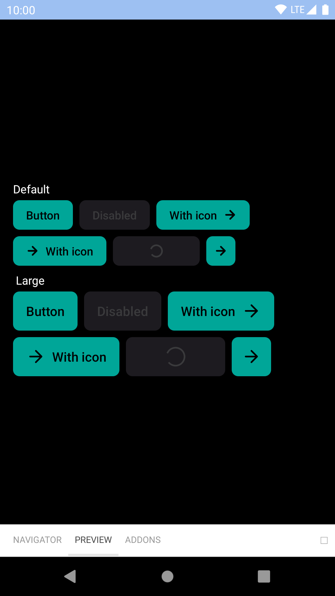 |
Primary On Light
| Day | Night |
|---|---|
 |
 |
 |
 |
Primary On Dark
| Day | Night |
|---|---|
 |
 |
 |
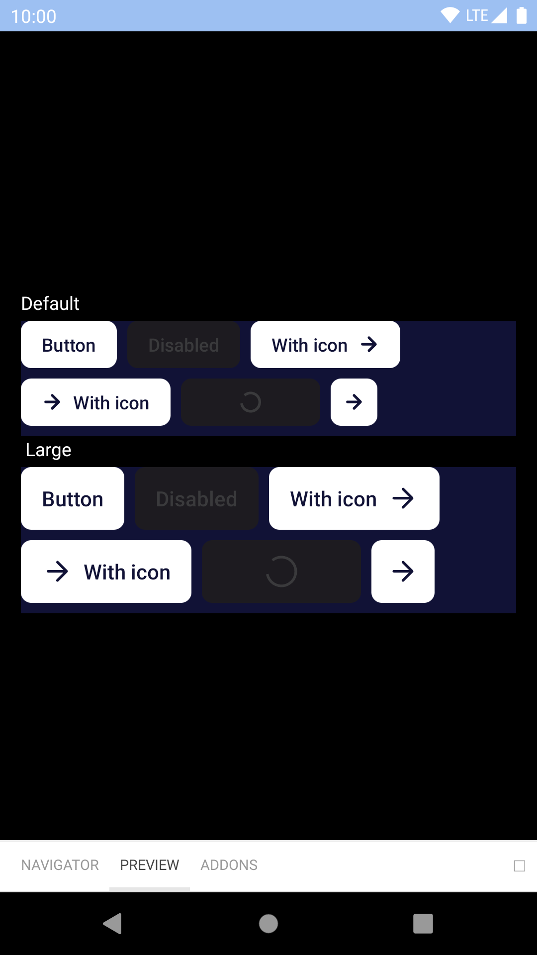 |
Secondary
| Day | Night |
|---|---|
 |
 |
 |
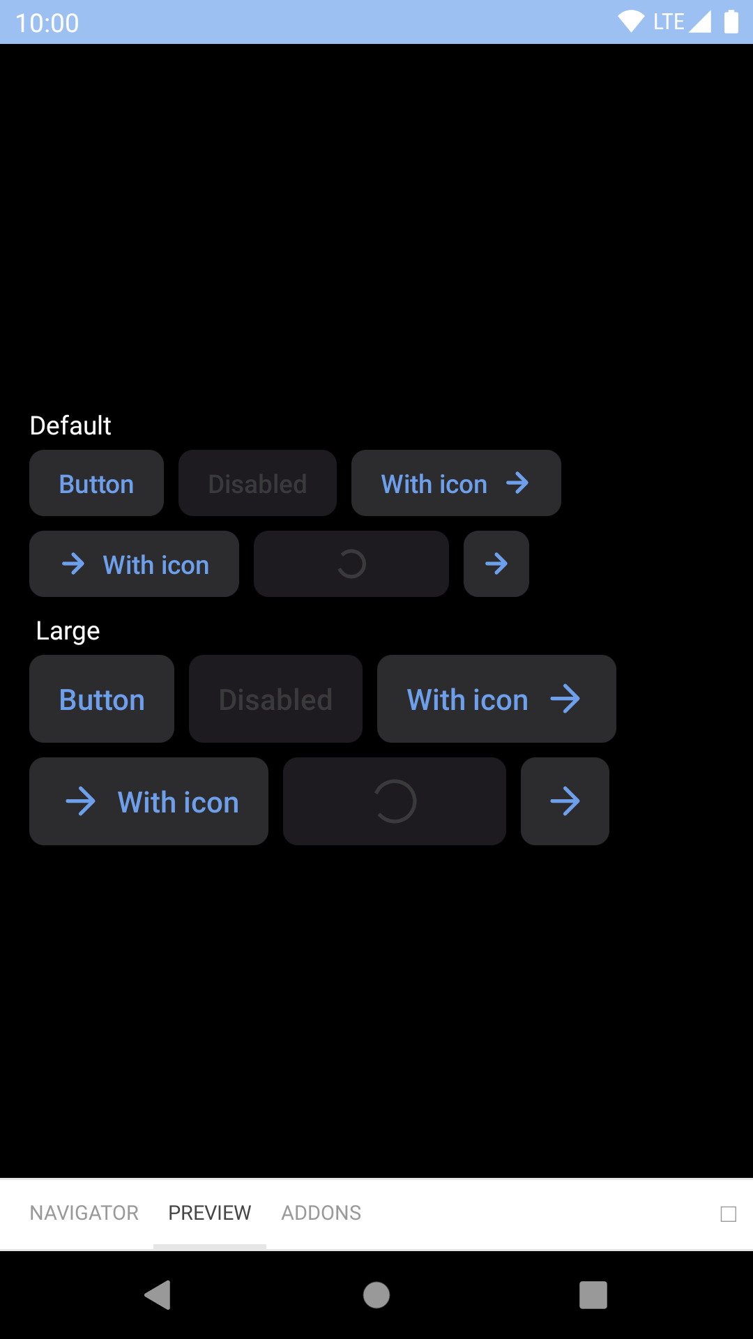 |
Secondary On Dark
| Day | Night |
|---|---|
 |
 |
 |
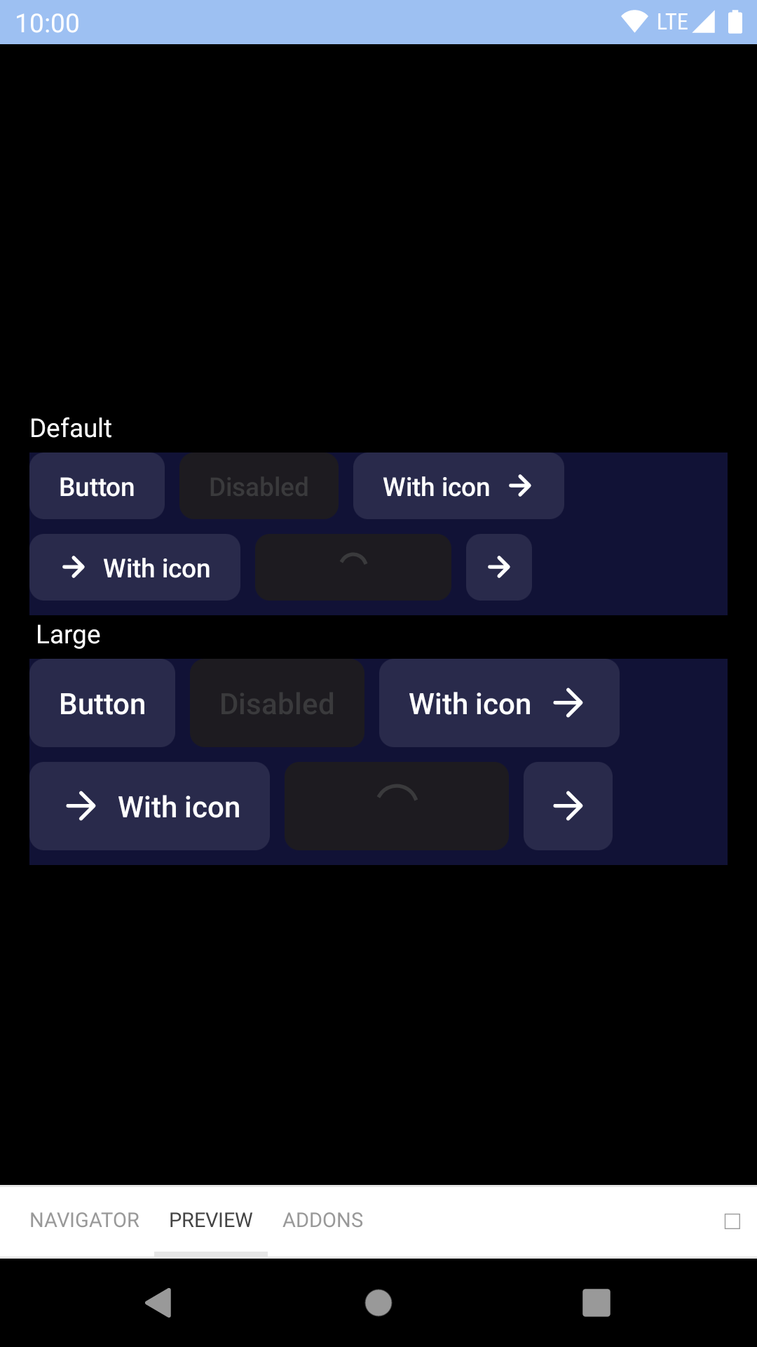 |
Destructive
| Day | Night |
|---|---|
 |
 |
 |
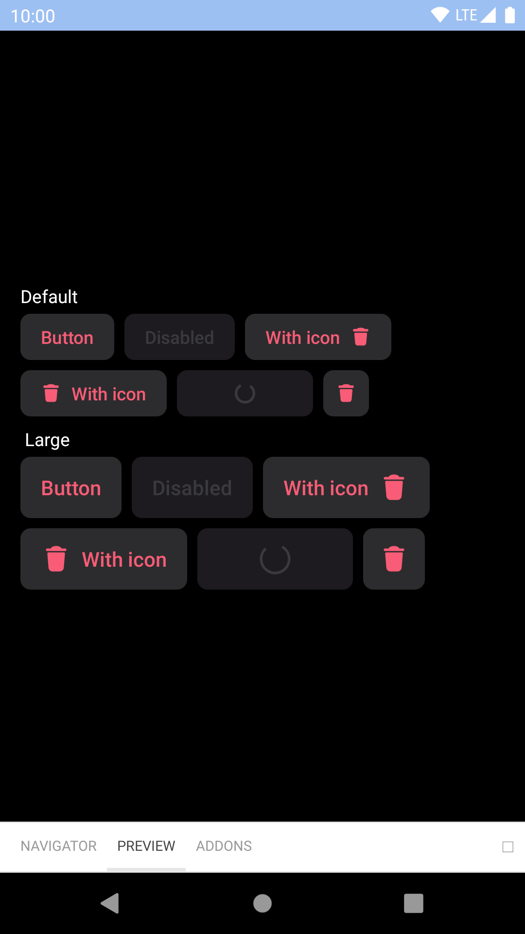 |
Featured
| Day | Night |
|---|---|
 |
 |
 |
 |
Link
| Day | Night |
|---|---|
 |
 |
 |
 |
Link On Dark
| Day | Night |
|---|---|
 |
 |
 |
 |
Installation
Check the main Readme for a complete installation guide.
Usage
                                                import { StyleSheet, View } from 'react-native';
                                                import React, { Component } from 'react';
                                                import { BUTTON_TYPES, ICON_ALIGNMENTS, BpkButtonV2 } from 'backpack-react-native/bpk-component-button';
                                                import { spacingBase } from '@skyscanner/bpk-foundations-react-native/tokens/base.react.native';

                                                const styles = StyleSheet.create({
                                                  container: {
                                                    flex: 1,
                                                    justifyContent: 'center',
                                                    padding: spacingBase,
                                                  }
                                                });

                                                export default class App extends Component {
                                                  render() {
                                                    return (
                                                      <View style={styles.container}>
                                                        <BpkButtonV2
                                                          type={BUTTON_TYPES.primary}
                                                          title="Book flight"
                                                          onPress={() => {}}
                                                        />
                                                        <BpkButtonV2
                                                          type={BUTTON_TYPES.featured}
                                                          title="Book flight"
                                                          onPress={() => {}}
                                                        />
                                                        <BpkButtonV2
                                                          disabled
                                                          type={BUTTON_TYPES.destructive}
                                                          title="Book flight"
                                                          onPress={() => {}}
                                                        />
                                                        <BpkButtonV2
                                                          large
                                                          type={BUTTON_TYPES.primary}
                                                          title="Book flight"
                                                          onPress={() => {}}
                                                        />
                                                        <BpkButtonV2
                                                          type={BUTTON_TYPES.featured}
                                                          title="Book flight"
                                                          icon="baggage"
                                                          onPress={() => {}}
                                                        />
                                                        <BpkButtonV2
                                                          type={BUTTON_TYPES.primary}
                                                          title="Book flight"
                                                          icon="baggage"
                                                          iconAlignment={ICON_ALIGNMENTS.leading}
                                                          onPress={() => {}}
                                                        />
                                                        <BpkButtonV2
                                                          type={BUTTON_TYPES.featured}
                                                          title="Book flight"
                                                          icon="baggage"
                                                          iconOnly
                                                          onPress={() => {}}
                                                        />
                                                      </View>
                                                    );
                                                  }
                                                }
Props
| Property | PropType | Required | Default Value |
|---|---|---|---|
| onPress | func | true | - |
| title | string | true | - |
| accessibilityLabel | string | false | props.title |
| disabled | bool | false | false |
| icon | oneOf(string, element) Strings must be a BpkIcon | false | null |
| iconAlignment | oneOf('leading', 'trailing') | false | trailing |
| iconOnly | bool | false | false |
| large | bool | false | false |
| type | oneOf('primary', 'featured', 'secondary', 'destructive', 'primaryOnLight', 'primaryOnDark', 'secondaryOnDark', 'link', 'linkOnDark') | false | null |
Made with ❤️ by Skyscanner © 2024
© 2024 Skyscanner Backpack. Page last updated on Nov 21, 2022, 15:07