Button

Default
| Day | Night |
|---|---|
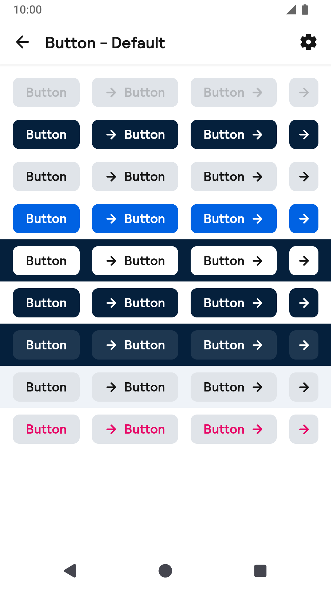 |
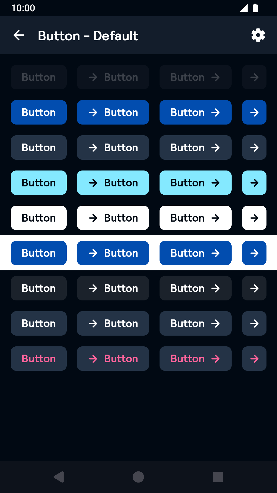 |
Large
| Day | Night |
|---|---|
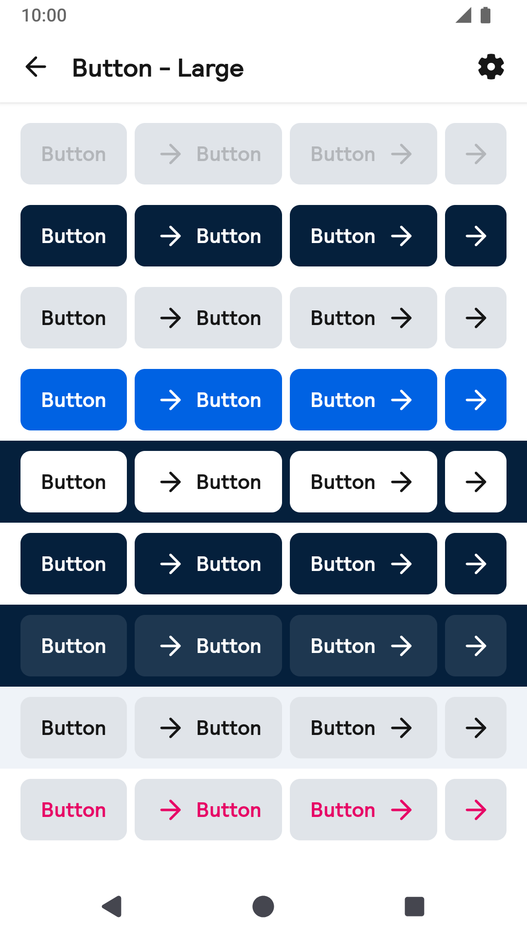 |
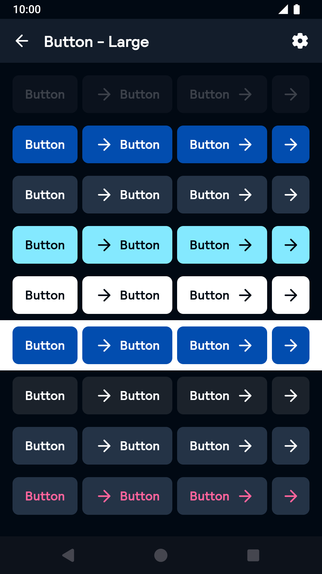 |
Link
| Day | Night |
|---|---|
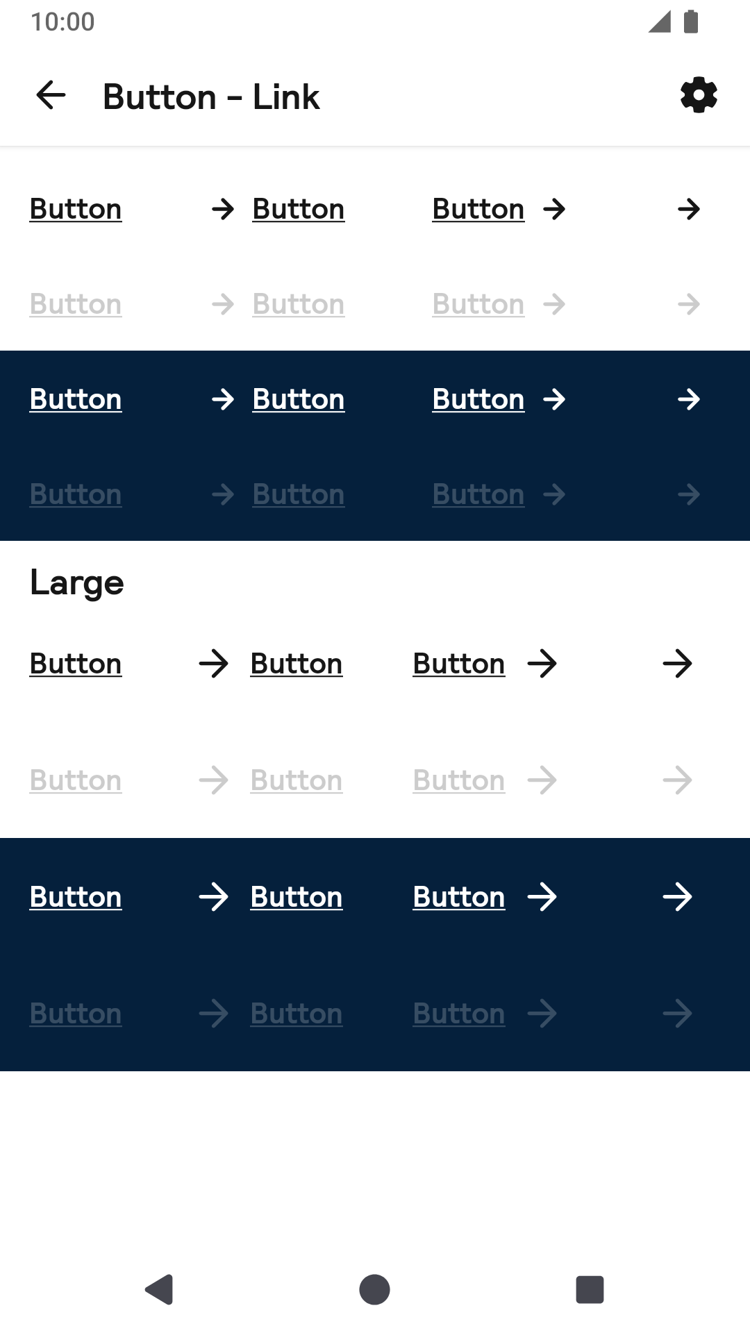 |
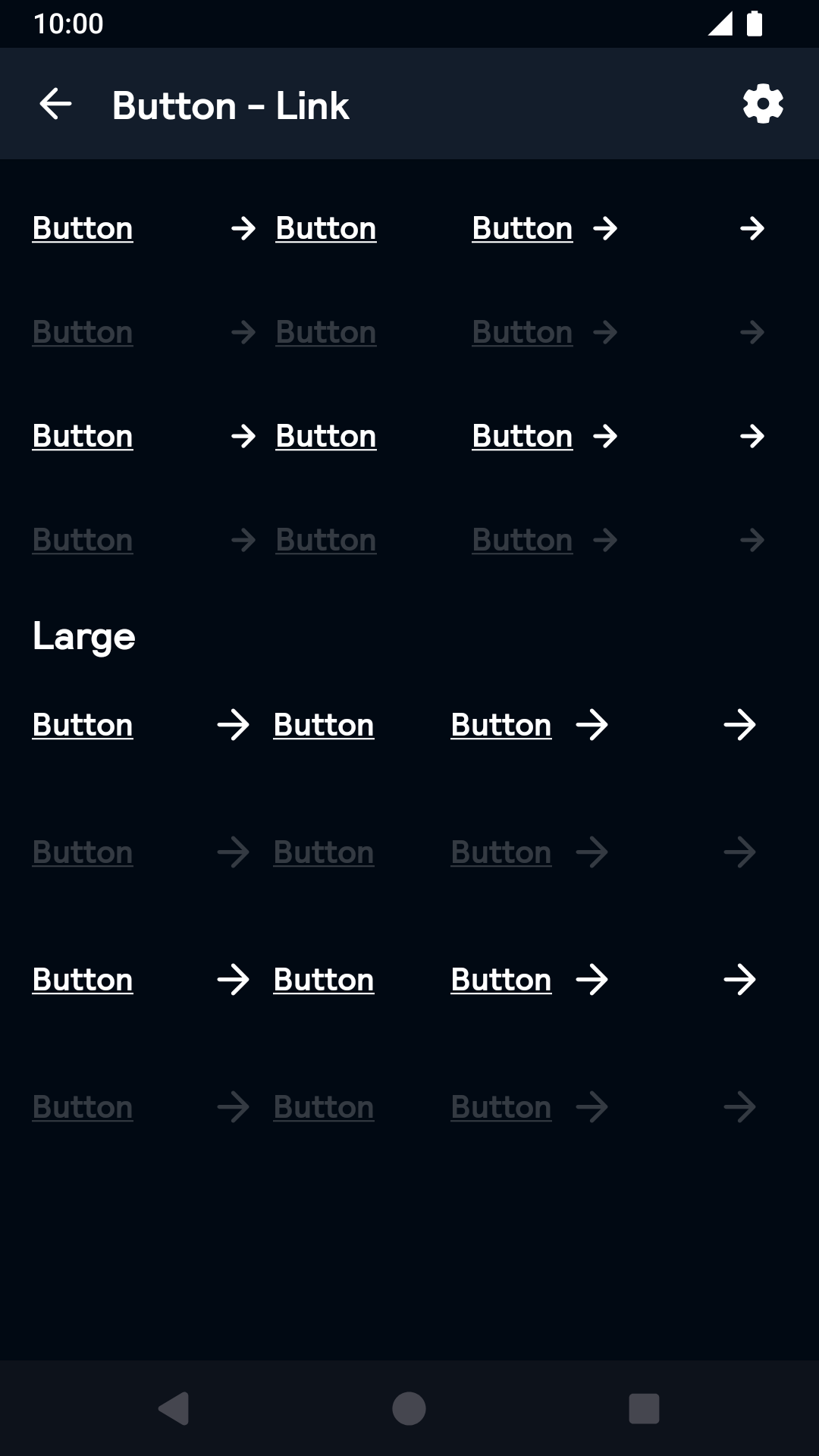 |
Drawable Icon
| Day | Night |
|---|---|
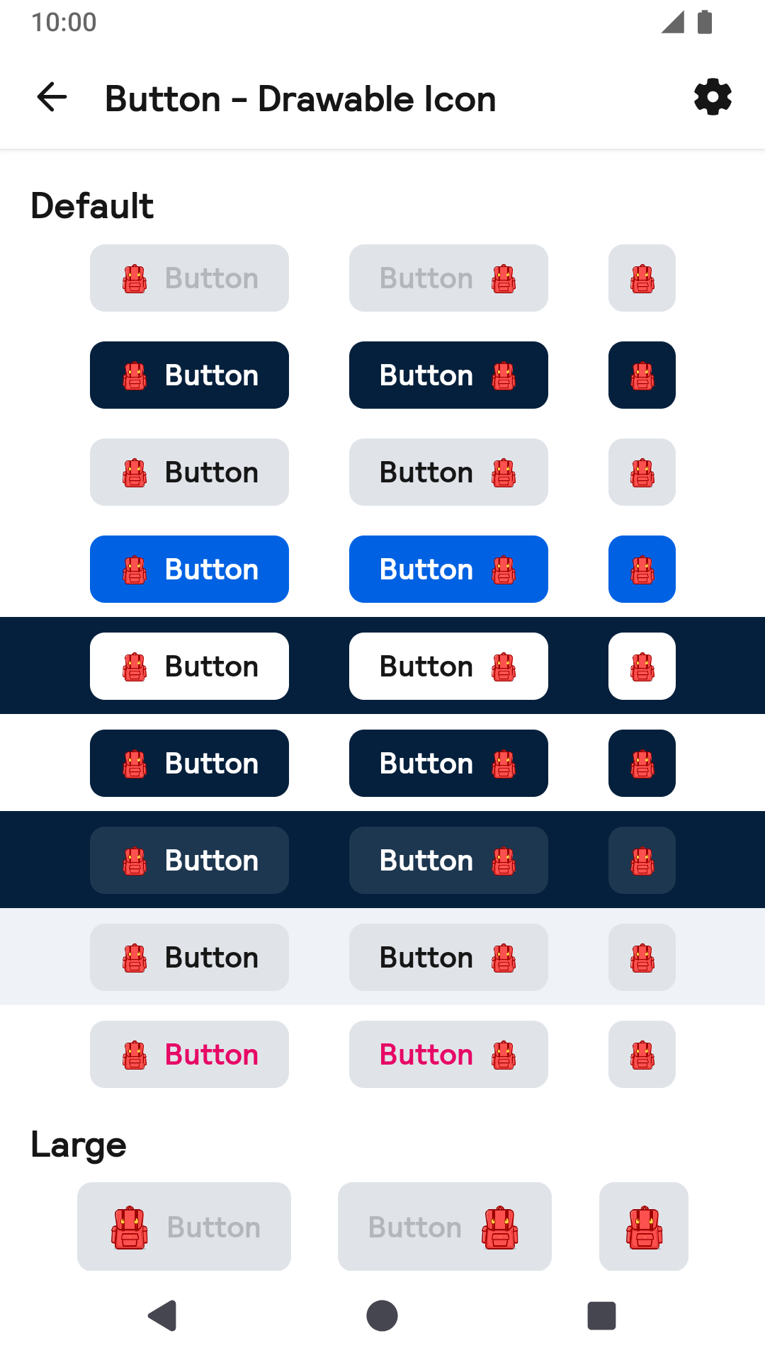 |
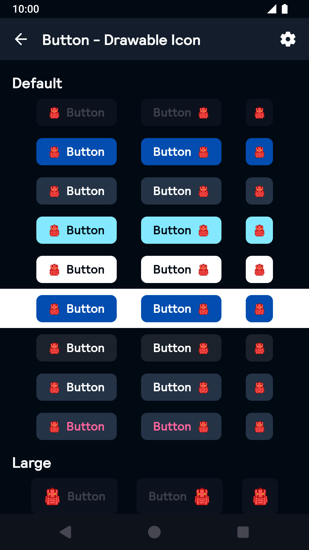 |
Installation
Backpack Compose is available through Maven Central. Check the main Readme for a complete installation guide.
Usage
Example of a text Button with default (small) size and primary type:
Example of a disabled button:
Example of a loading button:
Example of a large button:
Example of a secondary button:
Example of a icon only button:
Example of a button with leading icon and text:
Example of a button with custom icon and text: