- Welcome
- Getting started
- Latest updates
- Foundations
-
Components
- Accordion
- Alert
- Alignment
- App Search Modal
- Aria live
- Autosuggest
- Badge
- Banner alert
- Bar chart
- Blockquote
- Bottom navigation
- Bottom sheet
- Breadcrumb
- Breakpoint
- Button
- Calendar
- Card
- Card list
- Card button
- Carousel
- Checkbox
- Chip
- Chip group
- Code
- Content cards
- Data Table
- Datepicker
- Description list
- Dialog
- Divider
- Drawer
- Field Set
- Flare
- Flat list
- Flight leg
- Floating action button
- Floating notification
- Form label
- Form validation
- Graphic promotion
- Horizontal navigation
- Icon
- Image
- Image Gallery
- Infinite scroll
- Info Banner
- Inset Banner
- Link
- List
- Map
- Mobile scroll container
- Modal
- Navigation bar
- Navigation Tab Group
- Nudger
- Overlay
- Page indicator
- Pagination
- Panel
- Phone input
- Picker
- Popover
- Price
- Progress bar
- Radio button
- Rating
- Rating Bar
- Scrollable calendar
- Search Modal
- Section header
- Section list
- Select
- Skeleton
- Skip link
- Slider
- Snackbar
- Snippet
- Spinner
- Split input
- Star rating
- Swap Button
- Switch
- Table
- Text
- Text input
- Theming
- Ticket
- Toast
- Tooltip
- Touchable native feedback
- Touchable overlay
- Search Input Summary
- Content
- Accessibility
- Contributing
- Localisation
Button
Buttons help our travellers make all kinds of action, from logging in to booking that dream trip.
Button

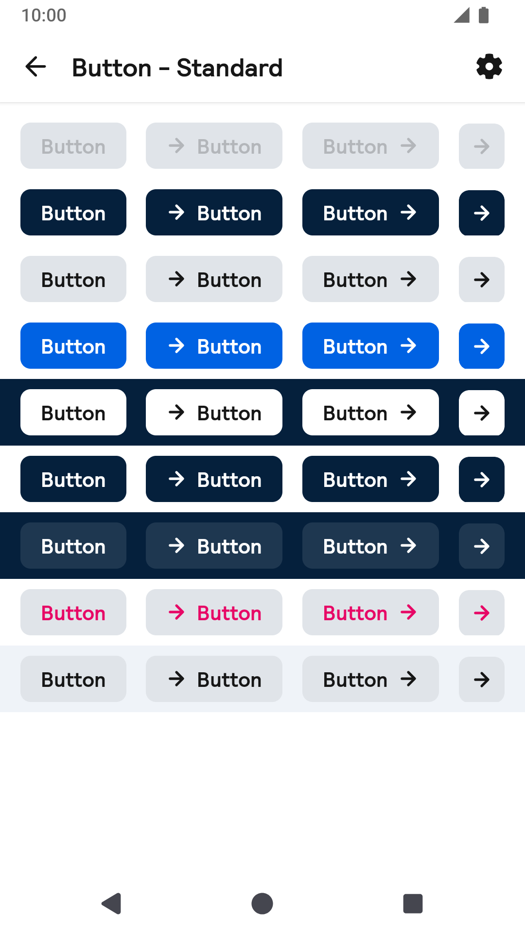
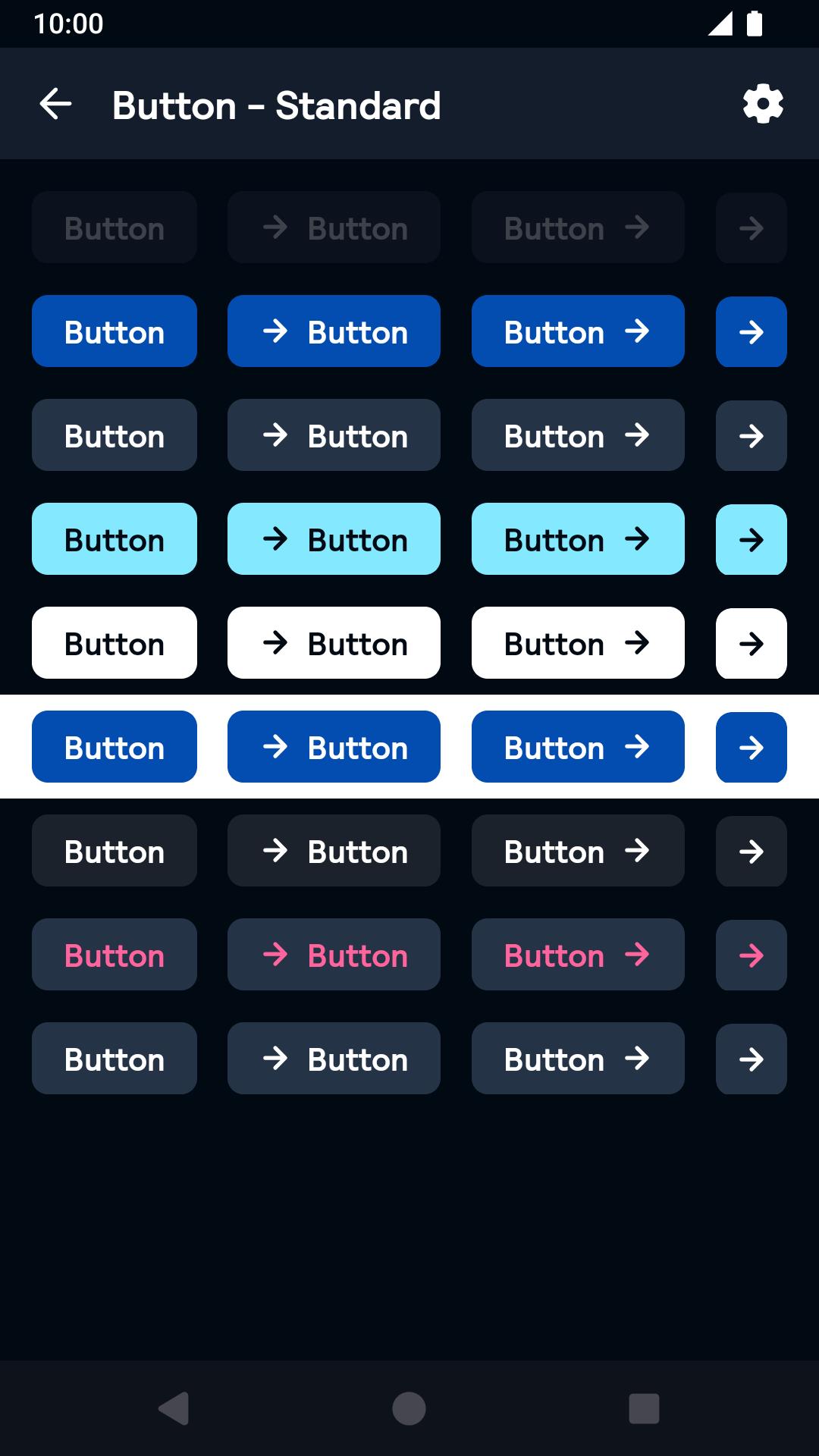
Standard
| Day | Night |
|---|---|
 |
 |
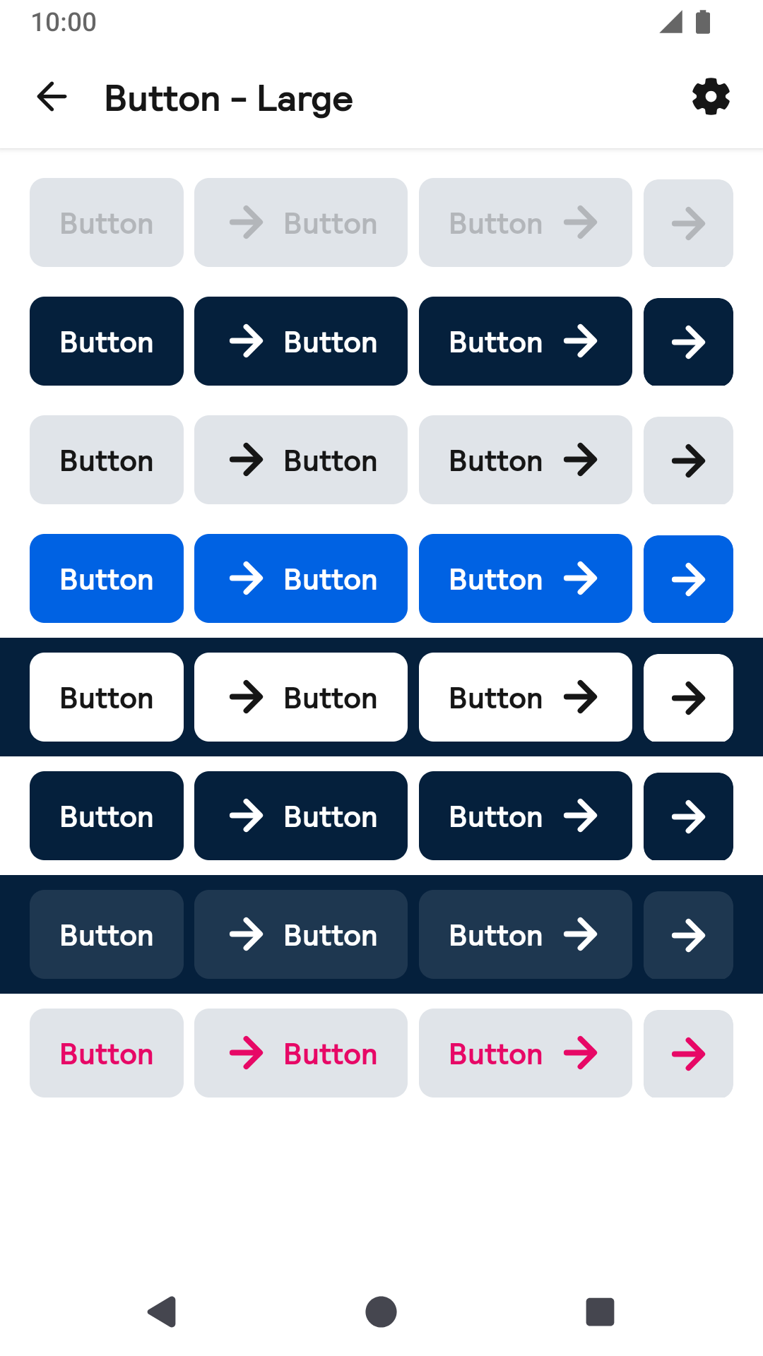
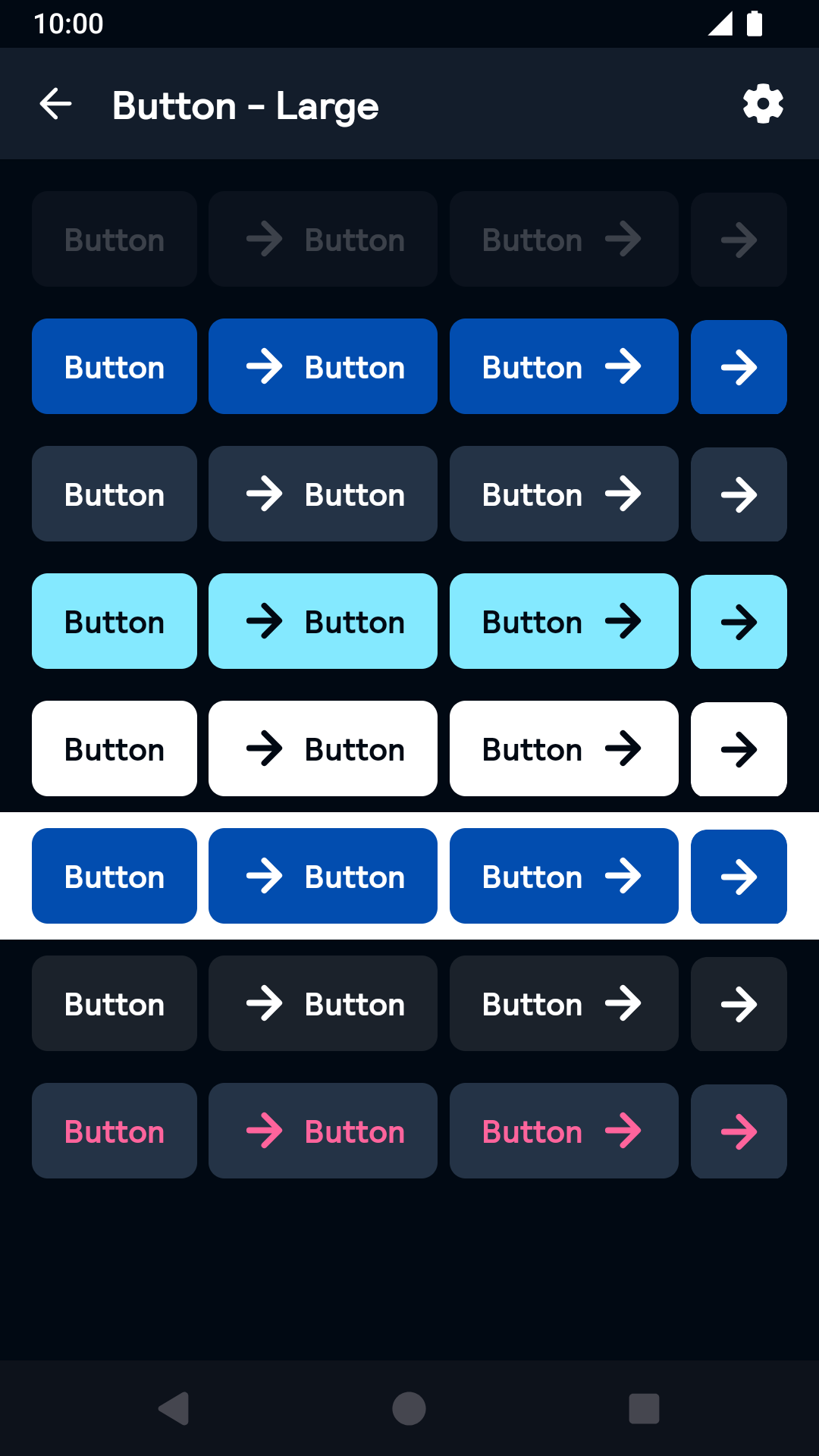
Large
| Day | Night |
|---|---|
 |
 |
Link
| Day | Night |
|---|---|
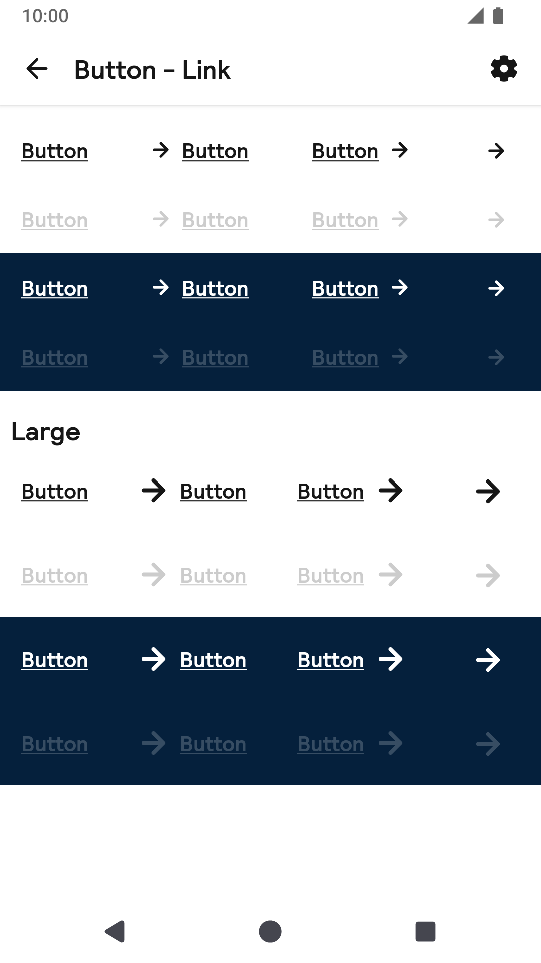 |
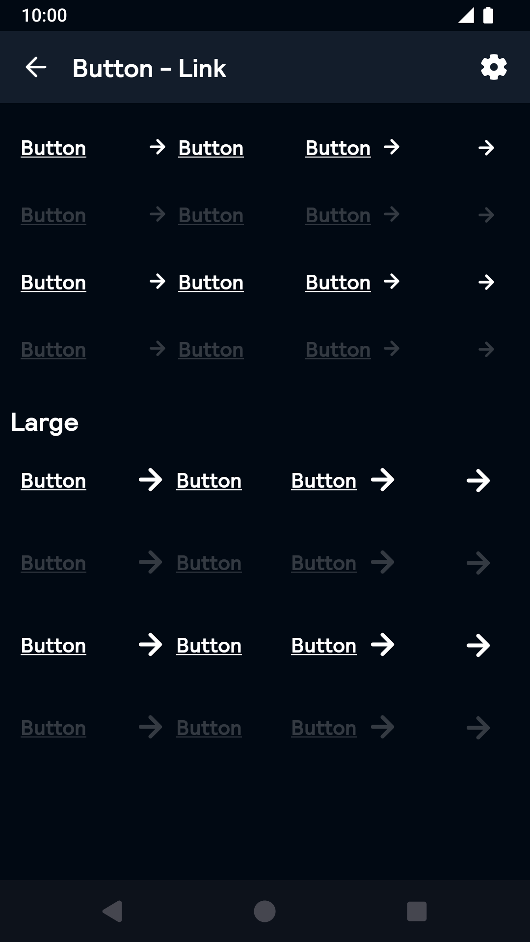 |
Installation
Backpack Android is available through Maven Central. Check the main Readme for a complete installation guide.
Usage
The Button component can be used in both XML and Kotlin/Java
Example of a primary button in XML
                                                <net.skyscanner.backpack.button.BpkButton
                                                  android:layout_width="wrap_content"
                                                  android:layout_height="wrap_content"
                                                  android:text="Button"
                                                  app:buttonIconPosition="end"
                                                  app:buttonIcon="@drawable/bpk_long_arrow_right"
                                                  app:buttonType="primary"
                                                  app:buttonLoading="false" />
Example of a primary button in Kotlin
                                                import net.skyscanner.backpack.button.BpkButton

                                                BpkButton(context,BpkButton.Type.Primary).apply {
                                                   icon = AppCompatResources.getDrawable(context, R.drawable.bpk_weather)
                                                   iconPosition = BpkButton.END
                                                   text = "Button"
                                                   loading = false
                                                }
Large
Example of a large secondary button in XML
                                                <net.skyscanner.backpack.button.BpkButton
                                                  android:layout_width="wrap_content"
                                                  android:layout_height="wrap_content"
                                                  android:text="Button"
                                                  app:buttonIconPosition="end"
                                                  app:buttonIcon="@drawable/bpk_long_arrow_right"
                                                  app:buttonType="primary"
                                                  app:bpkButtonSize="large"
                                                  app:buttonLoading="false" />
Example of a large secondary button in Kotlin
                                                import net.skyscanner.backpack.button.BpkButton

                                                BpkButton(context, BpkButton.Type.Secondary, size = BpkButton.Size.Large).apply {
                                                   icon = AppCompatResources.getDrawable(context, R.drawable.bpk_weather)
                                                   iconPosition = BpkButton.END
                                                   text = "Button"
                                                   loading = false
                                                }
Icon
The icon prop only supports VectorDrawables or BitmapDrawables. If you provide a different drawable make sure its size is 16dp.
Theme Props
- buttonBackground
- buttonTextColor
BpkButton accepts the above themeable attributes for the following styles
- bpkButtonPrimary
- bpkButtonSecondary
- bpkButtonDestructive
- bpkButtonPrimaryOnDark
- bpkButtonPrimaryOnLight
- bpkButtonFeatured
Example
                                                  <style name="BlueTheme" parent="AppTheme">
                                                    <item name="bpkButtonPrimary">@style/BlueButton</item>
                                                  </style>

                                                  <style name="BlueButton">
                                                    <item name="buttonBackground">@color/bpkSkyBlueShade03</item>
                                                    <item name="buttonTextColor">@color/bpkSkyGrayTint05</item>
                                                  </style>
Check theming for more information.
Made with ❤️ by Skyscanner © 2024
© 2024 Skyscanner Backpack. Page last updated on Nov 21, 2022, 15:07