- Welcome
- Getting started
- Latest updates
- Foundations
-
Components
- Accordion
- Alert
- Alignment
- App Search Modal
- Aria live
- Autosuggest
- Badge
- Banner alert
- Bar chart
- Blockquote
- Bottom navigation
- Bottom sheet
- Breadcrumb
- Breakpoint
- Button
- Calendar
- Card
- Card list
- Card button
- Carousel
- Checkbox
- Chip
- Chip group
- Code
- Content cards
- Data Table
- Datepicker
- Description list
- Dialog
- Divider
- Drawer
- Field Set
- Flare
- Flat list
- Flight leg
- Floating action button
- Floating notification
- Form label
- Form validation
- Graphic promotion
- Horizontal navigation
- Icon
- Image
- Image Gallery
- Infinite scroll
- Info Banner
- Inset Banner
- Link
- List
- Map
- Mobile scroll container
- Modal
- Navigation bar
- Navigation Tab Group
- Nudger
- Overlay
- Page indicator
- Pagination
- Panel
- Phone input
- Picker
- Popover
- Price
- Progress bar
- Radio button
- Rating
- Rating Bar
- Scrollable calendar
- Search Modal
- Section header
- Section list
- Select
- Skeleton
- Skip link
- Slider
- Snackbar
- Snippet
- Spinner
- Split input
- Star rating
- Swap Button
- Switch
- Table
- Text
- Text input
- Theming
- Ticket
- Toast
- Tooltip
- Touchable native feedback
- Touchable overlay
- Search Input Summary
- Content
- Accessibility
- Contributing
- Localisation
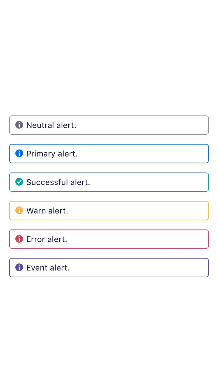
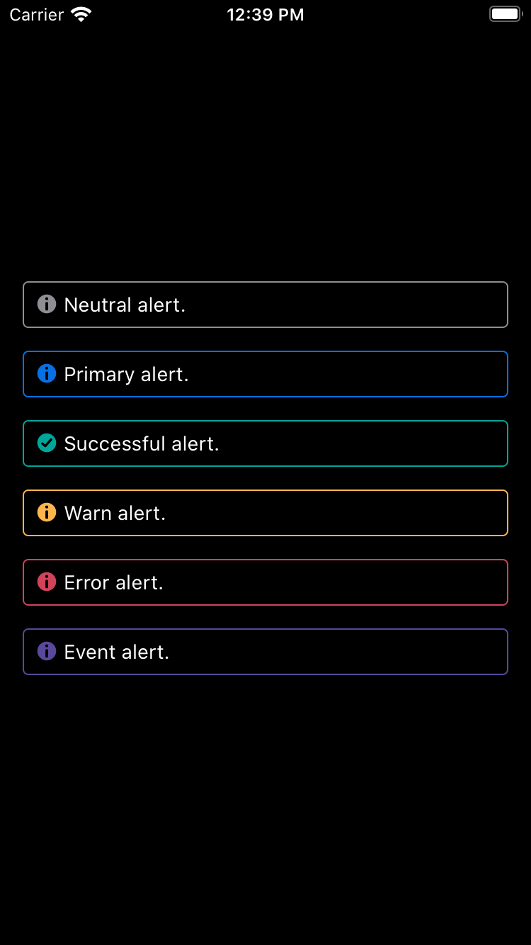
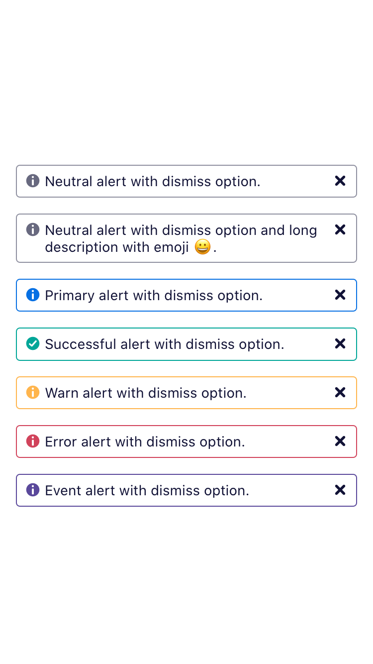
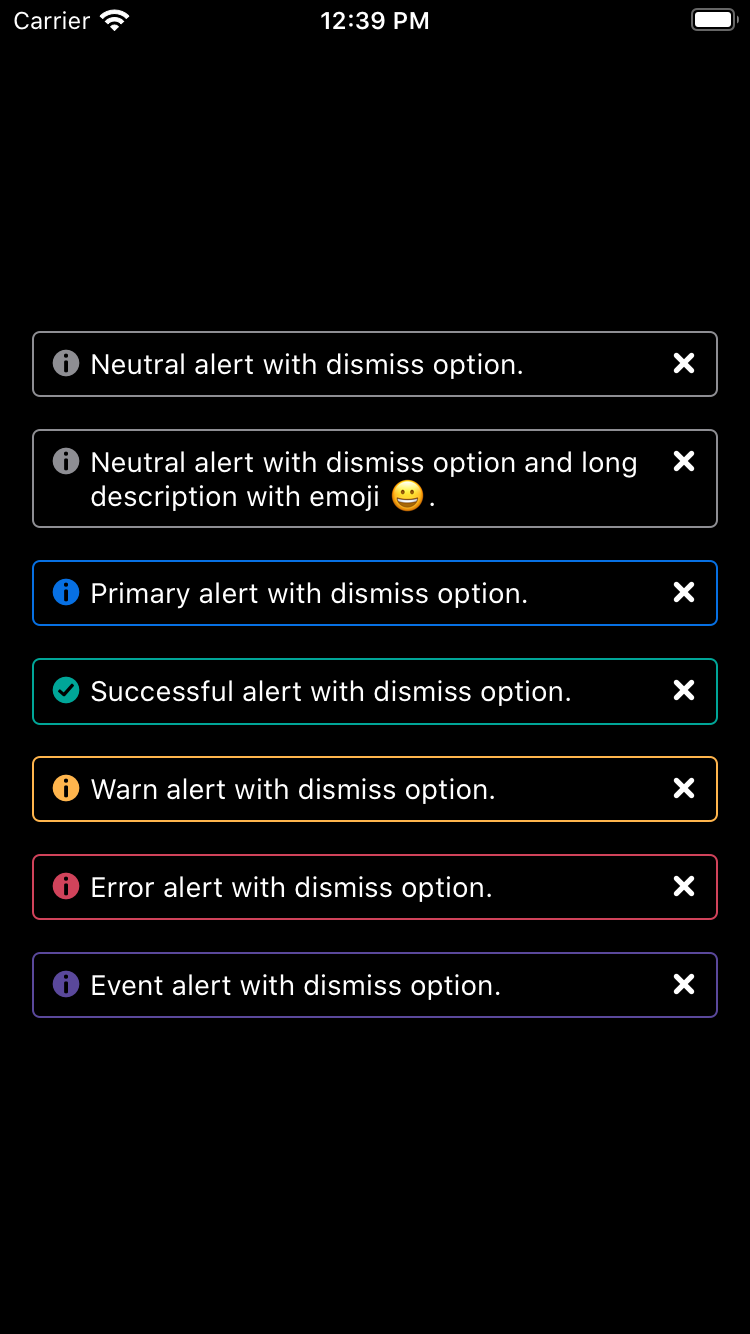
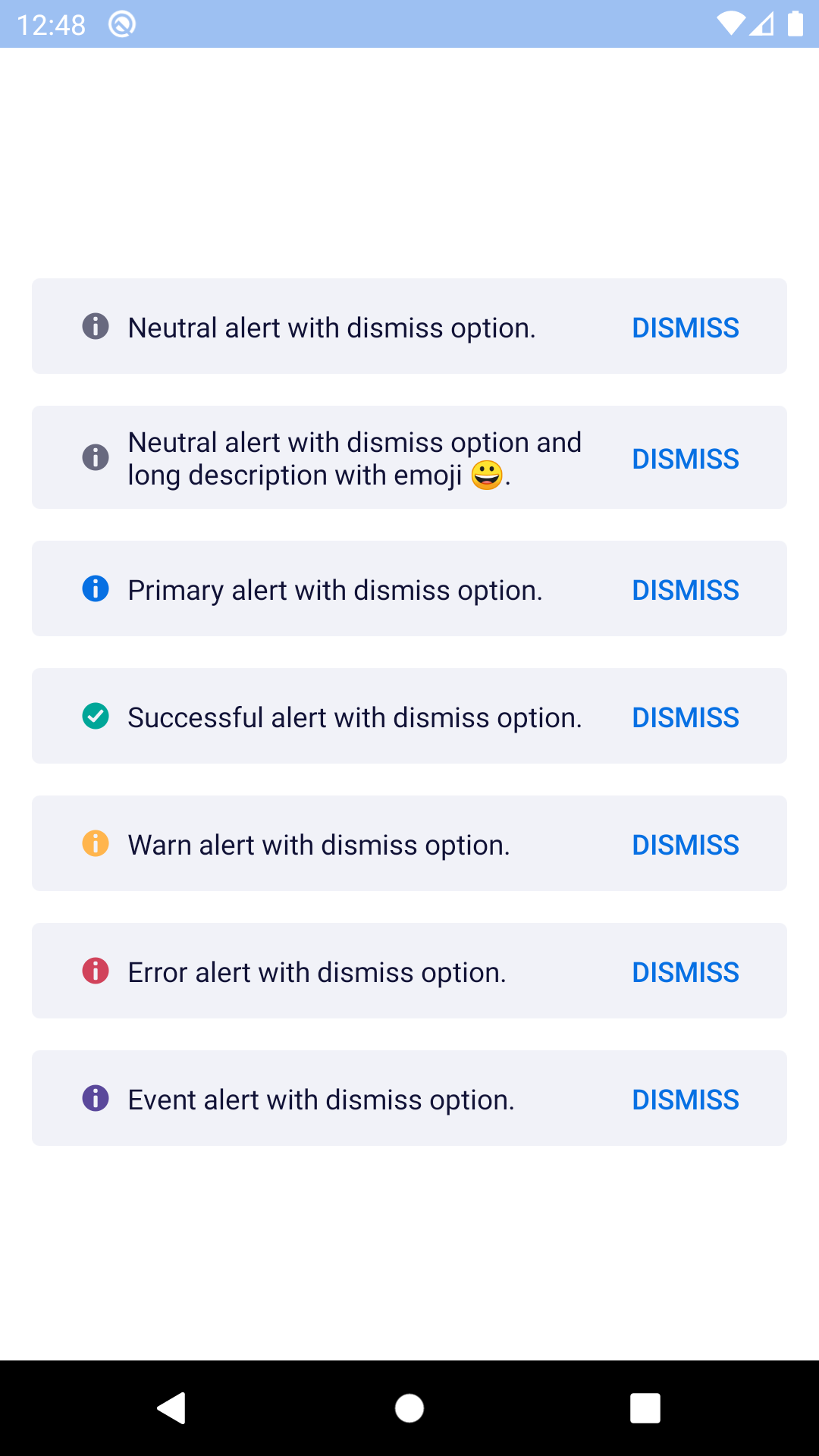
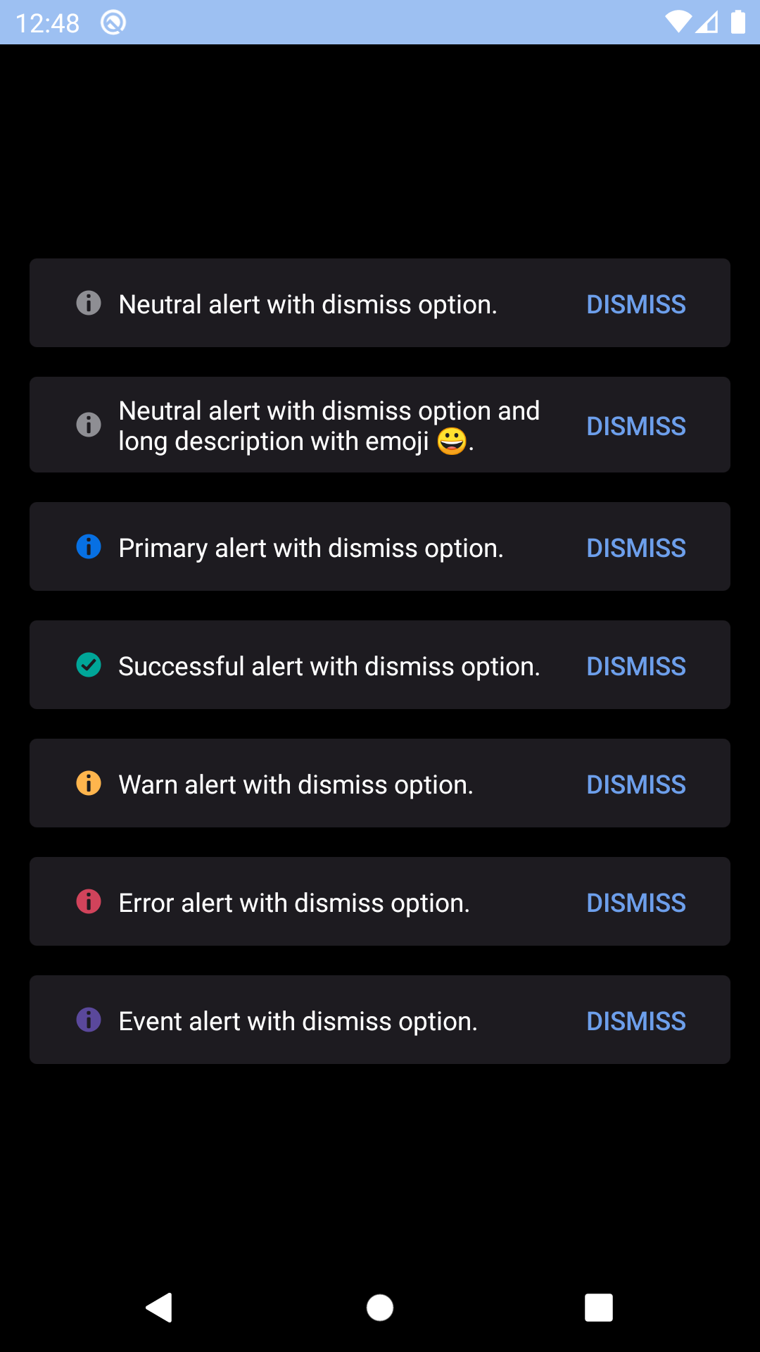
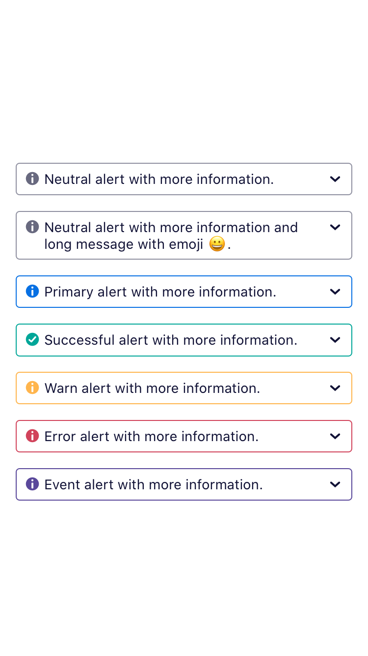
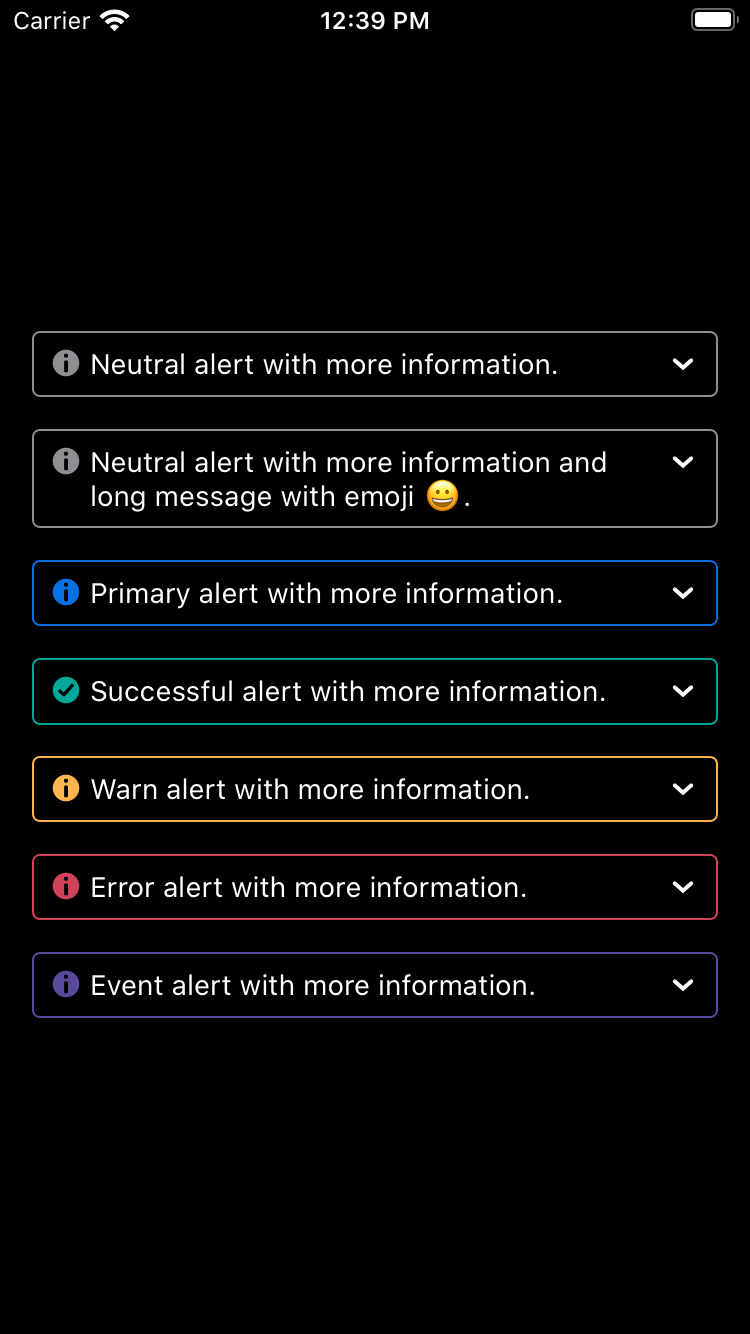
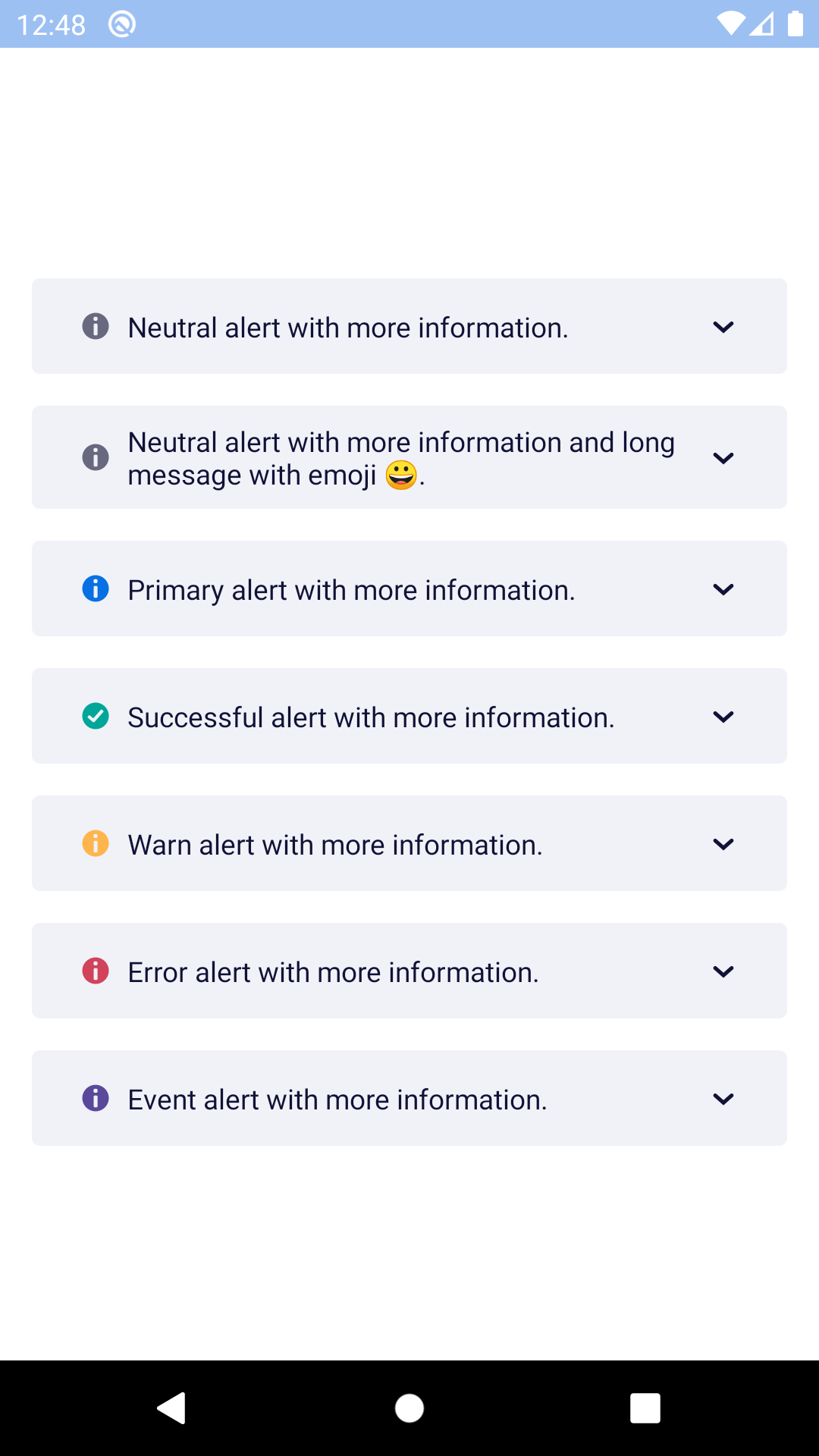
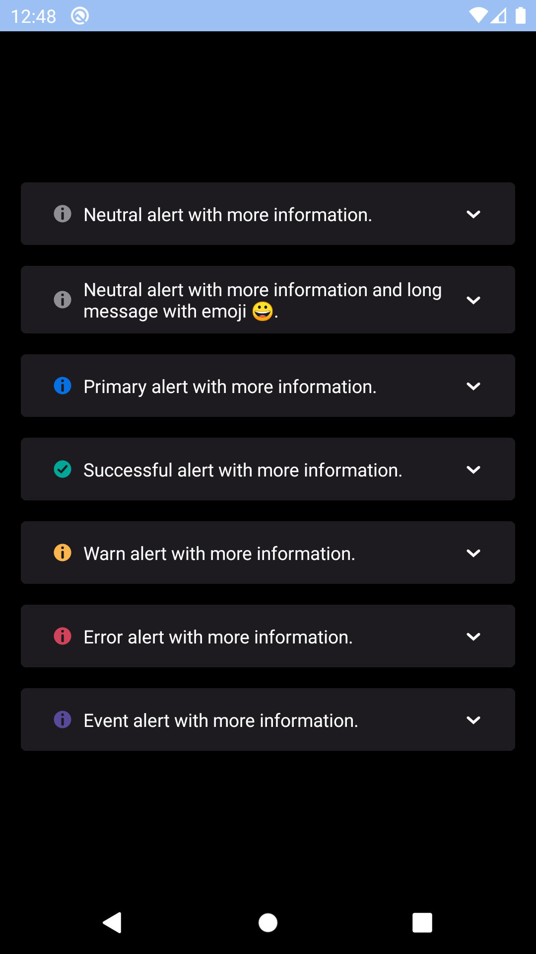
Banner alert
Banner alerts provide inline feedback about an operation or task.
bpk-component-banner-alert
Backpack React Native banner alert component.
Default
| Day | Night |
|---|---|
 |
 |
 |
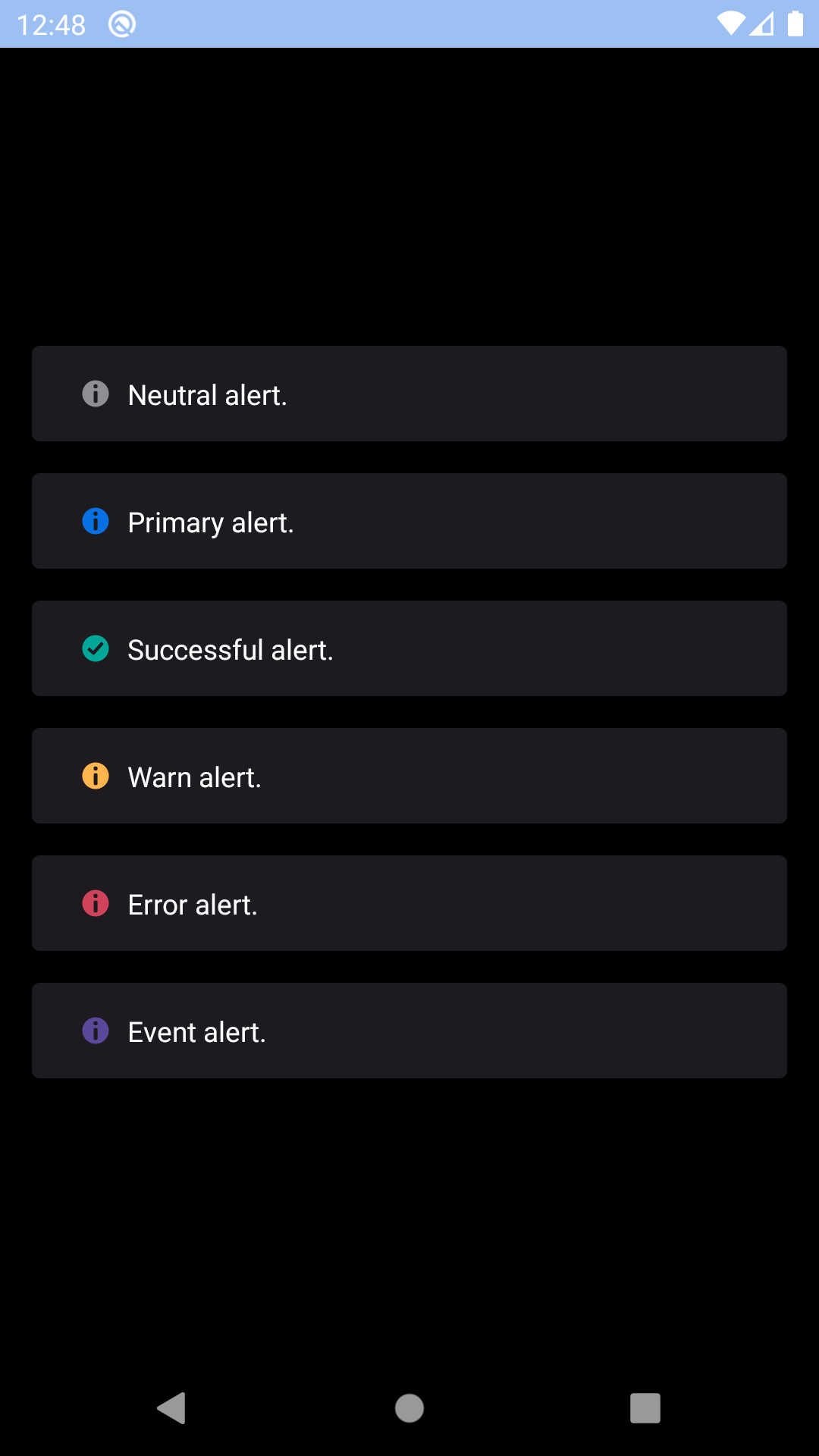 |
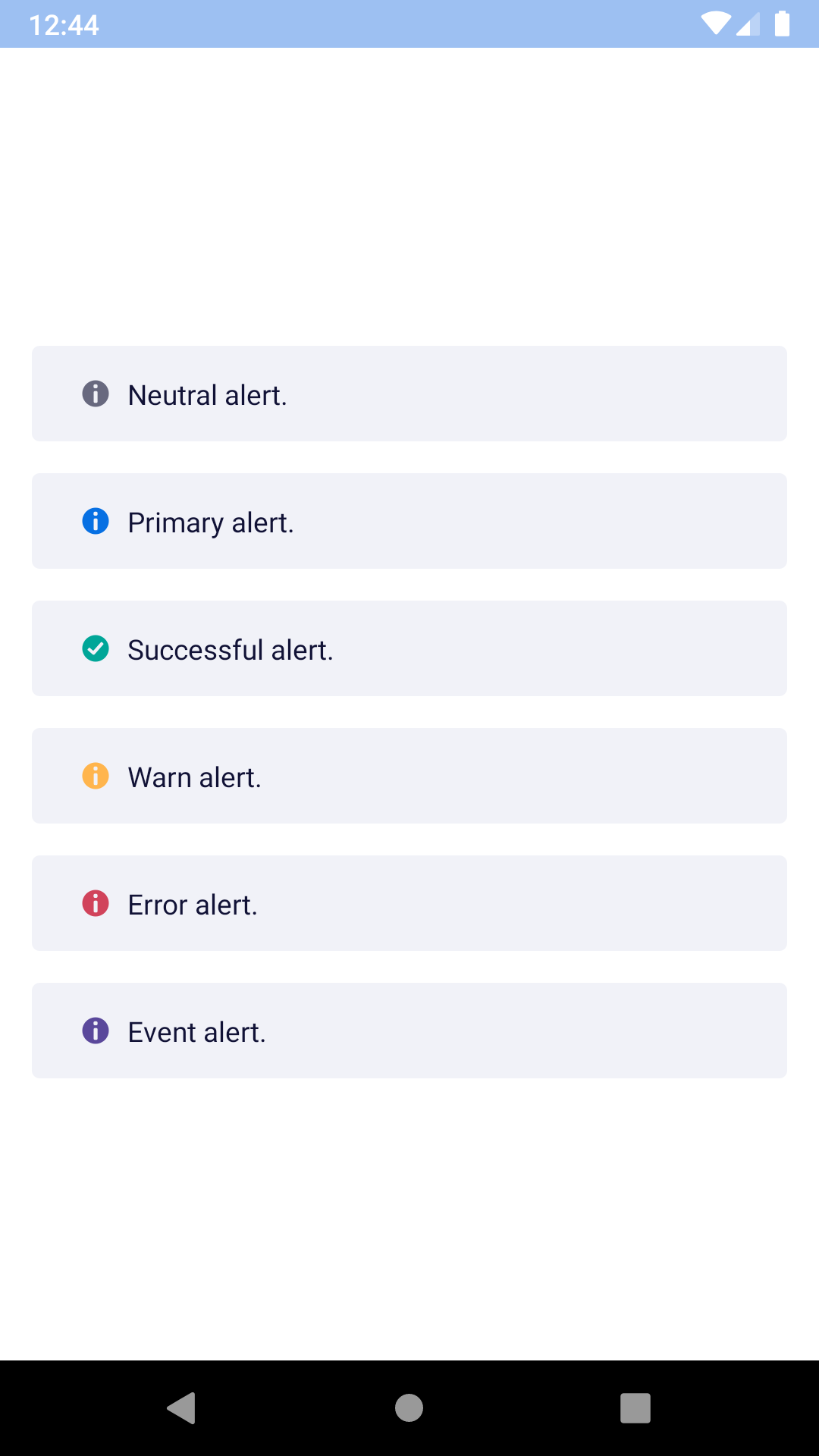
Dismissable
| Day | Night |
|---|---|
 |
 |
 |
 |
Expandable
| Day | Night |
|---|---|
 |
 |
 |
 |
Installation
Check the main Readme for a complete installation guide.
Usage
                                                import React, { Component } from 'react';
                                                import { View, StyleSheet } from 'react-native';
                                                import BpkText from 'backpack-react-native/bpk-component-text';
                                                import { spacingBase } from '@skyscanner/bpk-foundations-react-native/tokens/base.react.native';
                                                import BpkBannerAlert, { ALERT_TYPES } from 'backpack-react-native/bpk-component-banner-alert';

                                                const styles = StyleSheet.create({
                                                  container: {
                                                    flex: 1,
                                                    justifyContent: 'center',
                                                    padding: spacingBase,
                                                  },
                                                  bannerAlert: {
                                                    marginBottom: spacingBase,
                                                  },
                                                });

                                                export default class App extends Component {
                                                  constructor() {
                                                    super();

                                                    this.state = {
                                                      showDismissable: true,
                                                      expanded: false,
                                                    };
                                                  }

                                                  onDismiss = () => {
                                                    this.setState({ showDismissable: false });
                                                  };

                                                  onExpandablePress = () => {
                                                    this.setState({ expanded: !this.state.expanded });
                                                  };

                                                  render() {
                                                    return (
                                                      <View style={styles.container}>
                                                        <BpkBannerAlert
                                                          style={styles.bannerAlert}
                                                          type={ALERT_TYPES.success}
                                                          message="Success message!"
                                                        />
                                                        <BpkBannerAlert
                                                          style={styles.bannerAlert}
                                                          type={ALERT_TYPES.warn}
                                                          message="Warn message!"
                                                          dismissButtonLabel="Dismiss"
                                                          onDismiss={this.onDismiss}
                                                          dismissable
                                                          show={this.state.showDismissable}
                                                        />
                                                        <BpkBannerAlert
                                                          style={styles.bannerAlert}
                                                          type={ALERT_TYPES.error}
                                                          message="Error message!"
                                                          toggleExpandedButtonLabel="Expand"
                                                          onToggleExpanded={this.onExpandablePress}
                                                          expanded={this.state.expanded}
                                                        >
                                                          <BpkText textStyle="sm">
                                                            Lorem ipsum dolor sit amet, consectetur adipiscing elit. Quisque
                                                            sagittis sagittis purus, id blandit ipsum. Pellentesque nec diam nec
                                                            erat condimentum dapibus. Nunc diam augue, egestas id egestas ut,
                                                            facilisis nec mi. Donec et congue odio, nec laoreet est. Integer
                                                            rhoncus varius arcu, a fringilla libero laoreet at.
                                                          </BpkText>
                                                        </BpkBannerAlert>
                                                      </View>
                                                    );
                                                  }
                                                }
Props
| Property | PropType | Required | Default Value |
|---|---|---|---|
| message | string or Node | true | - |
| type | oneOf(ALERT_TYPES) | true | - |
| animateOnEnter | bool | false | false |
| animateOnLeave | bool | false | false |
| children | node | false | null |
| dismissable | bool | false | false |
| dismissButtonLabel | string | false | null |
| expanded | bool | false | false |
| onDismiss | func | false | null |
| onToggleExpanded | func | false | null |
| show | bool | false | true |
| toggleExpandedButtonLabel | string | false | null |
| bannerStyle | style | false | null |
Prop Details
bannerStyle
These styles will be applied to the banner alerts outer View container, but still within it's animation container. This is useful for maintaining smooth animations whilst applying top/bottom margin.
Made with ❤️ by Skyscanner © 2024
© 2024 Skyscanner Backpack. Page last updated on Oct 30, 2022, 21:12