- Welcome
- Getting started
- Latest updates
- Foundations
-
Components
- Accordion
- Alert
- Alignment
- App Search Modal
- Aria live
- Autosuggest
- Badge
- Banner alert
- Bar chart
- Blockquote
- Bottom navigation
- Bottom sheet
- Breadcrumb
- Breakpoint
- Button
- Calendar
- Card
- Card list
- Card button
- Carousel
- Checkbox
- Chip
- Chip group
- Code
- Content cards
- Data Table
- Datepicker
- Description list
- Dialog
- Divider
- Drawer
- Field Set
- Flare
- Flat list
- Flight leg
- Floating action button
- Floating notification
- Form label
- Form validation
- Graphic promotion
- Horizontal navigation
- Icon
- Image
- Image Gallery
- Infinite scroll
- Info Banner
- Inset Banner
- Link
- List
- Map
- Mobile scroll container
- Modal
- Navigation bar
- Navigation Tab Group
- Nudger
- Overlay
- Page indicator
- Pagination
- Panel
- Phone input
- Picker
- Popover
- Price
- Progress bar
- Radio button
- Rating
- Rating Bar
- Scrollable calendar
- Search Modal
- Section header
- Section list
- Select
- Skeleton
- Skip link
- Slider
- Snackbar
- Snippet
- Spinner
- Split input
- Star rating
- Swap Button
- Switch
- Table
- Text
- Text input
- Theming
- Ticket
- Toast
- Tooltip
- Touchable native feedback
- Touchable overlay
- Search Input Summary
- Content
- Accessibility
- Contributing
- Localisation
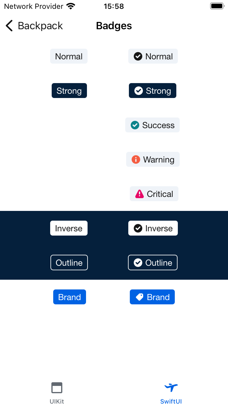
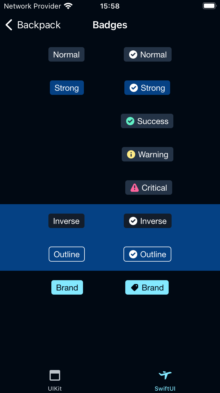
Badge
Badges are static components that show helpful details or attributes.
Backpack-SwiftUI/Badge

Default
| Day | Night |
|---|---|
 |
 |
Usage
Basic text badge
If you don't specify a .badgeStyle(<style>) it will use the .default type
                                                import Backpack_SwiftUI

                                                BPKBadge("Hello World")

                                                BPKBadge("Hello World")
                                                    .badgeStyle(.destructive)
Badge with icon
If you don't specify a .badgeStyle(<style>) it will use the .default type
                                                import Backpack_SwiftUI

                                                BPKBadge("Hello World", icon: .tickCircle)

                                                BPKBadge("Hello World", icon: .tickCircle)
                                                    .badgeStyle(.destructive)
Made with ❤️ by Skyscanner © 2024
© 2024 Skyscanner Backpack. Page last updated on May 2, 2023, 13:44