bpk-component-calendar
Backpack React Native calendar component.
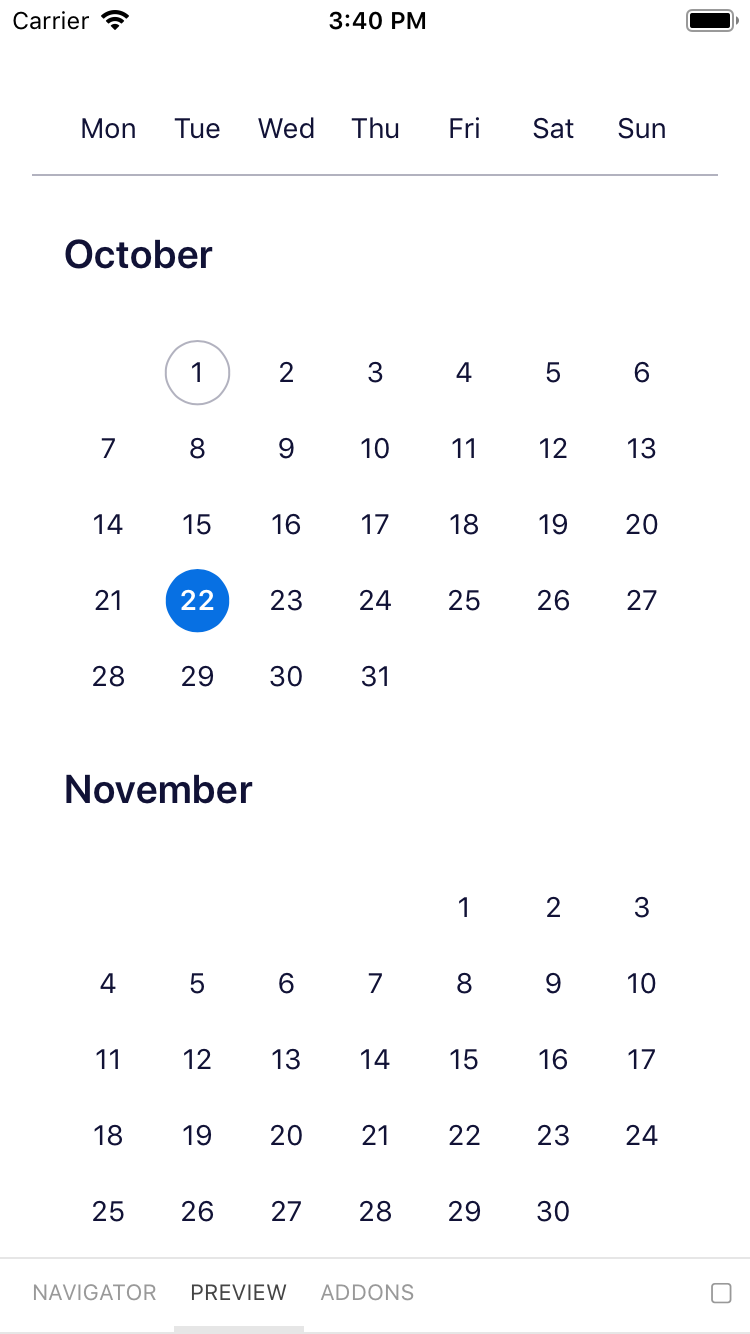
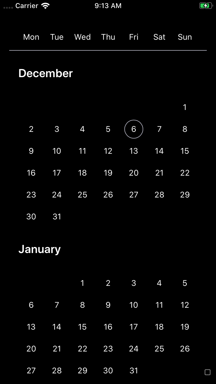
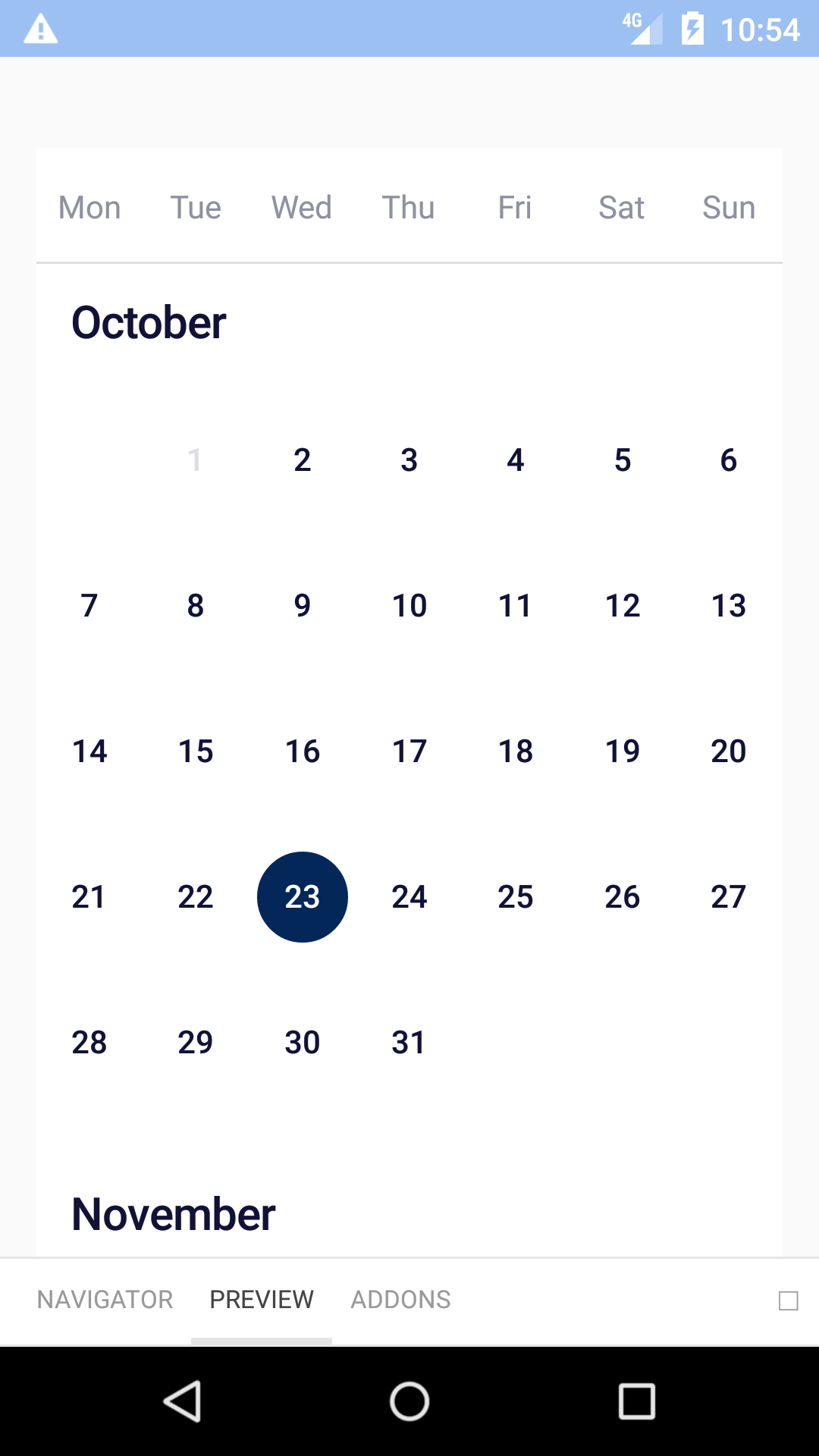
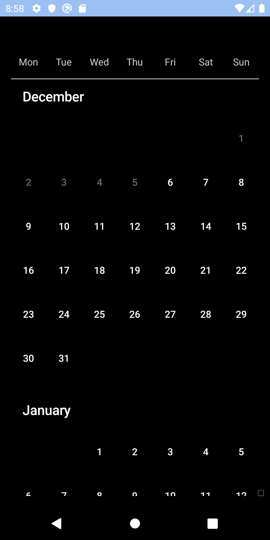
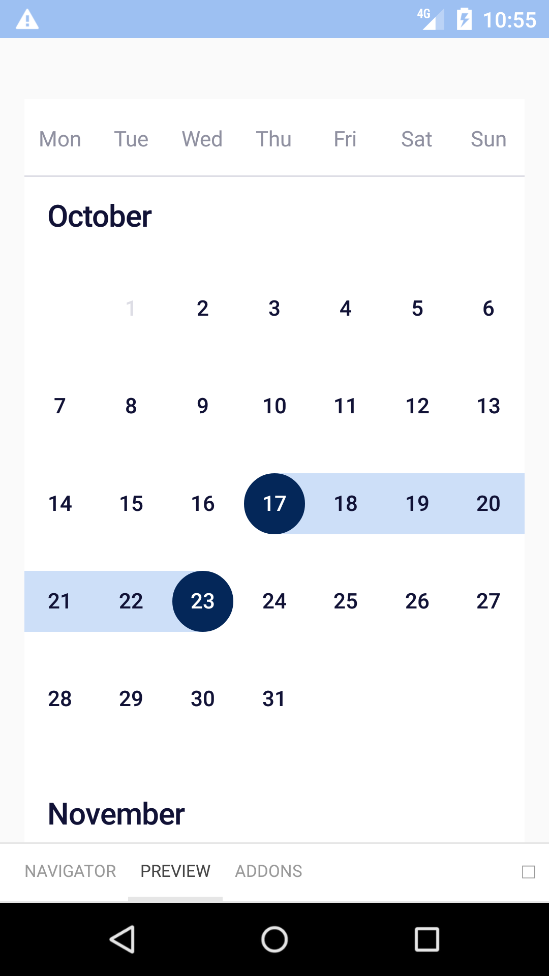
Single
| Day | Night |
|---|---|
 |
 |
 |
 |
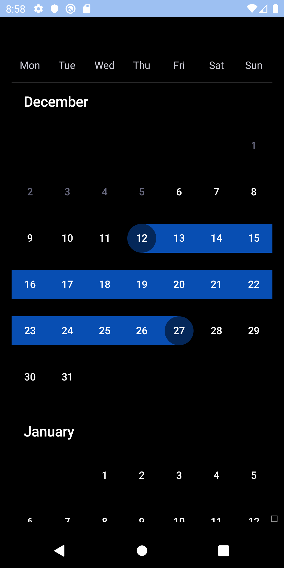
Multiple
| Day | Night |
|---|---|
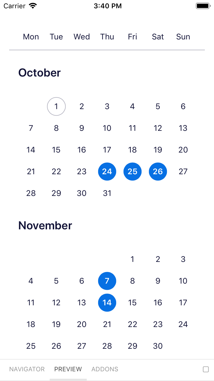 |
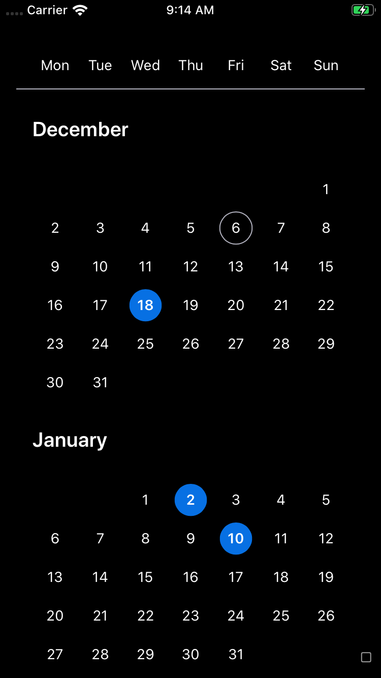 |
Range
| Day | Night |
|---|---|
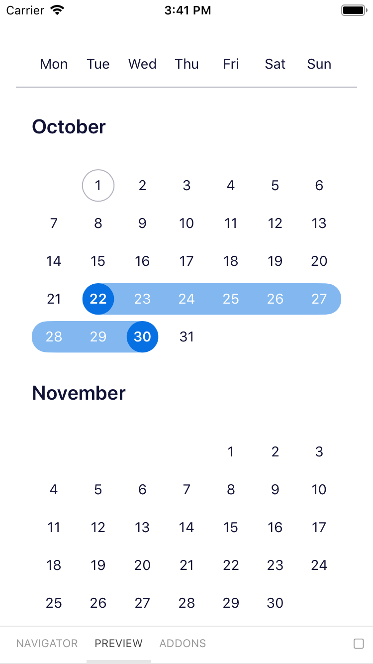 |
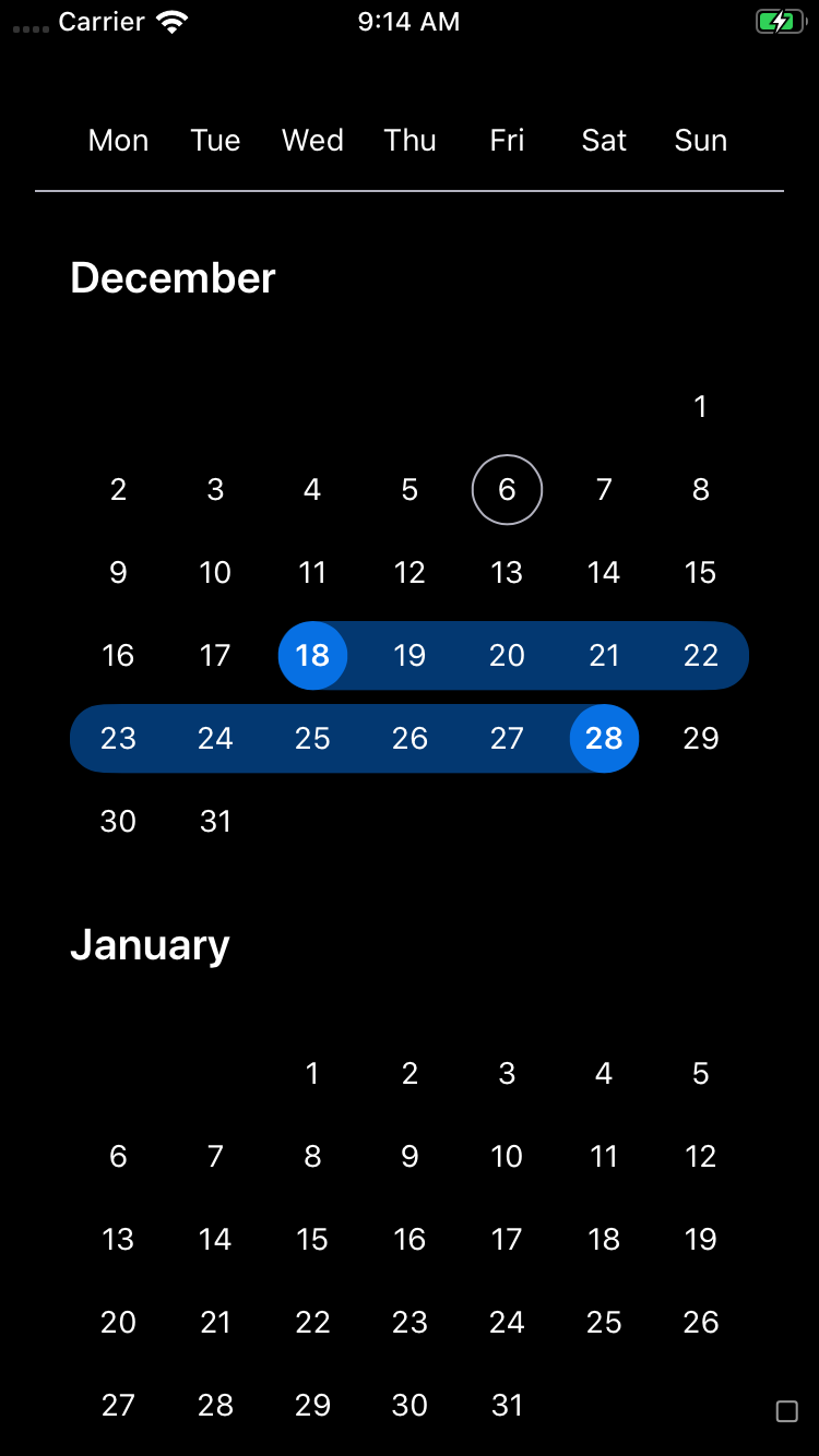 |
 |
 |
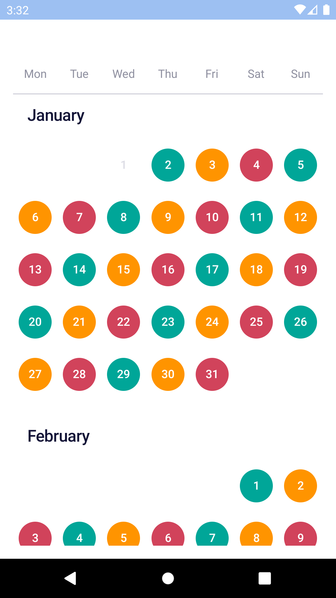
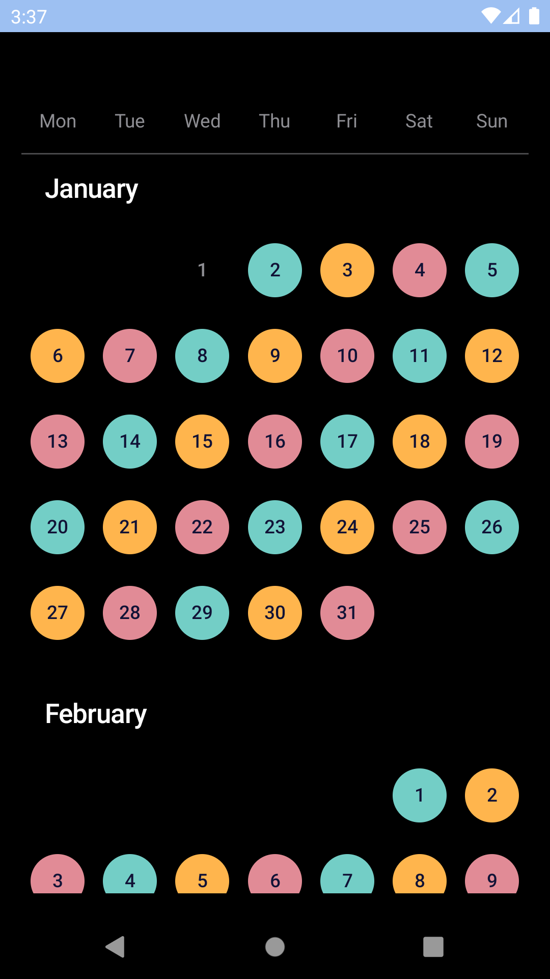
Custom colours
| Day | Night |
|---|---|
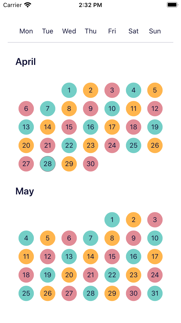 |
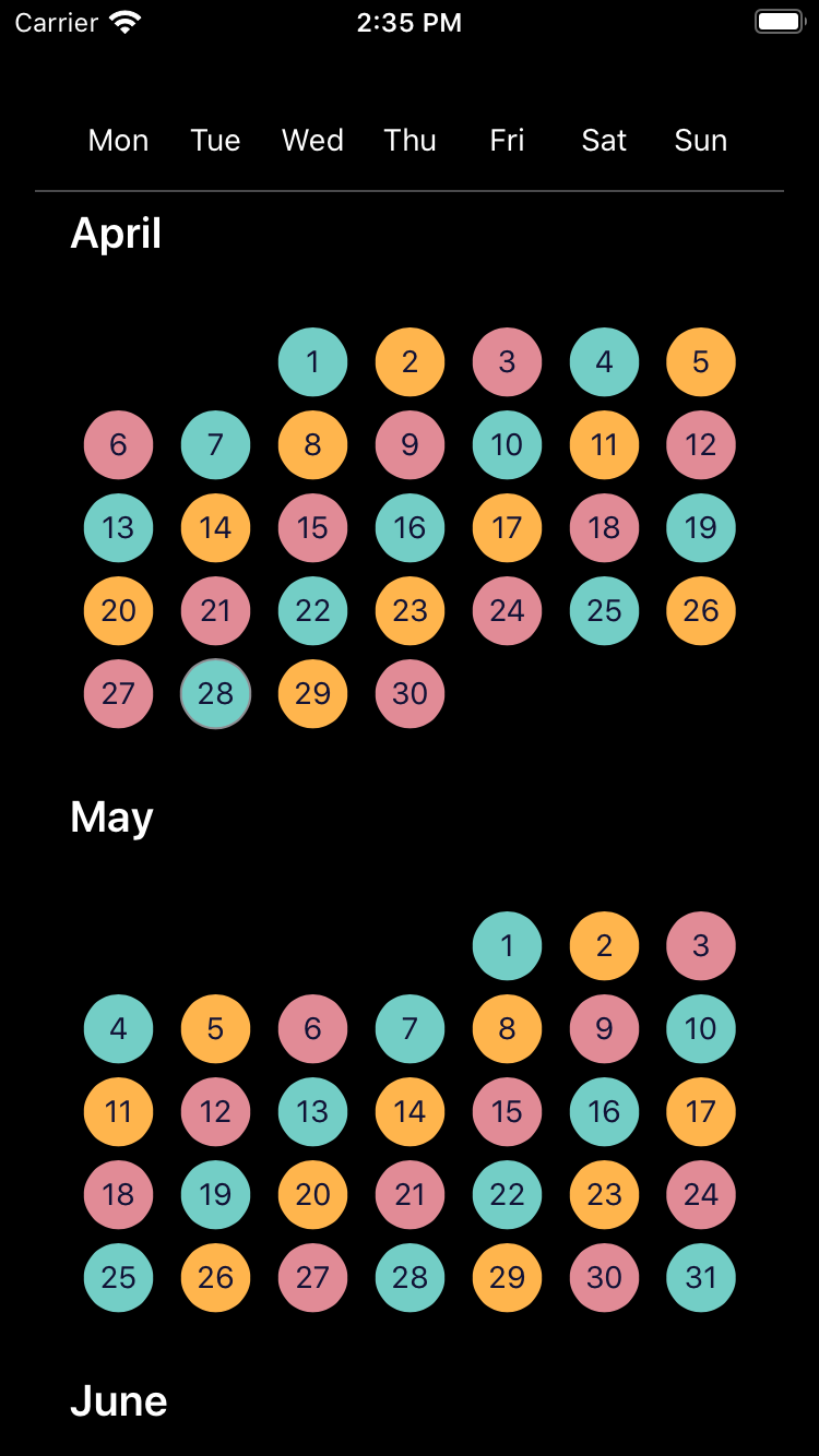 |
 |
 |
Installation
Check the main Readme for a complete installation guide.
Time Zones
BpkCalendar uses dates at the UTC midnight boundary exclusively for selected dates and expects that format for minDate and maxDate. If BpkCalendar is used with dates that are not UTC it will behave in undefined ways and most likely not work.
To create dates to be used with the component we recommend the following
                                                // Min date of the calendar at 2019-01-02
                                                const minDate = new Date(Date.UTC(2019, 0, 2));

                                                // Dates can also be provided as timestamps
                                                const minDate = Date.UTC(2019, 0, 2);
To format the dates for display use
                                                const locale = 'en-gb';
                                                const formattedDate = date.toLocaleDateString(locale, { timeZone: 'UTC' });
Usage
                                                import React, { Component } from 'react';
                                                import { StyleSheet, View } from 'react-native';
                                                import { spacingBase } from '@skyscanner/bpk-foundations-react-native/tokens/base.react.native';
                                                import BpkCalendar, { makeRangeSelection } from 'backpack-react-native/bpk-component-calendar';

                                                const rangeSelection = makeRangeSelection({
                                                  startDateSelectHint: I18n.translate('CALENDAR_RANGE_START_DATE_SELECT_HINT_LABEL'),
                                                  endDateSelectHint: I18n.translate('CALENDAR_RANGE_END_DATE_SELECT_HINT_LABEL'),
                                                  startDateSelectedState: I18n.translate('CALENDAR_RANGE_START_DATE_SELECTED_STATE_LABEL'),
                                                  endDateSelectedState: I18n.translate('CALENDAR_RANGE_END_DATE_SELECTED_STATE_LABEL'),
                                                  endAndStartDateSelectedState: I18n.translate('CALENDAR_RANGE_END_AND_START_DATE_SELECTED_STATE_LABEL'),
                                                  dateBetweenStartAndEndSelectedState: I18n.translate('CALENDAR_RANGE_DATE_BETWEEN_START_AND_END_SELECTED_STATE_LABEL'),
                                                  makeNextSelectionPrompt: I18n.translate('CALENDAR_RANGE_NEXT_SELECTION_PROMPT_LABEL'),
                                                });

                                                class App extends Component {
                                                  constructor(props) {
                                                    super(props);

                                                    this.state = { selectedDates: [] };
                                                  }

                                                  handleNewDates = newDates => {
                                                    this.setState({
                                                      selectedDates: newDates,
                                                    });
                                                  };

                                                  render() {
                                                    return (
                                                      <BpkCalendar
                                                        locale={'en-gb'}
                                                        selectionType={rangeSelection}
                                                        selectedDates={this.state.selectedDates}
                                                        onChangeSelectedDates={this.handleNewDates}
                                                        minDate={Date.UTC(2019, 0, 2)}
                                                        maxDate={Date.UTC(2019, 11, 31)}
                                                      />
                                                    );
                                                  }
                                                }
Footer view
NOTE: this is only supported for Android, it will have no effect on iOS.
The Android calendar supports the notion of a footer view for each month, we provide a highlightedDaysFooterView implementation to show a list of highlighted days for each month:
                                                import React from 'react';
                                                import BpkCalendar, {
                                                  makeRangeSelection,
                                                  highlightedDaysFooterView,
                                                  colorBucketHighlight,
                                                  DateMatchers,
                                                } from 'backpack-react-native/bpk-component-calendar';

                                                const rangeSelection = makeRangeSelection({
                                                  startDateSelectHint: I18n.translate('CALENDAR_RANGE_START_DATE_SELECT_HINT_LABEL'),
                                                  endDateSelectHint: I18n.translate('CALENDAR_RANGE_END_DATE_SELECT_HINT_LABEL'),
                                                  startDateSelectedState: I18n.translate('CALENDAR_RANGE_START_DATE_SELECTED_STATE_LABEL'),
                                                  endDateSelectedState: I18n.translate('CALENDAR_RANGE_END_DATE_SELECTED_STATE_LABEL'),
                                                  endAndStartDateSelectedState: I18n.translate('CALENDAR_RANGE_END_AND_START_DATE_SELECTED_STATE_LABEL'),
                                                  dateBetweenStartAndEndSelectedState: I18n.translate('CALENDAR_RANGE_DATE_BETWEEN_START_AND_END_SELECTED_STATE_LABEL'),
                                                  makeNextSelectionPrompt: I18n.translate('CALENDAR_RANGE_NEXT_SELECTION_PROMPT_LABEL'),
                                                });

                                                const App = () => (
                                                  <BpkCalendar
                                                    locale={'en-gb'}
                                                    selectionType={rangeSelection}
                                                    minDate={Date.UTC(2019, 0, 2)}
                                                    maxDate={Date.UTC(2019, 11, 31)}
                                                    // You can optionally use a highlight color bucket to highlight a day cell in the calendar,
                                                    // using the same style used by `highlightedDaysFooterView`
                                                    colorBuckets={[
                                                      colorBucketHighlight(
                                                        DateMatchers.any(Date.UTC(2019, 0, 10)),
                                                      ),
                                                    ]}
                                                    androidFooterView={highlightedDaysFooterView({
                                                      days: [
                                                        {
                                                          date: Date.UTC(2019, 0, 10),
                                                          description: 'A day to remember',
                                                        },
                                                      ],
                                                    })}
                                                  />
                                                )
Props
BpkCalendar
| Property | PropType | Required | Default Value |
|---|---|---|---|
| locale | string | true | - |
| selectionType | Object | true | null |
| colorBuckets | arrayOf(ColorBucket) | false | undefined |
| disabledDates | DateMatcher | false | null |
| maxDate | oneOf(Date, number) | false | today + 1 year |
| minDate | oneOf(Date, number) | false | today |
| onChangeSelectedDates | function | false | null |
| selectedDates | arrayOf(Date, number) | false | [] |
| androidFooterView | object | false | undefined |
selectionType
This prop expects an object created by one of these three functions:
- makeSingleSelection
- makeRangeSelection
- makeMultipleSelection
They each require a single argument providing the necessary translated strings for assistive technology. Consult the Flow types for or the migration guide for version 14.0.0 for further details.
selectedDates
- When selectionType is created by makeSingleSelection, you should only include zero or one entries in the selectedDates array.
- When selectionType is created by makeRangeSelection, you should only include zero, one or two entries in the selectedDates array.
API
Table of Contents
- DateMatchers
- colorBucket
- colorBucketNegative
- colorBucketNeutral
- colorBucketPositive
- colorBucketHighlight
- highlightedDaysFooterView
DateMatchers
range
Creates a range matcher to be used in BpkCalendar.
A range matcher will match any date in between start and end date, inclusive.
Parameters
Examples
                                                <BpkCalendar
                                                 disabledDates={DateMatchers.range(start, end)}
                                                />
Returns DateMatcher a range date matcher.
after
Creates an after matcher to be used in BpkCalendar.
An after matcher will match all dates after the provided date.
Parameters
Examples
                                                <BpkCalendar
                                                 disabledDates={DateMatchers.after(date)}
                                                />
Returns DateMatcher an after date matcher.
before
Creates a before matcher to be used in BpkCalendar.
A before matcher will match all dates before the provided date.
Parameters
Examples
                                                <BpkCalendar
                                                 disabledDates={DateMatchers.before(date)}
                                                />
Returns DateMatcher an before date matcher.
any
Creates an any matcher to be used in BpkCalendar.
An any matcher will match if the date is equal to any of the dates provided.
Parameters
Examples
                                                <BpkCalendar
                                                 disabledDates={DateMatchers.any(...listOfDates)}
                                                />
Returns DateMatcher an any date matcher.
colorBucket
Creates a new color bucket to be used in BpkCalendar.
A color bucket is used to define custom colours for calendar days.
NOTE: Your are responsible for ensuring multiple color buckets don't overlap, in case they do the last one applied (last in the list) will take precedence.
Parameters
- color string The background color
- days DateMatcher The days in this bucket
- textStyle TextStyle? The text style. Valid values are light or dark. Changes how the text looks based on the background color, where light or dark refers to the background colour. (optional, default undefined)
Examples
                                                <BpkCalendar
                                                 colorBuckets={[
                                                   colorBucket(colorPanjin, DateMatchers.range(startOfSummer, endOfSummer)),
                                                   colorBucket(colorSagano, DateMatchers.after(endOfSummer))
                                                 ]}
                                                />
Returns ColorBucket A new color bucket
colorBucketNegative
A negative cell style which is suitable to indicate for example a date which has a comparatively high price among the dates in the calendar.
Parameters
- days DateMatcher The days in this bucket
Returns ColorBucket the negative bucket
colorBucketNeutral
A neutral cell style which is suitable to indicate for example a date which has a comparatively average price among the dates in the calendar.
Parameters
- days DateMatcher The days in this bucket
Returns ColorBucket the neutral bucket
colorBucketPositive
A positive cell style which is suitable to indicate for example a date which has a comparatively low price among the dates in the calendar.
Parameters
- days DateMatcher The days in this bucket
Returns ColorBucket the positive bucket
colorBucketHighlight
A cell style which is suitable to indicate a highlighted day, e.g. a holiday. Use this in conjunction with highlightedDaysFooterView to show a footer with the list of highlighted days for a month.
NOTE: This is an Android only feature.
Parameters
- days DateMatcher The days in this bucket
Returns ColorBucket the highlighted bucket
highlightedDaysFooterView
Creates a footer view to show a list of highlighted days.
NOTE: This is an Android only feature.
Parameters
- viewDef Object the view definition.
Returns Object a footer view.