Backpack/ProgressBar

Default
| Day | Night |
|---|---|
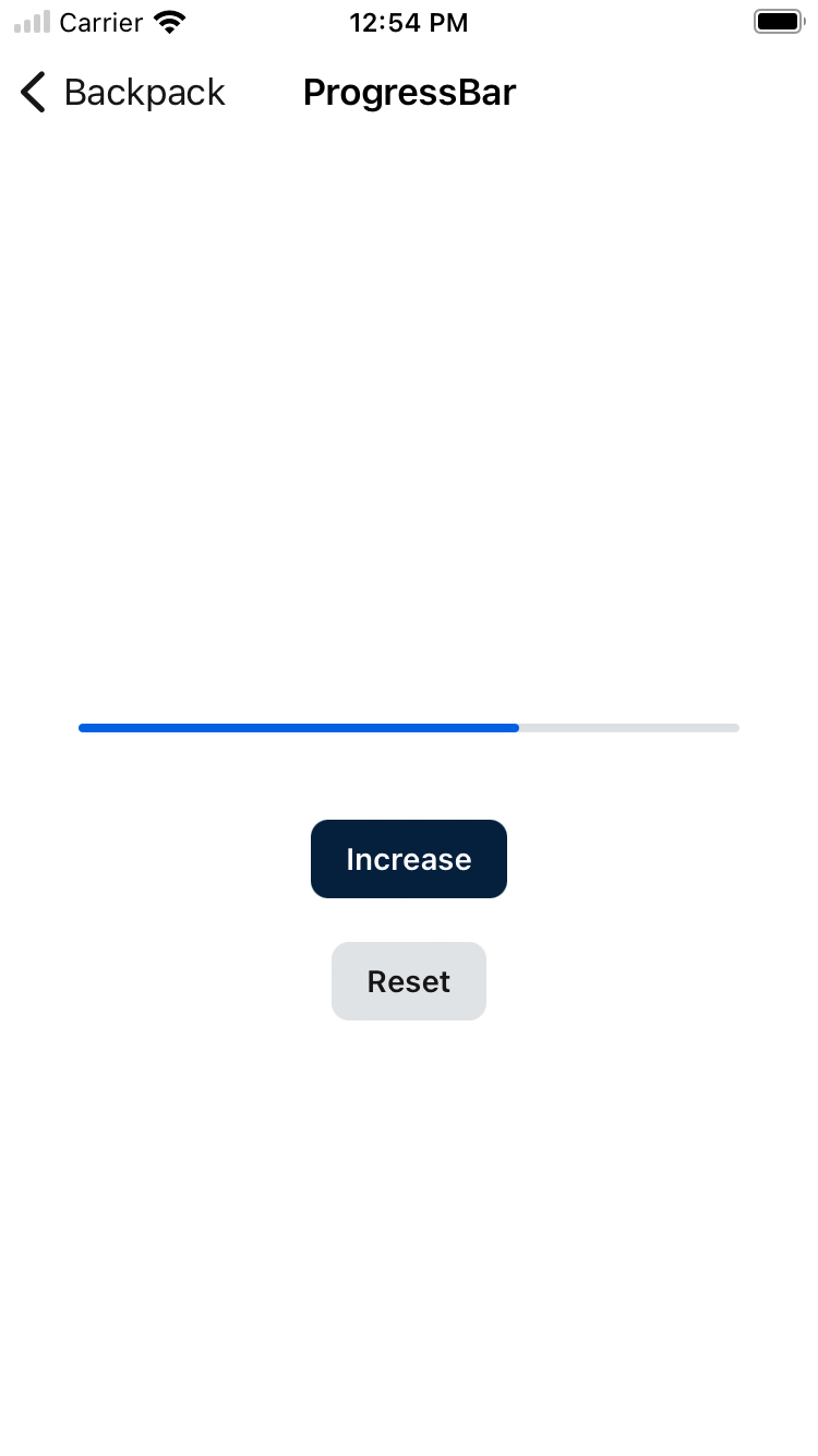 |
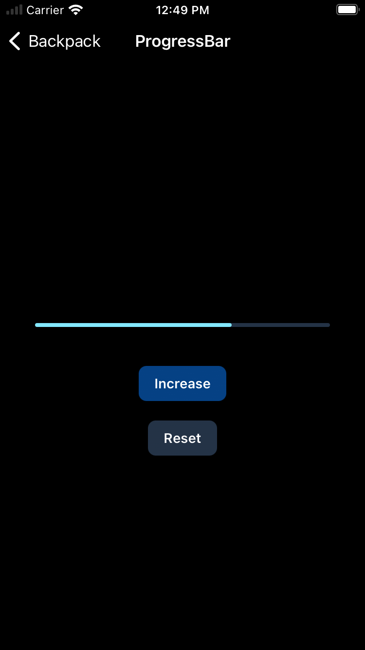 |
Usage
Backpack/ProgressBar is a simple UIProgressView with Skyscanner styling applied.
Appearance attributes
- (UIColor)fillColor