Checkbox

Default
| Day | Night |
|---|---|
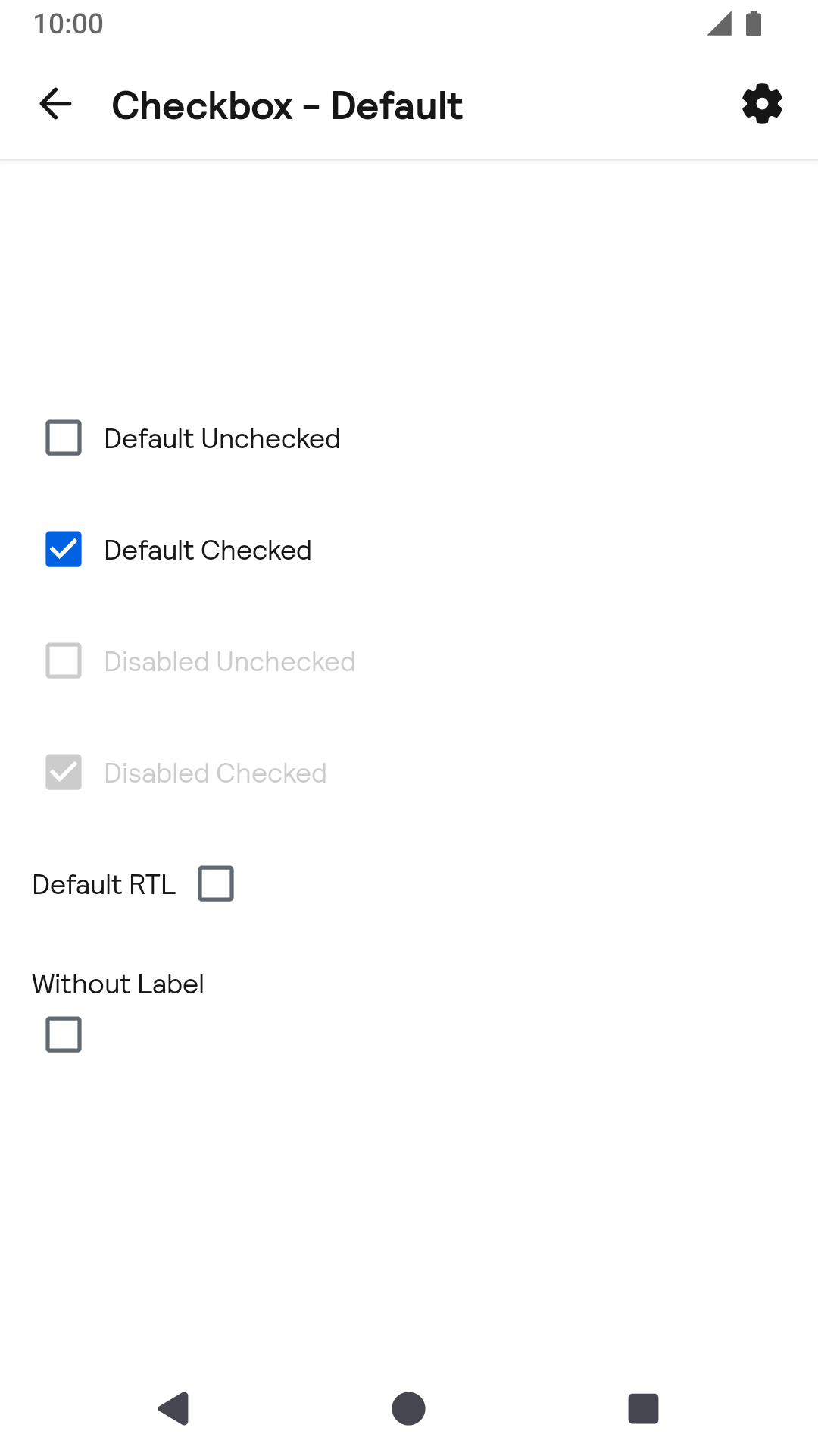 |
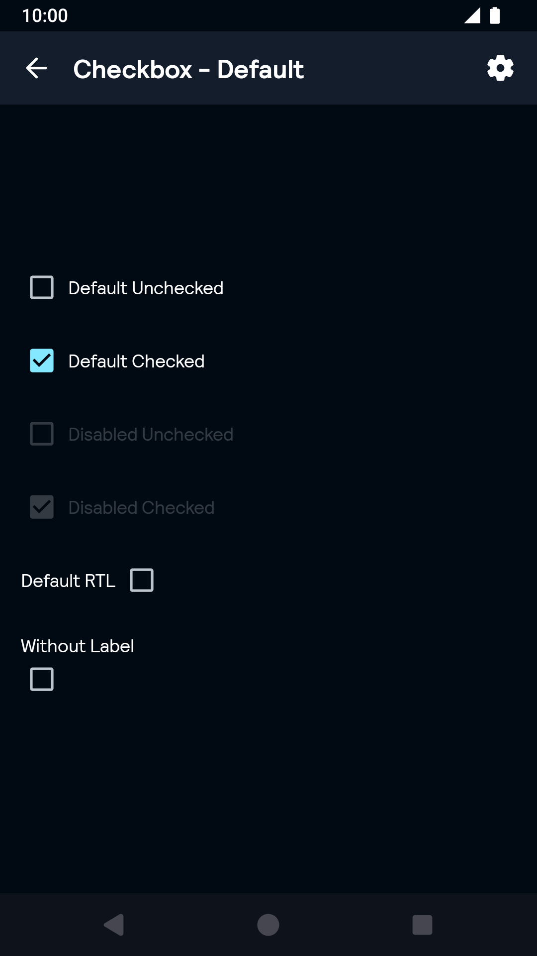 |
Installation
Backpack Android is available through Maven Central. Check the main Readme for a complete installation guide.
Usage
The Checkbox component can be used in both XML and Kotlin/Java
Example of a checkbox in XML
Example of a checkbox in Kotlin
Theme Props
- checkboxColorChecked
- checkboxColorDisabled
- checkboxColor
Styles can be changed globally through bpkCheckboxStyle. Check theming for more information.