Calendar

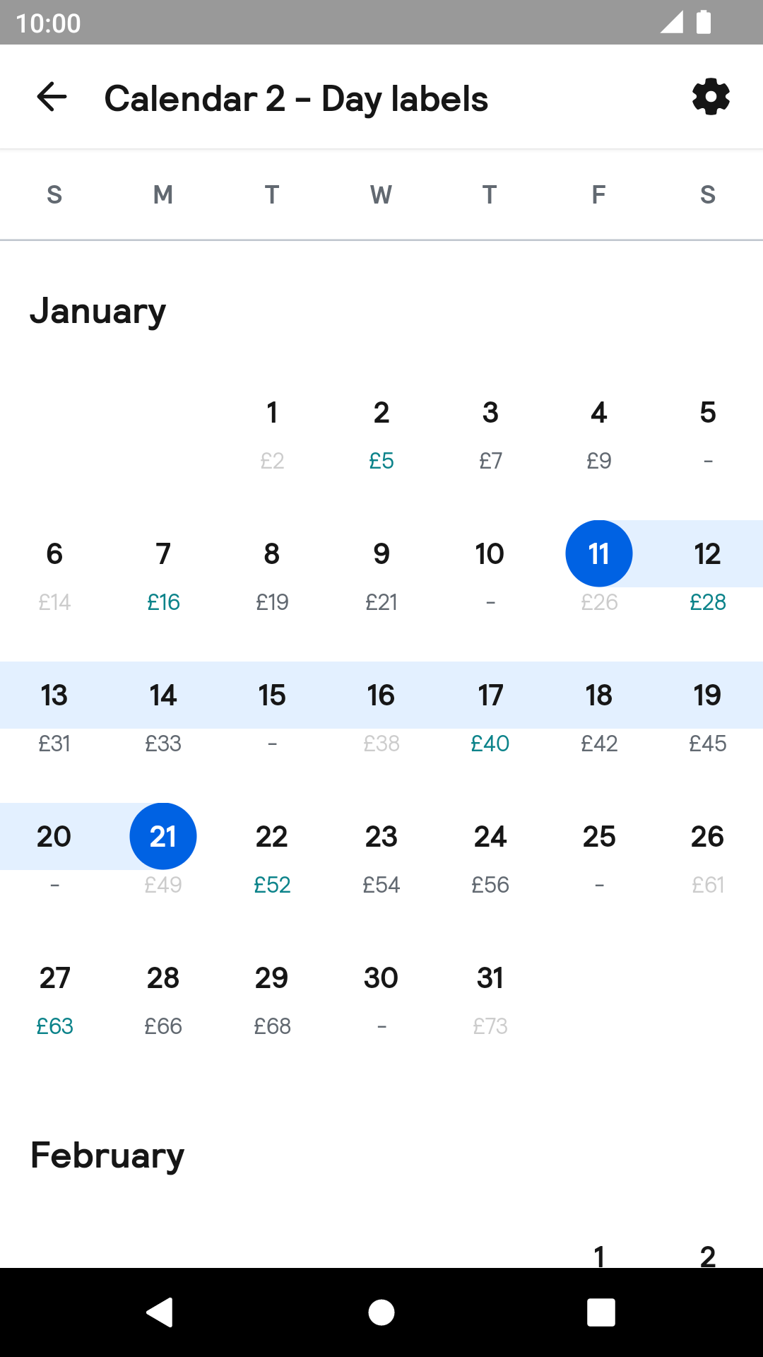
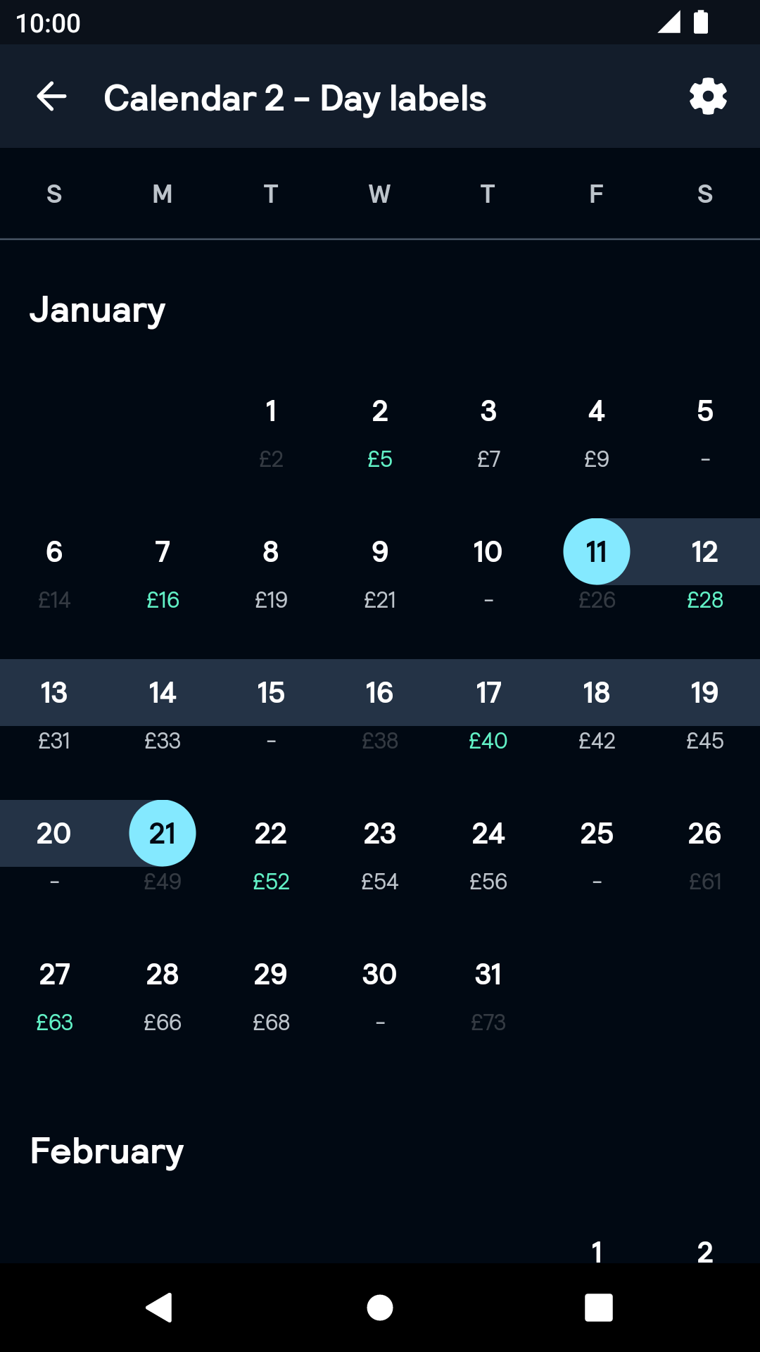
Labeled
| Day | Night |
|---|---|
 |
 |
Icon as labeled
| Day | Night |
|---|---|
 |
 |
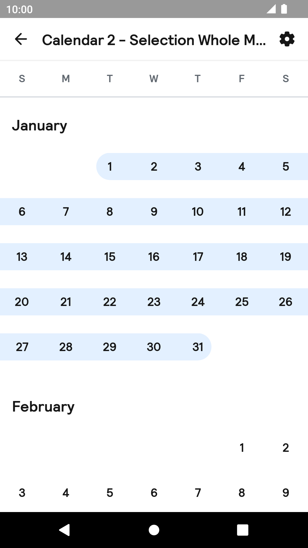
Month
| Day | Night |
|---|---|
 |
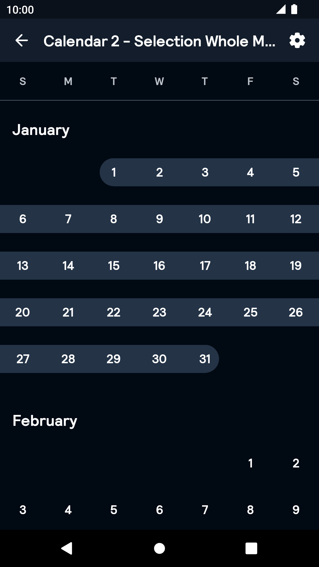 |
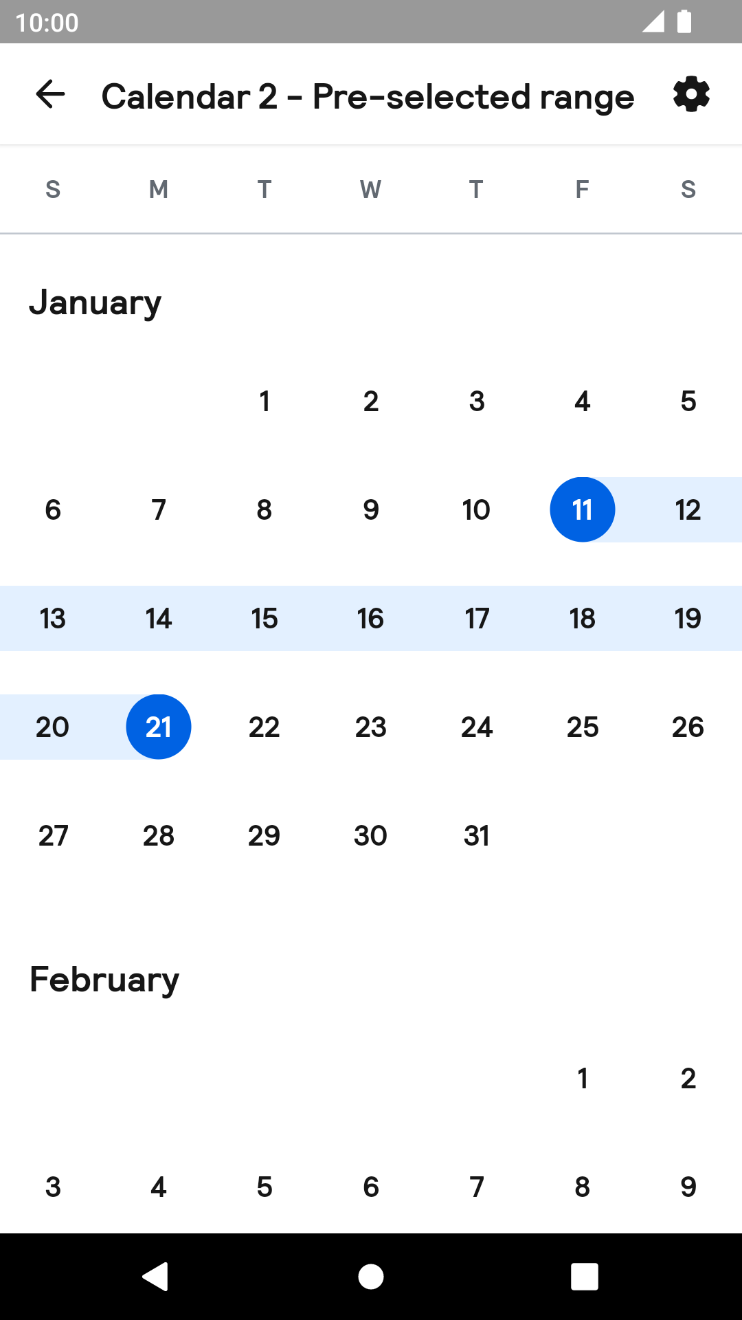
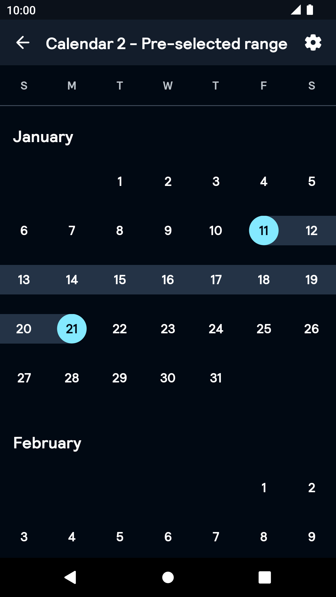
Range
| Day | Night |
|---|---|
 |
 |
Installation
Backpack Android is available through Maven Central. Check the main Readme for a complete installation guide.
Usage
BpkCalendar uses coroutines under the hood. Since it designed with coroutines, the API is designed primarily for Kotlin language and may not be interoperable with Java. To use the API, make sure kotlinx-coroutines is included to your project.
BpkCalendar is designed as a state machine. All the information it contains is available as a state in the StateFlow. Each method of the public API and some of the user interactions will change its state and emit it.
The Calendar component can be used in both XML and Kotlin, but requires the basic setup to be done in Kotlin. Both single and range selection are supported.
Example of a calendar declaration in XML
NOTE: Note that the package name of new Calendar has been changed to net.skyscanner.backpack.calendar2.
Example of a declaration in Kotlin
Once you've declared the calendar, you need to setup it like following:
Now the component is ready. You can listen for the selection change using its state:
Advanced dates customisation
You can attach some of the information to each date displayed in calendar. This information will update its appearance and behaviour.
In order to do this, specify cellInfo parameters like shown here:
You can also use icons as the cell info:
Theme Props
- calendarDateSelectedBackgroundColor
- calendarDateSelectedRangeBackgroundColor
- calendarDateSelectedTextColor
- calendarDateSelectedSameDayBackgroundColor
Styles can be changed globally through bpkCalendarStyle. Check theming for more information.