This helps you understand the status of a component at a glance using the layers panel. Engineers can also make use of this in the inspect panel.
🎒 Backpack
Figma + code
Figma components prefixed with a 🎒 emoji have code counterpart with the same name.
eg: 🎒 Bpk Slider
🚧 Backpack Beta
Figma only
Figma components prefixed with a 🚧 emoji have been proposed to be added to Backpack. The design of these components may not be finalised. Your squad might have to contribute the component if you want to use it.
eg: 🚧 Bpk Gallery
👻 Graveyard
Deprecated components
When we need to remove a component from the design system, it goes to the Graveyard before being deleted altogether. You should not add Graveyard components to your designs. If you’re already using a Graveyard component, you’ll need to replace it to ensure that the design can be implemented correctly.
eg: 👻 App Buttons
⚡️ Live product
Figma only
Some parts of the product, e.g: Search Controls, are composed from 🎒 Backpack tokens and components, but ultimately aren’t standalone own Backpack components.
We have prefixed these with ⚡️ to signify they’re in the live product, but not part of Backpack. This is not a Backpack priority to keep these designs up to date.
eg: ⚡️Search Controls

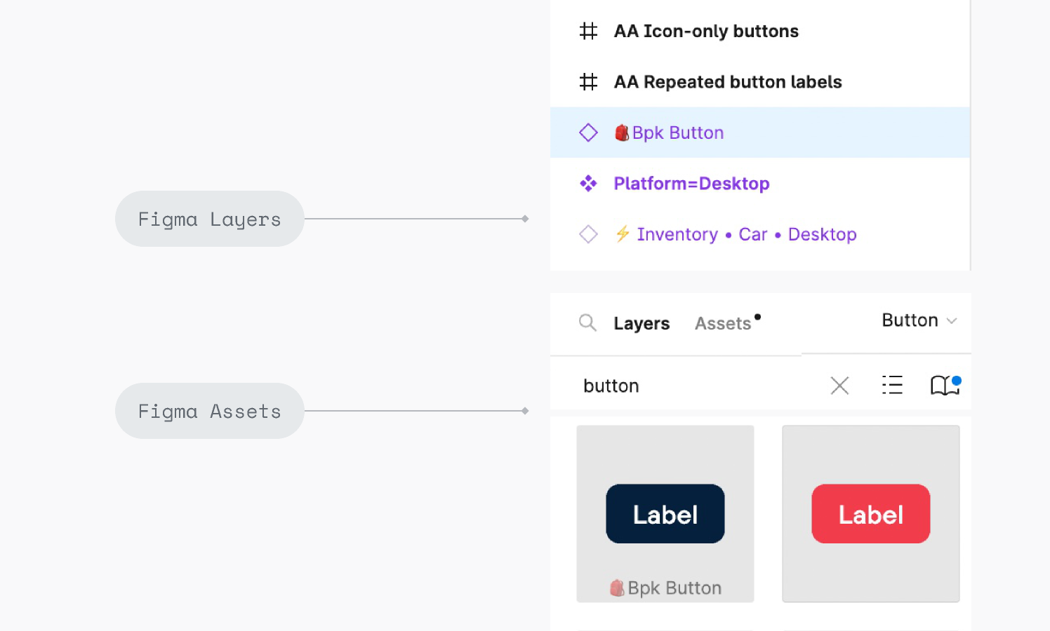
Layer and asset view (Designers)
The prefix 🎒 Bpk will appear in both the Figma layer panel, and Assets view.
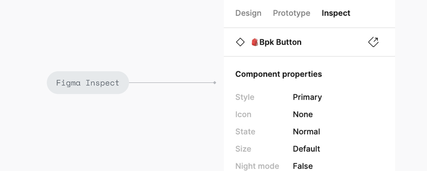
Inspect view (Engineers)
The prefix 🎒 Bpk will appear in the Inspect panel. This lets us know there is a code counterpart with the same name.