Skyscanner’s icons are designed to be simple, modern, friendly, and sometimes quirky. Each icon is reduced to its minimal form, retaining essential and distinctive characteristics.
Sizes
Icons are available at 24px and 16px. The 16px icon is drawn using the same stroke weight, but sometimes with reduced detail to maintain its clarity in the smaller size.

Anatomy
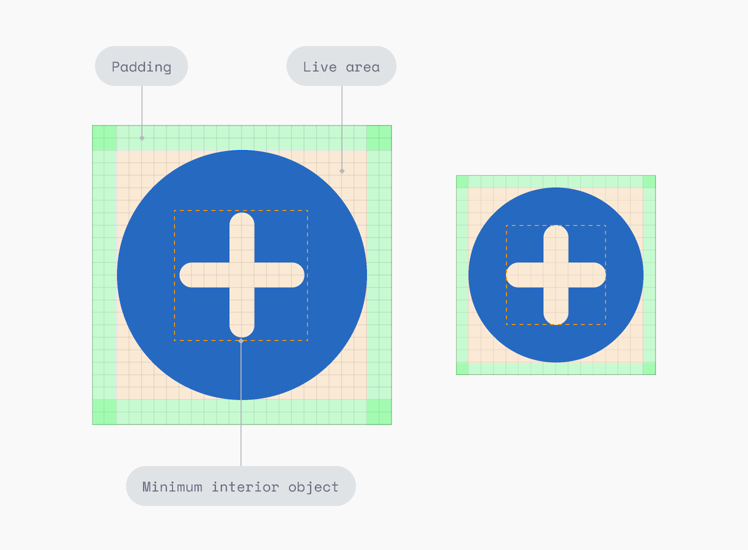
Every icon has a live area, padding, and minimum interior object (where applicable).

|
Anatomy |
24px Icon |
16px Icon |
|---|---|---|
|
Padding |
2px |
1px |
|
Live area |
20px |
14px |
|
Minimum interior object |
10px |
8px |
Tall and wide icons
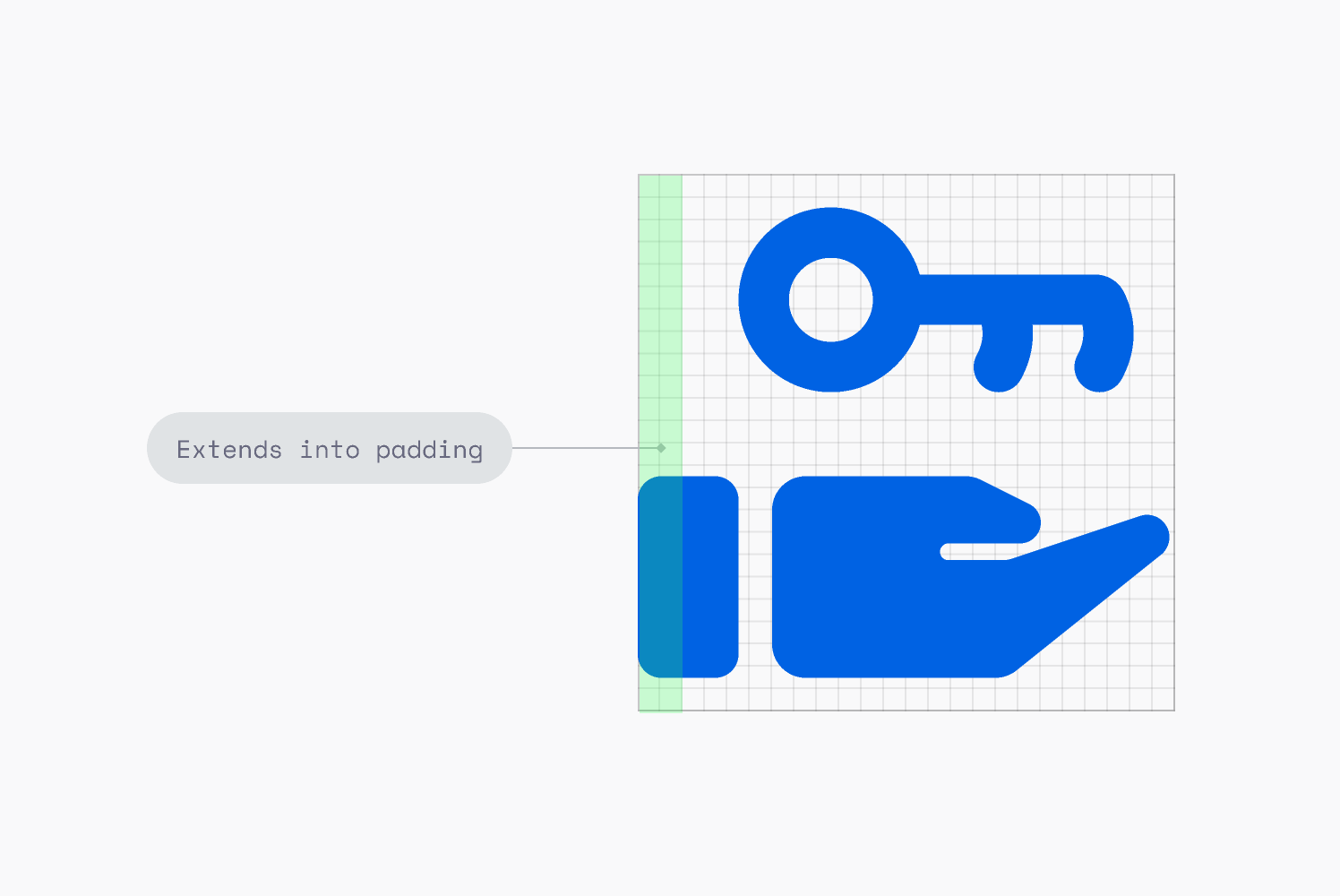
Most icons fit the live area, however, tall or wide icons might extend into the padding to optically balance their size.

Default stroke and radius
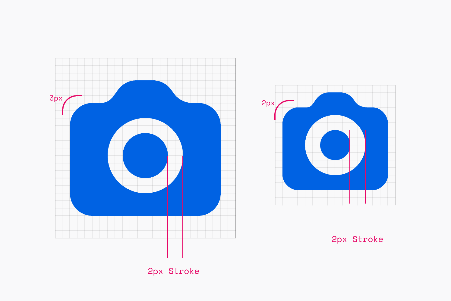
Icons feature a consistent stroke width of 2px to knock out shapes or draw lines. This remains the same in both sizes. The default radius for curves is 3px, which scales down to 2px.

Smaller stroke and radius
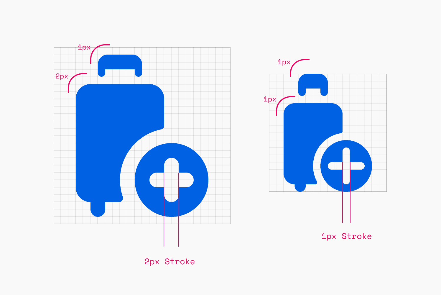
Not all icons are created equal. A cloakroom hook or suitcase handle requires close attention. 2px radius can be used in 24px icons, and 1px in 16px icons. 1px strokes can be used in 16px icons.

|
Anatomy |
24px Icon |
16px Icon |
|---|---|---|
|
Default stroke |
2px |
2px |
|
Default radius |
3px |
2px |
|
Smaller stroke |
1px |
1px |
|
Smaller radius |
1px |
1px |
Curves
Some icons have a dramatic curve, which is inspired by the Skyscanner logo. Visualised in the image below, it’s slightly bolder than the curve of the beam in the logo.
