- Welcome
- Getting started
- Latest updates
- Foundations
-
Components
- Accordion
- Alert
- Alignment
- App Search Modal
- Aria live
- Autosuggest
- Badge
- Banner alert
- Bar chart
- Blockquote
- Bottom navigation
- Bottom sheet
- Breadcrumb
- Breakpoint
- Button
- Calendar
- Card
- Card list
- Card button
- Carousel
- Checkbox
- Chip
- Chip group
- Code
- Content cards
- Data Table
- Datepicker
- Description list
- Dialog
- Divider
- Drawer
- Field Set
- Flare
- Flat list
- Flight leg
- Floating action button
- Floating notification
- Form label
- Form validation
- Graphic promotion
- Horizontal navigation
- Icon
- Image
- Image Gallery
- Infinite scroll
- Info Banner
- Inset Banner
- Link
- List
- Map
- Mobile scroll container
- Modal
- Navigation bar
- Navigation Tab Group
- Nudger
- Overlay
- Page indicator
- Pagination
- Panel
- Phone input
- Picker
- Popover
- Price
- Progress bar
- Radio button
- Rating
- Rating Bar
- Scrollable calendar
- Search Modal
- Section header
- Section list
- Select
- Skeleton
- Skip link
- Slider
- Snackbar
- Snippet
- Spinner
- Split input
- Star rating
- Swap Button
- Switch
- Table
- Text
- Text input
- Theming
- Ticket
- Toast
- Tooltip
- Touchable native feedback
- Touchable overlay
- Search Input Summary
- Content
- Accessibility
- Contributing
- Localisation
Text input
Text inputs are used to capture textual information as well as numbers and passwords.
TextField

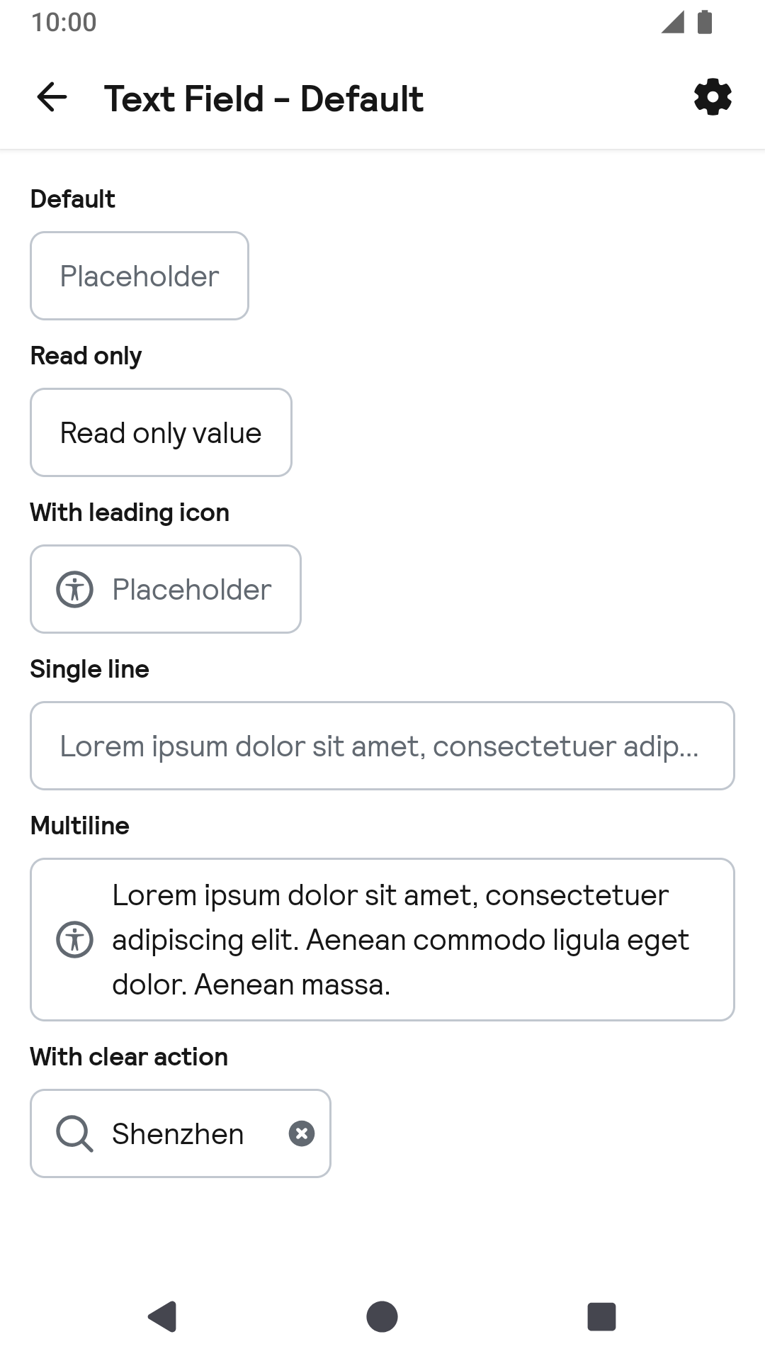
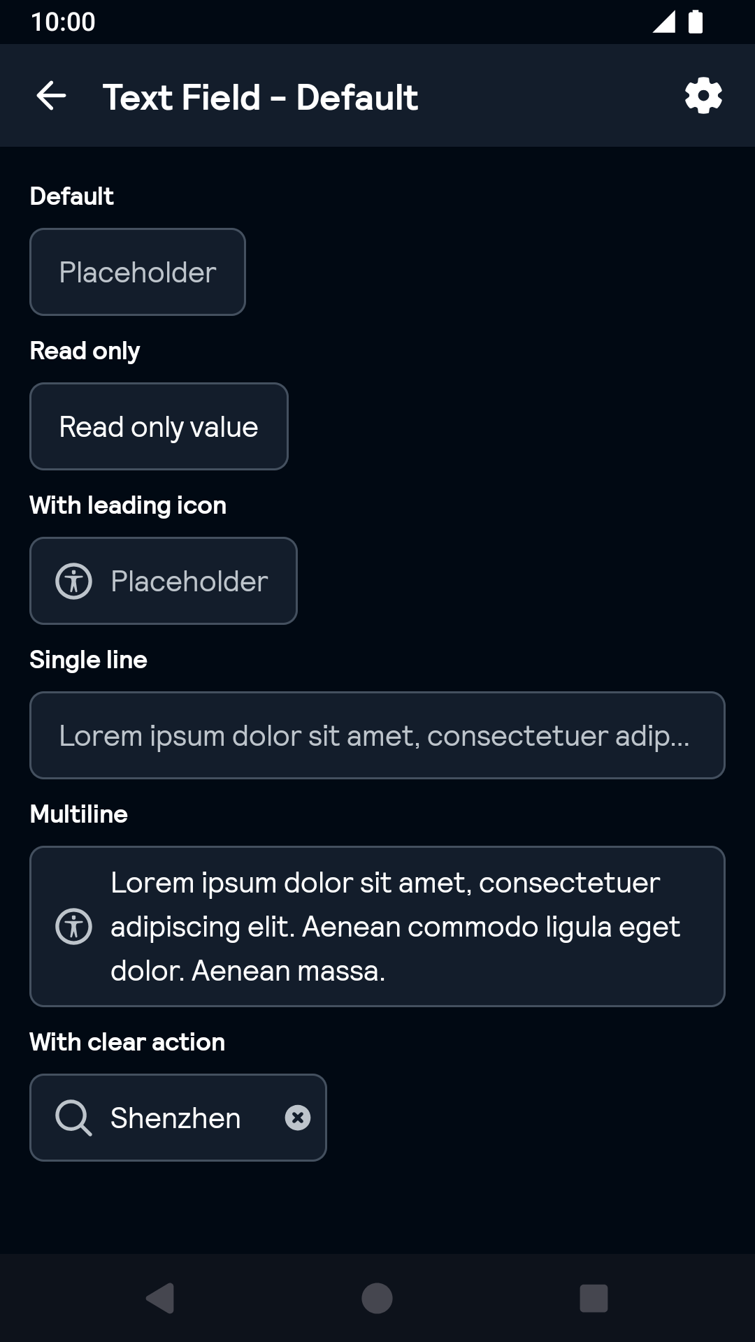
Default
| Day | Night |
|---|---|
 |
 |
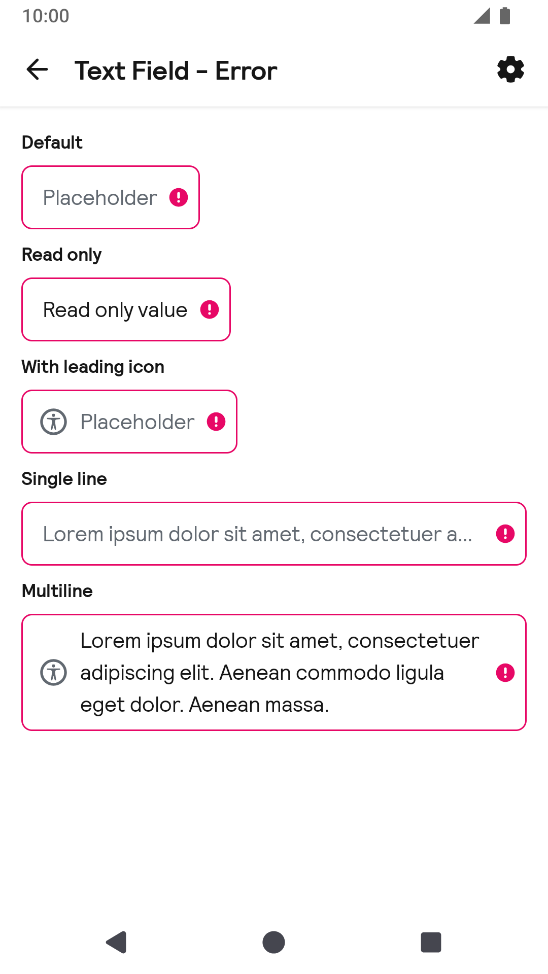
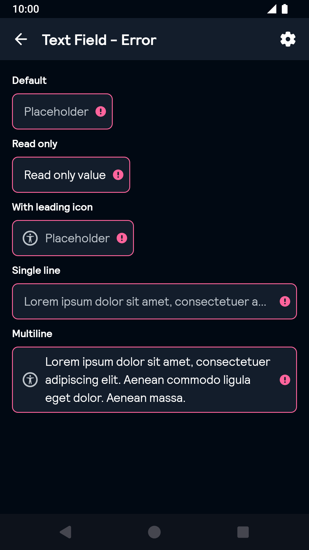
Error
| Day | Night |
|---|---|
 |
 |
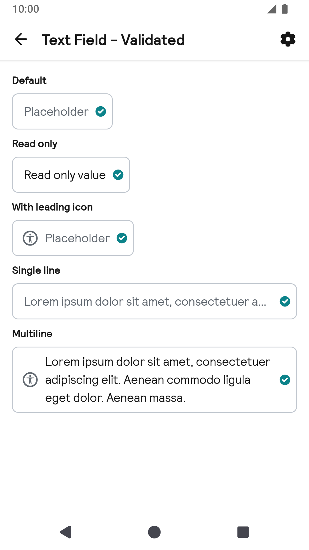
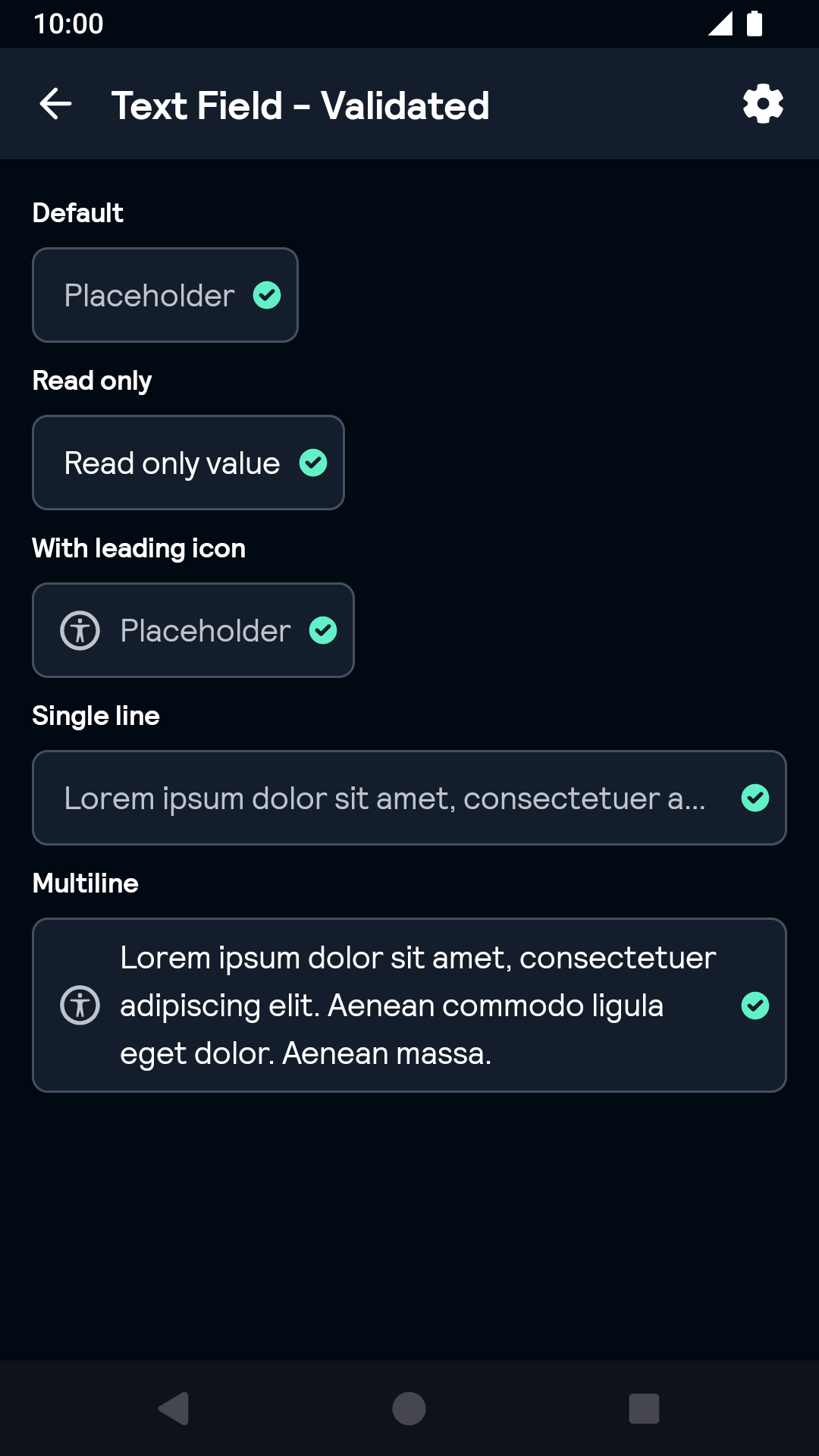
Validated
| Day | Night |
|---|---|
 |
 |
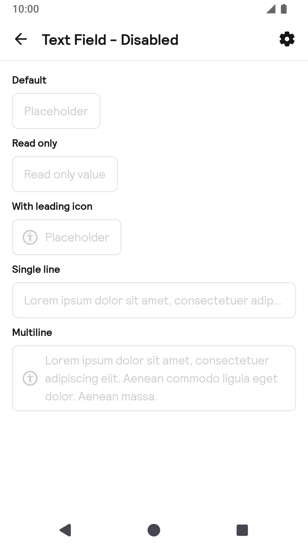
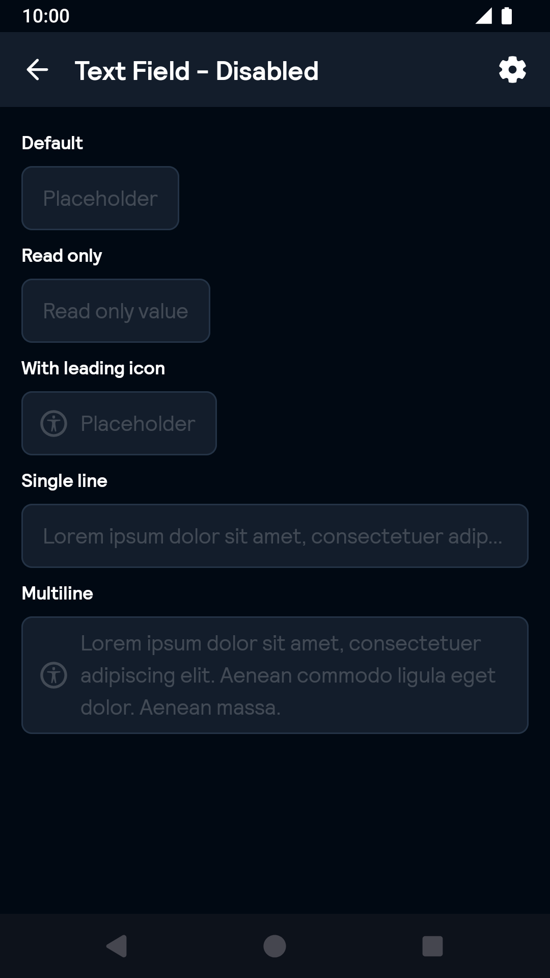
Disabled
| Day | Night |
|---|---|
 |
 |
TextArea
| Day | Night |
|---|---|
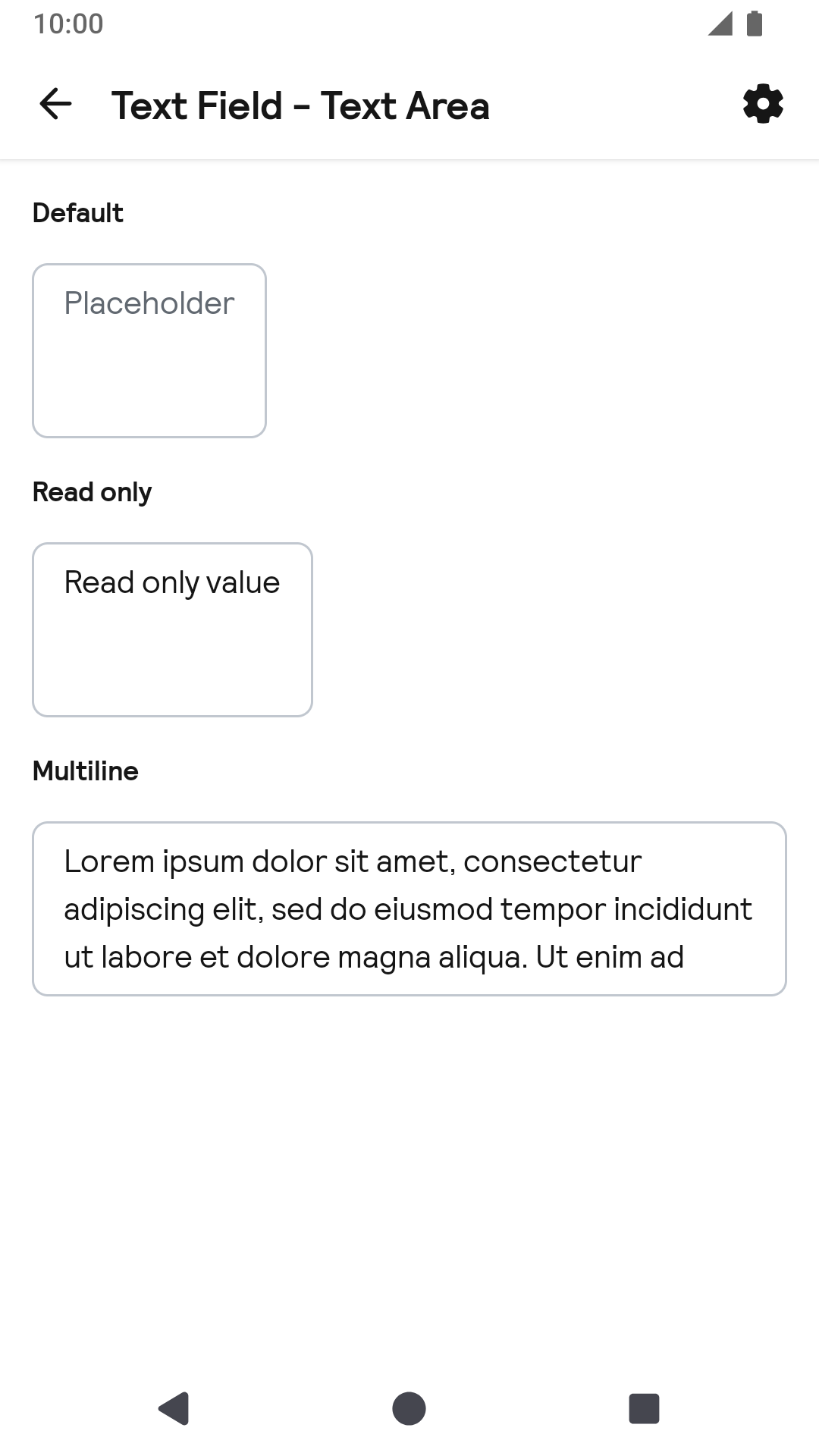 |
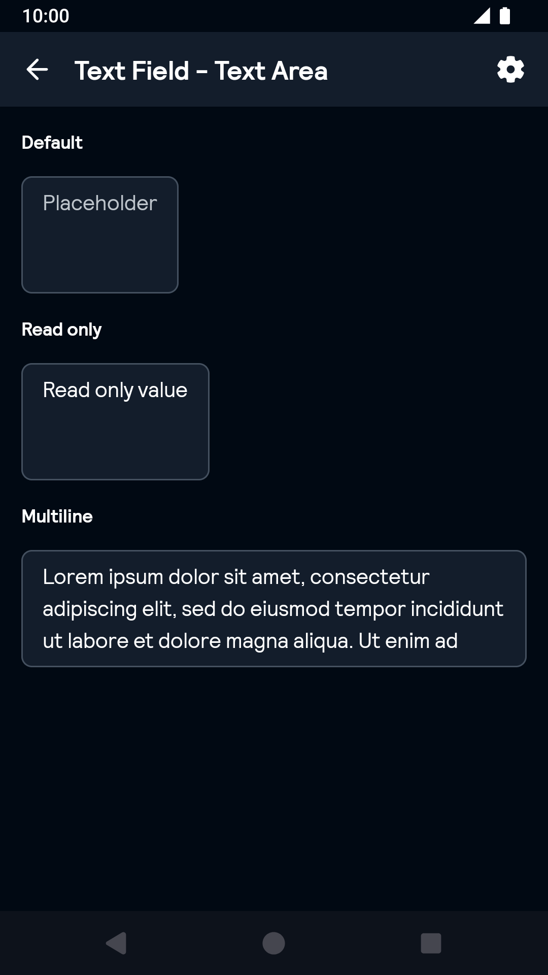 |
TextArea Error
| Day | Night |
|---|---|
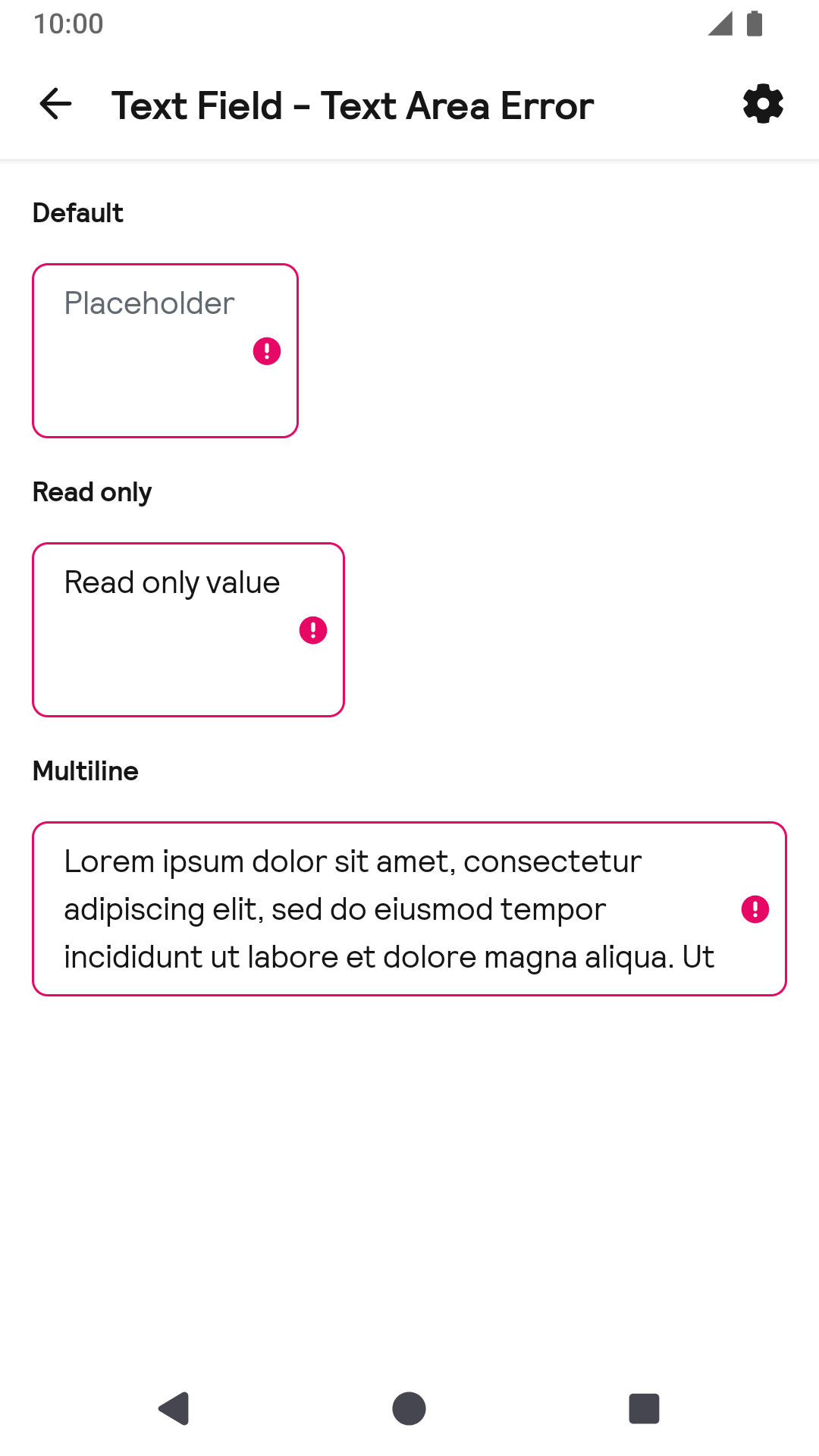 |
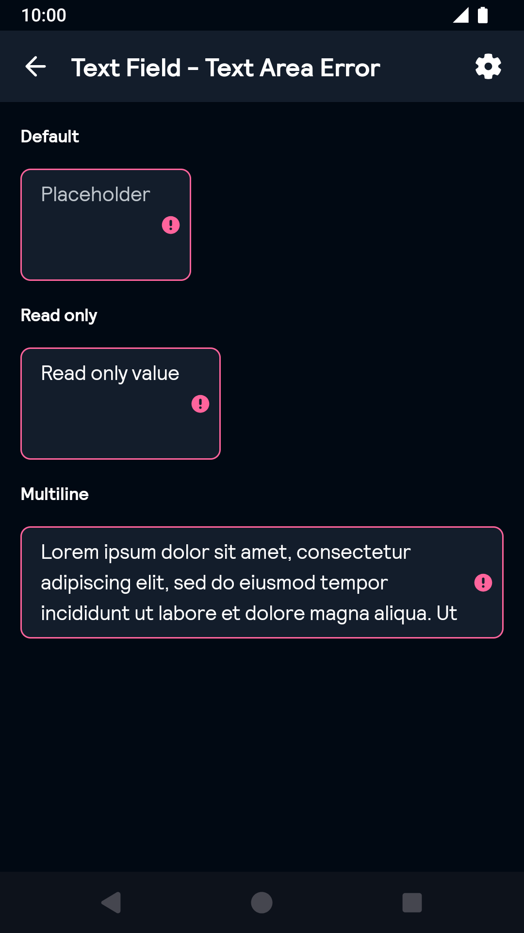 |
TextArea Validated
| Day | Night |
|---|---|
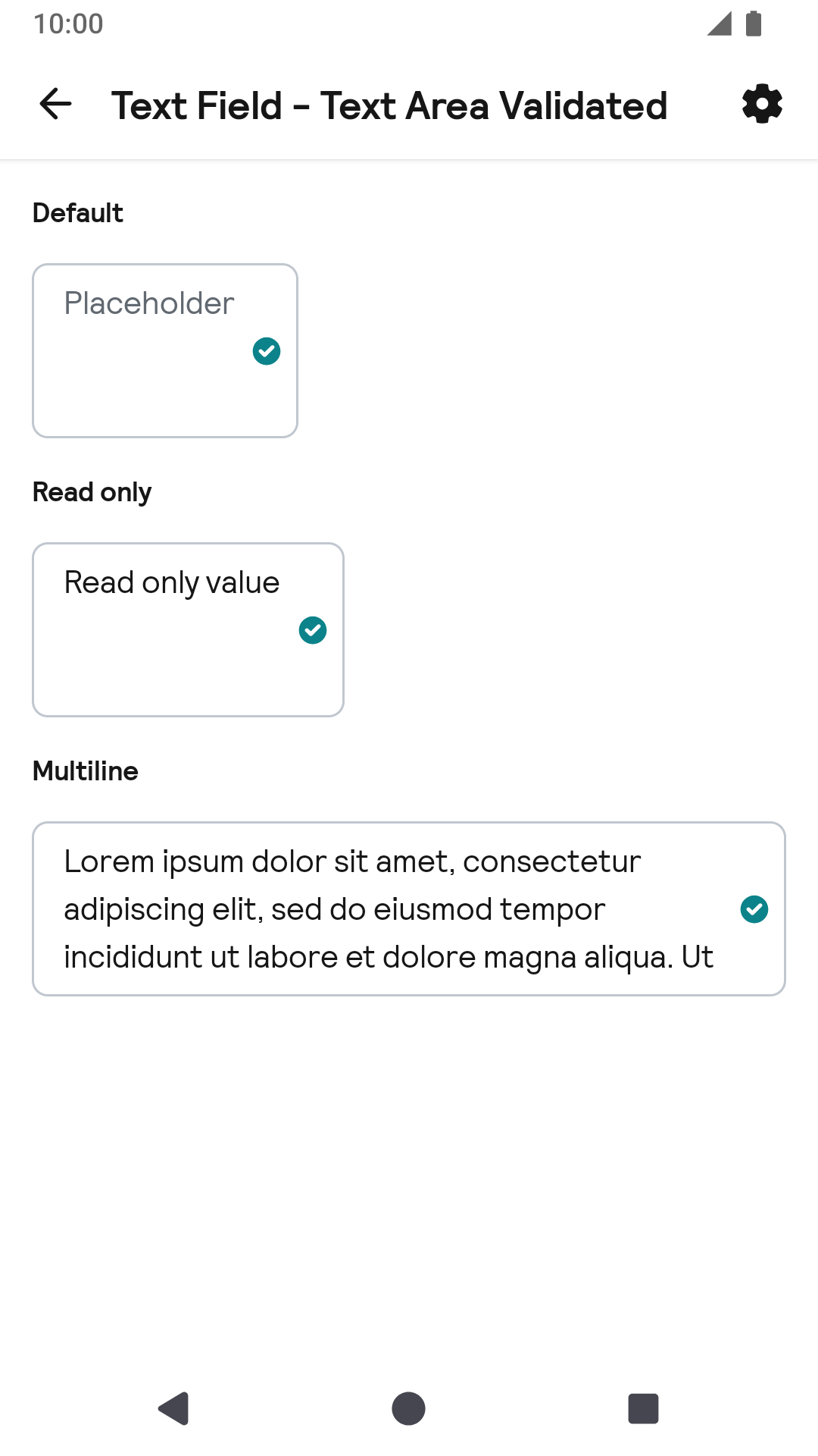 |
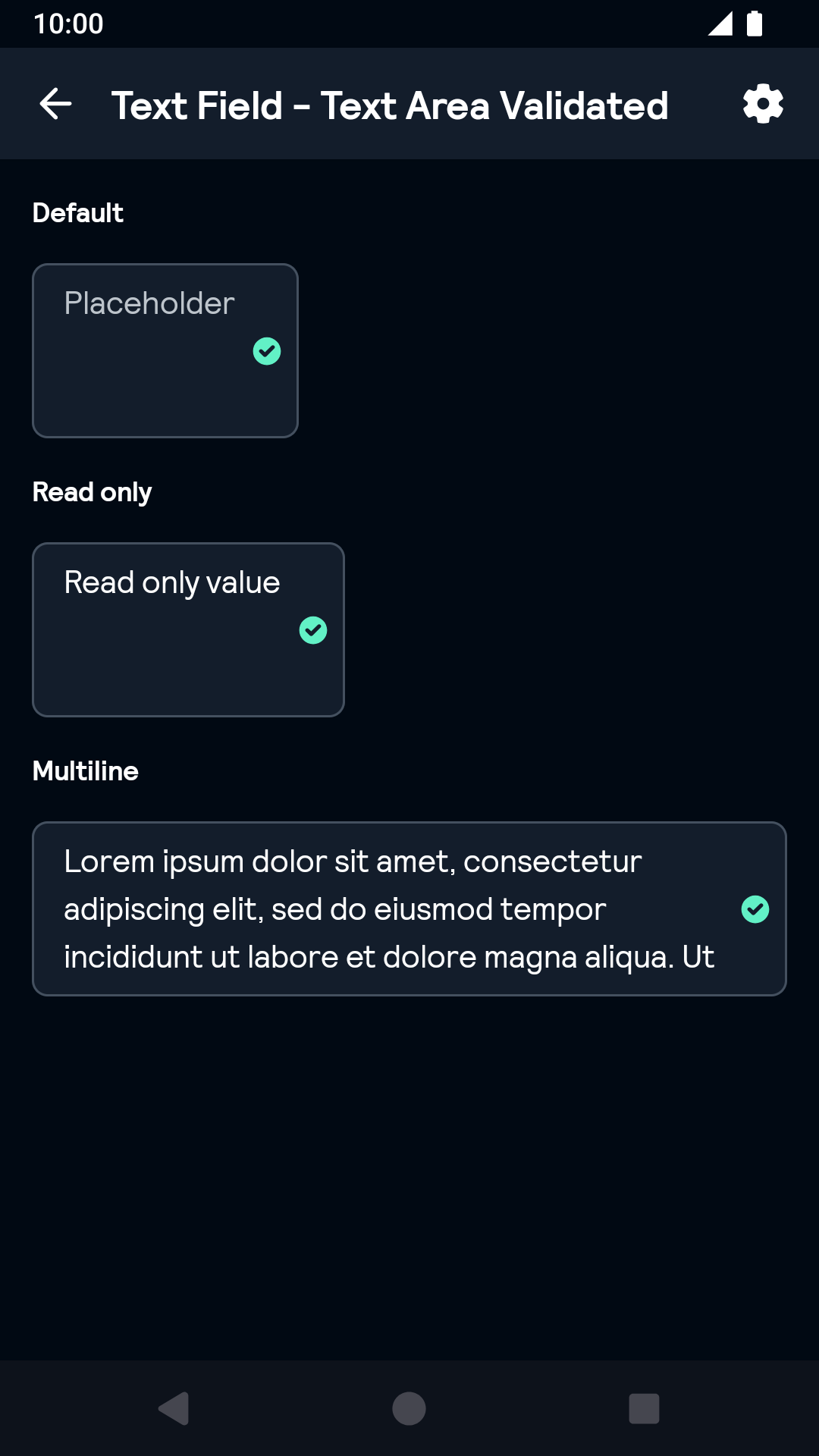 |
TextArea Disabled
| Day | Night |
|---|---|
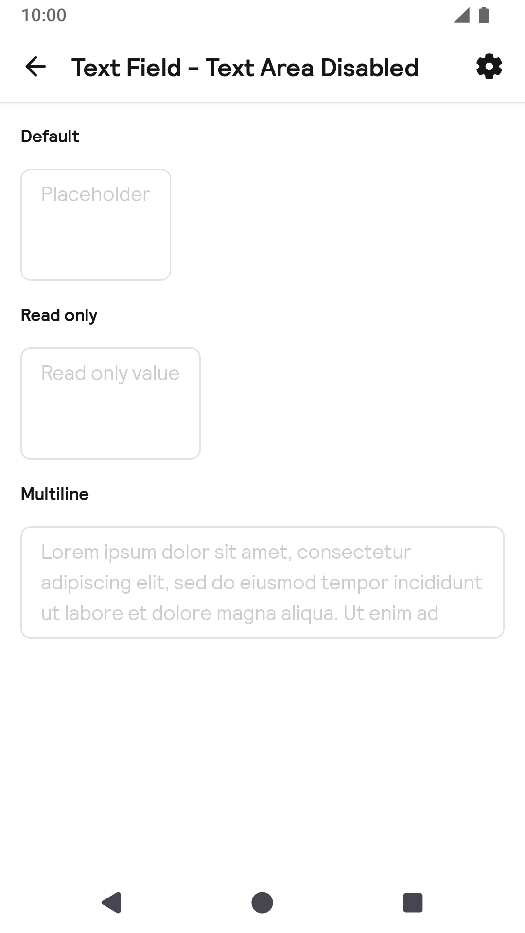 |
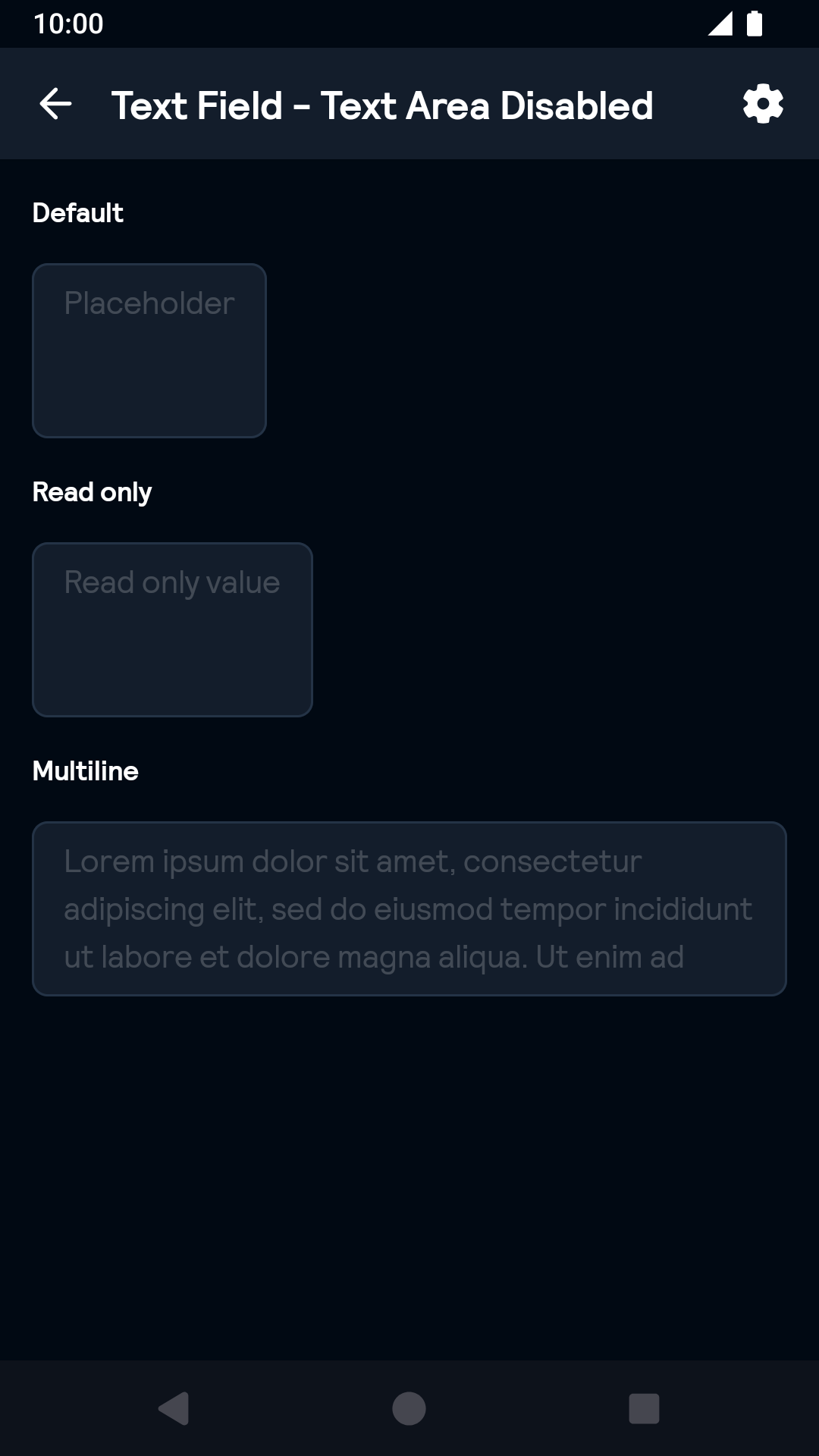 |
Installation
Backpack Compose is available through Maven Central. Check the main Readme for a complete installation guide.
Usage
Note: If TextField is used inside BpkFieldSet it will inherit its default status from BpkFieldSet.
Example of a TextField:
                                                import net.skyscanner.backpack.compose.textfield.BpkTextField

                                                BpkTextField(
                                                  value = value,
                                                  onValueChange = { value -> },
                                                  placeholder = "Placeholder",
                                                )
Example of a TextField with leading icon:
                                                import net.skyscanner.backpack.compose.icon.BpkIcon
                                                import net.skyscanner.backpack.compose.textfield.BpkTextField
                                                import net.skyscanner.backpack.compose.tokens.Accessibility

                                                BpkTextField(
                                                  value = value,
                                                  onValueChange = { value -> },
                                                  placeholder = "Placeholder",
                                                  icon = BpkIcon.Accessibility,
                                                )
Example of a TextField with clear action:
                                                import net.skyscanner.backpack.compose.icon.BpkIcon
                                                import net.skyscanner.backpack.compose.textfield.BpkTextField
                                                import net.skyscanner.backpack.compose.textfield.BpkClearAction
                                                import net.skyscanner.backpack.compose.tokens.Accessibility

                                                BpkTextField(
                                                  value = value,
                                                  onValueChange = { value -> },
                                                  placeholder = "Placeholder",
                                                  icon = BpkIcon.Accessibility,
                                                  clearAction = BpkClearAction("Clear"){ value = "" }
                                                )
Example of a multiline TextField:
                                                import net.skyscanner.backpack.compose.textfield.BpkTextField

                                                BpkTextField(
                                                  value = value,
                                                  onValueChange = { value -> },
                                                  placeholder = "Placeholder",
                                                  maxLines = 3,
                                                )
Example of a TextField with error status:
                                                import net.skyscanner.backpack.compose.fieldset.BpkFieldStatus
                                                import net.skyscanner.backpack.compose.textfield.BpkTextField

                                                BpkTextField(
                                                  value = value,
                                                  onValueChange = { value -> },
                                                  placeholder = "Placeholder",
                                                  status = BpkFieldStatus.Error("Error text"),
                                                )
Example of a TextArea:
                                                import net.skyscanner.backpack.compose.textfield.BpkTextArea

                                                BpkTextArea(
                                                  value = value,
                                                  onValueChange = { value -> },
                                                  placeholder = "Placeholder",
                                                )
Example of a TextArea with error status:
                                                import net.skyscanner.backpack.compose.fieldset.BpkFieldStatus
                                                import net.skyscanner.backpack.compose.textfield.BpkTextArea

                                                BpkTextArea(
                                                  value = value,
                                                  onValueChange = { value -> },
                                                  placeholder = "Placeholder",
                                                  status = BpkFieldStatus.Error("Error text"),
                                                )
Made with ❤️ by Skyscanner © 2024
© 2024 Skyscanner Backpack. Page last updated on Oct 31, 2022, 13:26