- Welcome
- Getting started
- Latest updates
- Foundations
-
Components
- Accordion
- Alert
- Alignment
- App Search Modal
- Aria live
- Autosuggest
- Badge
- Banner alert
- Bar chart
- Blockquote
- Bottom navigation
- Bottom sheet
- Breadcrumb
- Breakpoint
- Button
- Calendar
- Card
- Card list
- Card button
- Carousel
- Checkbox
- Chip
- Chip group
- Code
- Content cards
- Data Table
- Datepicker
- Description list
- Dialog
- Divider
- Drawer
- Field Set
- Flare
- Flat list
- Flight leg
- Floating action button
- Floating notification
- Form label
- Form validation
- Graphic promotion
- Horizontal navigation
- Icon
- Image
- Image Gallery
- Infinite scroll
- Info Banner
- Inset Banner
- Link
- List
- Map
- Mobile scroll container
- Modal
- Navigation bar
- Navigation Tab Group
- Nudger
- Overlay
- Page indicator
- Pagination
- Panel
- Phone input
- Picker
- Popover
- Price
- Progress bar
- Radio button
- Rating
- Rating Bar
- Scrollable calendar
- Search Modal
- Section header
- Section list
- Select
- Skeleton
- Skip link
- Slider
- Snackbar
- Snippet
- Spinner
- Split input
- Star rating
- Swap Button
- Switch
- Table
- Text
- Text input
- Theming
- Ticket
- Toast
- Tooltip
- Touchable native feedback
- Touchable overlay
- Search Input Summary
- Content
- Accessibility
- Contributing
- Localisation
Text input
Text inputs are used to capture textual information as well as numbers and passwords.
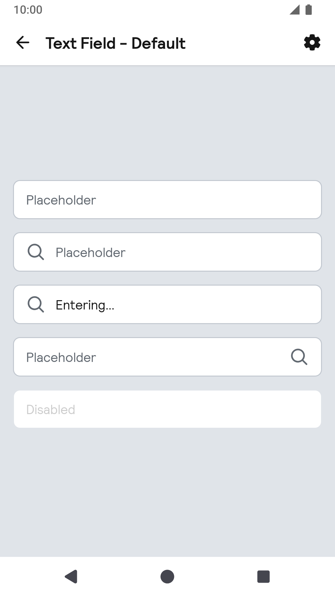
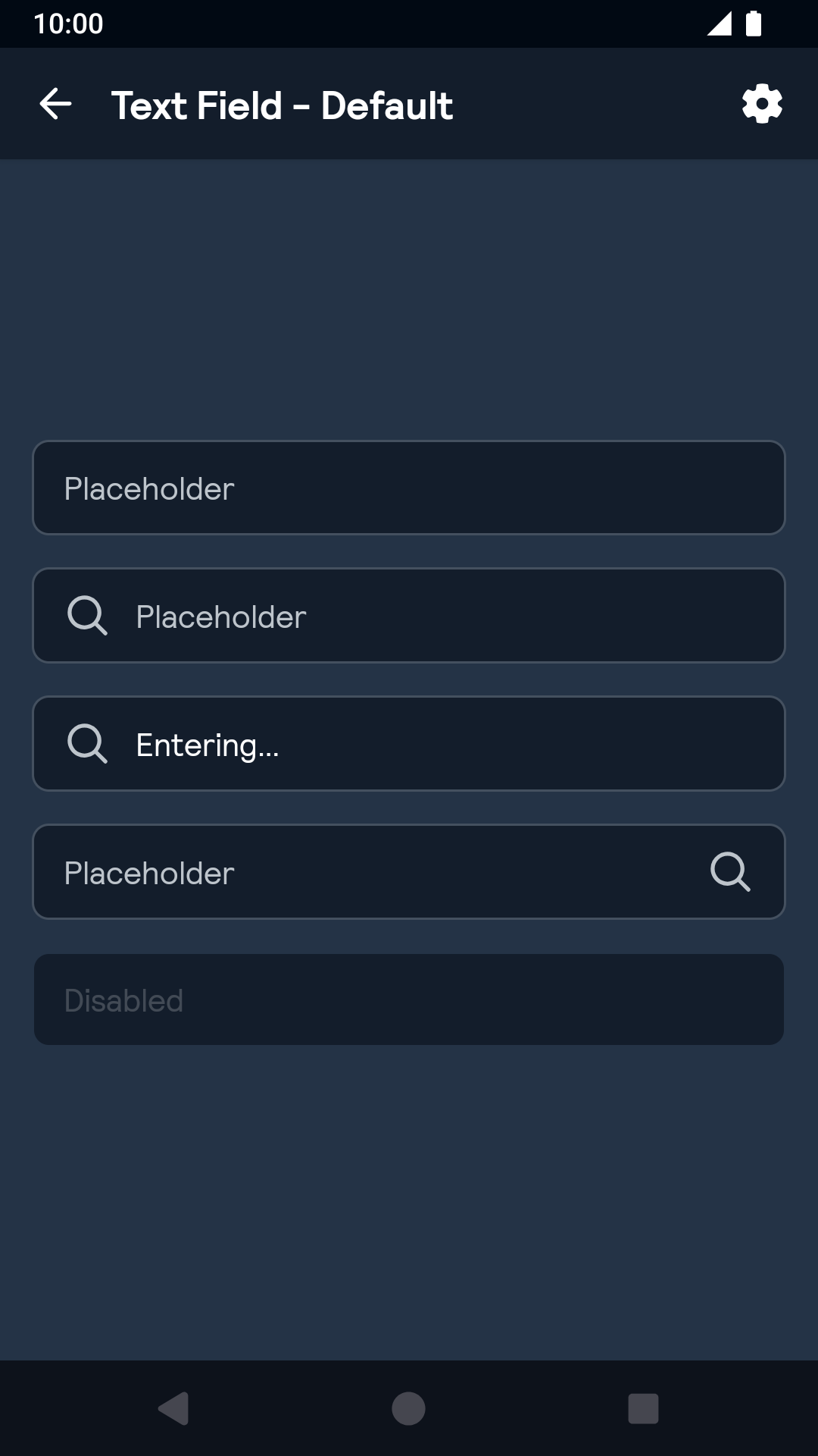
Text Field

Default
| Day | Night |
|---|---|
 |
 |
Labels
| Day | Night |
|---|---|
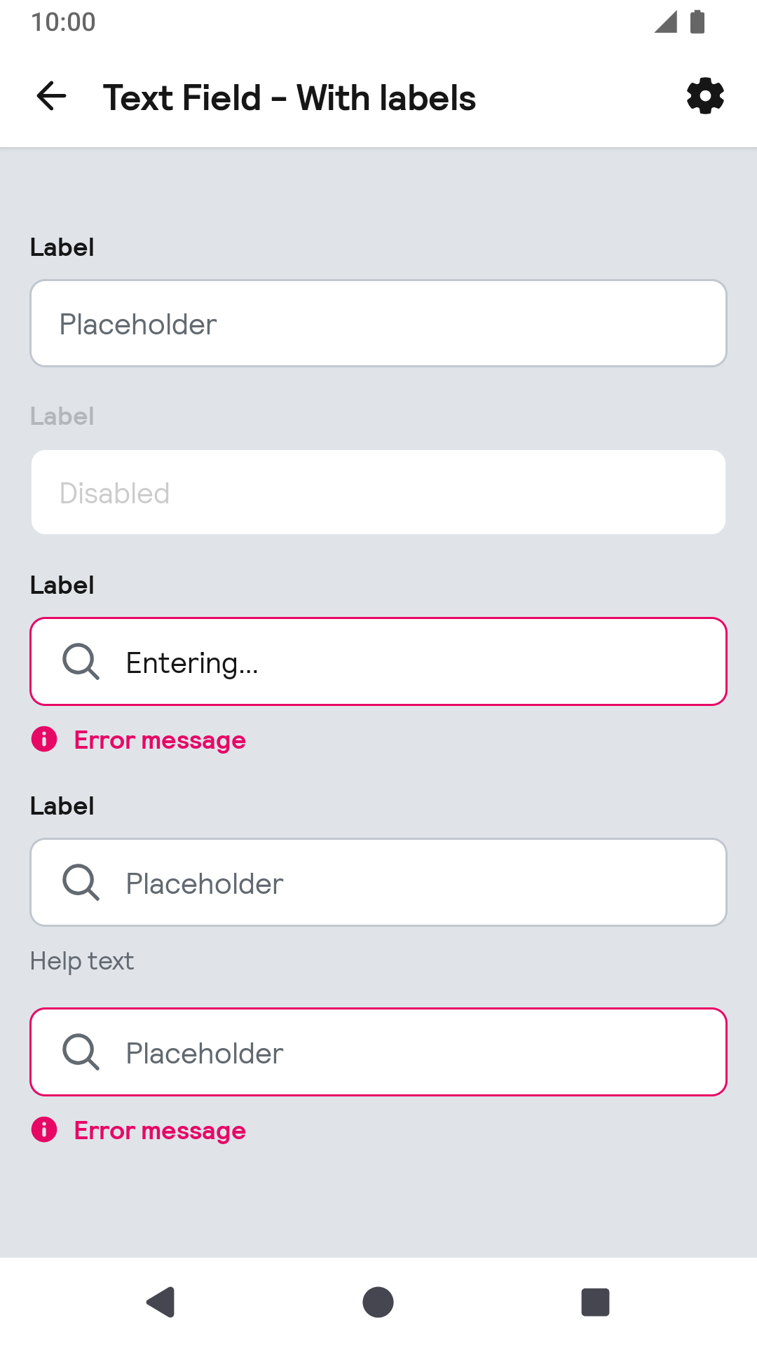 |
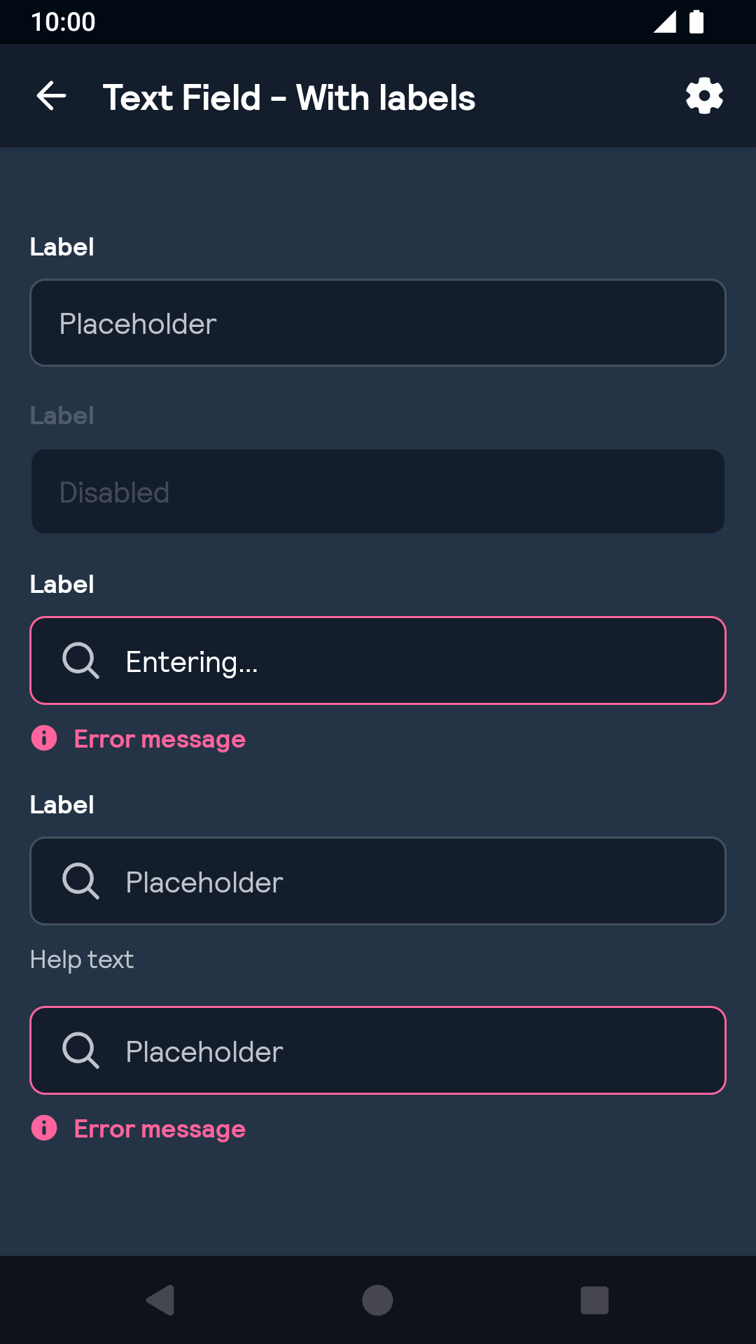 |
Installation
Backpack Android is available through Maven Central. Check the main Readme for a complete installation guide.
Usage
The Text Field component can be used in both XML and Kotlin
Example of a text field with icon on start in XML:
                                                <net.skyscanner.backpack.text.BpkTextField
                                                  android:layout_width="match_parent"
                                                  android:layout_height="wrap_content"
                                                  app:textFieldIconStart="@drawable/bpk_search" />
Example of a text field with icon on start in Kotlin:
                                                import net.skyscanner.backpack.text.BpkTextField

                                                BpkTextField(context).apply {
                                                   setText('Flights to Edinburgh')
                                                   iconStart = AppCompatResources.getDrawable(context, R.drawable.bpk_search)
                                                }
To add a label and/or a helper or error message you can use the BpkTextInputLayout:
Example of a text layout with label, error and helper text:
                                                <net.skyscanner.backpack.text.BpkTextInputLayout
                                                  android:layout_width="match_parent"
                                                  android:layout_height="wrap_content"
                                                  android:label="Label"
                                                  app:textInputHelperText="Helper text"
                                                  app:textInputError="Error message">

                                                  <net.skyscanner.backpack.text.BpkTextField
                                                    android:layout_width="match_parent"
                                                    android:layout_height="wrap_content"
                                                    android:hint="Placeholder"
                                                    android:text="Content"
                                                    app:textFieldIconStart="@drawable/bpk_search" />
                                                </net.skyscanner.backpack.text.BpkTextInputLayout>
Example of a text layout with label, error and helper text:
                                                import net.skyscanner.backpack.text.BpkTextField
                                                import net.skyscanner.backpack.text.BpkTextInputLayout

                                                BpkTextInputLayout(testContext).apply {
                                                  label = "Label"
                                                  error = "Error"
                                                  helperText = "Helper text"

                                                  val textField = BpkTextField(testContext).apply {
                                                    hint = "Hint"
                                                    setText("Text")
                                                  }

                                                  addView(textField)
                                                }
Note: If both error message and helper text are supplied the error message takes precedence.
By default the error view has a visibility of GONE until an error is set. To avoid the layout jumping set the textFieldErrorEnabled (XML) or errorEnabled (Java/Kotlin) flag to true, which will set visibility to INVISIBLE.
Theme Props
BpkTextField
- textFieldColor
- textFieldColorHintNormal
- textFieldColorHintFocused
- textFieldColorIcon
- textFieldBackground
- Font theming
BpkTextInputLayout
- textInputErrorTextColor
- textInputHelperTextColor
- textInputErrorIcon
Styles can be changed globally through bpkTextFieldStyle and bpkTextInputLayoutStyle. Check theming for more information.
Example
                                                  <style name="BlueTheme" parent="AppTheme">
                                                    <item name="bpkTextFieldStyle">@style/TextFieldStyle</item>
                                                    <item name="bpkTextInputLayoutStyle">@style/TextInputLayoutStyle</item>
                                                  </style>

                                                  <style name="TextFieldStyle" >
                                                    <item name="textFieldColor">@color/bpkSkyBlueShade02</item>
                                                    <item name="textFieldColorHintNormal">@color/bpkSkyBlueTint01</item>
                                                    <item name="textFieldColorHintFocused">@color/bpkSkyBlue</item>
                                                  </style>

                                                  <style name="TextInputLayoutStyle">
                                                    <item name="textInputErrorTextColor">@color/bpkSkyBlueShade02</item>
                                                    <item name="textInputHelperTextColor">@color/bpkSkyBlueTint01</item>
                                                    <item name="textInputErrorIcon">@drawable/bpk_information</item>
                                                  </style>
Made with ❤️ by Skyscanner © 2024
© 2024 Skyscanner Backpack. Page last updated on Oct 31, 2022, 13:28