- Welcome
- Getting started
- Latest updates
- Foundations
-
Components
- Accordion
- Alert
- Alignment
- App Search Modal
- Aria live
- Autosuggest
- Badge
- Banner alert
- Bar chart
- Blockquote
- Bottom navigation
- Bottom sheet
- Breadcrumb
- Breakpoint
- Button
- Calendar
- Card
- Card list
- Card button
- Carousel
- Checkbox
- Chip
- Chip group
- Code
- Content cards
- Data Table
- Datepicker
- Description list
- Dialog
- Divider
- Drawer
- Field Set
- Flare
- Flat list
- Flight leg
- Floating action button
- Floating notification
- Form label
- Form validation
- Graphic promotion
- Horizontal navigation
- Icon
- Image
- Image Gallery
- Infinite scroll
- Info Banner
- Inset Banner
- Link
- List
- Map
- Mobile scroll container
- Modal
- Navigation bar
- Navigation Tab Group
- Nudger
- Overlay
- Page indicator
- Pagination
- Panel
- Phone input
- Picker
- Popover
- Price
- Progress bar
- Radio button
- Rating
- Rating Bar
- Scrollable calendar
- Search Modal
- Section header
- Section list
- Select
- Skeleton
- Skip link
- Slider
- Snackbar
- Snippet
- Spinner
- Split input
- Star rating
- Swap Button
- Switch
- Table
- Text
- Text input
- Theming
- Ticket
- Toast
- Tooltip
- Touchable native feedback
- Touchable overlay
- Search Input Summary
- Content
- Accessibility
- Contributing
- Localisation
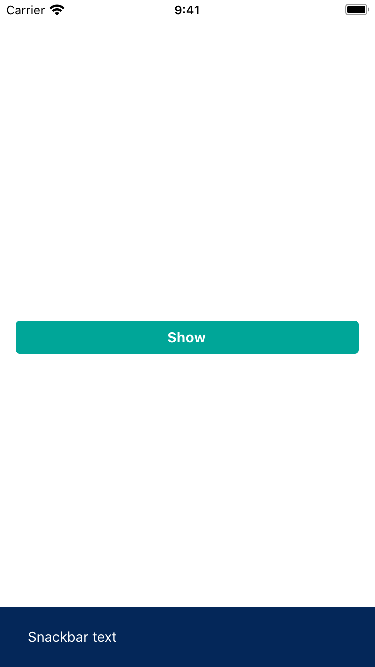
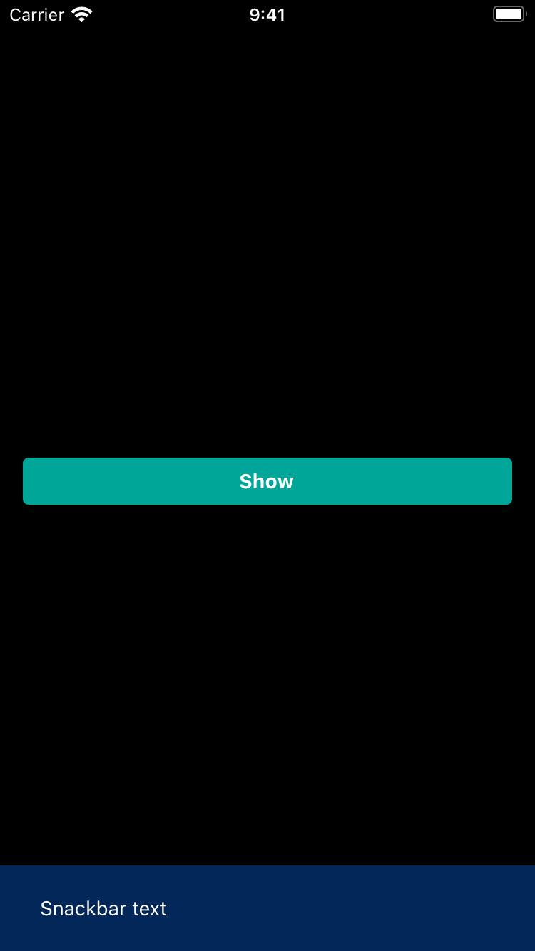
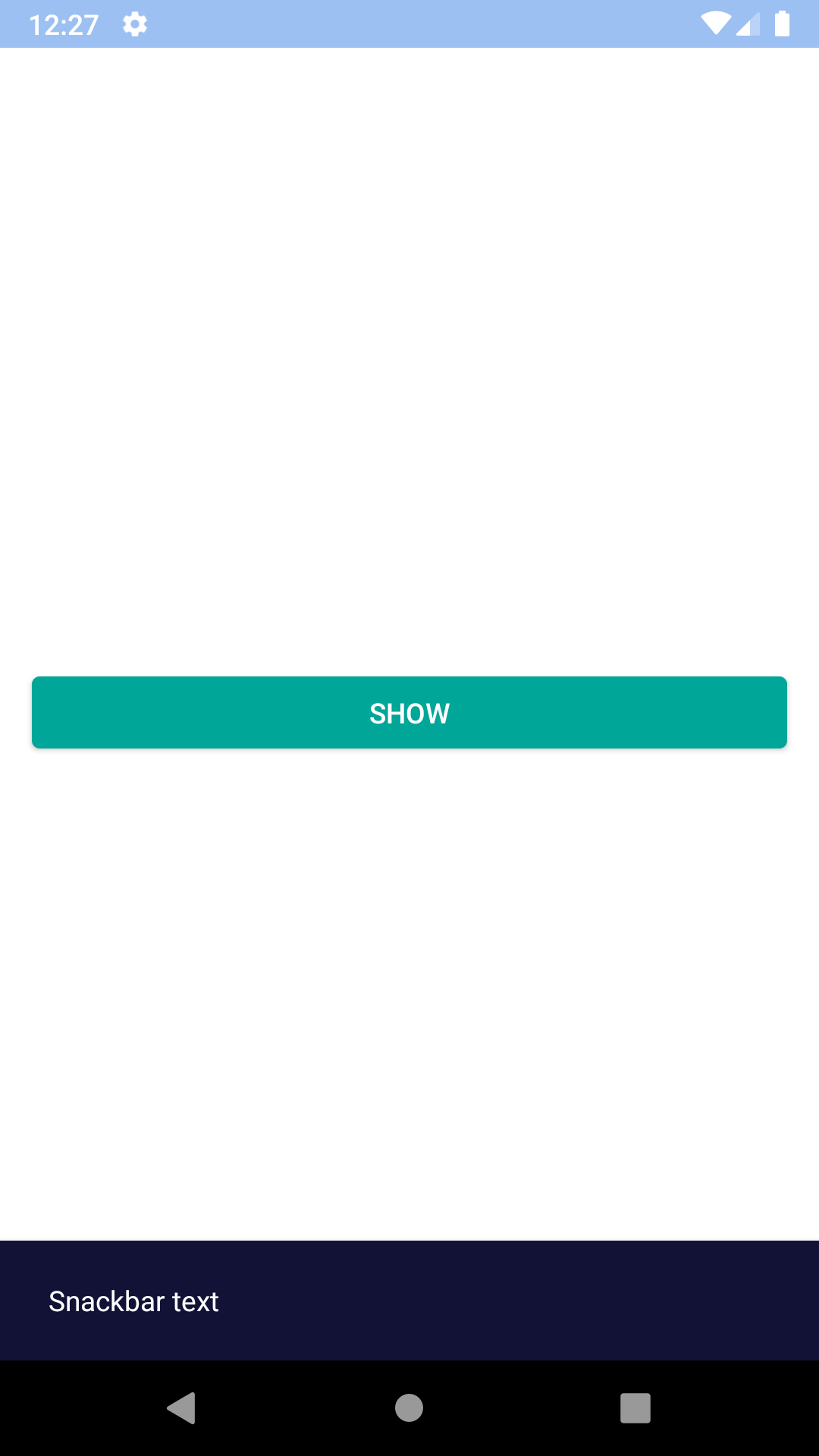
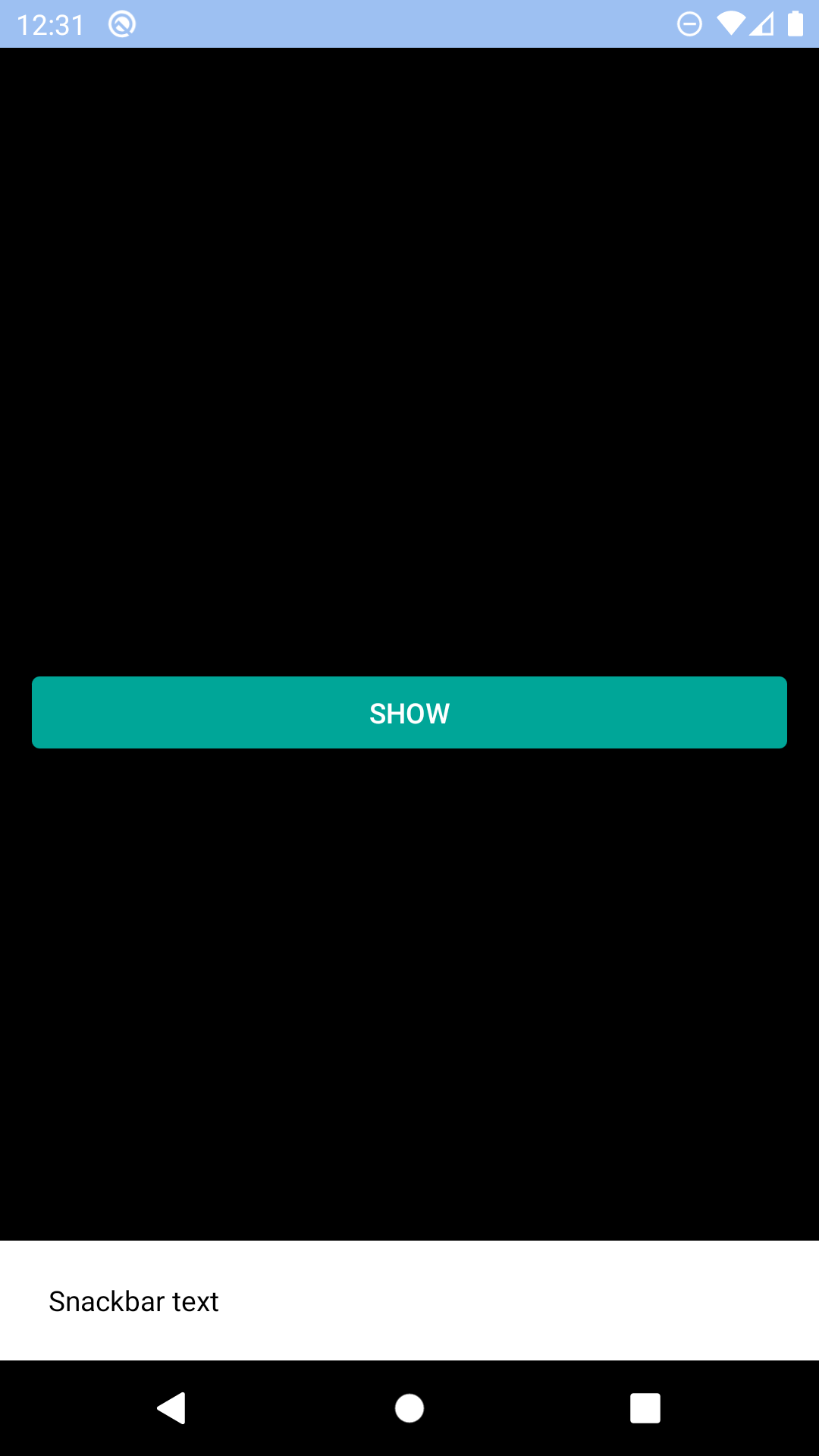
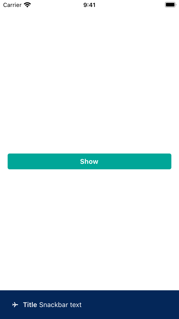
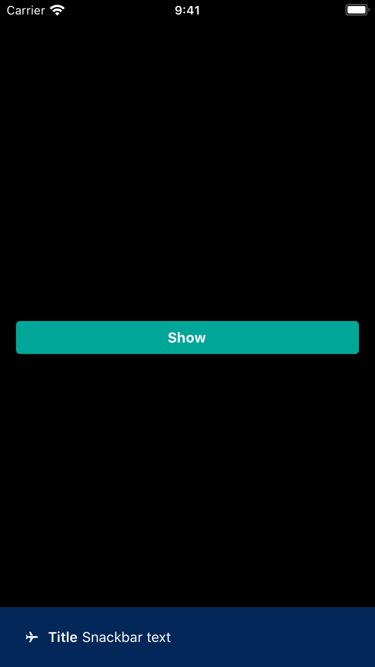
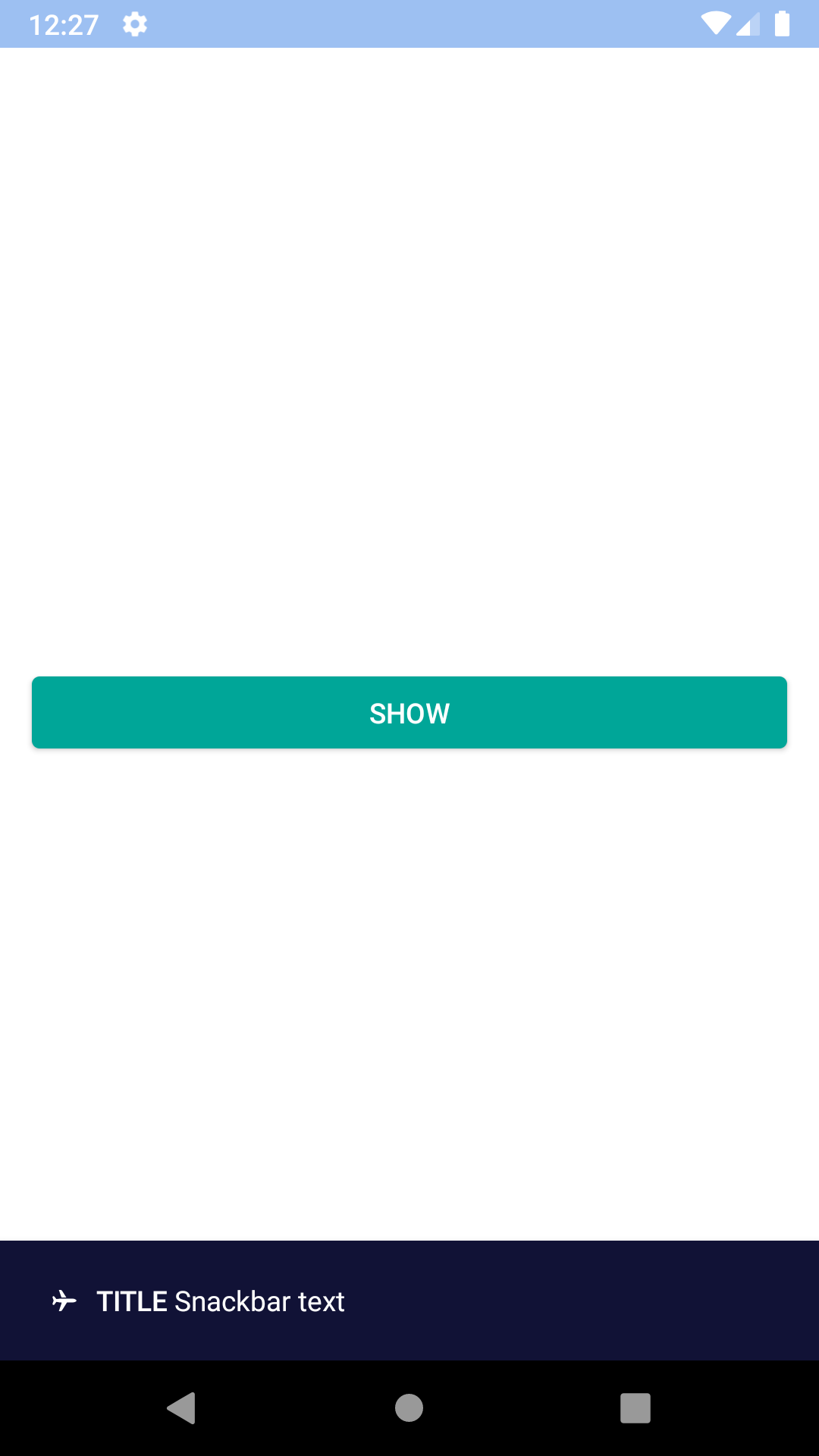
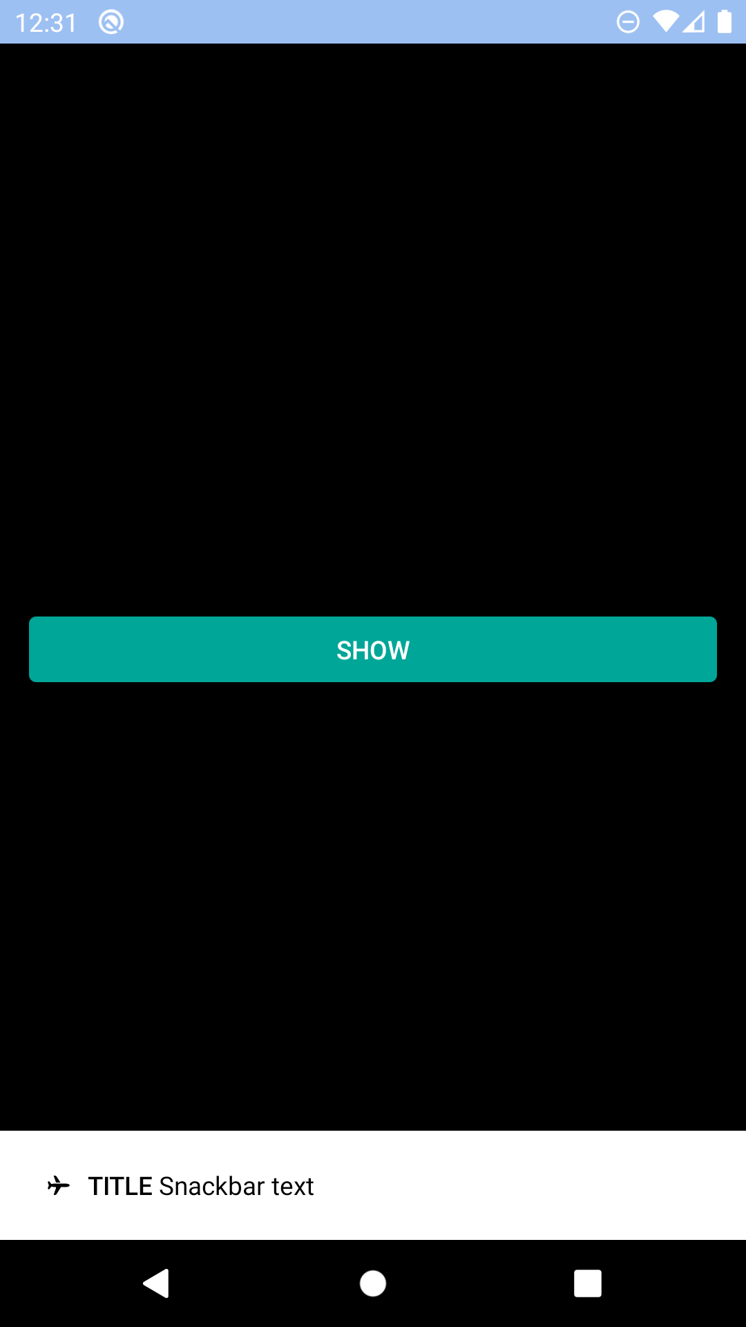
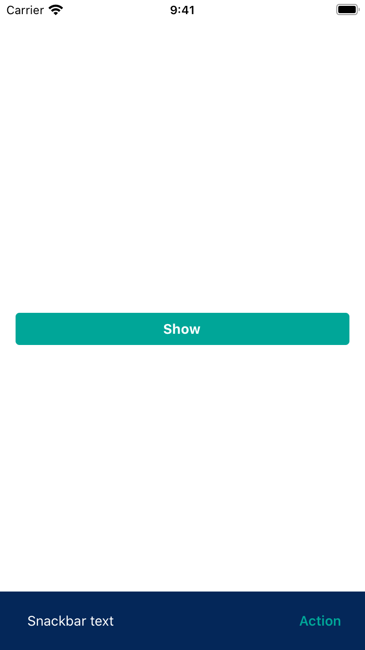
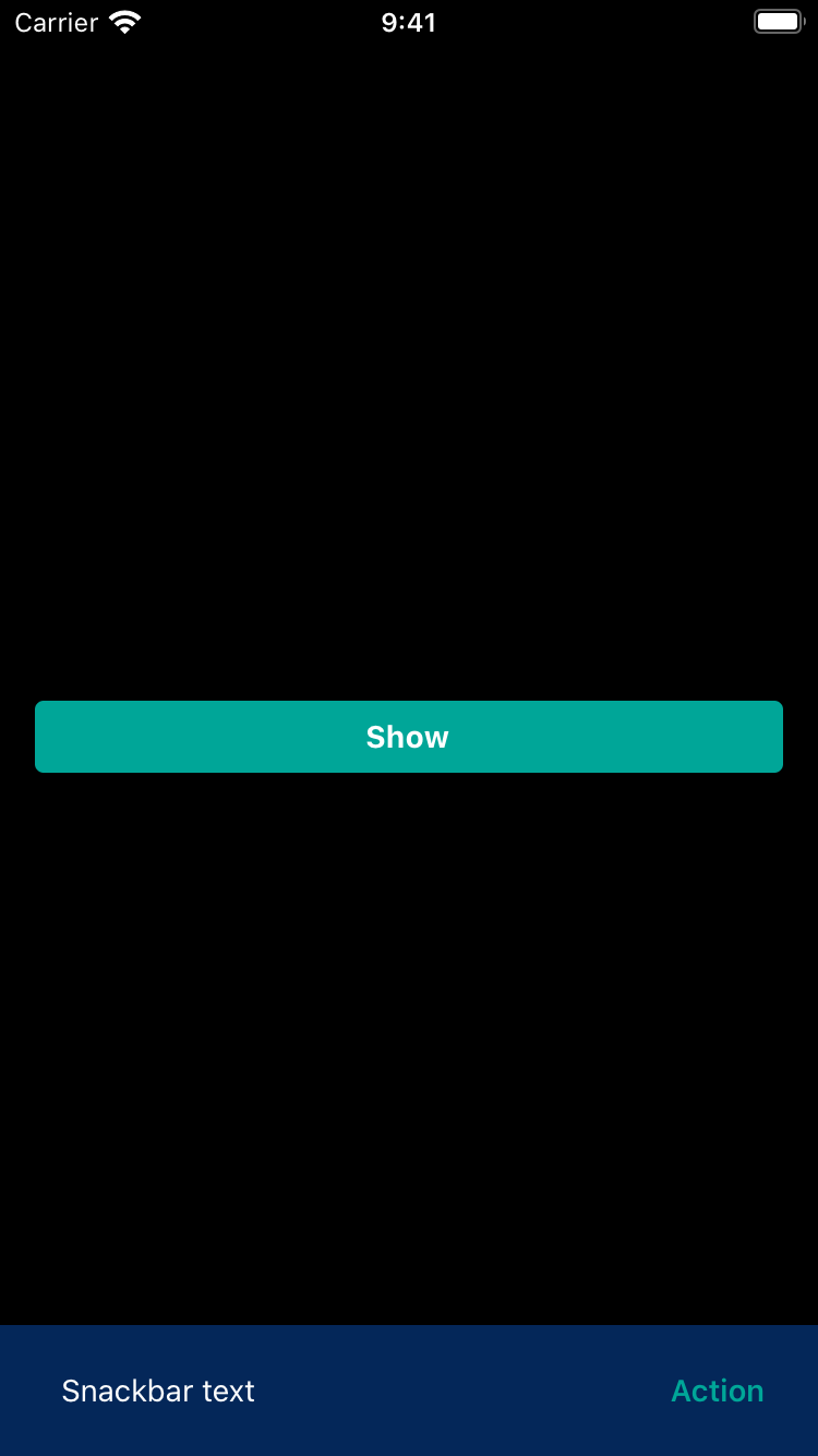
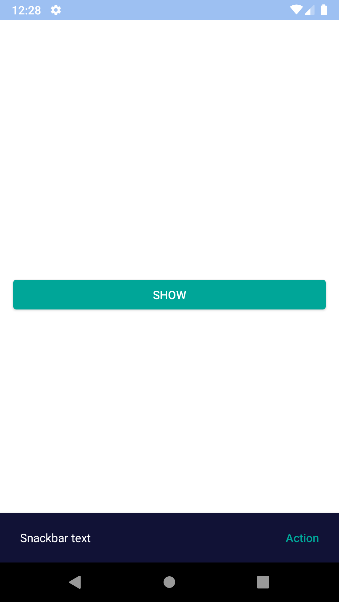
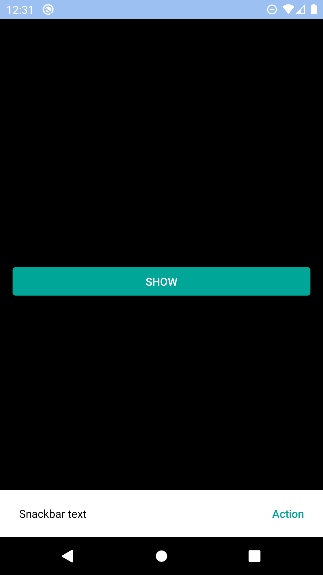
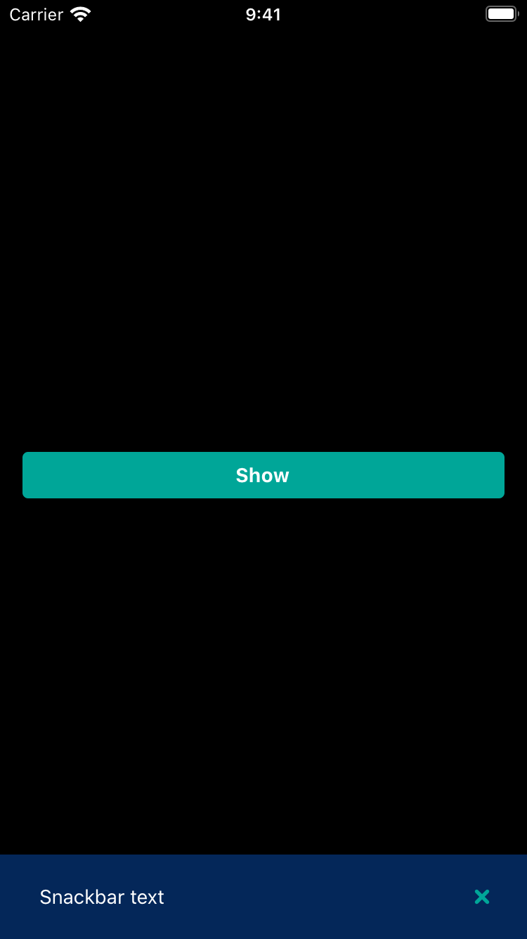
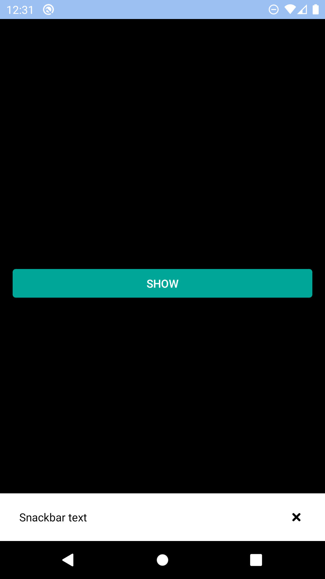
Snackbar
A Snackbar provides brief messages about app processes at the bottom of screen.
bpk-component-snackbar
Backpack React Native snackbar component.
Default
| Day | Night |
|---|---|
 |
 |
 |
 |
Title and icon
| Day | Night |
|---|---|
 |
 |
 |
 |
Action
| Day | Night |
|---|---|
 |
 |
 |
 |
Icon action
| Day | Night |
|---|---|
 |
 |
 |
 |
Installation
Check the main Readme for a complete installation guide.
Usage
                                                import React from 'react';
                                                import BpkAlert from 'backpack-react-native/bpk-component-alert';
                                                import BpkButton from 'backpack-react-native/bpk-component-button';
                                                import { icons } from 'backpack-react-native/bpk-component-icon';
                                                import BpkSnackbar, { SNACKBAR_LENGTHS } from 'backpack-react-native/bpk-component-snackbar';

                                                export default () => (
                                                  <BpkButton
                                                    title="Show"
                                                    onPress={() => {
                                                      BpkSnackbar.show({
                                                        text: 'Snackbar text',
                                                        duration: SNACKBAR_LENGTHS.short,
                                                        title: 'Title',
                                                        icon: icons.flight,
                                                        action: {
                                                          text: 'Action',
                                                          onPress: () => {
                                                            BpkAlert.alert('Action pressed');
                                                          }
                                                        }
                                                      })
                                                    }}
                                                  />
                                                );
Props
BpkSnackbar
| Property | PropType | Required | Default Value |
|---|---|---|---|
| duration | number | true | SNACKBAR_LENGTHS.short |
| text | string | true | - |
| title | string | false | - |
| icon | string | false | - |
| action | object | false | - |
| action.text* | string | true | - |
| action.icon* | string | true | - |
| action.onPress | function | true | - |
NOTES
- when action is provided action.text or action.icon should be provided, but not both at the same time.
Made with ❤️ by Skyscanner © 2024
© 2024 Skyscanner Backpack. Page last updated on Oct 31, 2022, 13:23