- Welcome
- Getting started
- Latest updates
- Foundations
-
Components
- Accordion
- Alert
- Alignment
- App Search Modal
- Aria live
- Autosuggest
- Badge
- Banner alert
- Bar chart
- Blockquote
- Bottom navigation
- Bottom sheet
- Breadcrumb
- Breakpoint
- Button
- Calendar
- Card
- Card list
- Card button
- Carousel
- Checkbox
- Chip
- Chip group
- Code
- Content cards
- Data Table
- Datepicker
- Description list
- Dialog
- Divider
- Drawer
- Field Set
- Flare
- Flat list
- Flight leg
- Floating action button
- Floating notification
- Form label
- Form validation
- Graphic promotion
- Horizontal navigation
- Icon
- Image
- Image Gallery
- Infinite scroll
- Info Banner
- Inset Banner
- Link
- List
- Map
- Mobile scroll container
- Modal
- Navigation bar
- Navigation Tab Group
- Nudger
- Overlay
- Page indicator
- Pagination
- Panel
- Phone input
- Picker
- Popover
- Price
- Progress bar
- Radio button
- Rating
- Rating Bar
- Scrollable calendar
- Search Modal
- Section header
- Section list
- Select
- Skeleton
- Skip link
- Slider
- Snackbar
- Snippet
- Spinner
- Split input
- Star rating
- Swap Button
- Switch
- Table
- Text
- Text input
- Theming
- Ticket
- Toast
- Tooltip
- Touchable native feedback
- Touchable overlay
- Search Input Summary
- Content
- Accessibility
- Contributing
- Localisation
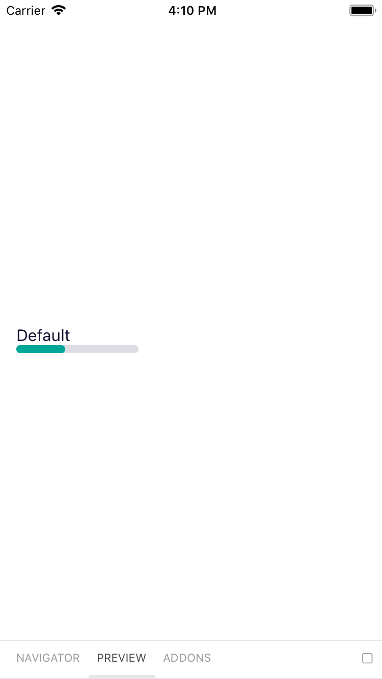
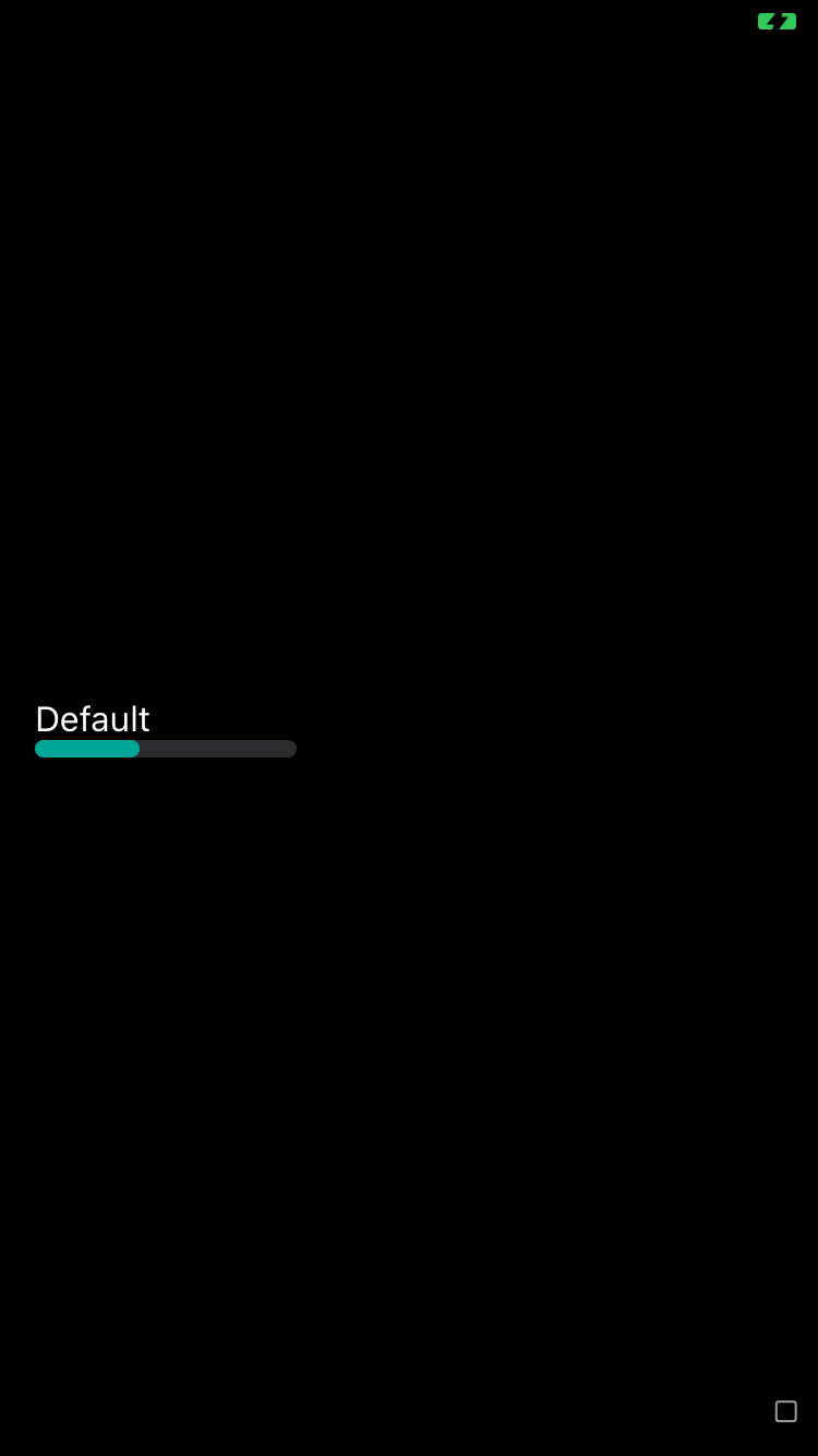
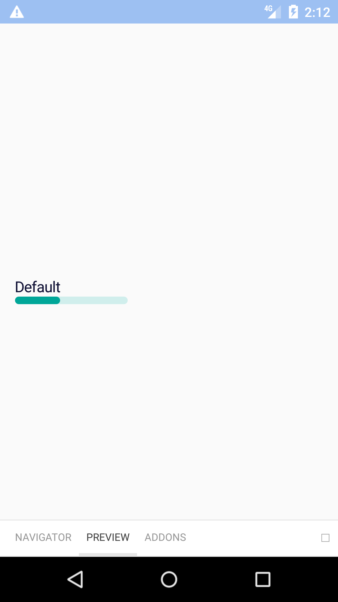
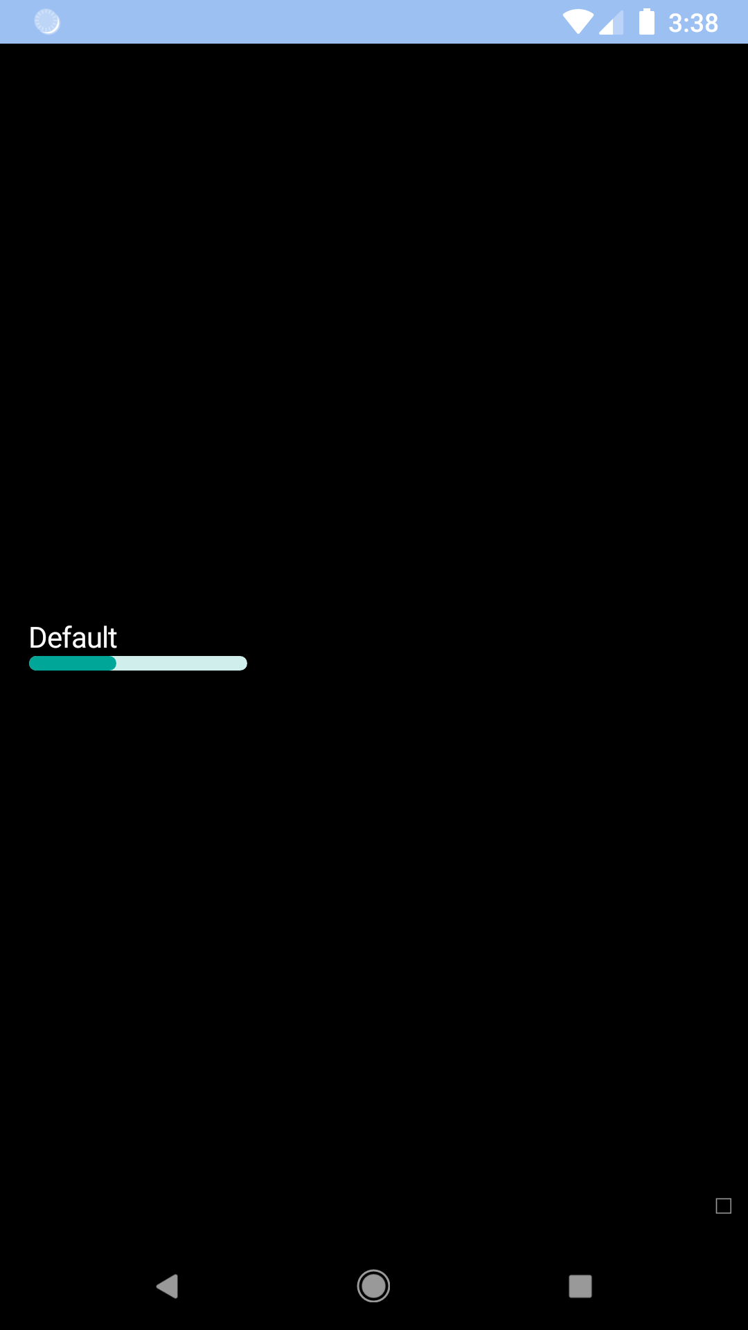
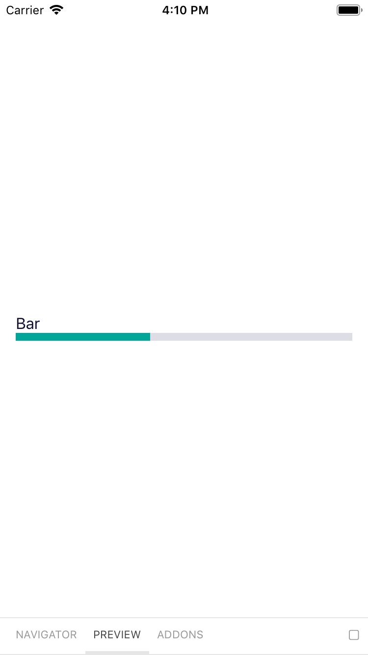
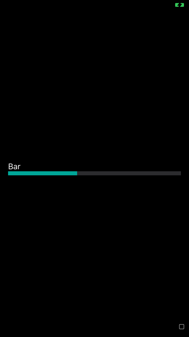
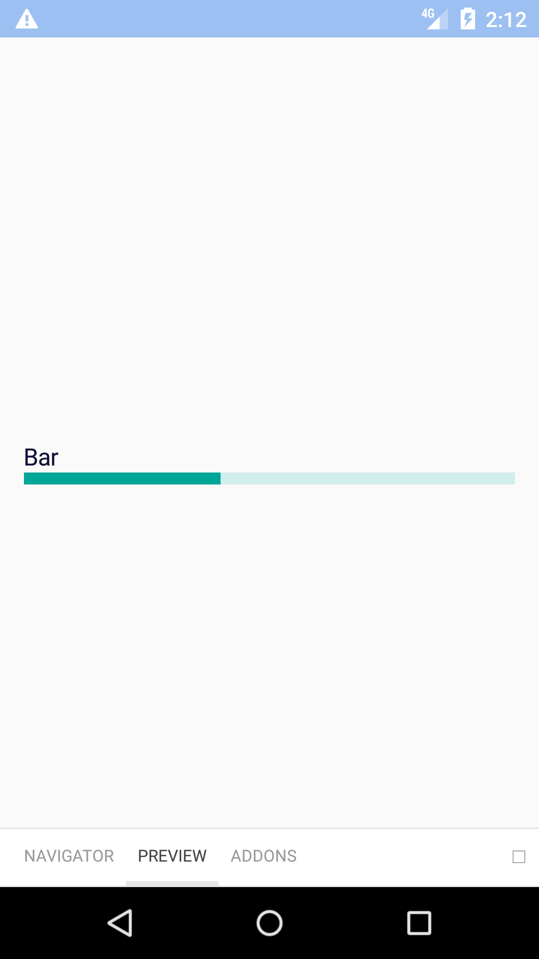
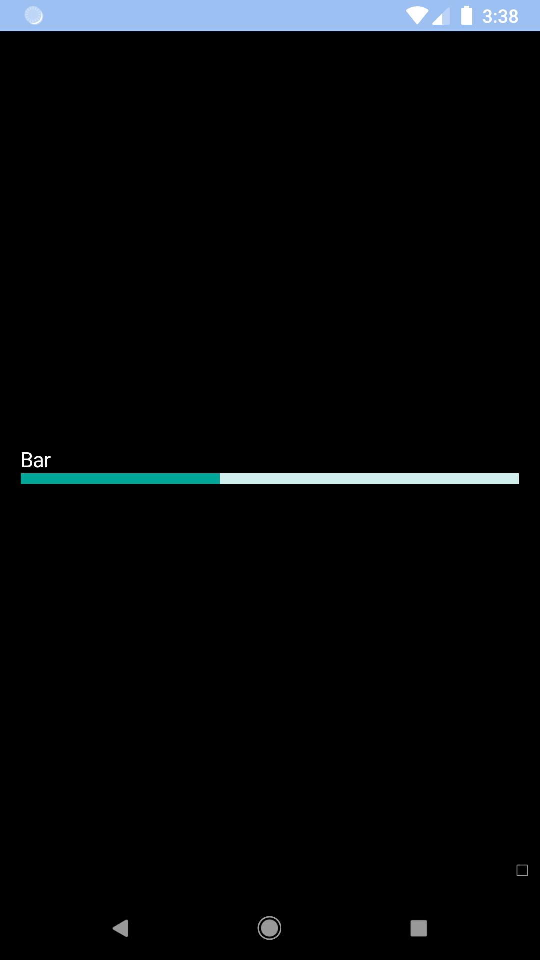
Progress bar
Progress bars are a great way of providing feedback when a task is running. Unlike spinners, they give the user a clear idea of how long the given task will take.
bpk-component-progress
Backpack React Native Progress component.
Default
| Day | Night |
|---|---|
 |
 |
 |
 |
Bar
| Day | Night |
|---|---|
 |
 |
 |
 |
Installation
Check the main Readme for a complete installation guide.
Usage
                                                import React, { Component } from 'react';
                                                import { View, StyleSheet } from 'react-native';
                                                import BpkProgress from 'backpack-react-native/bpk-component-progress';
                                                import { spacingBase } from '@skyscanner/bpk-foundations-react-native/tokens/base.react.native';

                                                const styles = StyleSheet.create({
                                                  container: {
                                                    flex: 1,
                                                    justifyContent: 'center',
                                                    padding: spacingBase,
                                                  },
                                                });

                                                export default class App extends Component {
                                                  render() {
                                                    return (
                                                      <View style={styles.container}>
                                                        <BpkProgress min={0} max={100} value={10} accessibilityLabel="0 of 100" />
                                                        <BpkProgress min={0} max={100} value={10} accessibilityLabel="0 of 100" type="Bar" />
                                                      </View>
                                                    );
                                                  }
                                                }
Props
| Property | PropType | Required | Default Value |
|---|---|---|---|
| accessibilityLabel | oneOfType(string, func) | true | - |
| max | number | true | - |
| min | number | true | - |
| value | number | true | - |
| fillStyle | object | false | - |
| style | object | false | - |
| theme | See Theme Props below | false | - |
| type | oneOf('default', 'bar') | false | default |
Theme Props
- progressFillBackgroundColor,
- progressTrackBackgroundColor
Made with ❤️ by Skyscanner © 2024
© 2024 Skyscanner Backpack. Page last updated on Aug 8, 2023, 08:38