- Welcome
- Getting started
- Latest updates
- Foundations
-
Components
- Accordion
- Alert
- Alignment
- App Search Modal
- Aria live
- Autosuggest
- Badge
- Banner alert
- Bar chart
- Blockquote
- Bottom navigation
- Bottom sheet
- Breadcrumb
- Breakpoint
- Button
- Calendar
- Card
- Card list
- Card button
- Carousel
- Checkbox
- Chip
- Chip group
- Code
- Content cards
- Data Table
- Datepicker
- Description list
- Dialog
- Divider
- Drawer
- Field Set
- Flare
- Flat list
- Flight leg
- Floating action button
- Floating notification
- Form label
- Form validation
- Graphic promotion
- Horizontal navigation
- Icon
- Image
- Image Gallery
- Infinite scroll
- Info Banner
- Inset Banner
- Link
- List
- Map
- Mobile scroll container
- Modal
- Navigation bar
- Navigation Tab Group
- Nudger
- Overlay
- Page indicator
- Pagination
- Panel
- Phone input
- Picker
- Popover
- Price
- Progress bar
- Radio button
- Rating
- Rating Bar
- Scrollable calendar
- Search Modal
- Section header
- Section list
- Select
- Skeleton
- Skip link
- Slider
- Snackbar
- Snippet
- Spinner
- Split input
- Star rating
- Swap Button
- Switch
- Table
- Text
- Text input
- Theming
- Ticket
- Toast
- Tooltip
- Touchable native feedback
- Touchable overlay
- Search Input Summary
- Content
- Accessibility
- Contributing
- Localisation
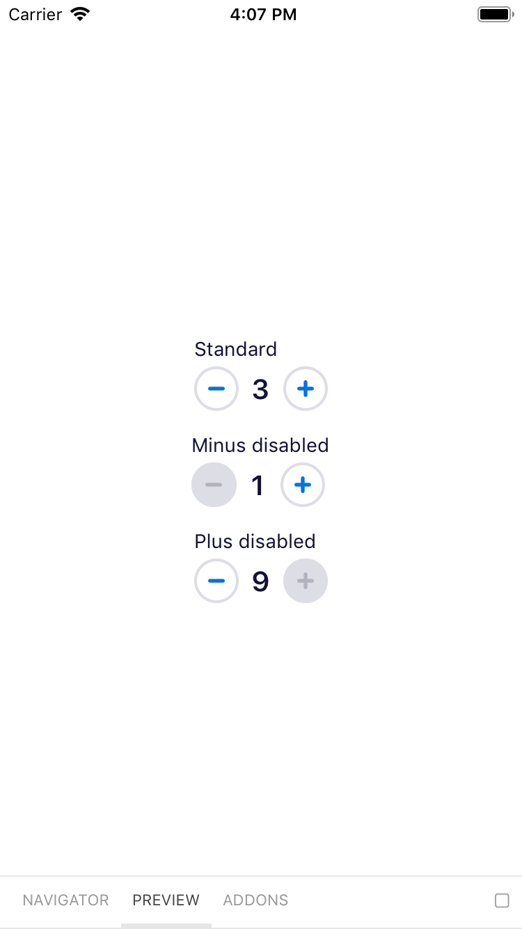
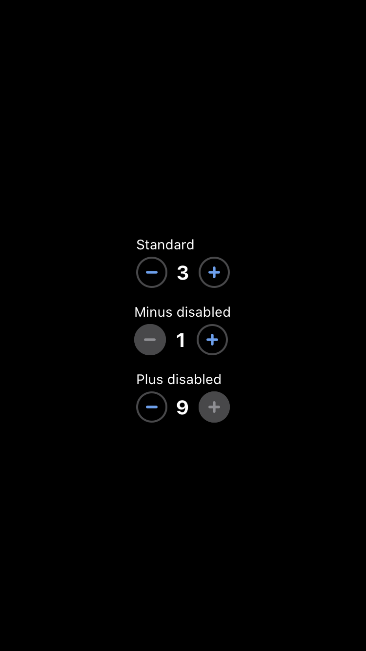
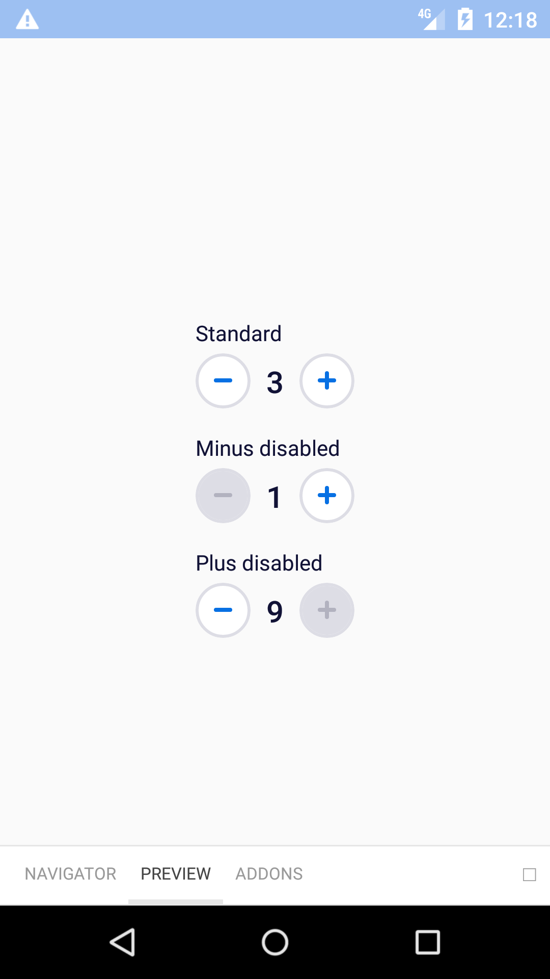
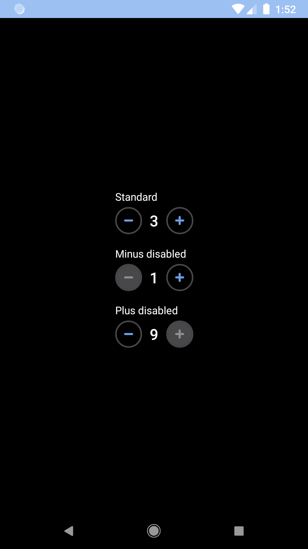
Nudger
Nudgers allow users to quickly specify a value within a given range.
bpk-component-nudger
Backpack React Native nudger component.
Default
| Day | Night |
|---|---|
 |
 |
 |
 |
Installation
Check the main Readme for a complete installation guide.
Usage
                                                import React, { Component } from 'react';
                                                import BpkNudger from 'backpack-react-native/bpk-component-nudger';

                                                export default class App extends Component {
                                                 constructor() {
                                                    super();
                                                    this.state = { value: 1 };
                                                  }

                                                  handleChange = (value) => {
                                                    this.setState({ value });
                                                  }

                                                  render() {
                                                    return (
                                                      <BpkNudger
                                                        min={1}
                                                        max={10}
                                                        value={this.state.value}
                                                        onChange={this.handleChange}
                                                        decreaseButtonLabel="Decrease"
                                                        increaseButtonLabel="Increase"
                                                      />
                                                    );
                                                  }
                                                }
Props
| Property | PropType | Required | Default Value |
|---|---|---|---|
| decreaseButtonLabel | string | true | - |
| increaseButtonLabel | string | true | - |
| max | number | true | - |
| min | number | true | - |
| onChange | func | true | - |
| value | number | true | - |
| theme | See Theme Props below | false | null |
Theme Props
Same as secondary button.
Made with ❤️ by Skyscanner © 2024
© 2024 Skyscanner Backpack. Page last updated on Apr 28, 2023, 02:22