- Welcome
- Getting started
- Latest updates
- Foundations
-
Components
- Accordion
- Alert
- Alignment
- App Search Modal
- Aria live
- Autosuggest
- Badge
- Banner alert
- Bar chart
- Blockquote
- Bottom navigation
- Bottom sheet
- Breadcrumb
- Breakpoint
- Button
- Calendar
- Card
- Card list
- Card button
- Carousel
- Checkbox
- Chip
- Chip group
- Code
- Content cards
- Data Table
- Datepicker
- Description list
- Dialog
- Divider
- Drawer
- Field Set
- Flare
- Flat list
- Flight leg
- Floating action button
- Floating notification
- Form label
- Form validation
- Graphic promotion
- Horizontal navigation
- Icon
- Image
- Image Gallery
- Infinite scroll
- Info Banner
- Inset Banner
- Link
- List
- Map
- Mobile scroll container
- Modal
- Navigation bar
- Navigation Tab Group
- Nudger
- Overlay
- Page indicator
- Pagination
- Panel
- Phone input
- Picker
- Popover
- Price
- Progress bar
- Radio button
- Rating
- Rating Bar
- Scrollable calendar
- Search Modal
- Section header
- Section list
- Select
- Skeleton
- Skip link
- Slider
- Snackbar
- Snippet
- Spinner
- Split input
- Star rating
- Swap Button
- Switch
- Table
- Text
- Text input
- Theming
- Ticket
- Toast
- Tooltip
- Touchable native feedback
- Touchable overlay
- Search Input Summary
- Content
- Accessibility
- Contributing
- Localisation
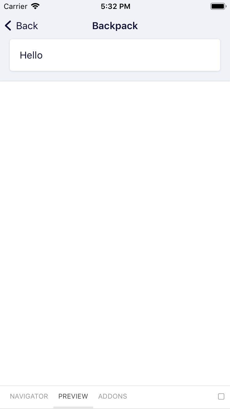
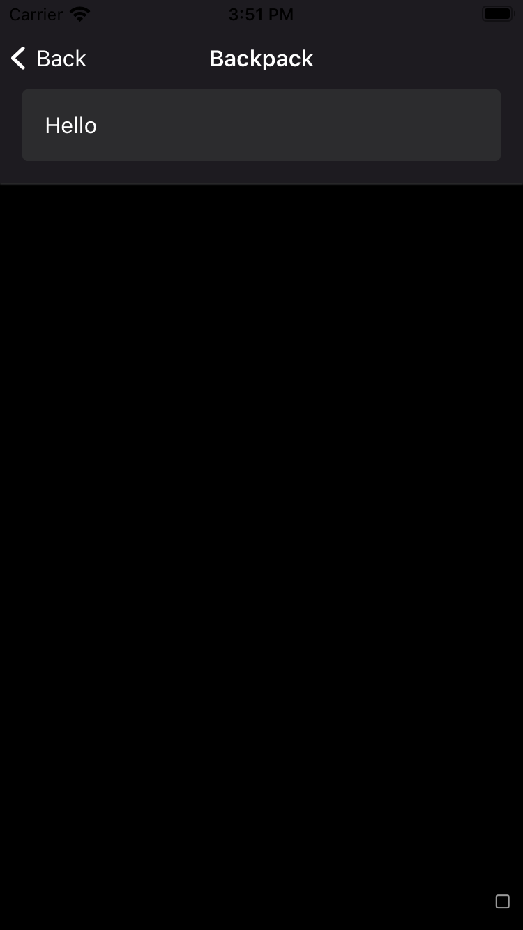
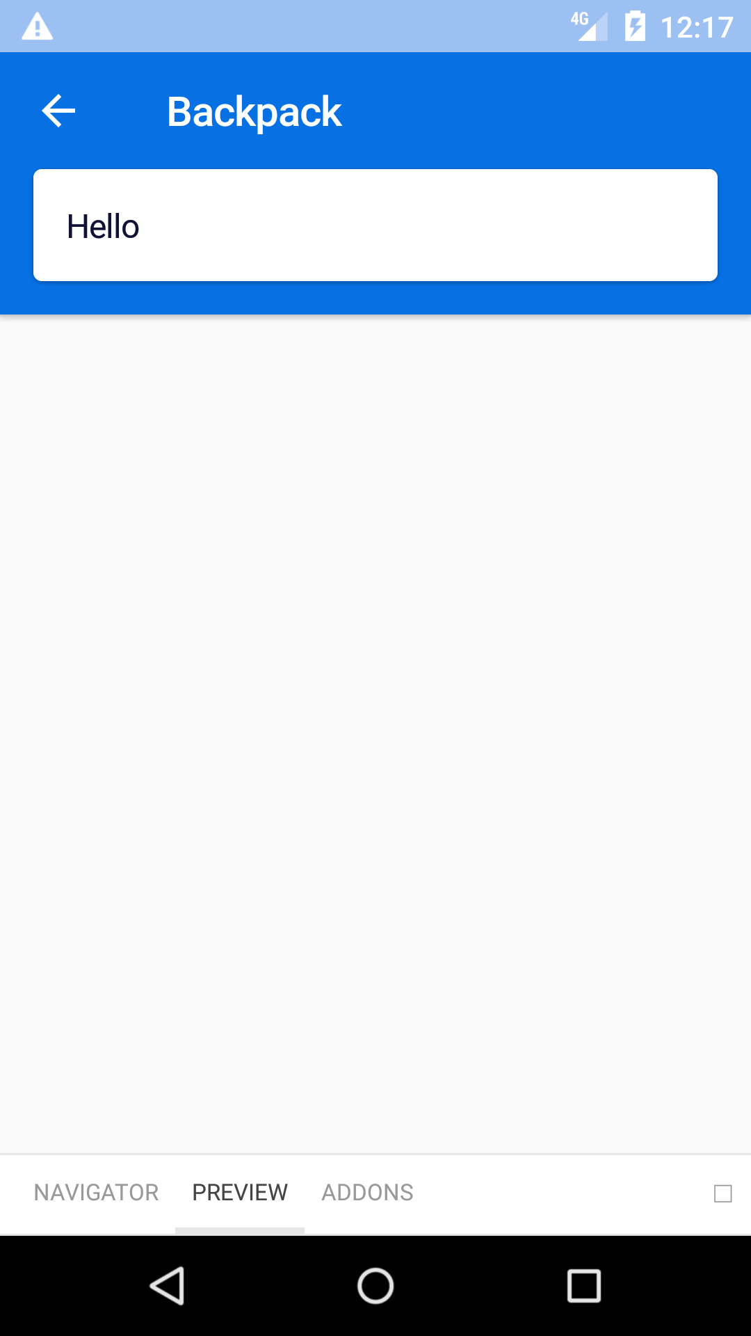
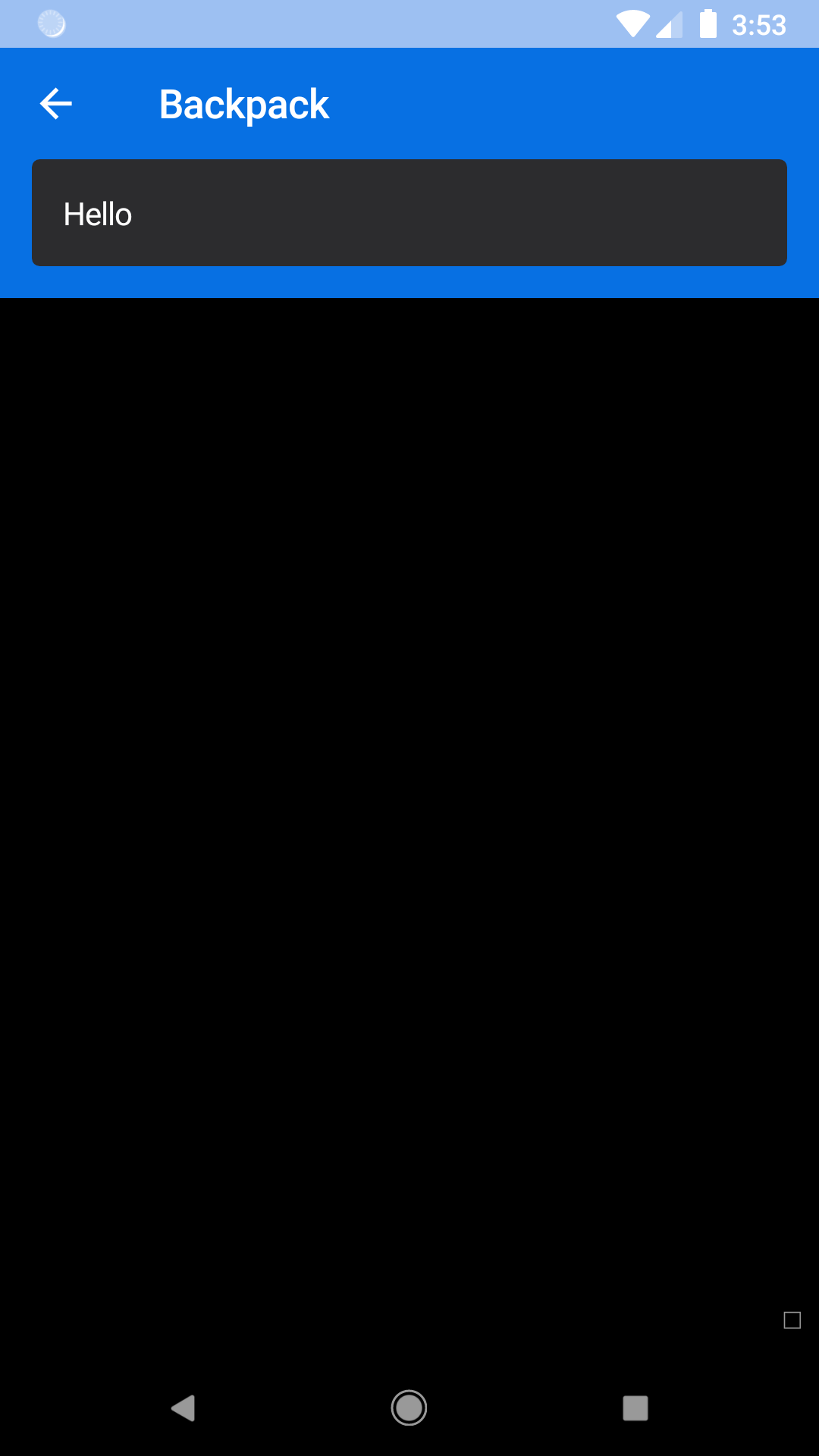
Navigation bar
The navigation bar component encapsulates a title and icon/text actions for controlling views.
bpk-component-navigation-bar
Backpack React Native navigation bar component.
Default
| Day | Night |
|---|---|
 |
 |
 |
 |
Modal
| Day | Night |
|---|---|
 |
 |
 |
 |
Subtitle view
| Day | Night |
|---|---|
 |
 |
 |
 |
Installation
Check the main Readme for a complete installation guide.
Usage
The component has slightly different APIs on iOS and Android. For both platforms the BpkNavigationBar is the main component to use. On Android we additionally provide BpkNavigationBarButtonAndroid to render the leading and trailing bar buttons. On iOS there are a few more variations of buttons and we provide three components:
- BpkNavigationBarBackButtonIOS for rendering a back item with an optional title.
- BpkNavigationBarTextButtonIOS for rendering a text button.
- BpkNavigationBarIconButtonIOS for rendering an icon only button.
Android
                                                import React from "react";
                                                import { I18nManager } from "react-native";
                                                import BpkNavigationBar, {
                                                  BpkNavigationBarButtonAndroid
                                                } from "bpk-component-navigation-bar";

                                                const backIcon = () =>
                                                  I18nManager.isRTL ? "native-android--forward" : "native-android--back";

                                                export default () => (
                                                  <BpkNavigationBar
                                                    leadingButton={
                                                      <BpkNavigationBarButtonAndroid
                                                        title={translationHelper.t("back-button-title")}
                                                        icon={backIcon}
                                                        onPress={() => null}
                                                      />
                                                    }
                                                    title={translationHelper.t("navigation-bar-title")}
                                                  />
                                                );
iOS
                                                import React from "react";
                                                import { I18nManager } from "react-native";
                                                import BpkNavigationBar, {
                                                  BpkNavigationBarBackButtonIOS
                                                } from "bpk-component-navigation-bar";

                                                export default () => (
                                                  <BpkNavigationBar
                                                    leadingButton={
                                                      <BpkNavigationBarBackButtonIOS
                                                        title={translationHelper.t("back-button-title")}
                                                        showTitle
                                                        onPress={() => null}
                                                      />
                                                    }
                                                    title={translationHelper.t("navigation-bar-title")}
                                                  />
                                                );
Components
BpkNavigationBar
Renders the navigation bar.
import BpkNavigationBar from 'backpack-react-native/bpk-component-navigation-bar'Props
| Property | PropType | Required | Default Value |
|---|---|---|---|
| title | oneOf(string, titleWithIcon shape) | true | - |
| theme | object | false | null |
| leadingButton | button element | false | null |
| trailingButton | button element | false | null |
| subtitleView | element | false | null |
titleWithIcon is an object with the shape
                                                PropTypes.shape({
                                                  value: PropTypes.string.isRequired, // The title to use
                                                  icon: PropTypes.string.isRequired, // The name of a Backpack icon e.g "lock"
                                                  iconPosition: PropTypes.oneOf(['leading', 'trailing']),
                                                });
Theme Props
Common:
- navigationBarBackgroundColor
- navigationBarTintColor
- navigationBarDisabledTintColor
Android:
- navigationBarStatusBarColor
iOS:
- navigationBarShadowColor
- navigationBarPrimaryColor
BpkNavigationBarButtonAndroid
Renders bar buttons on Android only.
import { BpkNavigationBarButtonAndroid } from 'backpack-react-native/bpk-component-navigation-bar'Props
| Property | PropType | Required | Default Value |
|---|---|---|---|
| title | string | true | - |
| icon | oneOf(Object.keys(BpkIcons.icon)) | true | - |
| onPress | func | false | null |
| disabled | bool | false | false |
BpkNavigationBarBackButtonIOS
Renders a back button on iOS with optional support to show a title.
import { BpkNavigationBarBackButtonIOS } from 'backpack-react-native/bpk-component-navigation-bar'Props
| Property | PropType | Required | Default Value |
|---|---|---|---|
| title | string | true | - |
| showTitle | bool | false | false |
| onPress | func | false | null |
BpkNavigationBarTextButtonIOS
Renders a text button on iOS.
import { BpkNavigationBarTextButtonIOS } from 'backpack-react-native/bpk-component-navigation-bar'Props
| Property | PropType | Required | Default Value |
|---|---|---|---|
| title | string | true | - |
| disabled | bool | false | false |
| emphasize | bool | false | false |
| onPress | func | false | null |
| type | oneOf('default', 'primary') | false | default |
BpkNavigationBarIconButtonIOS
Renders a text button on iOS.
import { BpkNavigationBarIconButtonIOS } from 'backpack-react-native/bpk-component-navigation-bar'Props
| Property | PropType | Required | Default Value |
|---|---|---|---|
| title | string | true | - |
| icon | oneOf(Object.keys(BpkIcons.icon)) | true | - |
| onPress | func | false | null |
| disabled | bool | false | false |
Made with ❤️ by Skyscanner © 2024
© 2024 Skyscanner Backpack. Page last updated on Oct 31, 2022, 13:20