- Welcome
- Getting started
- Latest updates
- Foundations
-
Components
- Accordion
- Alert
- Alignment
- App Search Modal
- Aria live
- Autosuggest
- Badge
- Banner alert
- Bar chart
- Blockquote
- Bottom navigation
- Bottom sheet
- Breadcrumb
- Breakpoint
- Button
- Calendar
- Card
- Card list
- Card button
- Carousel
- Checkbox
- Chip
- Chip group
- Code
- Content cards
- Data Table
- Datepicker
- Description list
- Dialog
- Divider
- Drawer
- Field Set
- Flare
- Flat list
- Flight leg
- Floating action button
- Floating notification
- Form label
- Form validation
- Graphic promotion
- Horizontal navigation
- Icon
- Image
- Image Gallery
- Infinite scroll
- Info Banner
- Inset Banner
- Link
- List
- Map
- Mobile scroll container
- Modal
- Navigation bar
- Navigation Tab Group
- Nudger
- Overlay
- Page indicator
- Pagination
- Panel
- Phone input
- Picker
- Popover
- Price
- Progress bar
- Radio button
- Rating
- Rating Bar
- Scrollable calendar
- Search Modal
- Section header
- Section list
- Select
- Skeleton
- Skip link
- Slider
- Snackbar
- Snippet
- Spinner
- Split input
- Star rating
- Swap Button
- Switch
- Table
- Text
- Text input
- Theming
- Ticket
- Toast
- Tooltip
- Touchable native feedback
- Touchable overlay
- Search Input Summary
- Content
- Accessibility
- Contributing
- Localisation
Link
This component enables links to other resources, pages or views.
Backpack/TappableLinkLabel

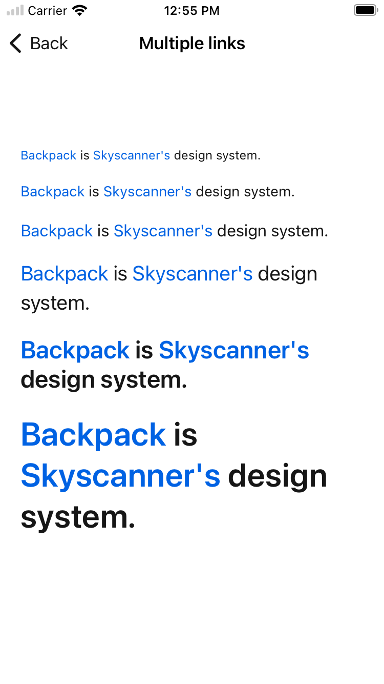
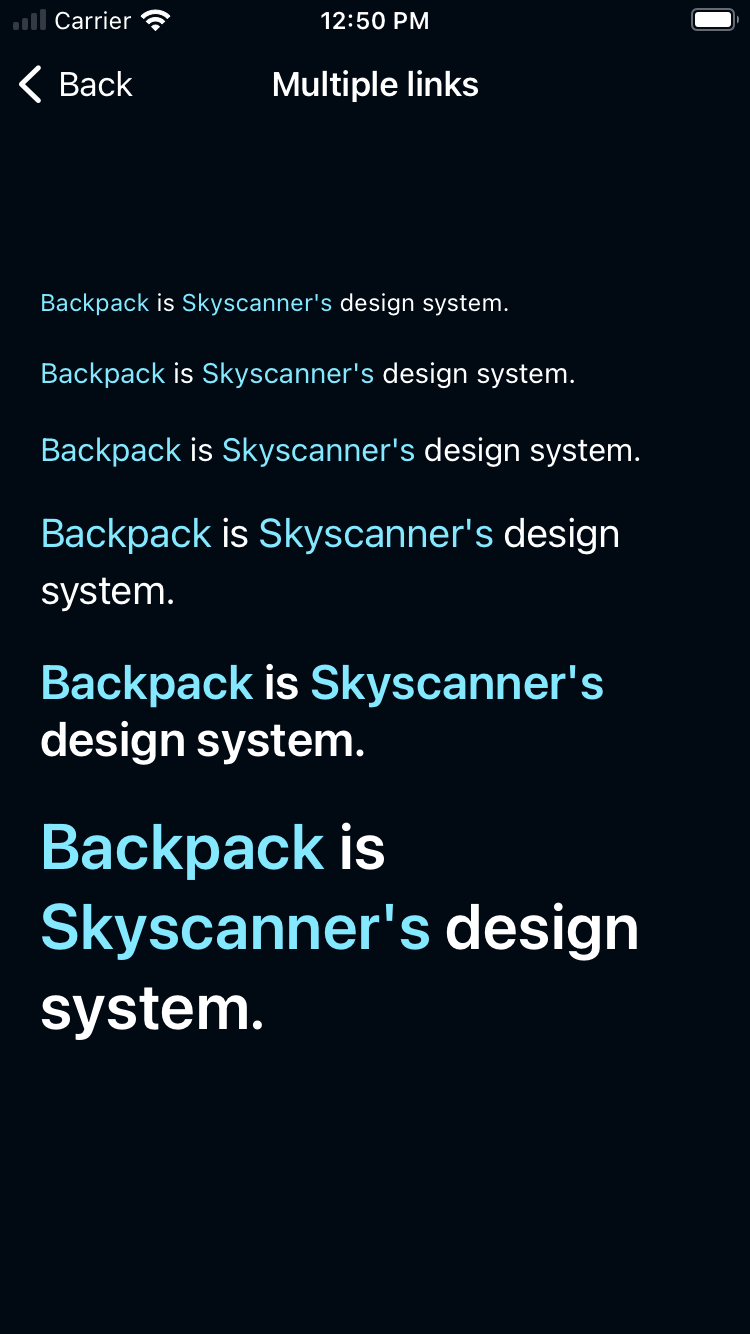
With multiple links
| Day | Night |
|---|---|
 |
 |
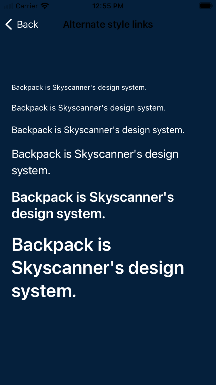
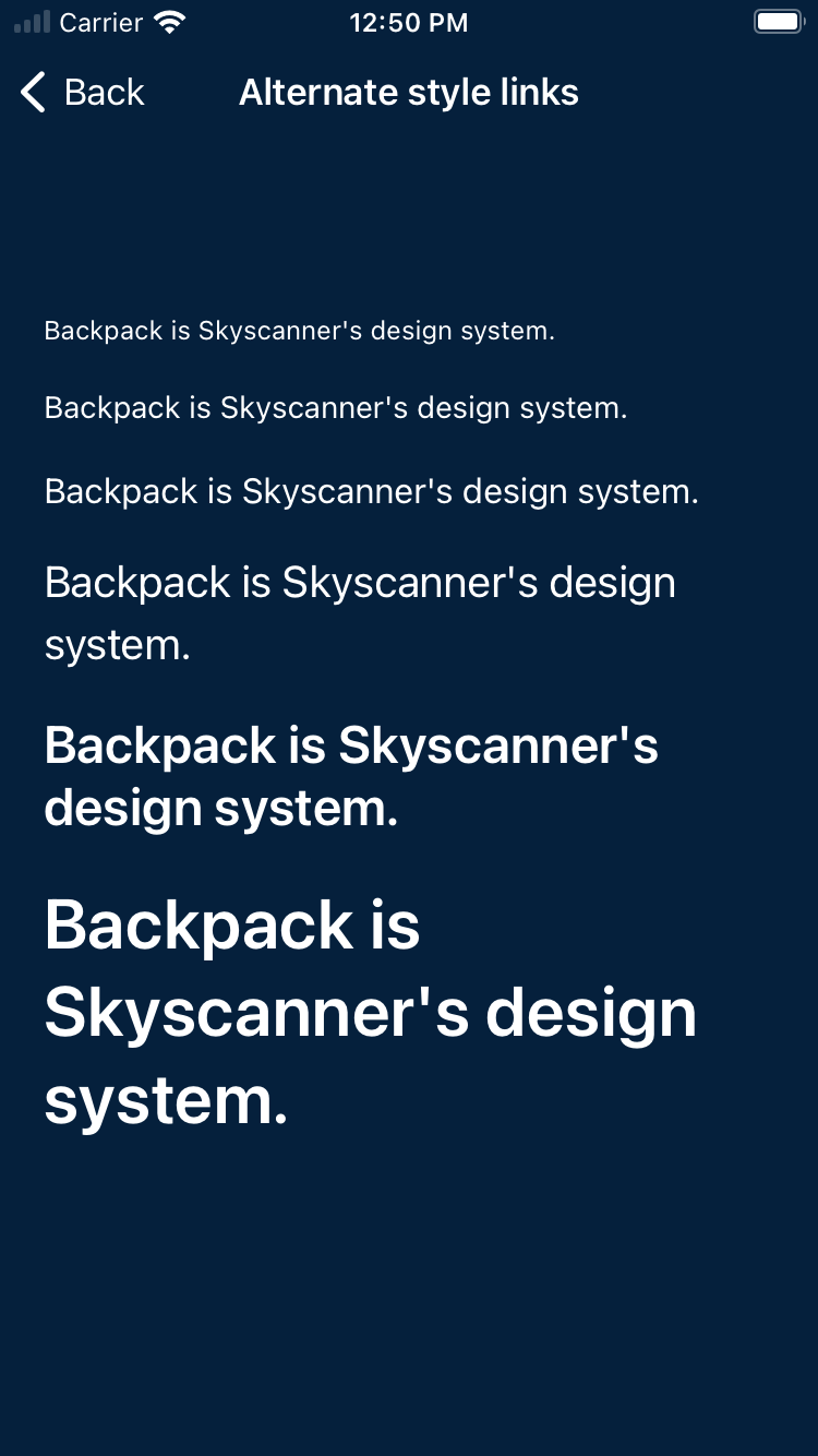
Alternate style
| Day | Night |
|---|---|
 |
 |
Usage
BPKTappableLinkLabel is a view that renders flowing text that can include tappable links as part of its content.
Objective-C
                                                #import <Backpack/TappableLinkLabel.h>

                                                BPKTappableLinkLabel *tappableLinkLabel = [[BPKTappableLinkLabel alloc] initWithFontStyle:BPKFontStyleTextBase];
                                                tappableLinkLabel.text = @“Find out more about our terms of service.”
                                                tappableLinkLabel.delegate = self;

                                                [tappableLinkLabel addLinkToURL:[NSURL URLWithString:@"http:..."] withRange:NSRange(location:24, length:16)];
                                                [tappableLinkLabel addLinkToTransitInformation:@{} withRange:NSRange(location:24, length:16)];
                                                // Position label with autolayout or other method

                                                // Apply alternative style:
                                                tappableLinkLabel.style = BPKTappableLinkLabelStyleAlternative;

                                                // Apply custom text color:
                                                tappableLinkLabel.textColor = BPKColor.panjin;

                                                ...

                                                #pragma mark - <BPKTappableLinkLabelDelegate>

                                                - (void)tappableLabel:(BPKTappableLinkLabel *)label didSelectLinkWithURL:(NSURL *)url {
                                                    [_presenter urlTapped:url];
                                                }

                                                - (void)tappableLabel:(BPKTappableLinkLabel *)label didSelectLinkWithTransitInformation:(NSDictionary *)components {
                                                    // do stuff
                                                }
Swift
                                                import Backpack

                                                let tappableLinkLabel = BPKTappableLinkLabel(fontStyle: .textBase)
                                                tappableLinkLabel.text = “Find out more about our terms of service.”
                                                tappableLinkLabel.delegate = self

                                                tappableLinkLabel.addLink(to: URL(string: "https:...")!, withRange: Range(location:24, length:16))
                                                tappableLinkLabel.addLink(toTransitInformation: ["identifier": "some link thing"], withRange: Range(location:24, length:16))
                                                // Position label with autolayout or other method

                                                // Apply alternative style:
                                                tappableLinkLabel.style = .alternative

                                                // Apply custom text color:
                                                tappableLinkLabel.textColor = BPKColor.panjin

                                                ...

                                                extension MyClass: BPKTappableLinkLabelDelegate {
                                                  func tappableLabel(_ label: BPKTappableLinkLabel, didSelectLinkWith url: URL) {
                                                      UIApplication.shared.open(url, options: [:], completionHandler: nil)
                                                  }

                                                  func tappableLabel(_ label: BPKTappableLinkLabel,
                                                                       didSelectLinkWithTransitInformation components: [AnyHashable: Any]) {
                                                      print(components)
                                                  }
                                                }
Appearance attributes
- (UIColor)linkContentColor
Made with ❤️ by Skyscanner © 2024
© 2024 Skyscanner Backpack. Page last updated on Feb 14, 2023, 16:57