- Welcome
- Getting started
- Latest updates
- Foundations
-
Components
- Accordion
- Alert
- Alignment
- App Search Modal
- Aria live
- Autosuggest
- Badge
- Banner alert
- Bar chart
- Blockquote
- Bottom navigation
- Bottom sheet
- Breadcrumb
- Breakpoint
- Button
- Calendar
- Card
- Card list
- Card button
- Carousel
- Checkbox
- Chip
- Chip group
- Code
- Content cards
- Data Table
- Datepicker
- Description list
- Dialog
- Divider
- Drawer
- Field Set
- Flare
- Flat list
- Flight leg
- Floating action button
- Floating notification
- Form label
- Form validation
- Graphic promotion
- Horizontal navigation
- Icon
- Image
- Image Gallery
- Infinite scroll
- Info Banner
- Inset Banner
- Link
- List
- Map
- Mobile scroll container
- Modal
- Navigation bar
- Navigation Tab Group
- Nudger
- Overlay
- Page indicator
- Pagination
- Panel
- Phone input
- Picker
- Popover
- Price
- Progress bar
- Radio button
- Rating
- Rating Bar
- Scrollable calendar
- Search Modal
- Section header
- Section list
- Select
- Skeleton
- Skip link
- Slider
- Snackbar
- Snippet
- Spinner
- Split input
- Star rating
- Swap Button
- Switch
- Table
- Text
- Text input
- Theming
- Ticket
- Toast
- Tooltip
- Touchable native feedback
- Touchable overlay
- Search Input Summary
- Content
- Accessibility
- Contributing
- Localisation
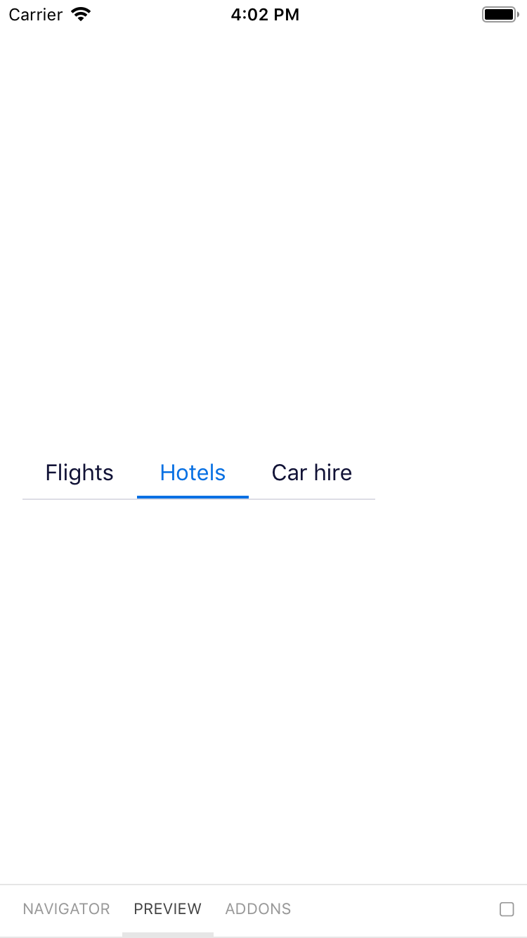
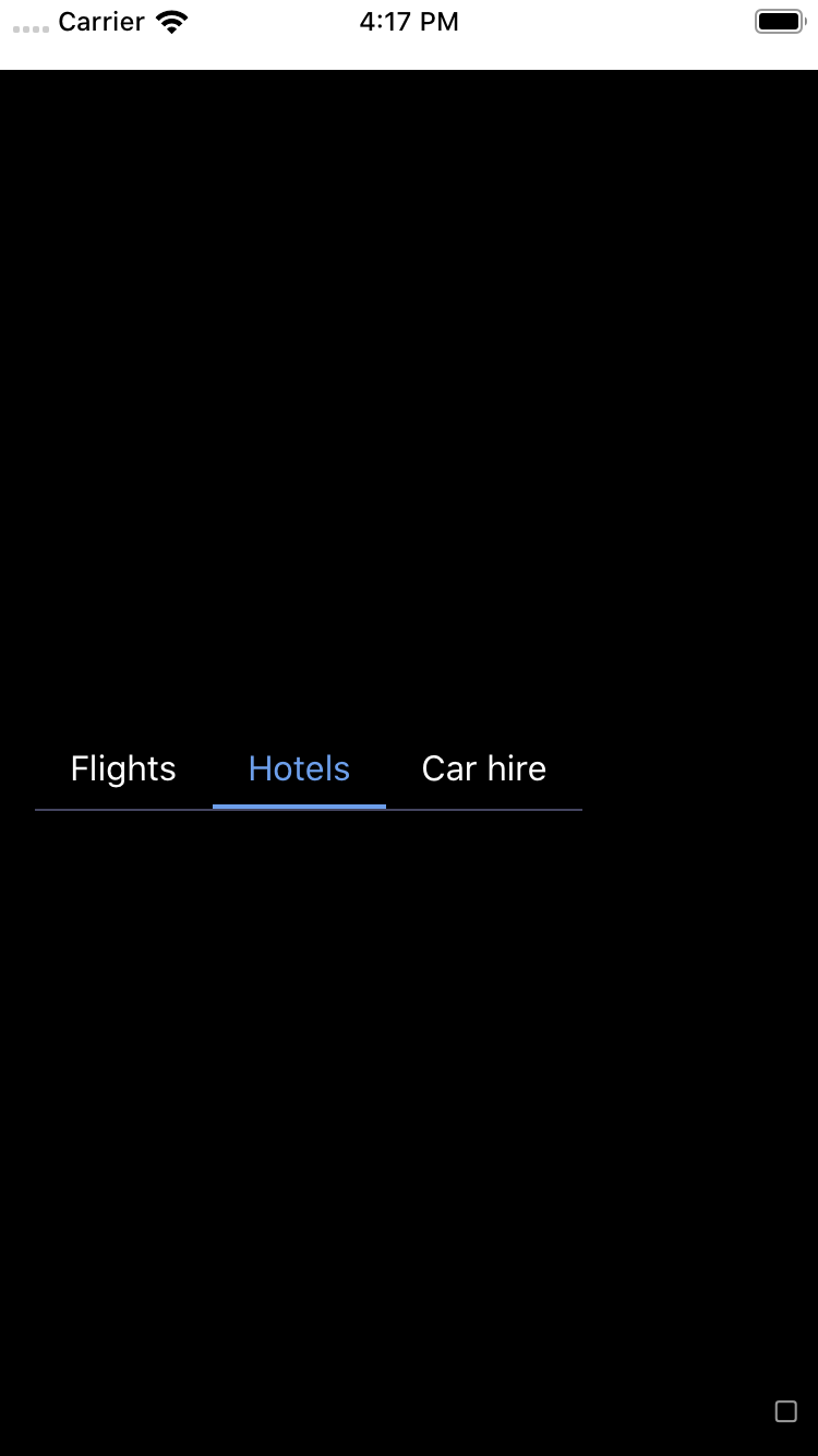
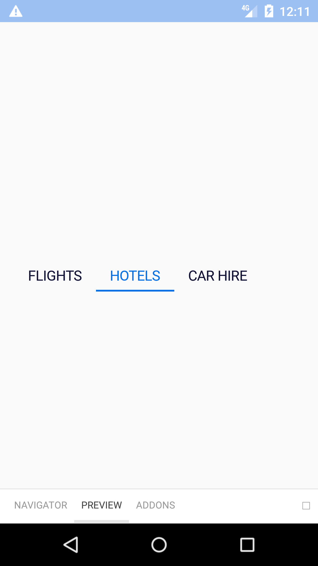
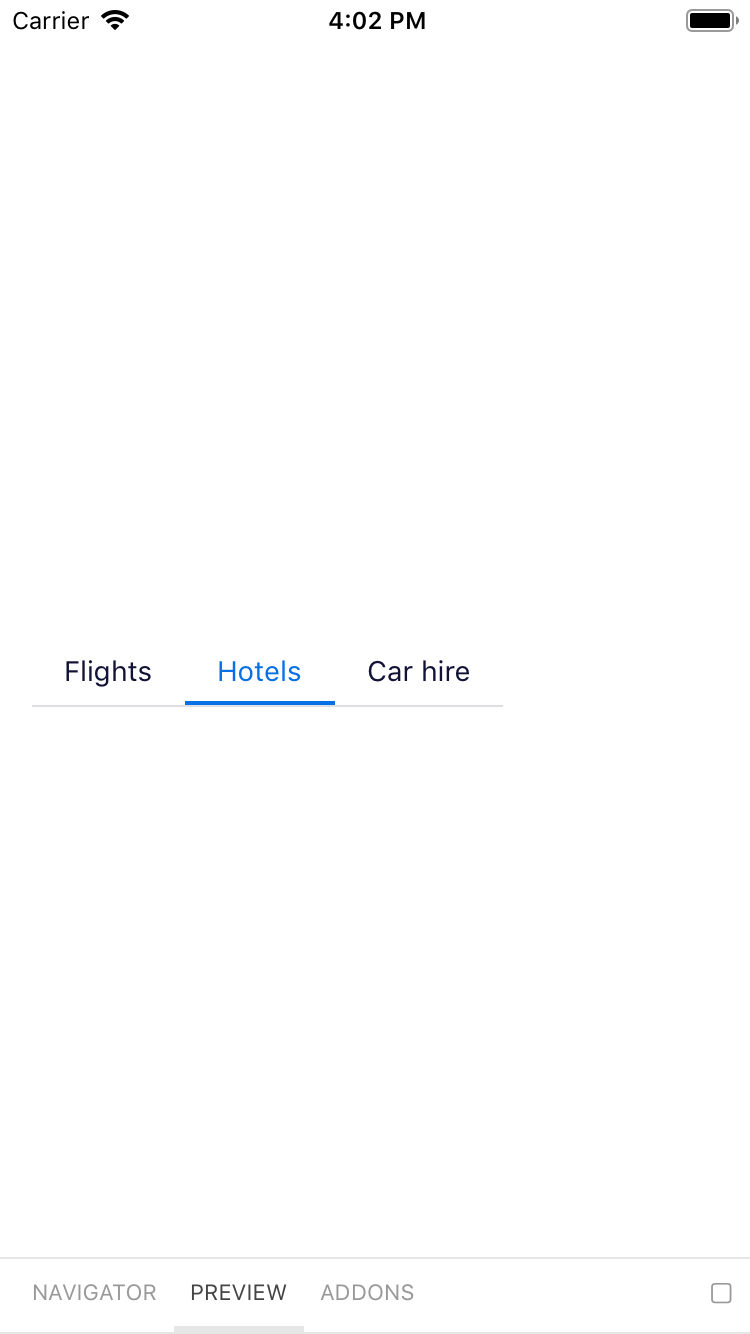
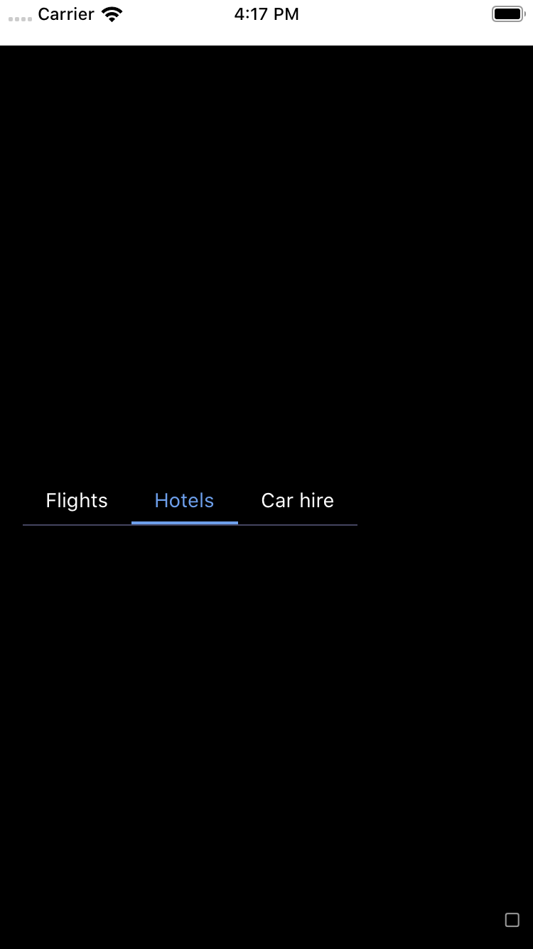
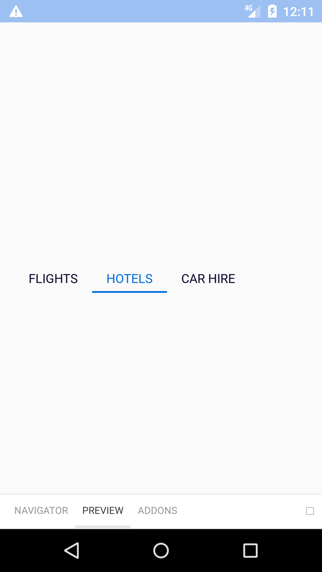
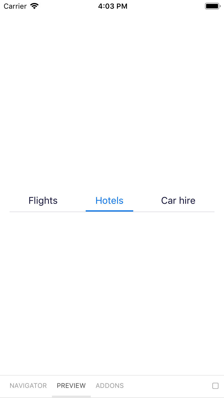
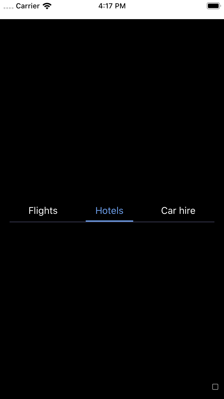
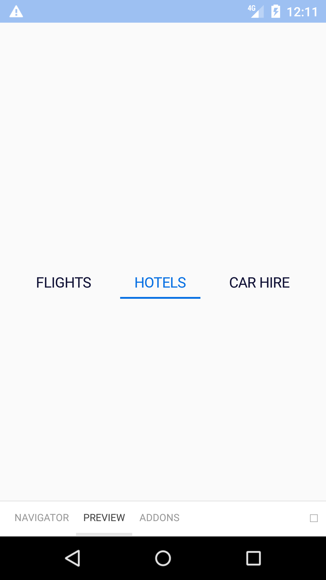
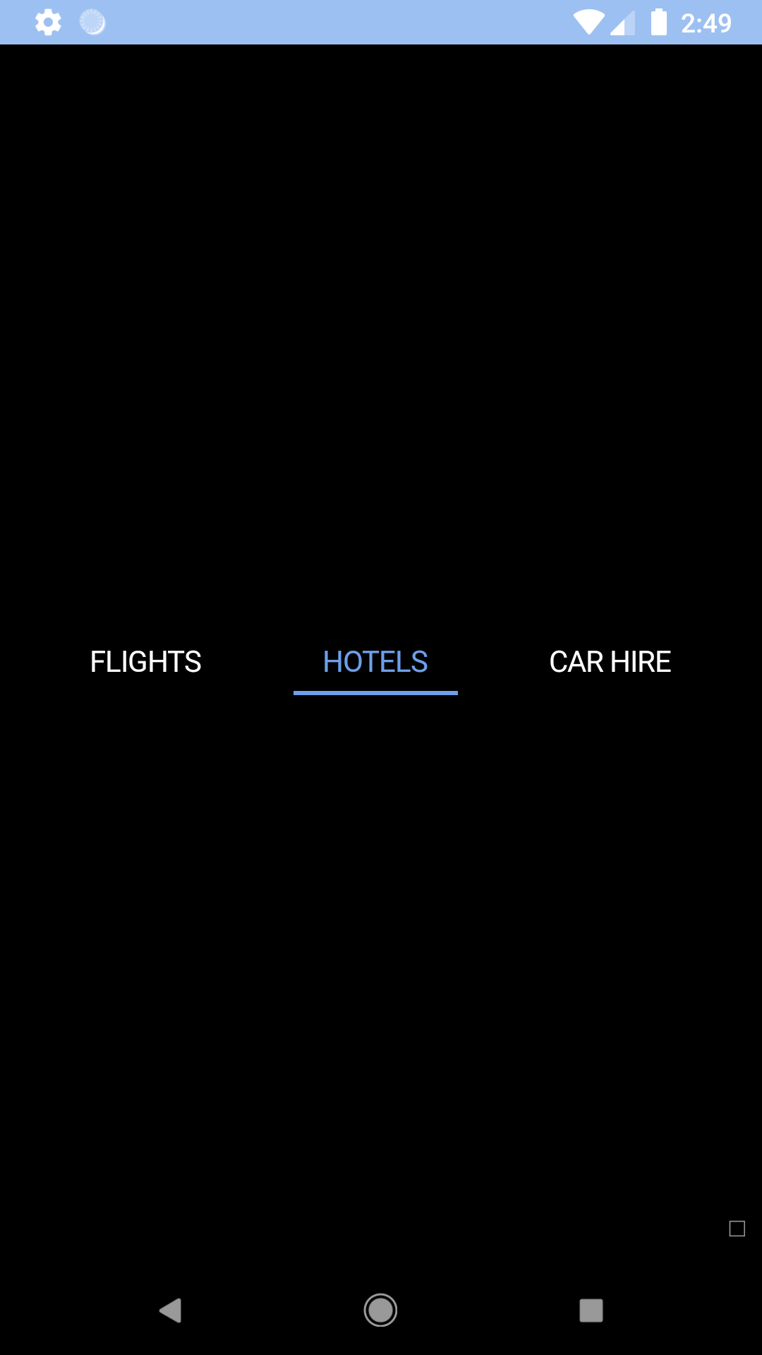
Horizontal navigation
A simple navigation component, ideal for representing a section of a page that links to other pages or views within the page.
bpk-component-horizontal-nav
Backpack React Native horizontal navigation component.
Default
| Day | Night |
|---|---|
 |
 |
 |
 |
Small
| Day | Night |
|---|---|
 |
 |
 |
 |
Space around
| Day | Night |
|---|---|
 |
 |
 |
 |
Installation
Check the main Readme for a complete installation guide.
Usage
                                                import React, { Component } from 'react';
                                                import BpkHorizontalNav, { BpkHorizontalNavItem } from 'backpack-react-native/bpk-component-horizontal-nav';

                                                export default class App extends Component {
                                                  constructor() {
                                                    super();
                                                    this.state = {
                                                      selectedId: 'flights',
                                                    };
                                                  }

                                                  render() {
                                                    return (
                                                      <BpkHorizontalNav selectedId={this.state.selectedId}>
                                                        <BpkHorizontalNavItem
                                                          id="flights"
                                                          title="Flights"
                                                          onPress={() => {
                                                            this.setState({ selectedId: 'flights' });
                                                          }}
                                                        />
                                                        <BpkHorizontalNavItem
                                                          id="hotels"
                                                          title="Hotels"
                                                          onPress={() => {
                                                            this.setState({ selectedId: 'hotels' });
                                                          }}
                                                        />
                                                        <BpkHorizontalNavItem
                                                          id="car-hire"
                                                          title="Car hire"
                                                          onPress={() => {
                                                            this.setState({ selectedId: 'car-hire' });
                                                          }}
                                                        />
                                                      </BpkHorizontalNav>
                                                    );
                                                  }
                                                };
Props
BpkHorizontalNav
| Property | PropType | Required | Default Value |
|---|---|---|---|
| children | node | true | - |
| selectedId | string (matching id prop of BpkHorizontalNavItem child) | true | - |
| selectedIndicatorStyle | style object | false | null |
| spaceAround | bool | false | false |
selectedIndicatorStyle
Styles to apply to the indicator placed below the selected nav item.
BpkHorizontalNavItem
| Property | PropType | Required | Default Value |
|---|---|---|---|
| id | string | true | - |
| onPress | func | true | - |
| title | string | true | - |
| accessibilityLabel | string | false | props.title |
| disabled | bool | false | false |
| small | bool | false | false |
| textStyle | style object | false | null |
| theme | See Theme Props below | false | null |
textStyle
Styles to apply to the BpkText component inside the nav item.
Theme Props
BpkHorizontalNav
- horizontalNavSelectedTextColor
BpkHorizontalNavItem
- horizontalNavSelectedTextColor
Made with ❤️ by Skyscanner © 2024
© 2024 Skyscanner Backpack. Page last updated on Dec 7, 2022, 09:57