The graphic promotion component displays carefully crafted words and complementary imagery.
Imagery

When using text with images you may need to darken the entire image, add a scrim, or reduce image complexity by removing objects, cropping, or limiting the colours.
Consider scale when using images with people. Subjects can fill the frame or be recessive and used to show scale. Think how small a person looks compared to a mountain.
Buttons
Buttons on graphic promos should be used in three limited styles.
Primary on dark, Default or Featured

Aspect ratio

Choose an image from where the focus fits into the correct aspect ratio. The component is responsive. Your image will re-crop automatically to the following ratios.
|
Style |
Ratio |
|---|---|
|
Landscape desktop |
2.6:1 |
|
Landscape tablet |
1.96:1 |
|
Portrait |
1:33 |
Final compositions
Consider the space in the image where the text sits. The emptier the space and the less complex the image, the stronger the final composition. Some users increase or decrease font size so have a different experience.
Overly fussy images, ones that are too light, or ones with no focus won’t work well with the text on graphic promos.

Content guidelines
The graphic promotion component should be used for structured storytelling. Follow the anatomy guidelines to keep the copy tight and consistent.
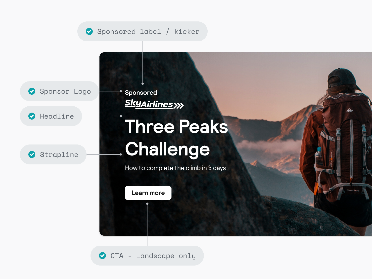
Anatomy guidelines
|
Section |
Guidance |
|---|---|
|
1. Kicker |
If the graphic promotion isn't sponsored, use the kicker to contextualise the content. For example 'Beach deals', 'Editorial article' or 'Travel guide' |
|
3. Headline |
Use the headline to grab attention – keep it snappy, relevant and on-theme |
|
4. Strap line |
The strapline is for adding extra detail where necessary |
|
5. CTA |
Follow usual UX writing principles when creating CTA copy |

- Don't use a call to action anywhere but the button.
- Don't use copy that doesn't tell a story in cohesion with other elements in the component.

Don’t add text character icons like chevrons or arrows in the button or any in-line copy.
