- Welcome
- Getting started
- Latest updates
- Foundations
-
Components
- Accordion
- Alert
- Alignment
- App Search Modal
- Aria live
- Autosuggest
- Badge
- Banner alert
- Bar chart
- Blockquote
- Bottom navigation
- Bottom sheet
- Breadcrumb
- Breakpoint
- Button
- Calendar
- Card
- Card list
- Card button
- Carousel
- Checkbox
- Chip
- Chip group
- Code
- Content cards
- Data Table
- Datepicker
- Description list
- Dialog
- Divider
- Drawer
- Field Set
- Flare
- Flat list
- Flight leg
- Floating action button
- Floating notification
- Form label
- Form validation
- Graphic promotion
- Horizontal navigation
- Icon
- Image
- Image Gallery
- Infinite scroll
- Info Banner
- Inset Banner
- Link
- List
- Map
- Mobile scroll container
- Modal
- Navigation bar
- Navigation Tab Group
- Nudger
- Overlay
- Page indicator
- Pagination
- Panel
- Phone input
- Picker
- Popover
- Price
- Progress bar
- Radio button
- Rating
- Rating Bar
- Scrollable calendar
- Search Modal
- Section header
- Section list
- Select
- Skeleton
- Skip link
- Slider
- Snackbar
- Snippet
- Spinner
- Split input
- Star rating
- Swap Button
- Switch
- Table
- Text
- Text input
- Theming
- Ticket
- Toast
- Tooltip
- Touchable native feedback
- Touchable overlay
- Search Input Summary
- Content
- Accessibility
- Contributing
- Localisation
Dialog
Dialogs inform users about a specific task and may contain critical information, or require decisions or acknowledgement.
Backpack-SwiftUI/Dialog

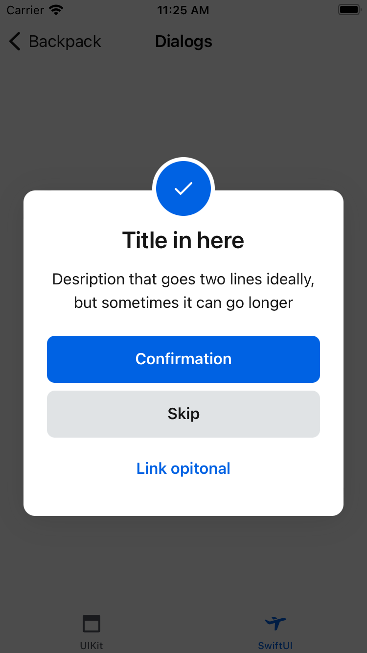
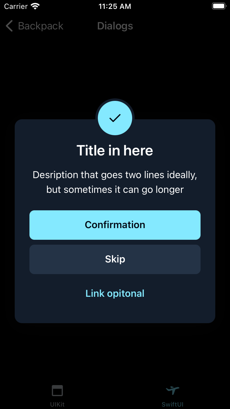
Success
| Day | Night |
|---|---|
 |
 |
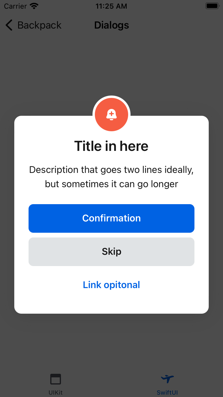
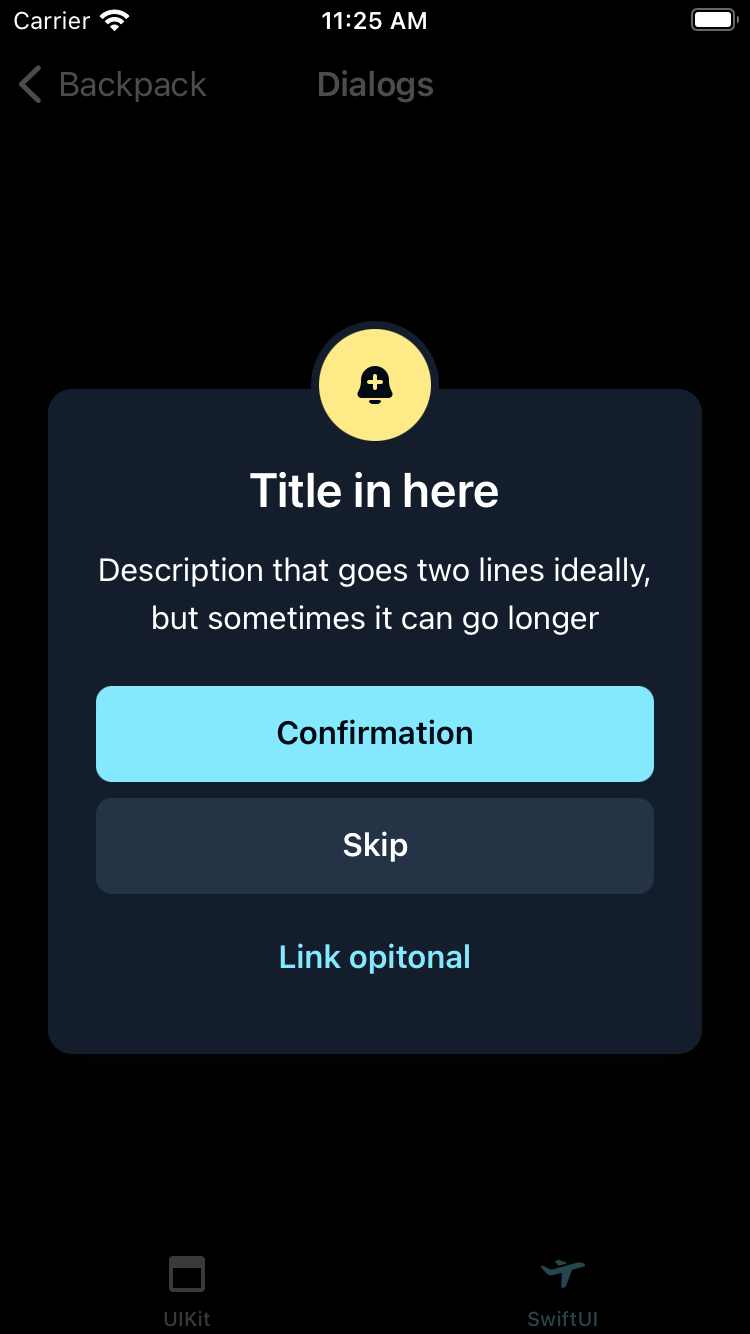
Warning
| Day | Night |
|---|---|
 |
 |
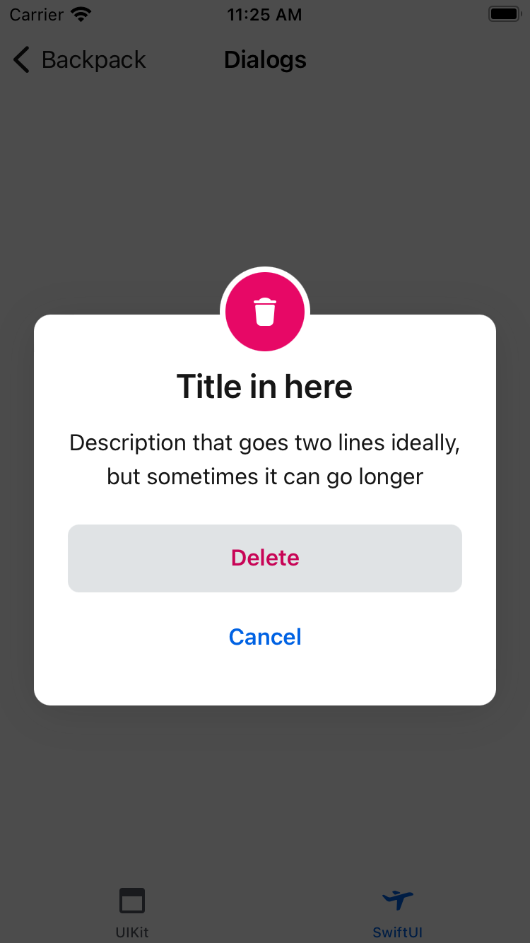
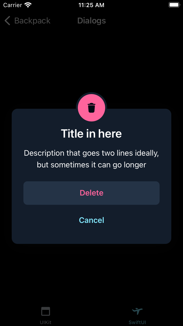
Destructive
| Day | Night |
|---|---|
 |
 |
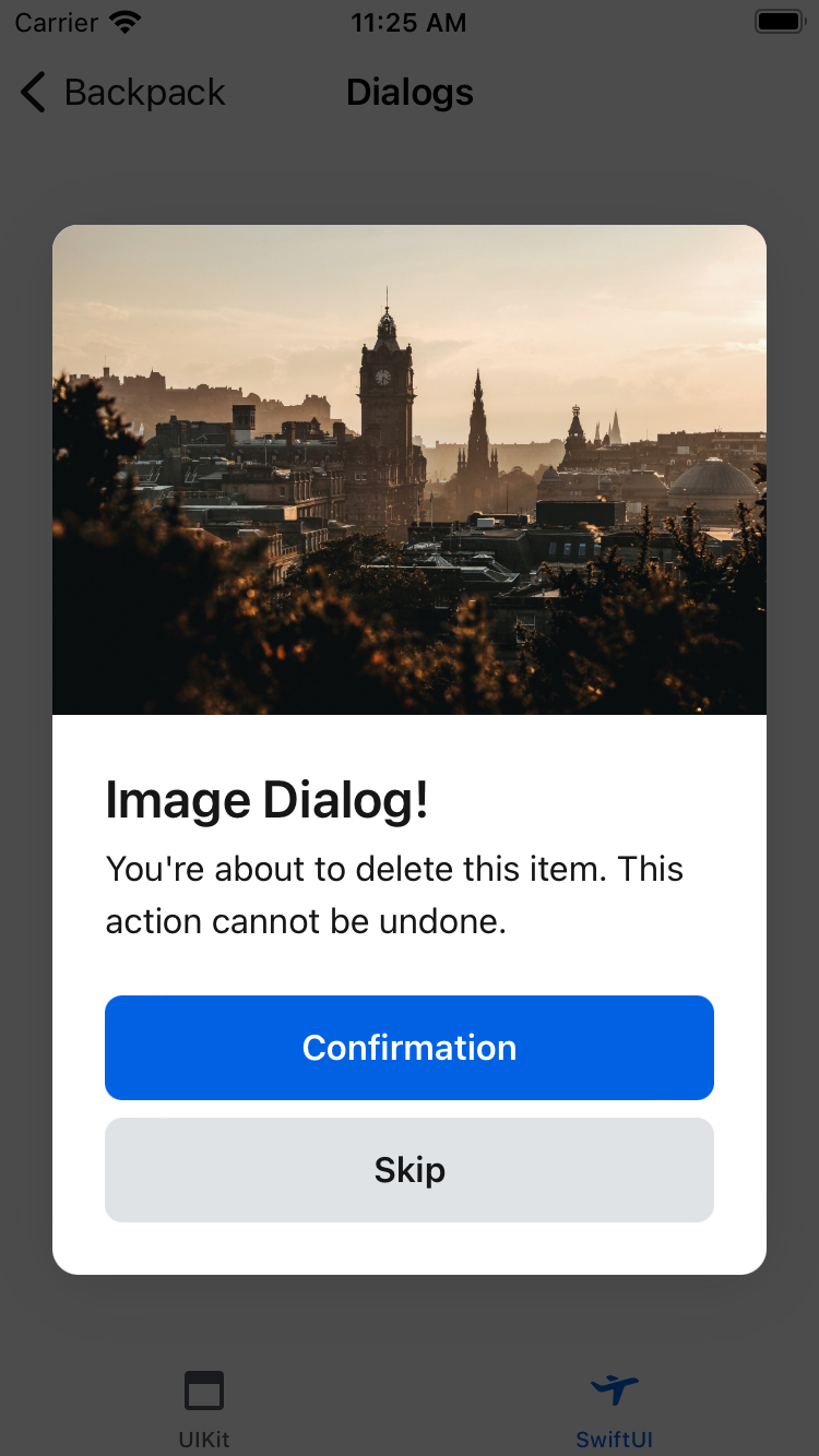
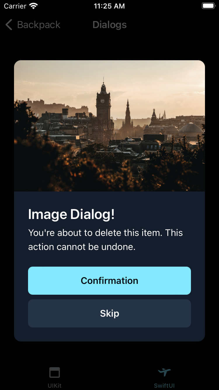
Image
| Day | Night |
|---|---|
 |
 |
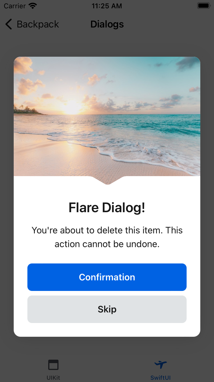
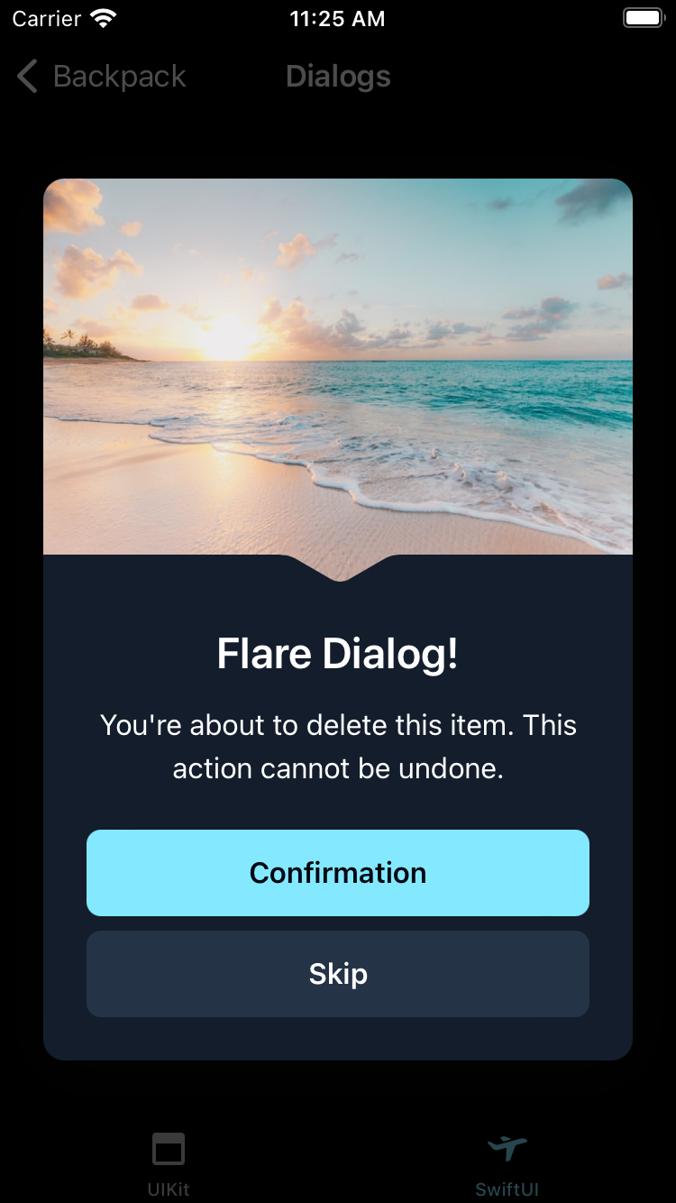
Flare
| Day | Night |
|---|---|
 |
 |
Usage
BPKDialog works as a ViewModifier that can be applied to any SwiftUI View. It's presented by binding the presented property to a Binding<Bool>.
                                                @State var isPresented = false

                                                var body: some View {
                                                    BPKButton("Show dialog") {
                                                        isPresented.toggle()
                                                    }
                                                    .bpkSuccessDialog(
                                                        presented: $isPresented,
                                                        title: "Success Dialog!",
                                                        text: "You have completed this task.",
                                                        confirmButton: BPKDialogButton("Confirm") { isPresented.toggle() }
                                                    )
                                                }
Setting Actions
Dialogs can have actions associated with them, in the form of buttons or by tapping outside of the dialog. These are represented by BPKDialogButton instances.
The dialog will decide what style of button to use based on the type of dialog.
You can also set the action to be performed when the dialog is dismissed by tapping outside of it by setting the onTouchOutside property.
                                                Text("Screen content")
                                                    .bpkSuccessDialog(
                                                        presented: $isPresented,
                                                        title: "Success Dialog!",
                                                        text: "You have completed this task.",
                                                        confirmButton: BPKDialogButton("Confirm") { isPresented.toggle() },
                                                        secondaryButton: BPKDialogButton("Secondary") { isPresented.toggle() },
                                                        linkButton: BPKDialogButton("Learn more") { isPresented.toggle() },
                                                        onTouchOutside: { isPresented.toggle() }
                                                    )
Success Dialog
                                                Text("Screen content")
                                                    .bpkSuccessDialog(
                                                        presented: $isPresented,
                                                        title: "Success Dialog!",
                                                        text: "You have completed this task.",
                                                        confirmButton: BPKDialogButton("Confirm") { isPresented.toggle() }
                                                    )
Warning Dialog
                                                Text("Screen content")
                                                    .bpkWarningDialog(
                                                        presented: $isPresented,
                                                        title: "Warning Dialog!",
                                                        text: "Be careful with this task.",
                                                        confirmButton: BPKDialogButton("Confirm") { isPresented.toggle() }
                                                    )
Destructive Dialog
                                                Text("Screen content")
                                                    .bpkDestructiveDialog(
                                                        presented: $isPresented,
                                                        title: "Destructive Dialog!",
                                                        text: "This task is very dangerous.",
                                                        confirmButton: BPKDialogButton("Confirm") { isPresented.toggle() }
                                                    )
Image Dialog
                                                Text("Screen content")
                                                    .bpkImageDialog(
                                                        presented: $isPresented,
                                                        image: Image("your_image"),
                                                        title: "Look at this image!",
                                                        text: "Isn't it great?",
                                                        confirmButton: BPKDialogButton("Confirm") { isPresented.toggle() }
                                                    )
Flare Dialog
                                                Text("Screen content")
                                                    .bpkFlareDialog(
                                                        presented: $isPresented,
                                                        image: Image("your_flare_image"),
                                                        title: "Look at this flare!",
                                                        text: "Isn't it great?",
                                                        confirmButton: BPKDialogButton("Confirm") { isPresented.toggle() }
                                                    )
Made with ❤️ by Skyscanner © 2024
© 2024 Skyscanner Backpack. Page last updated on Apr 28, 2023, 02:20