- Welcome
- Getting started
- Latest updates
- Foundations
-
Components
- Accordion
- Alert
- Alignment
- App Search Modal
- Aria live
- Autosuggest
- Badge
- Banner alert
- Bar chart
- Blockquote
- Bottom navigation
- Bottom sheet
- Breadcrumb
- Breakpoint
- Button
- Calendar
- Card
- Card list
- Card button
- Carousel
- Checkbox
- Chip
- Chip group
- Code
- Content cards
- Data Table
- Datepicker
- Description list
- Dialog
- Divider
- Drawer
- Field Set
- Flare
- Flat list
- Flight leg
- Floating action button
- Floating notification
- Form label
- Form validation
- Graphic promotion
- Horizontal navigation
- Icon
- Image
- Image Gallery
- Infinite scroll
- Info Banner
- Inset Banner
- Link
- List
- Map
- Mobile scroll container
- Modal
- Navigation bar
- Navigation Tab Group
- Nudger
- Overlay
- Page indicator
- Pagination
- Panel
- Phone input
- Picker
- Popover
- Price
- Progress bar
- Radio button
- Rating
- Rating Bar
- Scrollable calendar
- Search Modal
- Section header
- Section list
- Select
- Skeleton
- Skip link
- Slider
- Snackbar
- Snippet
- Spinner
- Split input
- Star rating
- Swap Button
- Switch
- Table
- Text
- Text input
- Theming
- Ticket
- Toast
- Tooltip
- Touchable native feedback
- Touchable overlay
- Search Input Summary
- Content
- Accessibility
- Contributing
- Localisation
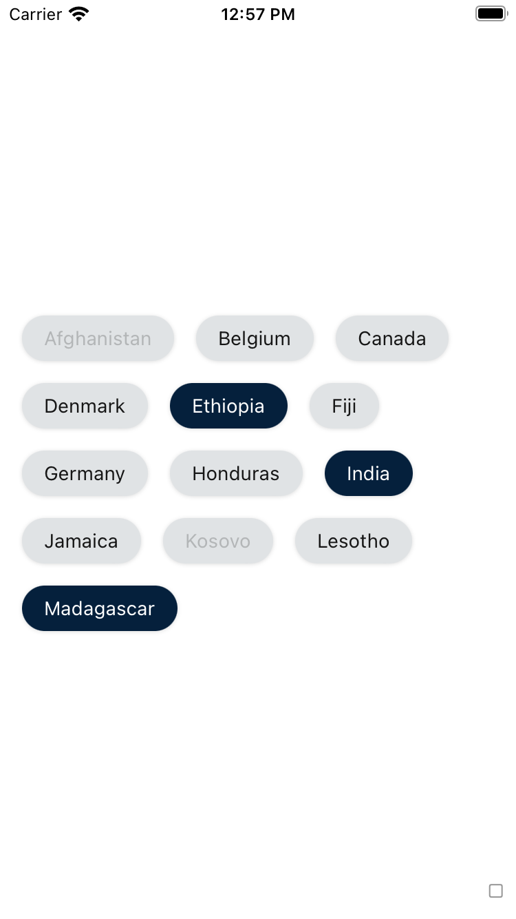
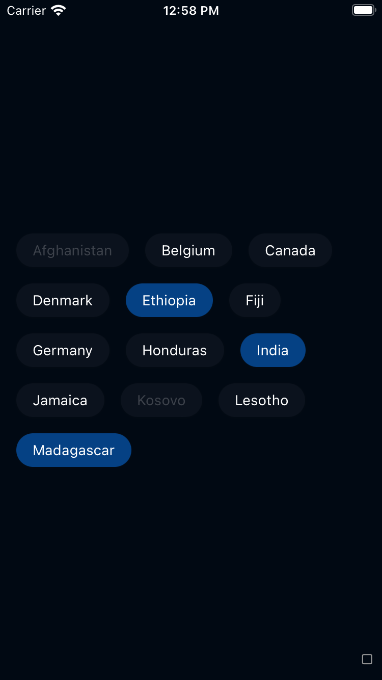
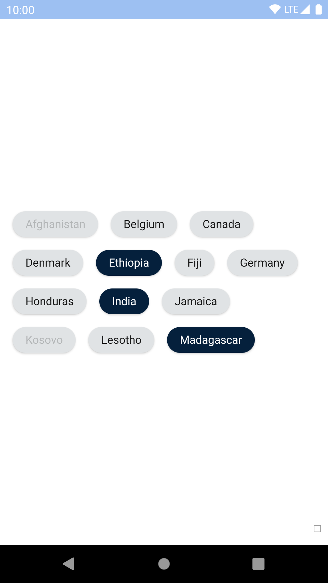
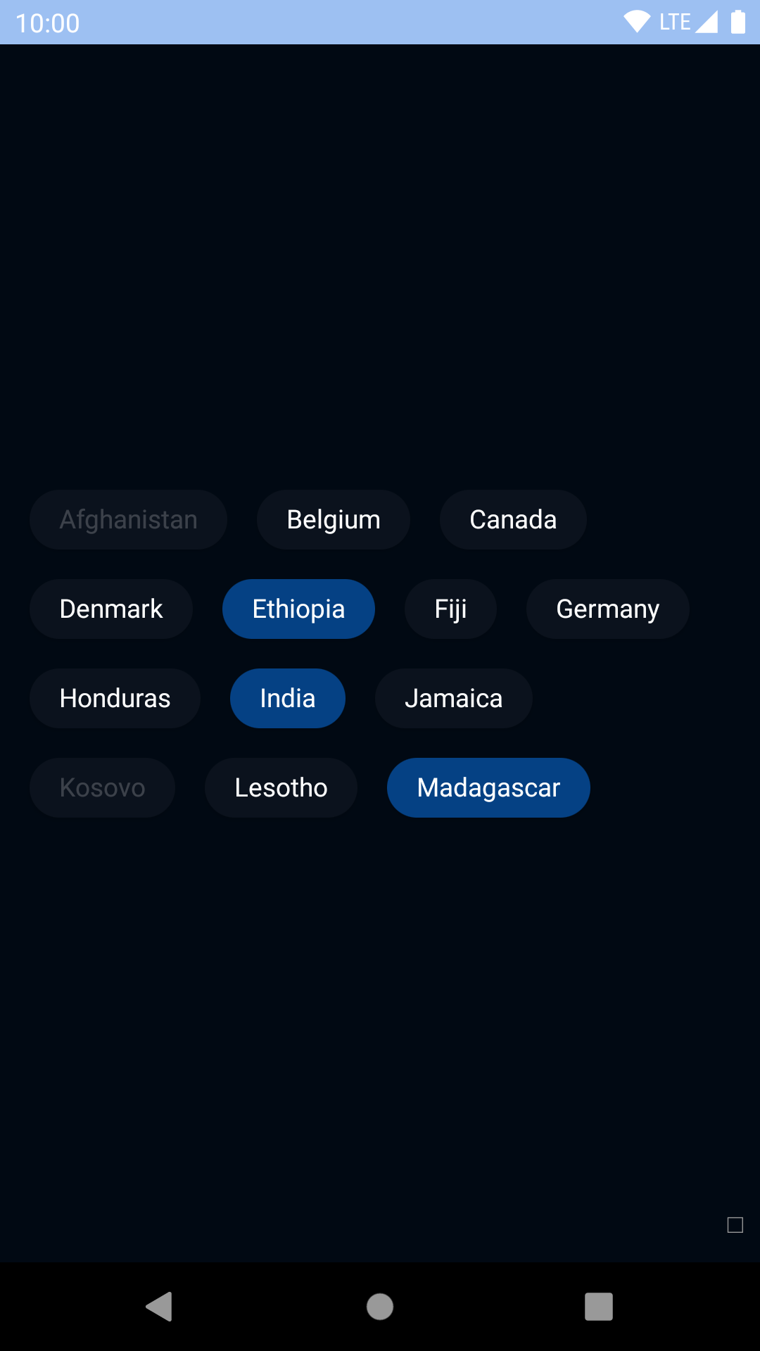
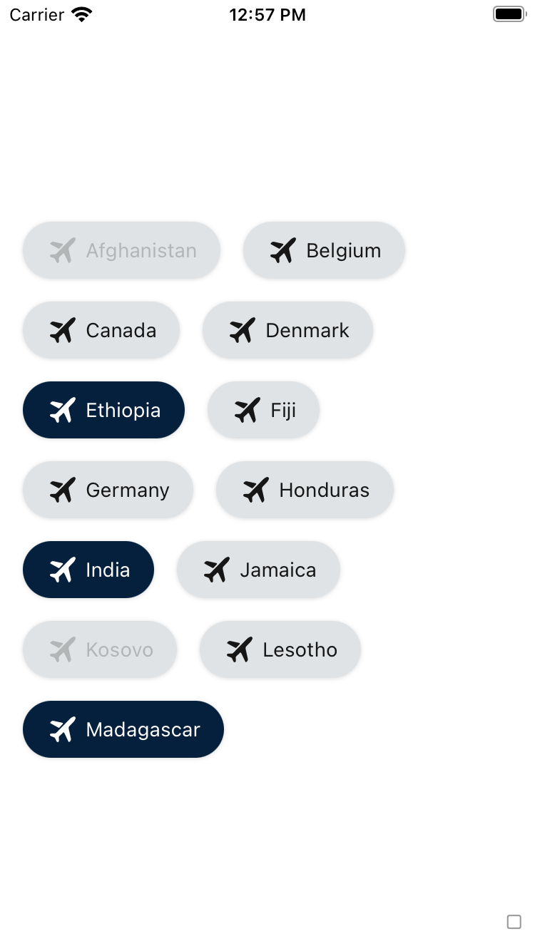
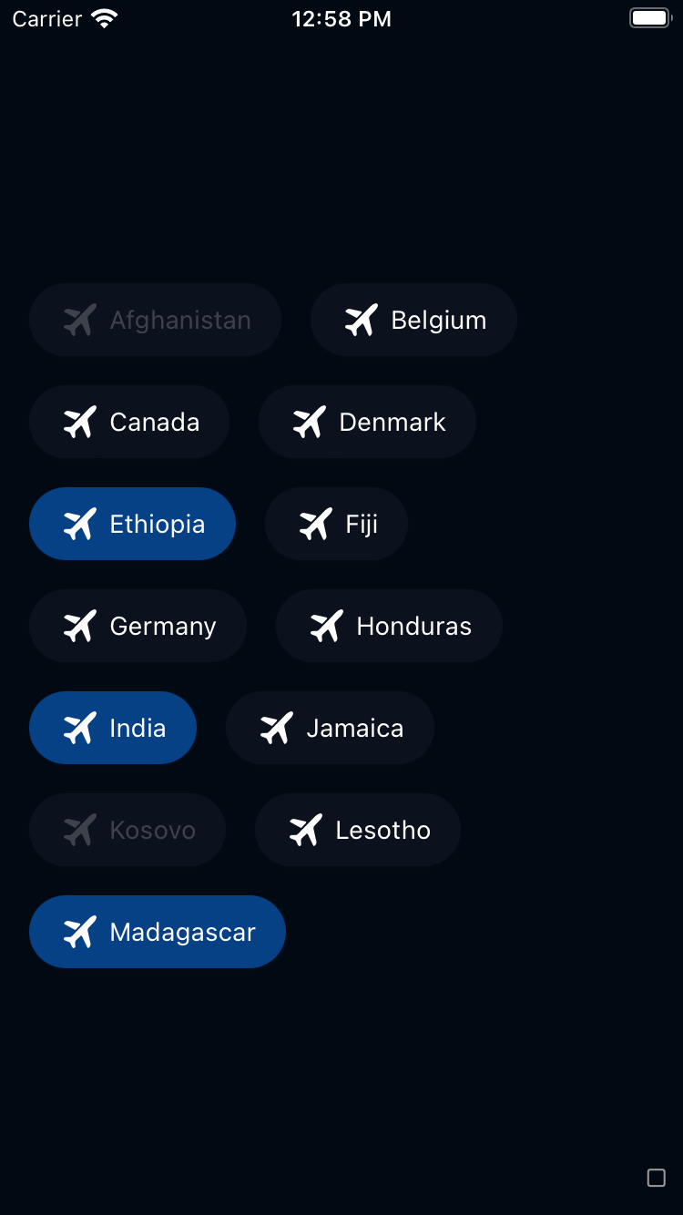
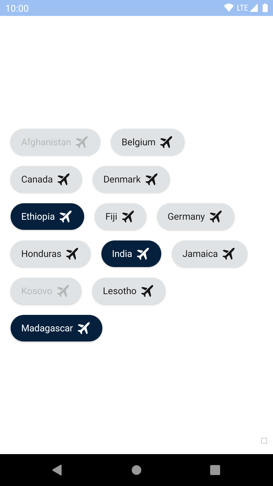
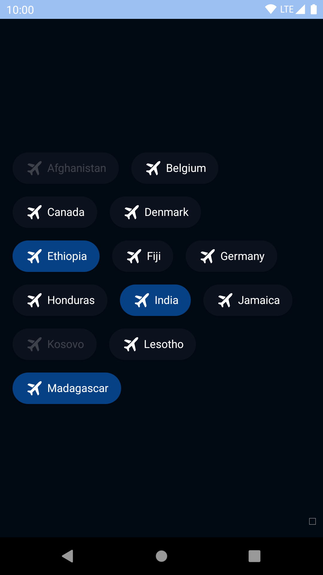
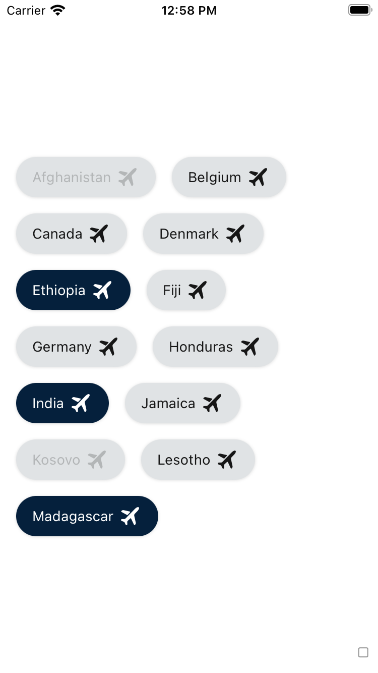
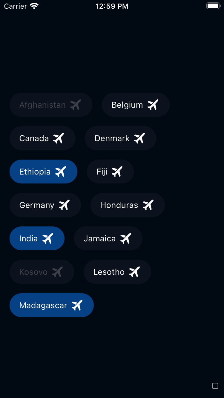
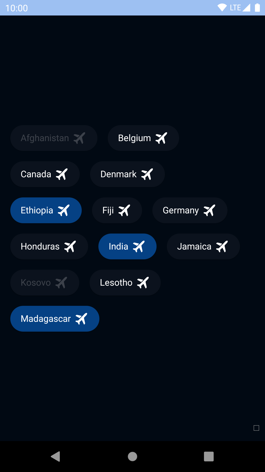
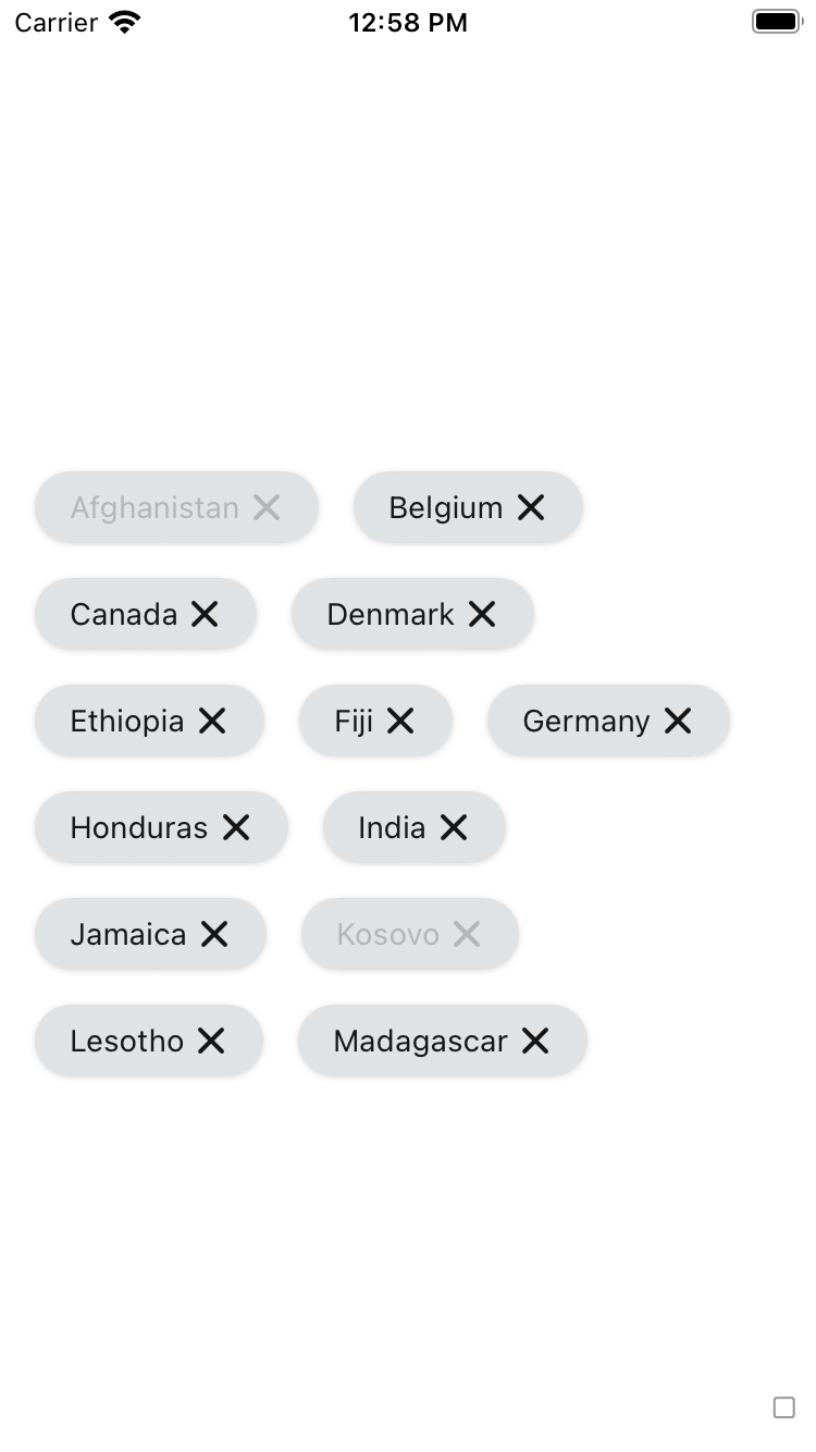
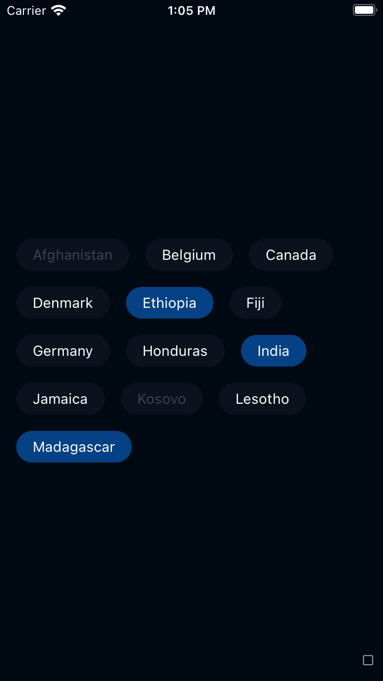
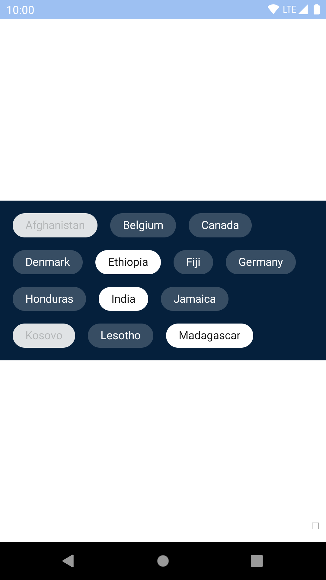
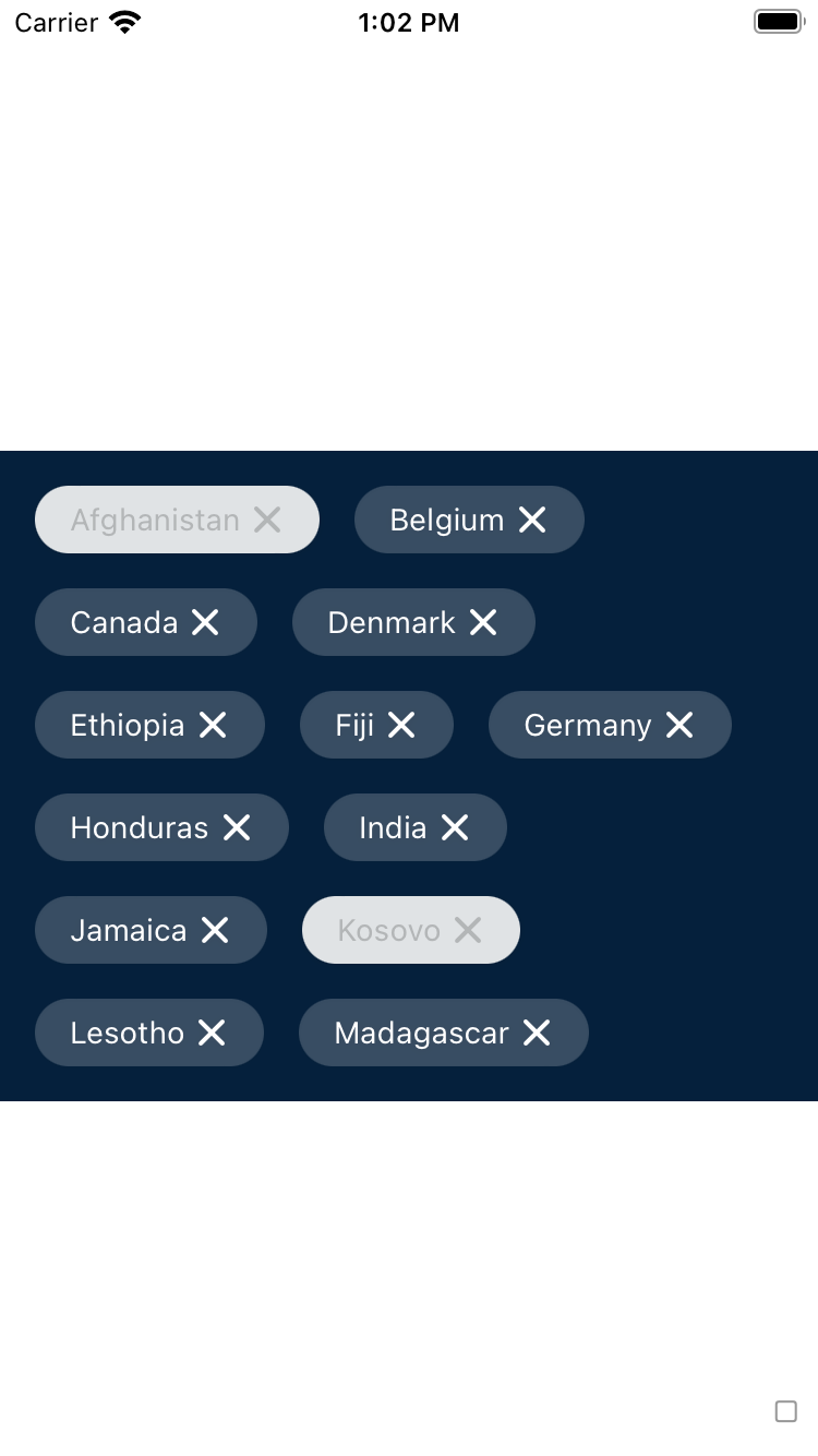
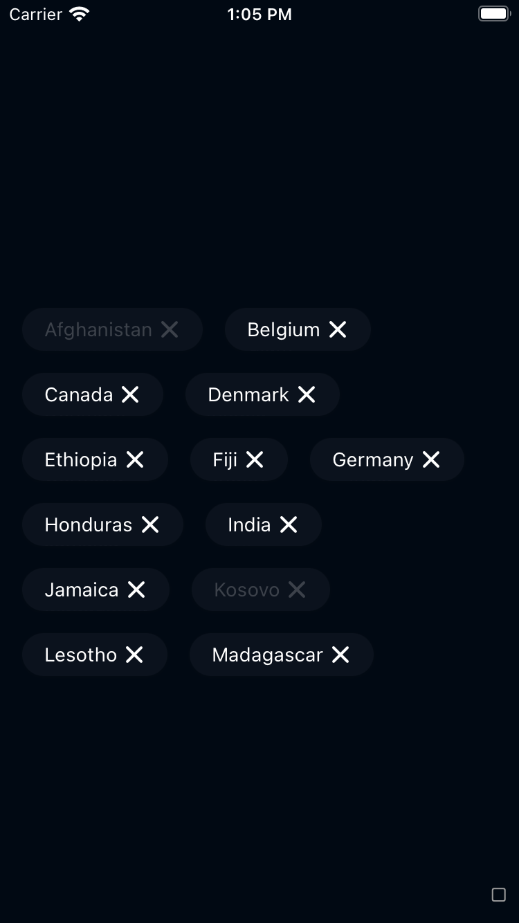
Chip
Chips let travellers enter information, filter options, make choices, and ultimately take action.
bpk-component-chip
Backpack React Native chip component.
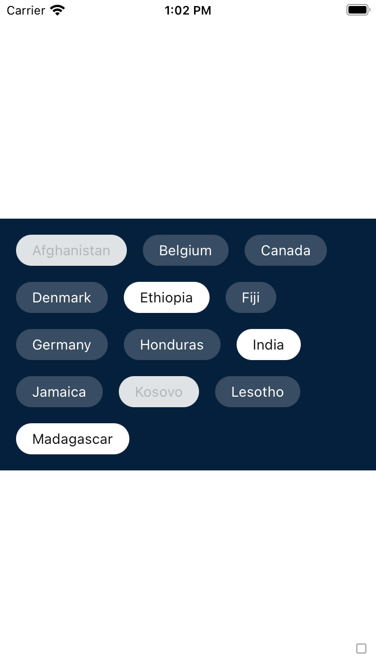
Default
| Day | Night |
|---|---|
 |
 |
 |
 |
With icons
With leading icon
| Day | Night |
|---|---|
 |
 |
 |
 |
With trailing icon
| Day | Night |
|---|---|
 |
 |
 |
 |
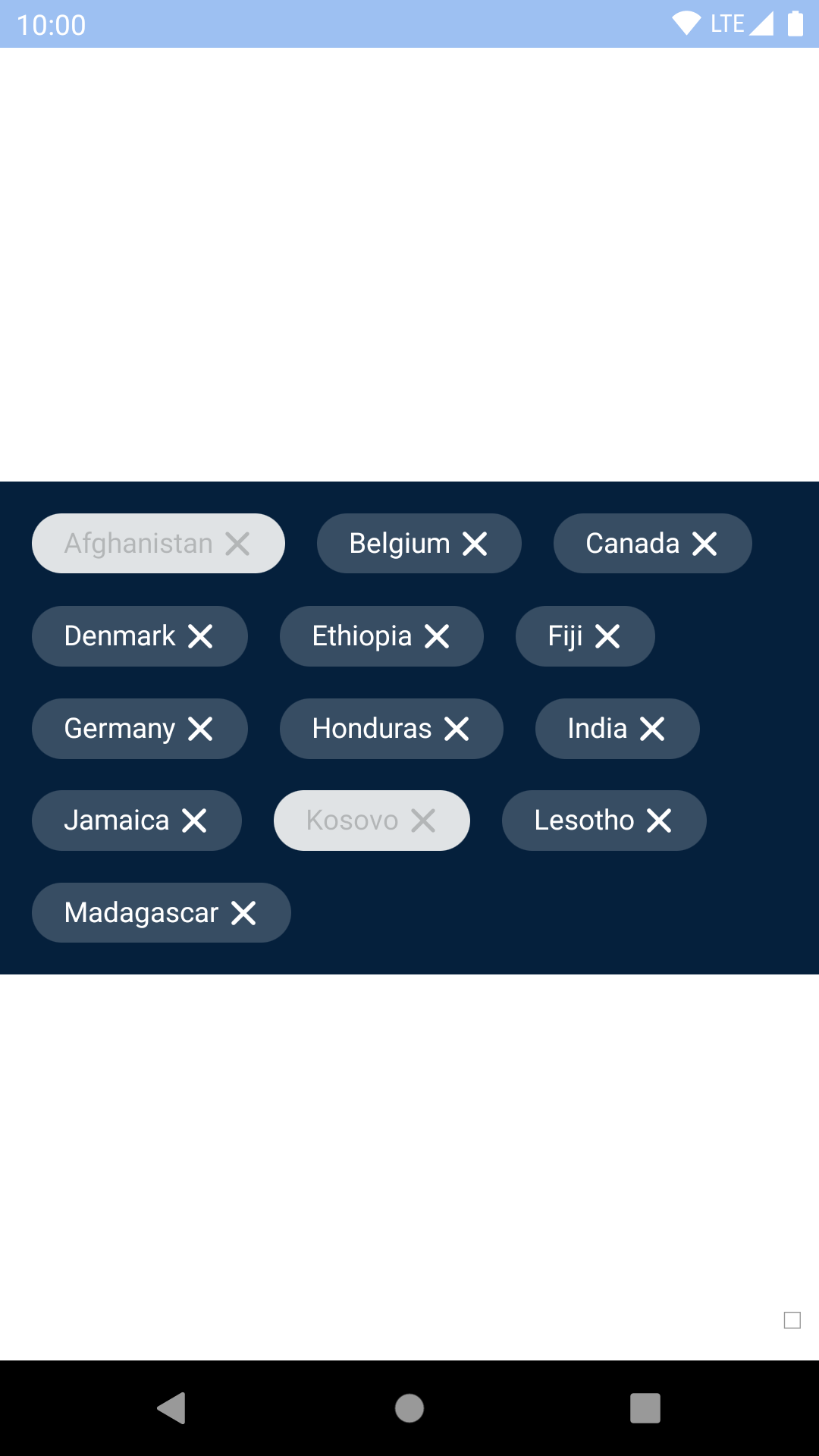
Dismissible
| Day | Night |
|---|---|
 |
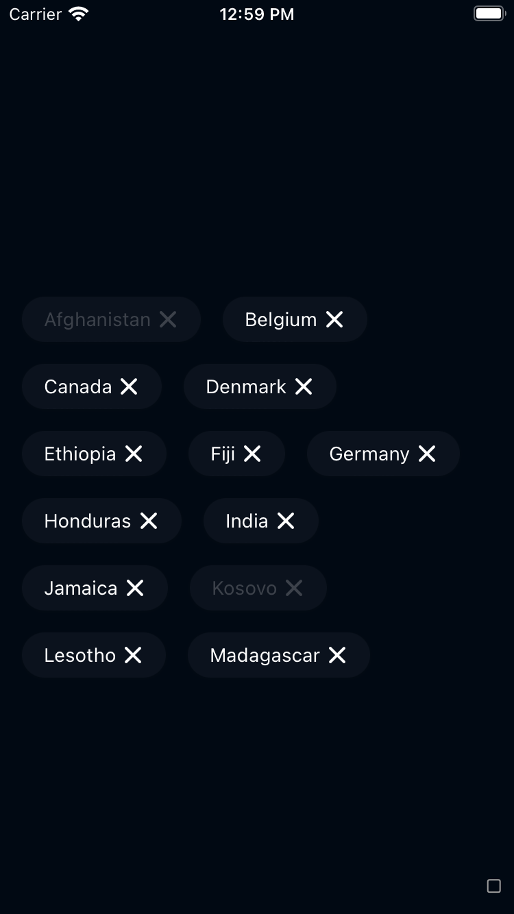 |
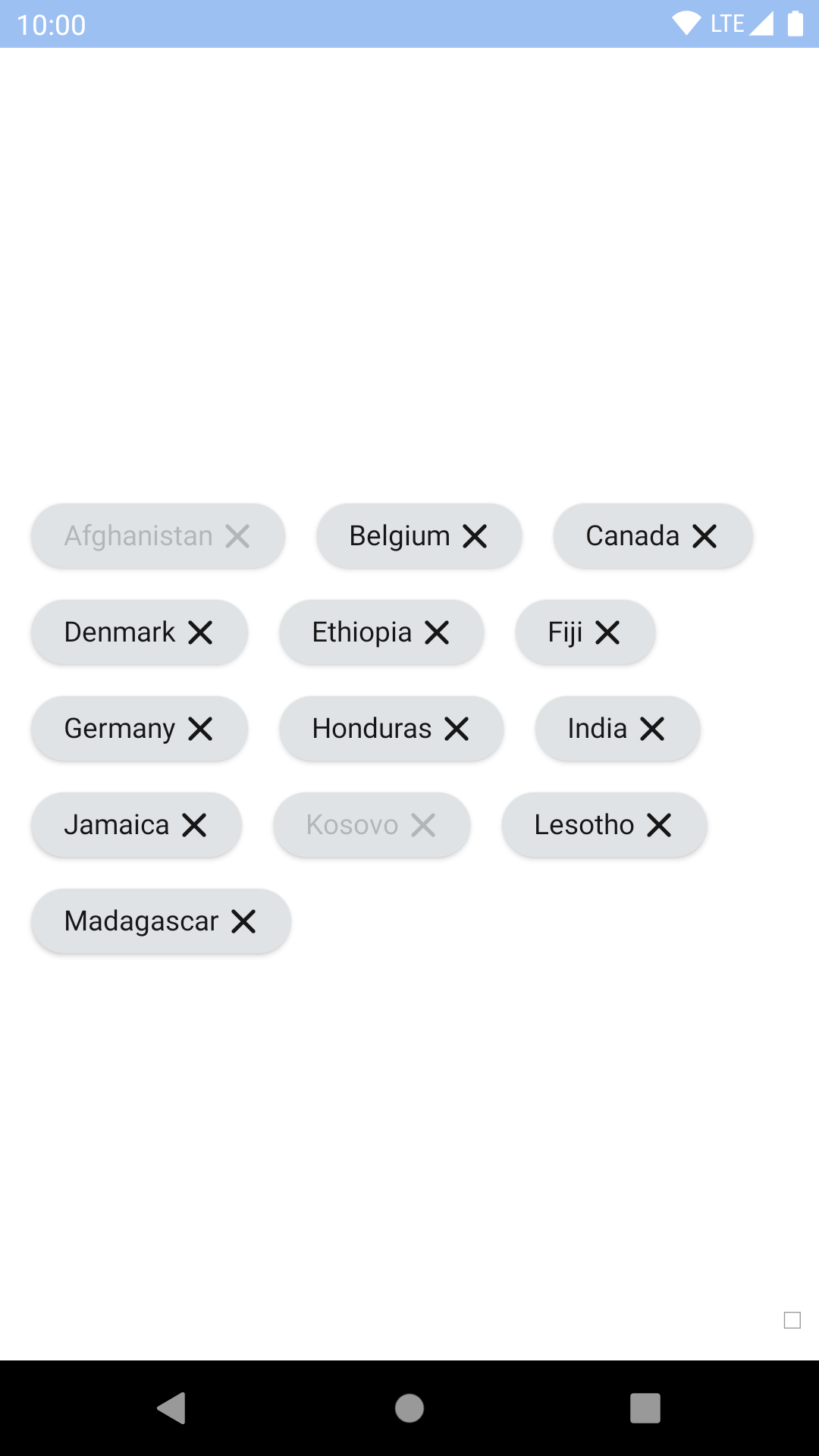 |
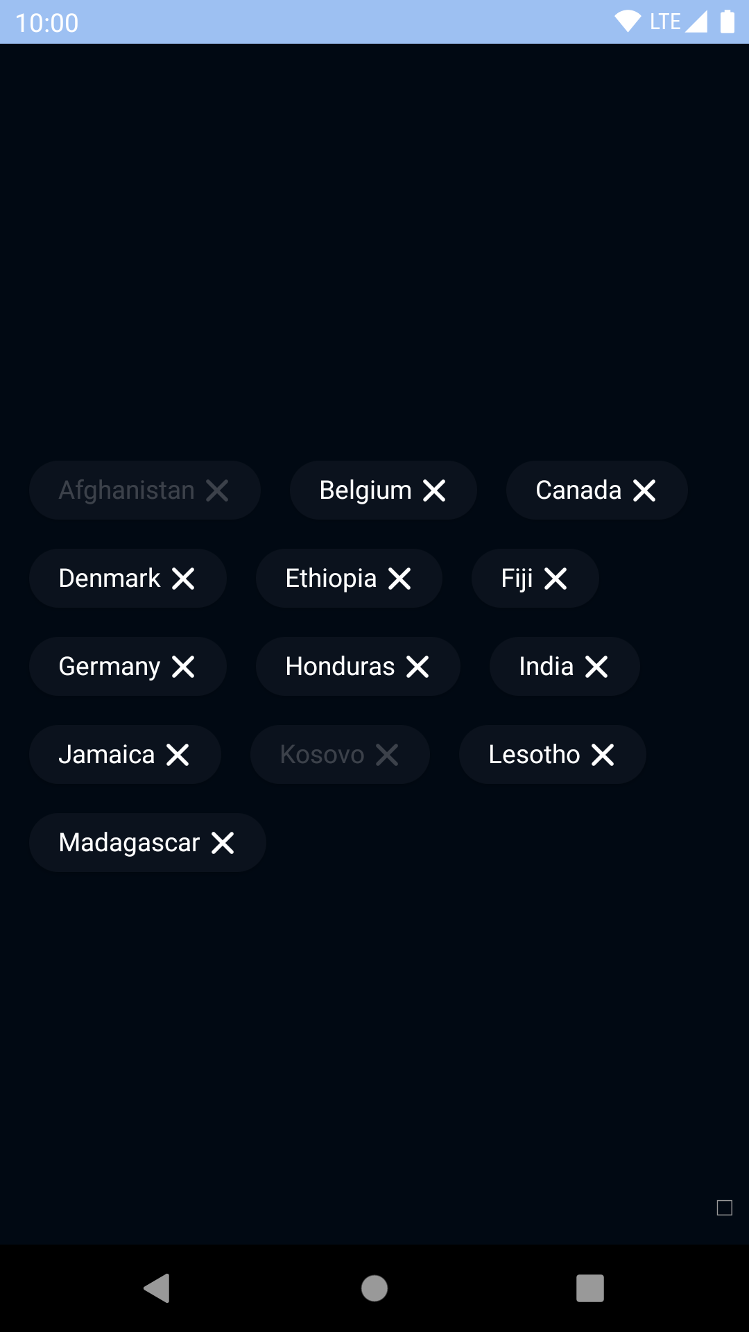 |
Outline
| Day | Night |
|---|---|
 |
 |
 |
 |
Outline Dismissible
| Day | Night |
|---|---|
 |
 |
 |
 |
Installation
Check the main Readme for a complete installation guide.
Usage
                                                import React, { Component } from 'react';
                                                import { StyleSheet, View } from 'react-native';
                                                import { spacingBase } from '@skyscanner/bpk-foundations-react-native/tokens/base.react.native';
                                                import BpkChip, { BpkDismissibleChip } from 'backpack-react-native/bpk-component-chip';
                                                import BpkIcon, { icons } from 'backpack-react-native//bpk-component-icon';


                                                const styles = StyleSheet.create({
                                                  container: {
                                                    flex: 1,
                                                    justifyContent: 'center',
                                                    padding: spacingBase,
                                                  },
                                                });

                                                export default class App extends Component {
                                                  constructor() {
                                                    super();
                                                    this.state = {
                                                      flightsSelected: false,
                                                      showHotels: true,
                                                    };
                                                  }

                                                  dismiss = () => {
                                                    this.setState({
                                                      showHotels: false,
                                                    });
                                                  };

                                                  toggle = () => {
                                                    this.setState({
                                                      flightsSelected: !this.state.flightsSelected,
                                                    });
                                                  };

                                                  render() {
                                                    return (
                                                      <View style={styles.container}>
                                                        <BpkChip
                                                          accessibilityLabel="Toggle flights"
                                                          label="Flights"
                                                          onPress={this.toggle}
                                                          selected={this.state.flightsSelected}
                                                          leadingAccesoryView={<BpkIcon icon={icons.flight} />}
                                                        />
                                                        { this.state.showHotels &&
                                                          <BpkDismissibleChip
                                                            accessibilityLabel="Remove hotels"
                                                            label="Hotels"
                                                            onPress={this.dismiss}
                                                          />
                                                        }
                                                      </View>
                                                    );
                                                  }
                                                }
Props
BpkChip
| Property | PropType | Required | Default Value |
|---|---|---|---|
| accessibilityLabel | string | true | - |
| onPress | func | true | - |
| label | string | true | - |
| disabled | bool | false | false |
| selected | bool | false | false |
| innerChipStyle | ViewStyle | false | null |
| type | oneOf(CHIP_TYPES) | false | primary |
| leadingAccessoryView | element | false | null |
| trailingAccessoryView | element | false | null |
Note that on Android, style should be used for positional styling and innerChipStyle should be used for other styling. (On iOS, style and innerChipStyle are applied together so it doesn't matter which you use!)
leadingAccessoryView and trailingAccessoryView
Use accessory views to place icons inside the chip.
Theme Props
- chipSelectedBackgroundColor
- chipSelectedTextColor
- chipOutlineSelectedBackgroundColor
- chipOutlineSelectedTextColor
BpkDismissibleChip
| Property | PropType | Required | Default Value |
|---|---|---|---|
| accessibilityLabel | string | true | - |
| label | string | true | - |
| onPress | func | true | - |
| disabled | bool | false | false |
| innerChipStyle | ViewStyle | false | null |
| type | oneOf(CHIP_TYPES) | false | primary |
| leadingAccessoryView | element | false | null |
Note that on Android, style should be used for positional styling and innerChipStyle should be used for other styling. (On iOS, style and innerChipStyle are applied together so it doesn't matter which you use!)
leadingAccessoryView
Use accessory views to place icons inside the chip.
Note: Dismissible chips do not support trailing accessory views because they already have a close icon in that position.
Made with ❤️ by Skyscanner © 2024
© 2024 Skyscanner Backpack. Page last updated on Apr 21, 2023, 07:45