- Welcome
- Getting started
- Latest updates
- Foundations
-
Components
- Accordion
- Alert
- Alignment
- App Search Modal
- Aria live
- Autosuggest
- Badge
- Banner alert
- Bar chart
- Blockquote
- Bottom navigation
- Bottom sheet
- Breadcrumb
- Breakpoint
- Button
- Calendar
- Card
- Card list
- Card button
- Carousel
- Checkbox
- Chip
- Chip group
- Code
- Content cards
- Data Table
- Datepicker
- Description list
- Dialog
- Divider
- Drawer
- Field Set
- Flare
- Flat list
- Flight leg
- Floating action button
- Floating notification
- Form label
- Form validation
- Graphic promotion
- Horizontal navigation
- Icon
- Image
- Image Gallery
- Infinite scroll
- Info Banner
- Inset Banner
- Link
- List
- Map
- Mobile scroll container
- Modal
- Navigation bar
- Navigation Tab Group
- Nudger
- Overlay
- Page indicator
- Pagination
- Panel
- Phone input
- Picker
- Popover
- Price
- Progress bar
- Radio button
- Rating
- Rating Bar
- Scrollable calendar
- Search Modal
- Section header
- Section list
- Select
- Skeleton
- Skip link
- Slider
- Snackbar
- Snippet
- Spinner
- Split input
- Star rating
- Swap Button
- Switch
- Table
- Text
- Text input
- Theming
- Ticket
- Toast
- Tooltip
- Touchable native feedback
- Touchable overlay
- Search Input Summary
- Content
- Accessibility
- Contributing
- Localisation
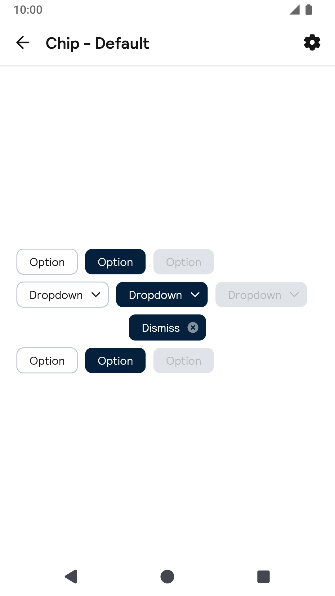
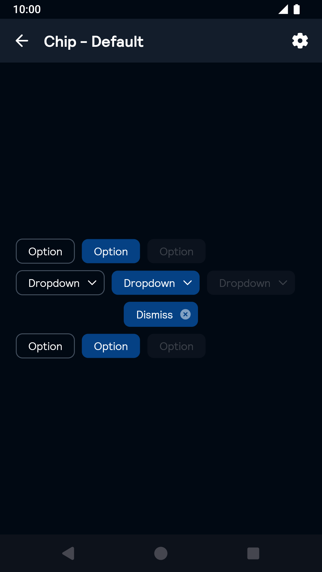
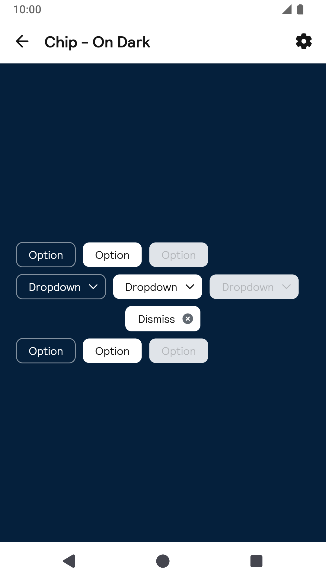
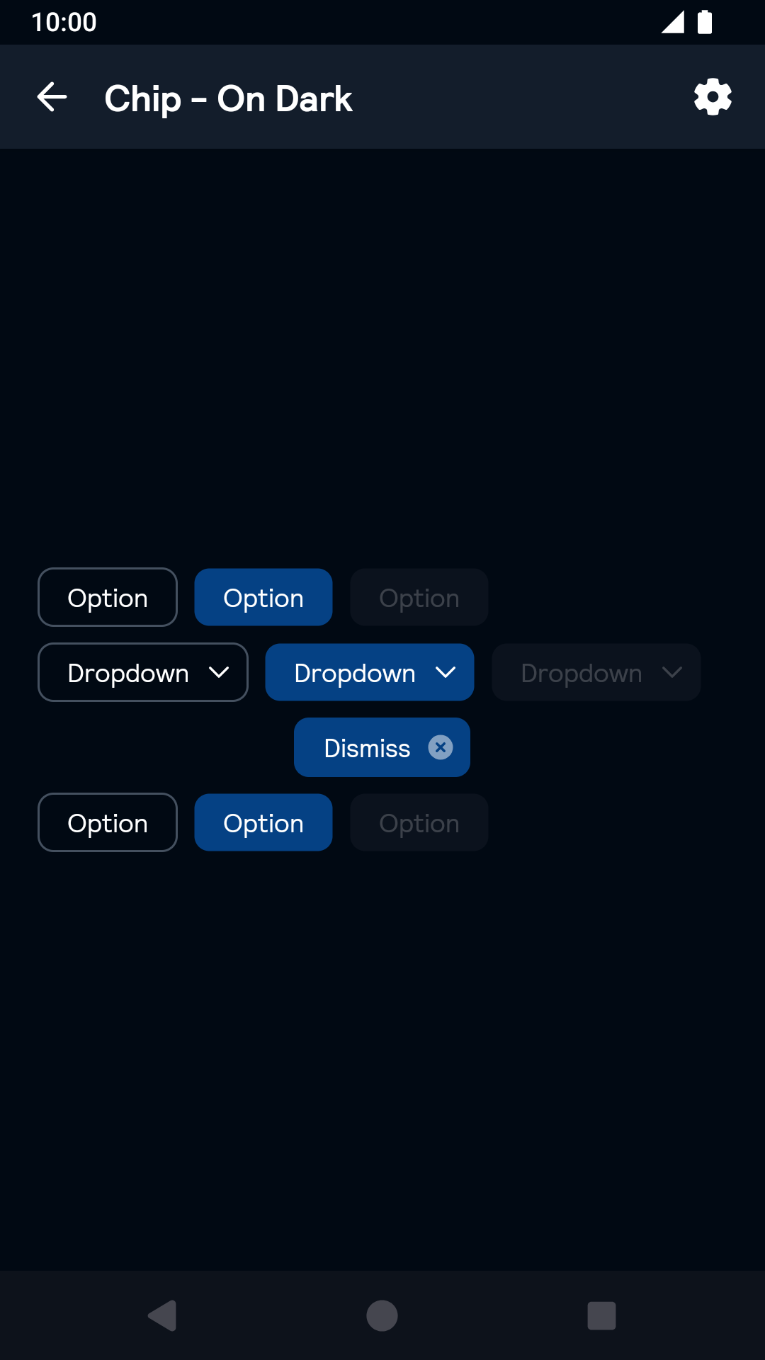
Chip
Chips let travellers enter information, filter options, make choices, and ultimately take action.
Chip

All
| Day | Night |
|---|---|
 |
 |
On dark
| Day | Night |
|---|---|
 |
 |
On Image
| Day | Night |
|---|---|
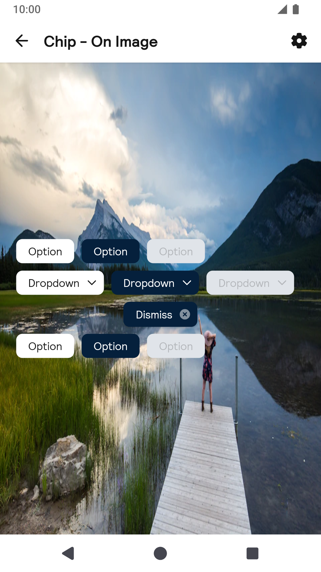 |
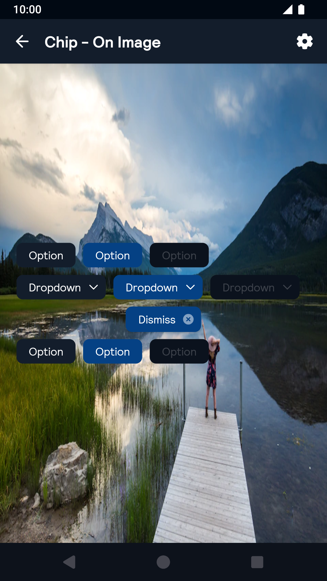 |
Installation
Backpack Android is available through Maven Central. Check the main Readme for a complete installation guide.
Usage
The Chip component can be used in both XML and Kotlin/Java
Example of a chip in XML
                                                    <net.skyscanner.backpack.chip.BpkChip
                                                      android:layout_width="wrap_content"
                                                      android:layout_height="wrap_content"
                                                      android:layout_margin="@dimen/bpkSpacingSm"
                                                      android:text="Message"
                                                      android:enabled="true"
                                                      app:selected="true"
                                                      app:chipIcon="@drawable/bpk_close"
                                                      app:chipStyle="onDark"
                                                      app:chipType="dropdown" />
Example of a chip in Kotlin
                                                import net.skyscanner.backpack.chip.BpkChip

                                                BpkChip(context).apply {
                                                  text = "Message"
                                                  isSelected = true
                                                  enabled = true
                                                  chipBackgroundColor = context.getColor(R.color.bpkSkyGrayTint07)
                                                  chipTextColor = context.getColor(R.color.bpkTextPrimary)
                                                  chipSelectedBackgroundColor = context.getColor(R.color.bpkSkyBlue)
                                                  disabledBackgroundColor = context.getColor(R.color.bpkSkyGrayTint07)
                                                  chipIcon = AppCompatResources.getDrawable(context, R.drawable.bpk_account)
                                                  style = BpkChip.Style.OnDark
                                                  type = BpkChip.Type.Dropdown
                                                }
Toggling the chip's state
By default the chip does not add any click listeners, so clicking it will not toggle its state. To do so add a click listener:
chip.setOnClickListener { chip.toggle() }Theme Props
- chipSelectedBackgroundColor
- chipBackgroundColor
- chipDisabledBackgroundColor
- chipTextColor
Styles can be changed globally through bpkChipStyle. Check theming for more information.
Made with ❤️ by Skyscanner © 2024
© 2024 Skyscanner Backpack. Page last updated on Nov 8, 2022, 13:11