- Welcome
- Getting started
- Latest updates
- Foundations
-
Components
- Accordion
- Alert
- Alignment
- App Search Modal
- Aria live
- Autosuggest
- Badge
- Banner alert
- Bar chart
- Blockquote
- Bottom navigation
- Bottom sheet
- Breadcrumb
- Breakpoint
- Button
- Calendar
- Card
- Card list
- Card button
- Carousel
- Checkbox
- Chip
- Chip group
- Code
- Content cards
- Data Table
- Datepicker
- Description list
- Dialog
- Divider
- Drawer
- Field Set
- Flare
- Flat list
- Flight leg
- Floating action button
- Floating notification
- Form label
- Form validation
- Graphic promotion
- Horizontal navigation
- Icon
- Image
- Image Gallery
- Infinite scroll
- Info Banner
- Inset Banner
- Link
- List
- Map
- Mobile scroll container
- Modal
- Navigation bar
- Navigation Tab Group
- Nudger
- Overlay
- Page indicator
- Pagination
- Panel
- Phone input
- Picker
- Popover
- Price
- Progress bar
- Radio button
- Rating
- Rating Bar
- Scrollable calendar
- Search Modal
- Section header
- Section list
- Select
- Skeleton
- Skip link
- Slider
- Snackbar
- Snippet
- Spinner
- Split input
- Star rating
- Swap Button
- Switch
- Table
- Text
- Text input
- Theming
- Ticket
- Toast
- Tooltip
- Touchable native feedback
- Touchable overlay
- Search Input Summary
- Content
- Accessibility
- Contributing
- Localisation
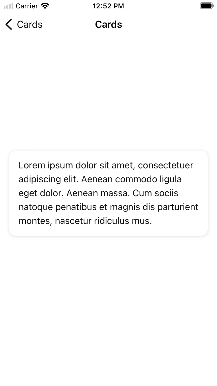
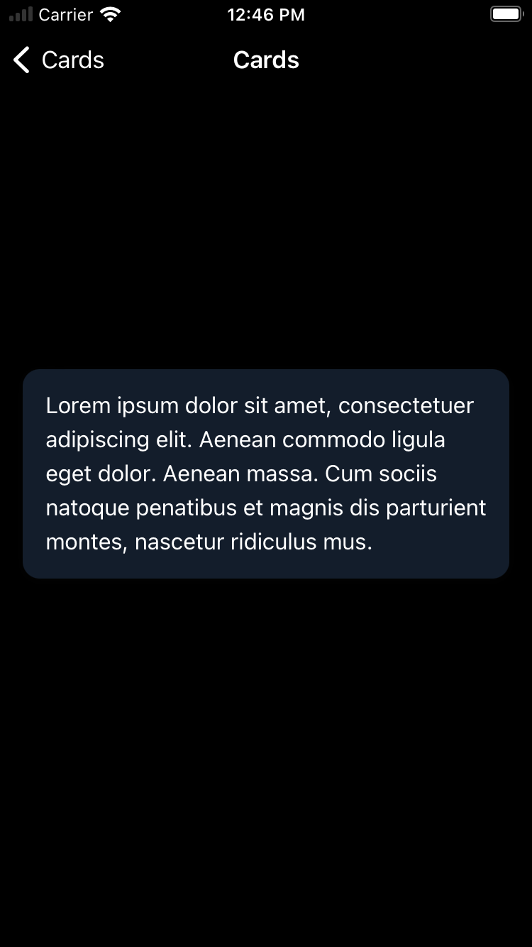
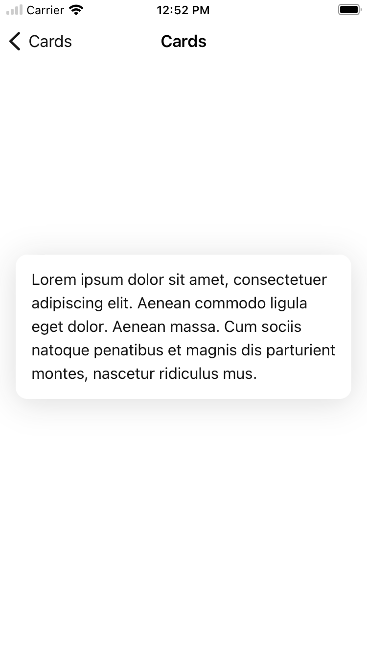
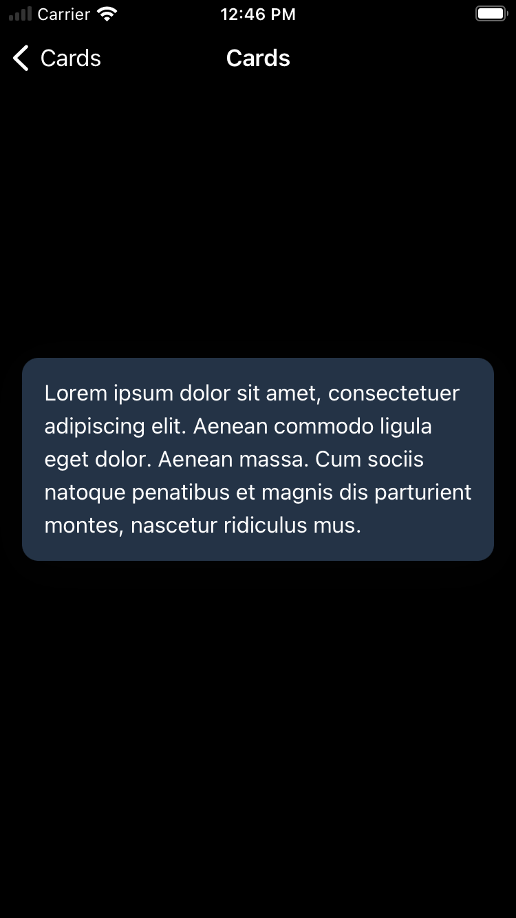
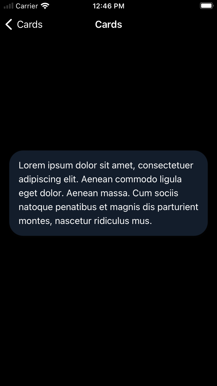
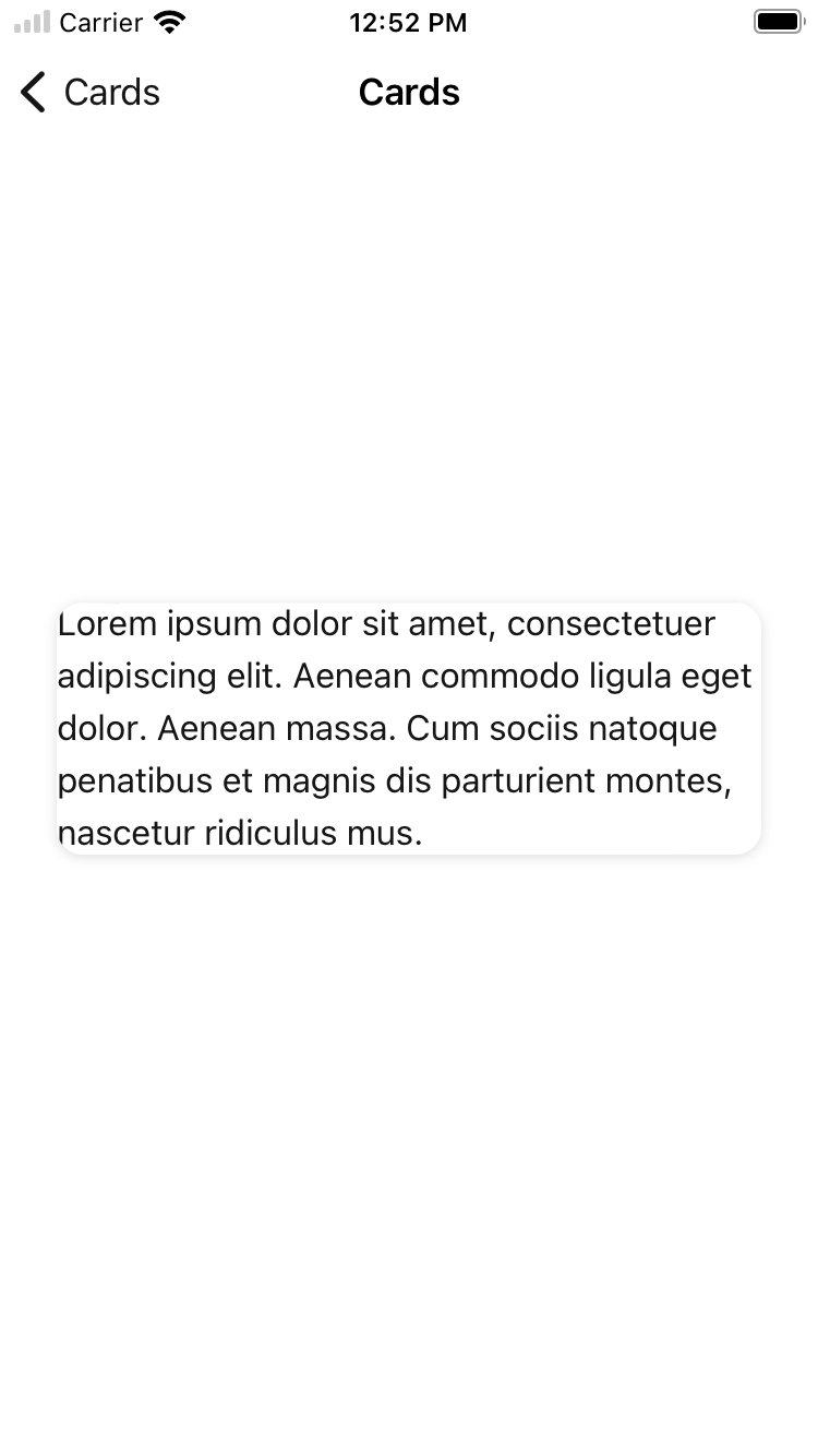
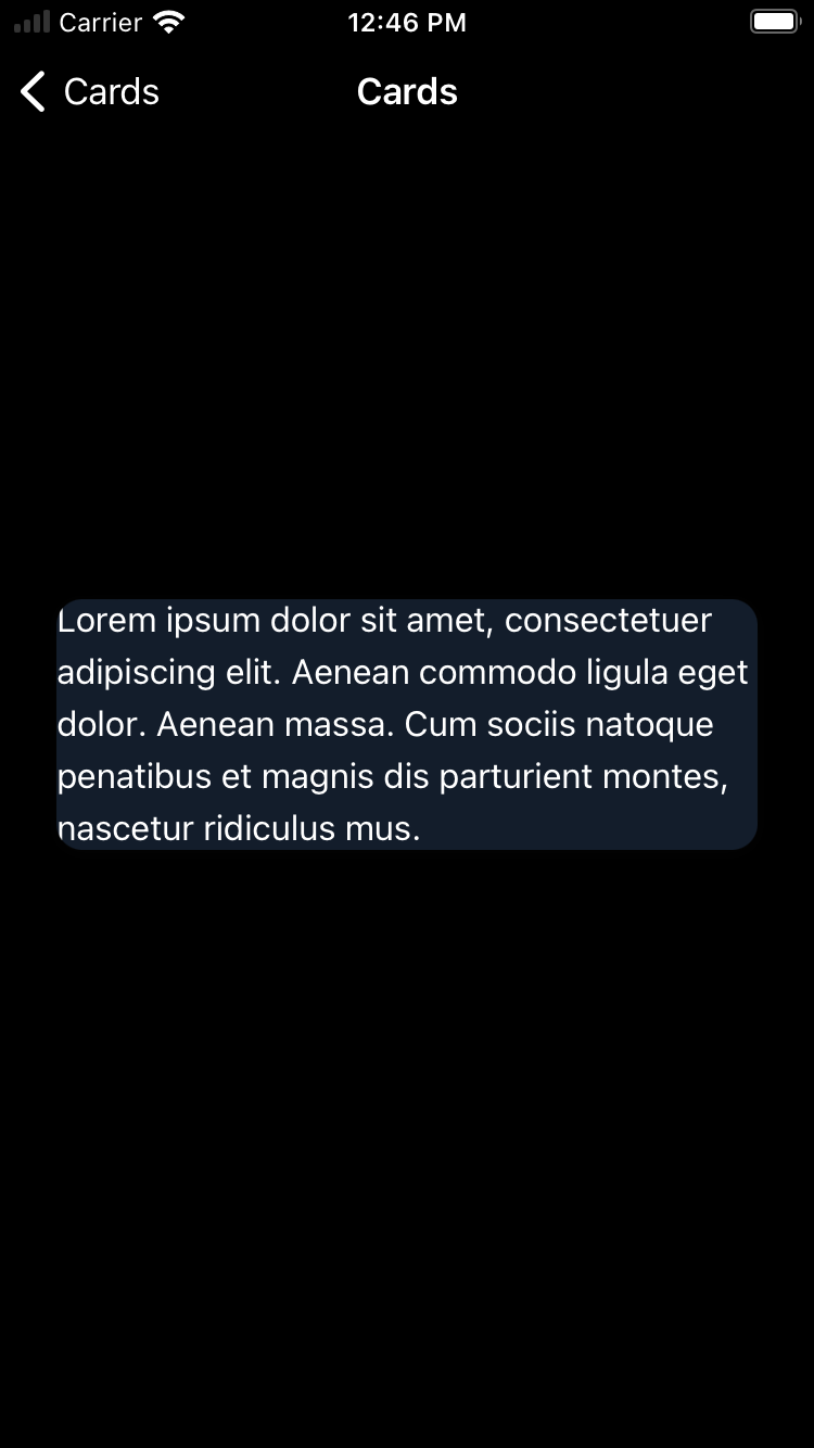
Card
Cards are used to group related items. They allow complex datasets to be broken down into individual, distinct areas for easy consumption.
Backpack/Card

Default
| Day | Night |
|---|---|
 |
 |
Selected
| Day | Night |
|---|---|
 |
 |
Large corner style
| Day | Night |
|---|---|
 |
 |
Without padding
| Day | Night |
|---|---|
 |
 |
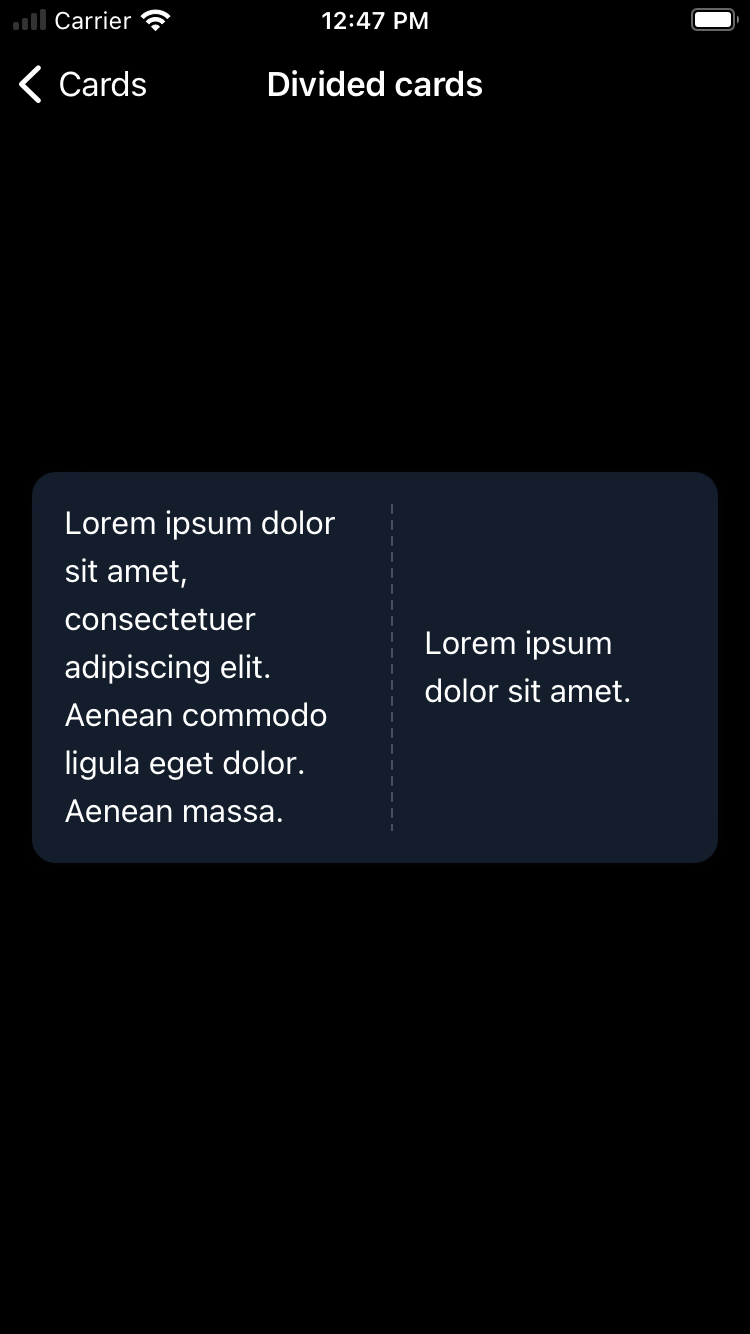
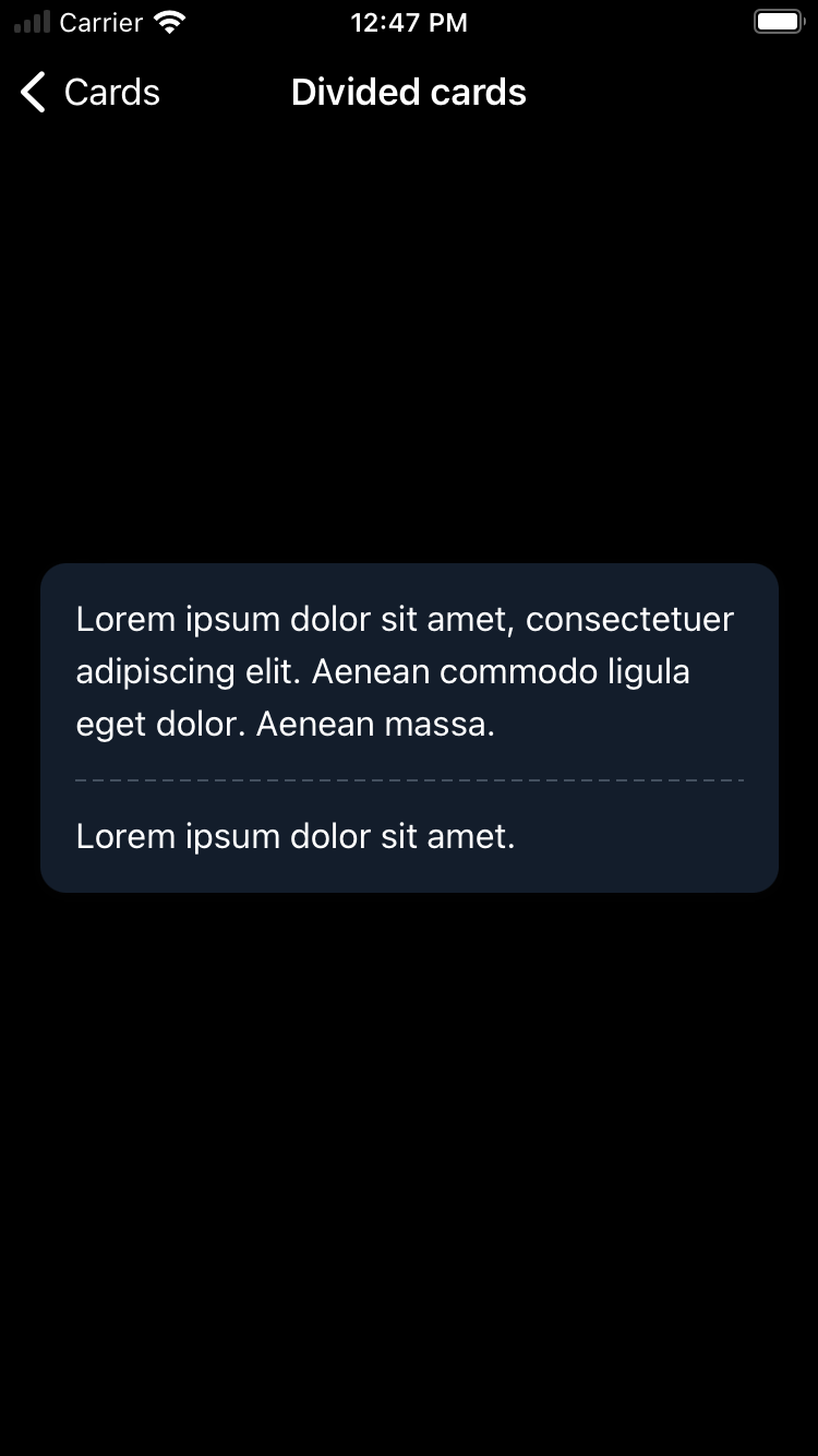
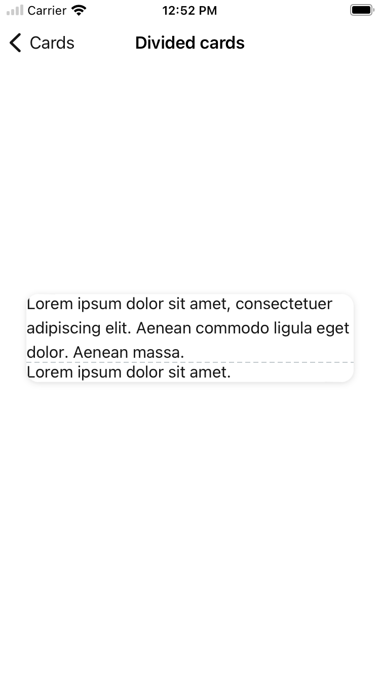
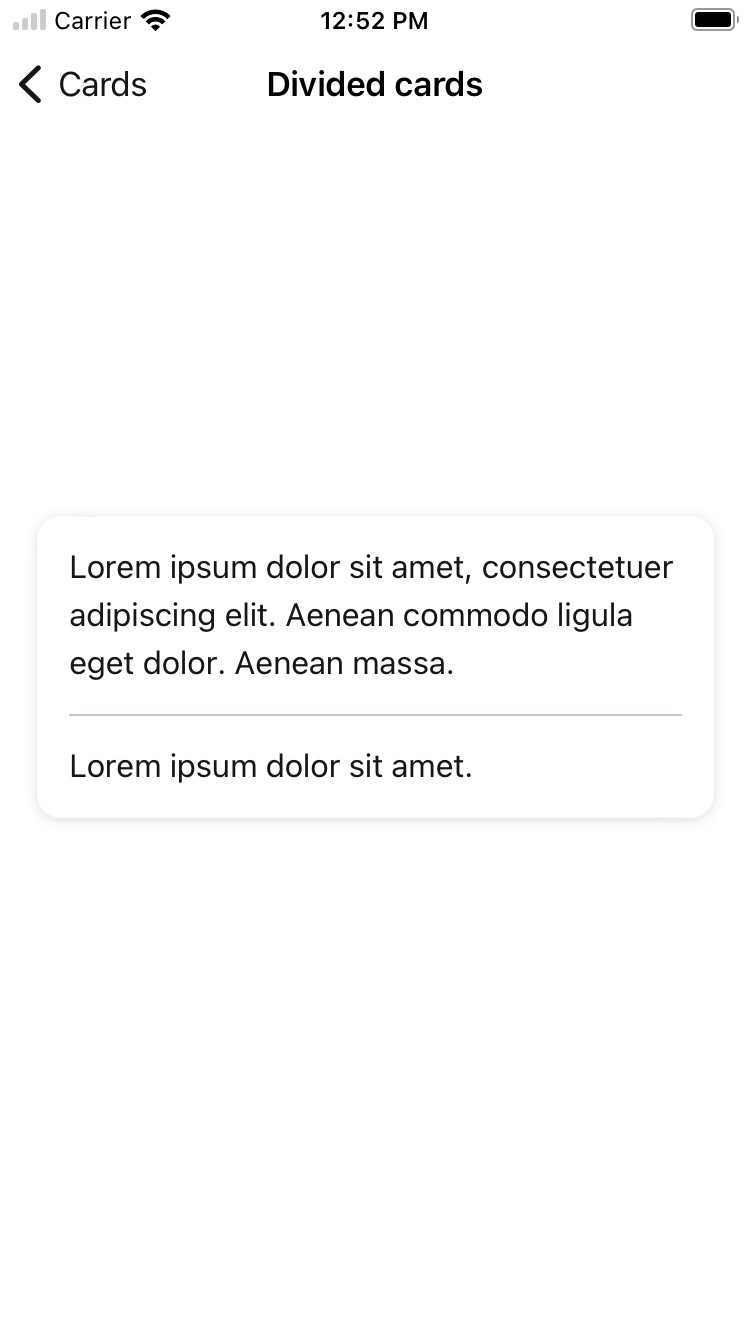
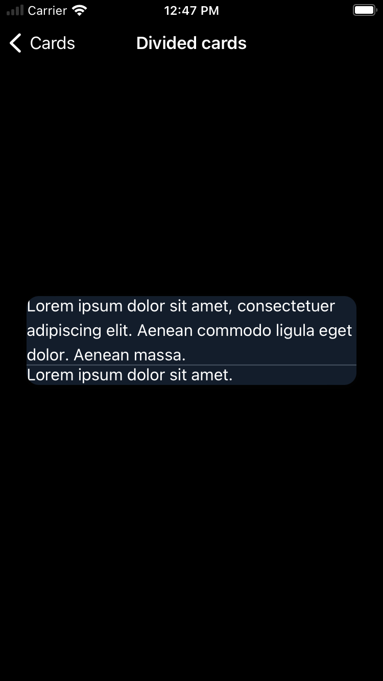
With divider
| Day | Night |
|---|---|
 |
 |
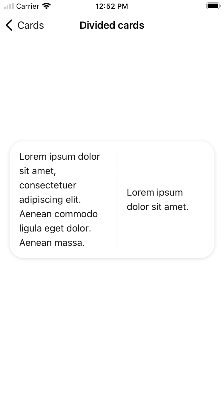
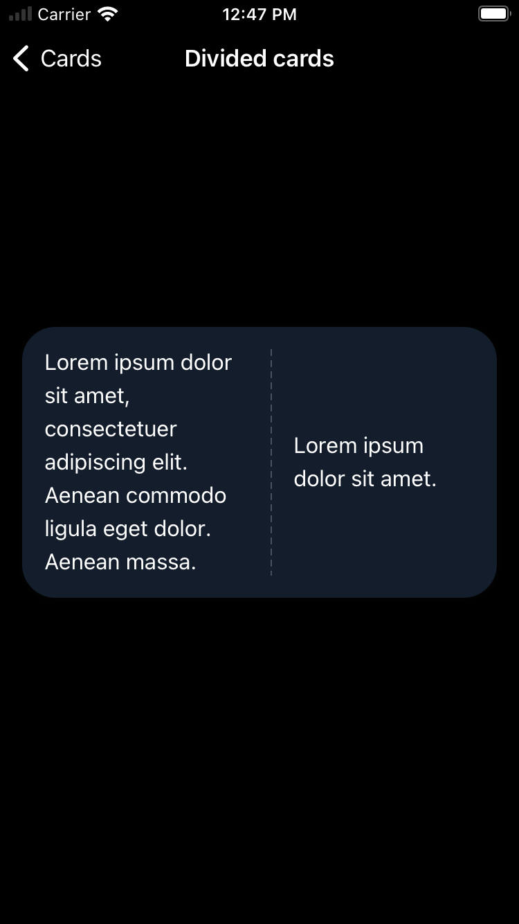
With divider arranged vertically
| Day | Night |
|---|---|
 |
 |
With divider and without padding
| Day | Night |
|---|---|
 |
 |
With divider and with large corner style
| Day | Night |
|---|---|
 |
 |
With solid divider
| Day | Night |
|---|---|
 |
 |
With solid divider and without padding
| Day | Night |
|---|---|
 |
 |
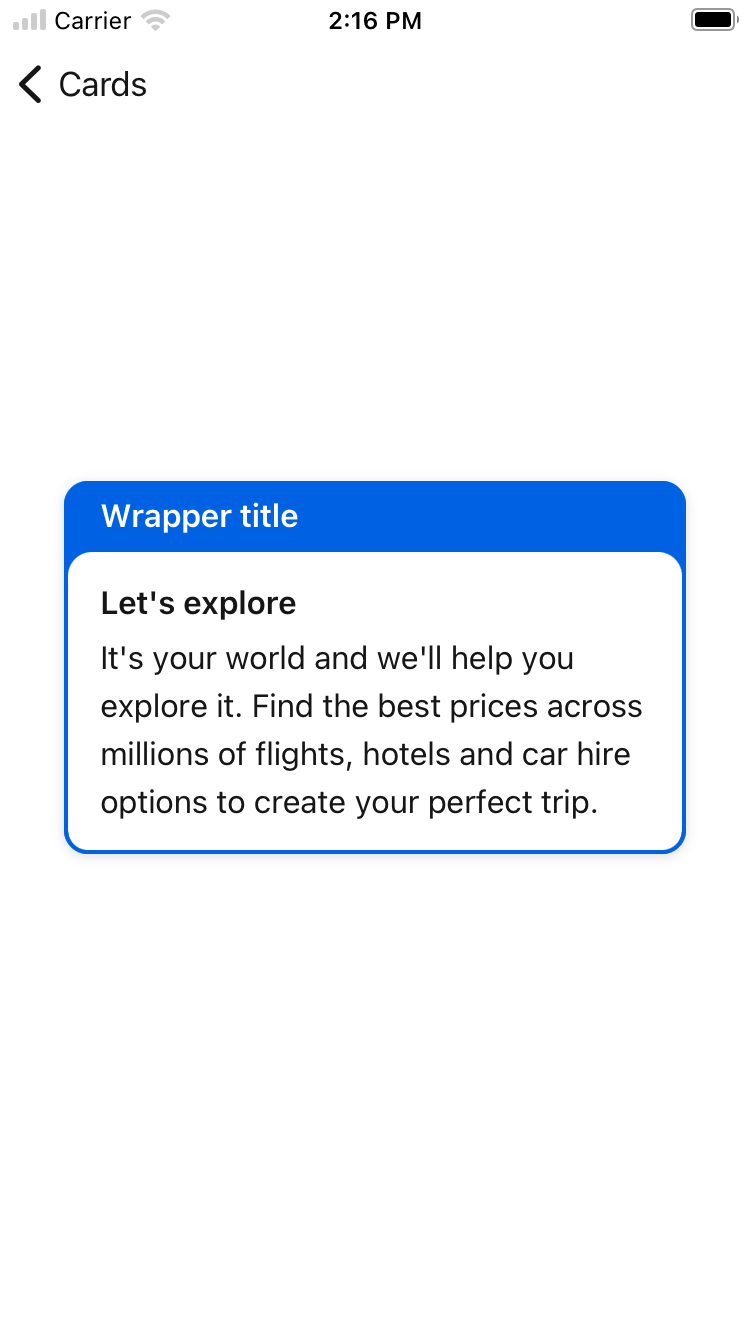
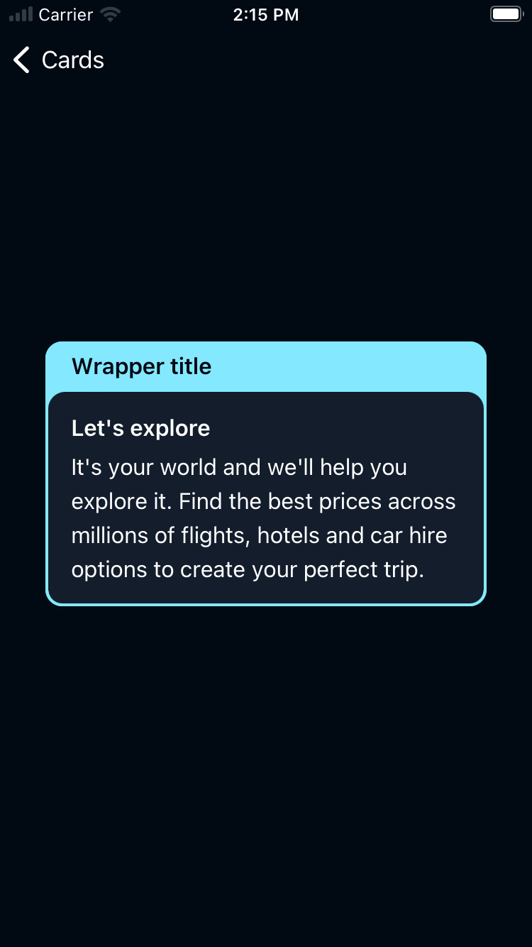
Card Wrapper
| Day | Night |
|---|---|
 |
 |
Usage
BPKCard contains the Backpack Card component. The card is a simple control view with or without a shadow, offering user interaction. It has a padded and non-padded variation. BPKCard can only have 1 direct subview and will add the appropriate constraints automatically when calling setting the subview property.
BPKDividedCard contains the Backpack Divided Card component. The divided card is a subclass of BPKCard. It can have 2 subviews and will add the appropriate constraints automatically when -initWithPrimarySubview:secondarySubview:padded/init(primarySubview: secondarySubview: padded: ) or -setPrimarySubview:secondarySubview/setSubviews(primarySubview: secondarySubview:) are called. It's axis can be vertical or horizontal.
Cards have an accessibility configuration. By default this is Container which means the card is invisible to assistive technology. In this case, ensure that the content of the card provides users of AT with the same action as tapping the card, and explain actions clearly.
Use the isElevated property to enable or disable shadows on the card.
If using a Button or Link configuration, ensure that the accessibilityLabel used describes the whole content of the card and the same action.
Do not use Button or Link configurations if the card has multiple actions or if the copy is long.
BPKCardWrapper contains the Backpack Card Wrapper component. It can have 2 subviews and will add the appropriate constraints automatically when init(header:card:backgroundColor:) is called. It's axis is vertical.
Use the elevation property to set the shadows on the wrapper. It can be .default, .focus, and .none.
Objective-C
BPKCard
                                                #import <Backpack/Card.h>

                                                BPKCard *card = [[BPKCard alloc] initWithPadded:YES];
                                                [card setSubview:myInnerView];
                                                card.padded = NO;
                                                card.isElevated = NO;
BPKDividedCard
                                                #import <Backpack/Card.h>

                                                BPKDividedCard *dividedCard = [[BPKDividedCard alloc] initWithPrimarySubview:myFirstInnerView secondarySubview:mySecondInnerSubview padded:YES];
                                                // dividedCard.padded = NO;
                                                dividedCard.orientation = UILayoutConstraintAxisVertical;
Swift
BPKCard
                                                import Backpack

                                                let card = BPKCard(paddded: true)
                                                card.subview = myInnerView
                                                card.padded = false
                                                card.isElevated = false
BPKDividedCard
                                                import Backpack

                                                let dividedCard = BPKDividedCard(
                                                    primarySubview: myFirstInnerView,
                                                    secondarySubview: mySecondInnerSubview,
                                                    padded: true
                                                )
                                                // dividedCard.padded = false
                                                dividedCard.orientation = .vertical
BPKCardWrapper
                                                let cardWrapper = BPKCardWrapper(
                                                    header: myHeader,
                                                    card: myCard,
                                                    backgroundColor: BPKColor.coreAccentColor
                                                )
Made with ❤️ by Skyscanner © 2024
© 2024 Skyscanner Backpack. Page last updated on May 2, 2023, 13:45