- Welcome
- Getting started
- Latest updates
- Foundations
-
Components
- Accordion
- Alert
- Alignment
- App Search Modal
- Aria live
- Autosuggest
- Badge
- Banner alert
- Bar chart
- Blockquote
- Bottom navigation
- Bottom sheet
- Breadcrumb
- Breakpoint
- Button
- Calendar
- Card
- Card list
- Card button
- Carousel
- Checkbox
- Chip
- Chip group
- Code
- Content cards
- Data Table
- Datepicker
- Description list
- Dialog
- Divider
- Drawer
- Field Set
- Flare
- Flat list
- Flight leg
- Floating action button
- Floating notification
- Form label
- Form validation
- Graphic promotion
- Horizontal navigation
- Icon
- Image
- Image Gallery
- Infinite scroll
- Info Banner
- Inset Banner
- Link
- List
- Map
- Mobile scroll container
- Modal
- Navigation bar
- Navigation Tab Group
- Nudger
- Overlay
- Page indicator
- Pagination
- Panel
- Phone input
- Picker
- Popover
- Price
- Progress bar
- Radio button
- Rating
- Rating Bar
- Scrollable calendar
- Search Modal
- Section header
- Section list
- Select
- Skeleton
- Skip link
- Slider
- Snackbar
- Snippet
- Spinner
- Split input
- Star rating
- Swap Button
- Switch
- Table
- Text
- Text input
- Theming
- Ticket
- Toast
- Tooltip
- Touchable native feedback
- Touchable overlay
- Search Input Summary
- Content
- Accessibility
- Contributing
- Localisation
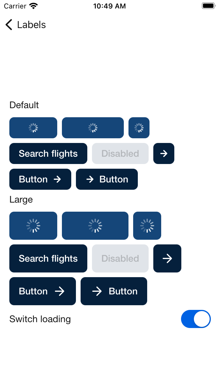
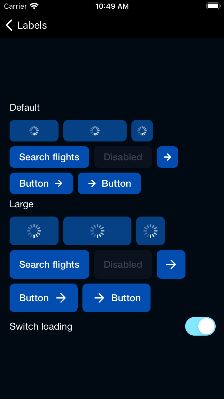
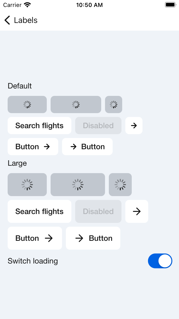
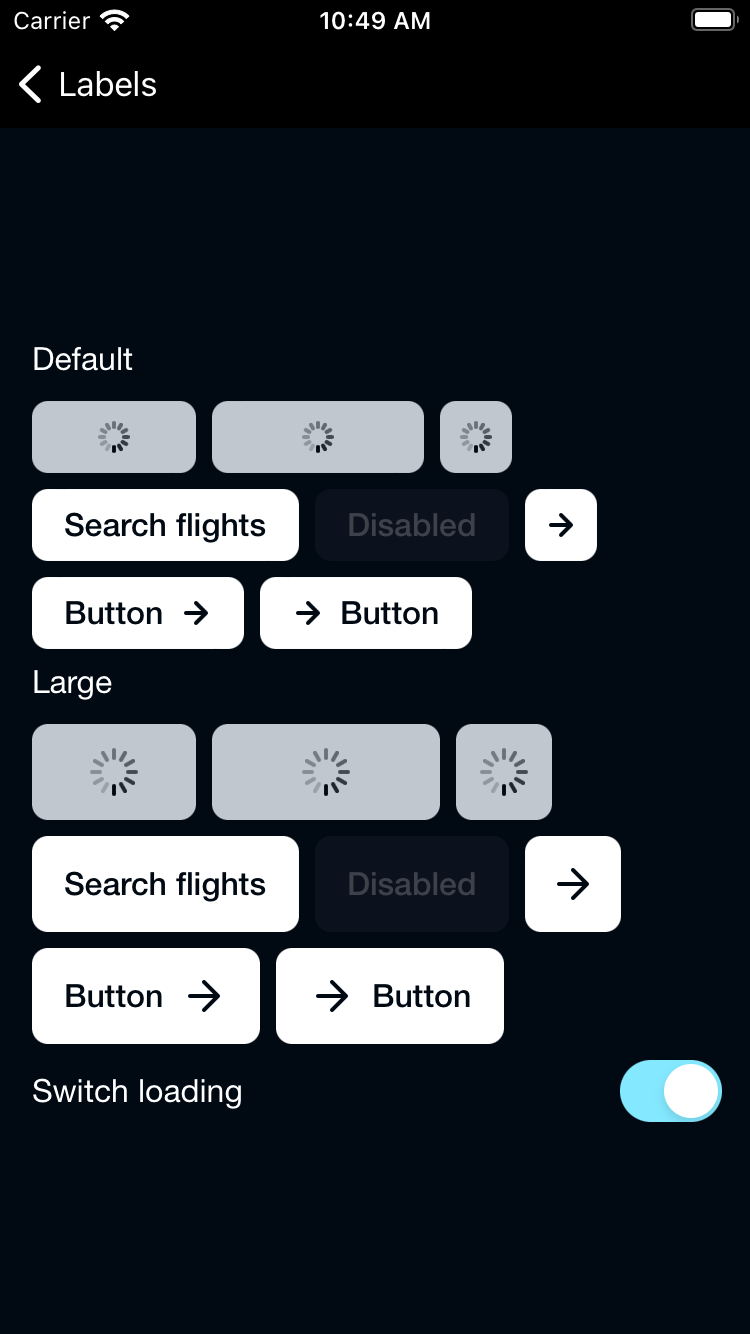
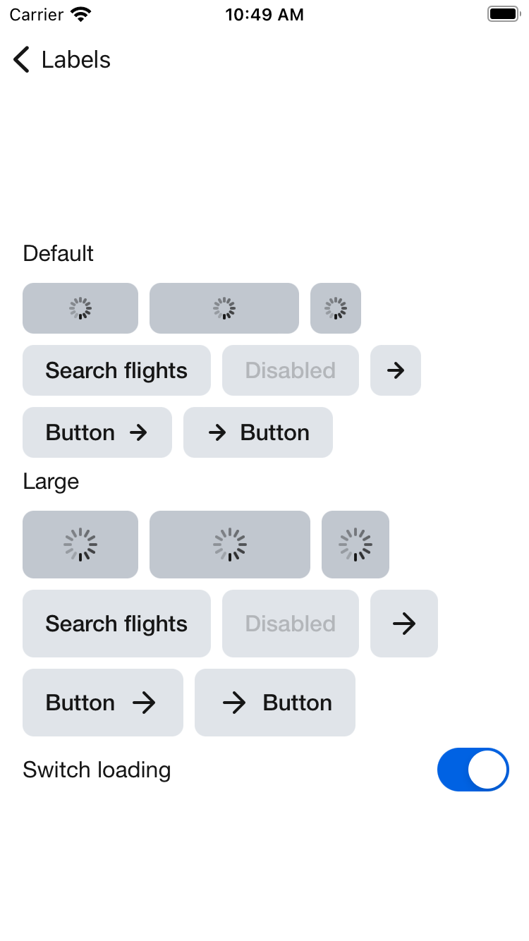
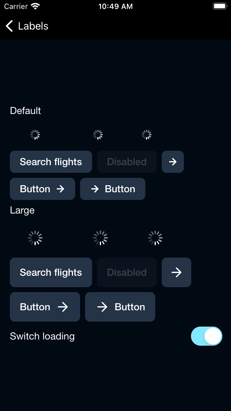
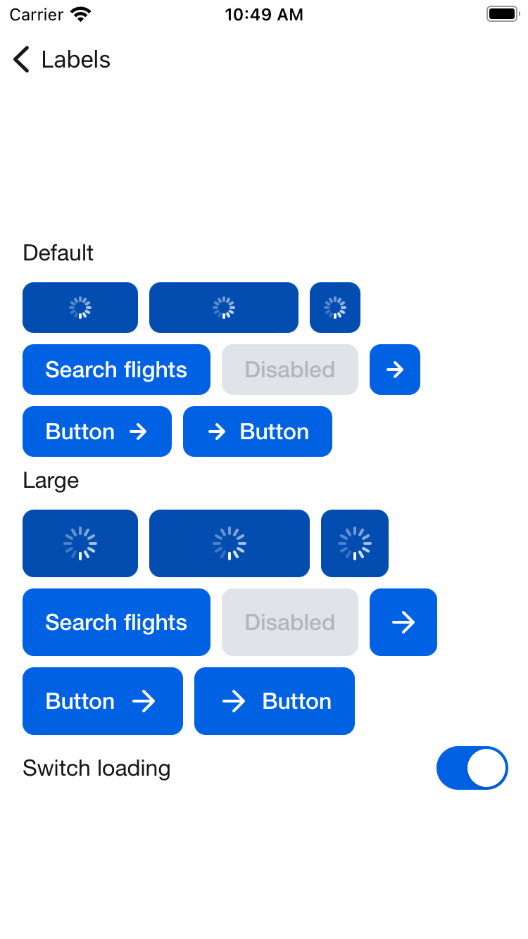
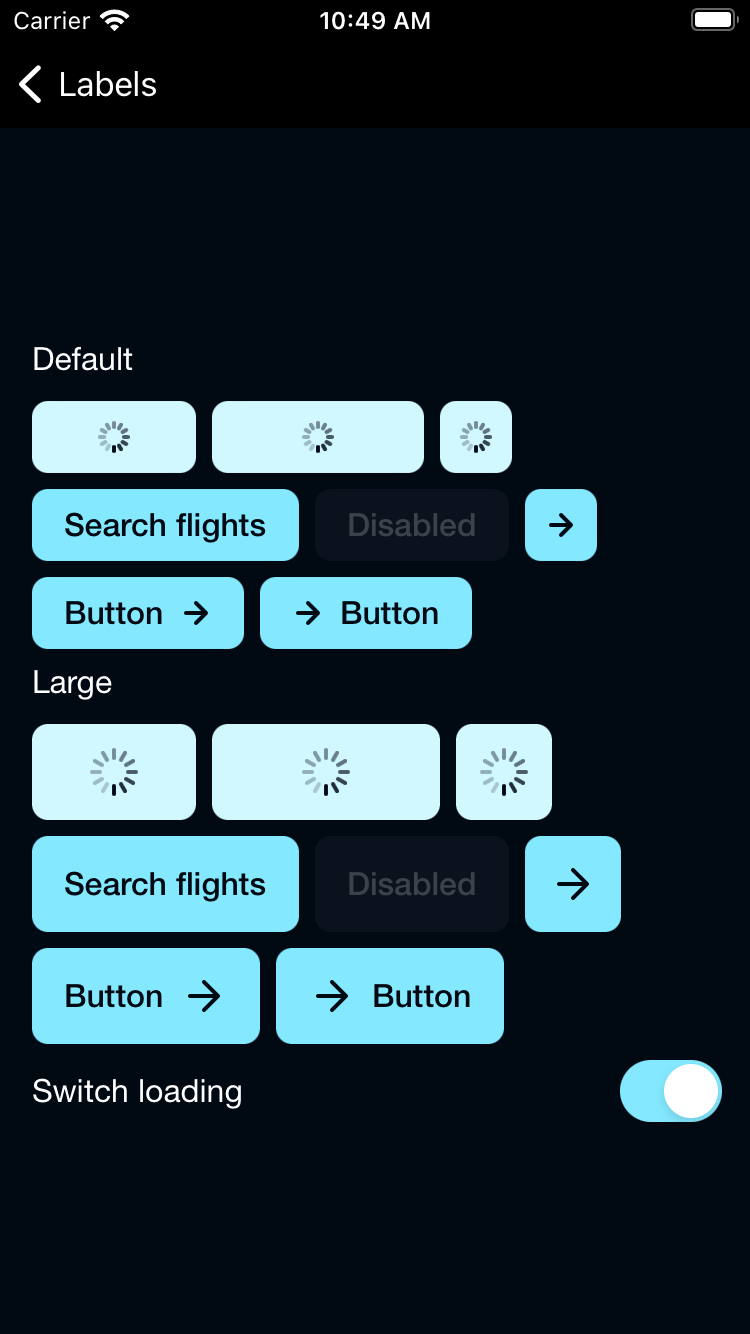
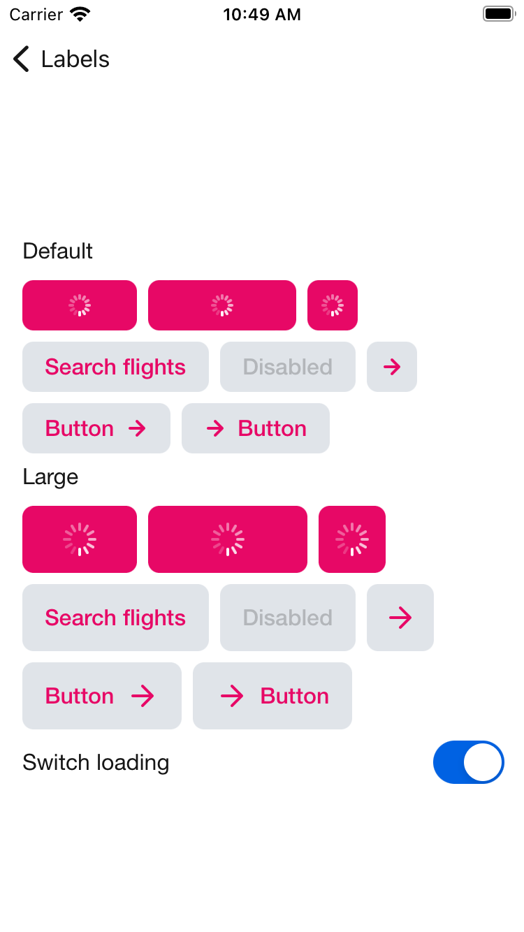
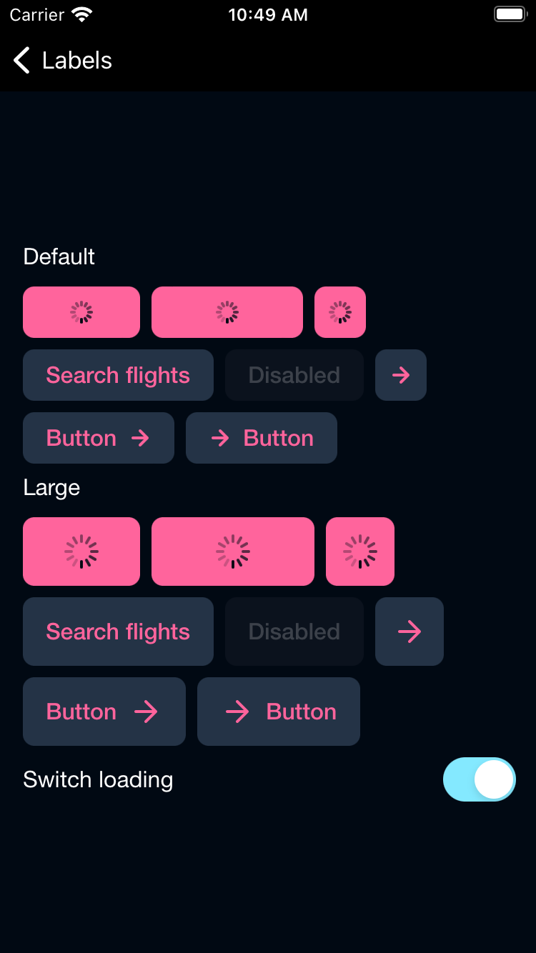
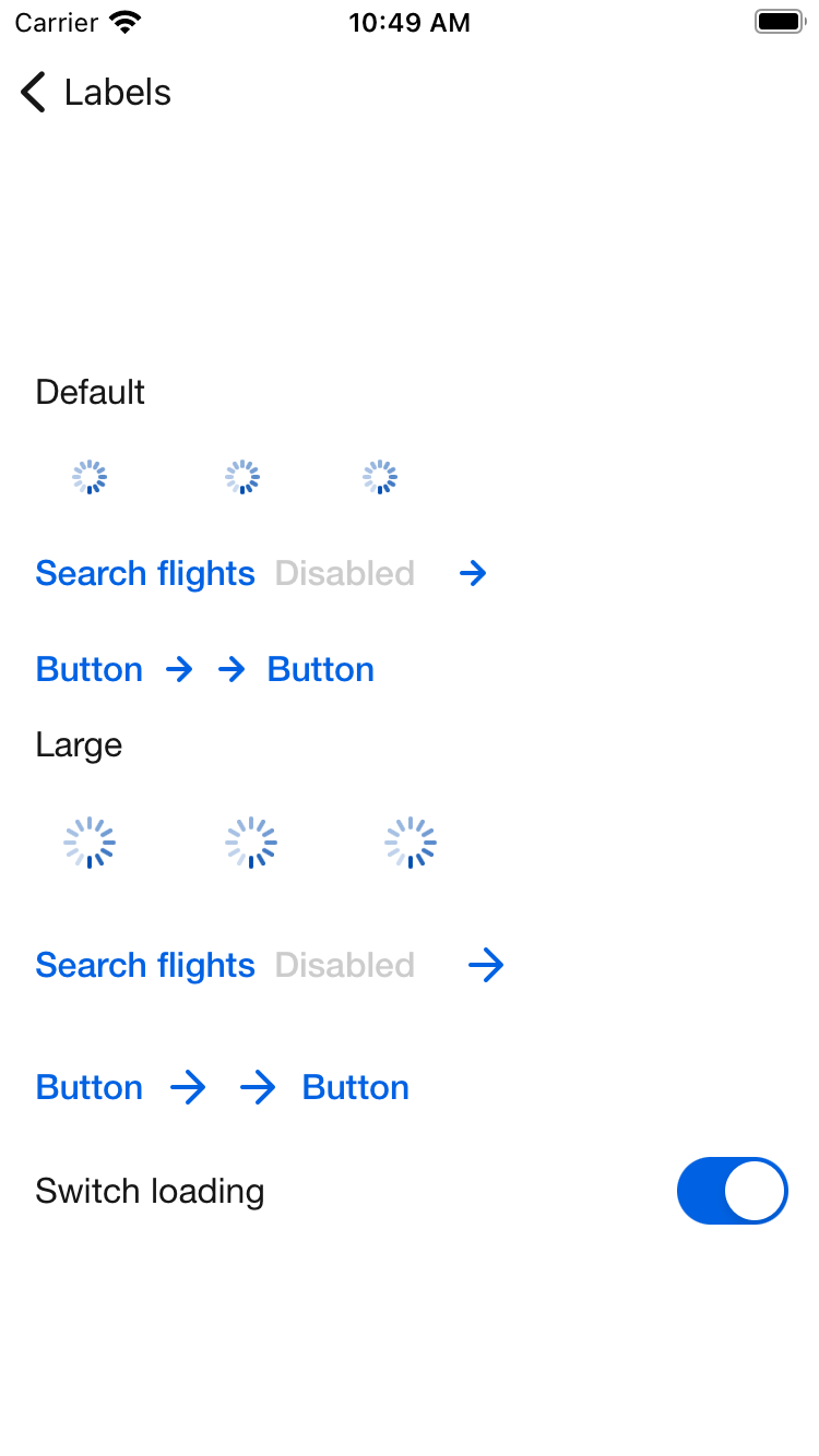
Button
Buttons help our travellers make all kinds of action, from logging in to booking that dream trip.
Button

Primary
| Day | Night |
|---|---|
 |
 |
PrimaryOnLight
| Day | Night |
|---|---|
 |
 |
PrimaryOnDark
| Day | Night |
|---|---|
 |
 |
Secondary
| Day | Night |
|---|---|
 |
 |
Featured
| Day | Night |
|---|---|
 |
 |
Destructive
| Day | Night |
|---|---|
 |
 |
Link
| Day | Night |
|---|---|
 |
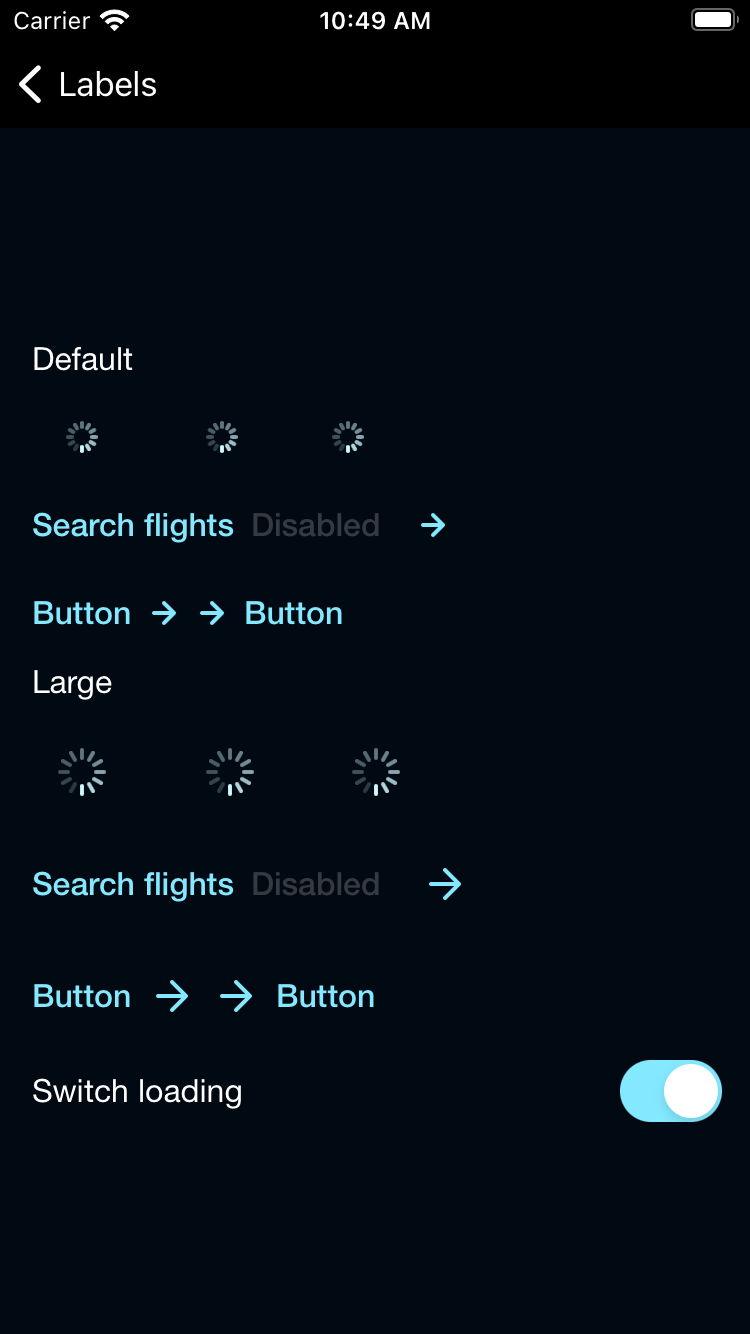 |
Usage
Basic button with a title and action closure.
If you don't specify a .buttonStyle(<type>) it will use the .primary type
                                                BPKButton("Button title") {
                                                    print("Button tap closure")
                                                }
Styled .secondary Button.
                                                BPKButton("Button title") {
                                                    print("Button tap closure")
                                                }
                                                .buttonStyle(.secondary)
Button with a title and icon.
Set the icon to:
- .leading(icon: <BPKIcon>)
- .trailing(icon: <BPKICon>)
                                                BPKButton(
                                                    "Button title",
                                                    icon: .leading(icon: .longArrowRight)
                                                ) {
                                                    print("Button tap closure")
                                                }

                                                BPKButton(
                                                    "Button title",
                                                    icon: .trailing(icon: .longArrowRight)
                                                ) {
                                                    print("Button tap closure")
                                                }
Button with loading state.
Pass in a @State variable or use .constant(true)
                                                BPKButton(
                                                    "Button title",
                                                    loading: $isLoading
                                                ) {
                                                    print("Button tap closure")
                                                }
Button with disabled state.
Pass in a @State variable or use .constant(true)
                                                BPKButton(
                                                    "Button title",
                                                    enabled: $isEnabled
                                                ) {
                                                    print("Button tap closure")
                                                }
Button with icon only
Pass in accessibilityLabel when creating a button with just an icon
                                                BPKButton(
                                                    icon: .longArrowRight,
                                                    accessibilityLabel: "Button label"
                                                ) {
                                                    print("Button tap closure")
                                                }
Button with large size
                                                BPKButton(
                                                    "Button title",
                                                    size: .large
                                                ) {
                                                    print("Button tap closure")
                                                }
Made with ❤️ by Skyscanner © 2024
© 2024 Skyscanner Backpack. Page last updated on Nov 21, 2022, 15:07