- Welcome
- Getting started
- Latest updates
- Foundations
-
Components
- Accordion
- Alert
- Alignment
- App Search Modal
- Aria live
- Autosuggest
- Badge
- Banner alert
- Bar chart
- Blockquote
- Bottom navigation
- Bottom sheet
- Breadcrumb
- Breakpoint
- Button
- Calendar
- Card
- Card list
- Card button
- Carousel
- Checkbox
- Chip
- Chip group
- Code
- Content cards
- Data Table
- Datepicker
- Description list
- Dialog
- Divider
- Drawer
- Field Set
- Flare
- Flat list
- Flight leg
- Floating action button
- Floating notification
- Form label
- Form validation
- Graphic promotion
- Horizontal navigation
- Icon
- Image
- Image Gallery
- Infinite scroll
- Info Banner
- Inset Banner
- Link
- List
- Map
- Mobile scroll container
- Modal
- Navigation bar
- Navigation Tab Group
- Nudger
- Overlay
- Page indicator
- Pagination
- Panel
- Phone input
- Picker
- Popover
- Price
- Progress bar
- Radio button
- Rating
- Rating Bar
- Scrollable calendar
- Search Modal
- Section header
- Section list
- Select
- Skeleton
- Skip link
- Slider
- Snackbar
- Snippet
- Spinner
- Split input
- Star rating
- Swap Button
- Switch
- Table
- Text
- Text input
- Theming
- Ticket
- Toast
- Tooltip
- Touchable native feedback
- Touchable overlay
- Search Input Summary
- Content
- Accessibility
- Contributing
- Localisation
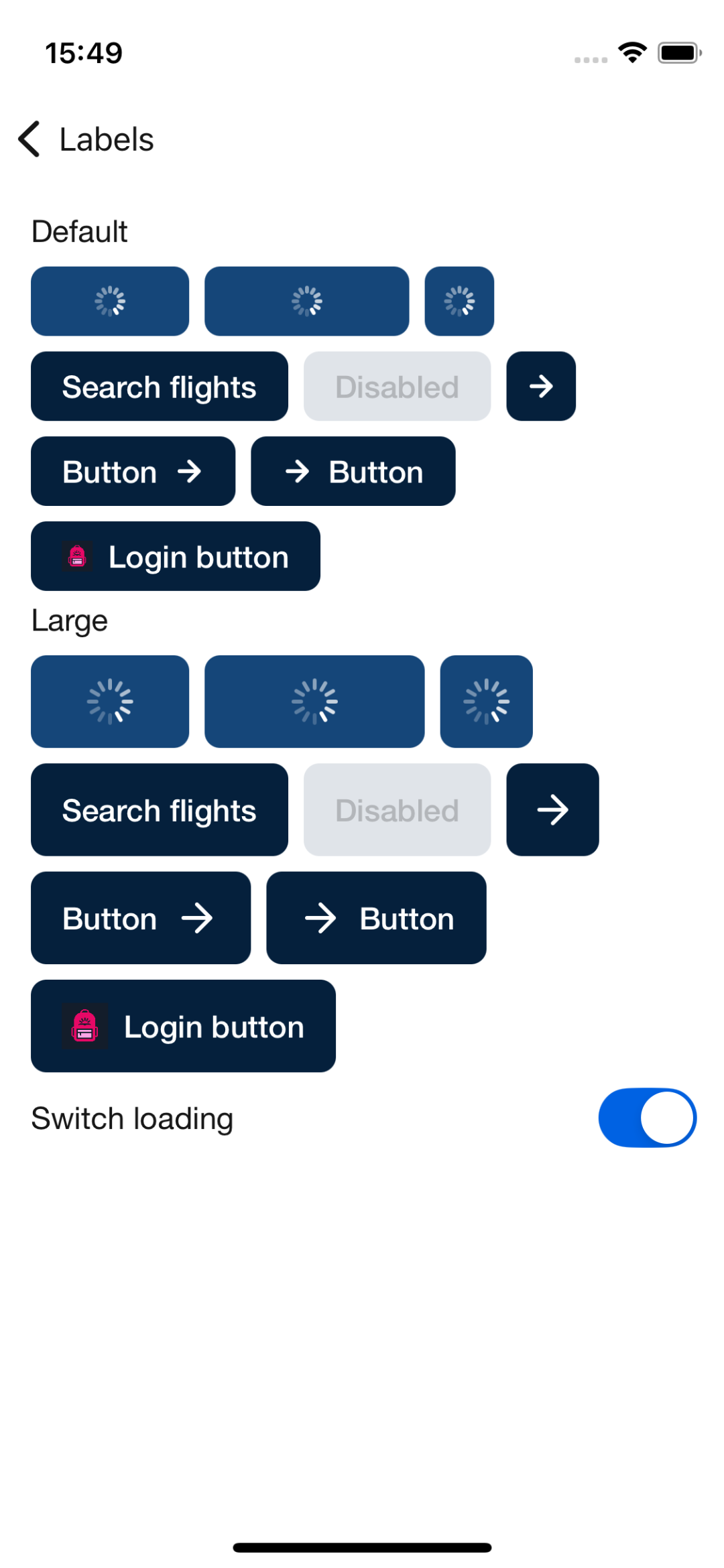
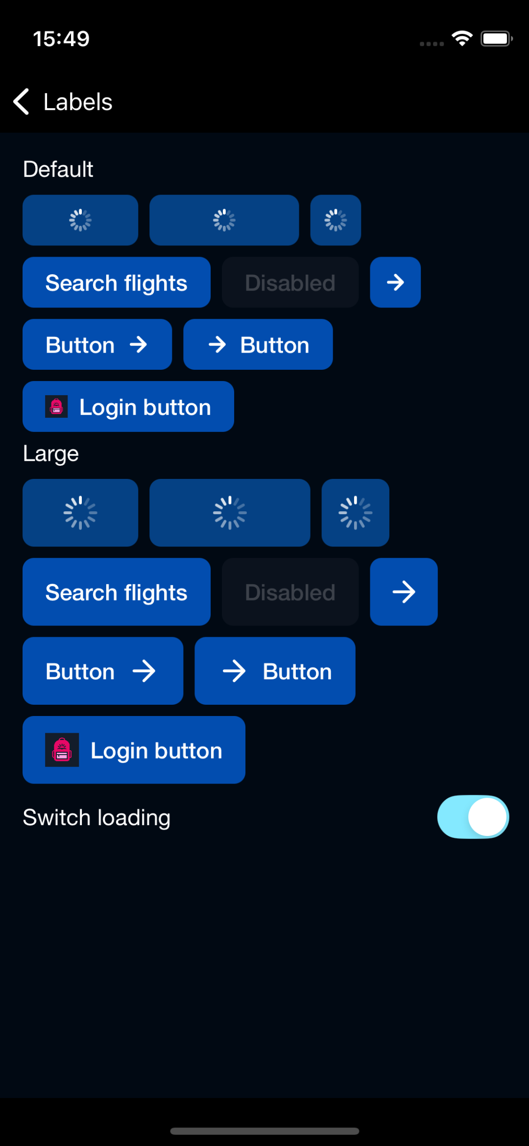
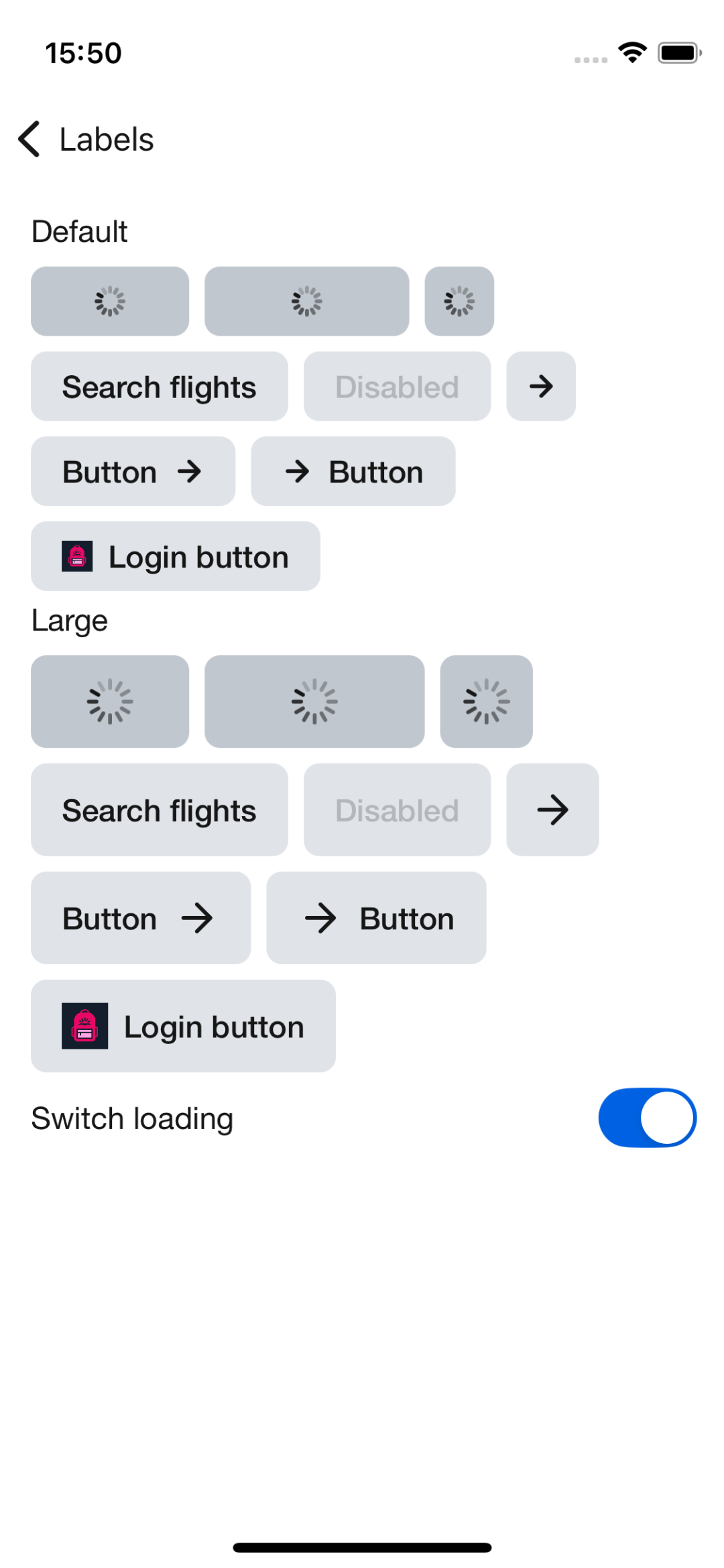
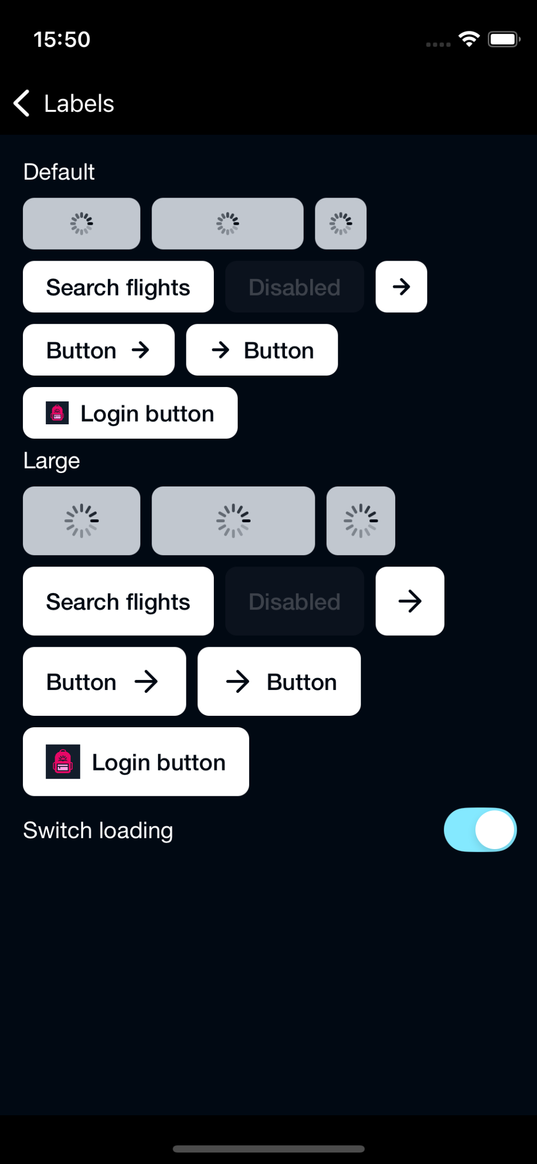
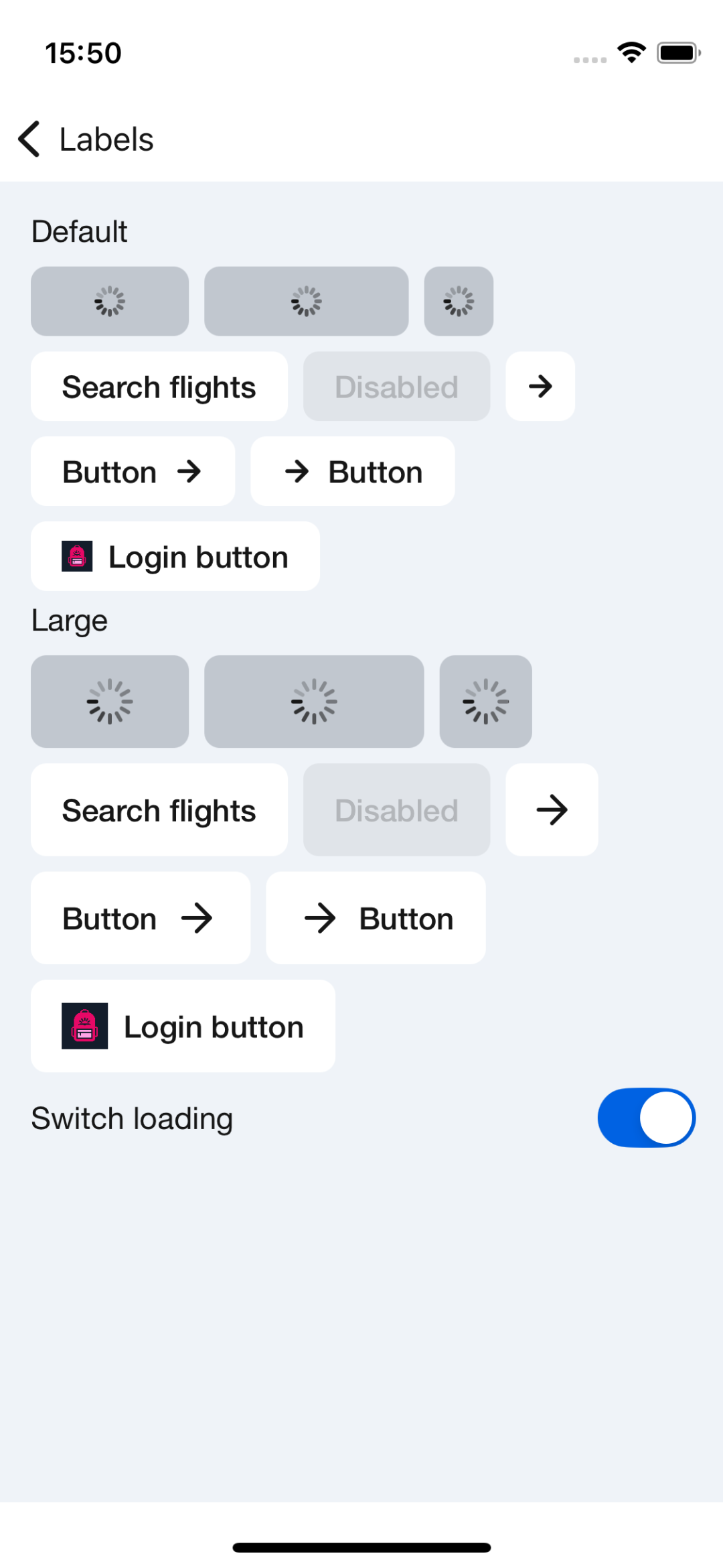
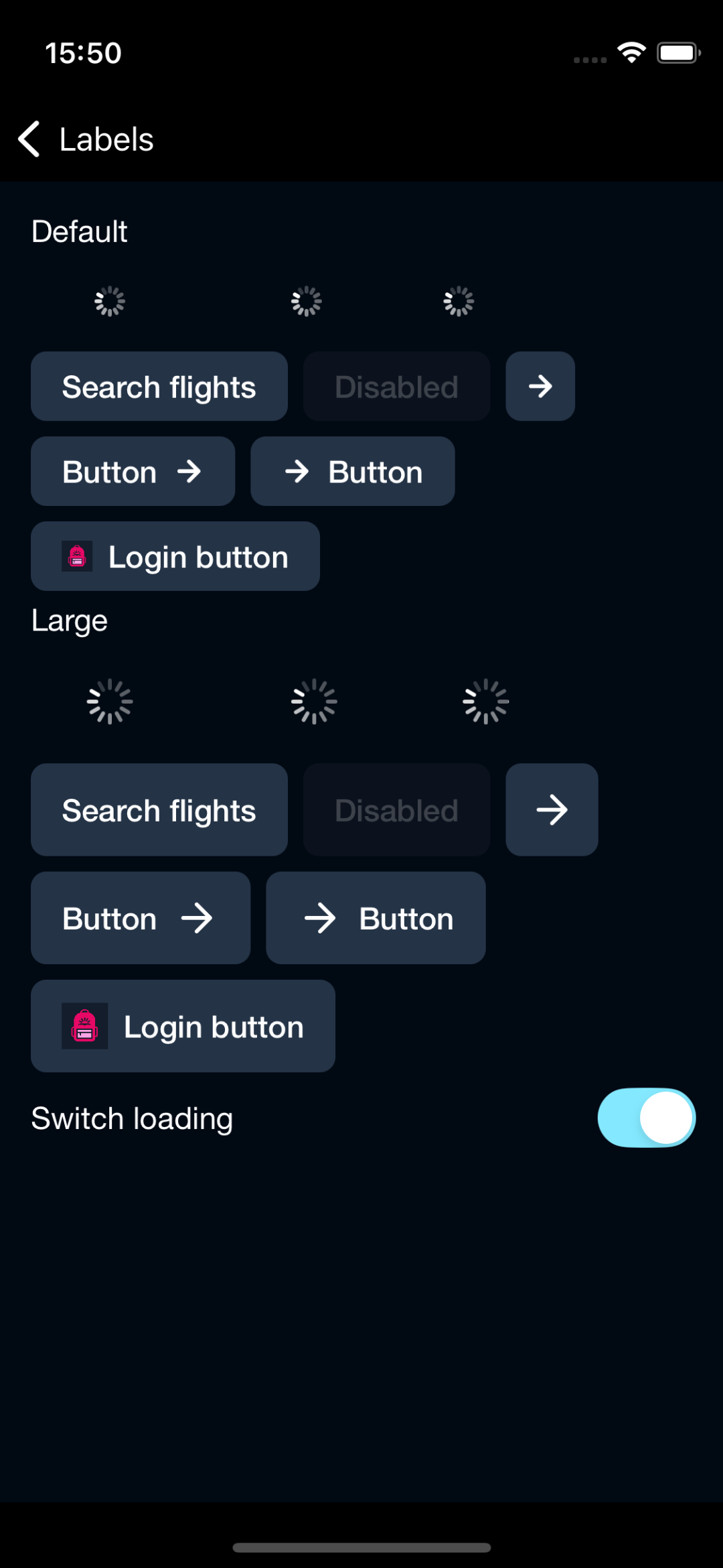
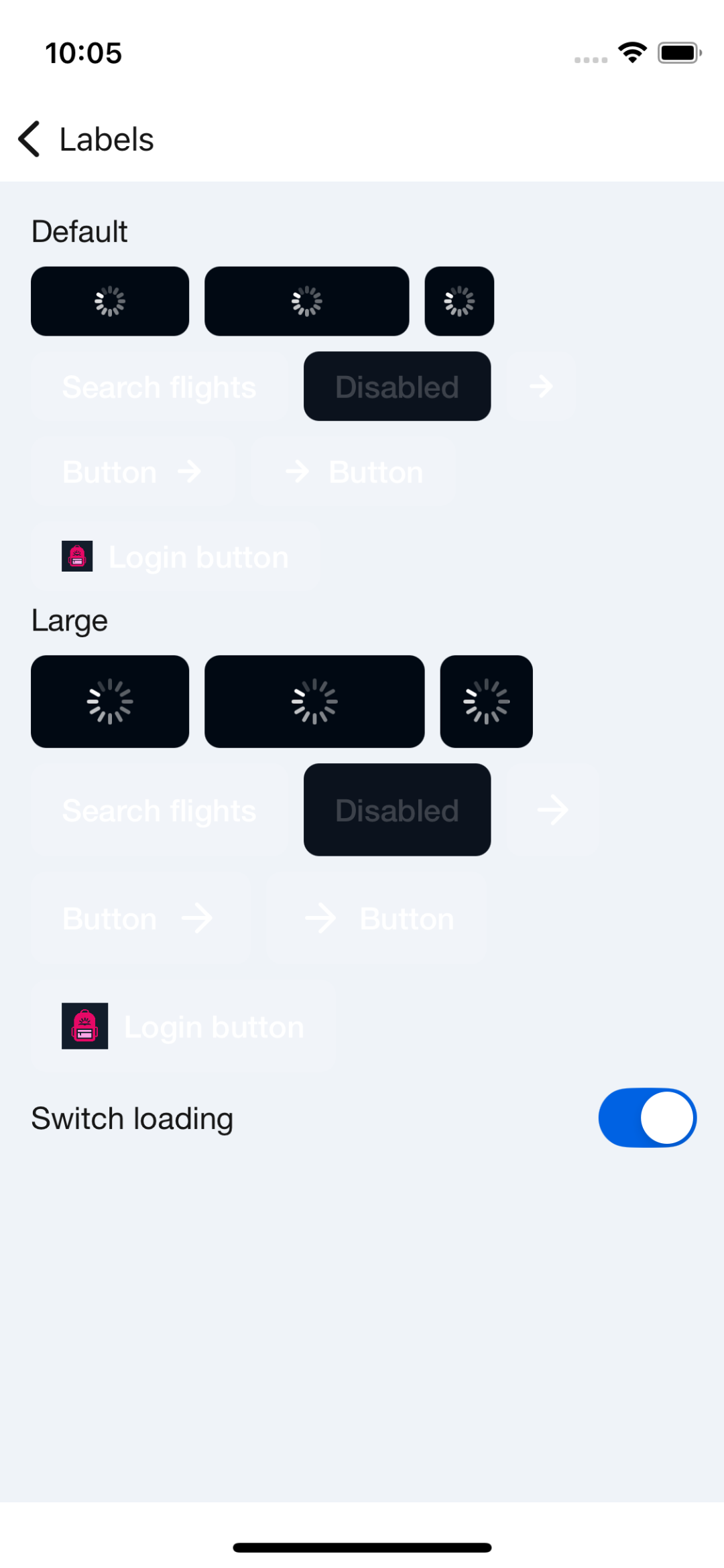
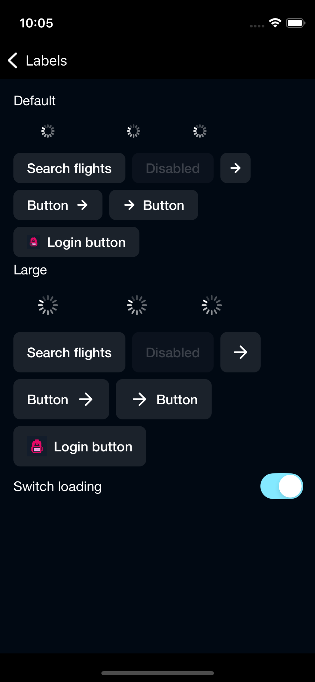
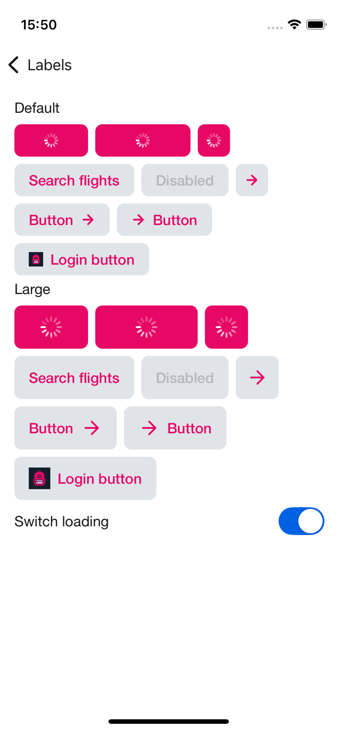
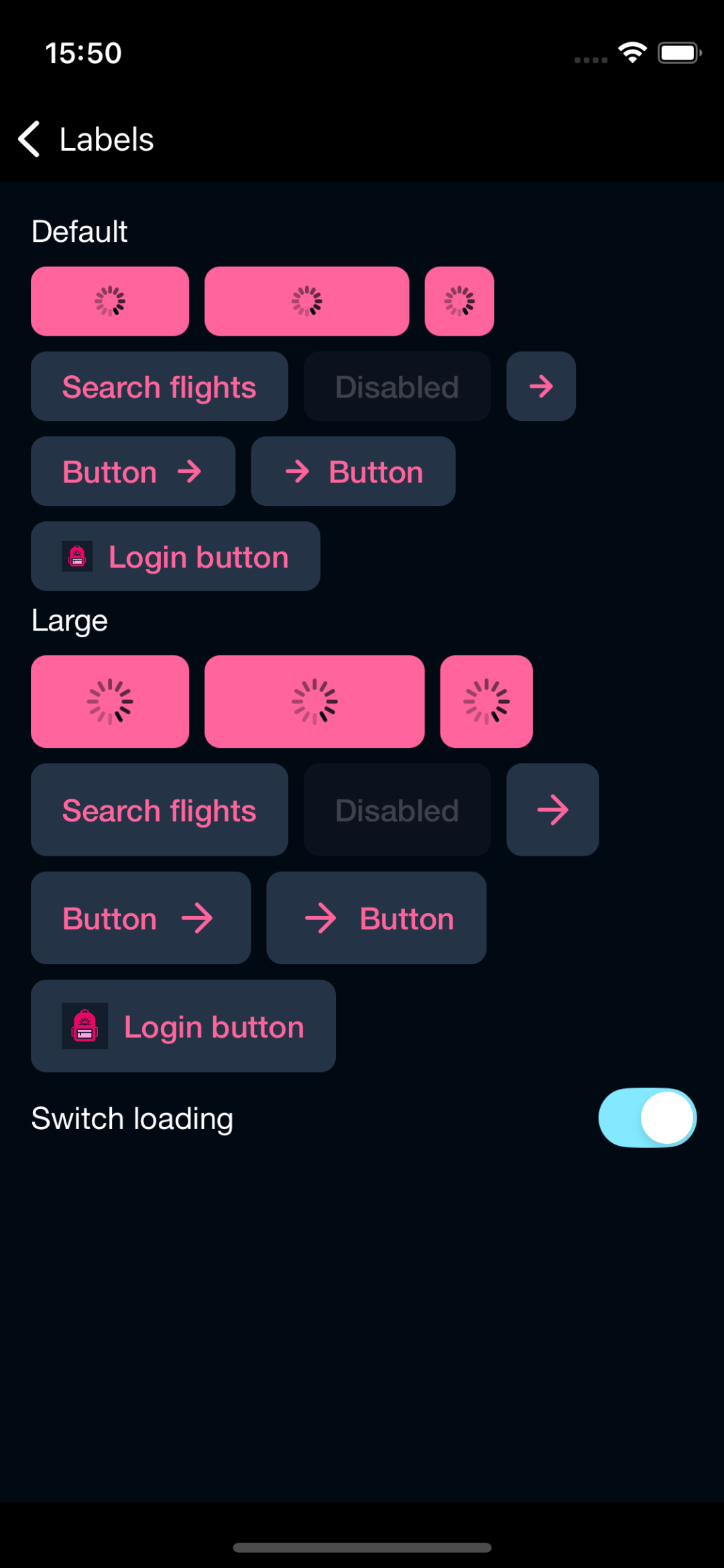
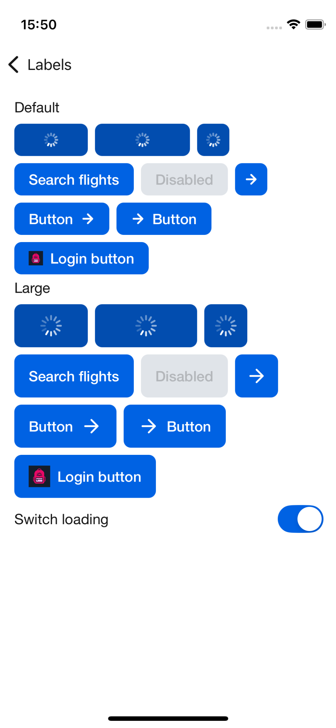
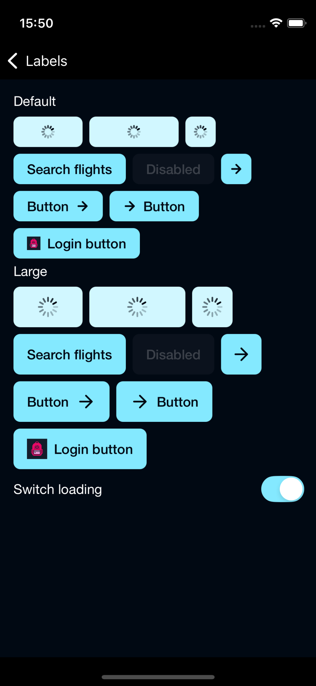
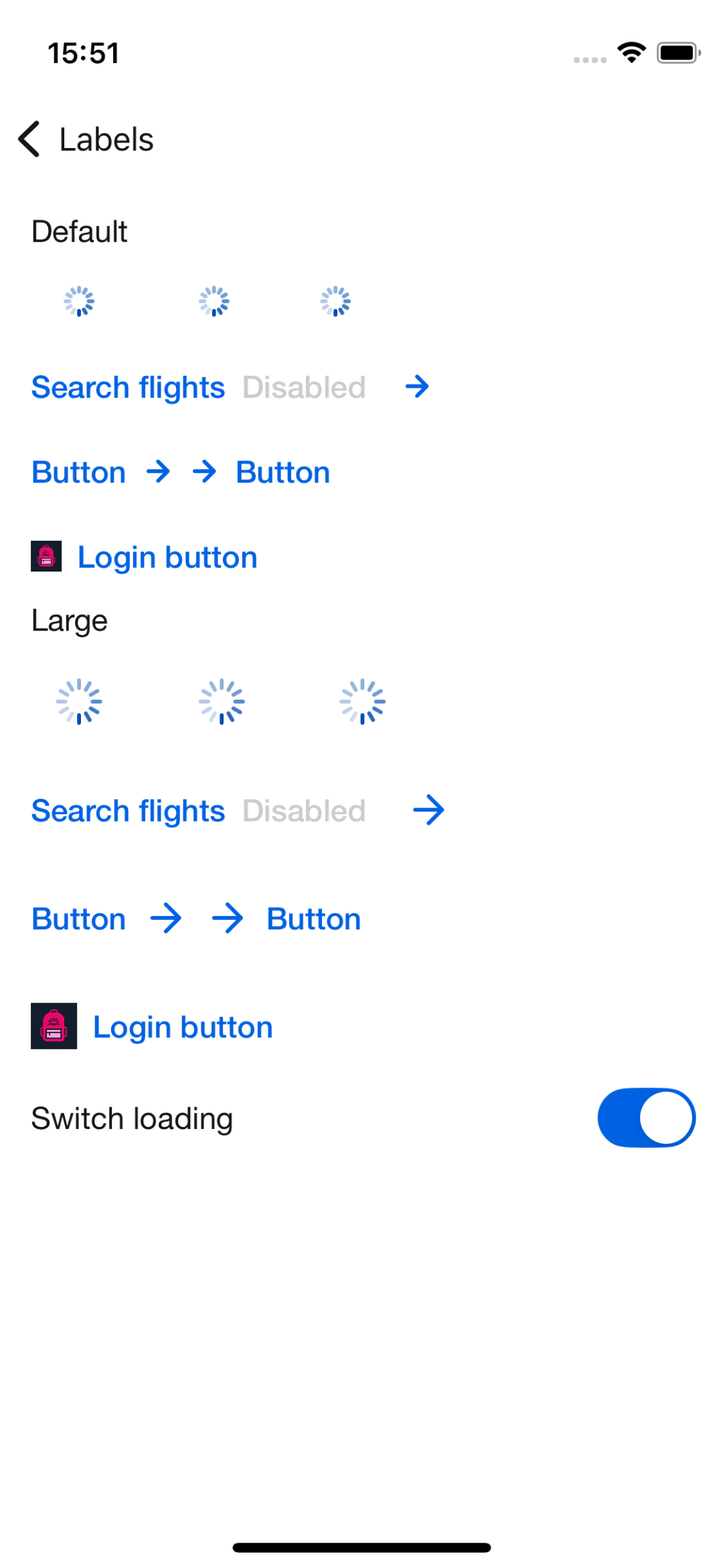
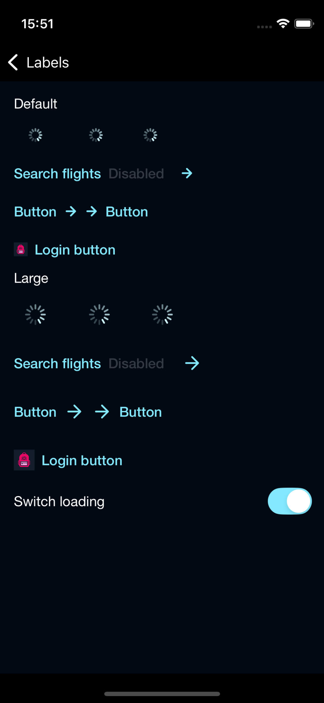
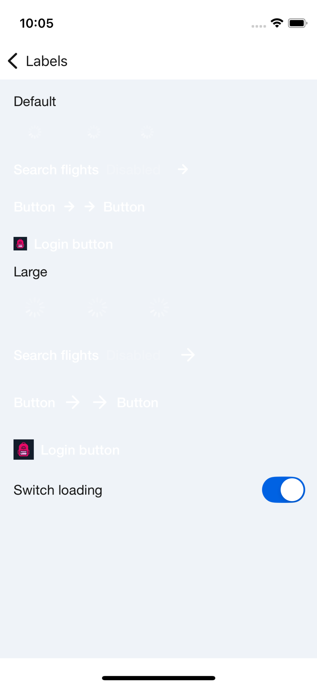
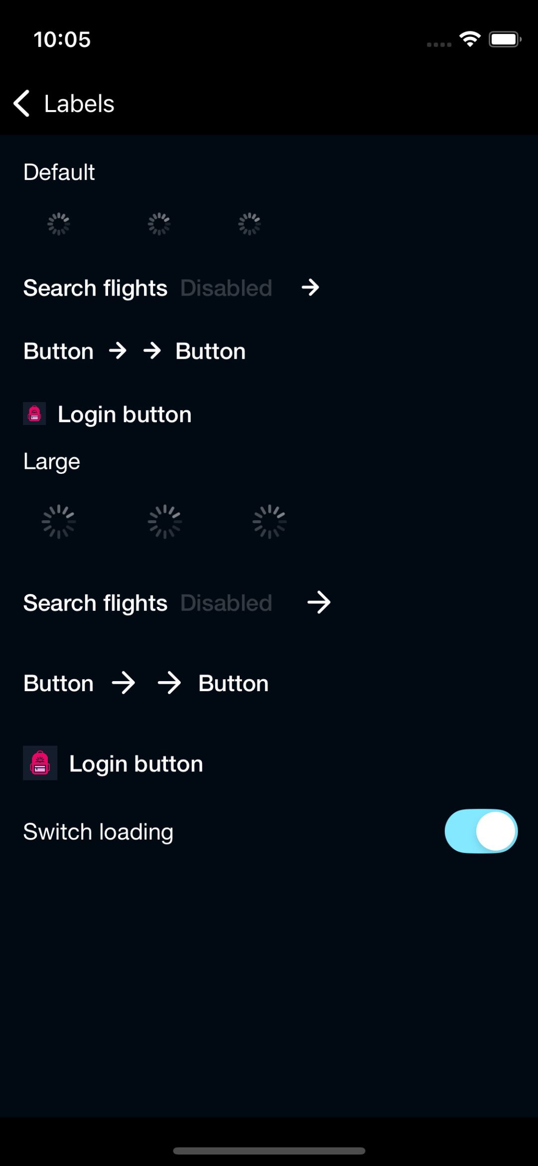
Button
Buttons help our travellers make all kinds of action, from logging in to booking that dream trip.
Backpack/Button

Primary
| Day | Night |
|---|---|
 |
 |
Primary On Light
| Day | Night |
|---|---|
 |
 |
Primary On Dark
| Day | Night |
|---|---|
 |
 |
Secondary
| Day | Night |
|---|---|
 |
 |
Secondary On Dark
| Day | Night |
|---|---|
 |
 |
Destructive
| Day | Night |
|---|---|
 |
 |
Featured
| Day | Night |
|---|---|
 |
 |
Link
| Day | Night |
|---|---|
 |
 |
Link On Dark
| Day | Night |
|---|---|
 |
 |
Usage
BPKButton contains the Backpack Button component which is a subclass of UIButton with Skyscanner styles. It accepts a Backpack font style to set the desired size, style and positioning properties. There's an isLoading property that if we set to YES will show an ActivityIndicator, also it will automatically set the enabled property to NO blocking the user interaction and it will change the style to a disable look and feel. Setting the isLoading property to NO again will restore the predefined style.
Objective-C
                                                #import <Backpack/Button.h>

                                                BPKButton *button = [[BPKButton alloc] initWithSize:BPKButtonSizeDefault style:BPKButtonStylePrimary];
                                                [button setTitle:@"My Button"];
                                                // Position button with autolayout or other method
With Icon
                                                #import <Backpack/Button.h>
                                                #import <Backpack/Icon.h>

                                                UIImage *icon = [BPKIcon templateIconNamed:@"long-arrow-right" size:BPKIconSizeSmall];
                                                BPKButton *button = [[BPKButton alloc] initWithSize:BPKButtonSizeDefault style:BPKButtonStylePrimary];
                                                [button setTitle:@"My Button"];
                                                [button setImage:icon];
                                                // Position button with autolayout or other method
Swift
                                                import Backpack

                                                let button = BPKButton(size: .default, style: .primary)
                                                button.title = "My Button"
                                                // Position button with autolayout or other method
With Icon
                                                import Backpack

                                                let icon = BPKIcon.makeTemplateIcon(name: .longArrowRight, size: .small)
                                                let button = BPKButton(size: .default, style: .primary)
                                                button.title = "My Button"
                                                button.image = icon
                                                // Position button with autolayout or other method
Dynamic Text
BPKButton doesn't currently support Dynamic Text, but this is planned for a later release.
Appearance attributes
(UIColor)primaryContentColor
(UIColor)primaryGradientStartColor
(UIColor)primaryGradientEndColor
(UIColor)featuredContentColor
(UIColor)featuredGradientStartColor
(UIColor)featuredGradientEndColor
(UIColor)linkContentColor
(UIColor)secondaryContentColor
(UIColor)secondaryBackgroundColor
(UIColor)secondaryBorderColor
(UIColor)destructiveContentColor
(UIColor)destructiveBackgroundColor
(UIColor)destructiveBorderColor
Made with ❤️ by Skyscanner © 2024
© 2024 Skyscanner Backpack. Page last updated on Nov 8, 2022, 14:19