- Welcome
- Getting started
- Latest updates
- Foundations
-
Components
- Accordion
- Alert
- Alignment
- App Search Modal
- Aria live
- Autosuggest
- Badge
- Banner alert
- Bar chart
- Blockquote
- Bottom navigation
- Bottom sheet
- Breadcrumb
- Breakpoint
- Button
- Calendar
- Card
- Card list
- Card button
- Carousel
- Checkbox
- Chip
- Chip group
- Code
- Content cards
- Data Table
- Datepicker
- Description list
- Dialog
- Divider
- Drawer
- Field Set
- Flare
- Flat list
- Flight leg
- Floating action button
- Floating notification
- Form label
- Form validation
- Graphic promotion
- Horizontal navigation
- Icon
- Image
- Image Gallery
- Infinite scroll
- Info Banner
- Inset Banner
- Link
- List
- Map
- Mobile scroll container
- Modal
- Navigation bar
- Navigation Tab Group
- Nudger
- Overlay
- Page indicator
- Pagination
- Panel
- Phone input
- Picker
- Popover
- Price
- Progress bar
- Radio button
- Rating
- Rating Bar
- Scrollable calendar
- Search Modal
- Section header
- Section list
- Select
- Skeleton
- Skip link
- Slider
- Snackbar
- Snippet
- Spinner
- Split input
- Star rating
- Swap Button
- Switch
- Table
- Text
- Text input
- Theming
- Ticket
- Toast
- Tooltip
- Touchable native feedback
- Touchable overlay
- Search Input Summary
- Content
- Accessibility
- Contributing
- Localisation
Button
Buttons help our travellers make all kinds of action, from logging in to booking that dream trip.
Button

Default
| Day | Night |
|---|---|
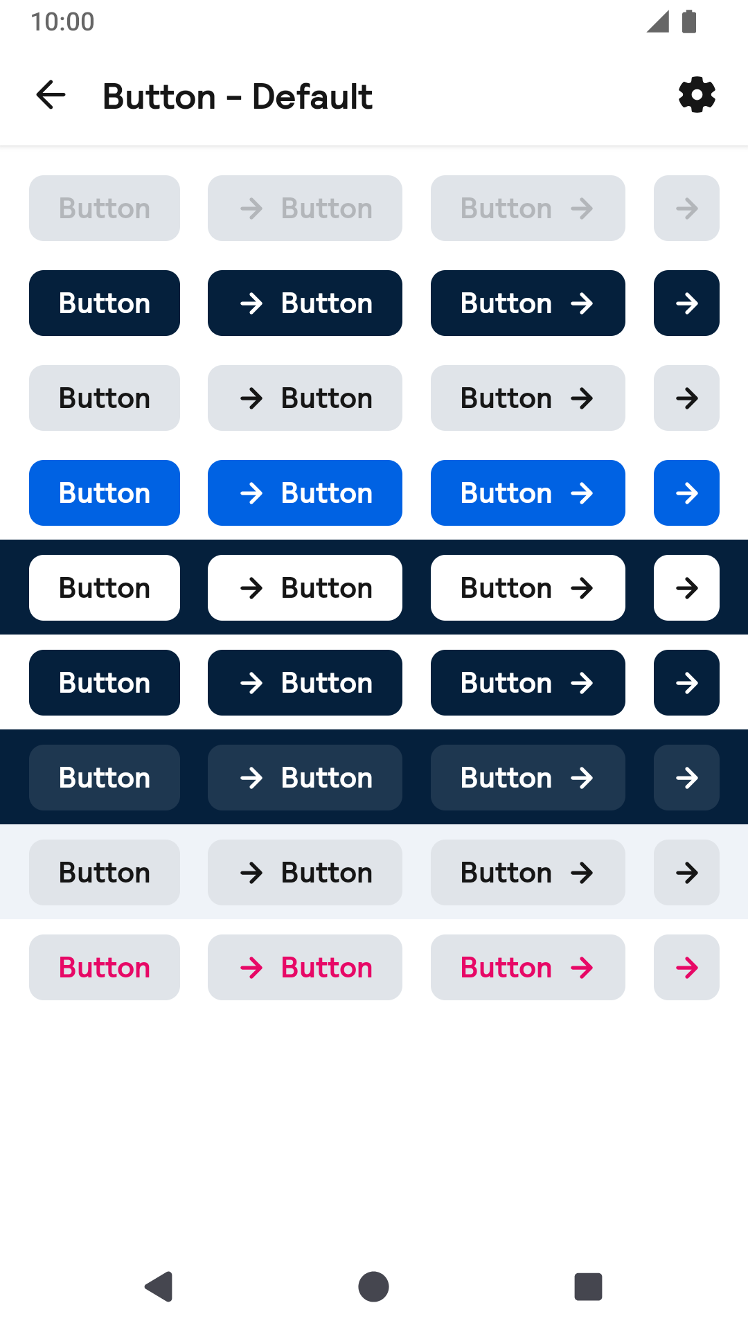 |
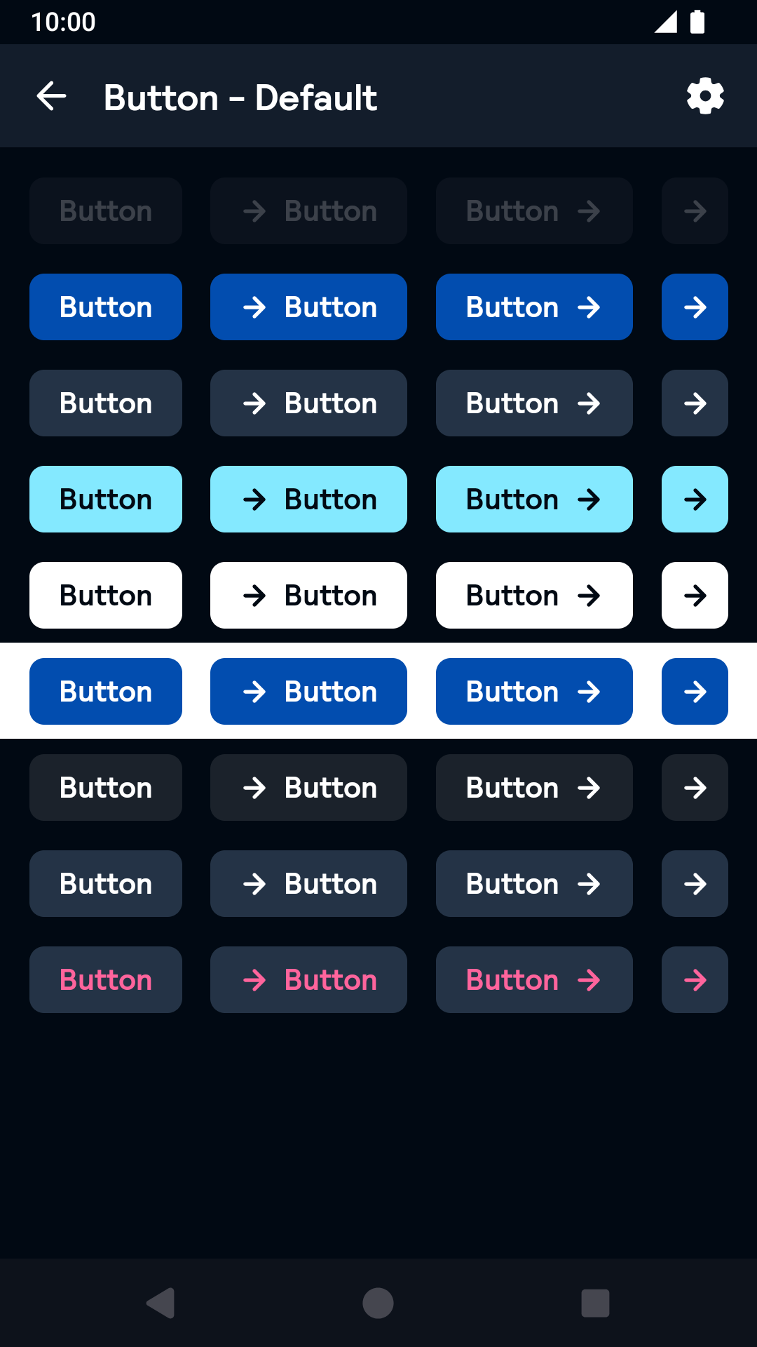 |
Large
| Day | Night |
|---|---|
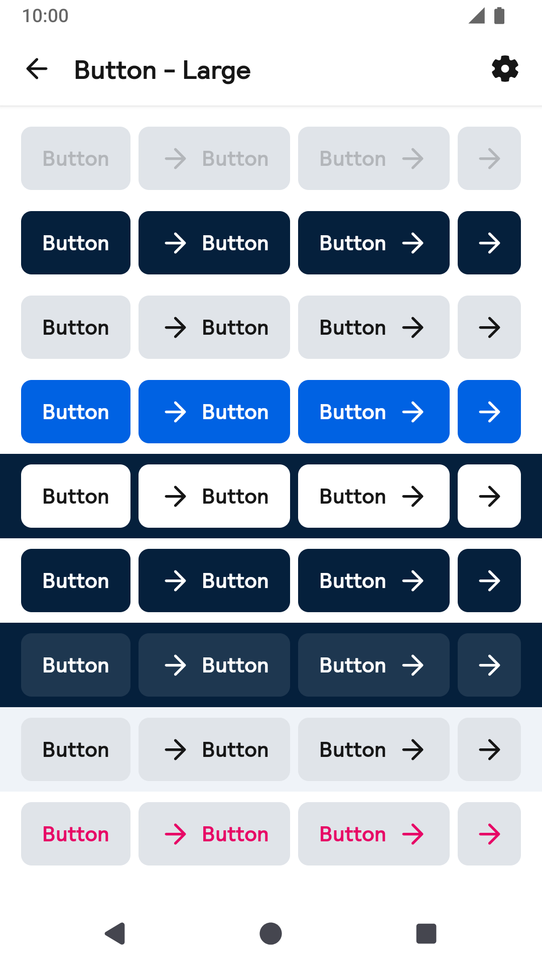 |
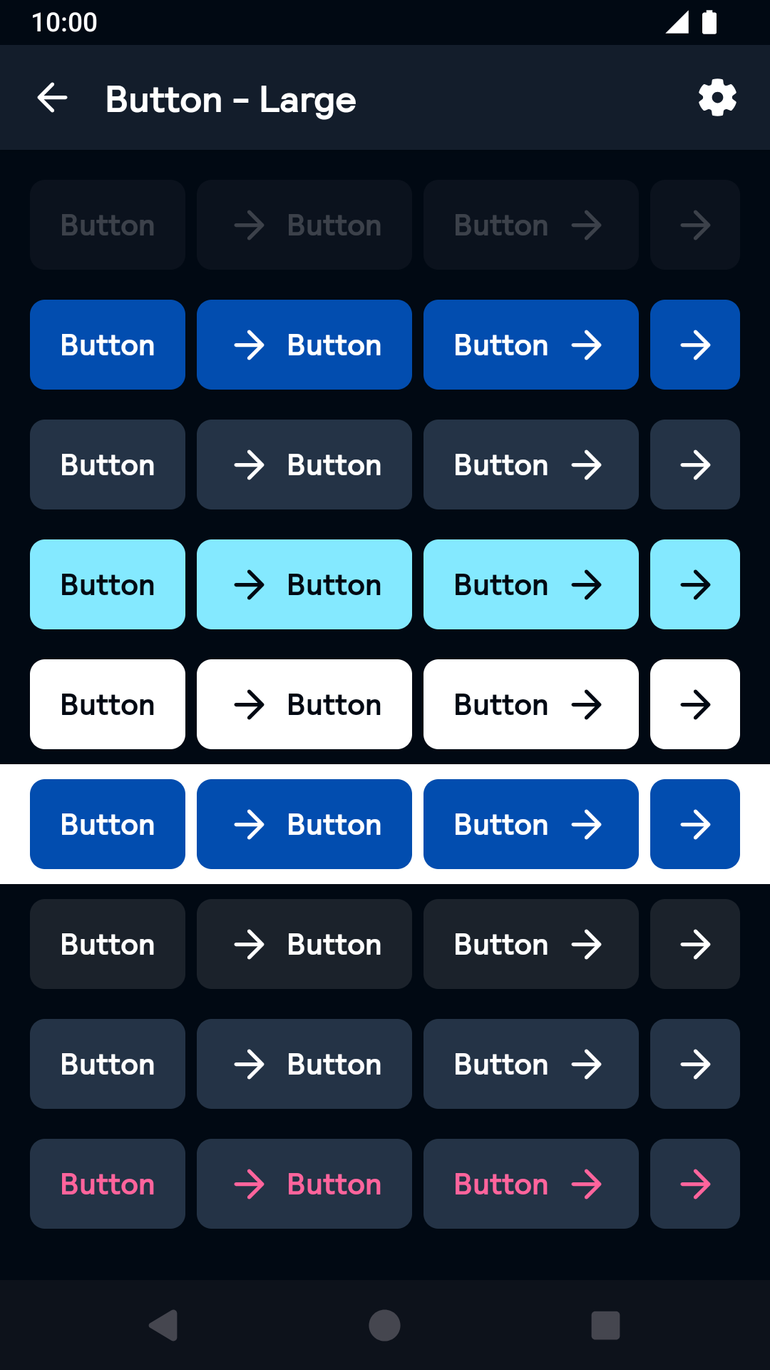 |
Link
| Day | Night |
|---|---|
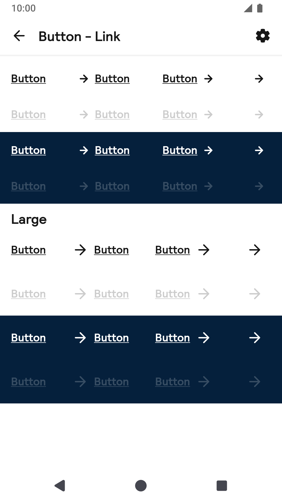 |
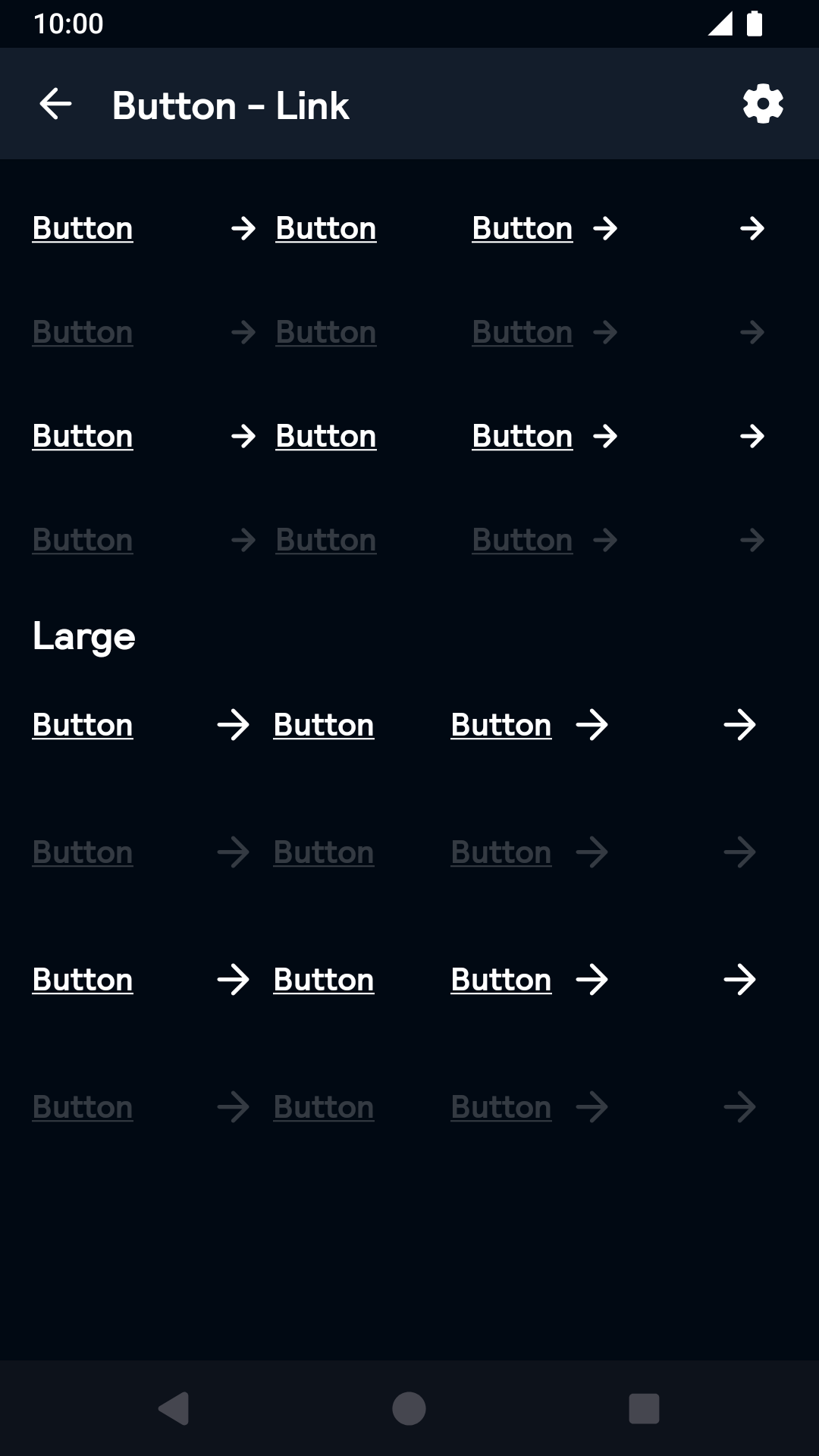 |
Drawable Icon
| Day | Night |
|---|---|
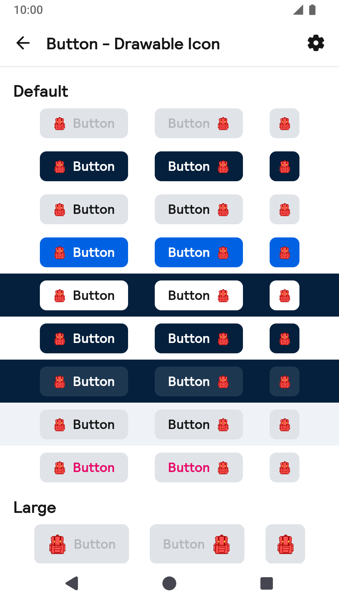 |
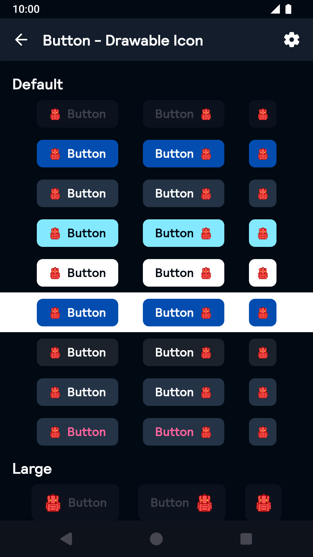 |
Installation
Backpack Compose is available through Maven Central. Check the main Readme for a complete installation guide.
Usage
Example of a text Button with default (small) size and primary type:
                                                import net.skyscanner.backpack.compose.button.BpkButton
                                                import net.skyscanner.backpack.compose.button.BpkButtonSize
                                                import net.skyscanner.backpack.compose.button.BpkButtonType

                                                BpkButton(
                                                  text = stringResource(R.string.my_button_text),
                                                  size = BpkButtonSize.Default,
                                                  type = BpkButtonType.Primary,
                                                ) {
                                                    // onClick
                                                }
Example of a disabled button:
                                                import net.skyscanner.backpack.compose.button.BpkButton

                                                BpkButton(
                                                  text = stringResource(R.string.my_button_text),
                                                  enabled = false,
                                                ) {
                                                  // onClick
                                                }
Example of a loading button:
                                                import net.skyscanner.backpack.compose.button.BpkButton

                                                BpkButton(
                                                  text = stringResource(R.string.my_button_text),
                                                  loading = true,
                                                ) {
                                                  // onClick
                                                }
Example of a large button:
                                                import net.skyscanner.backpack.compose.button.BpkButton
                                                import net.skyscanner.backpack.compose.button.BpkButtonSize

                                                BpkButton(
                                                  text = stringResource(R.string.my_button_text),
                                                  size = BpkButtonSize.Large,
                                                ) {
                                                  // onClick
                                                }
Example of a secondary button:
                                                import net.skyscanner.backpack.compose.button.BpkButton
                                                import net.skyscanner.backpack.compose.button.BpkButtonType

                                                BpkButton(
                                                  text = stringResource(R.string.my_button_text),
                                                  type = BpkButtonType.Secondary,
                                                ) {
                                                  // onClick
                                                }
Example of a icon only button:
                                                import net.skyscanner.backpack.compose.button.BpkButton
                                                import net.skyscanner.backpack.compose.icons.BpkIcons
                                                import net.skyscanner.backpack.compose.icons.sm.LongArrowRight

                                                BpkButton(
                                                  icon = BpkIcons.Sm.LongArrowRight,
                                                  contentDescription = stringResource(R.string.my_button_content_description),
                                                ) {
                                                  // onClick
                                                }
Example of a button with leading icon and text:
                                                import net.skyscanner.backpack.compose.button.BpkButton
                                                import net.skyscanner.backpack.compose.button.BpkButtonIconPosition
                                                import net.skyscanner.backpack.compose.icons.BpkIcons
                                                import net.skyscanner.backpack.compose.icons.sm.LongArrowRight

                                                BpkButton(
                                                  text = stringResource(R.string.my_button_text),
                                                  icon = BpkIcons.Sm.LongArrowRight,
                                                  position = BpkButtonIconPosition.Start,
                                                ) {
                                                  // onClick
                                                }
Example of a button with custom icon and text:
                                                import net.skyscanner.backpack.compose.button.BpkButton
                                                import androidx.compose.ui.res.painterResource

                                                BpkButton(
                                                  text = stringResource(R.string.my_button_text),
                                                  icon = painterResource(id = R.drwable.custom_icon),
                                                ) {
                                                  // onClick
                                                }
Made with ❤️ by Skyscanner © 2024
© 2024 Skyscanner Backpack. Page last updated on Nov 21, 2022, 15:07